Happy Daze

The cannabis snack company Happy Daze aims to provide young adults a tasty, enjoyable snack that complements their laid-back lifestyle. The products will be infused with high-quality cannabis and offer a unique experience that satisfies their cravings while also delivering the plant's therapeutic benefits.
The target audience consists of young adults aged 18–35 looking for a convenient and enjoyable snack infused with cannabis. They are adventurous and open-minded, seeking new experiences that fit their active lifestyle. They are laid-back, fun-loving, and value quality over quantity. Our health-conscious audience seeks products made from natural, high-quality ingredients.
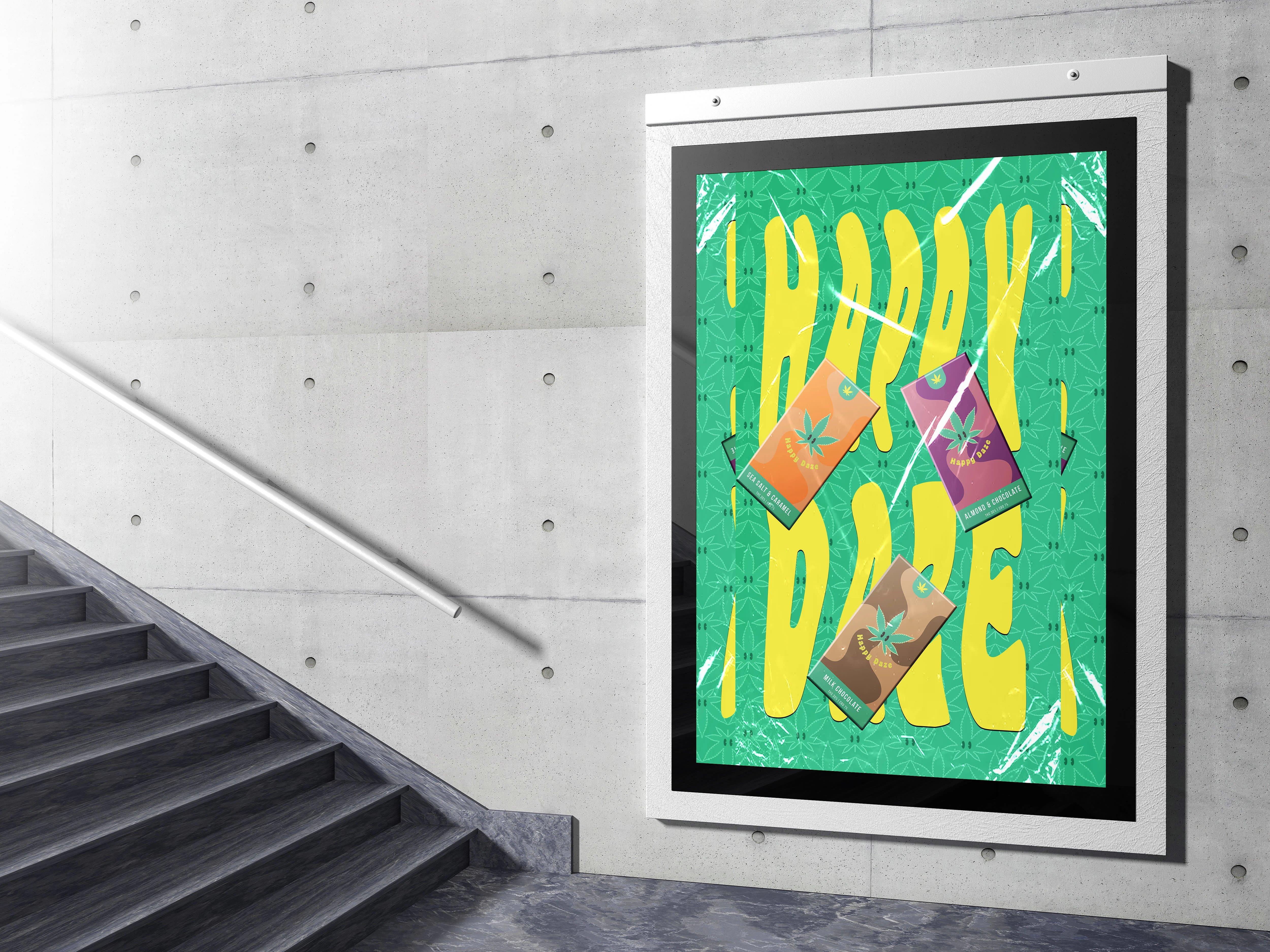
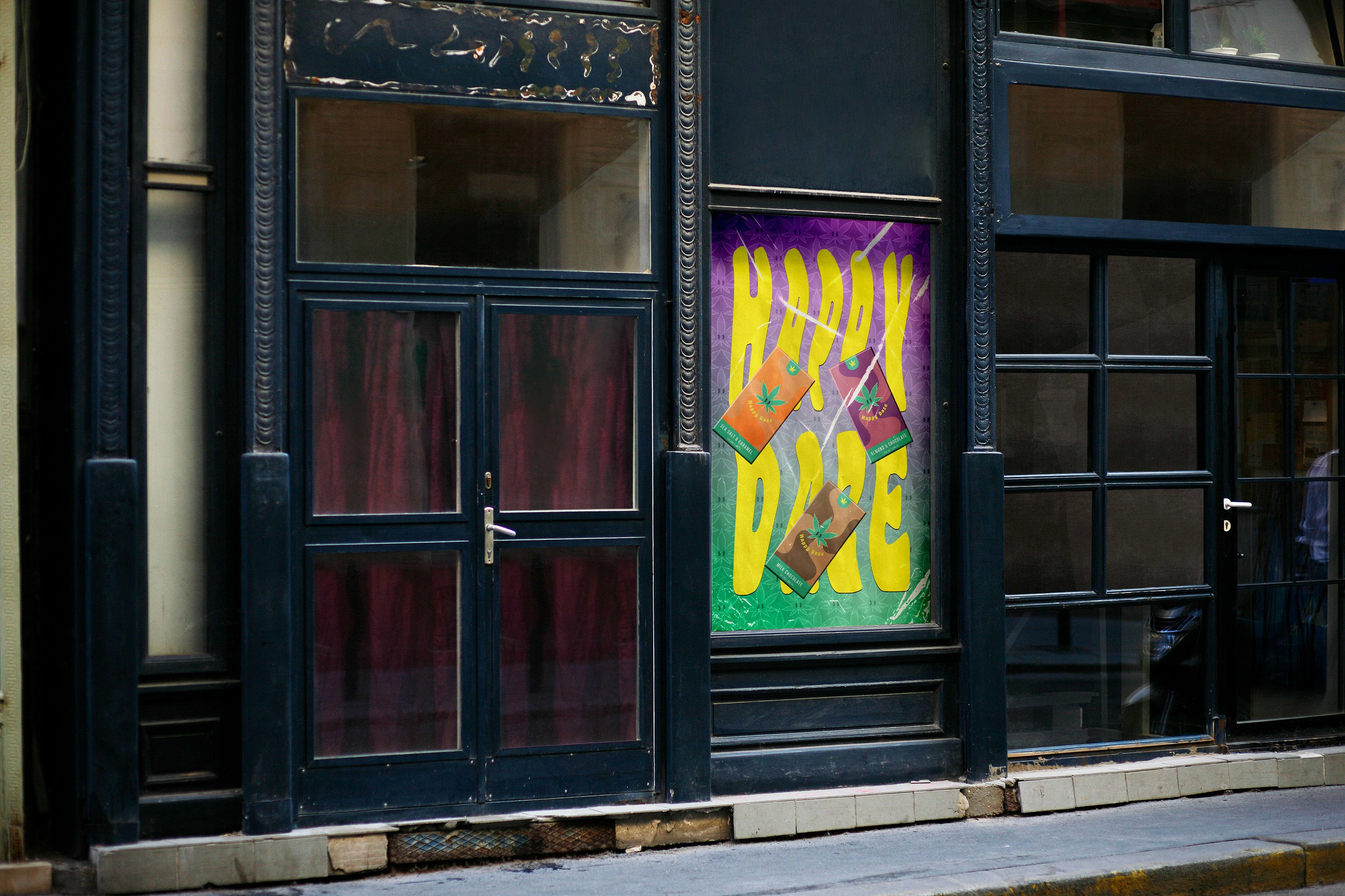
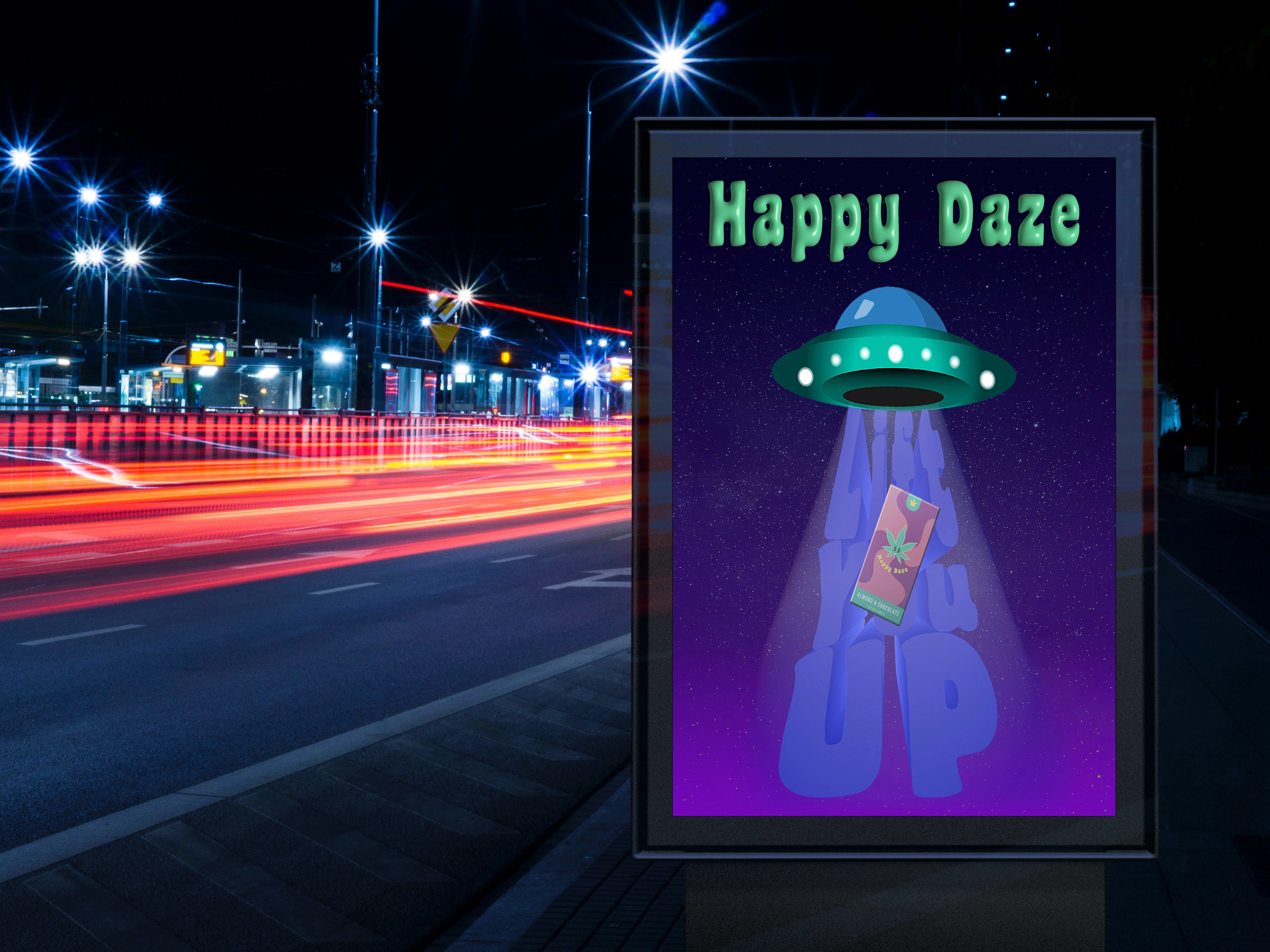
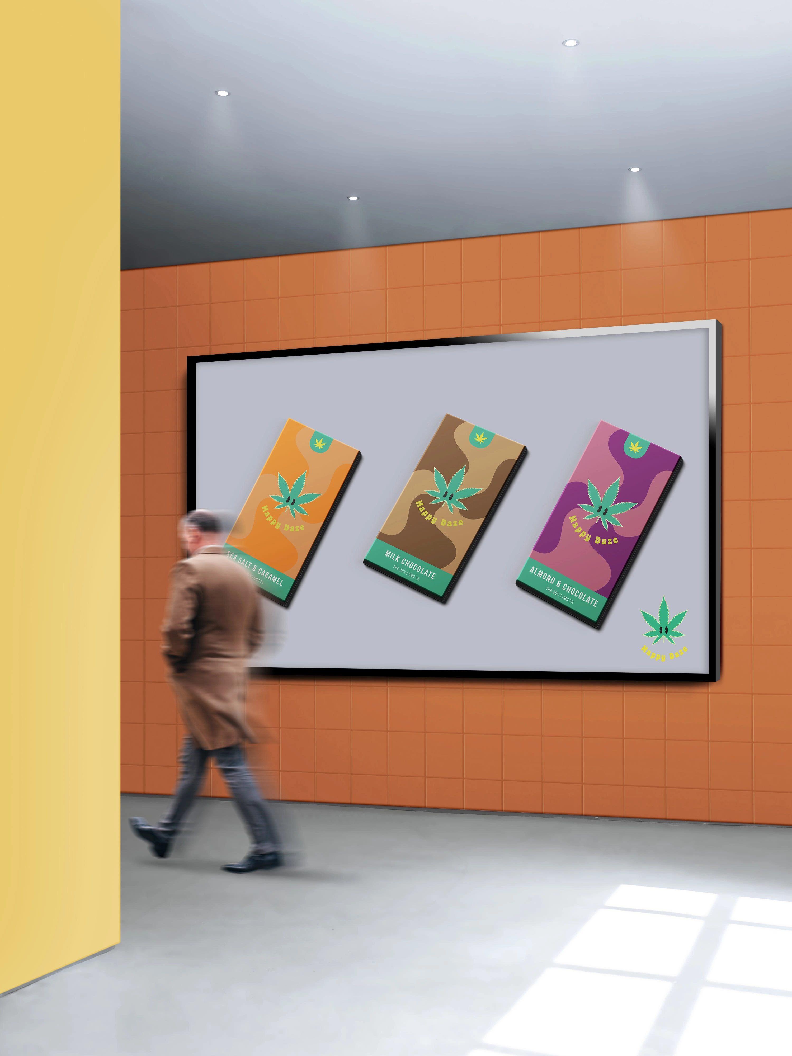
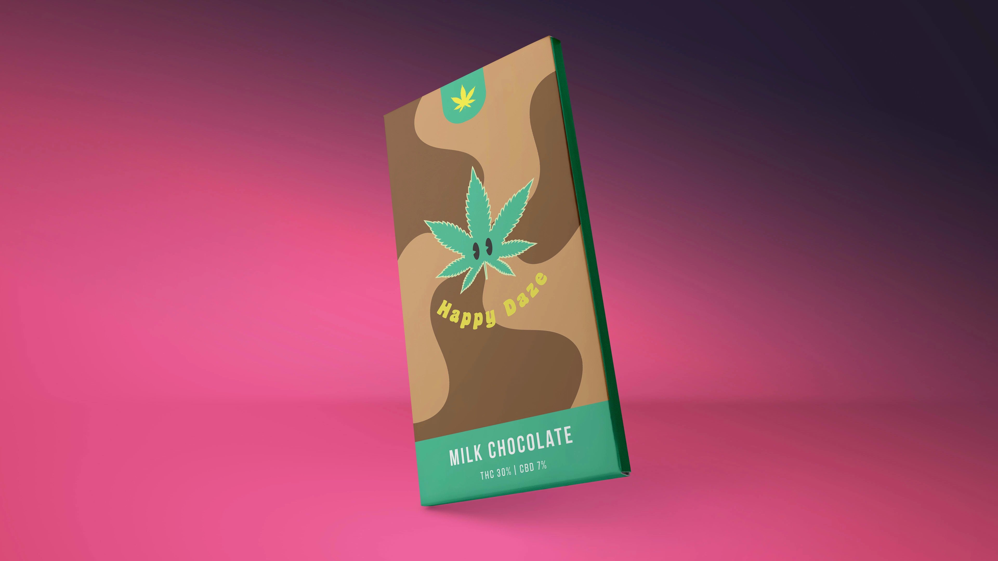
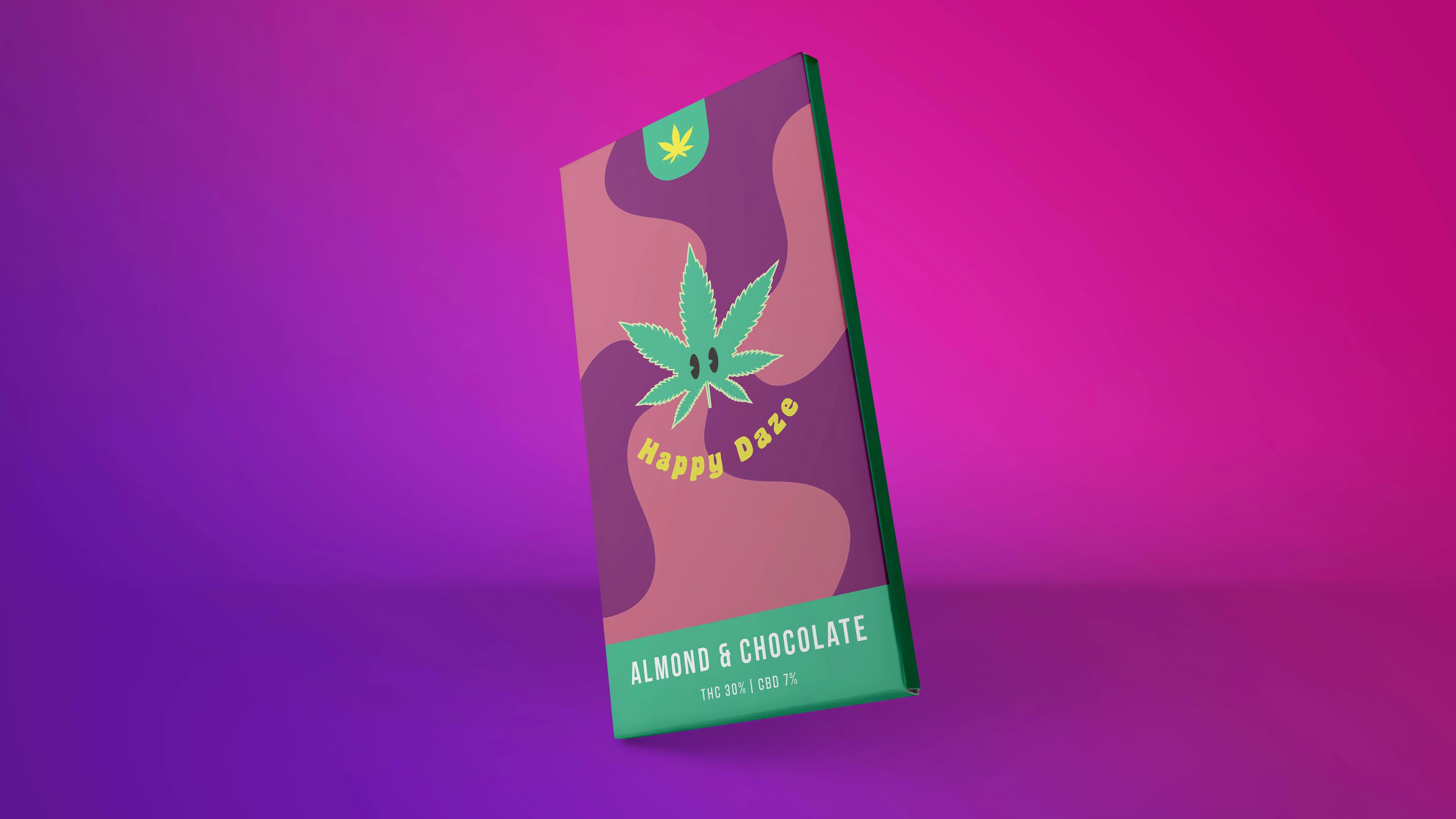
Happy Daze's brand personality is fun, adventurous, and laid-back. Happy Daze wants to convey a sense of relaxation and enjoyment while emphasizing our products' therapeutic benefits. We want our brand to be approachable, modern, and friendly, with a touch of edginess. Our initial product line will consist of cannabis-infused snacks. We want our products to stand out on the shelves with vibrant packaging that captures the essence of our brand—committed to providing our audience with a snack that satisfies their cravings and promotes relaxation and enjoyment.
My Thought Process
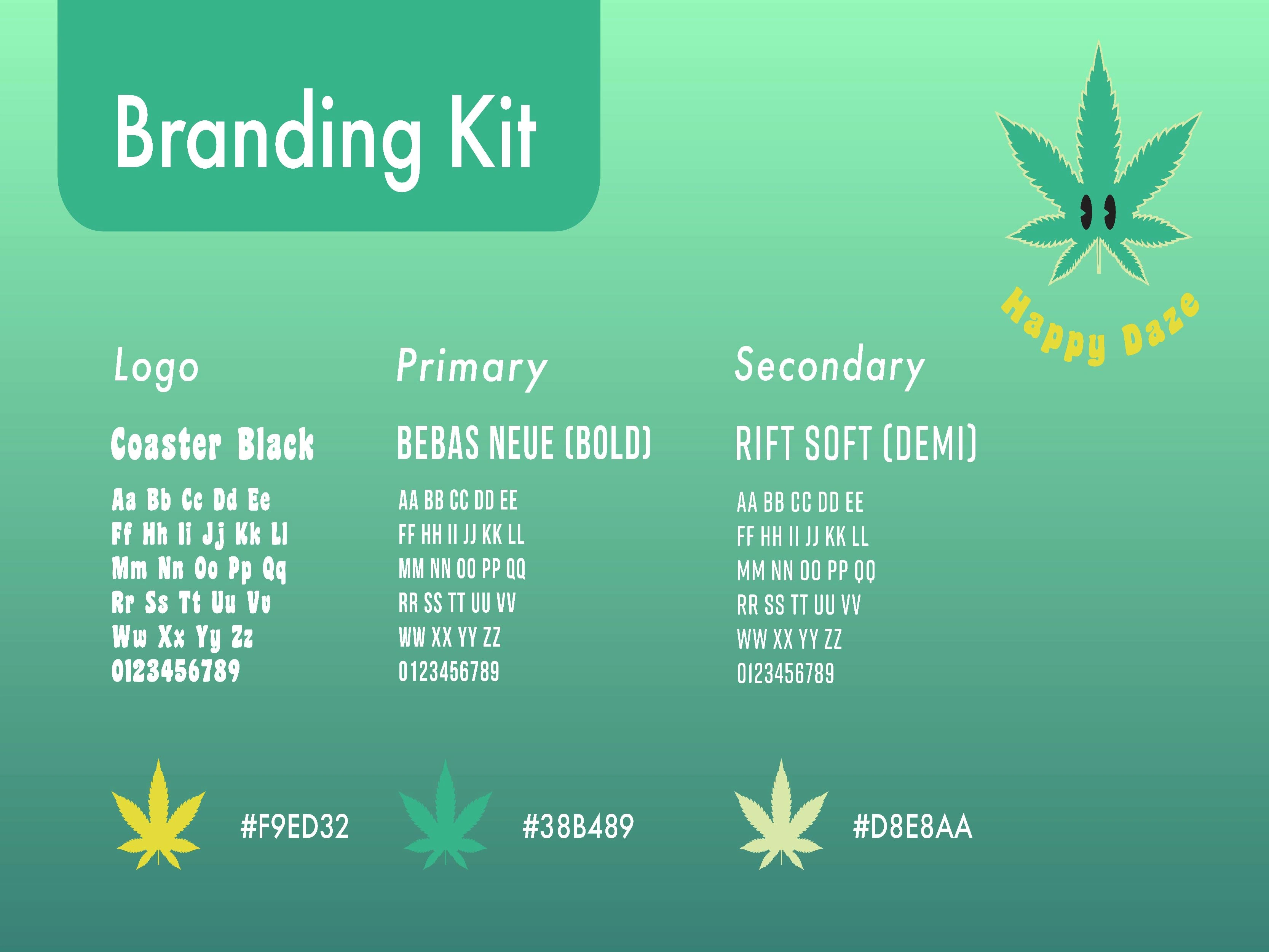
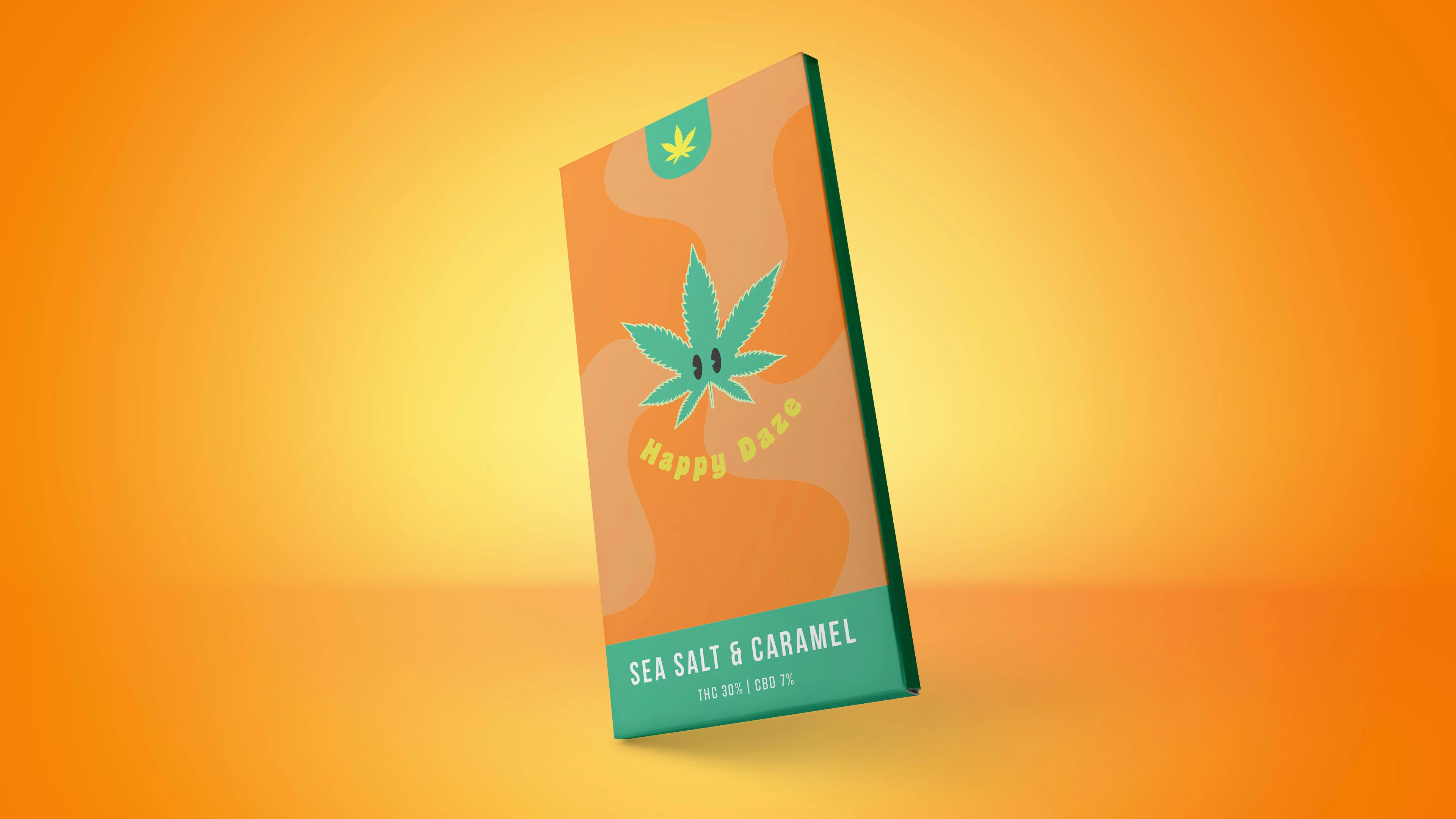
Yellow is often associated with happiness, optimism, and positivity, as it is the color of the sun, smiley faces, and many cheerful objects. Green can also represent balance, harmony, and calmness, enhancing yellow's optimistic and joyful effects. Therefore, green and yellow can create a mood of joy, positivity, and relaxation, appealing to audiences seeking enjoyable and uplifting experiences.
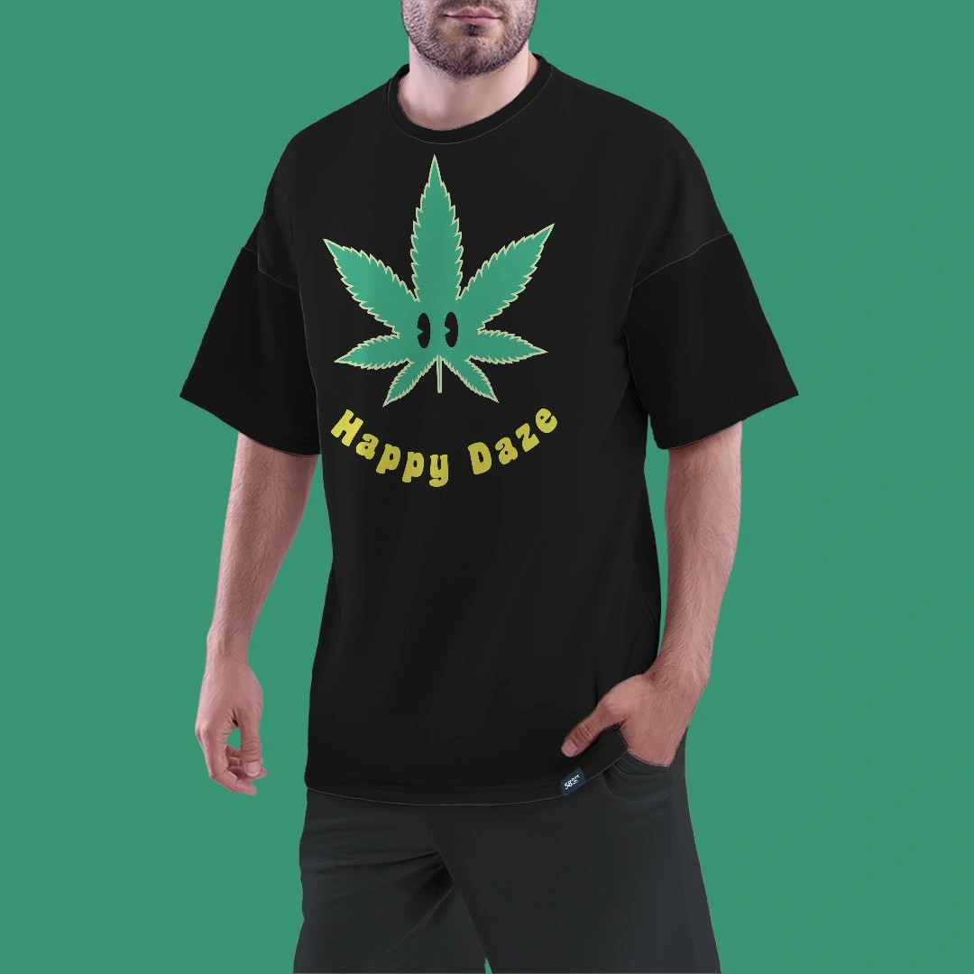
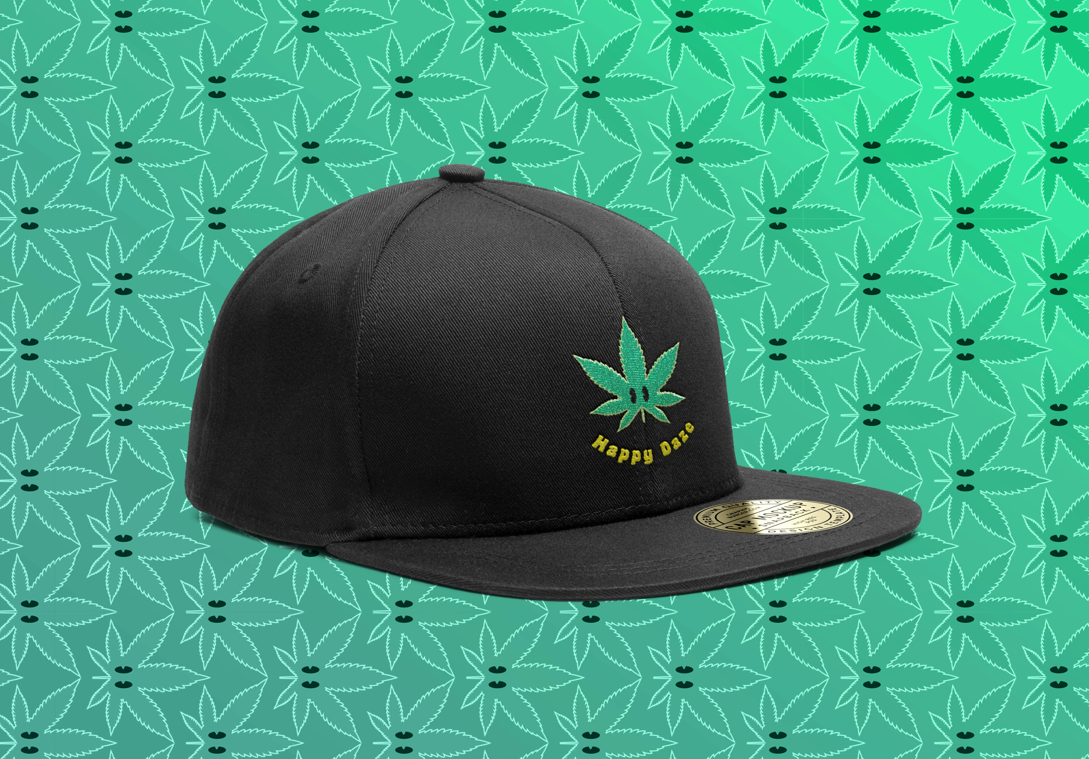
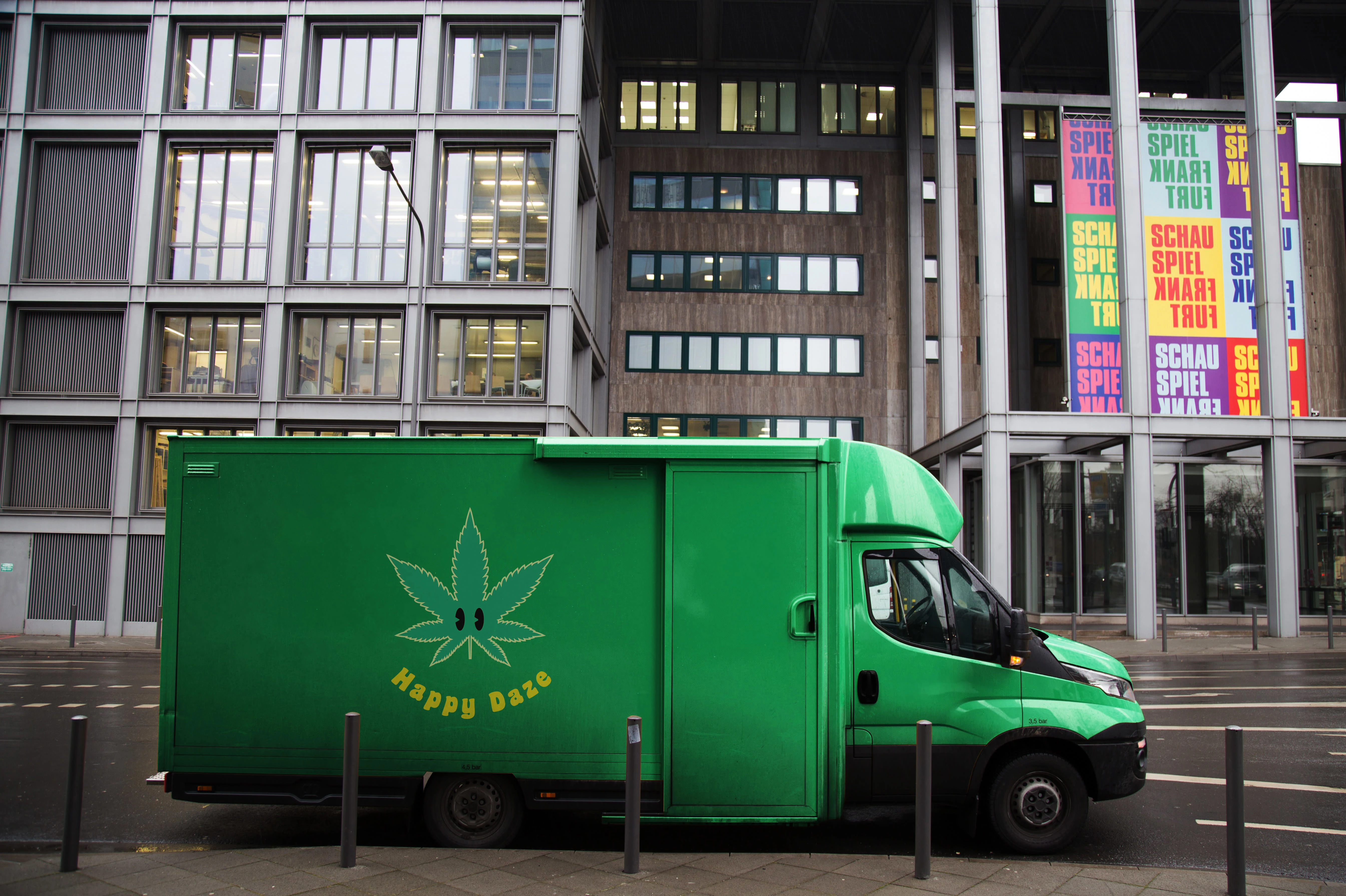
Using a marijuana leaf as a mascot, the brand can signal to the audience that it relates to cannabis culture and products. However, by inverting the typeface into a smile, the brand can also convey a playful and approachable personality, making the audience feel more comfortable and engaged with the brand. The smile can also suggest that the brand's products can make people happy and relaxed, which can be a desirable effect for cannabis-based snacks. By using a friendly and smiling mascot, the brand can avoid the stereotypes of stoner culture and appeal to a broader audience that may be curious or open-minded about cannabis but not necessarily identify as heavy users or enthusiasts. A unique and memorable logo can help the brand stand out from other cannabis snack brands that may use more generic or traditional imagery. By combining the marijuana leaf with the inverted smile, the brand can create a distinctive and recognizable logo easily associated with the brand name and products. The logo can also convey a sense of creativity and innovation, appealing to audiences seeking new and unique experiences.
Like this project
Posted Oct 1, 2023
I designed a logo for a cannabis snack brand using a friendly marijuana leaf to convey joy, approachability, and uniqueness.

