Designing the "Gilded Grace" Online Boutique
King Prime unity
This case study delves into the behind-the-scenes UI/UX design process for "Gilded Grace," a high-end jewelry store launching its online presence. Our goal was clear: to create a digital platform that truly reflected the brand's luxury, craftsmanship, and personal touch, offering a seamless and captivating experience.
Discovery & Brainstorming – Defining "Gilded Grace"
Our project began with intensive discovery sessions with the Gilded Grace team. They envisioned more than just an e-commerce site; they wanted a digital extension of their brand's essence: elegance, exclusivity, and exceptional customer service.
Key Goals Identified:
Elevated Aesthetics: The UI had to mirror the premium quality of their jewelry.
Intuitive Navigation: Customers needed to find items effortlessly, whether by collection, material, or price.
Immersive Product Experience: High-quality imagery and detailed descriptions were paramount.
Personalization: Features like custom engraving or bespoke consultations were essential.
Seamless Checkout: A trustworthy and straightforward purchasing process was non-negotiable.
Brainstorming Sessions: We explored visual metaphors for luxury, trust, and craftsmanship. Our competitive analysis of other luxury e-commerce sites helped identify best practices and potential pitfalls.
Initial Concepts Explored:
"Digital Showroom": Emphasizing large, beautiful product photography with minimal text.
"Artisanal Journey": Highlighting the craftsmanship and story behind each piece.
"Personal Stylist": Focusing on guided recommendations and custom options.
We ultimately decided to blend elements from all three concepts, aiming for a harmonious mix of visual grandeur, compelling storytelling, and personalized service, all supported by a smooth transactional flow.
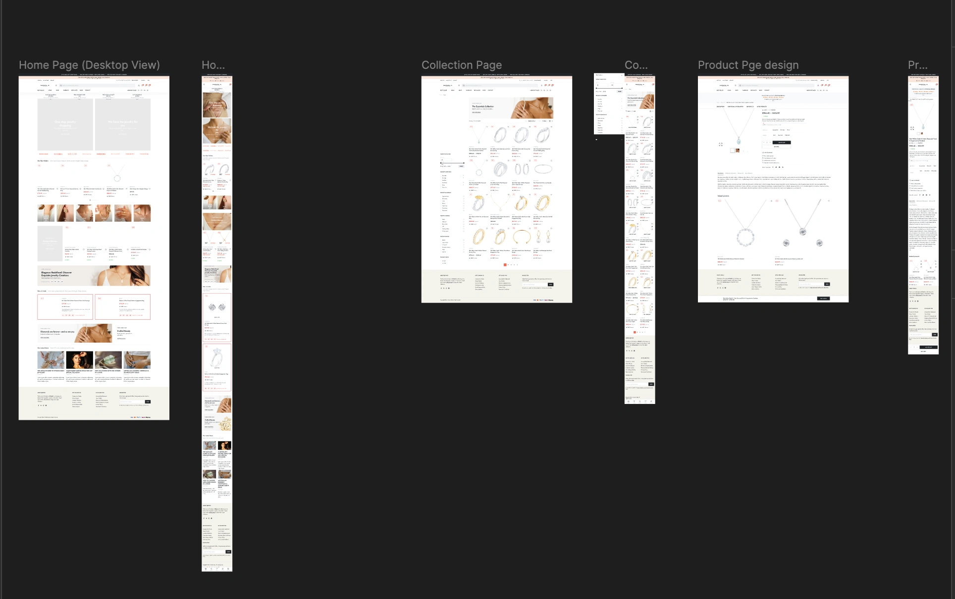
Wireframing & Information Architecture – Building the Blueprint
With our goals set, we moved to structuring the website. This involved creating information architecture (IA) to map content and wireframes to establish basic layout and functionality.
Information Architecture: We collaboratively developed a sitemap prioritizing user flow. Key categories included "New Arrivals," "Collections" (e.g., Engagement, Necklaces), "Bespoke," "About Us," and "Client Services." Crucially, we prominently included "Wishlist" and "Virtual Consultation" features.
Wireframing (Conceptual): We started with paper sketches, then moved to digital tools for medium-fidelity wireframes.
Homepage: Focused on featured collections, new arrivals, and a strong brand statement.
Product Listing Page (PLP): Prioritized clear filtering options (material, gemstone, price) and high-resolution thumbnail images.
Product Detail Page (PDP): Emphasized large, zoomable product images, detailed descriptions, material information, sizing guides, and clear calls to action (Add to Cart, Book Consultation).
Checkout Flow: Simplified into a multi-step process: Bag > Shipping > Payment > Confirmation, with clear progress indicators.
Iterations & Unexpected Roadblocks:
One significant roadblock was the client's initial desire for an overwhelming amount of information on the PDP. This led to cluttered layouts. Our solution was to introduce collapsible sections for details like "Material & Care" and "Shipping & Returns," allowing users to delve deeper if interested without initial clutter.
Another iteration involved navigation. Initial wireframes used a standard top menu. However, client feedback suggested a more subtle approach for a luxury brand. We adopted a hamburger menu on desktop, which expanded into a clean, comprehensive mega-menu on click, maintaining a minimalist aesthetic.
Like this project
Posted Jun 8, 2025
This case study delves into the behind-the-scenes UI/UX design process for "Gilded Grace," a high-end jewelry store launching its online presence.
Likes
0
Views
0