Homezign: brand identity

Designed by Saf


The brief
Homezign designs and builds whole homes in Bengaluru. Every home should be as unique as the people living in it. The identity had to carry that promise and the trust behind it: to be remembered not only for the homes it designs, but for the trust it builds.
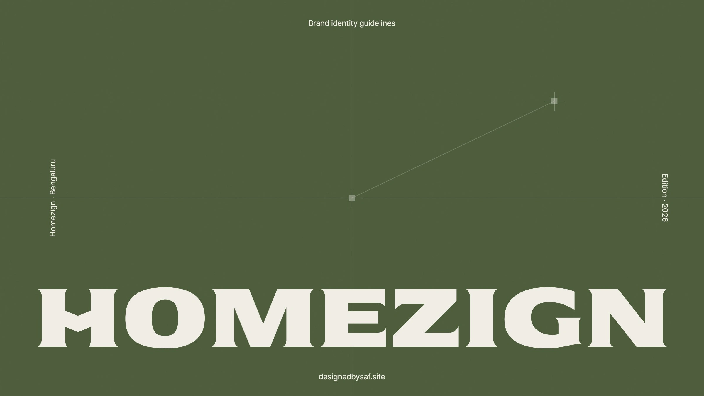
Brand identity guidelines, Edition 2026.
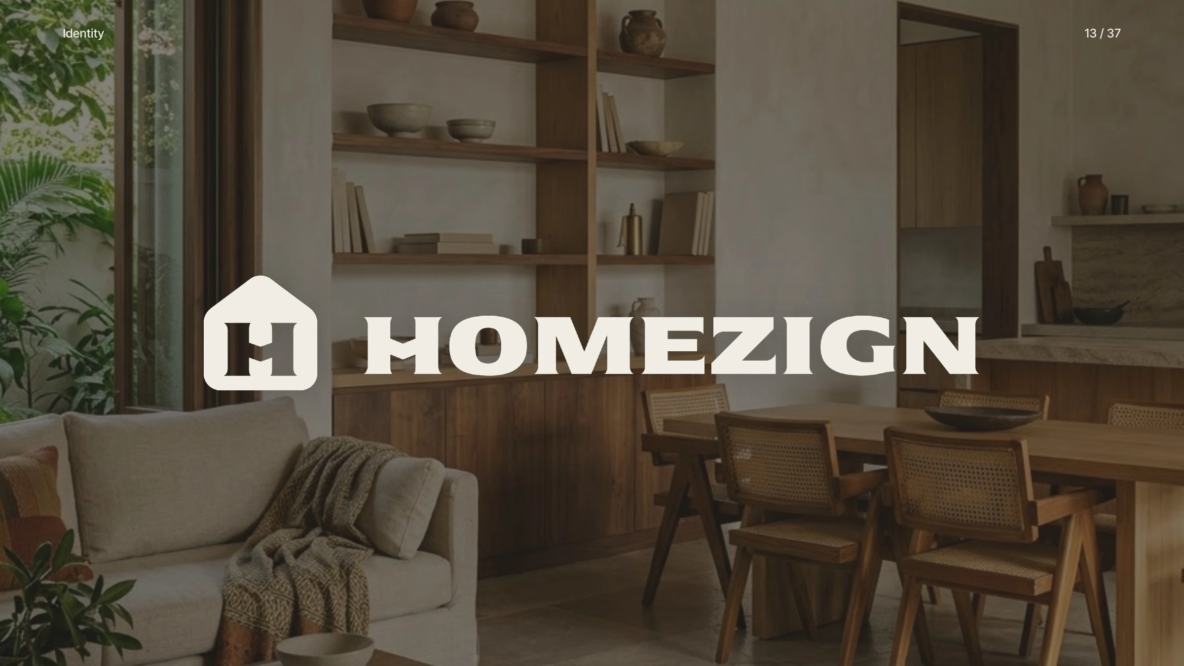
The signature, in a home.
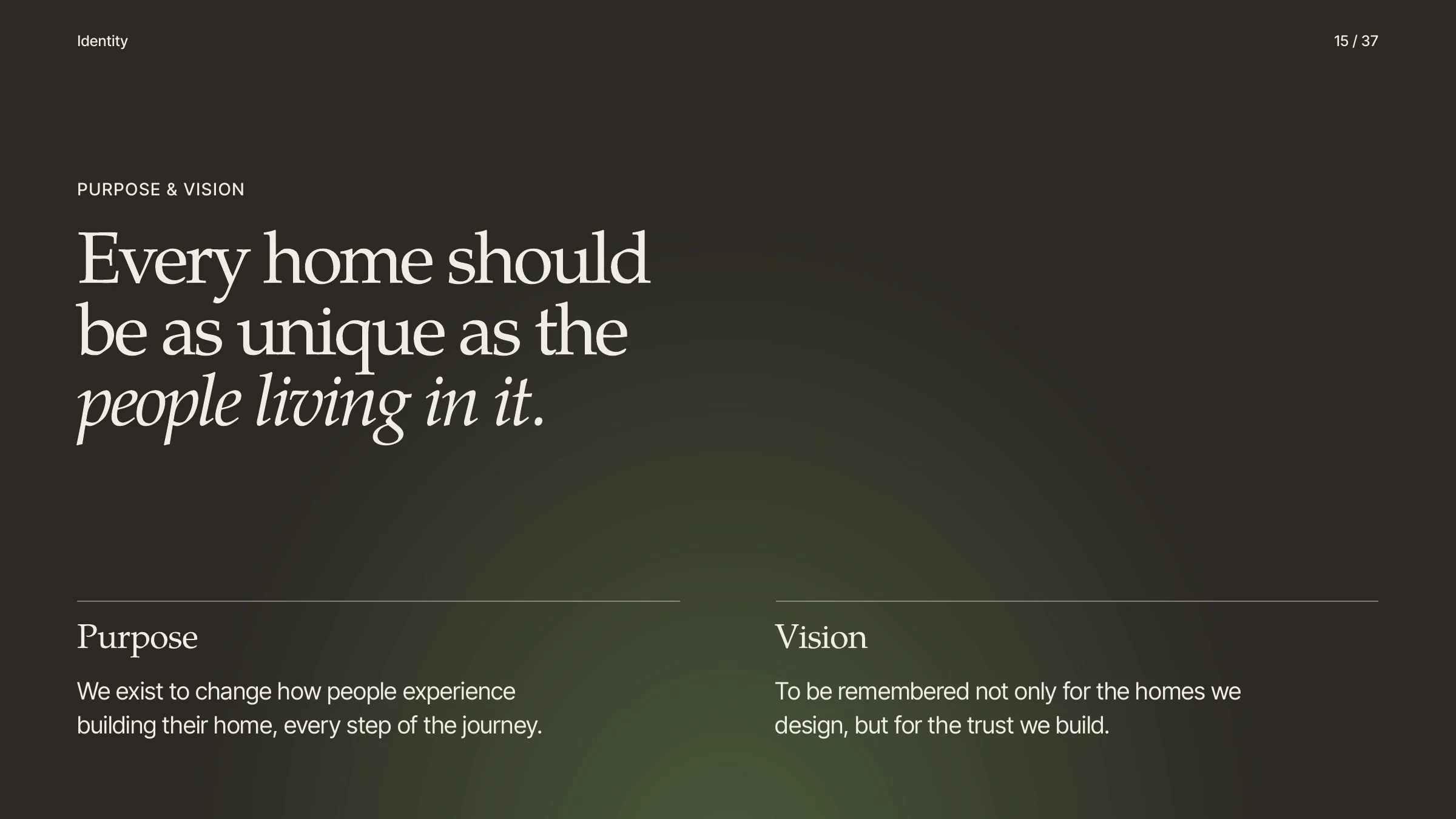
Purpose and vision.
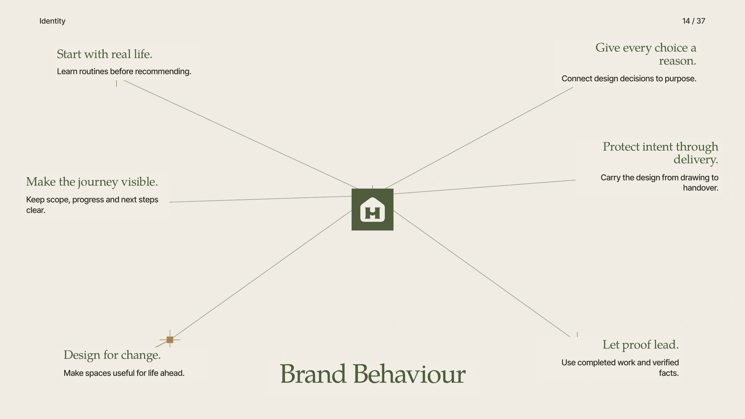
Brand behaviour: start with real life, give every choice a reason, let proof lead.
The mark
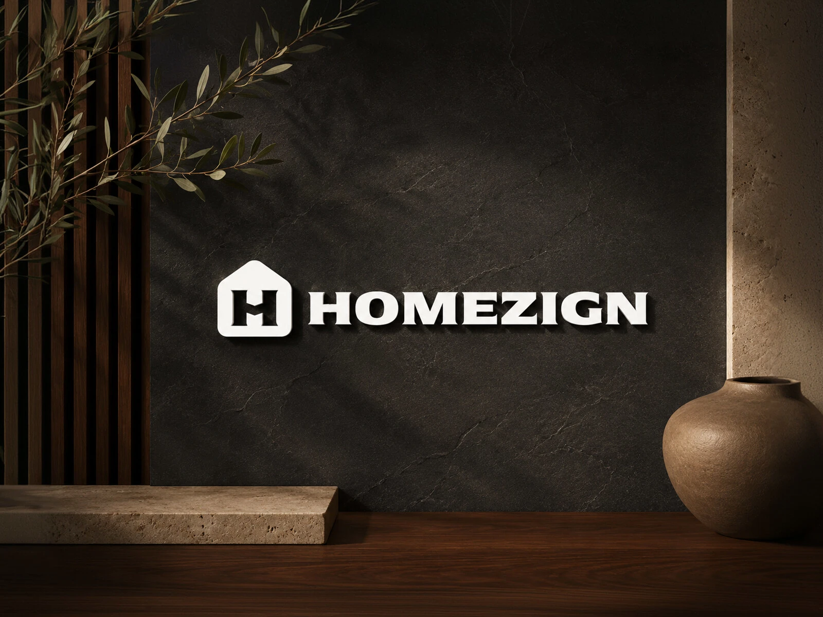
A home. An H. A meeting point. The house shape stands for shelter, belonging and everyday life. Homezign's first letter is held in its negative space. And the H doubles as a handshake: two people meeting through trust. Home, identity and relationship in one symbol.
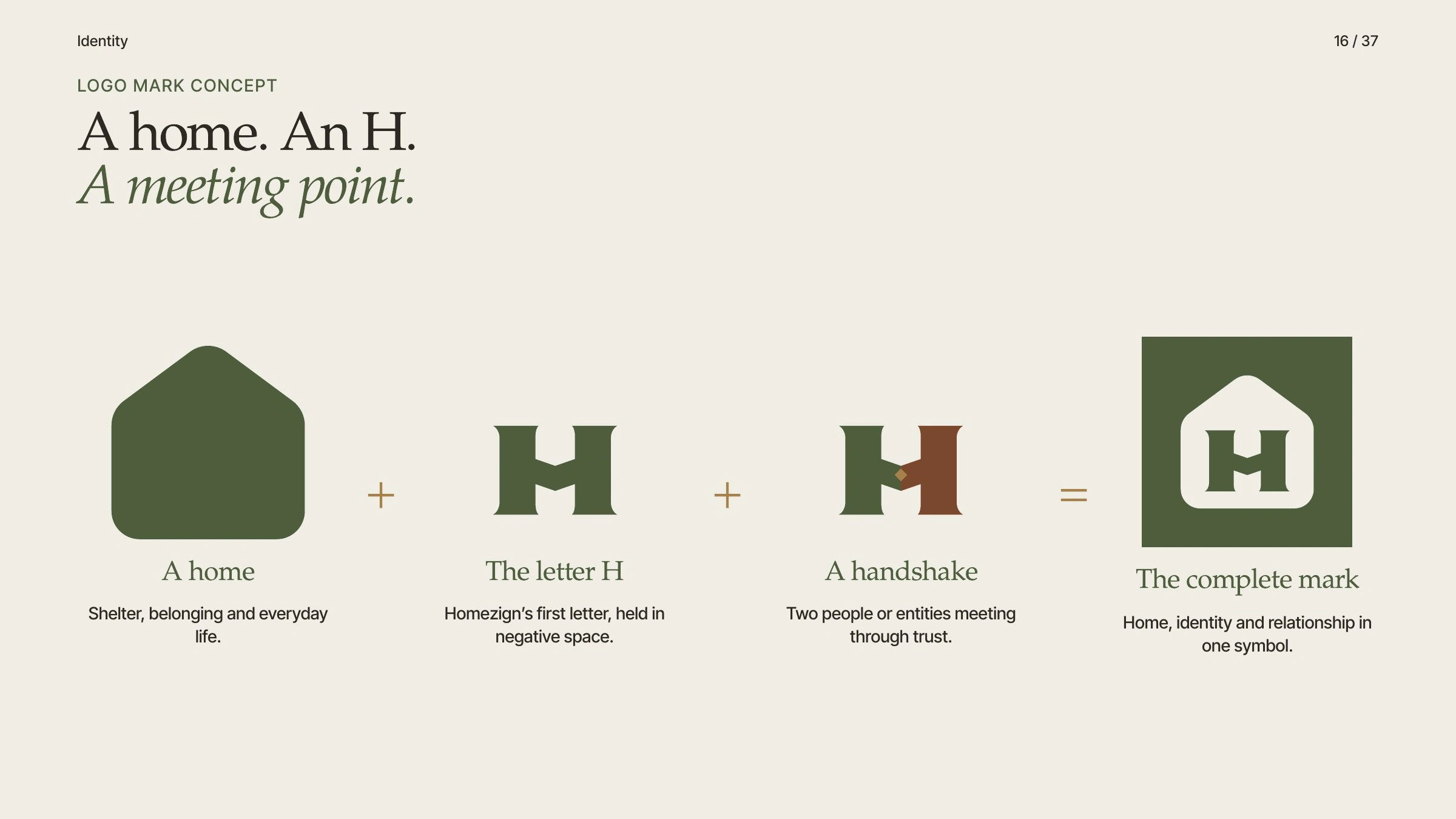
Logo mark concept: a home, the letter H and a handshake.
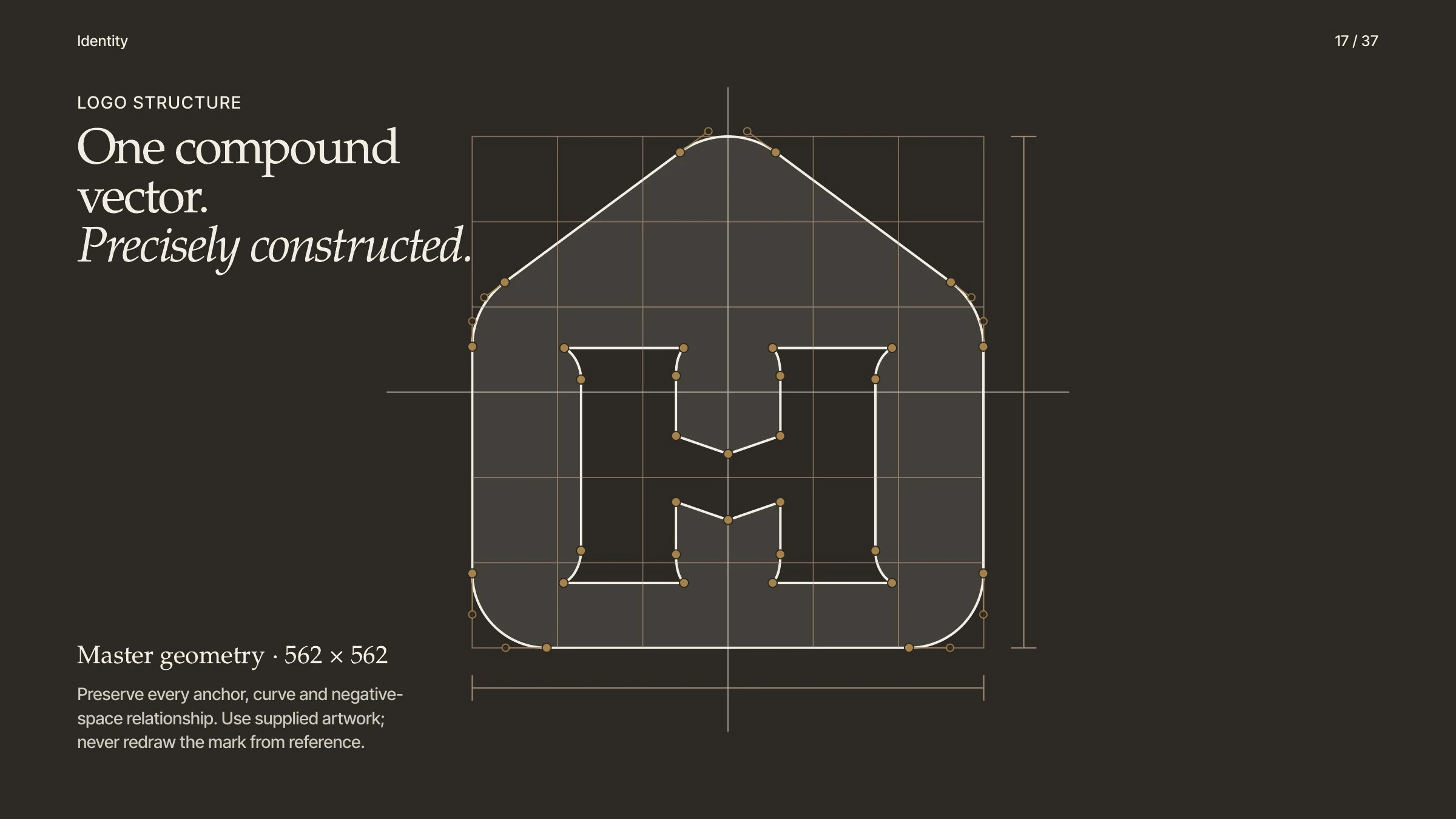
One compound vector, precisely constructed.
The signature
The lockup is set by optical balance, not mathematical centring. The wordmark sits intentionally lower than the H and begins after a protected gap, so the two read as one signature. Clear space is taken from the mark itself: one stem of the H on every side.
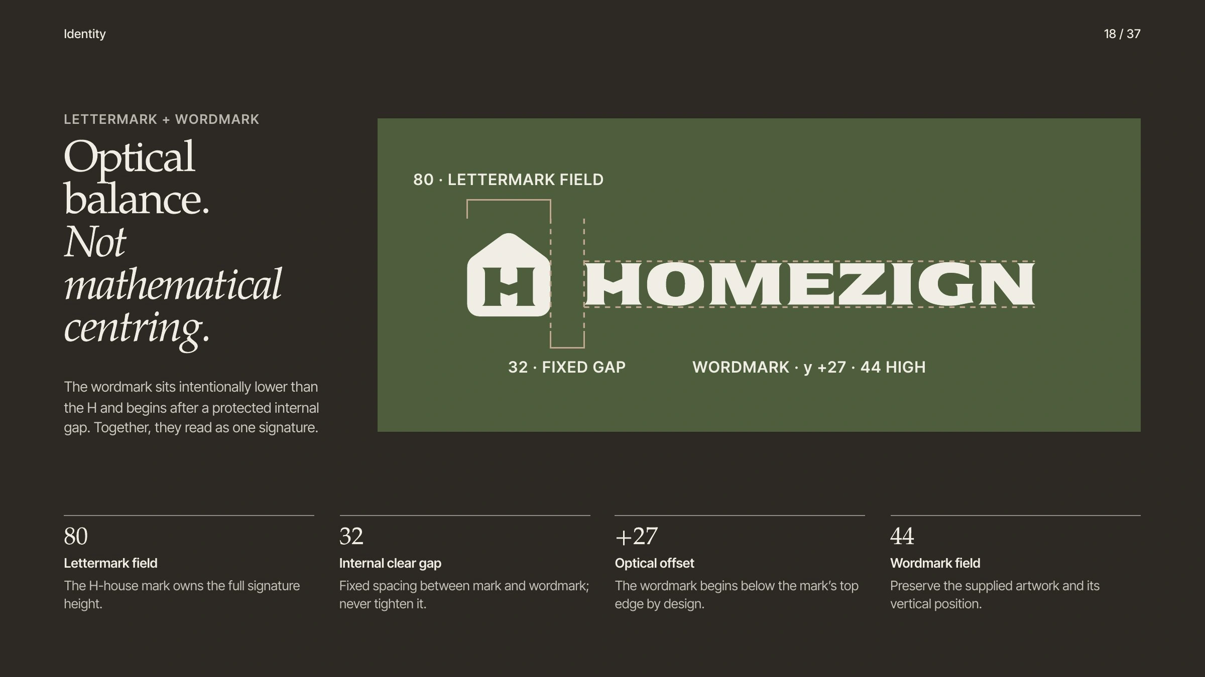
Optical balance between lettermark and wordmark.
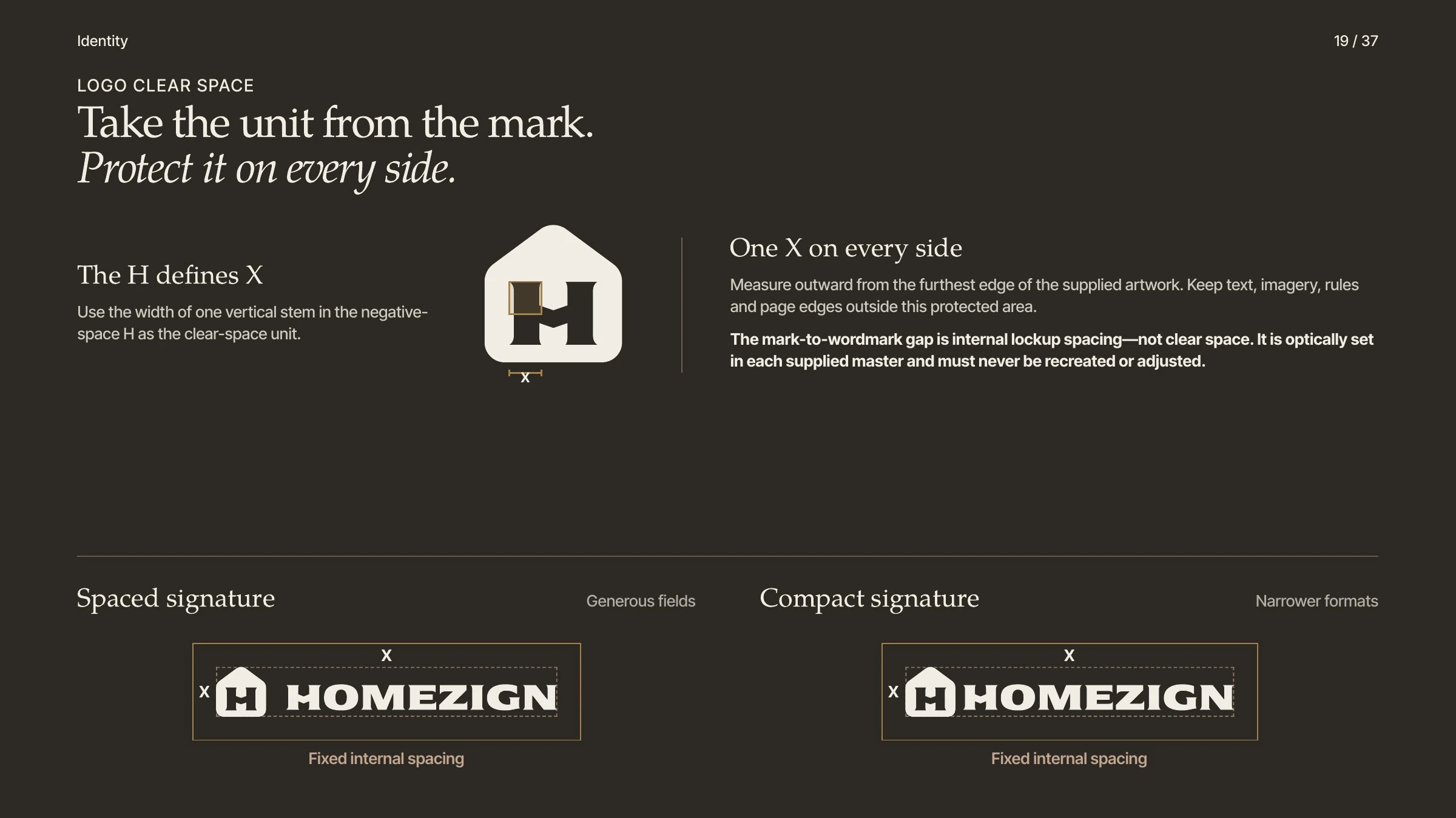
Clear space: take the unit from the mark.
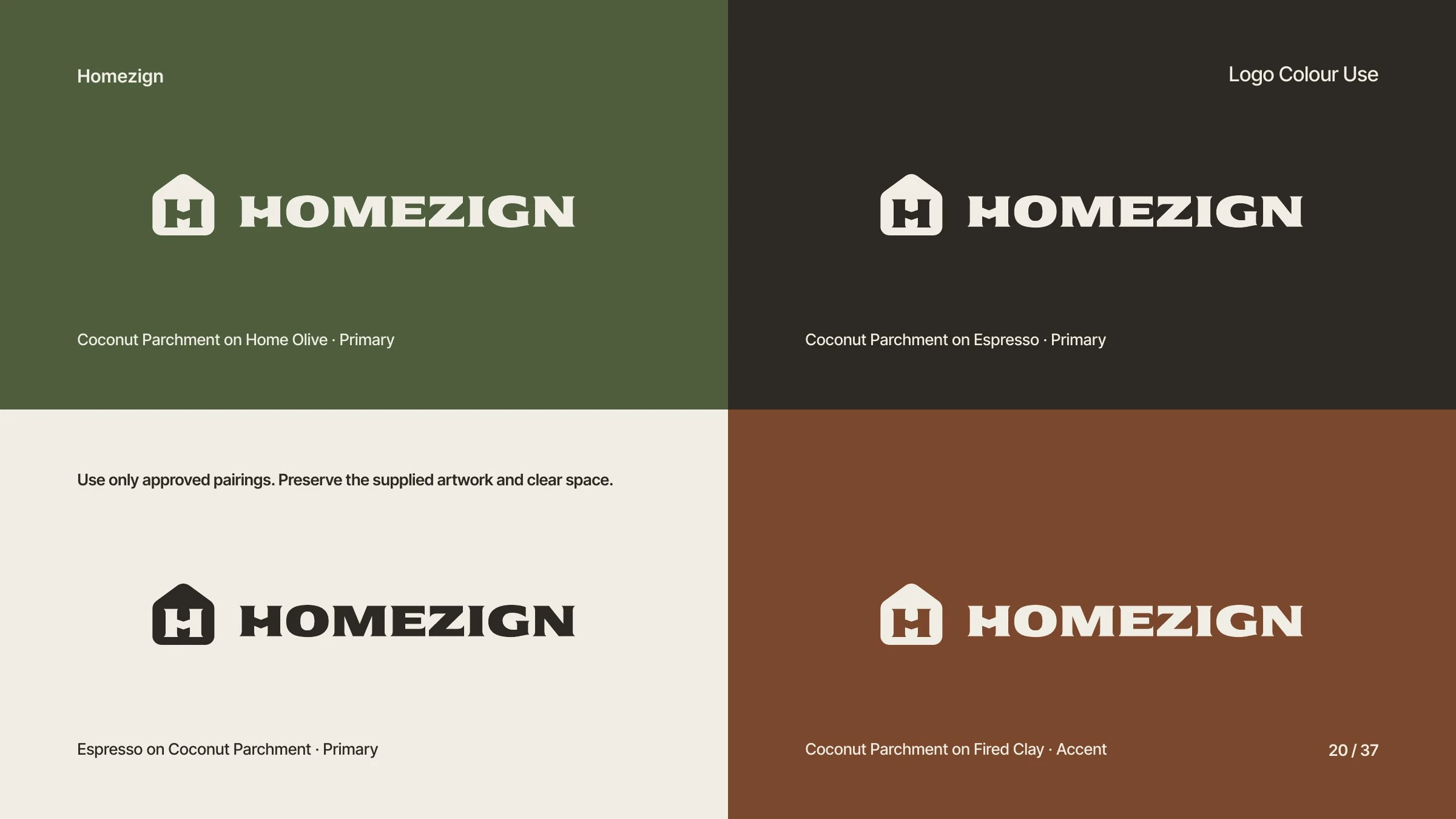
Approved colour pairings.
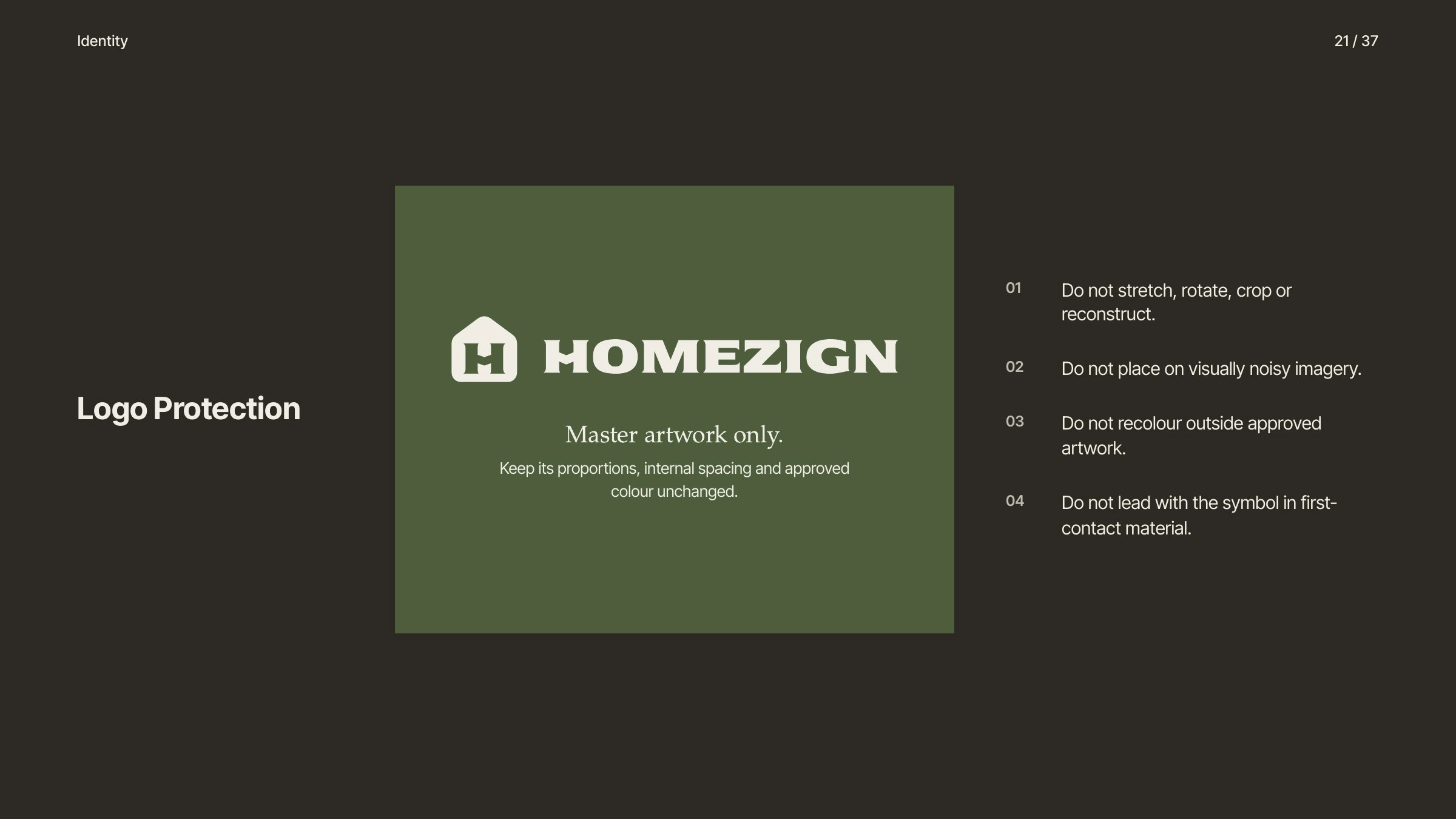
Logo protection.
Colour and type
Home Olive carries recognition, Coconut Parchment gives space, Espresso carries information, Fired Clay is the accent, with Antique Ochre and Travertine as material support. Three type roles never swap: Sekuya for the wordmark only, TeX Gyre Pagella for headlines and human emphasis, Inter for clarity at every step.
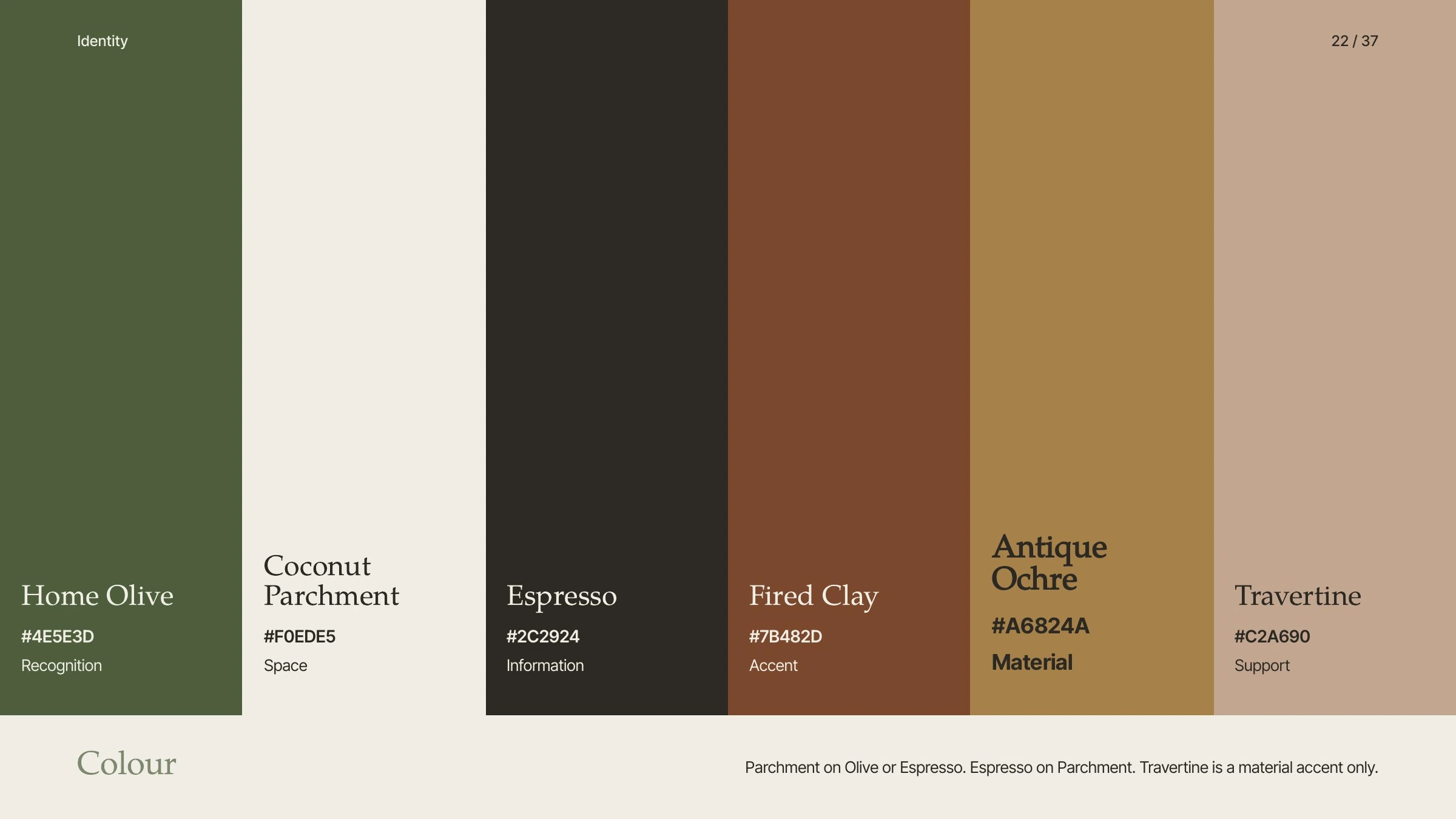
The palette.
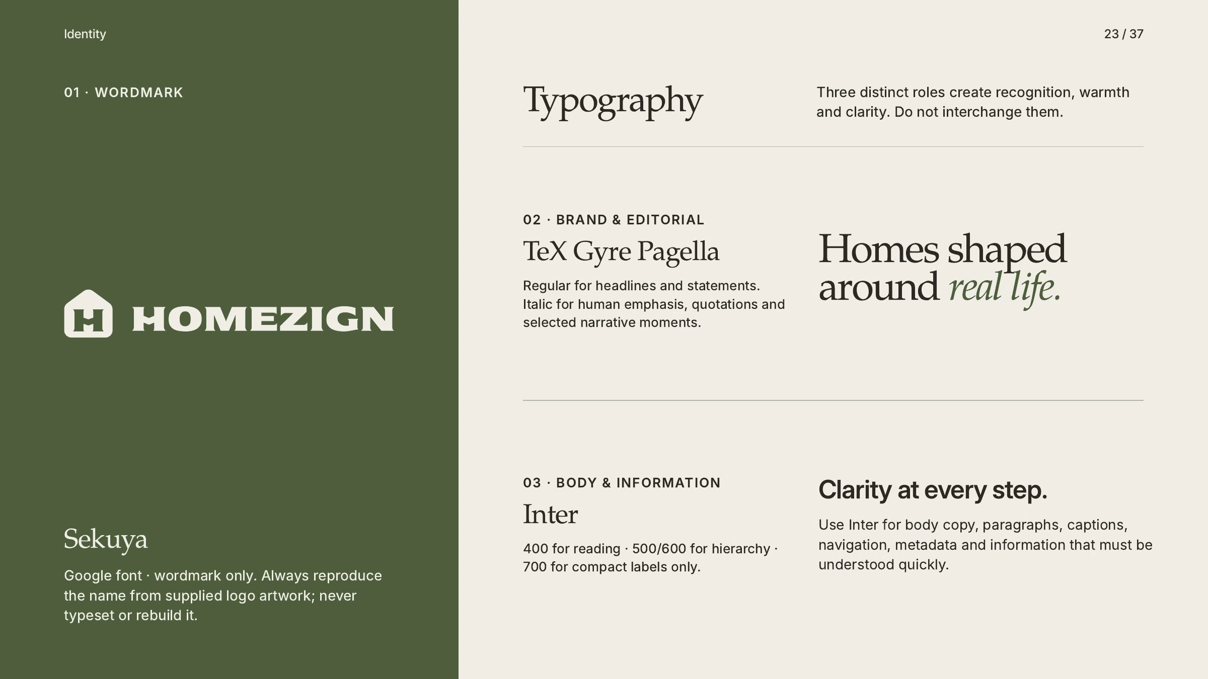
Typography: three distinct roles.
One house, eight categories
The house silhouette stays constant. Each interior icon inside it names one Homezign product category, from lighting and seating to ceramics and storage.
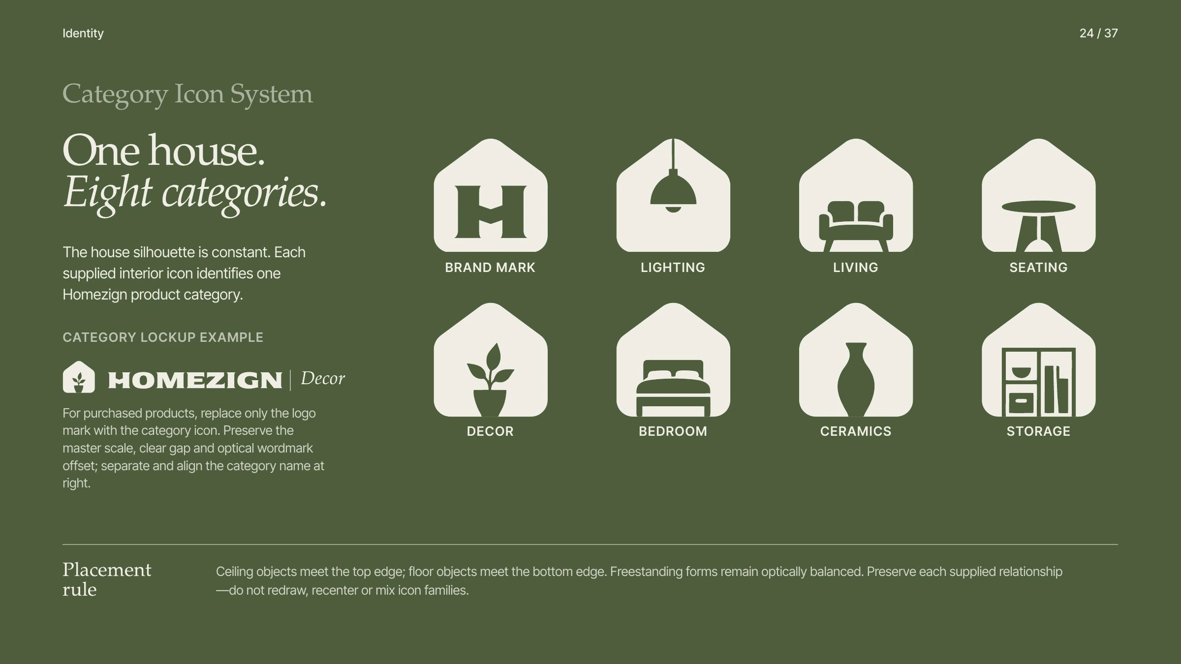
The category icon system.
Imagery
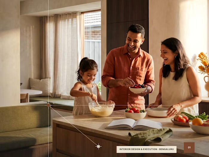
Life gives the space meaning. Show the moment, not just the room: family rituals, shared tasks and quiet connection, with the design supporting the story.
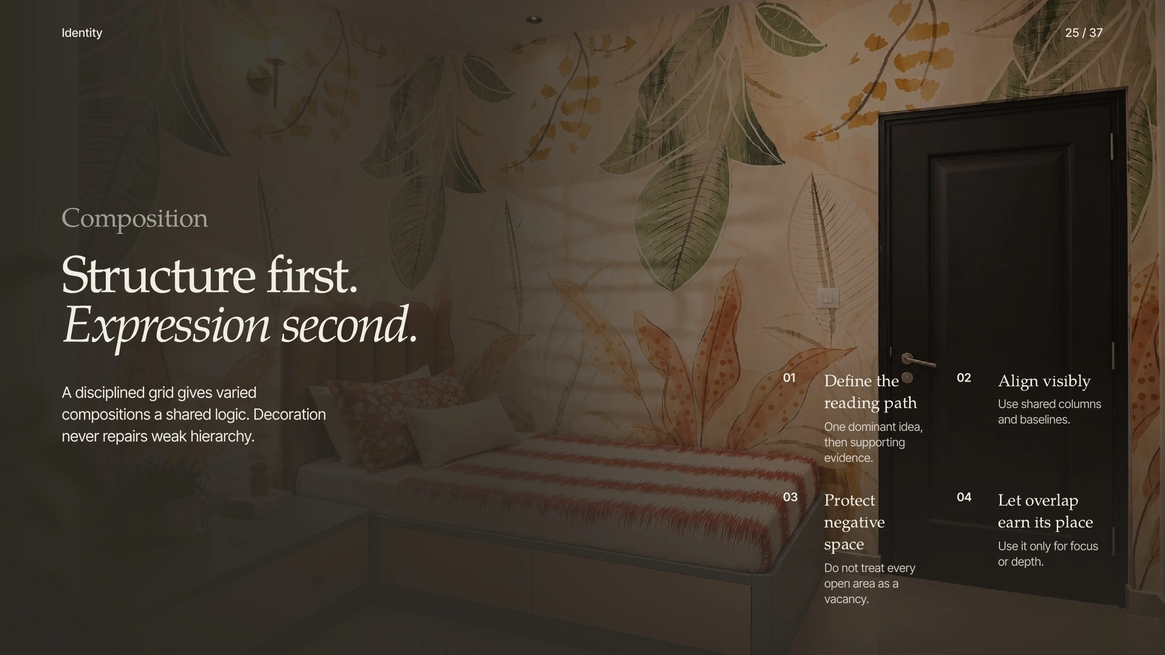
Composition: structure first, expression second.
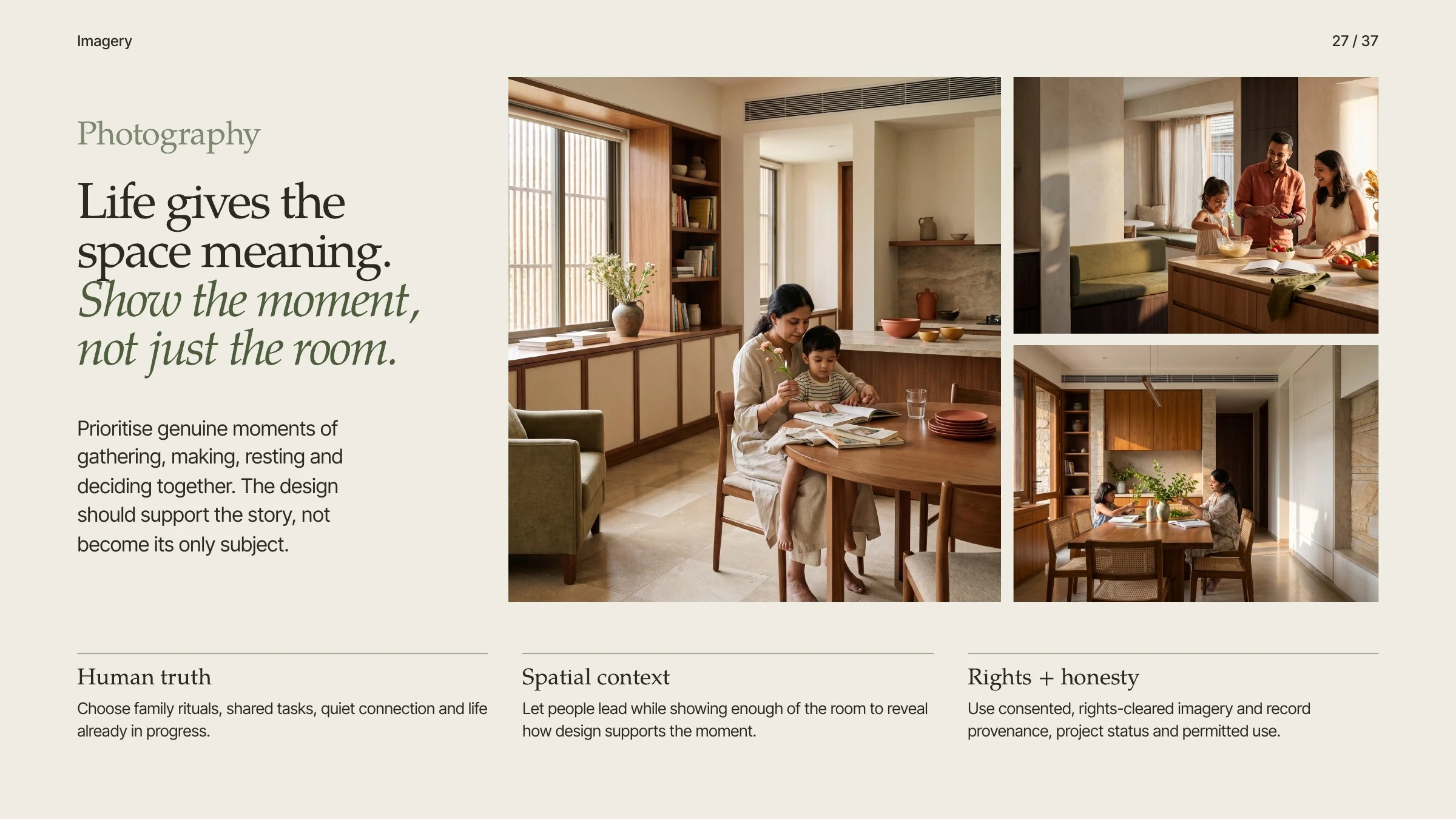
Photography: life gives the space meaning.
Applications
Stay recognizable, adapt without losing the system. The full signature speaks on signage, proposals and the website. On objects, an extracted house-wordmark badge becomes part of the thing itself: a hang tag, sticker, sewn tab, stamp or etch.
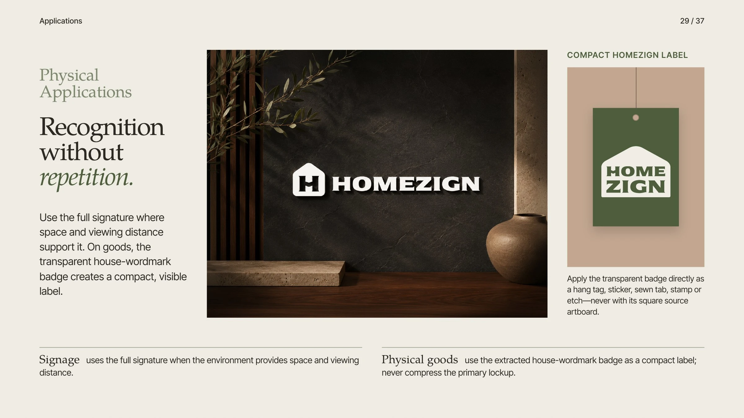
Physical applications: recognition without repetition.
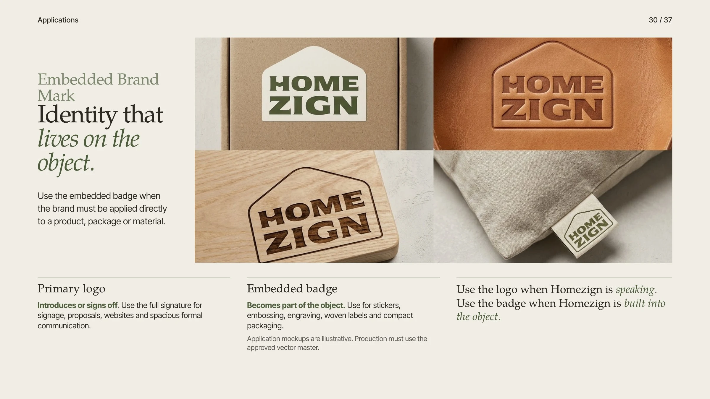
The embedded badge: identity that lives on the object.
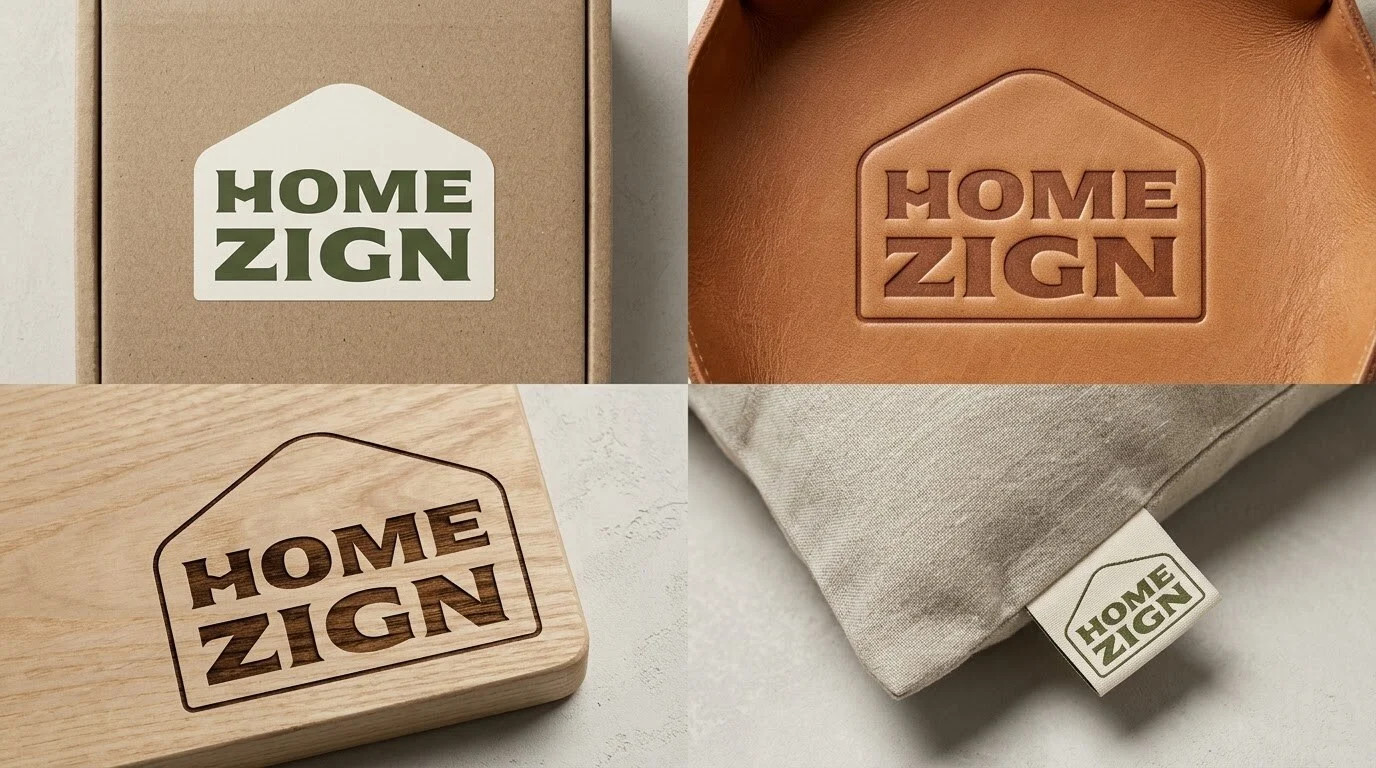
The badge on card, leather, wood and linen.
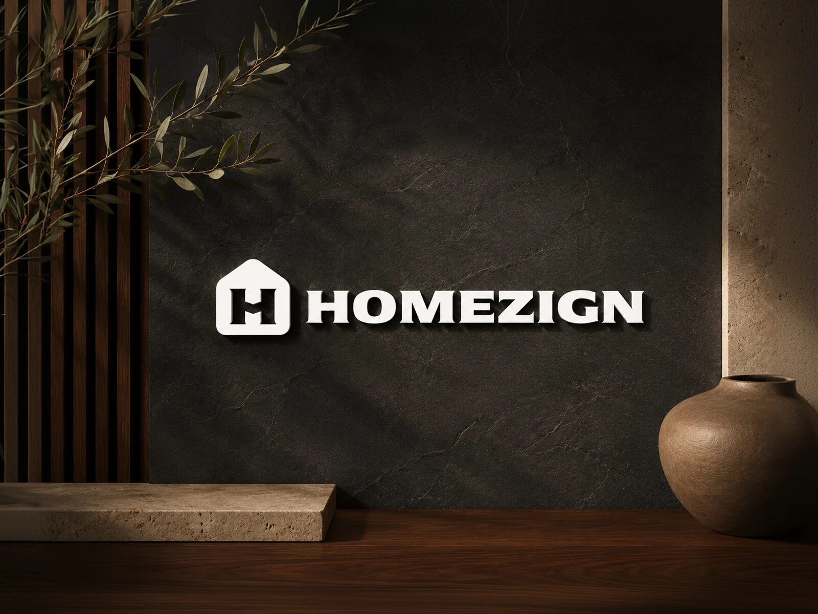
Wall signage.
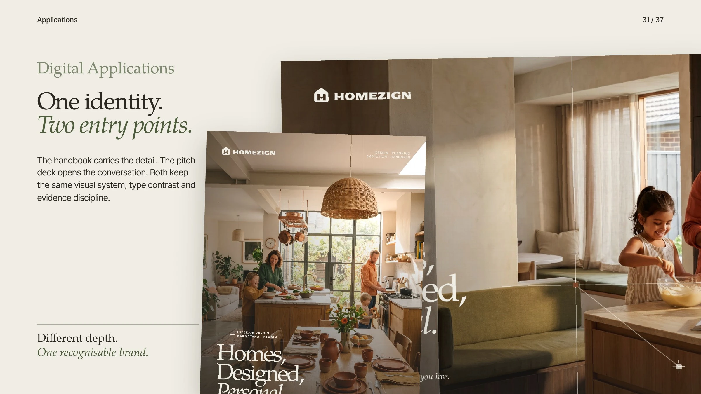
Digital applications: one identity, two entry points.
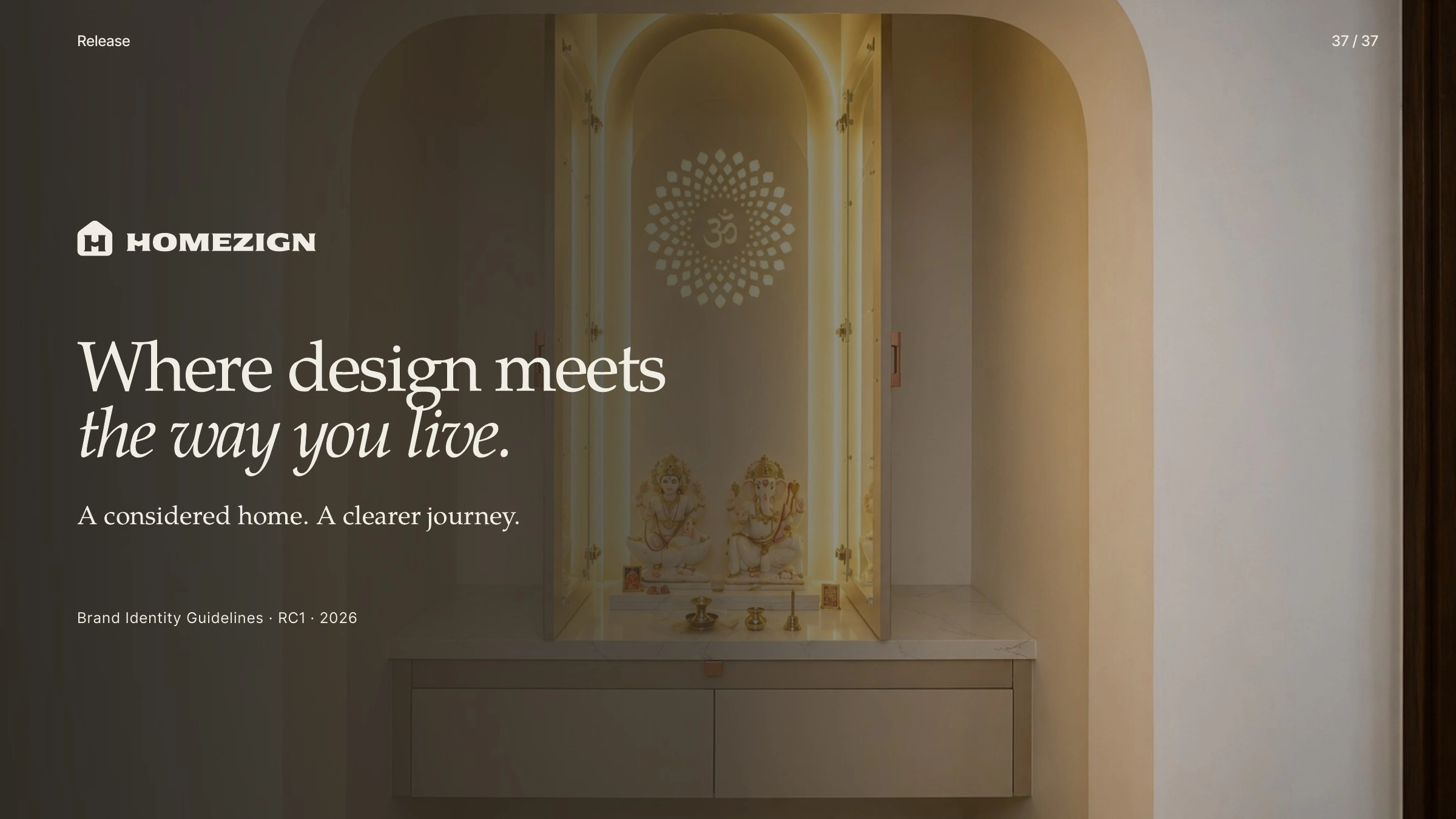
Where design meets the way you live.
Like this project
Posted Oct 30, 2026
Brand identity for Homezign, an interior design firm in Bengaluru: a mark that is a home, an H and a handshake, with colour, type, icons and applications.