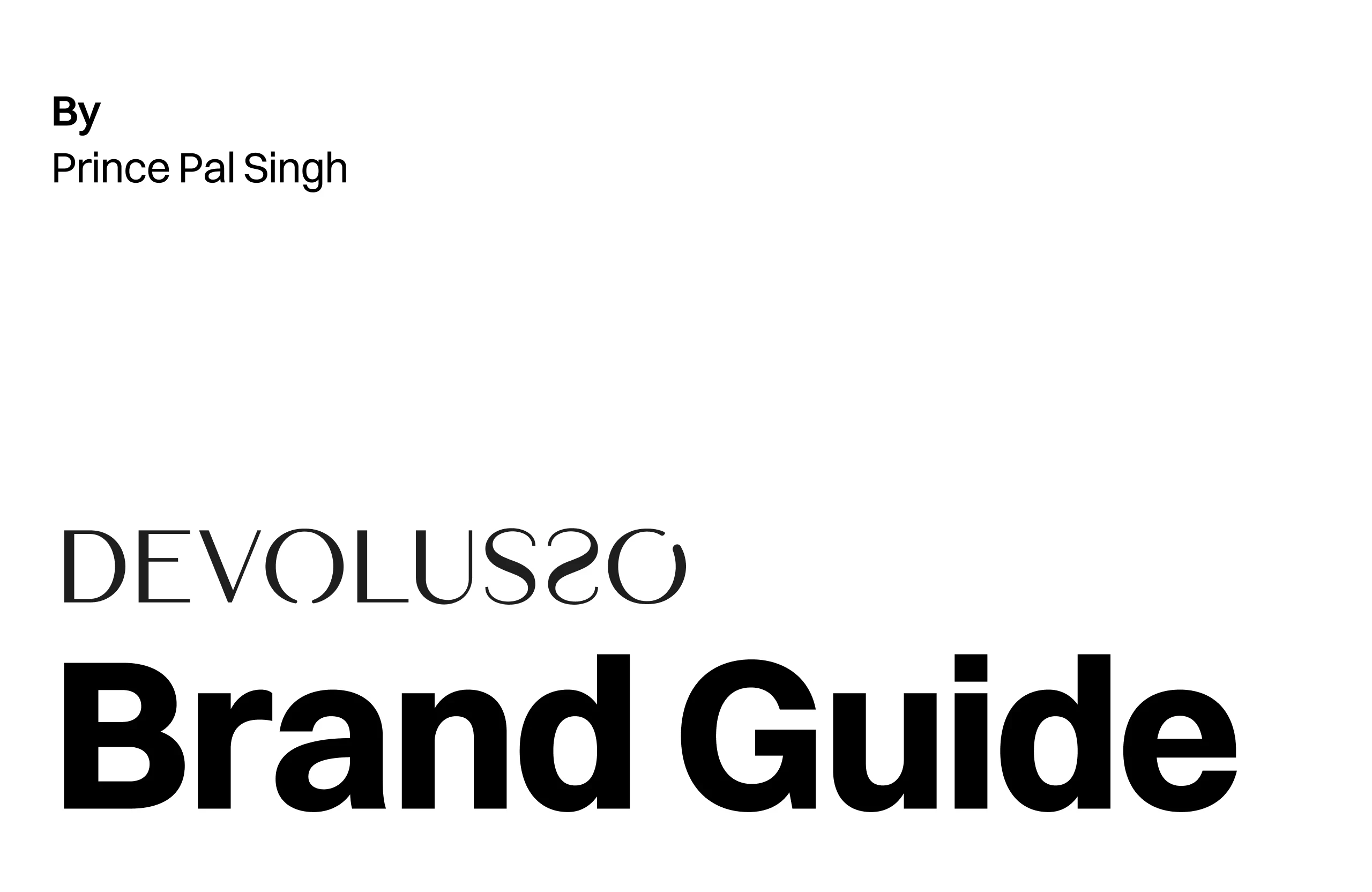
DEVOLUSSO - Brand Identity Design
Prince Pal Singh
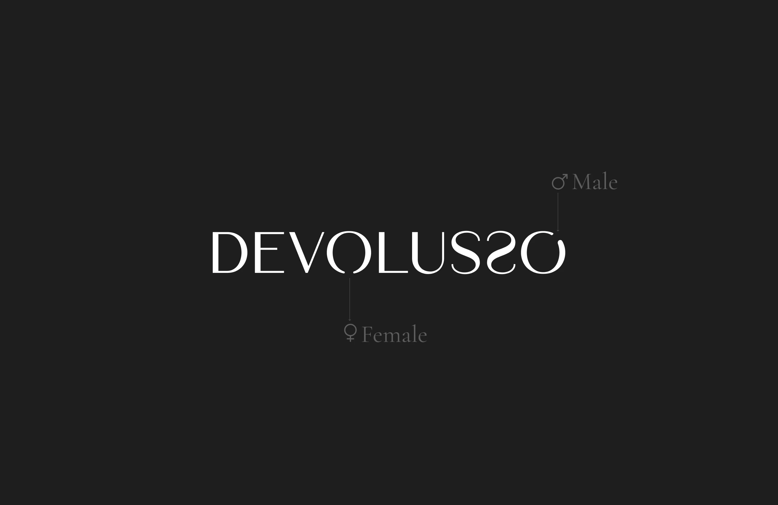
Logo Explainer
🧵 Case Study: DEVOLUSSO
Crafting a Luxury Fashion Brand with a Divine Identity
🪄 Project Overview
Client/Project: In-house Concept Development
Role: Brand Strategist, UI/UX Designer, Creative Director
Deliverables: Full Brand Guidelines Document, Naming, Identity System, Logo Usage, Color System, Typography, Voice, Packaging Direction
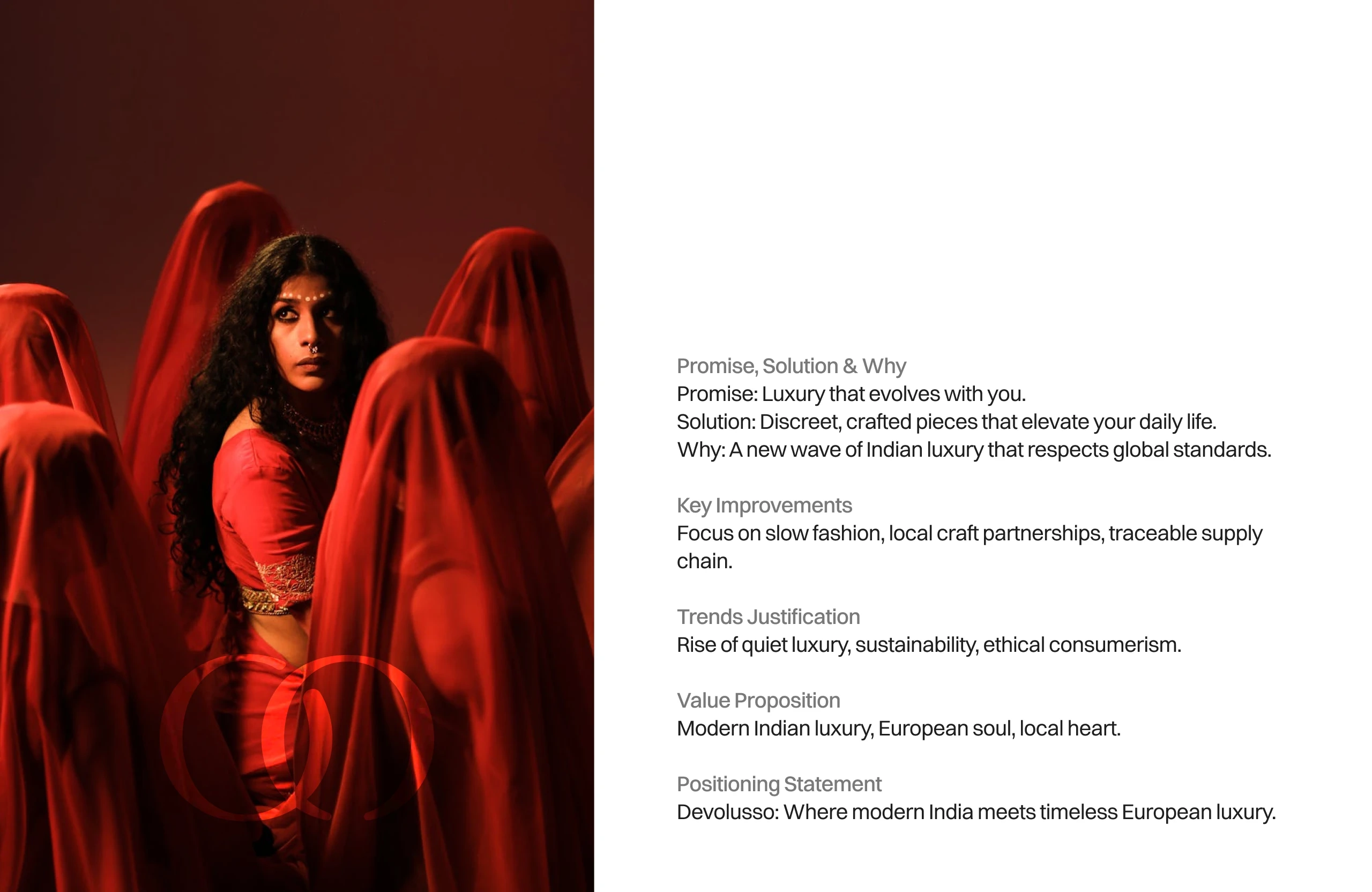
Goal:
To build a timeless, masculine-yet-elegant fashion brand inspired by divine heritage and modern Italian luxury — from scratch.
✨ The Challenge
In a saturated fashion market where trends change faster than seasons, I aimed to create a brand that stands still — not by being static, but by being eternal.
The brief was self-imposed but crystal clear:
What if we built a luxury brand that merged Sanskrit spiritual essence with Italian sophistication?
Thus, DEVOLUSSO was born — from Devo (divine) + Lusso (luxury). A name that feels like silk on the tongue and gold on the label.
🪷 Brand Naming Philosophy
Finding a name was no accident. I explored linguistic roots from Sanskrit, Urdu, and Italian, blending Eastern mythology with Western elegance.
DEVOLUSSO emerged as:
Universally pronounceable
Evocative of luxury
Deep in meaning
Memorable and aspirational
📘 Building the Brand Guidelines
The heart of this case study lies in the brand book — a foundational document to ensure every future visual, word, and stitch stays on-brand.
🛕 Brand Essence
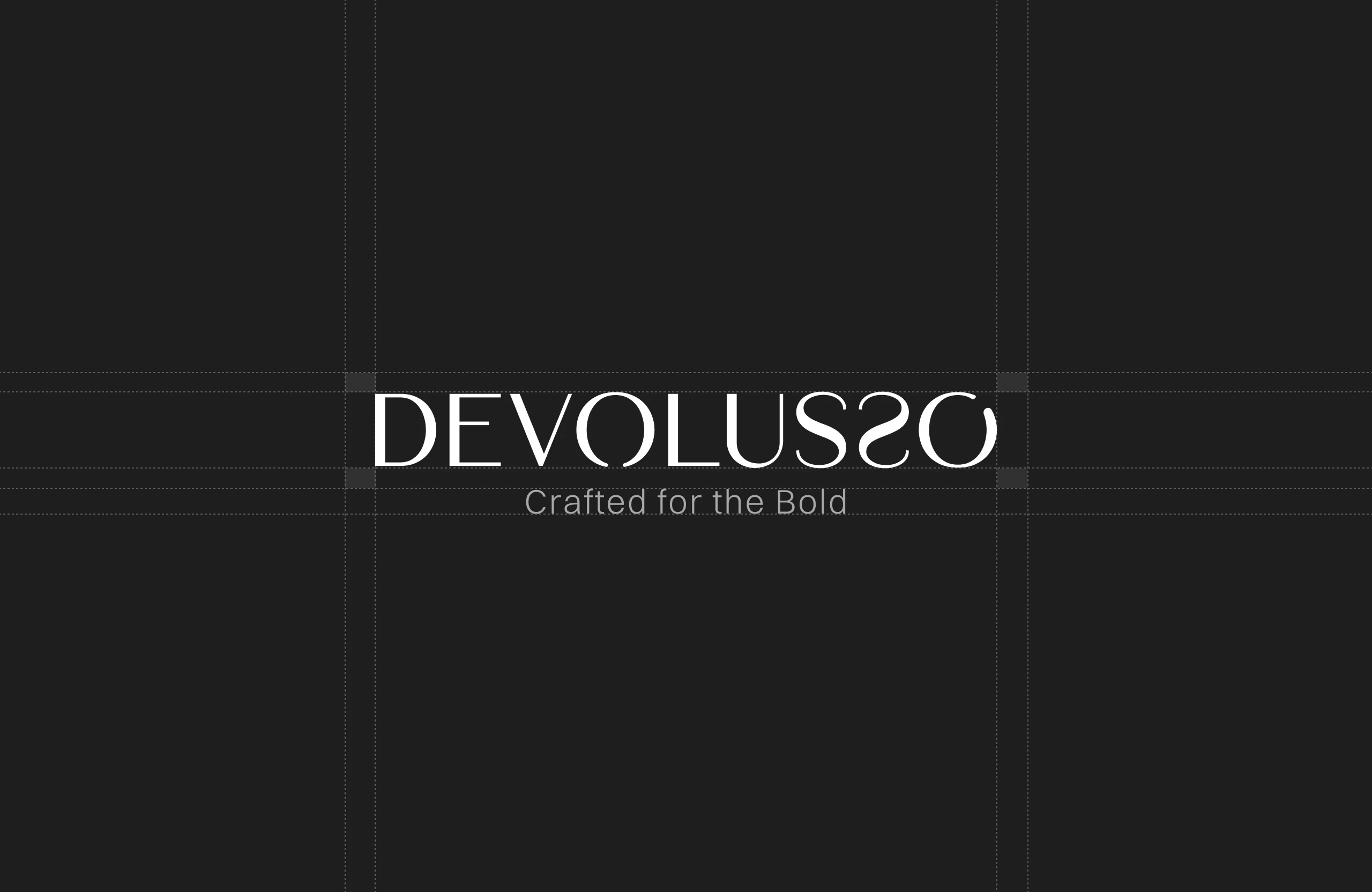
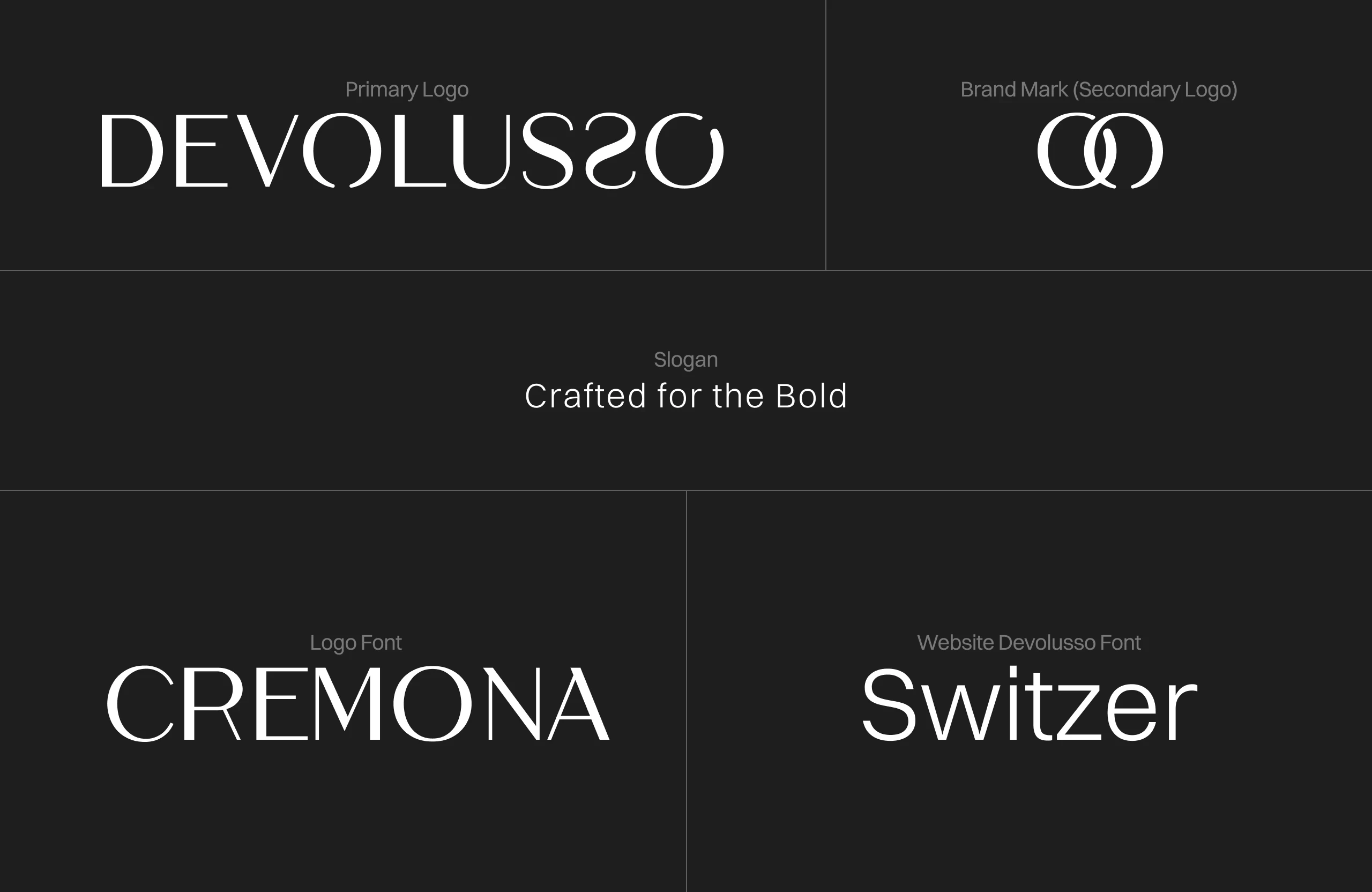
Tagline: “Crafted for the Bold”
Brand Voice: Confident, poetic, minimalist
Personality: Regal, grounded, modern, spiritual
🎨 Visual Identity
Color Palette
Midnight Black — Power, timelessness
Ivory White — Purity, serenity
Antique Gold — Opulence, sacredness
Deep Saffron — Cultural warmth
Typography
Heading Font: Cremona
Body Font: Switzer
Accent Font: Italic/scripty for poetic phrases
Logo Usage
Horizontal and monogram versions
Embossed variants for packaging
Clear-space and misuse rules defined
🖋️ Brand Voice & Storytelling
I defined a tone that speaks to modern royalty — those who don’t need to shout their success.
Examples:
“Each stitch remembers a story.”
“Crafted for those who walk like kings but speak like monks.”
“Less noise. More presence.”
🧵 Brand Application Previews
The guidelines also included mockups and creative direction for:
Hang tags
Label design (woven black + gold thread)
Packaging (matte black boxes with foil logo)
Website and editorial photography direction
🧭 Outcome
The final brand guidelines act as a north star for every touchpoint — from design to dialogue. With this, DEVOLUSSO is positioned as a future-forward fashion house that honors the past without being stuck in it.
💬 Reflection
This project wasn’t just about building a brand — it was about weaving philosophy, culture, and design into a singular experience.
Creating DEVOLUSSO reminded me that the strongest brands aren’t loud — they’re deep.
📎 Want to Collaborate?
Whether you're launching a fashion label or refining your luxury SaaS brand — let’s bring your identity to life.
Typographical Logo
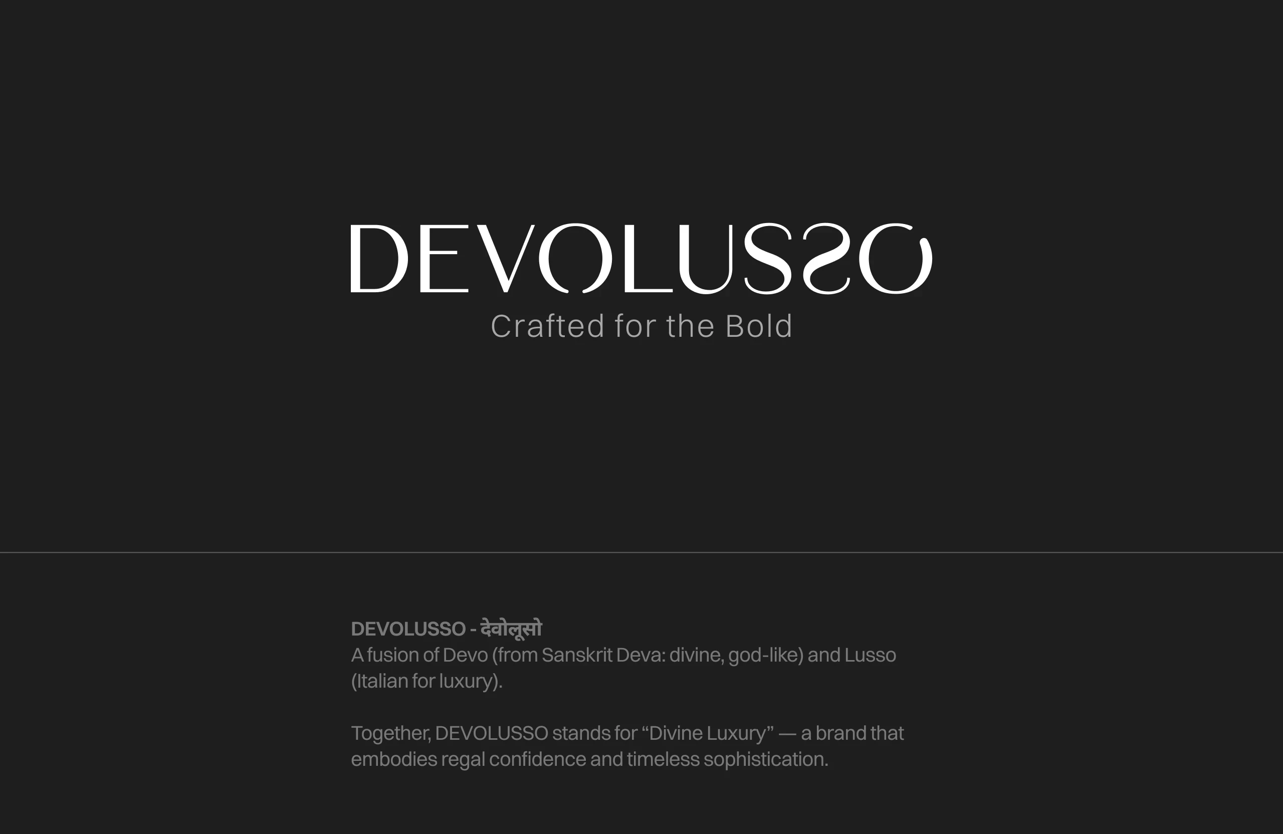
Brand Name Explainer
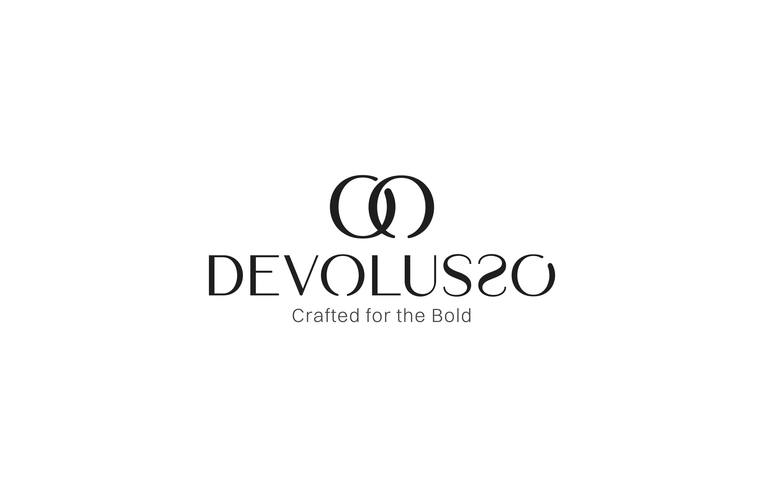
Full Logo
Logo Mark
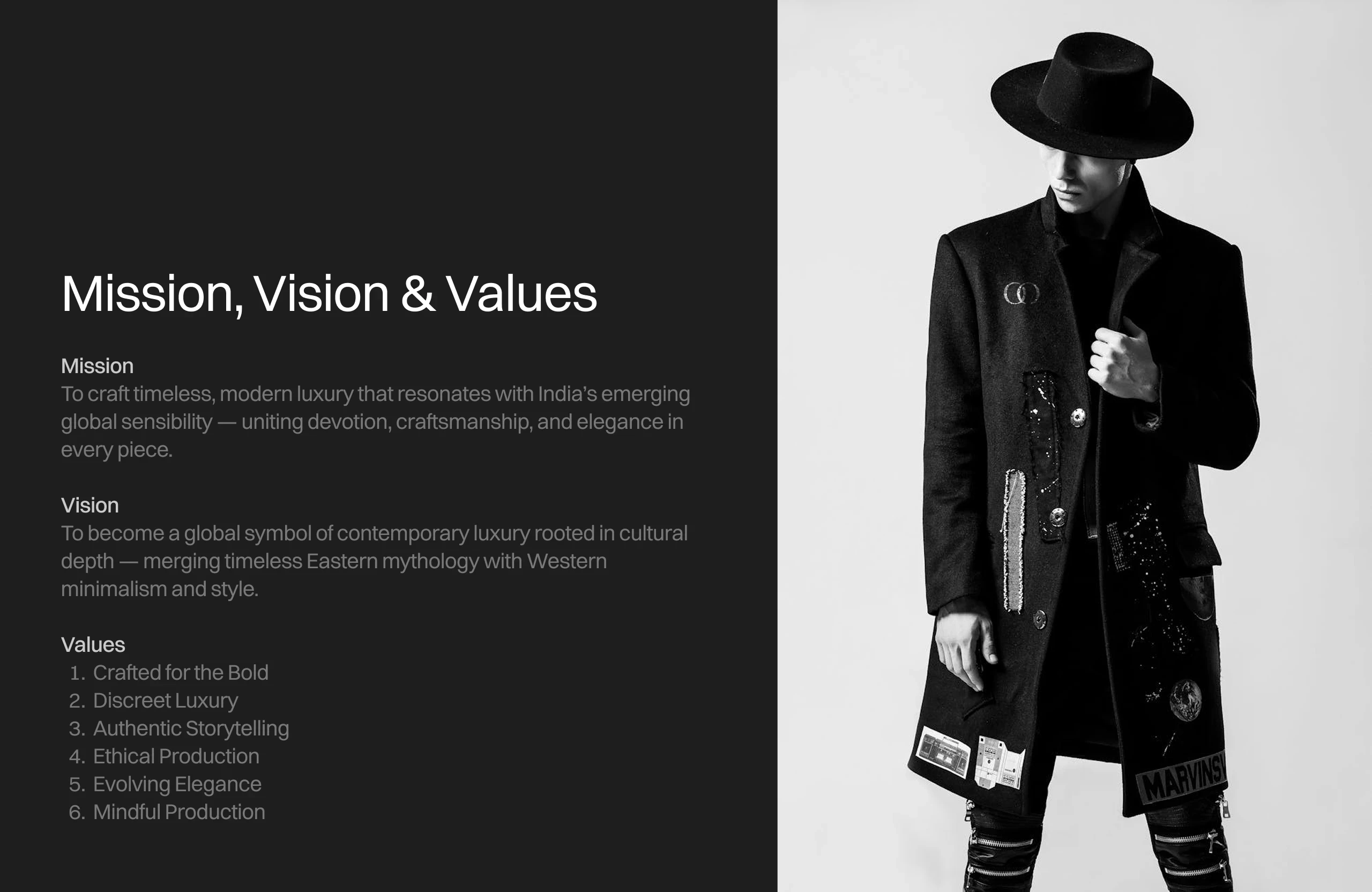
Brand's Mission
The Brand
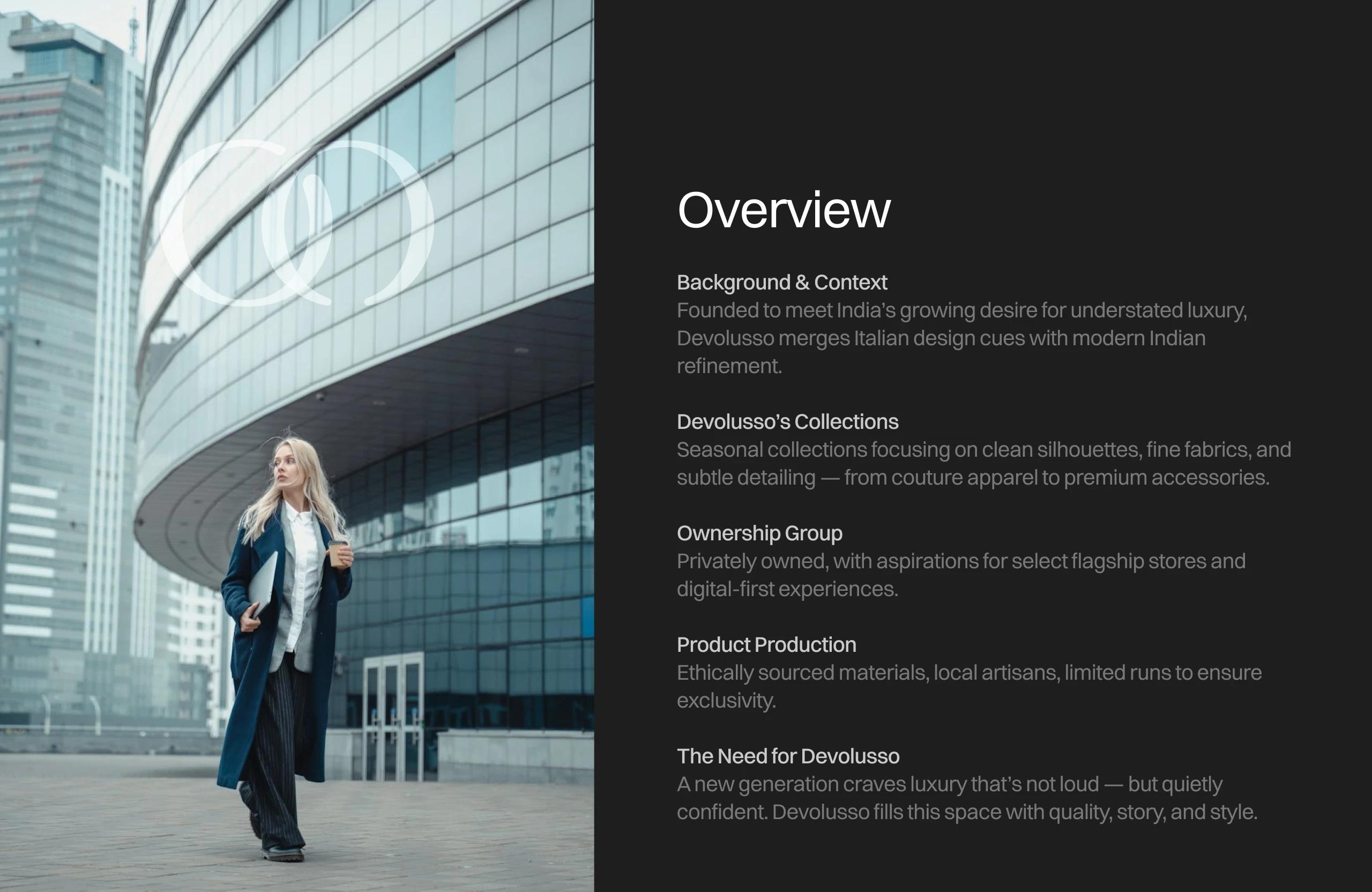
Brand Overview
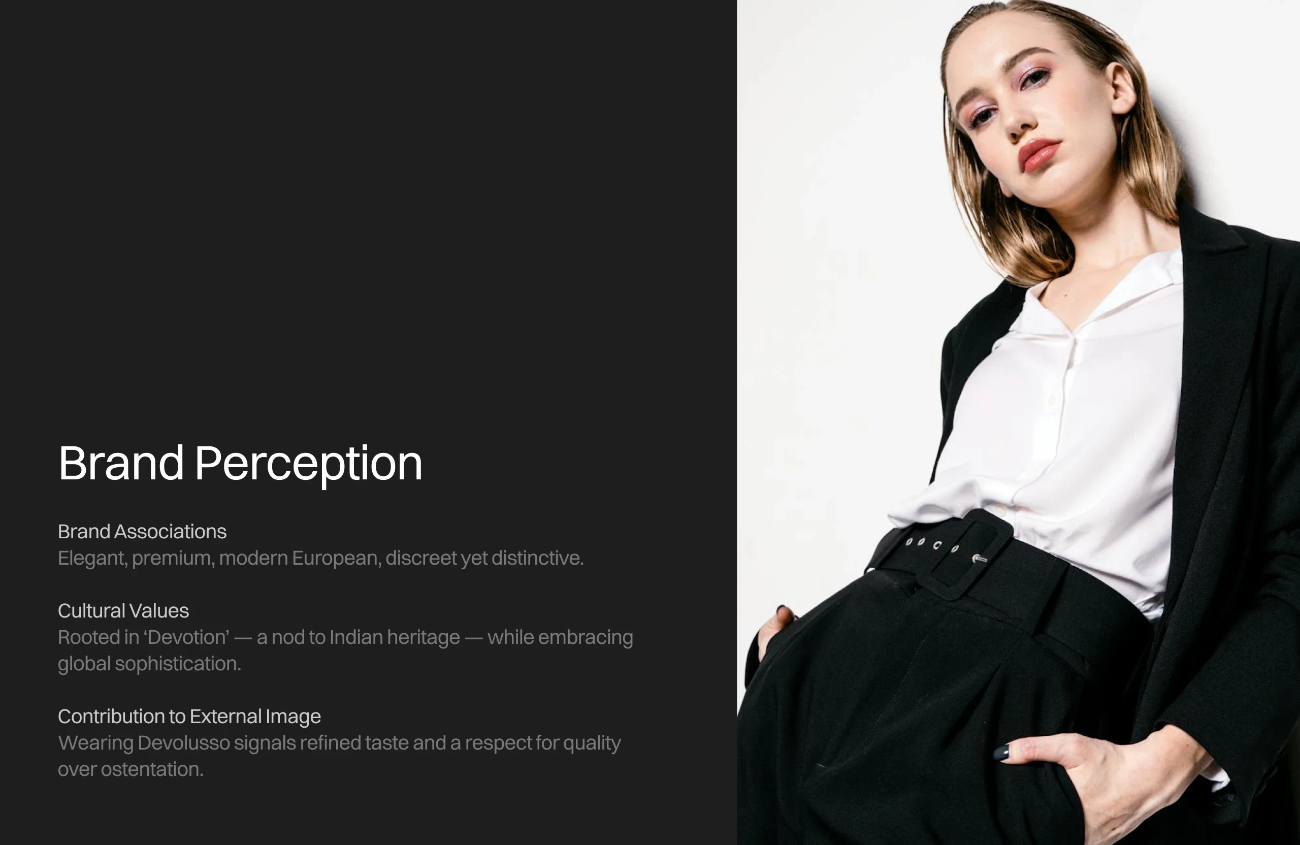
Brand Perception
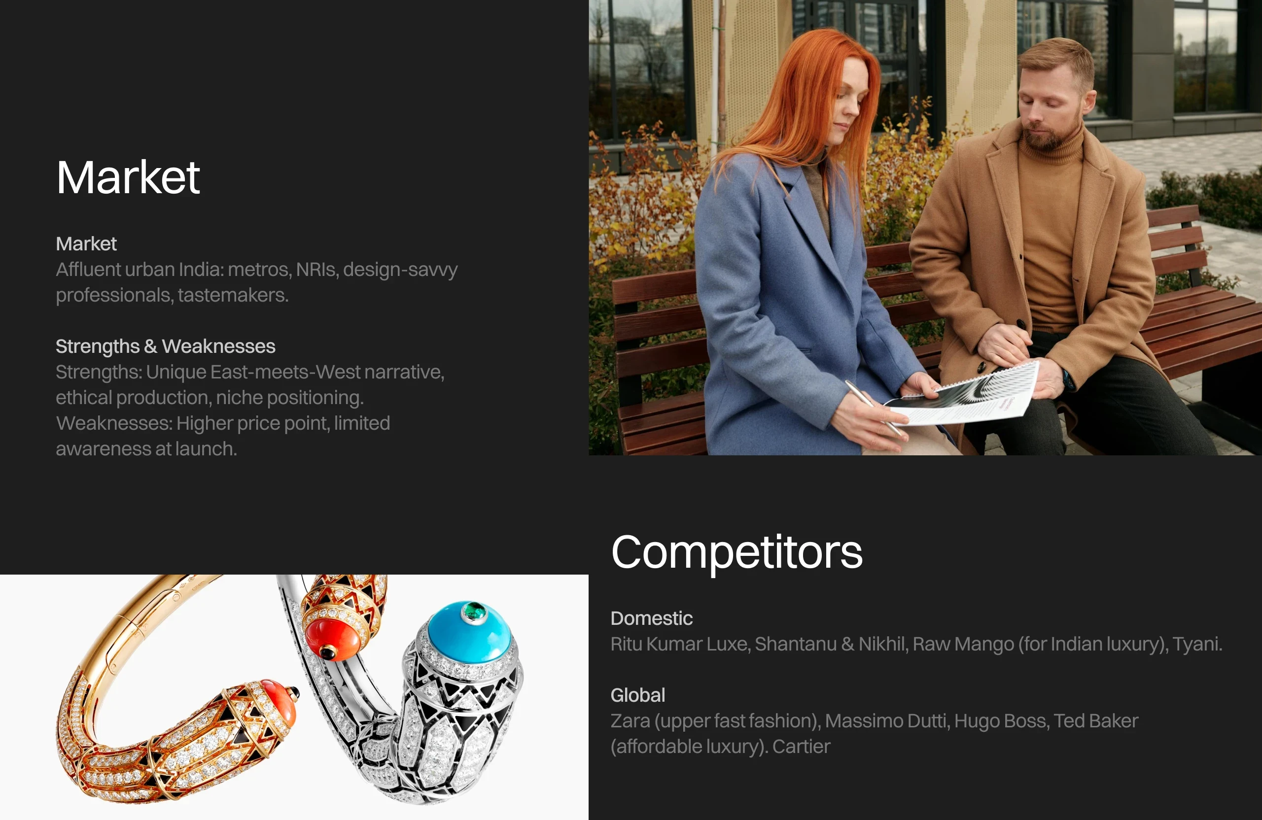
Market Research and Competitors Analysis
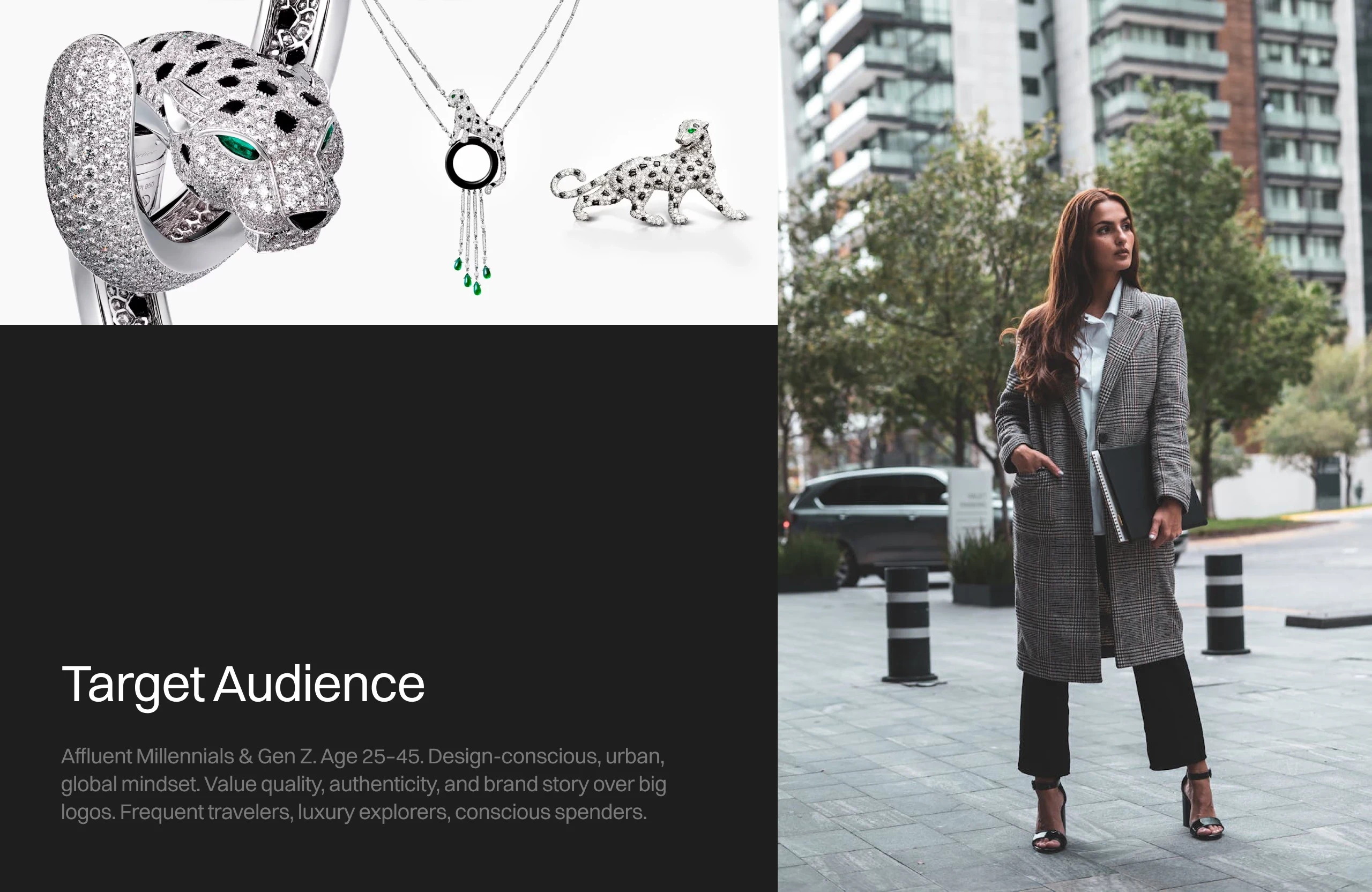
Target Audience
Brand Geometry

Brand's Color Palatte
Typography
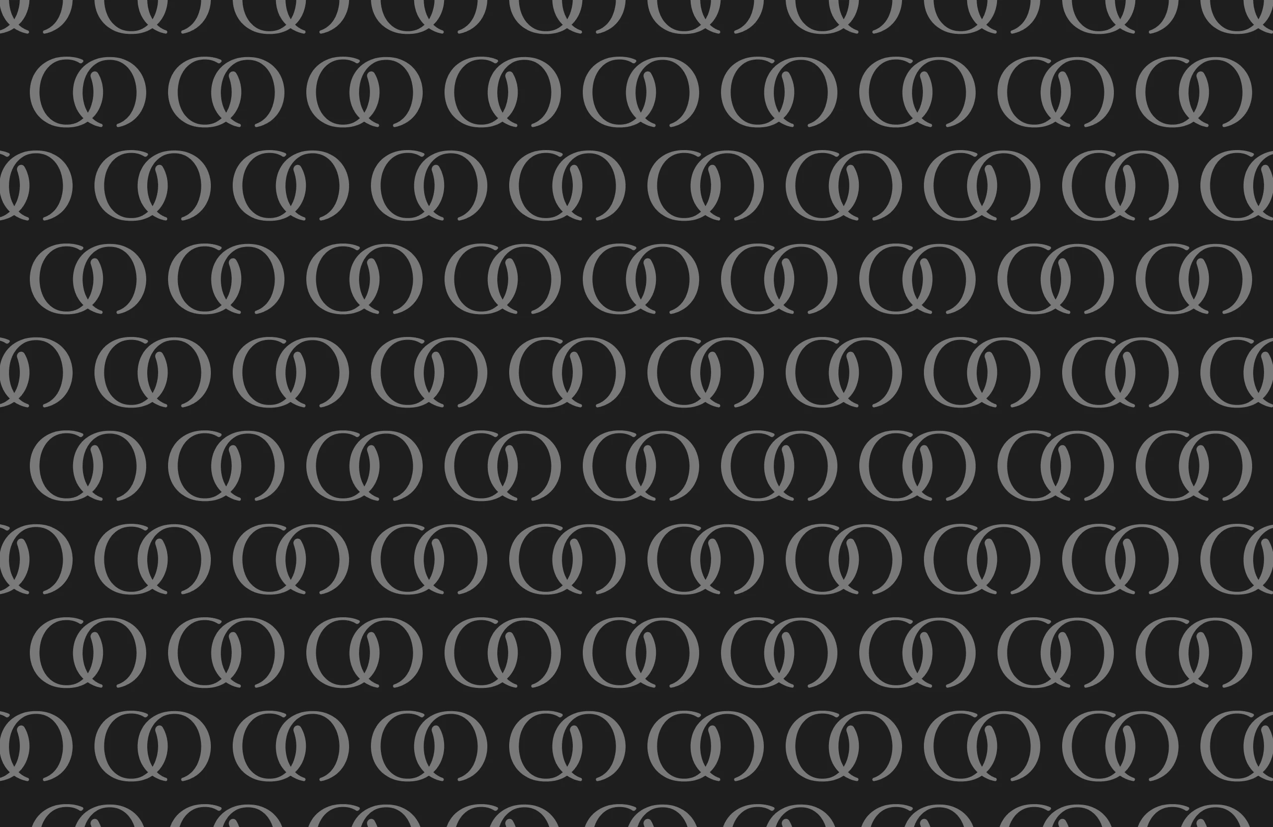
Patterns
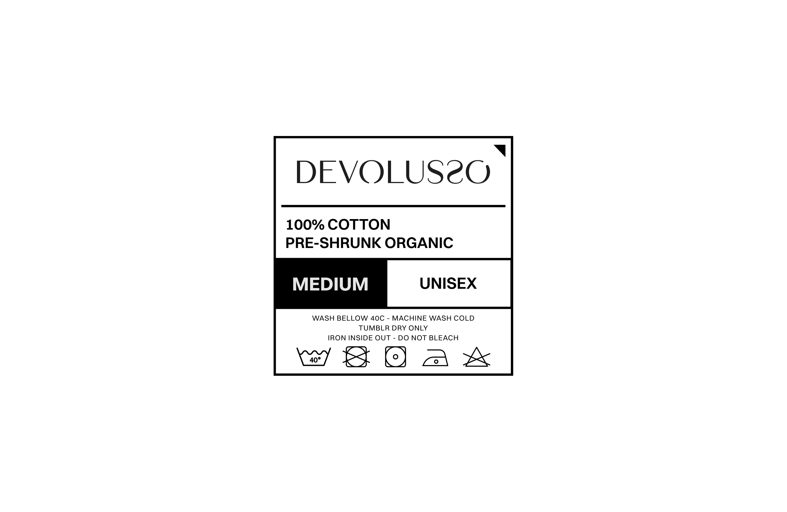
Tags
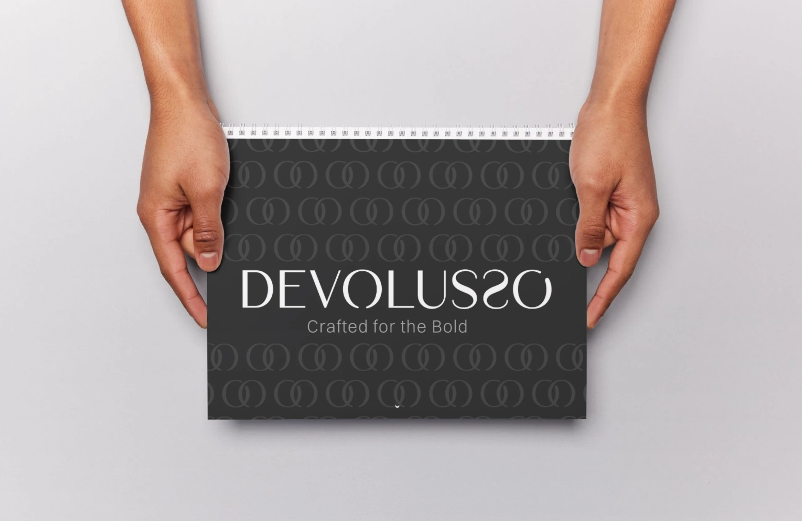
Brand Book
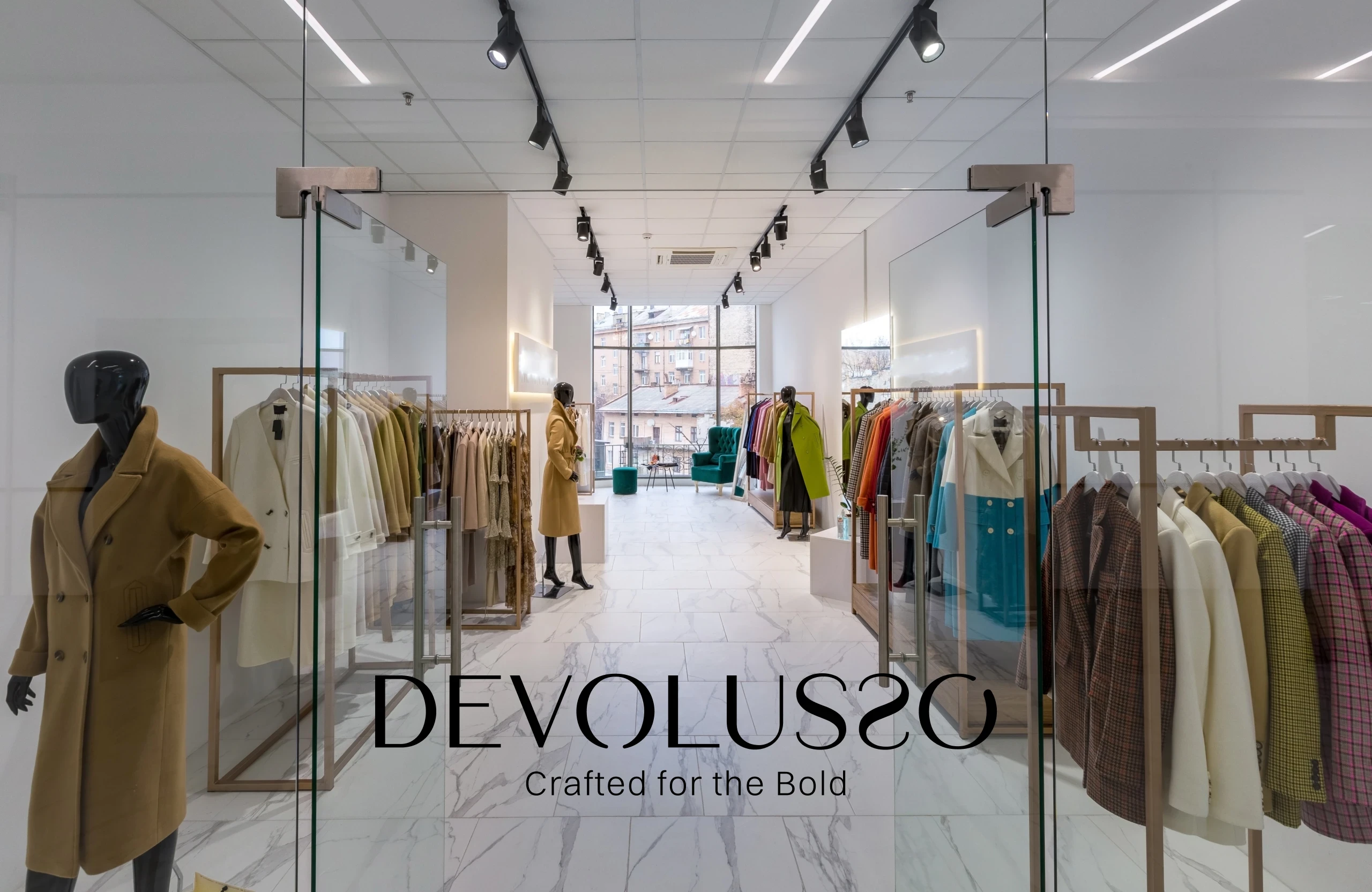
Brand Store
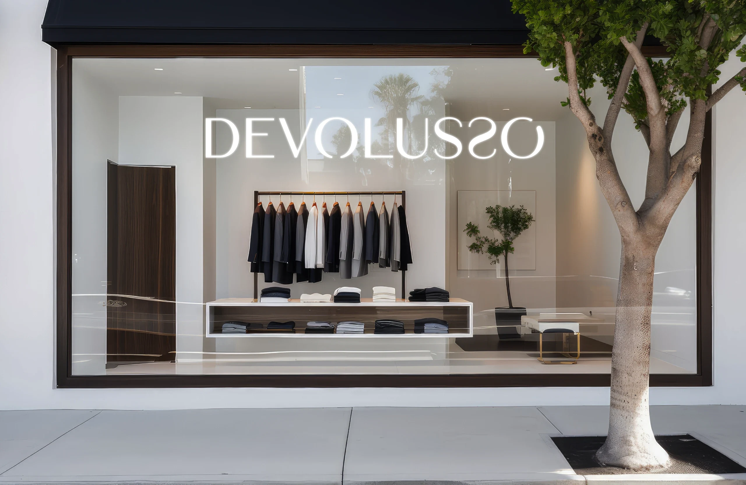
Brand Store
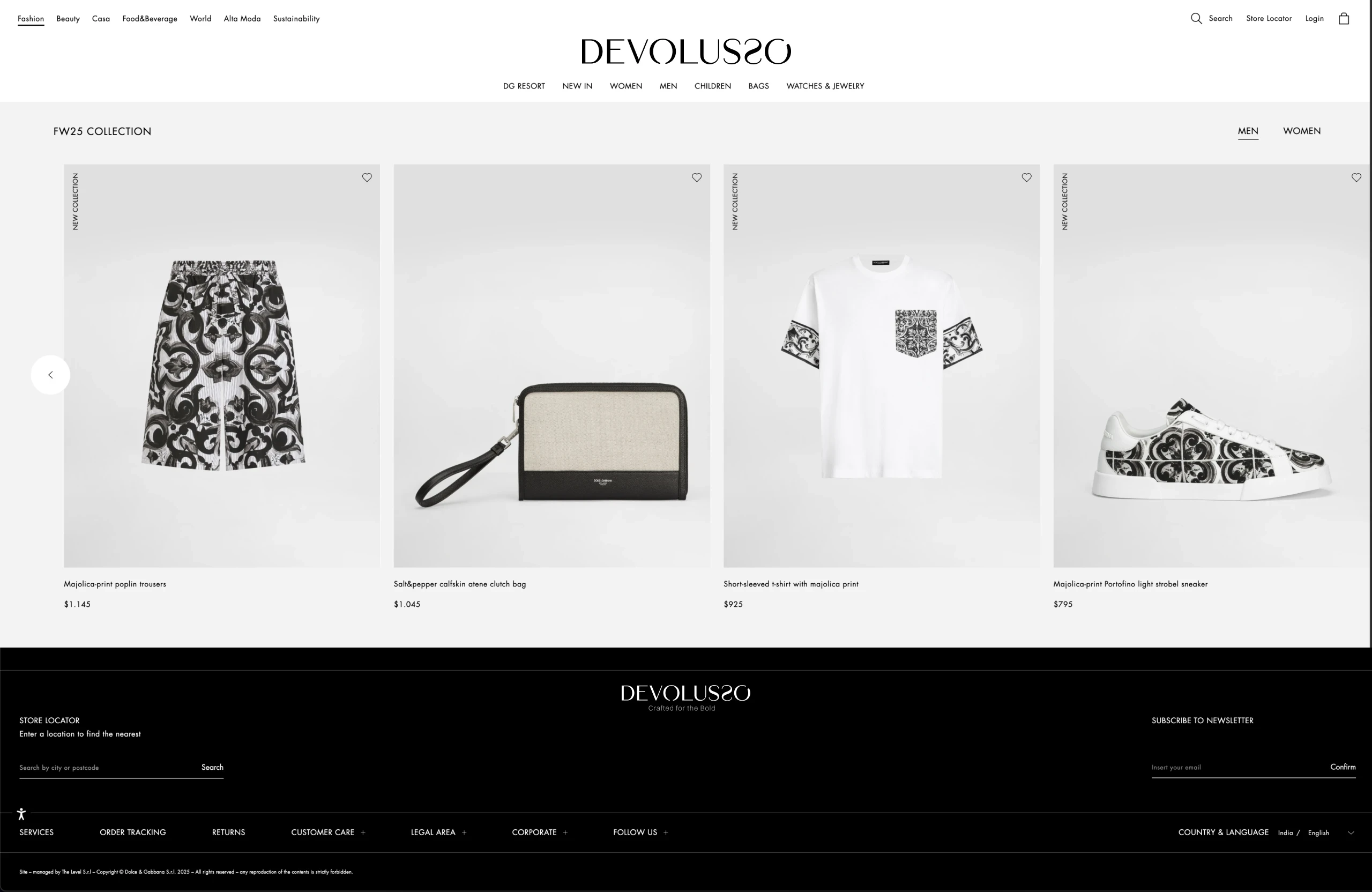
Website Design
Marketing Strategy
Marketing
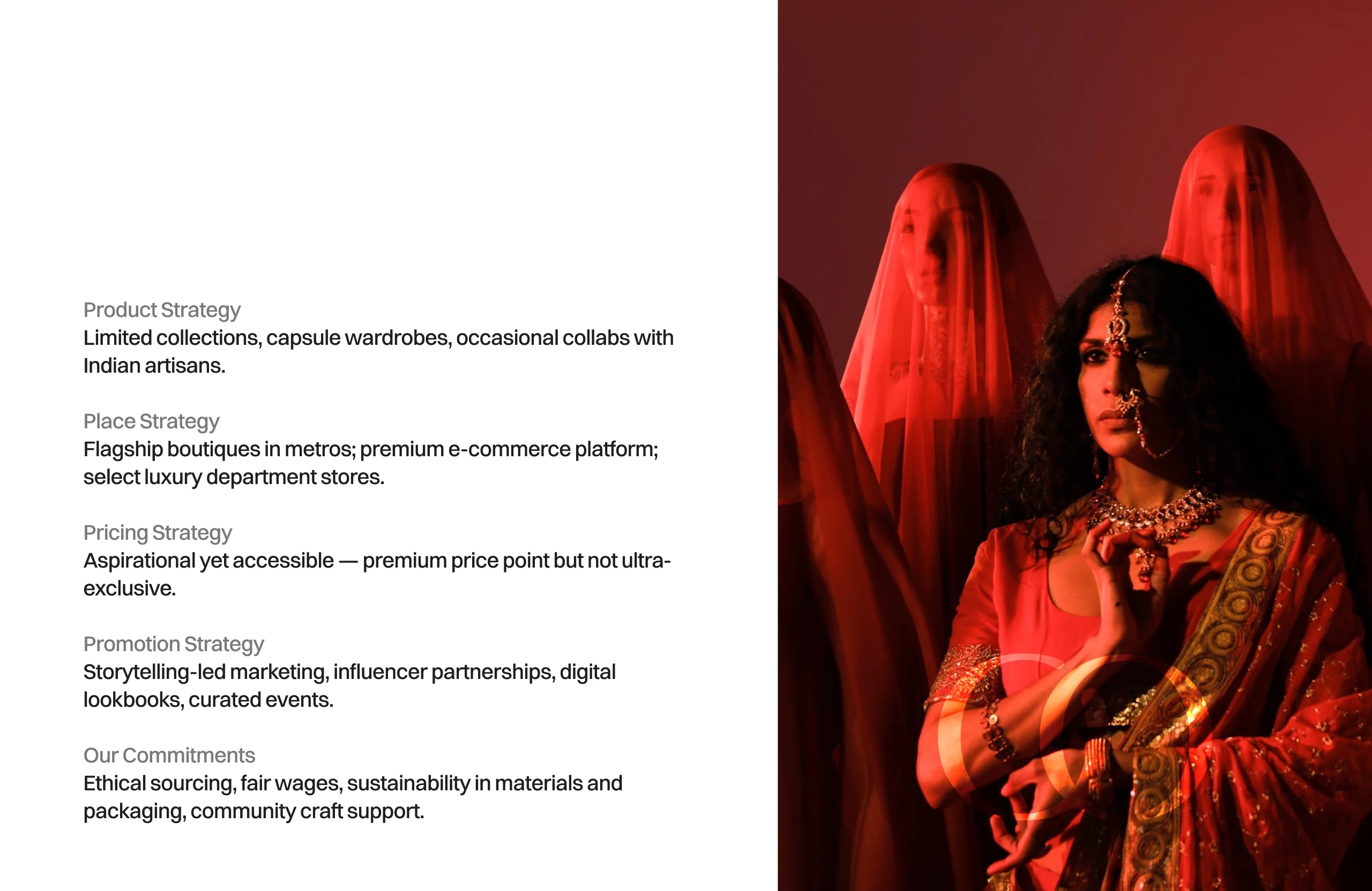
Strategy
DEVOLUSSO the brand
Thank You
Like this project
Posted Oct 23, 2025
Crafted a luxury fashion brand, DEVOLUSSO, with divine identity and timeless elegance.
Likes
0
Views
15