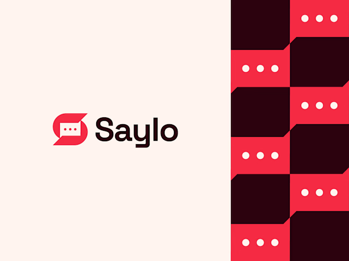
Designed this logo last year, and it’s been nice seeing it g...
Designed this logo last year, and it’s been nice seeing it get a strong response on Behance recently.😊
Stixel is built around the letter S, formed using pixel-inspired geometry to create a sharp, modern logomark. The idea was to keep it minimal but structured, with a strong digital feel that stays clear and recognizable at any size.
Looking back, it’s interesting how some concepts age better than expected.
What do you notice first, the symbol or the color choice?
Like this project
Posted Jan 16, 2026
Designed this logo last year, and it’s been nice seeing it get a strong response on Behance recently.😊 Stixel is built around the letter S, formed using pi...


