How I Designed an Aesthetic Landing Page for an AI-Driven Skinca
Mayur Joshi
Project Brief
This project is a part of 10k Designers. We were provided with a list of 120+ topics to choose from, And I chose to work on an AI-powered skincare recommendation app as my problem statement. My personal experiences with skincare challenges and frustrations, motivated me to address these issues through the development of an app.
Timeline? 14 DAYS.
Exploring the Problem
The skincare industry is vast, with countless products and routines available, often leaving consumers overwhelmed and unsure about what works best for their skin. Skinimal recognized this challenge and set out to address it by combining cutting-edge AI technology with skincare expertise.
TL; DR checkout the Final Prototype
If you’re short on time, you can quickly access the prototype by clicking this link 👈. With numerous interactive elements, you might find yourself engaged for a bit.
What is Skinimal?
Skinimal is an innovative AI-generated skincare app that caters to skin-conscious individuals seeking personalized skincare solutions. Leveraging advanced AI algorithms, Skinimal offers a comprehensive suite of features, including a skin scanner, a personalized skincare regime, an AI bot, and an integrated marketplace. This case study explores how Skinimal has transformed the skincare industry by providing users with tailored skincare routines and product recommendations, enhancing their skincare journey and overall experience.
Adding a memorable meme to brighten up the Case Study
My Design Process
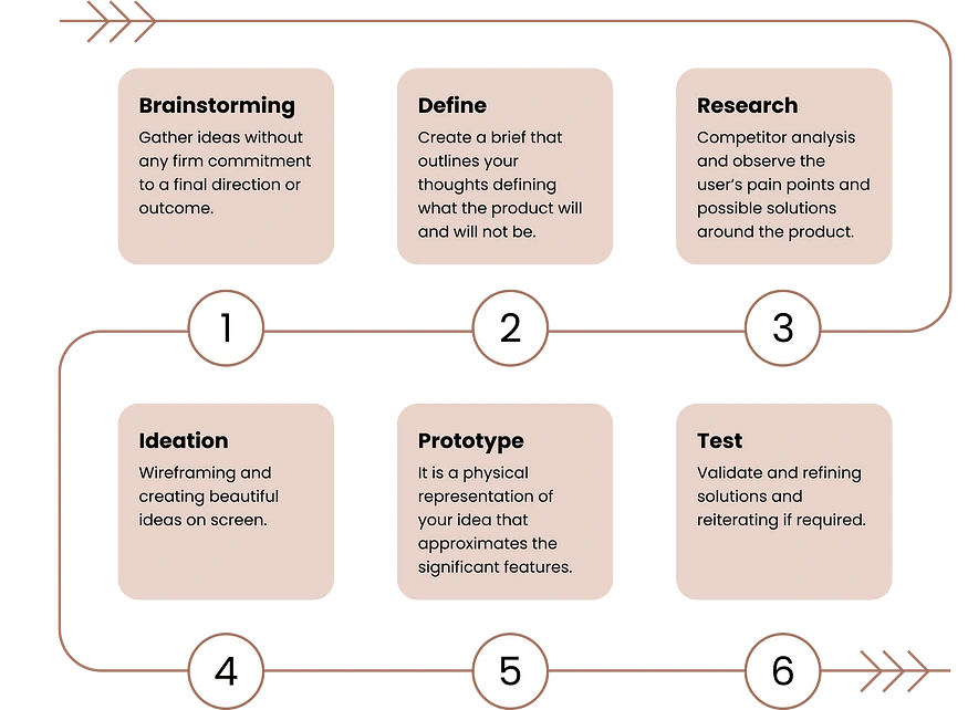
Research
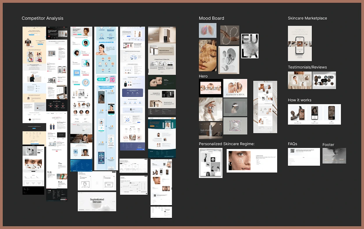
I started my research process by conducting a competitive analysis and feature-based analysis of key market players. Based on the analysis, I identified key opportunities for improvement:
Personalized recommendations based on a user’s skin type, concerns, and goals can be a key feature to provide a customized experience and enhance user satisfaction.
Offering detailed and intuitive information on ingredients can be a unique selling point and help the app stand out from competitors.
Providing cosmetic products based on a user’s personal color can be a great opportunity to offer a more personalized experience and cater to diverse skin tones.
Expanding the app’s selection of skincare products and providing an in-app purchase system can help the app compete with larger beauty retailers and provide a more seamless user experience.
Choosing a European target audience for Skinimal is a strategic decision driven by several factors. Europe boasts a diverse and sophisticated skincare market with a strong emphasis on health and wellness. The region’s consumers often prioritize quality, innovation, and sustainability in their skincare choices. Moreover, the skincare industry in Europe has a rich history and a willingness to embrace cutting-edge technologies. By focusing on this market, Skinimal aims to tap into a receptive audience that values personalized skincare, data-driven solutions, and eco-friendly product options, aligning perfectly with the app’s core features and values.
During the competitor analysis, I figured out that there were so many tedious long forms and a lot of user work to fill in their own details. As a solution to this problem, I realized 3 simple steps would be the best way to keep the user engaged.

Who are we designing this for?
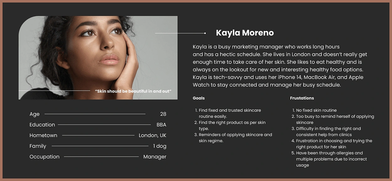
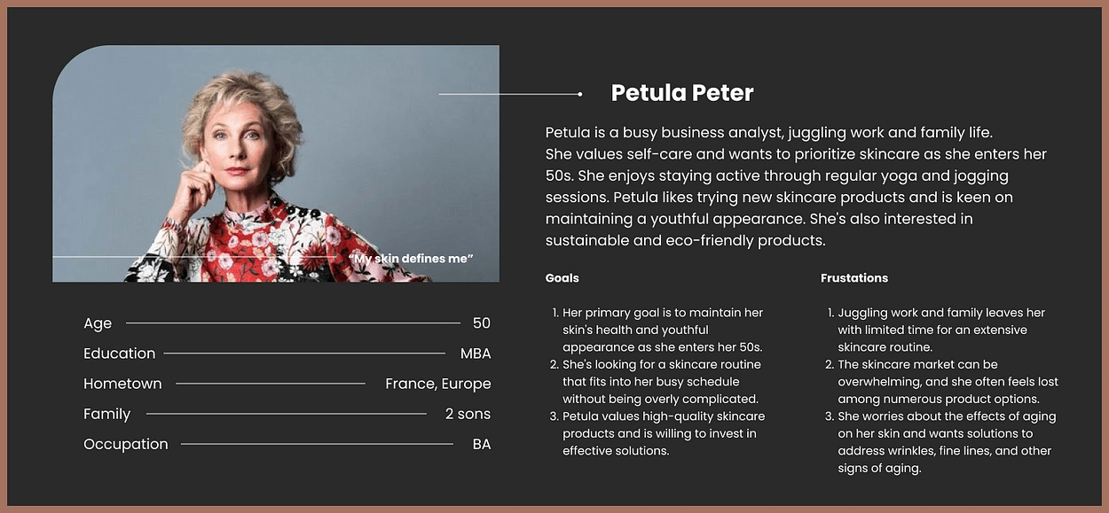
Individuals aged 20 years and above.
Individuals of various genders and diverse backgrounds.
Individuals who are new to skincare and seek guidance to make well-informed choices.
Incorporating AIDA and Double Diamond Framework
During the ideation phase, I utilized the AIDA and Double diamond framework, which I learned in our 10k Designers cohort classes. This process is a design thinking framework with four phases. Chat GPT was my creative partner and helped me with breaking down the concept better.
Product Features
After identifying the key focus areas, my primary goal was to develop features that would effectively address and solve these problems.
Advanced Skin Scanner: Skinimal’s skin scanner uses AI-powered image recognition technology to analyze users’ skin health accurately. By simply capturing a photo with their smartphone camera, users receive a detailed skin analysis, including moisture levels, pore size, pigmentation, and more.
Personalized Skincare Regime: Skinimal’s AI algorithms craft a customized skincare routine. The app suggests suitable products and step-by-step instructions to address specific skin concerns. Users receive regular reminders to maintain consistency, ensuring maximum efficacy of the skincare regime.
Friendly AI Bot — Iris: The app’s AI bot, affectionately named “Iris,” engages users in natural language conversations to understand their preferences and skincare history continually. As users interact with Iris over time, the AI bot learns and adapts its recommendations.
Integrated Skincare Marketplace: Skinimal features an integrated marketplace that collaborates with local and international skincare brands.
Meanwhile let me introduce you to our AI Expert “IRIS”
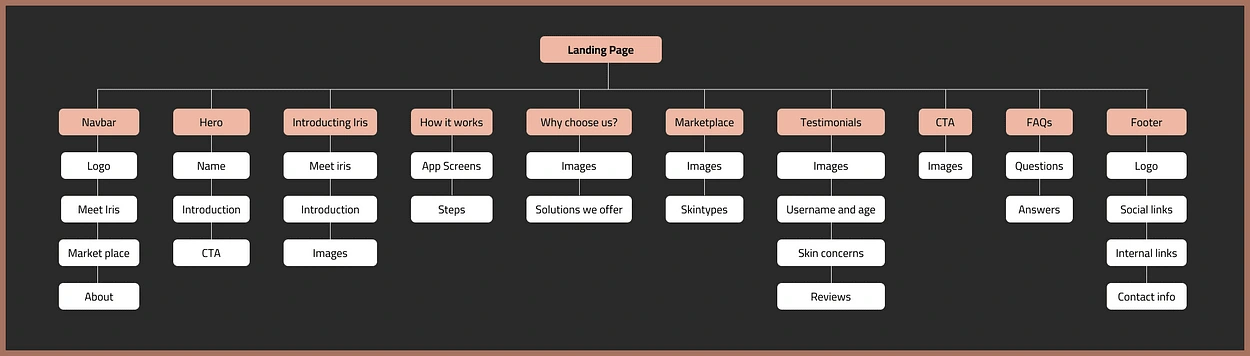
Information Architecture
I created an information architecture (IA) to help visualize the hierarchy and organization of information within the product. To achieve this, I arranged all the pages according to each journey and listed the items found on each page. The info architecture of Skinimal is designed to provide users with a seamless and user-friendly experience, guiding them through the key features and information they need for effective skincare management.
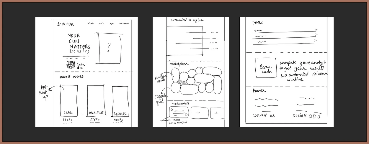
Wireframing
During the wireframing stage, I explored various layouts and adjusted the information architecture accordingly. Here’s a snippet of some of the wireframes.
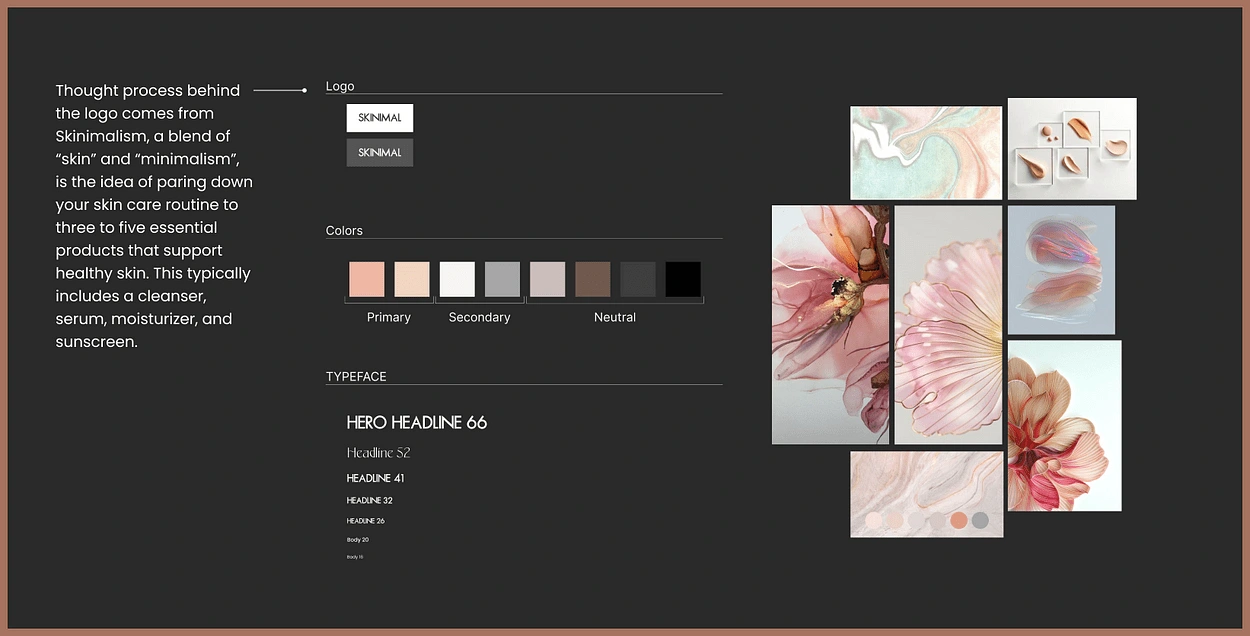
Visual Guidelines
Skinimal is a clean and modern representation of the brand’s identity, conveying its focus on skincare simplicity and effectiveness. Visual design choices were made based on the brand identity of the project, which included minimalistic, trendy, magical, feminine, and love.
Minimalistic Approach: The brand guidelines embrace minimalism with its simple and elegant design. It avoids unnecessary complexity, reflecting the idea of streamlined skincare.
Skinimal Logo: The logo primarily uses a clean and contemporary font for the word “Skinimal.” The choice of font is modern and easy to read, emphasizing clarity and straightforwardness.
Color Palette: The color palette is likely soft and soothing, with pastel or natural colors, such as peach or beiges, symbolizing the calmness and purity associated with skincare.
Balance: The design maintains a balanced composition, ensuring that all elements harmoniously coexist. The balance signifies the harmony Skinimal aims to bring to users’ skincare routines.
Mood Board
In addition to websites, I got inspired by existing make-up skincare websites. My mood board consisted of different elements to fuel my creativity.
Final Showcase
The wait is over, Please have a look at the final version of the landing page. Your feedback means alot to me, really. Please feel free to drop your thoughts in the comments below!
Iterations
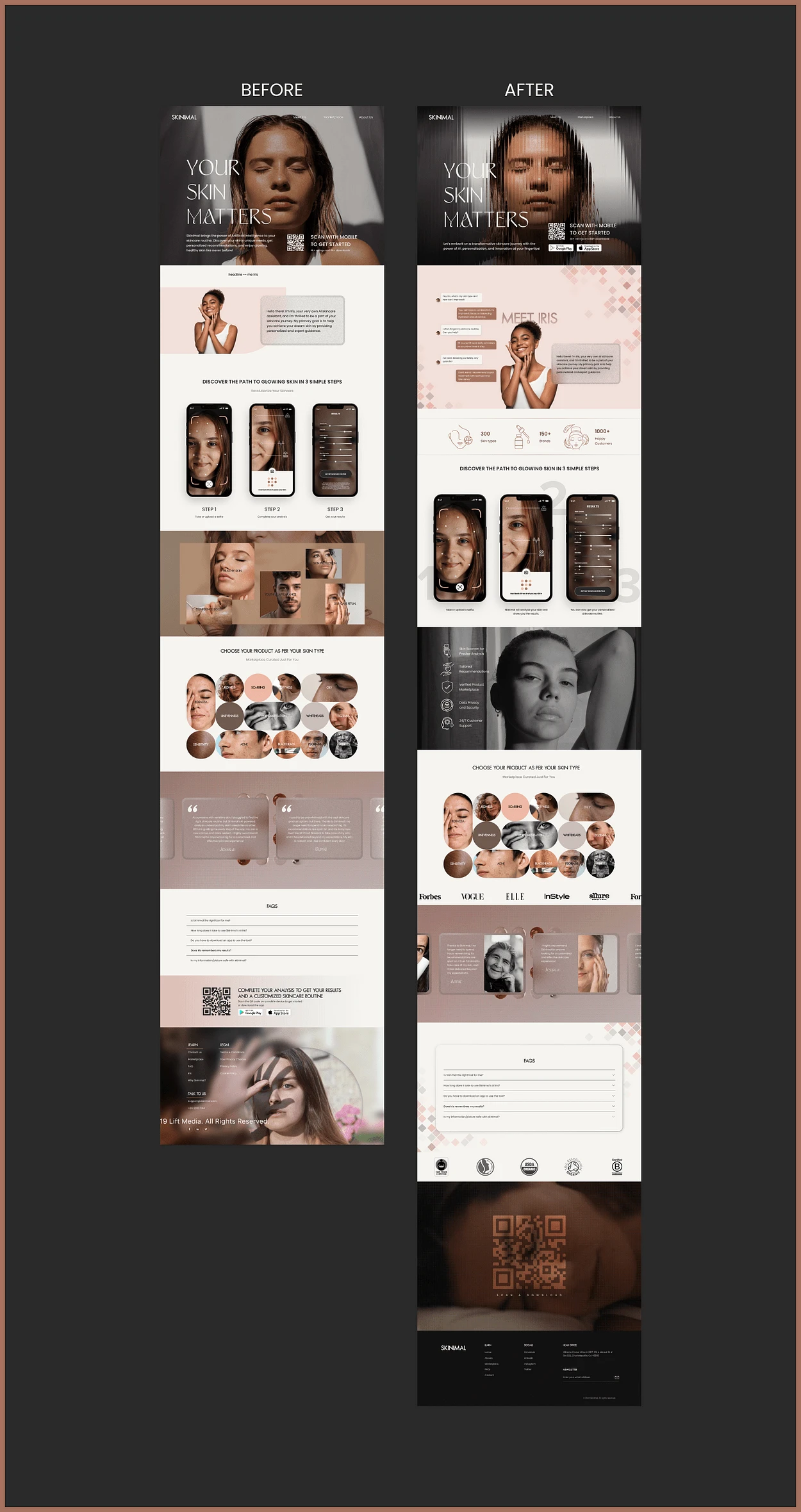
To arrive at the final version, I underwent over 30 iterations, adjusting layouts, fonts, and other design elements. The most time-consuming aspect was determining the key information to display in each section and clarifying the purpose of each section. In our cohort, we had amazing mentors to get our progress reviewed at any stage of our design process. Here are some iterations that led to the final product.
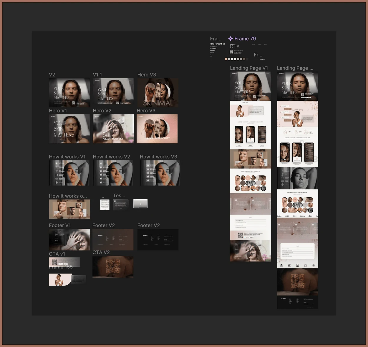
Reflecting on my initial draft and the final version, I’m amazed at how attention to detail has contributed to a more polished and scalable landing page.
Now, I will be walking you through sections, indivisually.
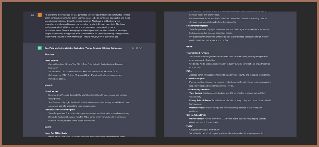
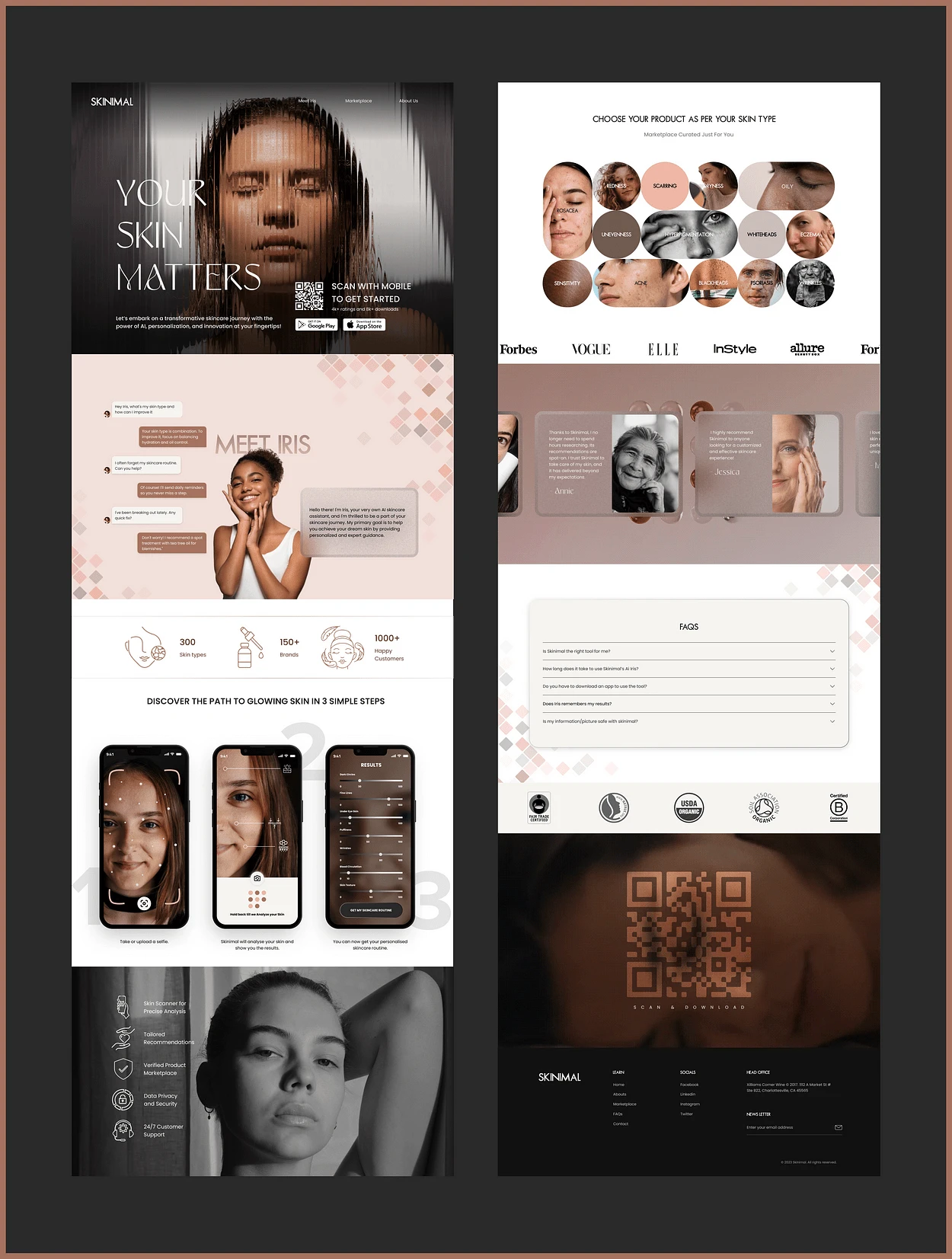
1. Hero Section
The hero section is vital on a landing page because it’s the first thing users see, shaping their initial impressions of the brand. Therefore, it’s crucial to design it to convey information clearly and build user trust.
My thought process behind the Hero section was to show the user the transformation “Skinimal” can do to their skin. I photo-manipulated this photograph and created it into an art showing the distortion.
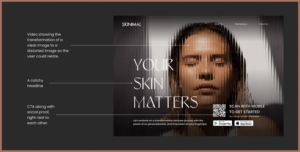
I went through many rounds of design to create an effective hero page with an engaging headline, a preview of the product, and strong social proof to build user trust.
2. Meet the AI personal skincare representative, Iris
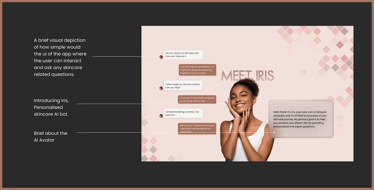
In this section, Right after the Hero, I wanted to introduce the user to the main highlight of the landing page, i.e. the personal skincare AI bot, Iris. Here it contains a minimal description and visual representation of what Iris can do for the user. Iris learns from user interactions, continuously refining its recommendations to match your evolving skincare needs.
3. How it works?
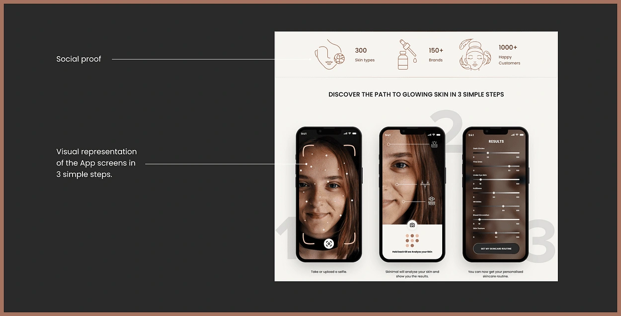
Here I’m outlining the three user-friendly steps to create a personalized skincare routine, demonstrating the app’s ease of use. The app would Scan the skin of the user, Analyse, and provide results of the skin composition. Iris would remember these results and the user can get back to the app with any sort of query they have regarding their skin hassle-free.
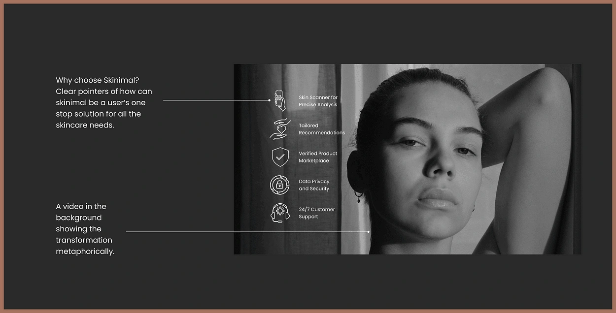
4. Why choose “Skinimal”?
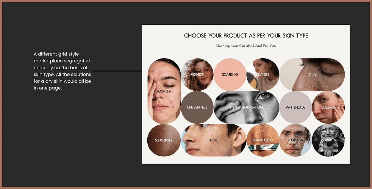
5. Marketplace
Product Recommendations: Explain how the app’s AI analyzes user data to recommend the best-suited products available nearby.
Value Proposition: Emphasize the convenience of the integrated marketplace that suggests the right skincare products.
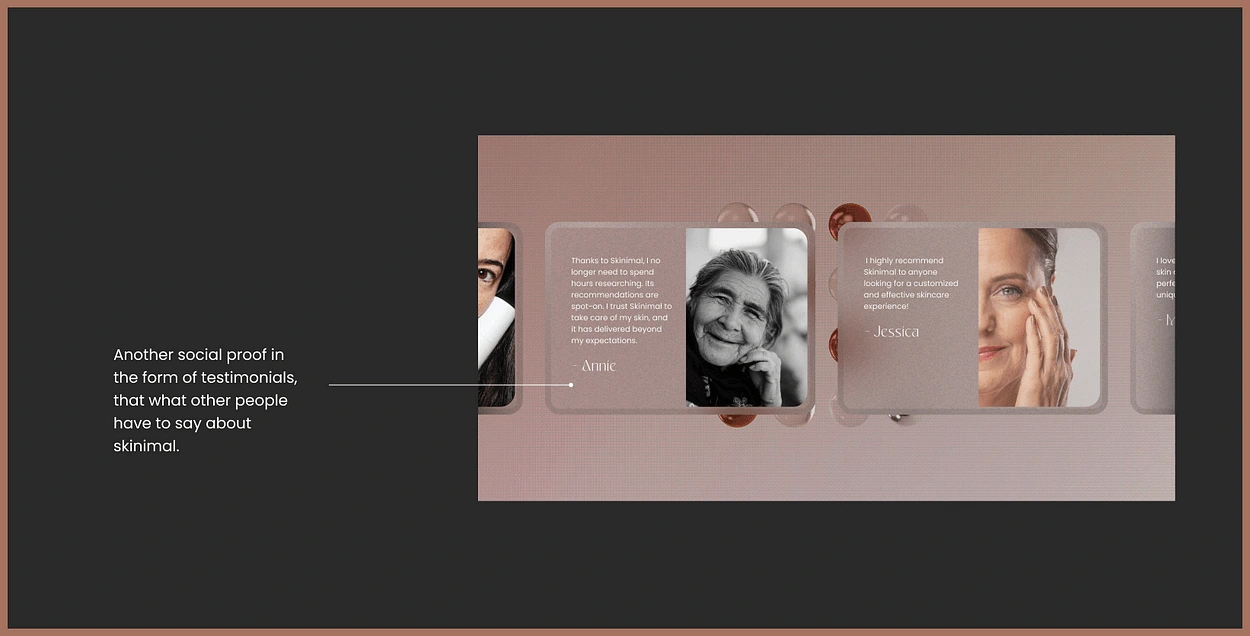
6. Testimonials
This is one of the sections that provides the user with proof of work, it showcases the testimonials from other people who have used the app and their results. These testimonials help in building the user’s trust.
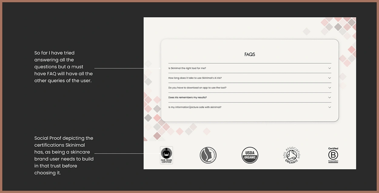
7. FAQs
In this section, I focused on any questions people might have after going through the landing page. The FAQ section has:
Most common and essential questions answered already.
A social proof to drive user attention
This is also a common feature that I noticed in most of the landing pages during my research.
8. CTA
A clear and concise which would direct the user to simply scan and download the app. A very unique yet catchy CTA, which is a video of self-love and pampering, playing in the background.
It’s Figma timee
You can check out the Final Prototype in Figma here👇
Lessons Learned…
Balancing Information: Finding the right balance between providing sufficient information without overwhelming the user is crucial.
Clear Guidance and Error Messaging: Incorporating error messaging and clear guidance improves the user experience and makes the analysis process more intuitive and user-friendly.
Timely Notifications: Providing clear and timely notifications, such as the pop-up notification after adding items to the cart, enhances the user experience by providing confirmation and clarity regarding their actions.
User Feedback and Iterative Design: Conducting user testing and gathering feedback is essential for understanding users’ needs and preferences. It enables iterative improvements to create a more intuitive and satisfying user experience
Like this project
Posted Oct 9, 2023
Ai Driven Skincare Routine
Likes
0
Views
24