Daily Cha - Brand Design

Aliyah B.


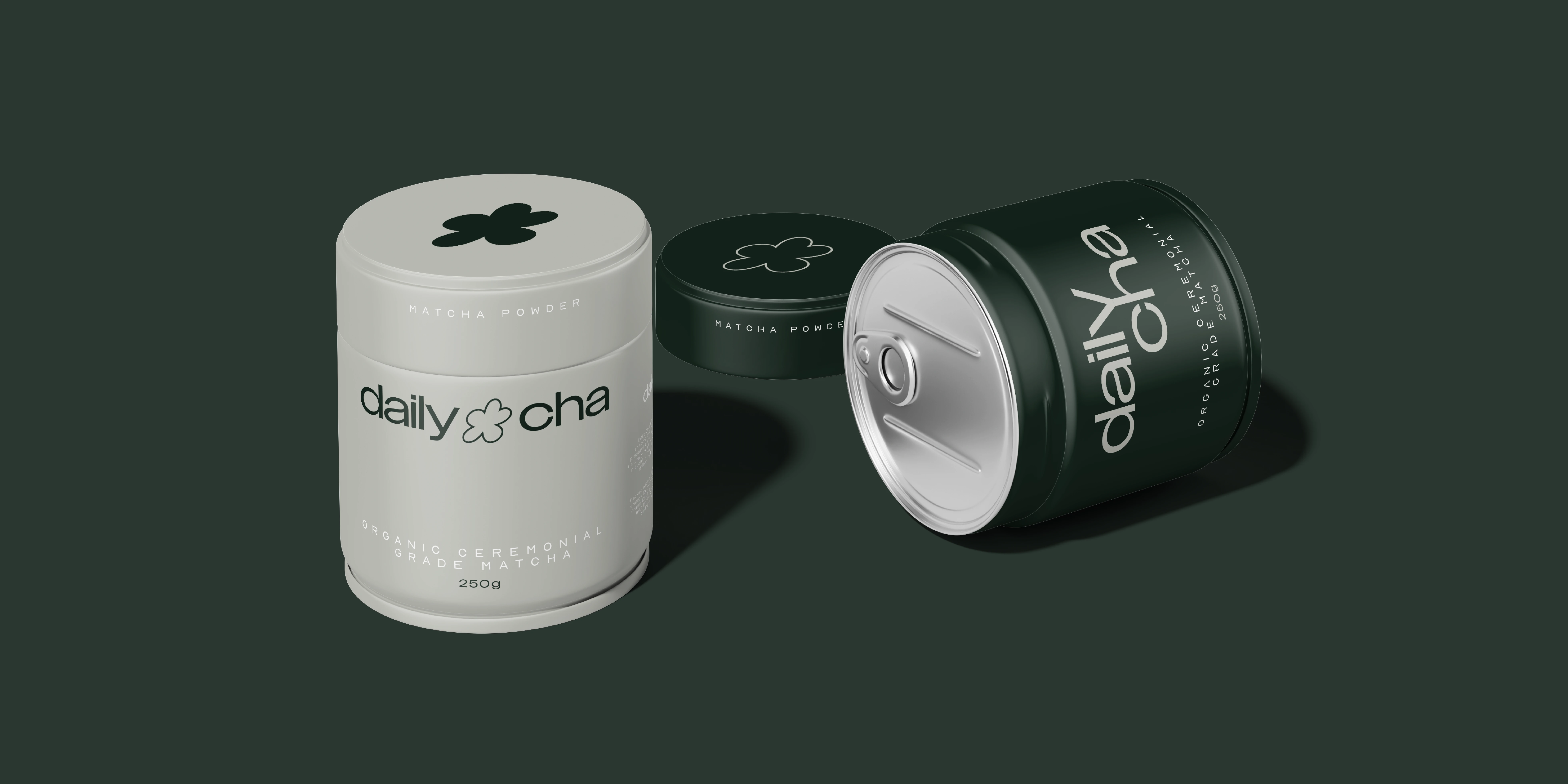
Daily Cha [ matcha café ]
Brand Identity
Packaging
Creative Direction
Website Design
Daily Cha was created to bring a modern, grounded feel to the world of matcha. The goal was to design a brand that feels calming, elevated, and true to the ritual of slowing down with a cup in hand.
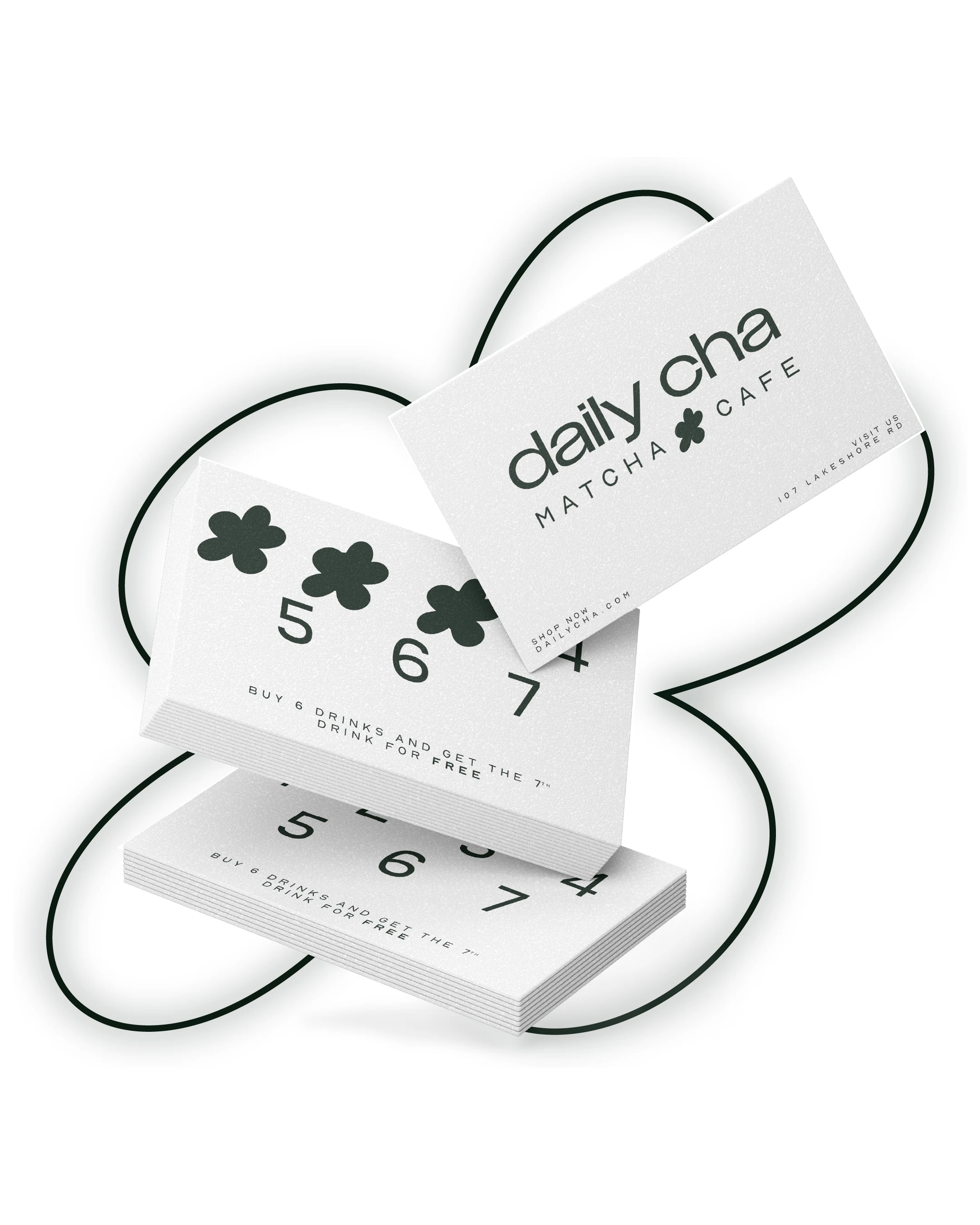
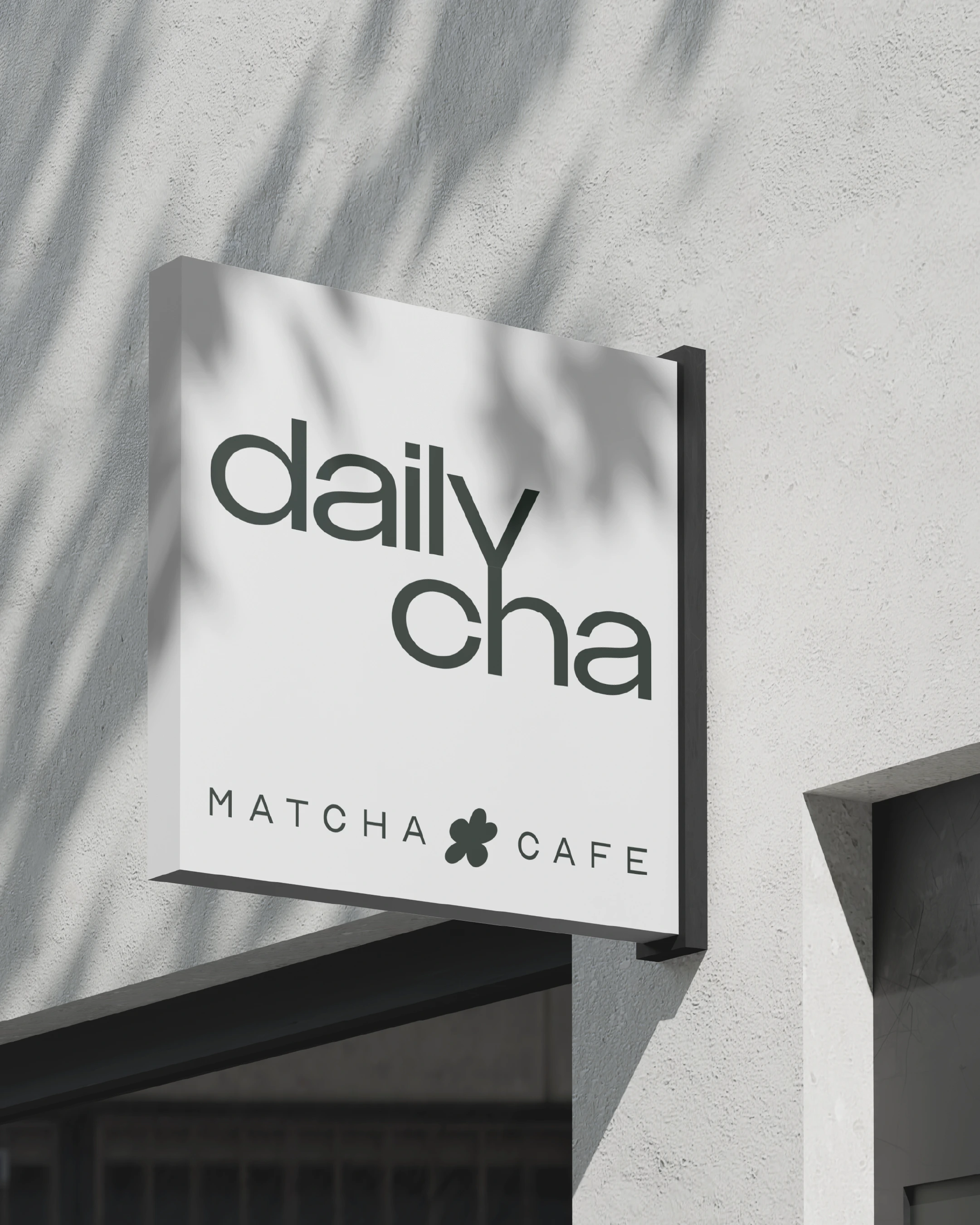
The logo was inspired by the matcha plant flower, simplified into a clean, modern symbol that represents growth and balance. It became the heart of the brand’s visual identity. The colour palette was built around soft, natural greens paired with warm neutrals to reflect the earthy tones of matcha and the peaceful feeling it brings. Every choice, from typography to layout, was made to feel intentional, minimal, and timeless.
I designed the full brand identity, packaging system, loyalty cards, and website to all work together as one cohesive experience. The packaging focuses on simplicity and quality, while the website expands on that same calm energy. Together, they tell a story that feels refreshing, thoughtful, and connected.
Ultimately, the cohesive brand identity establishes Daily Cha as a premium, refreshing presence in the market. By balancing modern aesthetics with grounded storytelling, the design successfully communicates the quality of the product, inviting customers to pause and authentically connect with the brand ritual.


CREATIVE DESIGN
Distinctive Visuals that Align Design with Direction.
LET'S BUILD BOLD
Direct message / email me or fill out my contact form via link below
Website: aliyahbstudio.com
Email: aliyahbstudio@gmail.com
Socials: @aliyahbstudio
Like this project
Posted Mar 12, 2026
brand identity established for Daily Cha, a matcha cafe, as a premium presence in the market.