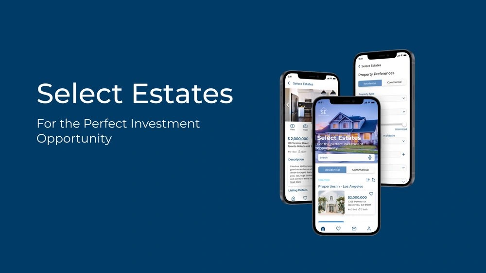
Select Estates

Overview
It is becoming increasingly popular for individuals to invest in real estate in order to achieve financial security. In many cases, it is a complex and emotional experience.
The online market is filled with blogs and agencies that provide information, however new buyers who don't have any professional guidance may find it difficult to get started and waste time viewing properties that are out of their price range. Through this web app, they will be provided with all the information and expertise they need to get started quickly.
About the Project
Select Estates is a project that I built as part of my UI Design Specialization course with CareerFoundry.
My Role
UX and UI Designer
Tools
Figma
Duration
10 Weeks
Challenge
People who want to invest in real estate need a solution that will help them find properties without any challenges and let them start investing quickly.
Solution
Creating a web app that will provide all the necessary information that users need to get started quicklv.
My Process
Persona
For this project, I was given some bullet points and based on the criteria, I defined a character that would be likely to be one of my app users. Creating this persona really helped me to better understand their struggles, limitations, successes and goals.
Demographics
Age: 42
Education: Bachelor's in Computer Science and Master's in Advanced Computer Systems
Marital Status: Married with 2
children
Occupation: IT consultant
Rashida
Goals:
• Rashida makes a good living and wants to invest in property beyond the city for increased financial security for her family.
• She wants to find the right information for fast decision-making.
• She wants a tool to help her find the right properties so as not to waste her time.
Tasks:
• As she is new to real estate, she wants a tool that is easy to use and that will help her find the property she's looking for.
• Search for properties, inputting criteria relevant to what she's looking for.
• Easily view and return to listings she's interested in.
• Receive relevant and comprehensive information about properties.
Quote:
"I want to provide my family with financial security. I've been considering buying property for a while, and am looking for a tool that can help me find what l'm looking for, quickly!"
USER STORIES AND FLOWS
According to Rashida's needs and goals, I mapped out the task flows in which I've considered all possible situations and navigational issues to complete the particular tasks.
WIREFRAMES
During the wireframing process I had some major changes specifically on home page and the property page. First thing was to remove one of the menus and I eventually decided to remove the hamburger menu and leave the bottom navigation as it seemed for convenient for the users. Then, on the home page, I added a hero image also removed the contact agent button from the bottom of the listings as people would want to click on the listing no matter what before contacting the agent so it did seem unnecessary. Also, on the property page I initially created a media section which was later removed as I thought it would make a lot more sense to have all the media at the very top so that people wouldn't spend time on looking for the photos/ videos.
MOOD BOARD
After completing my mid-fidelity prototypes, I decided to move on to the mood board. Based on my research, I worked with multiple colors and elements and explored different options and finally I decided to go with the below mood which was focused on the blues. I chose the colour blue because it's associated with security and dependibility and it's widely used by many companies and brands.
STYLE GUIDE
RESPONSIVE DESIGN
After working on my style guide, I moved on to designing for other screens. including tablet and desktop.
CONCLUSION
This was the first UI focused app I worked on and it was quite interesting to realize how different it was from UX part of a design although they go hand in hand. The most challenging part was designing for different breakpoints. Especially when designing the layout, I realized that I had to consider maintaininga consistent look as much as possible to avoid user confusions and frustrations. Although this project was UI focused and we were not required to do a User Testing. I really wish I did have set aside some time to test my design and get feedback from users as I strongly believe that would have been helpful to improve the app. So this will be my one of next steps continuing, and I will keep polishing my design and add more screens to the desktop version of the app.
Like this project
Posted Jun 23, 2023
A Real Estate Investment App for Busy Individuals
Likes
0
Views
4


