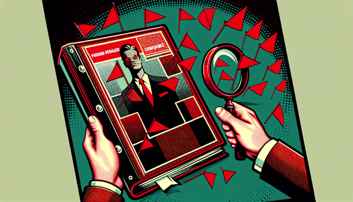
Brand Designer Style Consistency: Good Sign or Limitation?
Rebecca Person
Brand Designer Style Consistency: Good Sign or Limitation?What Is Brand Designer Style Consistency?1. Visual Uniformity2. Tonal Alignment3. Perception and TrustWhy Brand Consistency Matters1. Recognition Advantage2. Operational Efficiency3. Professional ImageIs There a Downside to Uniformity?1. Creativity Constraints2. Risk of Boredom3. Cultural or Market Variations5 Ways to Balance Consistency and Creativity1. Choose Core Elements Wisely2. Refresh Periodically3. Experiment in Small Doses4. Collaborate with Other Experts5. Use Guidelines for AdaptationOvercoming Common Roadblocks1. Maintain a Central Asset Library2. Provide Clear OnboardingFAQs about Brand Designer Style ConsistencyHow do you measure brand consistency?Is consistent branding different for personal brands?When does it make sense to break the rules?Where Does This Lead Us Next?
Brand Designer Style Consistency: Good Sign or Limitation?
I’ve been thinking about this a lot lately. Not just because I’ve been on back-to-back branding calls this week, but because I keep seeing the same question come up in my inbox: “How much of my style should stay consistent?”
Some clients want their brand to look the same everywhere, all the time. Others are more interested in shaking things up, trying something new for every campaign. And as a designer, I’m often caught somewhere in the middle — where consistency meets experimentation, especially when exploring brand designer styles.
So today, I want to unpack this whole idea of “style consistency” from the lens of someone who builds brands for a living. Is it a strength? A limitation? Or something in between?
What Is Brand Designer Style Consistency?
Style consistency in branding means using the same look, feel, and voice across everything a brand creates. That includes the visuals — like logos, colors, and fonts — but also the way the brand talks, writes, and sounds in messages.
Consistency makes it easier for people to recognize a brand quickly. Whether they see it on a website, Instagram post, product label, or email signature, the brand always feels like itself.
This isn't just about design looking “pretty.” It's about making sure the brand feels familiar no matter where someone encounters it.
1. Visual Uniformity
Visual consistency means using the same logo, font styles, and color palette across all brand materials. For help with a new identity, consider collaborating with logo designers. For example, if a brand always uses a bold red and a clean sans-serif typeface, that should show up on its website, packaging, social media — everywhere.
These repeated visuals help people remember the brand faster. Kids recognize McDonald’s golden arches before they can even read — that’s visual uniformity in action 🍟.
2. Tonal Alignment
Tonal consistency is about the way a brand speaks. If the brand sounds playful on Instagram but suddenly formal in emails, it can feel confusing.
A brand with tonal alignment keeps its voice steady — whether it’s writing captions, responding to DMs, or publishing a press release. It’s like talking to the same person, no matter where you’re chatting with them.
3. Perception and Trust
When a brand looks and sounds the same across all platforms, people start to trust it more. It feels reliable — like it knows who it is and what it stands for.
“Design consistency is like your brand showing up to work in the same outfit every day — but somehow still pulling it off.”
Over time, this consistent presence builds comfort. And comfort, in design, is often what leads to trust.
Why Brand Consistency Matters
As of April 16, 2025, brand consistency continues to influence how people recognize, remember, and trust a business. For freelance brand designers, it also affects how smoothly projects run and how teams collaborate. It’s less about being repetitive and more about being recognizable and reliable.
The more a brand repeats its visual and verbal identity, the easier it is for people to recall it. This applies to traditional brands, personal brands, and even design studios run by solo freelancers.
1. Recognition Advantage
People remember patterns. When a logo, font, or tone of voice shows up the same way across a website, Instagram post, and packaging, it becomes familiar. That familiarity makes the brand easier to spot without second-guessing.
"If your audience has to guess whether it’s you, it’s probably not working."
This is why even kids can identify LEGO or Netflix without reading the name. The brain processes repeated cues faster than unfamiliar ones, so consistency reduces mental effort.
2. Operational Efficiency
Clear brand guidelines reduce the number of decisions teams need to make. Instead of debating which blue to use or what tone to write in, freelancers and collaborators can follow a shared reference.
This speeds up content creation, design revisions, and onboarding. In multi-person projects, especially remote ones, this consistency avoids duplication, errors, and rework.
A centralized system—like a style guide or asset library—can cut production time and allow more focus on strategy or experimentation.
3. Professional Image
When a brand appears consistent, it sends a signal that the business behind it is organized and intentional. Random or mismatched visuals can make a brand feel unpolished, even if the product or service is great.
Uniformity in branding doesn’t guarantee quality, but it does suggest attention to detail. For clients and customers, this appearance of structure makes the brand feel more legitimate.
🧠 It's not about being fancy — it's about being dependable in how you show up.
Is There a Downside to Uniformity?
Despite its advantages, brand designer style consistency can create challenges when applied too rigidly. While consistency supports familiarity, it can also limit experimentation if not balanced with flexibility. Most brands benefit from a structured identity, but those same structures can become constraints when the market or creative direction shifts.
Too much sameness can lead to missed opportunities. As of April 16, 2025, many designers and creative teams are questioning where the line is between maintaining brand cohesion and adapting to new demands.
1. Creativity Constraints
Strict brand guidelines can make it harder to try new ideas. If every visual component is locked down — from button shape to color contrast — it becomes difficult to introduce fresh concepts or evolve with trends.
Designers often work within grids, templates, and pre-approved styles. While helpful for speed and alignment, these tools can also restrict creative freedom. Over time, this may result in designs that feel repetitive or creatively shallow.
“It’s like painting with only three colors — you can make it work, but eventually, you’ll start craving a fourth.”
Teams that follow the rules too closely may avoid taking risks, even when innovation is necessary.
2. Risk of Boredom
When brand visuals remain unchanged for long stretches, audiences may stop noticing them. Familiarity can turn into invisibility — especially on fast-moving platforms like Instagram or TikTok where attention spans are short.
Design fatigue isn’t always obvious. It can show up as declining engagement, lower campaign performance, or even internal disinterest among the team. The brand may still be consistent, but no longer compelling.
Some companies address this by introducing seasonal variations or campaign-specific themes while keeping core elements intact. But without these refresh points, even the strongest brand identities can begin to feel stale.
3. Cultural or Market Variations
Uniform branding doesn’t always translate across regions. A color that signals positivity in one culture might carry negative connotations in another. A tone that feels humorous in one language may sound harsh when translated.
Global brands often face this when expanding into new markets, sometimes partnering with brand designers in Egypt for deeper cultural insights. Strict style guides may conflict with cultural norms, leading to misinterpretation or reduced relevance.
For multilingual or multicultural campaigns, localized adaptations sometimes require bending or breaking brand rules. When done carefully, these adjustments preserve meaning without losing identity — but they can create friction with centralized brand teams or global consistency goals.
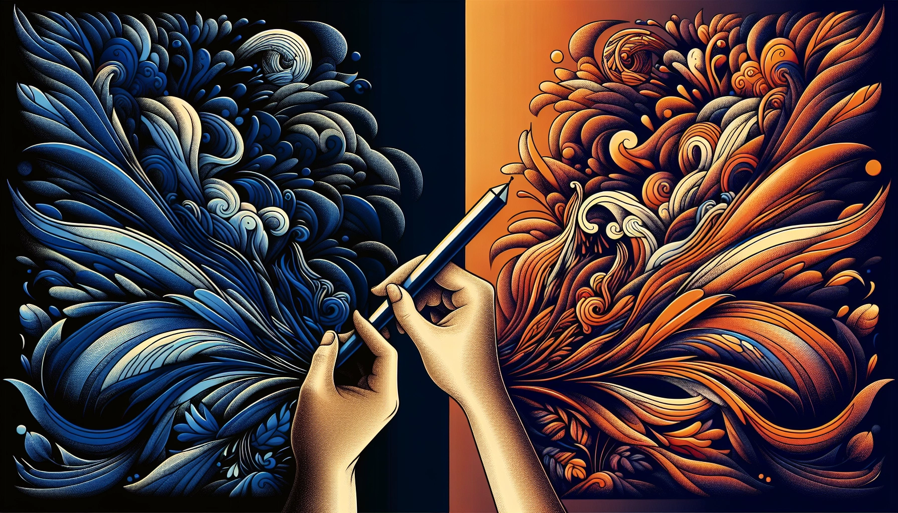
5 Ways to Balance Consistency and Creativity
Consistency and creativity don’t cancel each other out. They coexist when a brand sets up rules that are strict enough to be recognized but flexible enough to evolve. These five approaches help designers maintain brand identity without repeating the same visual formula every time.
1. Choose Core Elements Wisely
Not every part of a brand needs to be locked in. Prioritize a few essential elements—like the logo, primary color, and tone of voice. These act as anchors.
“Think of it like a band: keep the lead singer and the sound, but remix the rest.”
Leave other components more flexible. For example, icon styles, secondary fonts, or illustration patterns can shift depending on the project or channel. This creates space for variation without losing recognition.
2. Refresh Periodically
Designs that remain unchanged for years can start to feel invisible. Updating small details every 6–12 months can keep a brand current without requiring a full rebrand.
This might include adjusting color shades, modernizing typography, or evolving visual metaphors. These changes are usually subtle enough to maintain recognition but noticeable enough to feel fresh.
On Apr 16, 2025, most brands are still using versioned updates rather than sudden overhauls. It’s not reinvention—it’s maintenance.
3. Experiment in Small Doses
Creative testing doesn’t require breaking the brand. Use limited campaigns, microsites, or seasonal assets to trial new ideas. These are separate enough from core brand touchpoints to allow freedom, but still connected enough to offer useful feedback.
“It’s like sneaking a new dish onto the menu. If nobody complains at brunch, maybe it’s worth keeping.”
Track how audiences respond. If something works, it can be slowly integrated into the broader system. If it doesn’t, it fades without consequence.
4. Collaborate with Other Experts
Bringing in other designers, illustrators, or copywriters can introduce new styles while preserving the brand’s voice. Outside perspectives often highlight gaps or opportunities that internal teams overlook.
Collaboration also reduces the risk of creative stagnation. A second or third voice can push ideas further while still respecting the established brand framework.
This is especially useful on platforms like Contra, where freelancers often team up on multi-skill projects—branding, motion, copy, product—without losing alignment.
5. Use Guidelines for Adaptation
Style guides don’t have to be rulebooks. Flexible guidelines define what’s permanent, what can shift, and what’s open to experimentation.
Some brand systems now include “adaptive zones” that allow for regional, seasonal, or campaign-based changes. These aren’t random—they’re structured options with documented use cases.
For example, a brand might allow a holiday color variation or alternate typography system for international markets. The identity stays intact, but the execution adapts.
Overcoming Common Roadblocks
Even with clear style guides, consistency across branding projects often breaks down in real-world situations. On Apr 16, 2025, the most common issues still include mismatched visuals, outdated assets, and collaborators interpreting the brand voice differently. These problems usually show up when teams grow, shift, or scale quickly.
In freelance work, especially when collaborating with other creatives or clients who’ve worked with multiple designers before, visual inconsistencies stack up. Logos arrive in the wrong format. Colors are slightly off. Fonts get substituted. Each detail might seem small, but over time, they create a fragmented brand impression.
“If your font choices start multiplying like rabbits 🐇, it’s time for a reset.”
Onboarding is another friction point. When new freelancers or team members join a project without a clear understanding of what is fixed and what is flexible, they either guess—or hesitate to design anything at all. The result is either chaotic or painfully slow.
1. Maintain a Central Asset Library
A central asset library stores all official brand elements in one place. This includes logos (in all approved formats), exact hex codes for brand colors, font files, icon sets, templates, and style references. Without a centralized library, team members often pull old versions from saved folders, previous emails, or screenshots.
Asset libraries reduce the number of file requests and eliminate guesswork. When consistently maintained, they ensure every designer, writer, or developer is working from the same foundation. This helps keep brand visuals aligned across deliverables — from microsites to pitch decks.
Cloud-based libraries are preferred, especially when working with remote teams or rotating freelancers. They allow updates to be rolled out in real time and prevent outdated assets from circulating.
2. Provide Clear Onboarding
A structured onboarding process gives new collaborators a baseline understanding of how the brand operates. This includes quick-start documentation, annotated examples, and access to the brand’s style guide. It does not need to be long — just clear.
Templates and “do/don’t” comparisons are especially effective for onboarding visual designers. For writers or strategists, providing sample copy with tone annotations can help establish voice consistency early.
“A 10-slide walkthrough beats a 100-page PDF no one opens.”
Onboarding also creates space to highlight which parts of the brand are fixed and which are flexible. This avoids overcorrection — where someone follows the rules so rigidly that the work loses energy or adaptability.
FAQs about Brand Designer Style Consistency
How do you measure brand consistency?
Brand consistency can be measured using internal audits, style checks, and asset comparison tools. A common method is a brand audit, which reviews whether logos, colors, fonts, and voice are used the same way across every platform — from social posts to product packaging.
Some teams use checklists or scoring systems to track alignment with their brand guide. Others rely on AI-powered platforms that flag off-brand visuals or typography. Designers often do quick visual tests by placing deliverables side-by-side to scan for inconsistencies.
“It’s like playing spot-the-difference, but with logos and tone of voice instead of cartoon ducks.”
Analytics tools can also measure recall and recognition. For example, tracking how quickly users identify a brand in A/B tests or using eye-tracking in UX studies can reveal how effectively brand elements are working together.
Is consistent branding different for personal brands?
Personal brands follow the same consistency logic as business brands, but with fewer constraints. The same elements—like color palettes, typography, and tone—still create recognition. However, personal brands typically evolve faster and reflect the individual’s personality more directly.
Changes in roles, platforms, or audience can shift a personal brand’s style without harming trust. For example, a designer might switch from minimalist black-and-white visuals to a more playful, colorful aesthetic as their niche changes. This shift works as long as the underlying identity and values remain clear.
Visual consistency in personal brands often focuses on profile images, post templates, and tone in captions or bios. Tonal consistency is usually tied to how a person writes, speaks, or shows up in video—less scripted, more conversational.
When does it make sense to break the rules?
Breaking brand rules is often intentional during major campaigns, rebrands, or one-time events. This can include launching a new product, entering a new market, or celebrating an anniversary.
In these cases, designers might introduce alternate color schemes, new visual motifs, or different content formats. The idea is to draw attention or mark a shift without confusing the audience about who the brand is.
“If your brand’s birthday party looks exactly like every normal Tuesday, it’s probably not a party.” 🎉
Localized campaigns also occasionally require breaking or bending global brand guidelines. For example, changing color usage or imagery to align with cultural expectations. These changes are usually documented as exceptions and not considered permanent.
Where Does This Lead Us Next?
As of April 16, 2025, consistency continues to be a valuable part of the brand designer’s toolkit—but not without friction. Most strong brand systems are built around a small group of fixed elements and a wider set of flexible components. This allows for recognition without total repetition.
Designers working with rigid guidelines often report slower creative cycles and fewer opportunities to test new ideas. On the other hand, brands that loosen too many rules risk losing their core identity. Neither extreme works on its own.
“If everything looks the same, people stop seeing it. If nothing looks the same, people don’t know what they’re looking at.”
A balanced approach uses clear, documented standards while leaving space for seasonal updates, platform-specific variations, and regional personalization. This doesn’t require a reinvention—it just means the system is designed to flex where it matters.
For freelancers, this balance is easier to manage when working independently or in small teams. Fewer approval layers, direct communication with clients, and flexible timelines often make it possible to maintain consistency without locking creativity out of the process.
On platforms like Contra, where freelancers keep full control of their work and earnings, it becomes more realistic to build long-term brand systems that evolve with each client—without sacrificing visual alignment or creative momentum.
Like this project
Posted Apr 20, 2025
Brand Designer Style Consistency: Good Sign or Limitation? Learn how consistency impacts creativity, trust, and recognition in brand design.