
Visual identity system and digital design guidelines created for a specialized QA engineering community.


Hot Testing visual identity summary
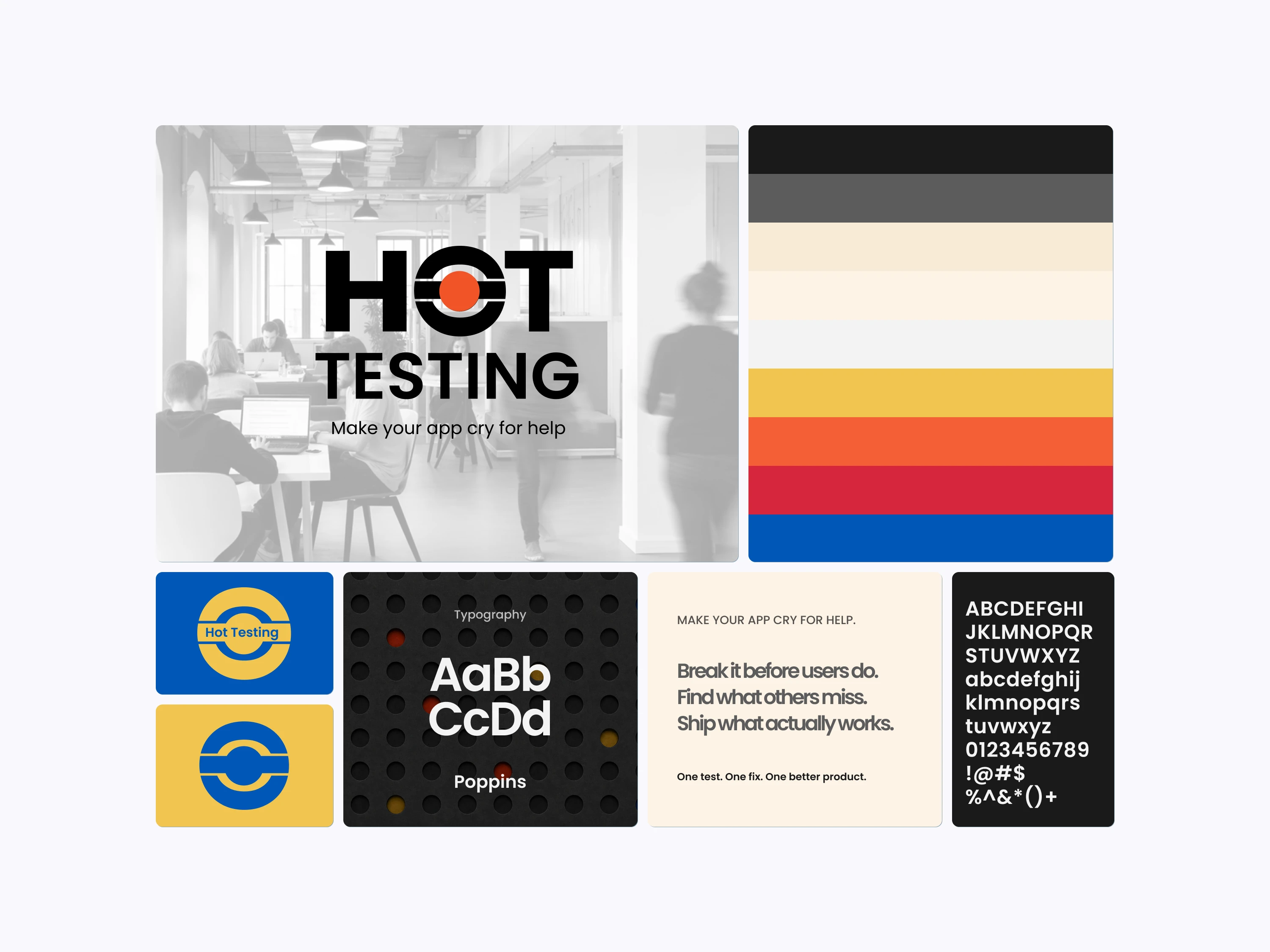
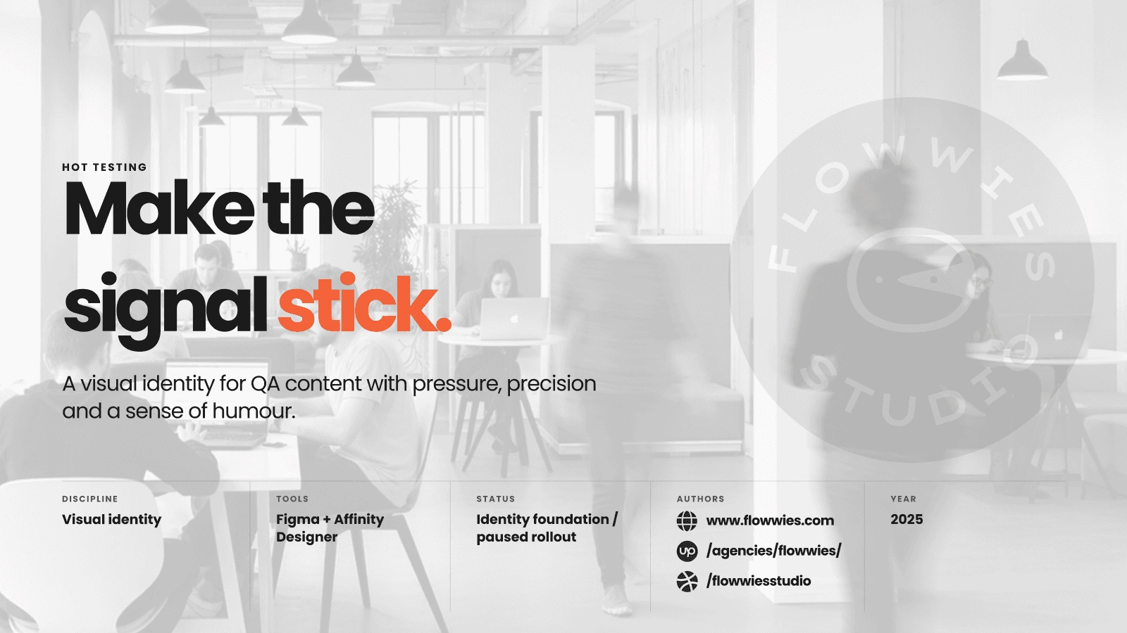
Hot Testing is a personal-brand identity for software-testing content and community. The brief was to make a technical subject memorable without sacrificing the clarity and trust expected from QA communication.
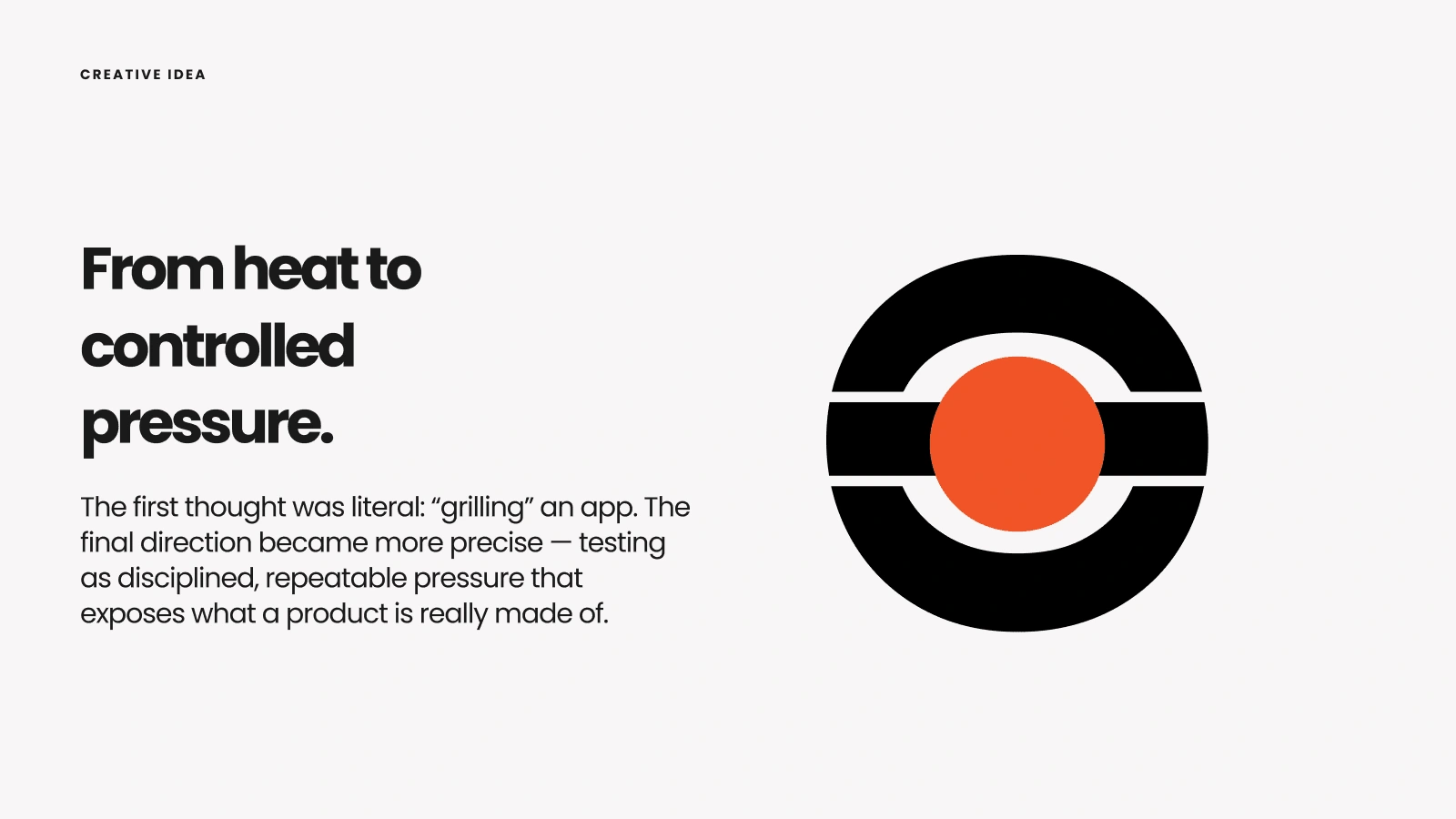
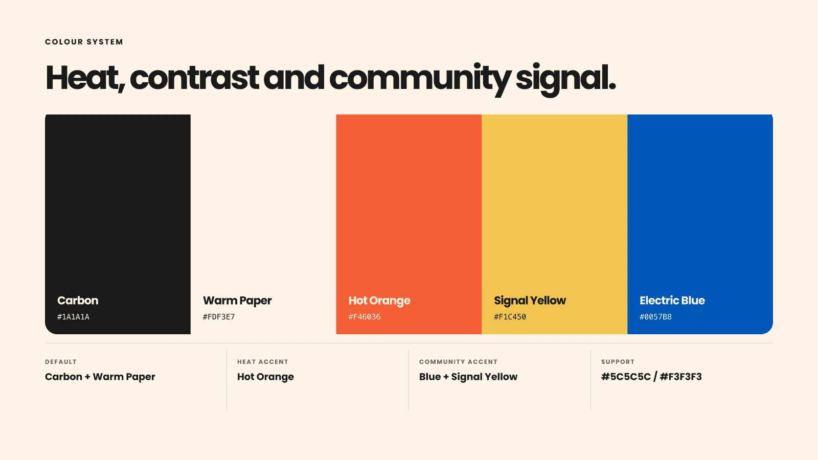
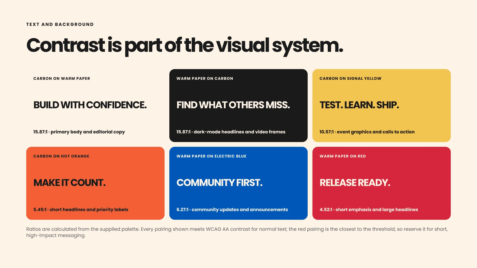
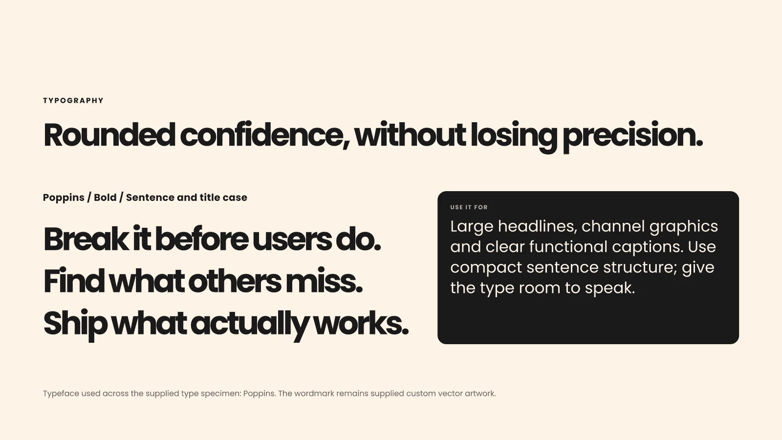
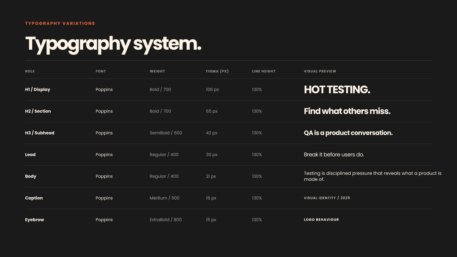
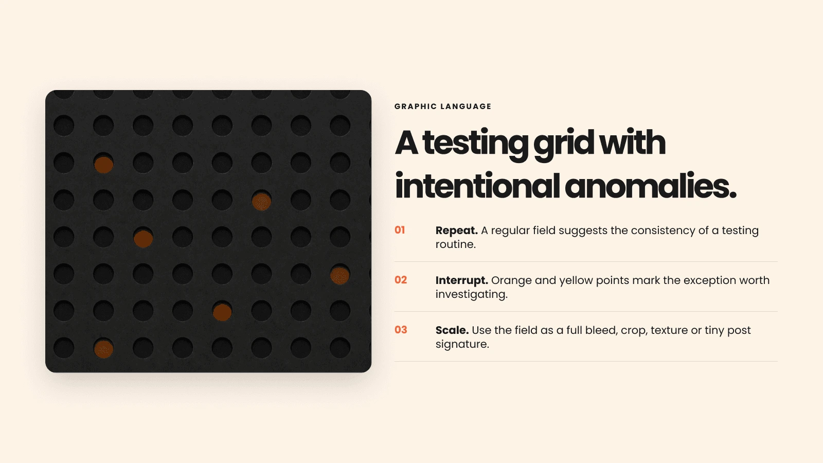
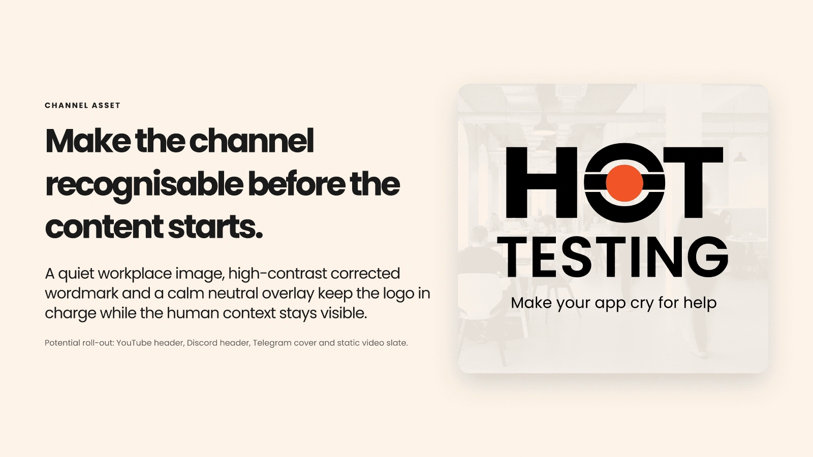
The visual concept uses controlled pressure: the letter O becomes a focused point, the palette combines heat with high contrast, rounded Poppins typography balances confidence with precision, and a testing-inspired grid introduces intentional anomalies.
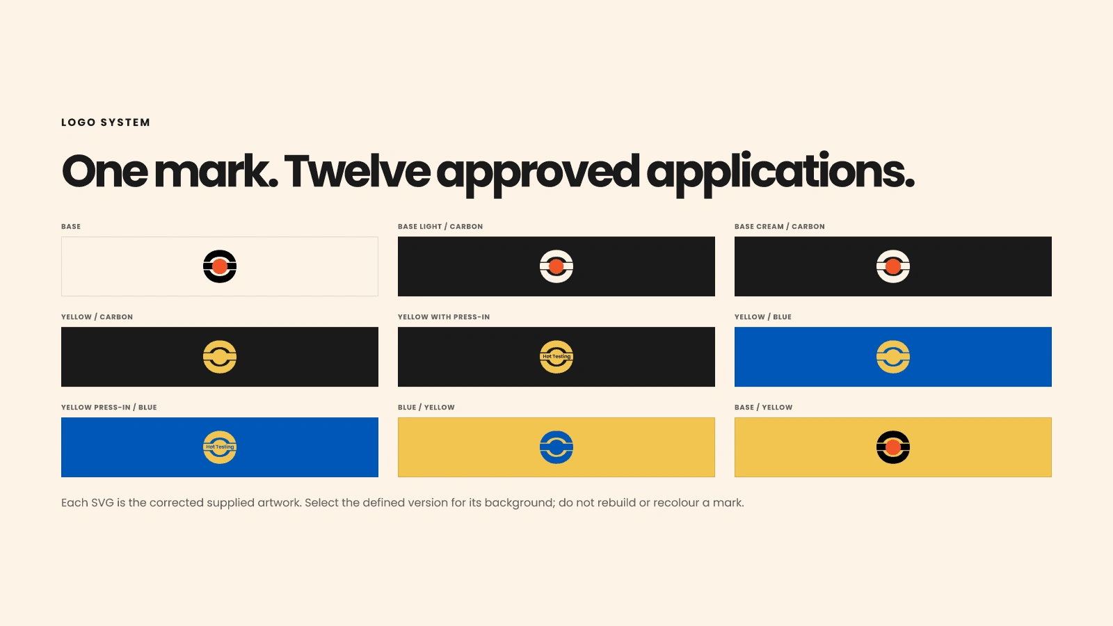
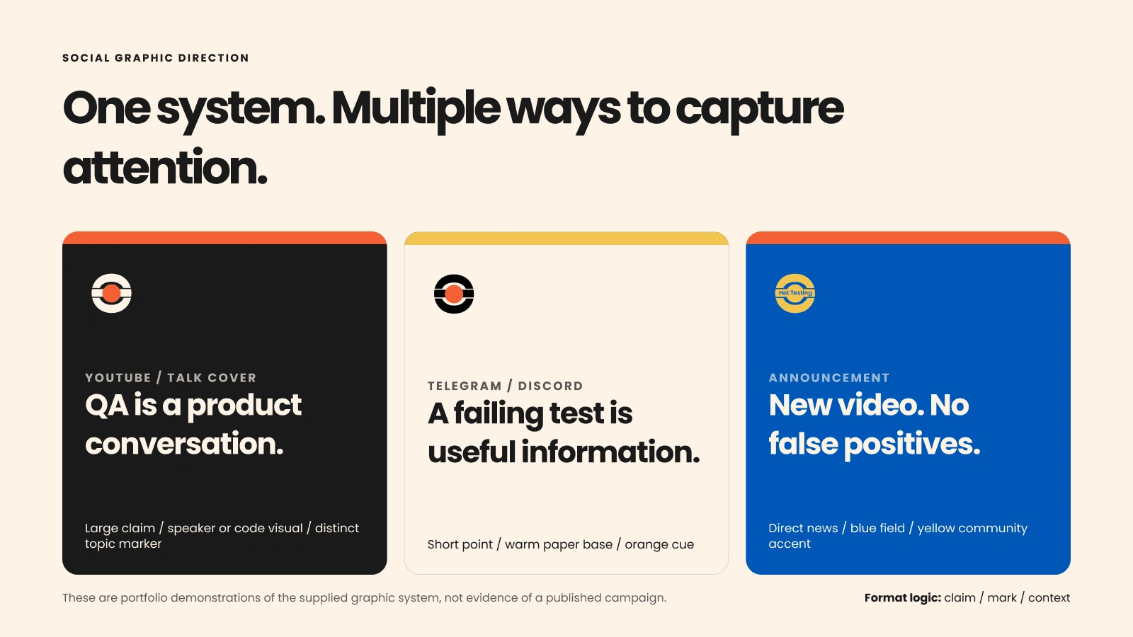
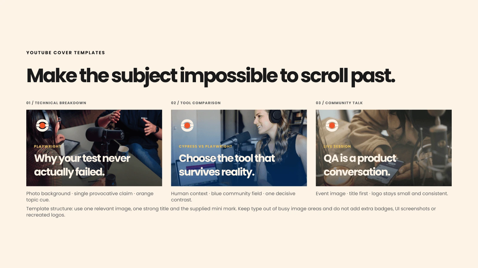
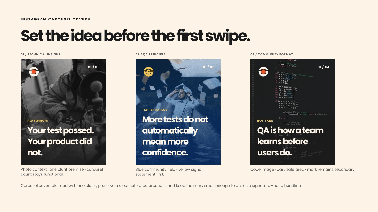
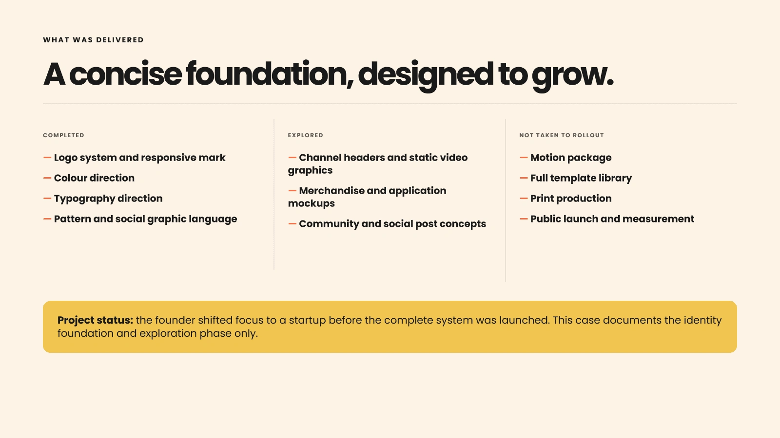
The system includes primary and compact marks, approved color applications, typography, social and carousel covers, channel graphics, and practical mockups. The identity foundation was completed, while the public rollout was paused; no launch or performance results are claimed.
1 like · 2 views · Nov 22, 2026
Created a visual identity system for a QA community, including logo, color and typography systems, social graphics, and practical mockups.


