Data Storytelling: History of Engineering Faculty

Ava DeCroix
Overview: As part of my 'Blueprint for Modernity' coursework, I conducted an original research project to contribute to work on the history of engineering.
❓THE RESEARCH QUESTION
What can we learn about the world of the early engineering faculty at Cornell?
🛠 THE PROCESS:
Identified historical source data from The Cornellian, Cornell's yearbook, from 1875-1915
Converted documents to usable text data
Cleaned the data for usability and relevancy using R/RStudio
Visualized the data in 5 multi-panel visualizations using ggplotly
Analyzed the data with historical context
Presented the findings in a 30-page final research report
📜 THE DATA
I found my primary source data on the online HathiTrust digital library. Its original format was scanned document pages, which I downloaded and converted to text files after isolating the lists of faculty.
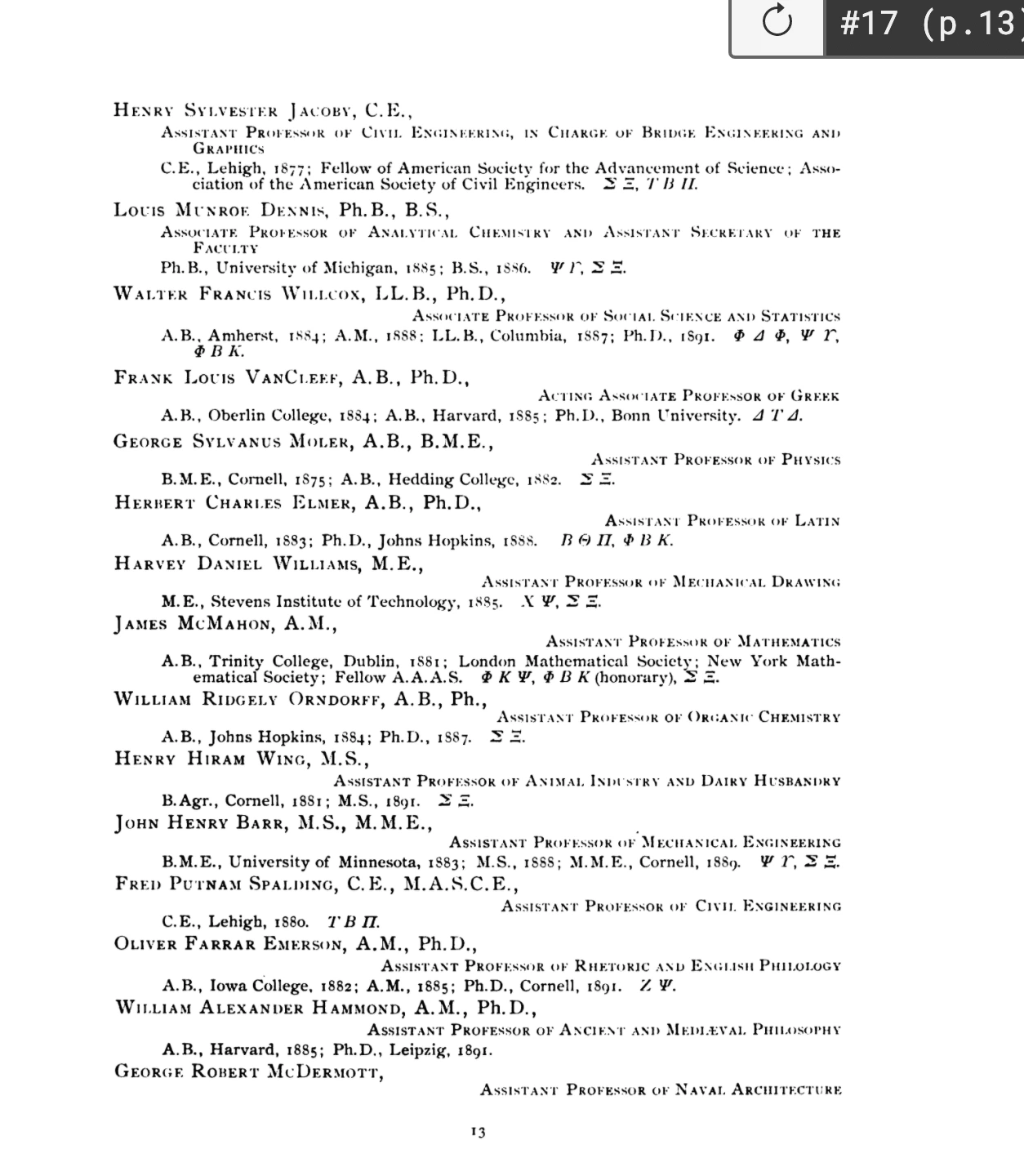
Original data, 1895
Using R, I cleaned these text files and merged them into a usable, formatted database.
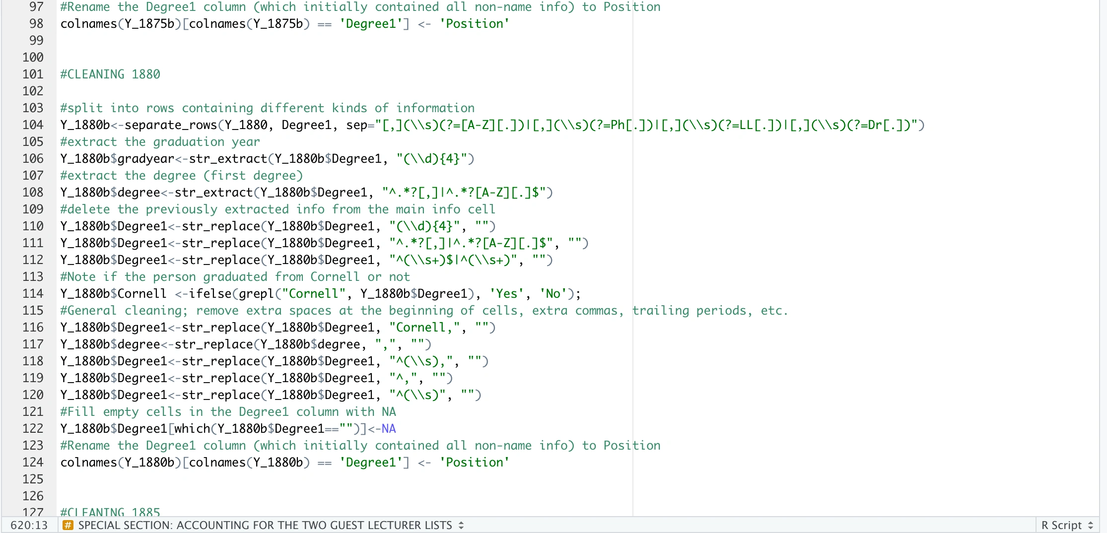
A snapshot of some of the cleaning code
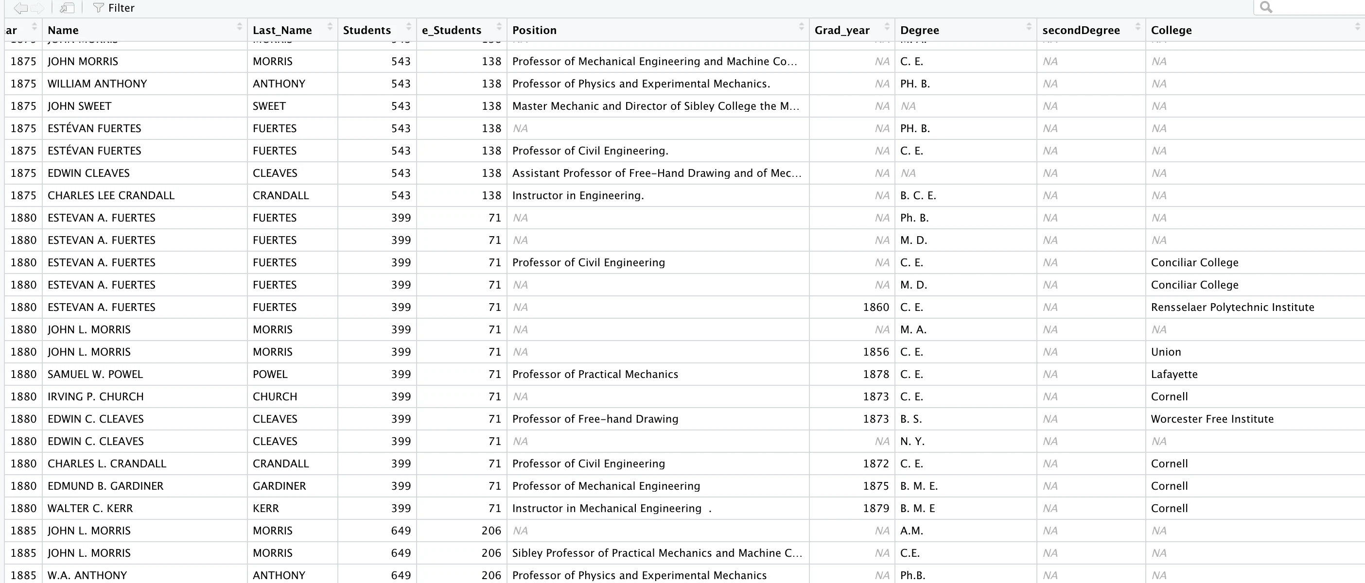
Part of the cleaned consolidated database
📊 THE VISUALIZATION
Using my newly cleaned database, I was able to create 5 multi-panel interactive visualizations providing insight into the world of the early engineering faculty at Cornell, including student-to-faculty ratio, turnover, distribution of specializations, alumni professors, and more. A few examples are shown below:
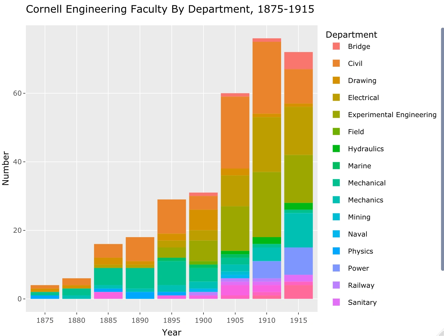
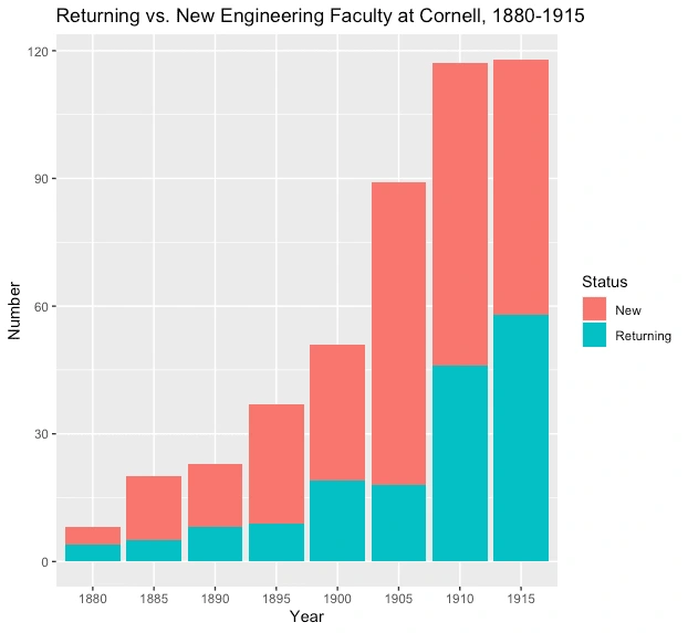
The final report included an appendix containing these visualizations, a discussion of the insights from each, and full historical context to enrich the understanding of the visualizations.
Project Paper:
https://docs.google.com/document/d/1VeCJ9SyYGshH8Hd3awvHPzA61GgTC7N8lF5aJxbPOIA/edit
Like this project
Posted Dec 29, 2021
Making history come alive through data and uncovering hidden trends in early engineering at the collegiate level
Likes
0
Views
36


UX Research & Design: Spanky's Web Application
Smoker Craft, Inc. Design Research Project

Visual design: Playbill Reimagined

UX Improvement: Higher Ed