UX Research & Design: Spanky's Web Application
Overview 🔎
In a team of 3 developers, I partnered with Spanky's, an on-campus, student-run restaurant at the University of Notre Dame, to streamline their ordering process and increase customer satisfaction.

O'Neill Family Hall, home of Spanky's
Problem & Solution 🤝
The question:
How can we make ordering from Spanky's a stress-free, efficient process for both customers and employees?
The goals/requirements: In order to answer this question, we needed to...
• Talk to our users, both employees and customers, to find current pain points and opportunity areas
• Create wireframes, concept designs, and style guides to design an intuitive, simple, and secure website
• Build a website using React.js/Node.js and PlanetScale to bring our design ideas to life in a fully functional web application
Process 🛣
Phase 1: Research
We began by conducting user research with the current employees of Spanky's, to discover what would make their jobs easier and more manageable. We came away with three main takeaways:
The current method of keeping track of orders (manually entering each into an Excel sheet) was labor-intensive and led to many mistakes
There was no formal way to keep track of inventory, which led to many order cancellations due to inventory shortages
Once an order was ready, employees had to go physically find the customer to let them know their order was ready
Similarly, we conducted user research with current customers of Spanky's, to determine their pain points and desires. We came away with three additional takeaways:
Customers disliked having to physically go to the Spanky's location to place their order
Some students avoided ordering entirely because they did not want to waste time waiting until their food was ready
No one was clear on what the Spanky's menu was, and what food was available when
Phase 2: Design
Taking these insights from our research, we began working on designing the website. We brainstormed various concepts with low fidelity sketches. Our early drafts included two separate applications, one for customers and one for employees, but through iteration and user feedback we decided to combine the two into one for simplicity.
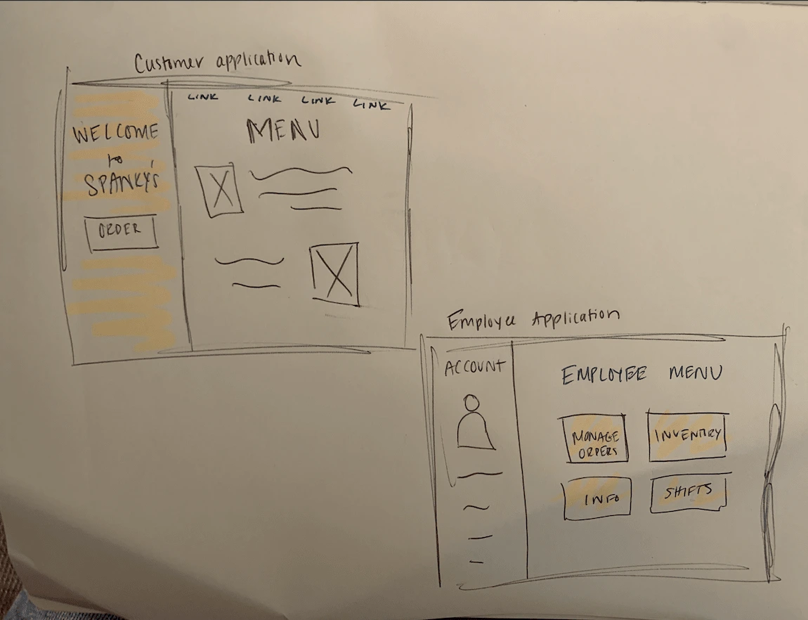
Early sketch of 2-application concept
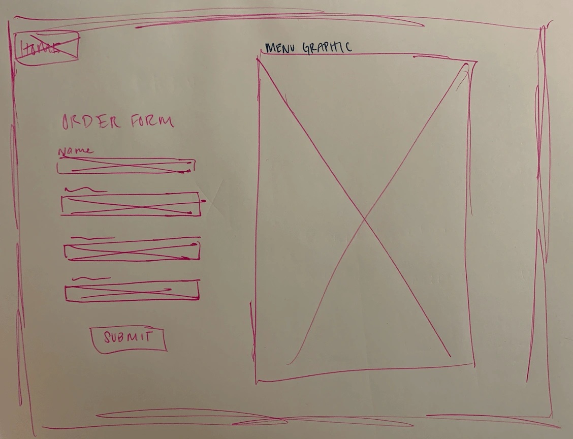
Sketch of order form page
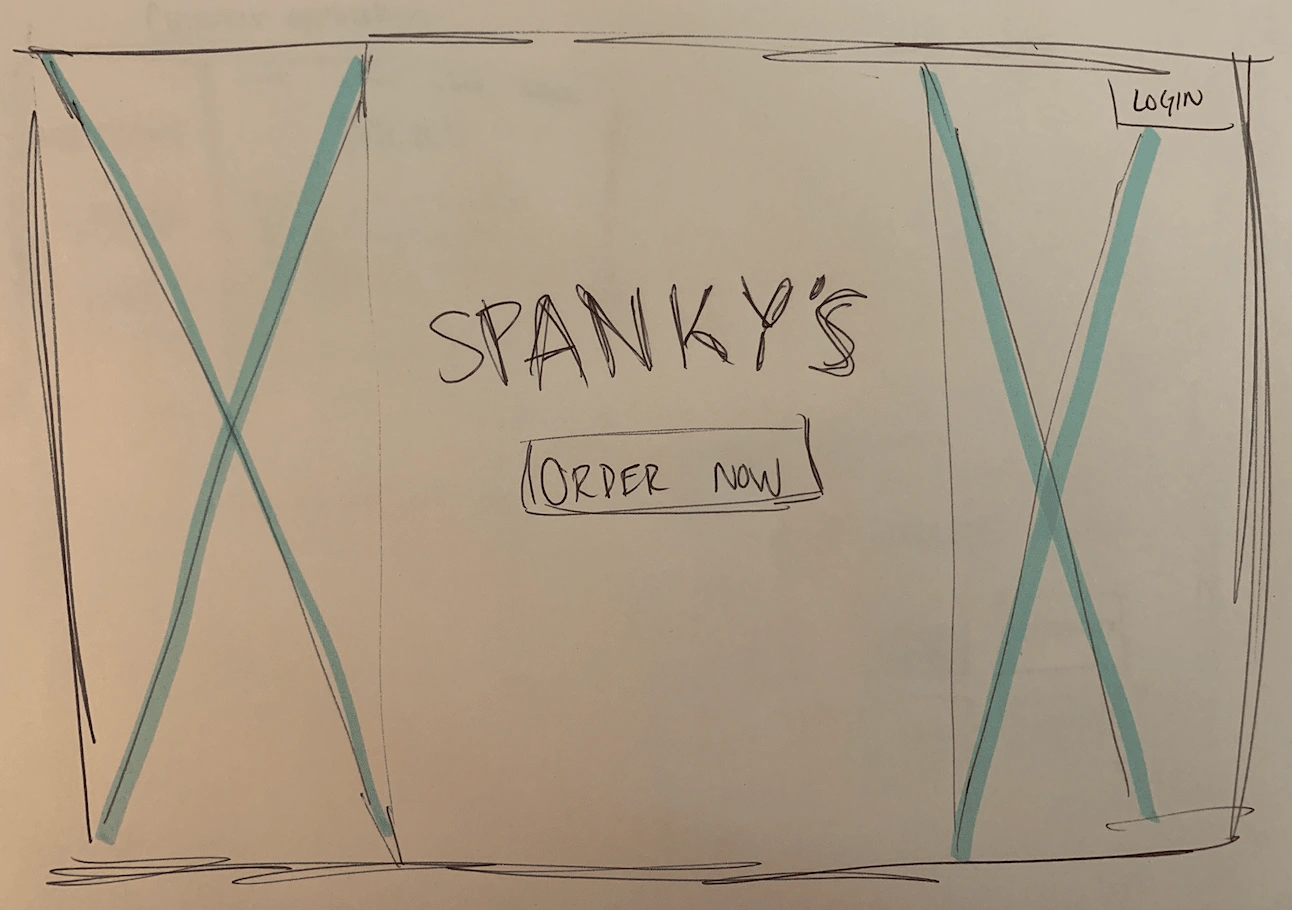
Early landing page concept
After rapidly generating these concepts, we discussed as a team and decided to move forward with a general site layout focused on the user's role. We designed the site to lead towards two different flows: one for employees, and one for customers. We built a fully interactive prototype in Figma to test our design and layout.
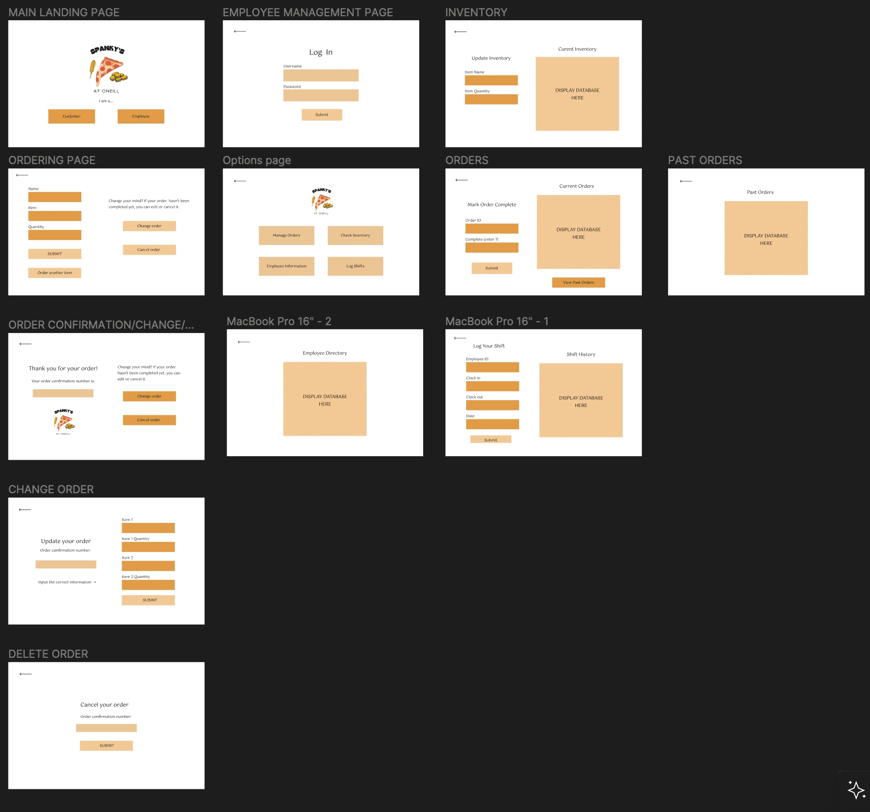
Figma prototype
Phase 3: Engineering
After testing our prototype with users and gather feedback, we took our design concept and used React.js and Node.js to build a fully functional web application. We kept the idea of customer and employee flows, and kept the UI simple and clean. We were given a color palette and a logo graphic to work with, and we implemented these into the website so that everything adhered to a consistent style guide. In order to address the issue of wait times, we implemented Google OAuth 2.0 authentication to send order confirmation receipts and notify customers when their orders were ready.
Note: not all pages shown below
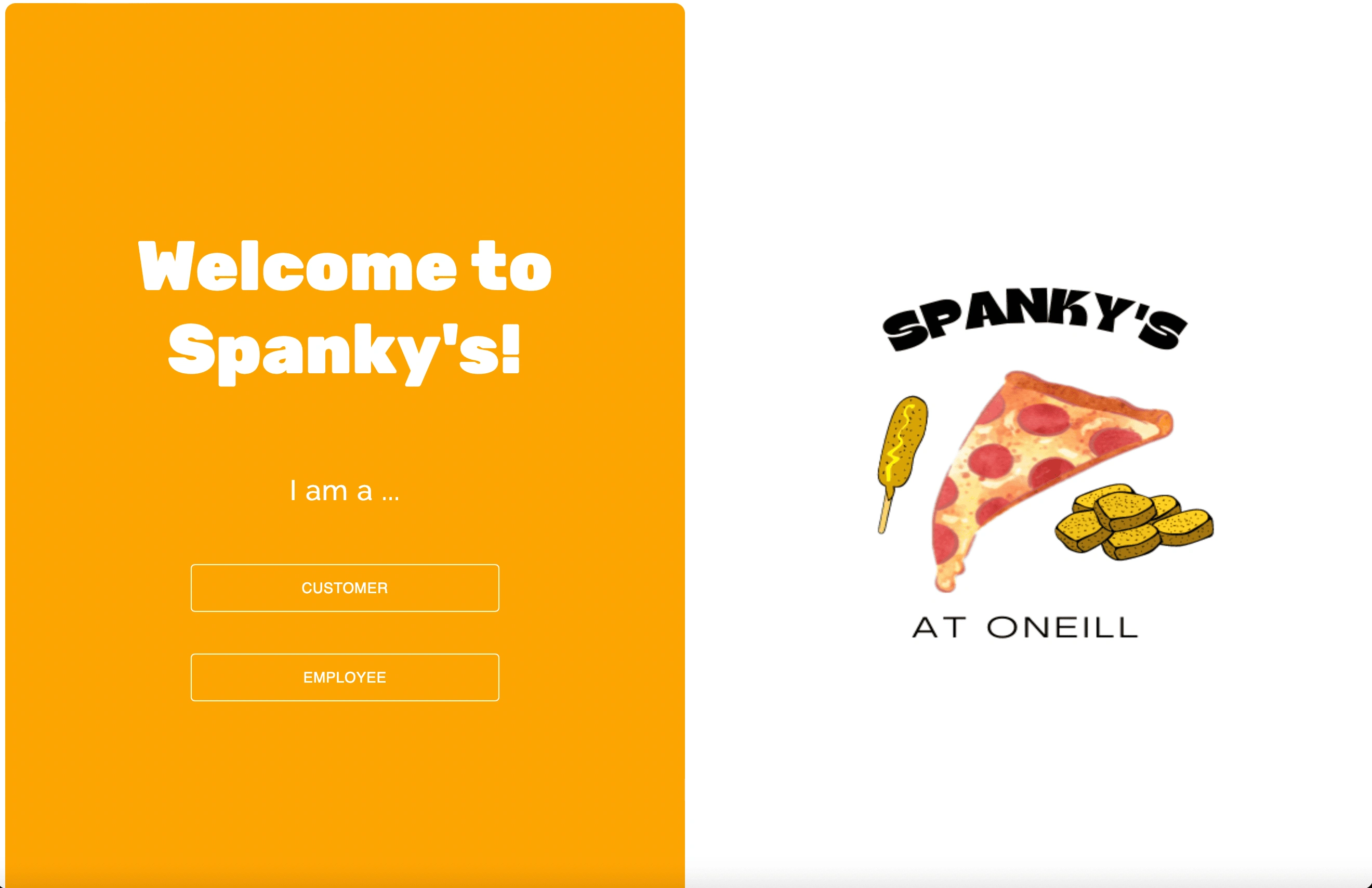
Landing page
We added a menu to reflect Spanky's current offerings. The customer will receive a confirmation notification with their order details, as well as an estimated wait time for their food based on current order queue.
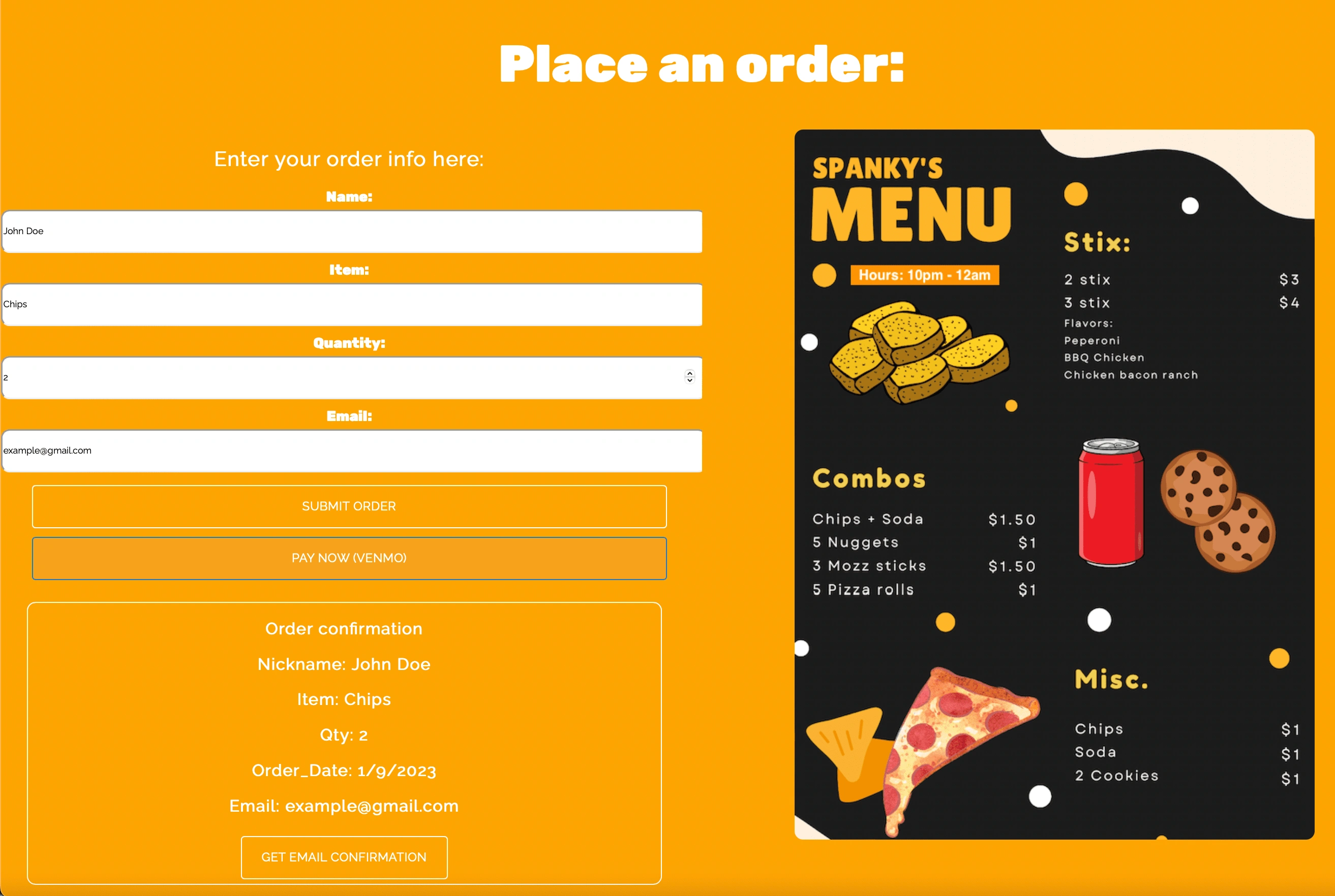
Ordering page (image cropped for format here)
Once an order is processed, it appears in the employee-only order queue page. Once an order has been completed, an employee can simply click the "Mark complete" button, which will automatically clear the order from the queue and send the customer an email letting them know that their food is ready for pickup.
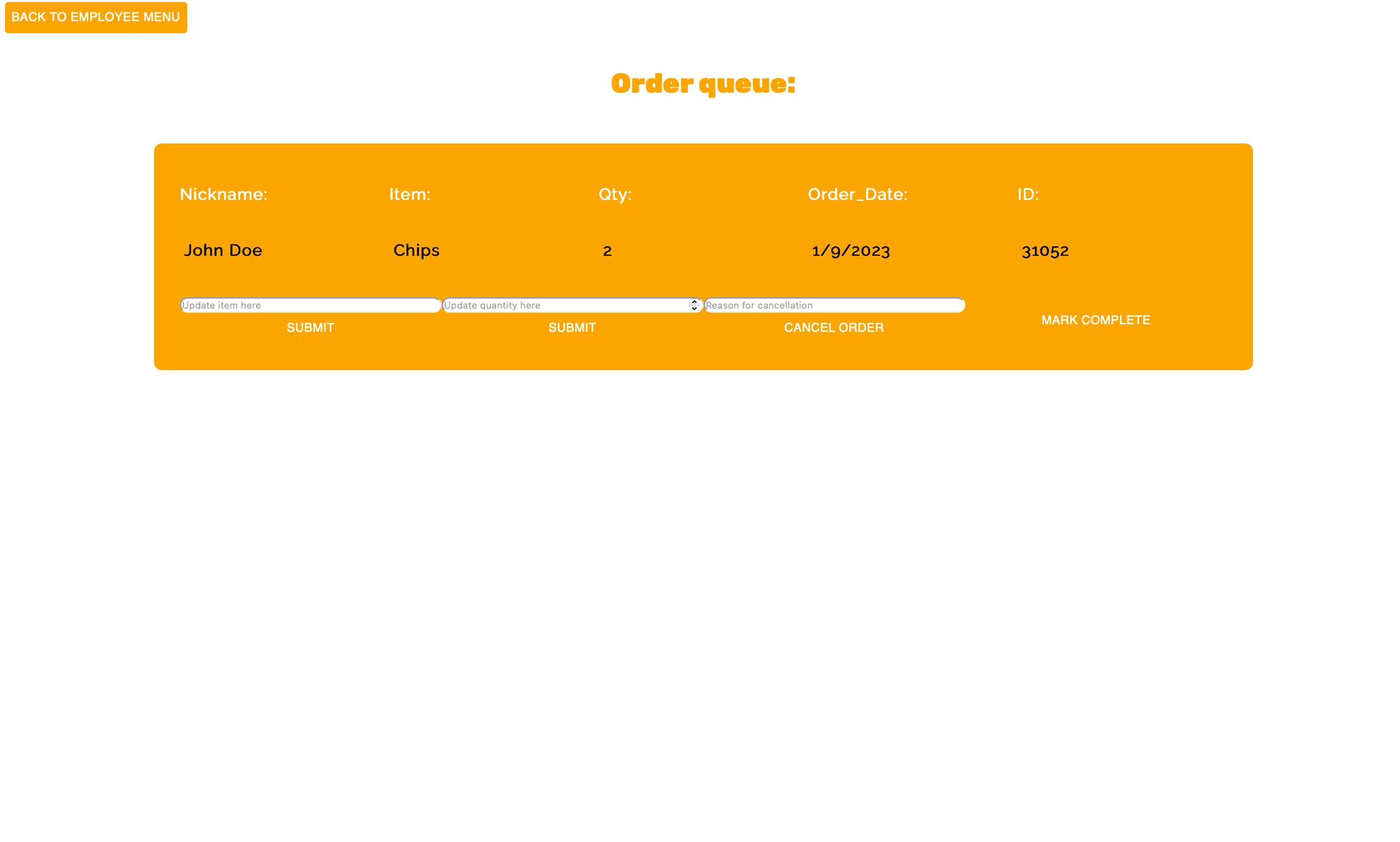
Employees can manage orders easily
Results 🎁
After adopting our application, Spanky's in-person wait time for orders reduced by 90%, and they saw a 20% increase in overall orders. Kitchen efficiency/order capacity was increased by 50%.
Takeaways 📣
Iterate early and often: generating a large number of low-fidelity prototypes and sketches helped us focus in on which elements were working and which needed a different approach
Talk to your users: don't assume you know what the best UX/UI will be for a given project - ask the people using it what they want and need
Consistency is key: using a consistent style guide (fonts, colors, graphics) helped our application look streamlined and creates a cohesive user experience
Like this project
Posted Jan 10, 2023
A custom solution for a student-run startup


