Bayt.com Job Search App Redesign
Overview
Bayt.com is the leading job site in the Middle East and North Africa, linking job seekers with employers. Thousands of jobs are posted daily from top regional employers.
I focused on improving user experience for job seekers, emphasizing easy navigation, clear job listings, and efficient application processes.
Problem
Main Screen
The first page is uninformative. It mainly consists of search input and advertising. There are no filters available on the first page.
Job card
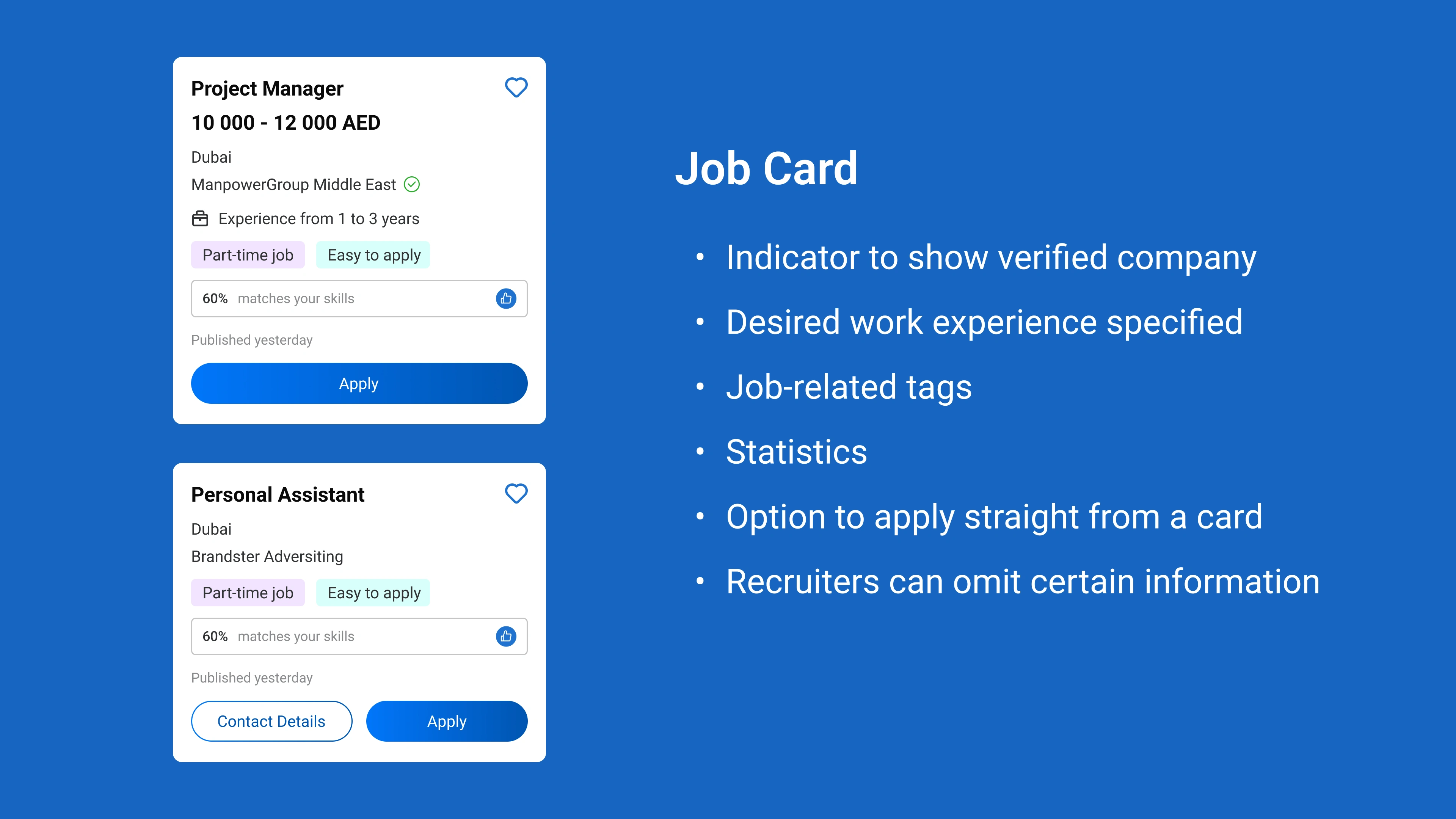
No tags or desired work experience specified.
No statistics indicate if my resume and work experience are suitable for this vacancy.
No button to submit a resume directly from the card.
No button to view the company's contact details directly from the card.
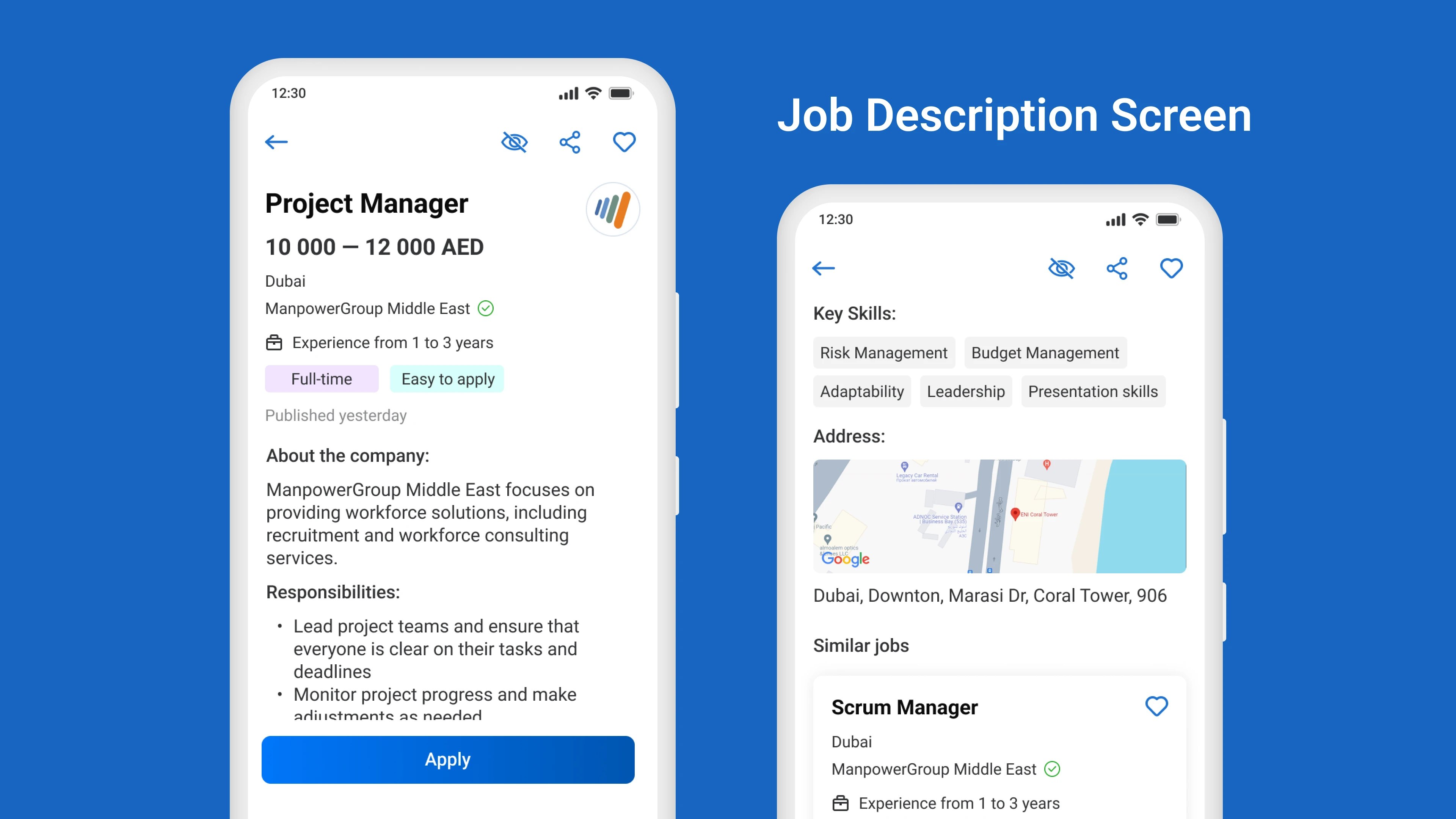
Job Description
No key skills tags are provided.
No address or map is mentioned.
No function for the company/employer to go through verification. Although there are many scammers, job seekers want to feel safe and not spend time on scammers.
The pages are overloaded. "Apply to similar jobs" and "People who applied to this job also applied" are the same things.
Job details are located at the very end of the page, which is not convenient.
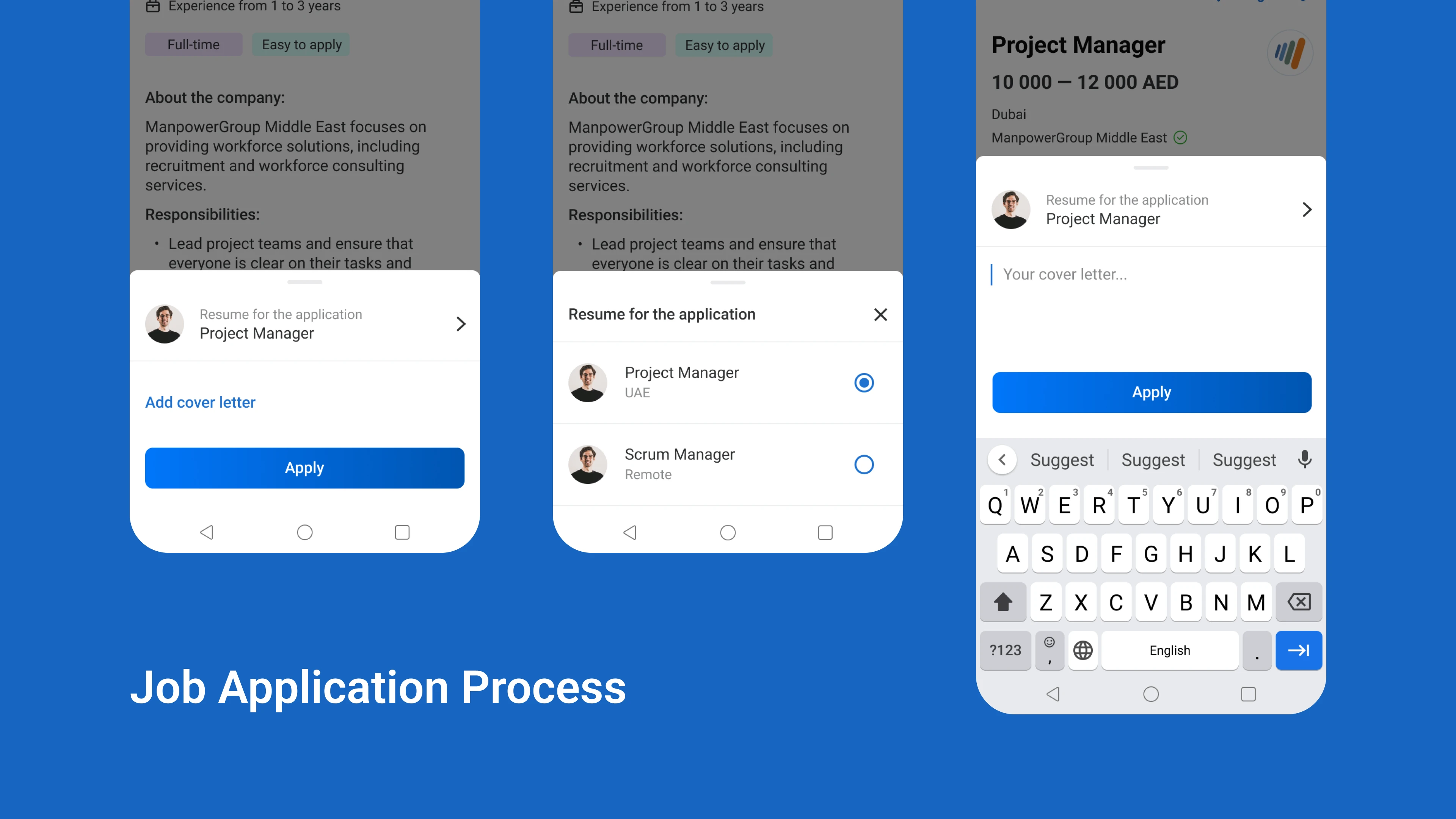
Apply to Job
Choosing the "easy-to-apply" option sends your resume immediately. However, users usually expect another question to verify the resume's relevance and prefer writing a cover letter before submitting the application.
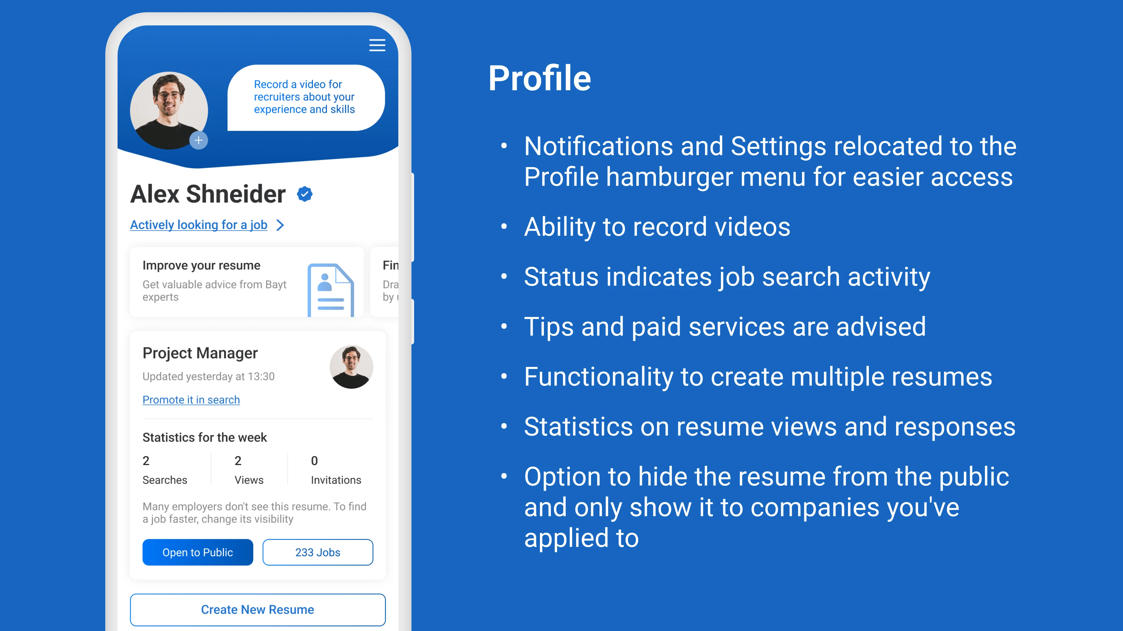
Profile
Users can't create multiple, tailored resumes for different jobs.
No tips or paid services are offered.
No statistics on resume views and responses.
No status to show if someone is actively job searching.
Process
User Research
I conducted a user survey to understand Bayt app users and identify areas for improvement. Key insights:
65% want to create multiple resumes, especially career changers and freelancers needing tailored resumes for different industries or projects.
Nearly everyone values features that provide feedback on how well their resume matches a job opening.
Job seekers prefer to apply directly from a job card to save time and effort.
Wireframes & Prototypes
I then created prototypes, enhancing the overall user journey based on the visual identity of Bayt.com.
Solution
I streamlined the app's interface and navigation to make it more intuitive. I simplified the job application process, added new features, and implemented clear and easily accessible menus.
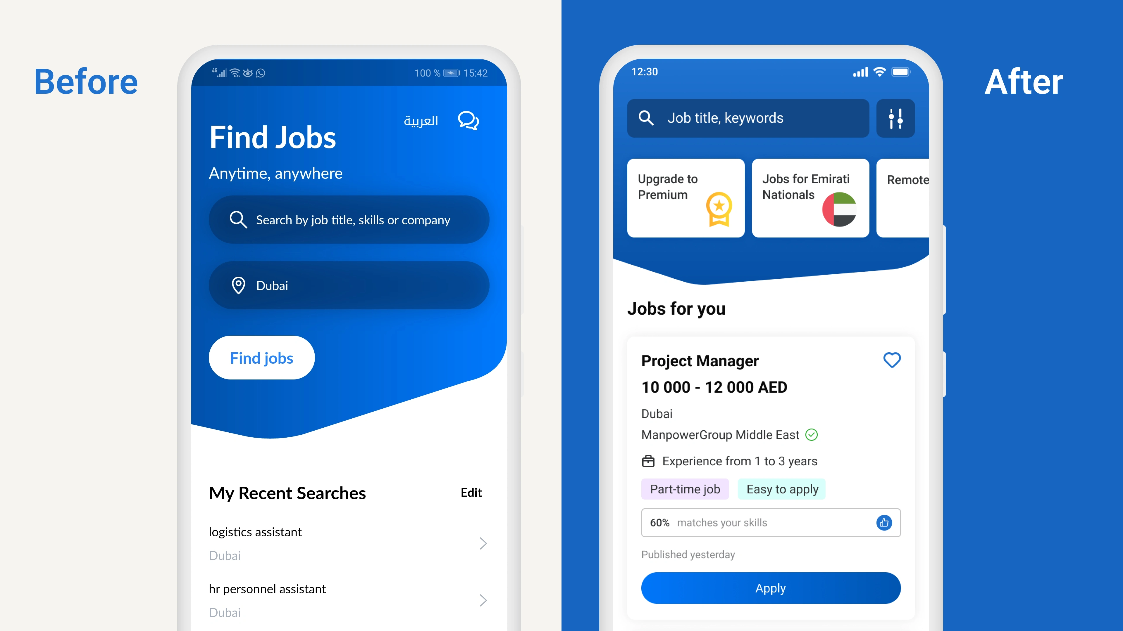
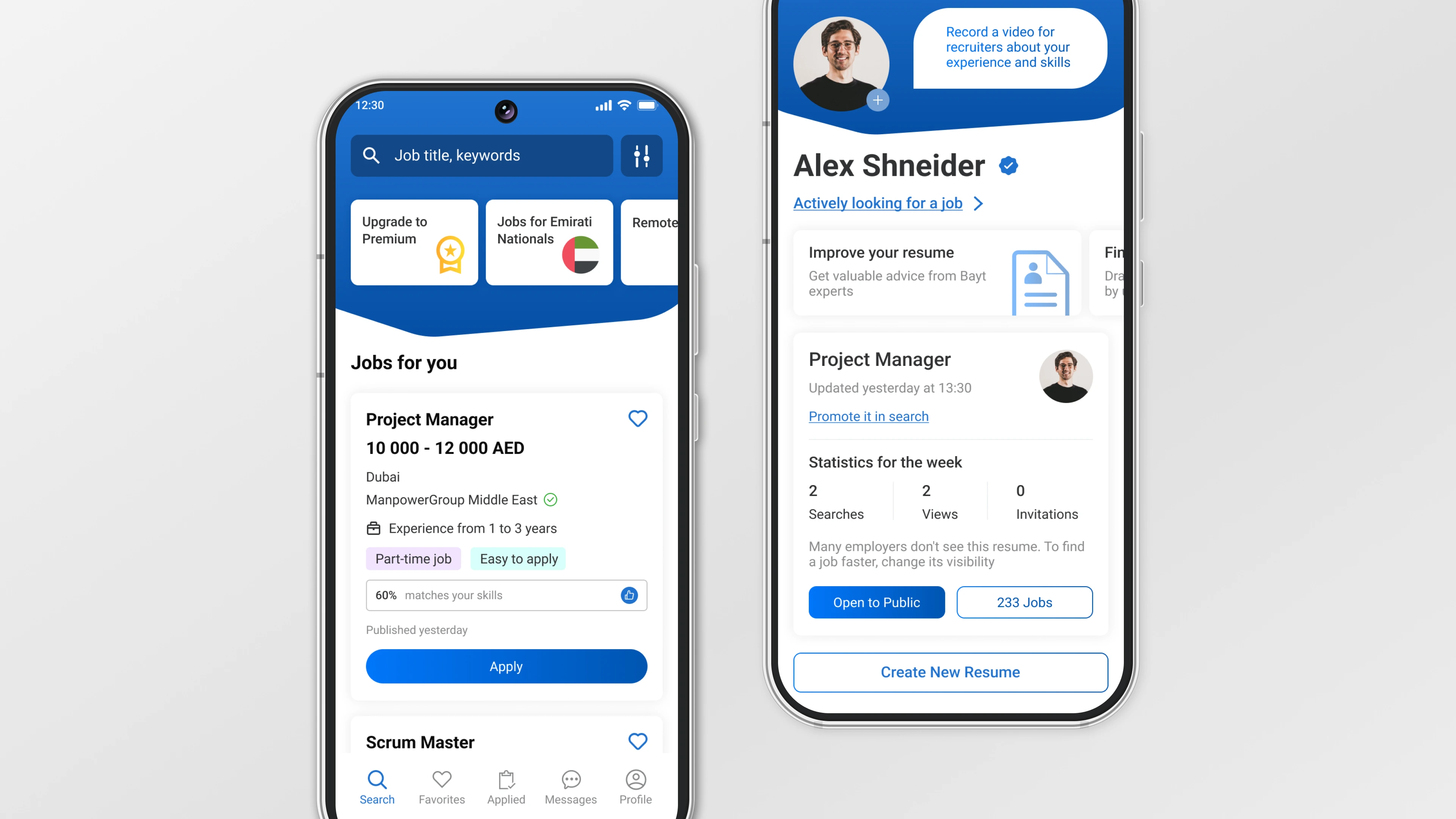
The main screen: Users can view relevant job listings instantly tailored to their preferences and past searches, presented in user-friendly job cards.

There are cards available for both advertising services and filter cards on the main screen. This allows users to find their desired category with just one click, without having to navigate to the filters.
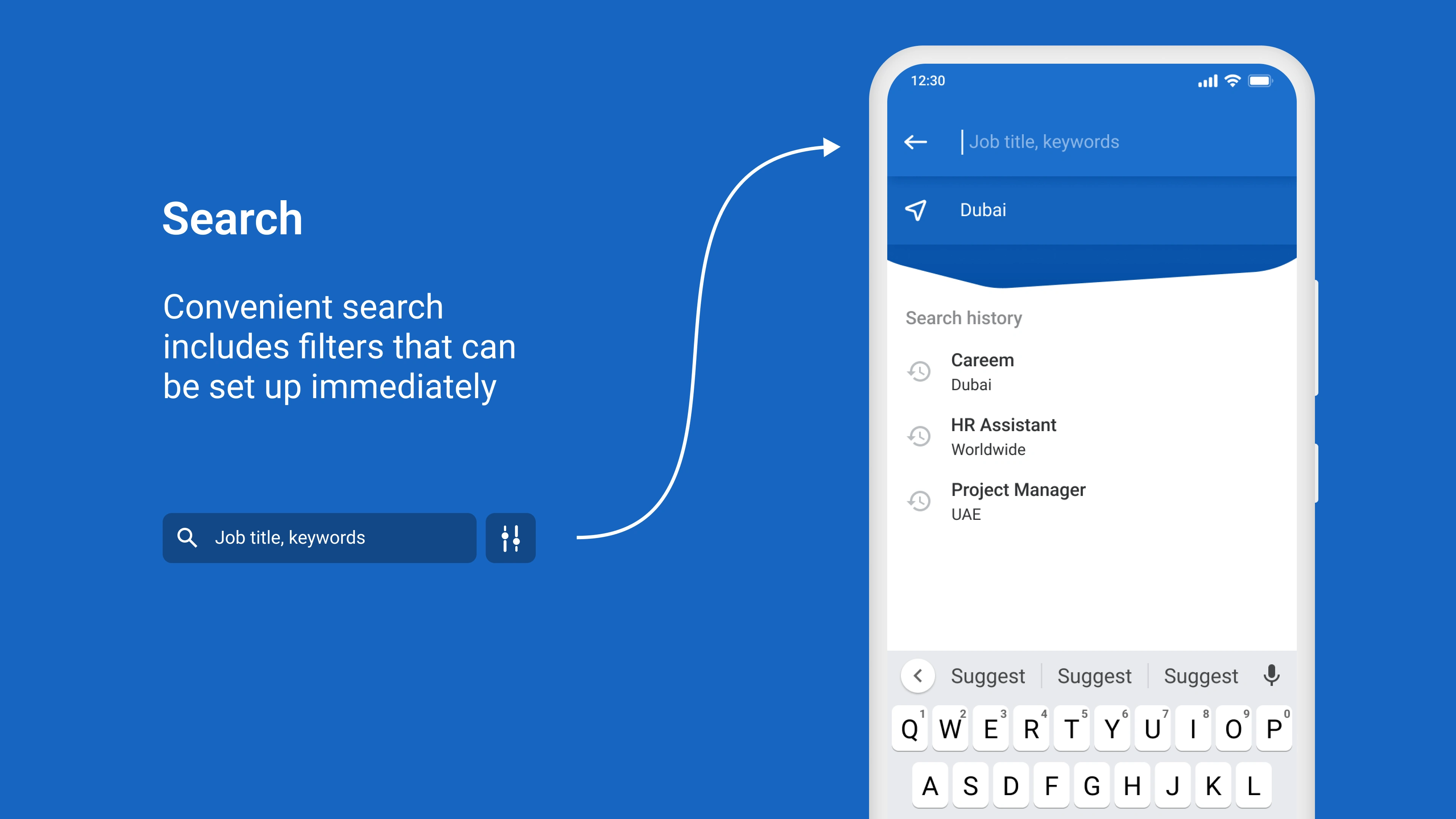
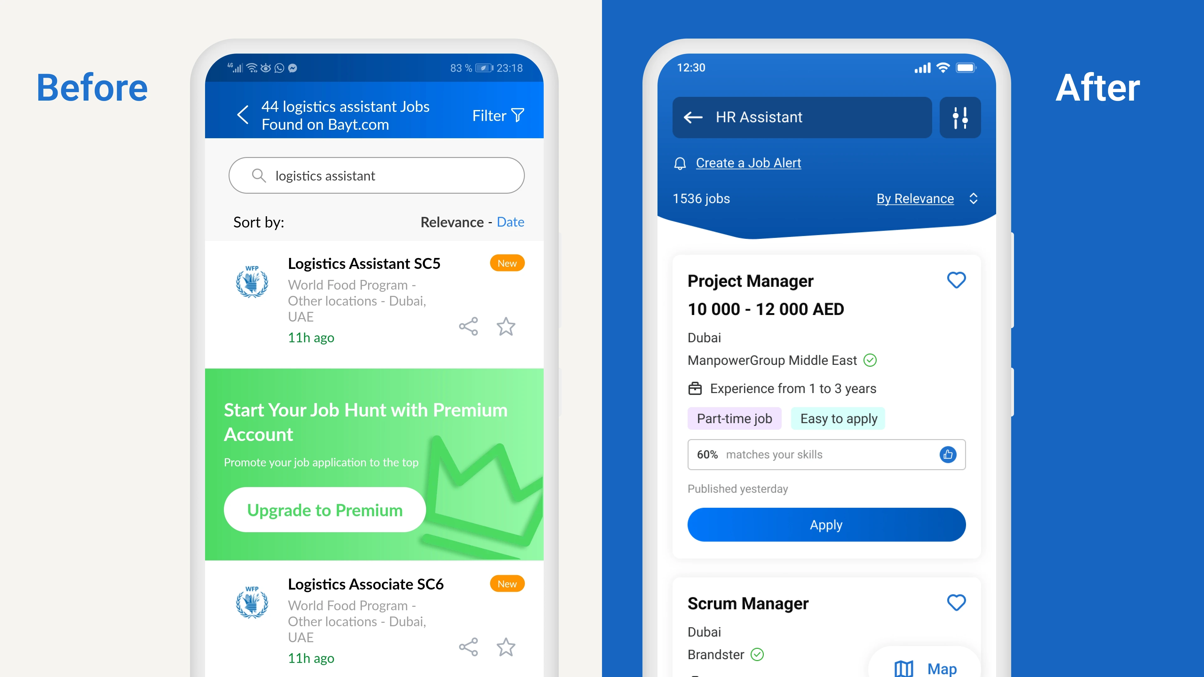
Job Search and Cards
Potential Outcomes and Opportunities from the Redesign
Enhanced User Experience
Improved usability and navigation could lead to higher user satisfaction and increased engagement (a goal to increase the average session duration by 10%).
A more intuitive and appealing design may attract new users and retain existing ones (aiming for a 20% increase in Daily Active Users and Retention rate).
Increased Conversions
Simplified and optimized application processes could lead to higher job application submission rates.
Enhanced onboarding experience may result in more account sign-ups and profile completions (objective - to increase profile completion rates by 30% and reduce the average time to complete a profile by 25%).
Better Market Position:
A successful redesign can position Bayt.com as a leading job search platform in the market.
Positive user experiences and reviews can enhance the brand's reputation and attract more users.
Like this project
Posted Aug 5, 2024
Creating a more user-friendly and visually appealing platform, emphasizing easy navigation, clear job listings, and efficient application processes
Likes
0
Views
10


