Careem DineOut Case Study
Overview
During my internship application at the design agency, I was assigned the task of designing three new crucial features for the Careem DineOut App. These features include Splitting the Bill, Choosing and Booking a Table, and the Loyalty Statistics screen. It was essential to ensure that all screens adhered to a consistent design language in line with Careem's branding. This case study provides an overview of my design process, key decisions, and the final results for each task.
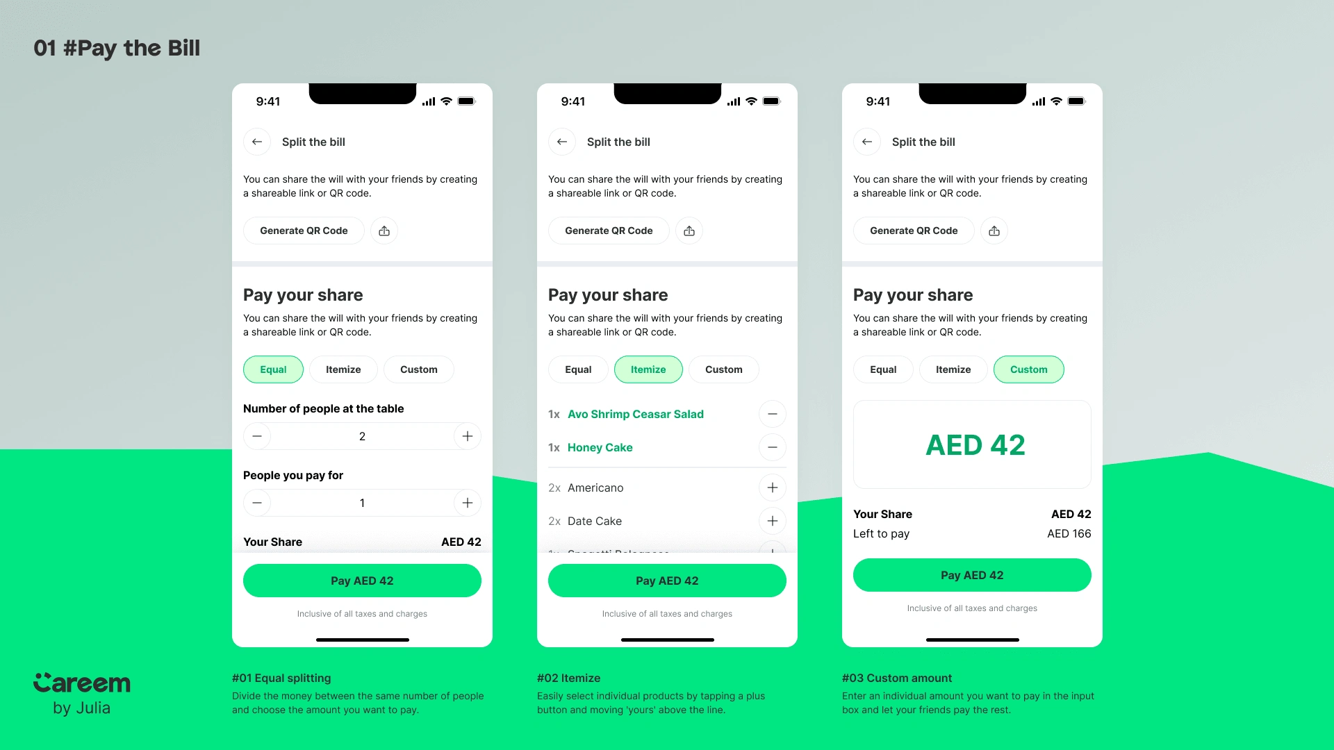
Task 1: Splitting the Bill
Objective:
Create an intuitive interface that allows users to accurately and easily split their restaurant bills.
Process:
1. Research & Inspiration:
- Analyzed bill-splitting features in popular apps.
- Identified common issues and best practices.
2. Wireframing:
- Designed low-fidelity wireframes to outline the user journey.
- Prioritized simplifying the selection of items and cost assignment.
3. Design Implementation:
- Produced high-fidelity mockups that align with Careem DineOut's branding.
- Included options for splitting by item, equally, or custom amounts.
Outcome:
The final design provides a clear, user-friendly interface that simplifies bill splitting. This makes it easy for groups to manage their payments efficiently.
Task 2: Choosing and Booking a Table
Objective:
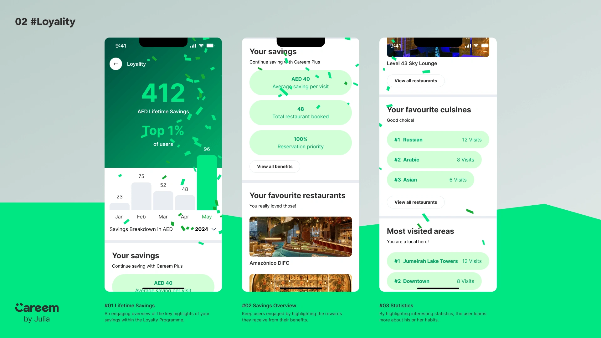
To create a seamless user experience for selecting and booking a table at a restaurant.
Process:
1. User Flow Mapping:
- Defined the user's steps by booking a table.
- Ensured the flow was logical and minimized the number of steps.
2. UI/UX Design:
- Designed screens to guide users through viewing table availability and confirming booking.
- Included filters to enhance the selection process.
3. Interaction Design:
- Developed interactive elements for selecting time slots and table capacities.
- Included a summary of the booking details.
Outcome:
The design ensures a smooth and intuitive experience, enabling users to find and book tables effortlessly while accommodating their specific preferences.
Task 3: Loyalty Statistics Screen
Objective:
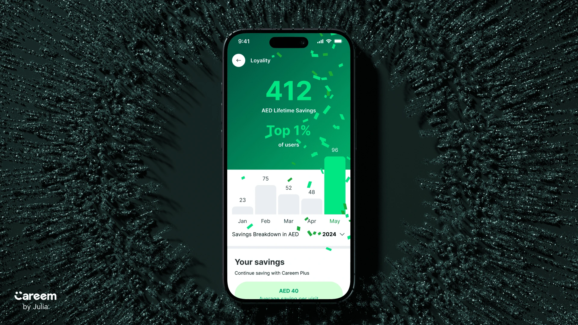
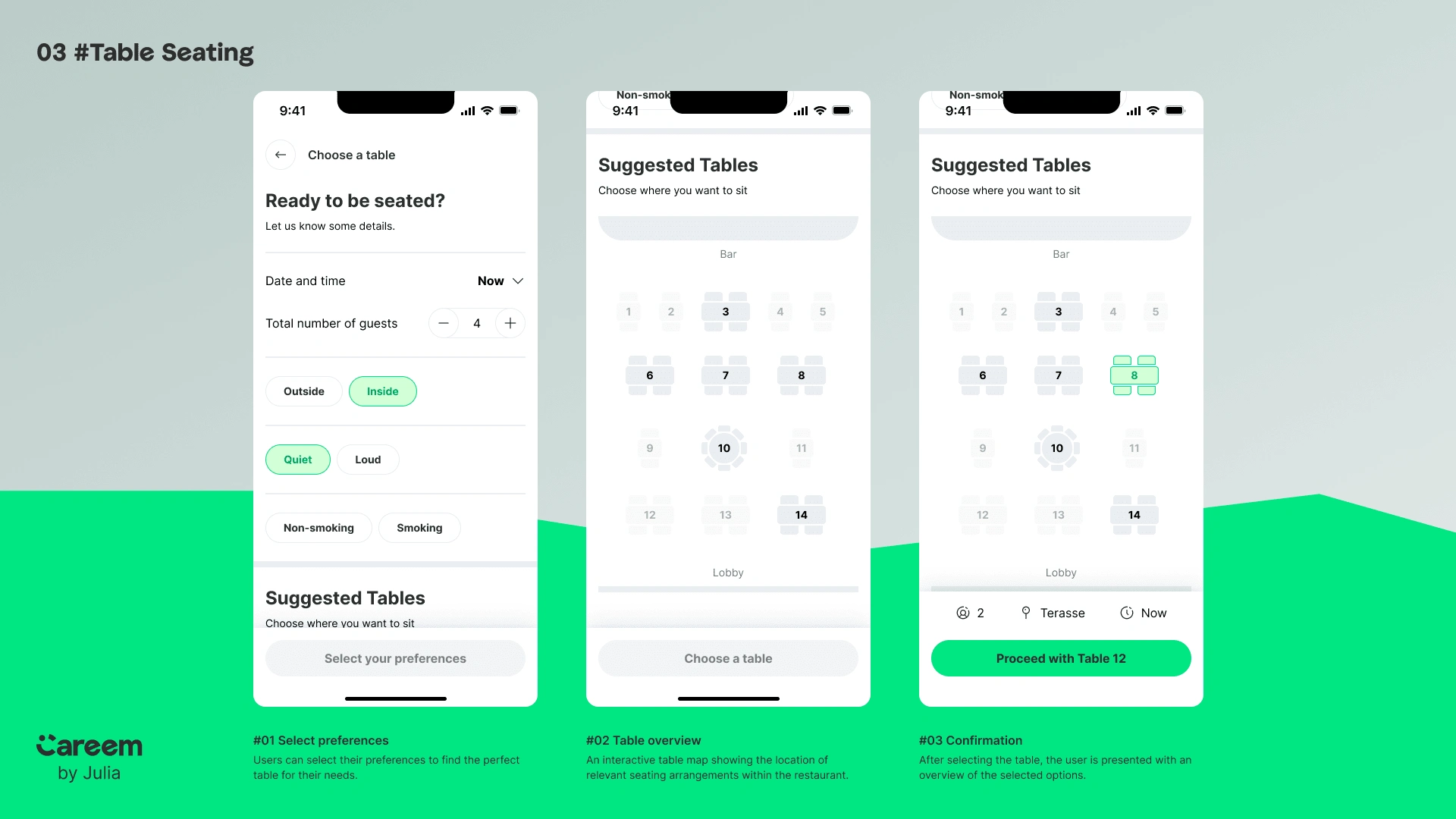
The goal is to design a screen visually representing users’ loyalty statistics, points, and rewards. This will encourage them to maintain their subscription, use the app more frequently, and stay engaged.
Process:
1. Concept Development:
- Brainstormed methods to visually represent loyalty points and tiers.
- Prioritized making the information engaging and easy to understand.
2. Wireframing & Prototyping:
- Outlined the structure of the loyalty statistics screen through wireframes.
- Tested the flow and usability with prototypes.
3. Visual Design:
- Designed a dynamic interface with clear indicators of points, statistics, and available rewards.
- Incorporated progress bars and graphical elements to boost visual appeal.
Outcome:
The loyalty statistics screen is visually inviting and offers users clear insights into their loyalty status, promoting subscription, engagement, and reward redemption.
Business Impact
By integrating these three additional features Careem DineOut can significantly enhance its value proposition, leading to increased user engagement, higher conversion rates, improved customer loyalty, and boosted revenue. Partner restaurants also benefit from optimized operations and increased patronage, creating a mutually beneficial ecosystem that supports long-term business growth and success.
What I learned💡
In this project, I applied my design skills to real-world scenarios with a focus on user experience, visual design, and interaction design. The final designs align with Careem DineOut's branding and offer intuitive, user-friendly interfaces for key app functions. This case study showcases my ability to develop cohesive, engaging designs that meet user needs and improve the overall experience.
Like this project
Posted Aug 5, 2024
Designed Splitting the Bill, Table Booking, and Loyalty Statistics screens for Careem DineOut, focusing on user-friendly and consistent interfaces
Likes
0
Views
22


