Comer Photography Collection at UTDallas Website Redesign
Zack Nguyen
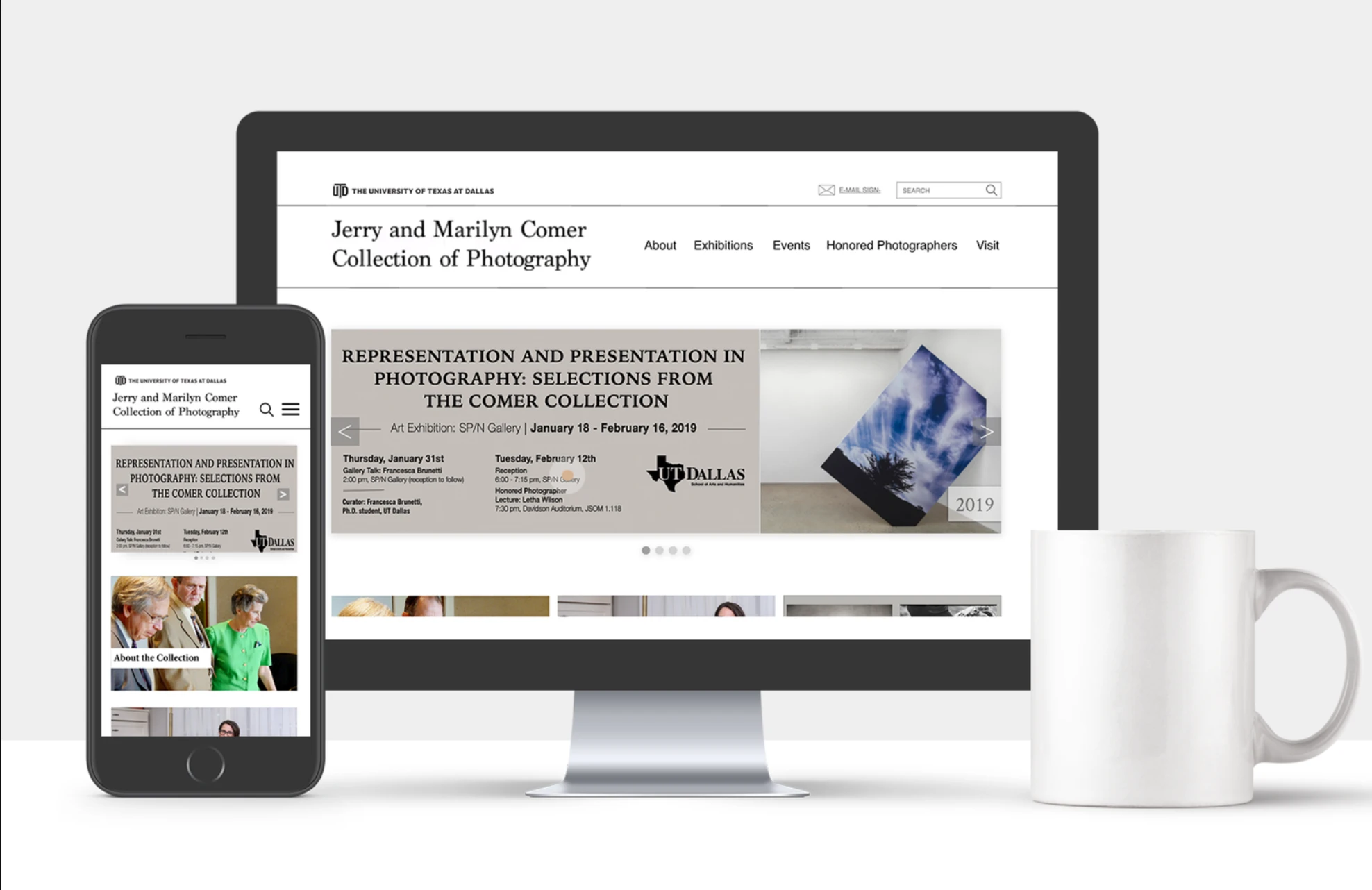
The Jerry and Marilyn Comer Photography Collection at The University of Texas at Dallas contains photographs, books, and archives relating to modern and contemporary art and photography.
In recent years, the website has received visits from artists, scholars, and public audiences. Therefore, the Comer Collection rethinks and reimagines friendly and simple interfaces, as well as efficient interactions.
Roles
UX/UI Designer- Web Design
Supervisor
S. Diane Durant, PhD
Director of Comer Collection at UT Dallas
Services
Visual Design
UX/UI Design
Deliverables
Low-fidelity wireframes
High-fidelity interactive prototypes
Tools
Adobe XD
Photoshop
Challenges to Address
Interaction Issues
The interactions on the homepage feel awkward and disjointed. For instance, the way the first photo behaves in the bio and exhibition sections can be confusing and distracting, rather than engaging and intuitive. The design lacks a sense of playfulness or clarity, which could hinder user experience.
Information Structure
While the homepage contains plenty of content, it suffers from a lack of clear organization. The abundance of information feels overwhelming, and the absence of a structured hierarchy makes navigation difficult. Visitors might become confused, especially when encountering the unorganized list of prints at the end of the site.
Connection & Engagement
The website falls short in providing tools for seamless communication or future inquiries. It lacks essential features for connecting with the team, as well as marketing elements that could enhance its appeal. Unlike other galleries or museums in the industry, the site does not exude a welcoming or professional tone, missing an opportunity to create a memorable impression.
Challenge 1. Interaction Issue
Challenge 2. Information Structure
Like this project
Posted Jun 13, 2025
Redesigned website interfaces for the Comer Photography Collection at UT Dallas.
Likes
0
Views
7
Timeline
Jun 1, 2020 - Dec 10, 2020
Clients
The University of Texas at Dallas