DanielGBright • My No-Code Portfolio That Feels Like Home

Daniel G Bright
Web Designer
UI Designer
Framer Designer
Figma
Framer
Spline
Overview
As a UX/UI designer passionate about creating user-centered solutions, I wanted a personal creative space outside my growing agency, Bright Studios. So, I designed and was built using Framer as a fun, independent project. This personal portfolio showcases my work and captures my style—an agile, impactful approach to design. In this case study, I’ll share how I used Framer to create a streamlined, visually engaging website that combines creativity and efficiency.
Project Goals
1. Personal Creative Outlet: Design a space that reflects my unique style and perspective, independent of client constraints.
2. Skill Showcase: Emphasize my UX/UI expertise, with a focus on fintech, health, sports, and finance projects.
3. Efficient, No-Code Build: Utilize Framer’s no-code capabilities to bring my vision to life quickly without sacrificing quality.
4. User-Friendly & Engaging: Create an intuitive, enjoyable user experience that’s approachable and aligned with my personality.
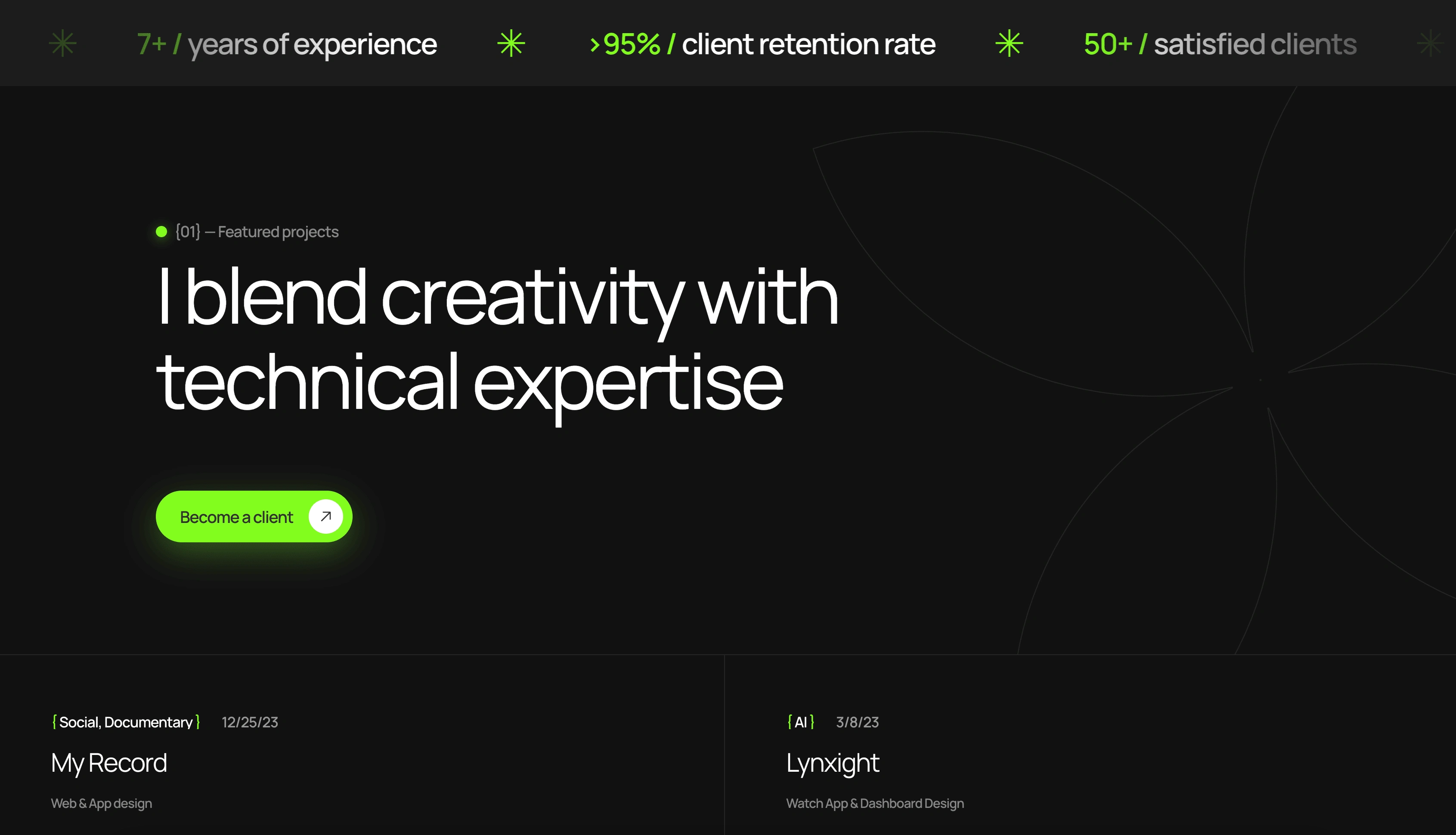
Case Studies
Approach & Design Process
1. Discovery & Research
I explored portfolio best practices, prioritizing a layout that is visually compelling but easy to navigate. I aimed for a minimalist homepage with an emphasis on visual storytelling and a clean, scrollable layout. Given the personal nature of this project, I opted for a one-page design to keep things simple, focusing on high-impact content that’s immediately accessible.
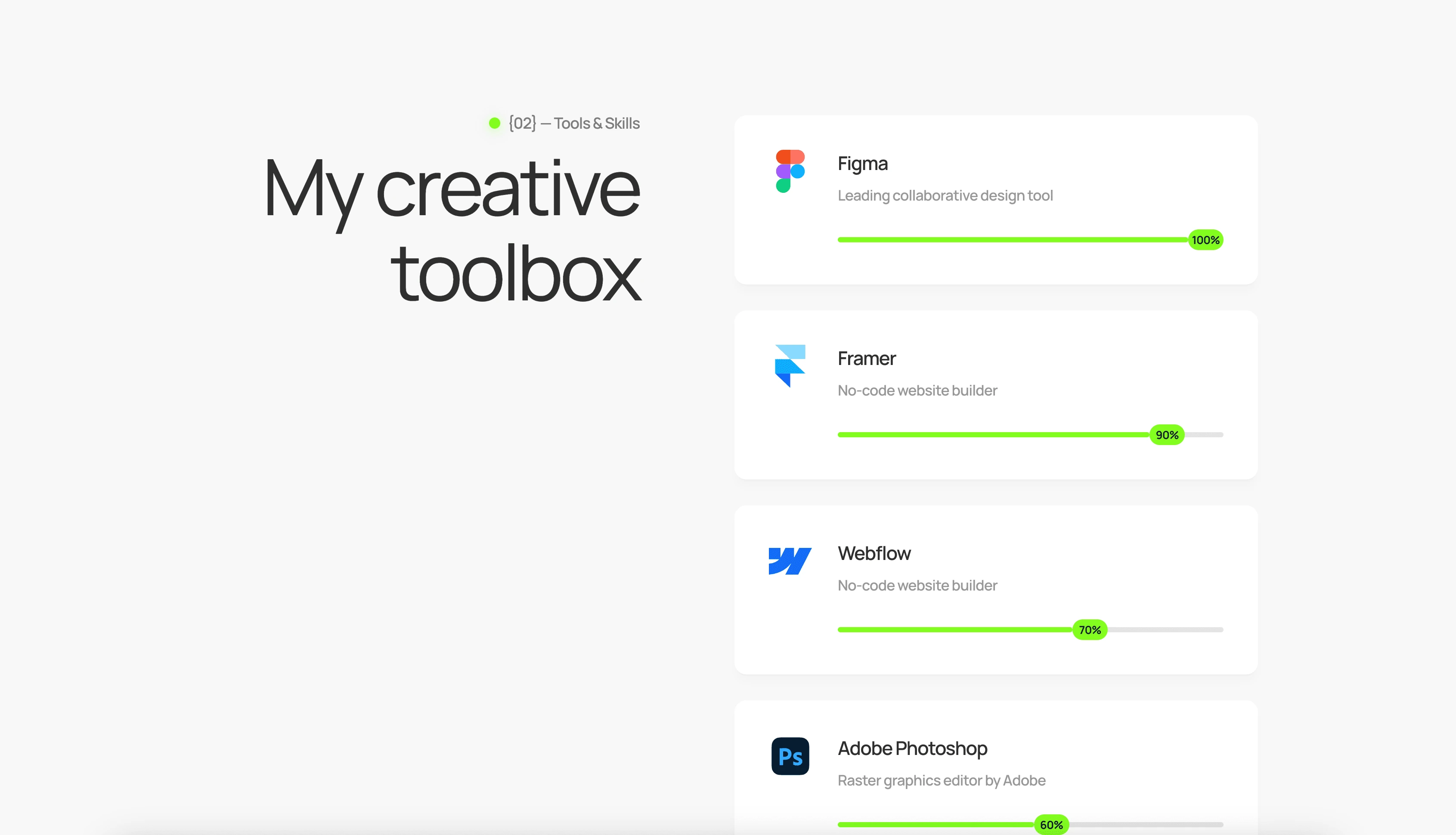
My Programs
2. Wireframing & Prototyping in Figma
I used Figma to map out a structure with essential sections:
• Intro Section: A quick overview of my expertise, with a personal touch.
• Project Portfolio: A dynamic gallery of selected work with brief descriptions for context.
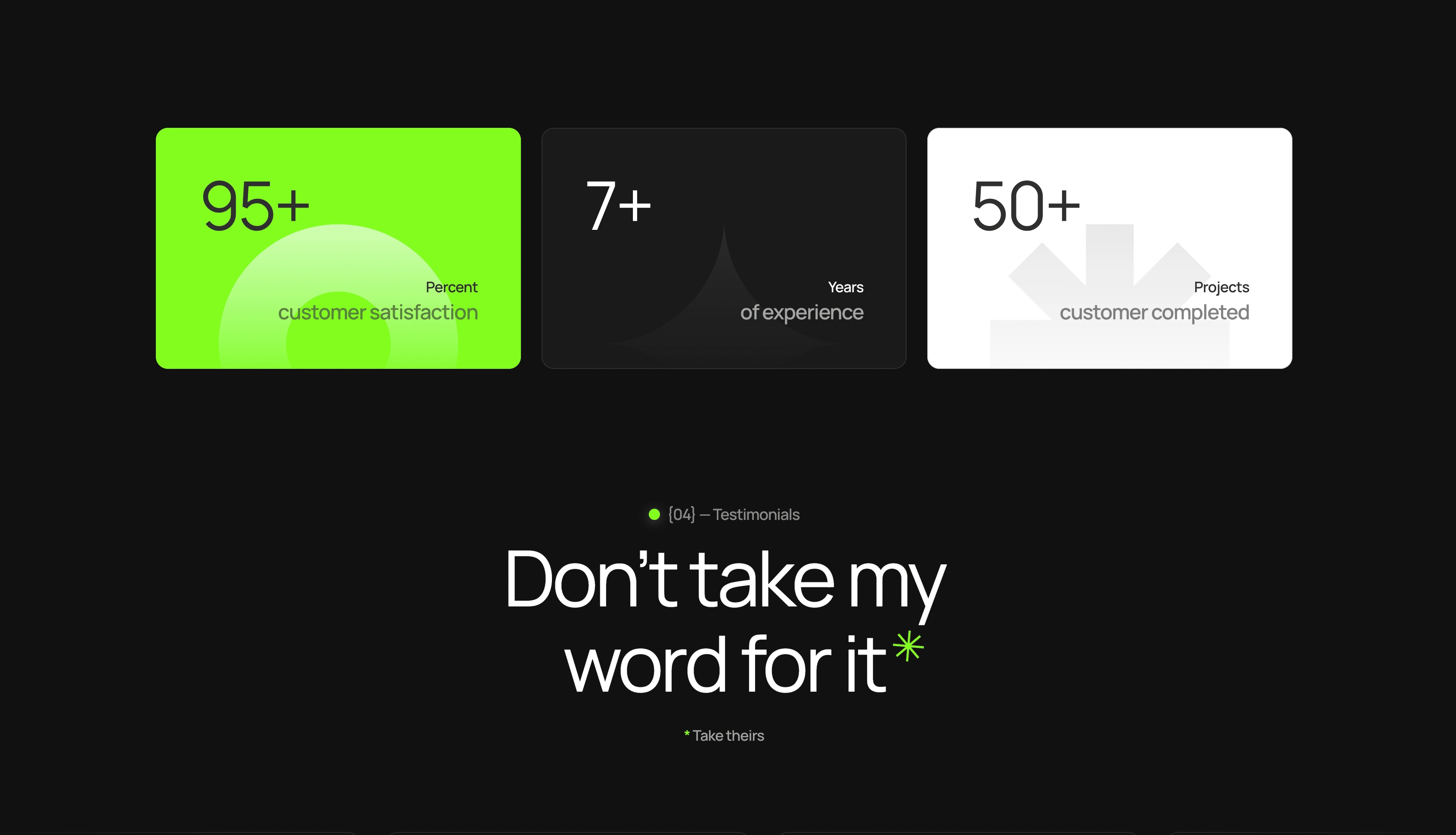
• Testimonials & Experience: Highlighting client feedback, skills, and certifications.
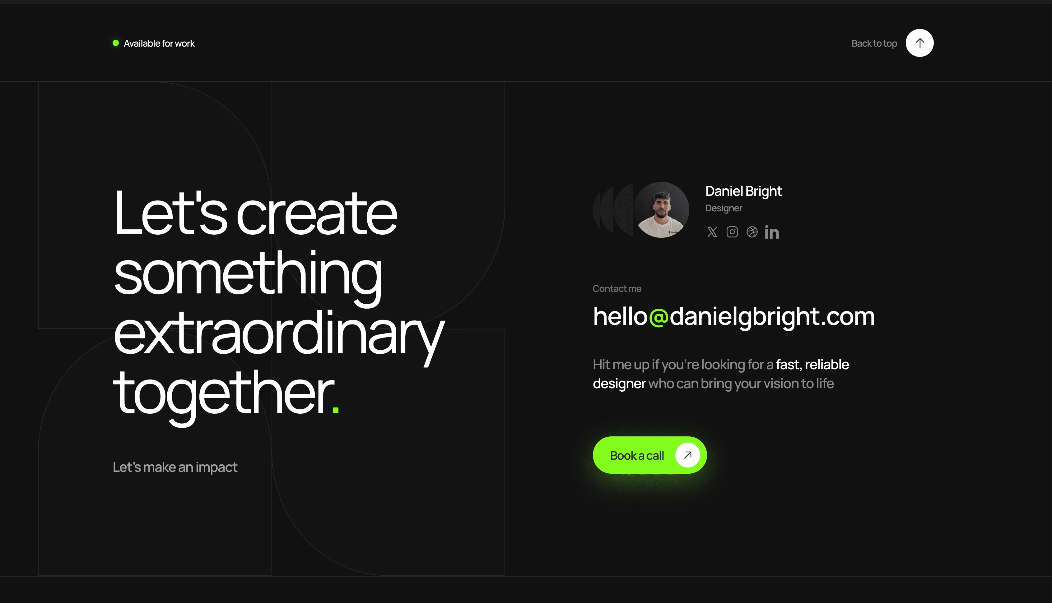
• Contact Section: A straightforward call-to-action inviting potential clients to connect.
After creating high-fidelity prototypes, I finalized the design, ensuring each section flowed seamlessly and maintained a laid-back but professional tone.
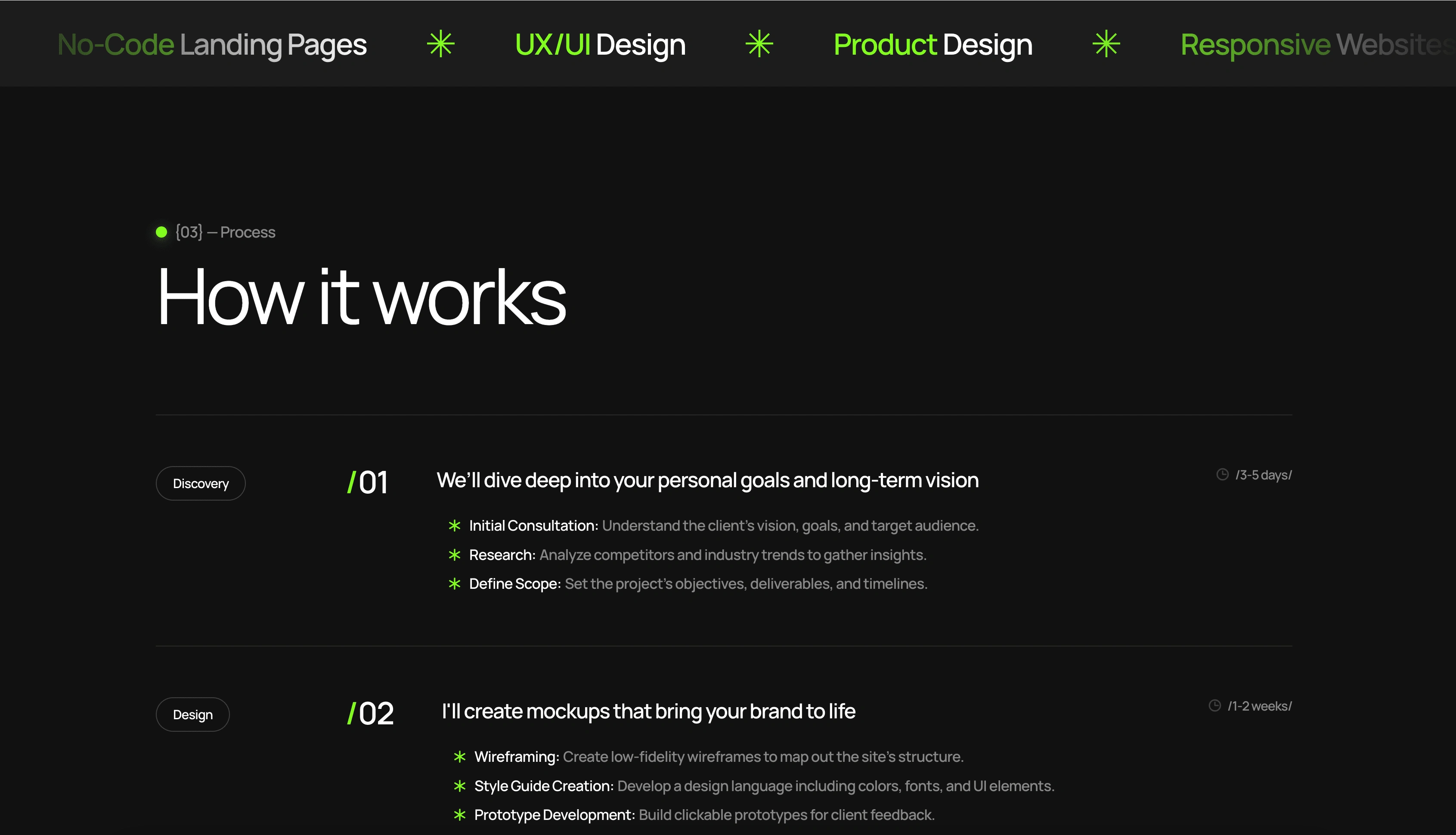
How it Works
3. Building with Framer
Using Framer, I brought the designs to life, capitalizing on its powerful no-code features to achieve a responsive and visually cohesive site. Key steps included:
• Dynamic Styling: Framer’s intuitive styling tools made it easy to set consistent colors, typography, and buttons.
• Responsiveness: I leveraged Framer’s responsive design tools, refining the layout for desktop and mobile to ensure a seamless experience across all devices.
• Micro-Interactions: Framer’s animation and interactive capabilities allowed me to add smooth transitions, subtle hover effects, and engaging scroll animations, making the site feel polished and interactive.
More about me
Key Challenges
1. Balancing Detail with Simplicity: Curating project content to keep the design simple yet comprehensive was essential for a clean user experience.
2. SEO Limitations: While Framer provides some SEO tools, I optimized images and used clear metadata to ensure the site performed well in searches.
Footer
Results & Impact
• Enhanced Personal Brand: The site immediately resonated, drawing increased traffic and longer visit times within the first month.
• New Client Leads: Startups and agencies took interest in the site’s unique, personal presentation of my work and approach.
• Positive Community Feedback: Clients and peers appreciated the site’s authentic vibe and accessible, professional layout.
Conclusion
Creating this portfolio was a fun, fulfilling project that let me explore and showcase my design skills using Framer’s no-code capabilities. The result is a reflection of my UX/UI approach - simple, engaging, and efficient. This personal website allows me to connect with potential clients in a space that’s authentically me, while Bright Studios grows and takes on exciting new projects.


