From Label to Light: Bold Beer Packaging
Taras Litvinenko

Hammer Mill Brewery
The client wanted concepts that wouldn’t just sit on the shelf — but demand attention.
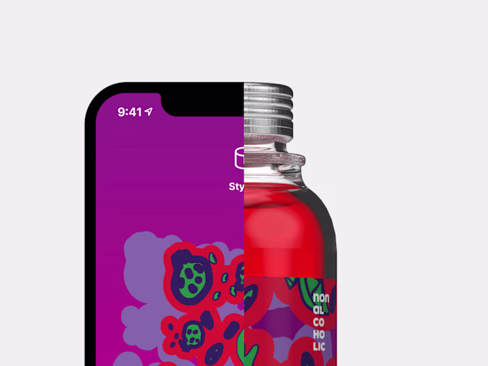
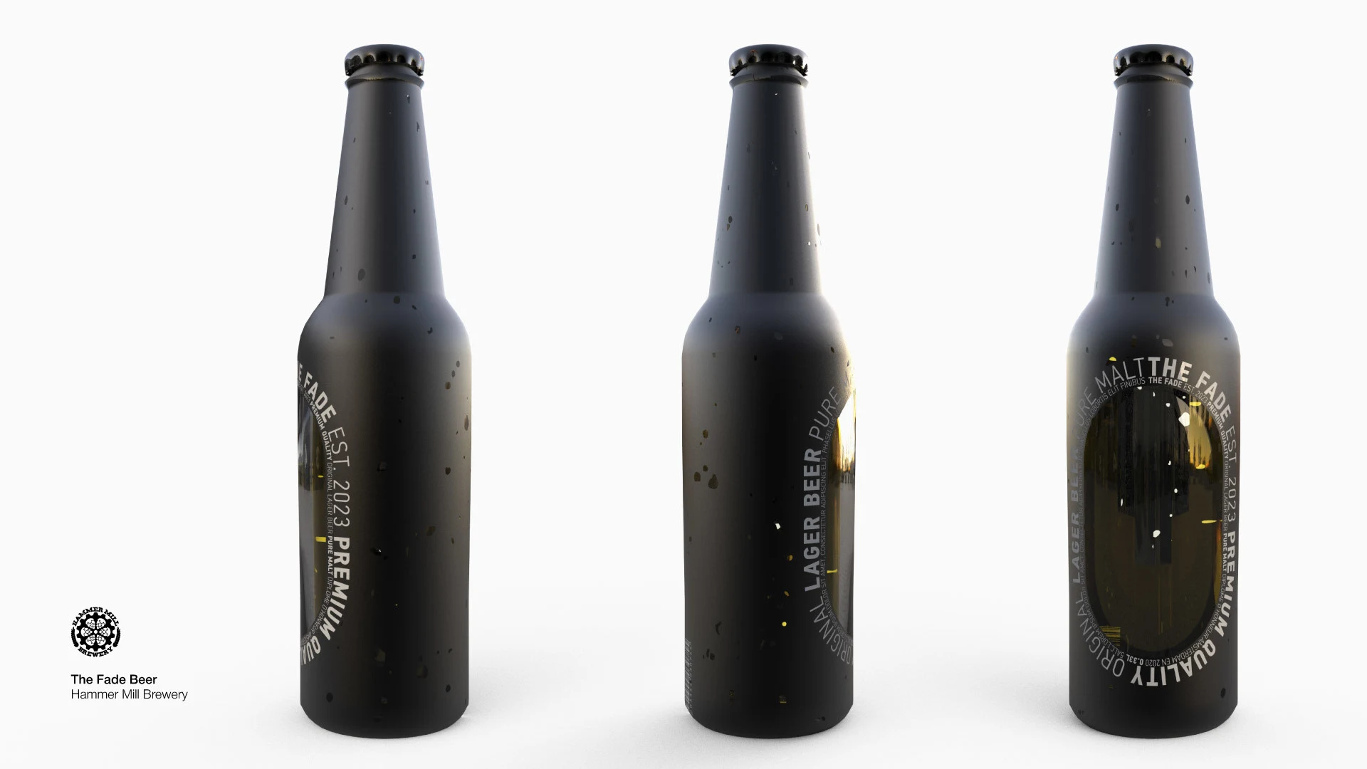
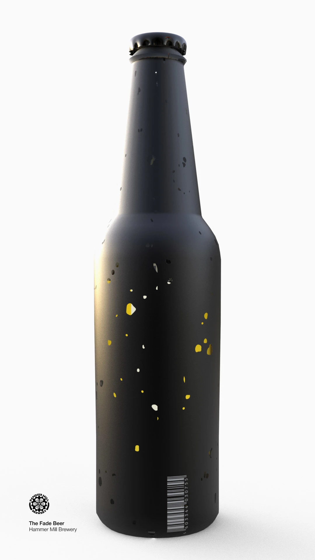
The Fade Beer
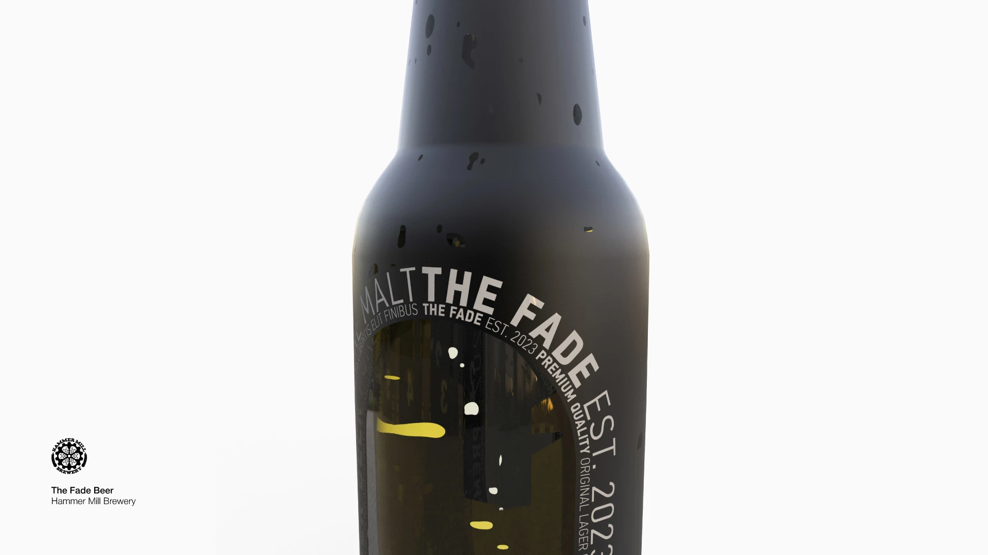
What happens if the label… disappears?
I took that idea literally. A full-black coating hides everything beneath it, while natural perforations let the light bleed through, creating a subtle glow from inside the bottle. The oval cutout is a deliberate echo of iconic beer labels — Heineken and others — making the design feel instantly familiar yet radically new.
A minimalist silhouette with a bold statement: you see the beer, you want the beer, you remember the beer.
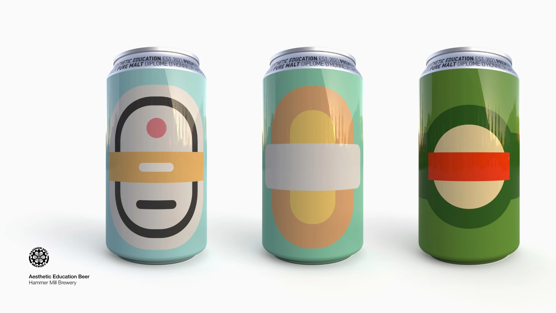
Aesthetic Education Beer
a minimalist design reminiscent of both beer icons and Rodchenko’s style.

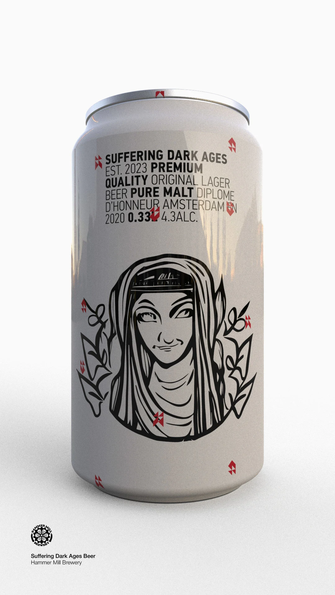
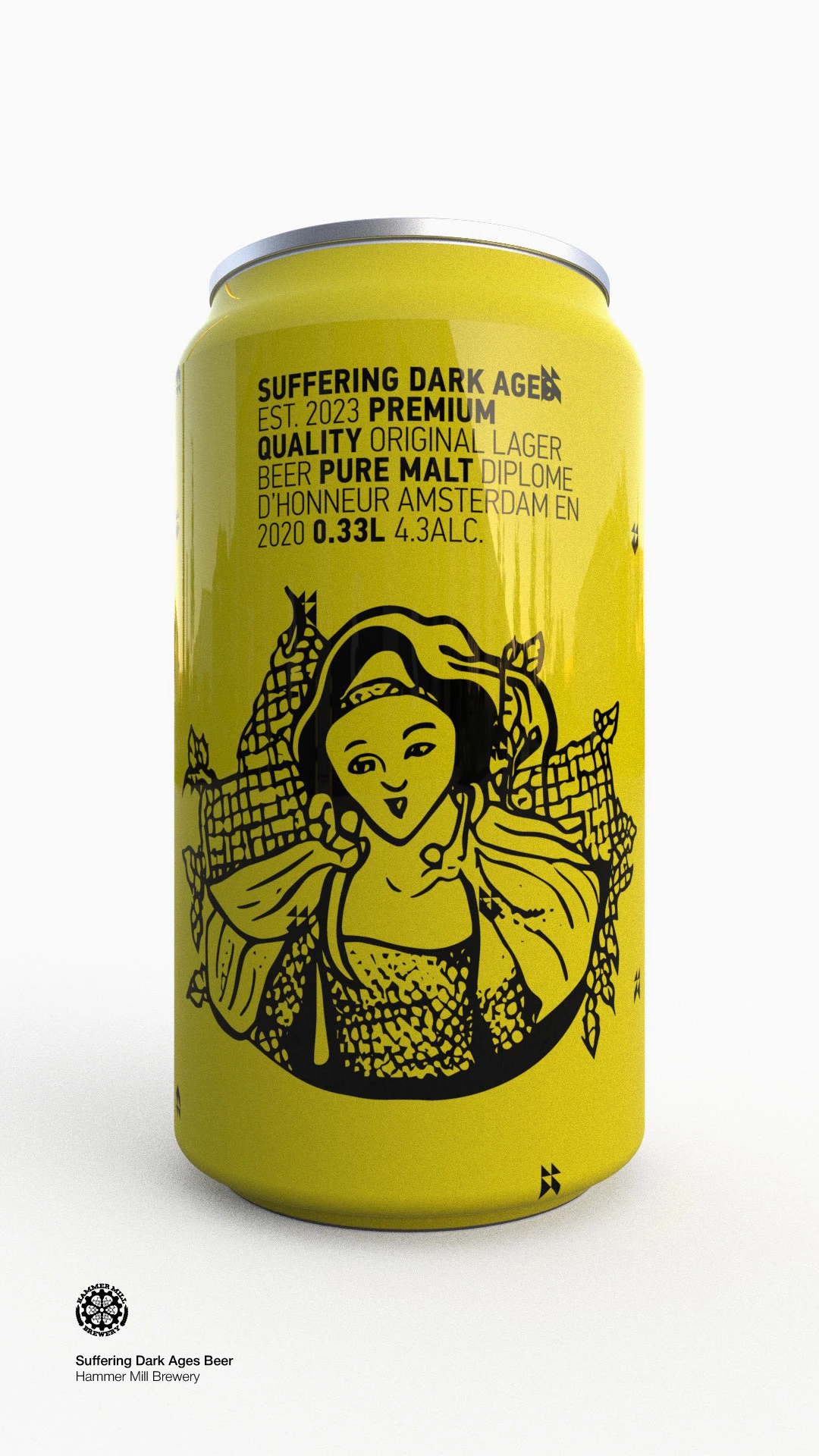
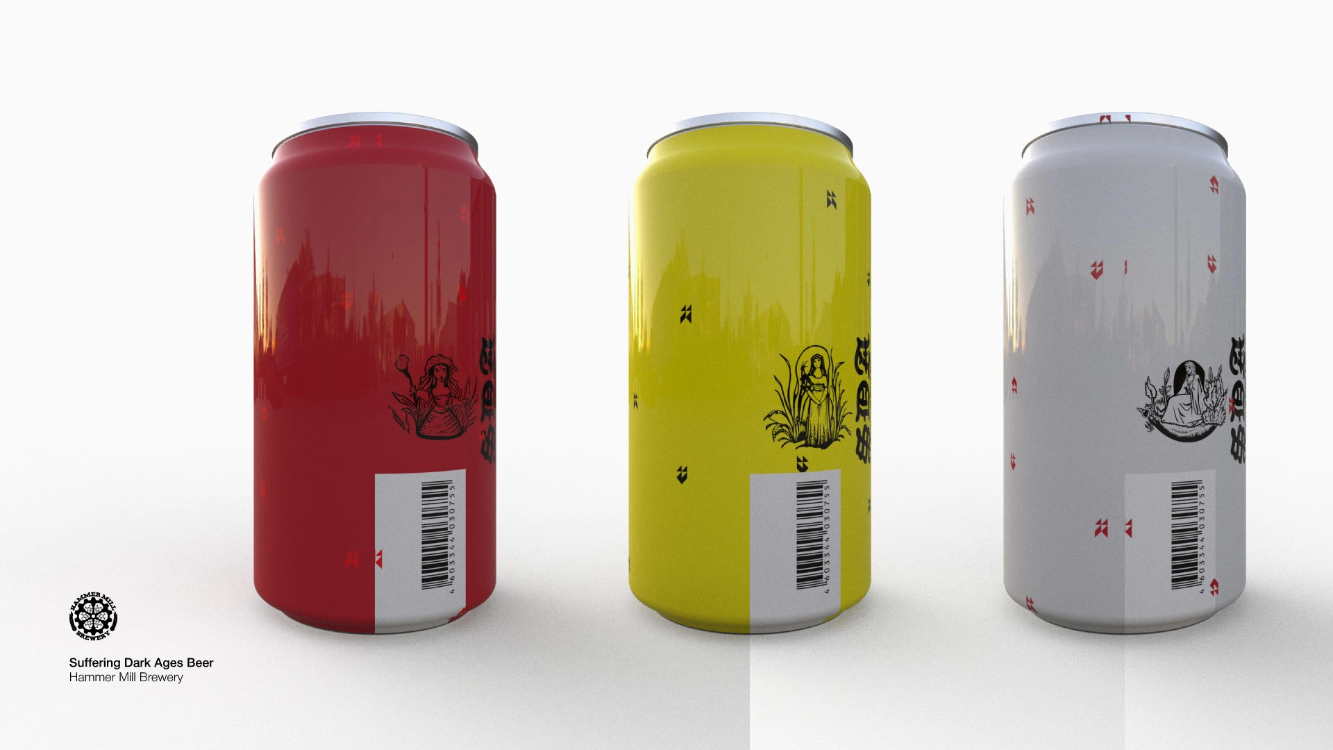
Suffering Dark Ages Beer
a tongue-in-cheek take on the overused “medieval” theme in alcohol packaging. I drew inspiration from awkward manuscript illustrations, where authors tried but lacked skill — and exploited AI’s quirks, like its “six fingers” and other oddities.

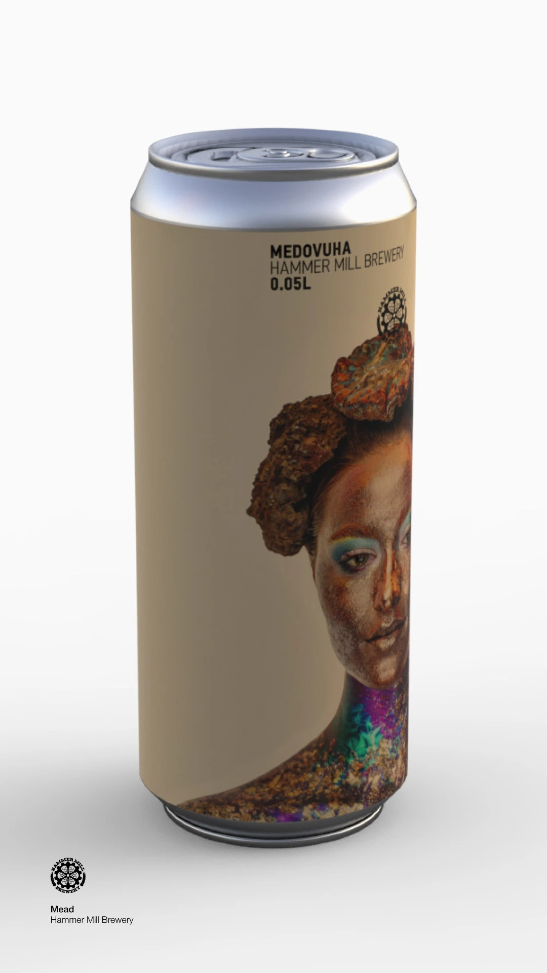
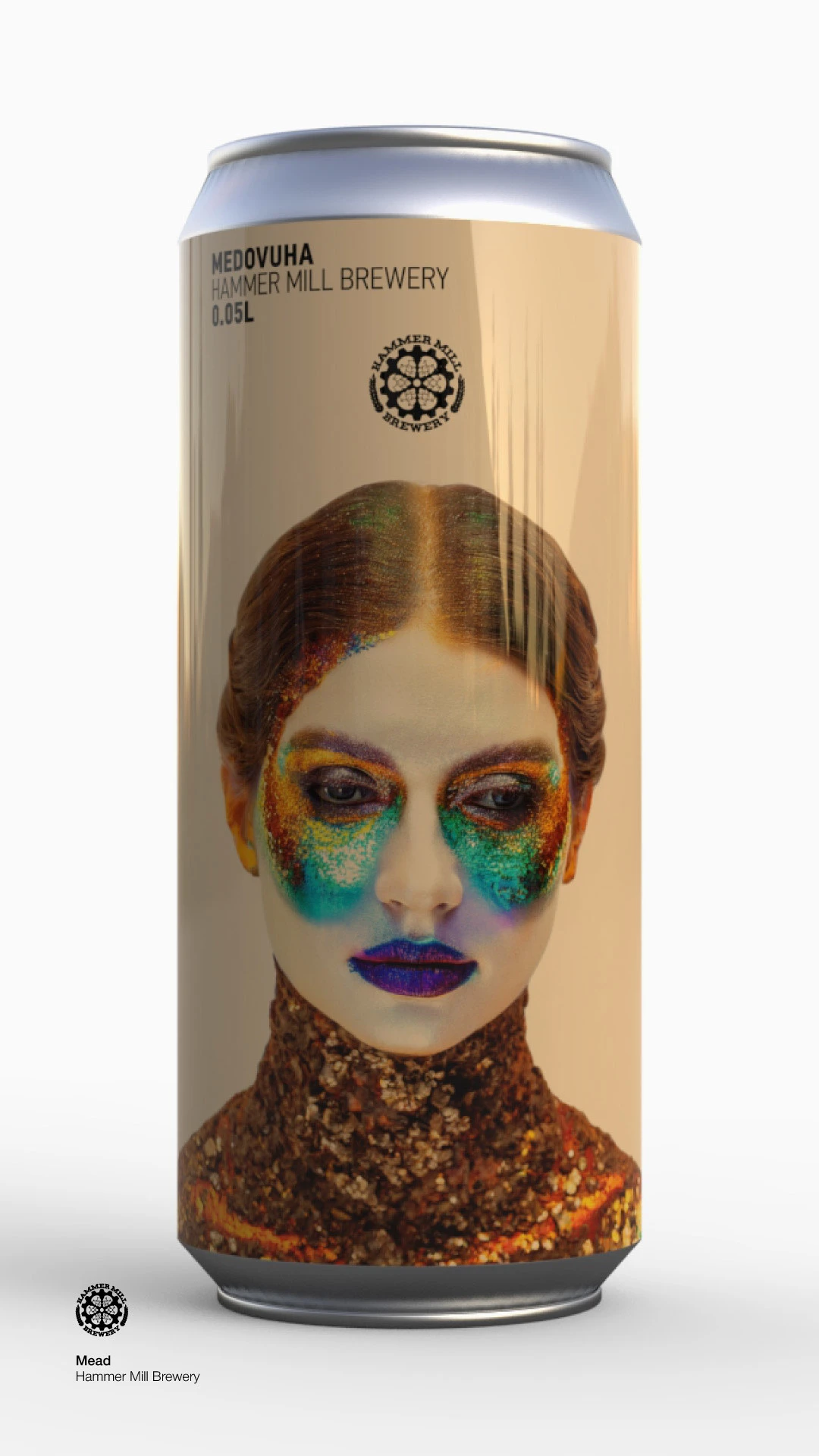
Mead
feminine imagery for the drink, but not fantasy or caricature. Instead, a serious, fashion-inspired look — as if designed by Gaultier or Galliano.
Like this project
Posted Aug 14, 2025
Bold beer designs: disappearing labels, minimalist tributes, AI oddities, medieval parody, and fashion-forward mead packaging