Code rectify logo and visual identity design
Zahid Rahim
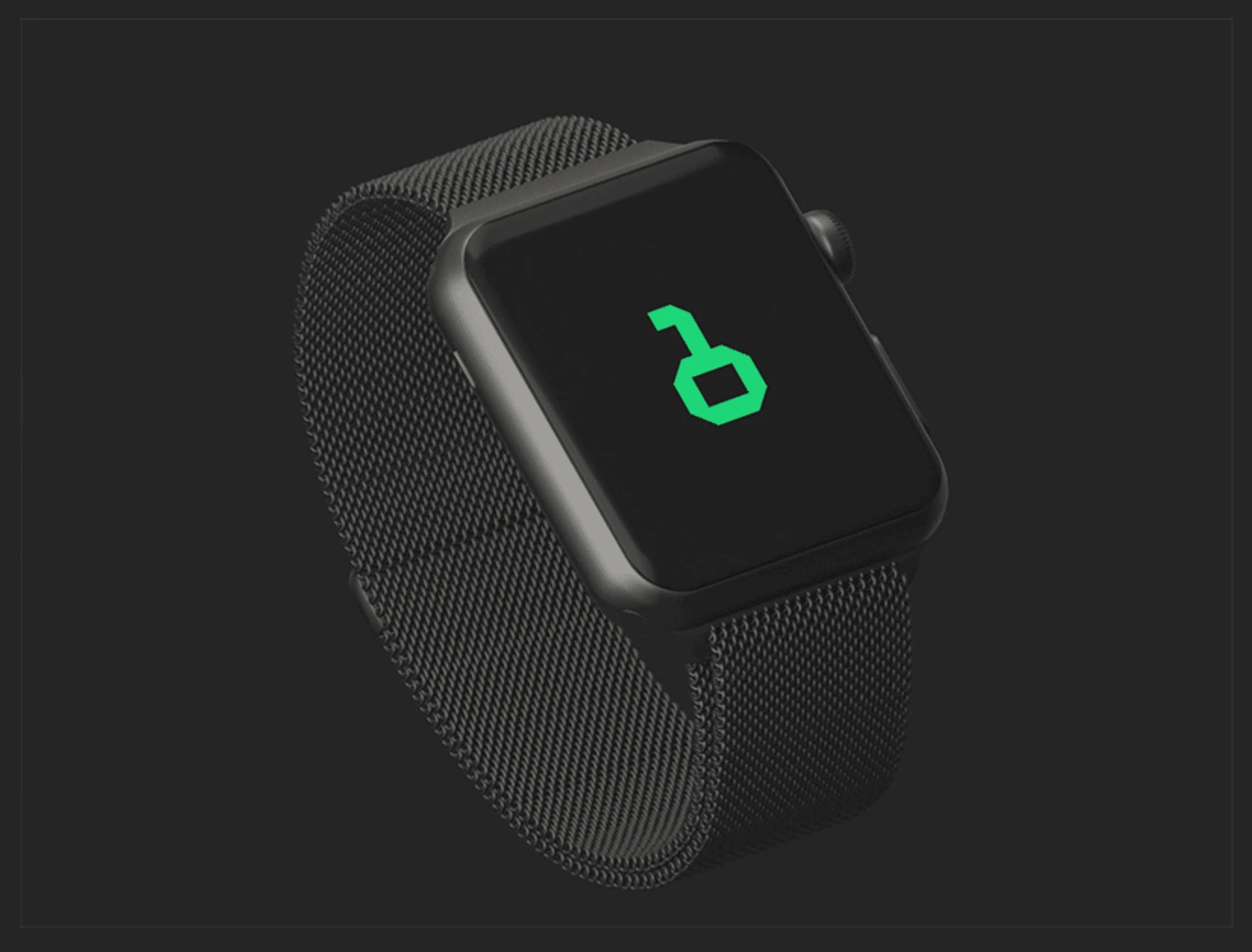
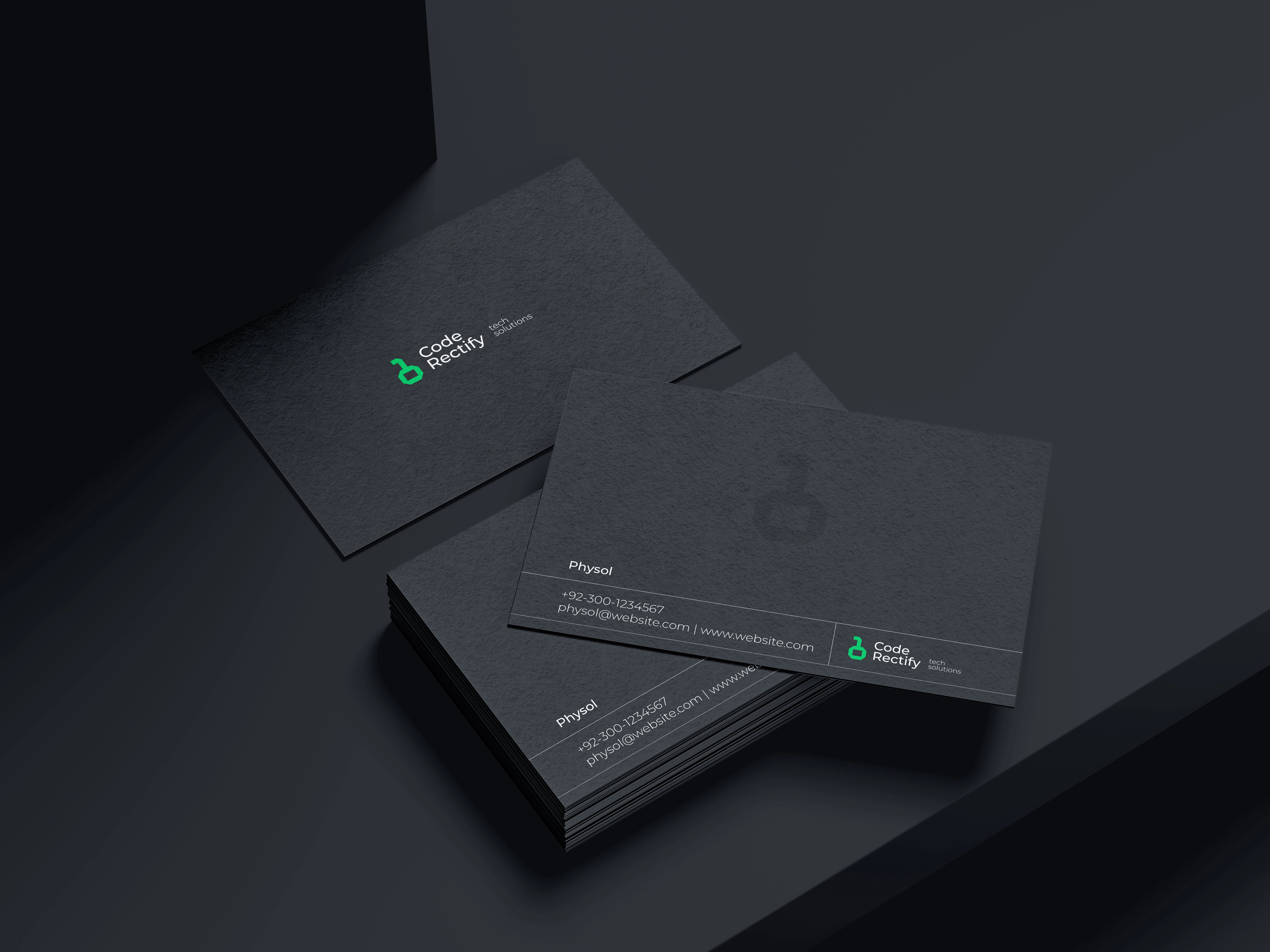
Description: The logo design for Code Rectify, a dynamic tech solutions provider. This logo encapsulates the essence of Code Rectify's mission – to unlock solutions for all your tech problems.
The Concept: At the heart of this design lies a powerful concept. The logo takes the form of a key, a universal symbol of access and solutions. However, it's not just any key; it's a key that transcends the physical realm and delves into the digital realm. The key is crafted entirely from the binary code, where the numbers 0 and 1 come together to form this emblematic icon.
Symbolism: The 1, strategically placed atop the 0, creates a visually striking representation of a key. This ingenious design choice serves a dual purpose: firstly, it symbolizes the act of unlocking, a fundamental aspect of Code Rectify's services. Secondly, it pays homage to the binary code – the language of computers. This blending of the physical and digital worlds encapsulates Code Rectify's commitment to providing tech solutions that bridge the gap between hardware and software.
Aesthetics: The logo's clean lines and modern typography exude professionalism and a forward-thinking approach. The choice of a sleek color palette further reinforces the tech-savvy nature of Code Rectify's services, while the binary key design element ensures instant recognition and memorability.
Conclusion: In crafting the Code Rectify logo, I sought to encapsulate the essence of this innovative tech solutions provider. It's more than just a logo; it's a visual representation of Code Rectify's dedication to unlocking the answers to all your tech-related problems.
Like this project
Posted Mar 21, 2025
Graphic Design, Branding, Art Direction, Adobe Illustrator