TYR Tactical Game Website Design

Jonathan Swanson


TYR — DESIGNING A TACTICAL GAME WEBSITE
OVERVIEW
TYR is built around a clear combat philosophy: positioning matters, every angle is a decision, and information should be readable at a glance. I designed this promotional website to carry that same thinking beyond the game and into a focused web experience.
The goal was not to make a generic marketing page. It was to make the site feel like an extension of TYR’s tactical interface, something that feels authored by the same world as the game.
DESIGN PHILOSOPHY
I treated TYR’s in-game UI as the visual bible. The final direction is built around four principles:
Readable tactical information: hierarchy, contrast, and spacing make the important information immediately legible.
Precision over decoration: motion and feedback are restrained so interaction feels useful, not noisy.
Every angle is intentional: clipped corners, angled panels, diamond markers, and framed modules echo the game’s armor and targeting language.
A living interface: hover states, selected tabs, grid textures, glow states, and animated readouts make the site feel active without distracting from the content.
TRANSLATING THE GAME INTO THE WEB
The navigation follows the rhythm of a game menu: a persistent status strip, clear section tabs, selected states, and subtle yellow hover indicators. Typography pairs condensed display lettering with technical monospace labels to create the contrast of a readable HUD.
The visual language stays consistent across the home page, vehicle database, armor inspection, and developer section. Buttons, panels, borders, and corner treatments share the same rules so the website feels like one cohesive instrument.
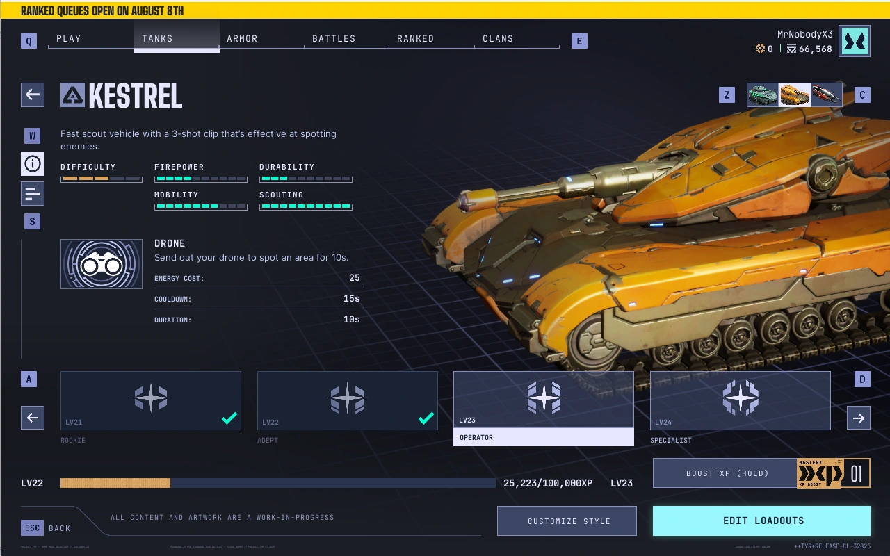
Game View for Tank Information
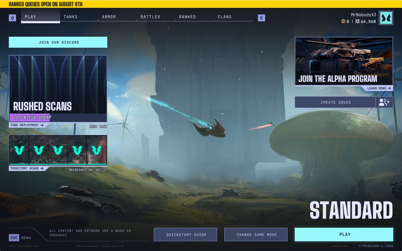
In Game Main Menu
DESIGNING FOR IMMEDIATE ACTION
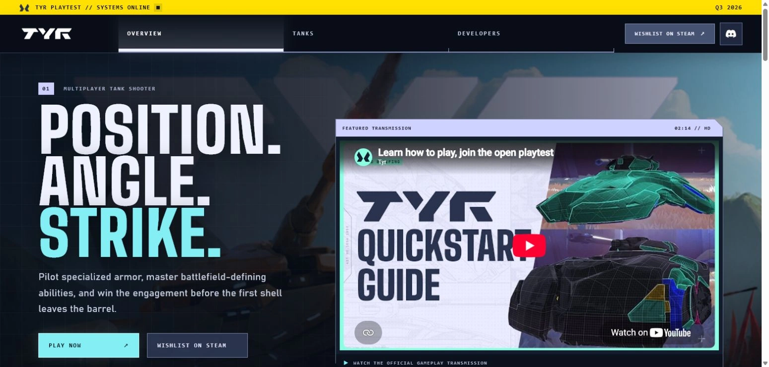
The homepage is structured around a simple question: what should a visitor understand or do within the first few seconds?
The official Play Guide is placed directly in the opening view so players can immediately access context for TYR’s combat, systems, and moment-to-moment decision making. It is not treated as a resource buried below the fold. It is the first explanatory layer after the visual introduction.
That placement creates a clear progression: establish the identity of TYR, show the game in motion, then offer a direct path to understanding how it is played. The video helps a new player move from curiosity to confidence before deciding whether to join the playtest.
Three actions are visible at the same moment:
PLAY NOW — takes an interested visitor directly to Steam so they can start playing.
WISHLIST ON STEAM — gives visitors who are not ready to install a low-friction way to save TYR for later and support its launch momentum.
JOIN THE DISCORD — creates a community path for questions, updates, playtest discussion, and direct connection with other players.
This is a deliberate hierarchy, not three interchangeable buttons. The Play Guide answers “how does this work?”, Steam answers “where do I play or follow it?”, and Discord answers “where do I stay connected?” Keeping those actions in the opening composition reduces the distance between interest and participation.
INTERACTIVE ARMOR INSPECTION
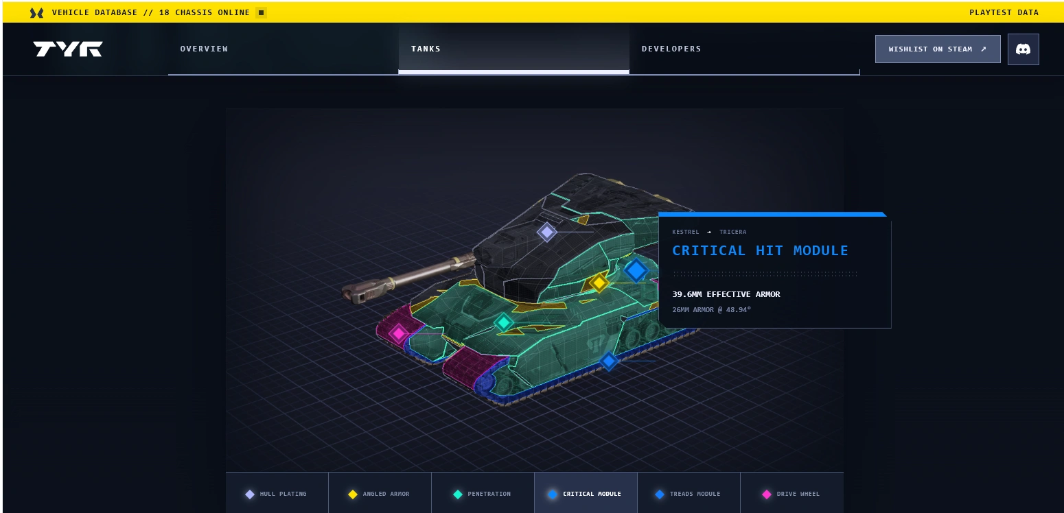
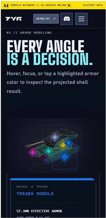
The armor section turns a technical system into something visitors can understand through exploration. Instead of presenting a static tank image, the page invites visitors to read the vehicle the way a player would read an engagement.
Highlighted armor points identify meaningful zones on the tank. Hovering or focusing a point opens its corresponding readout beside the marker. The readout uses projected armor values and color-coded feedback to explain the result, while leaving the point closes the module and keeps the interface clean.
The placement of each diamond is intentional. Markers sit directly on the relevant armor, turret, penetration, critical-hit, and tread areas, so the relationship between the point and the readout remains clear even as the tank scales responsively.
THE TANKS PAGE
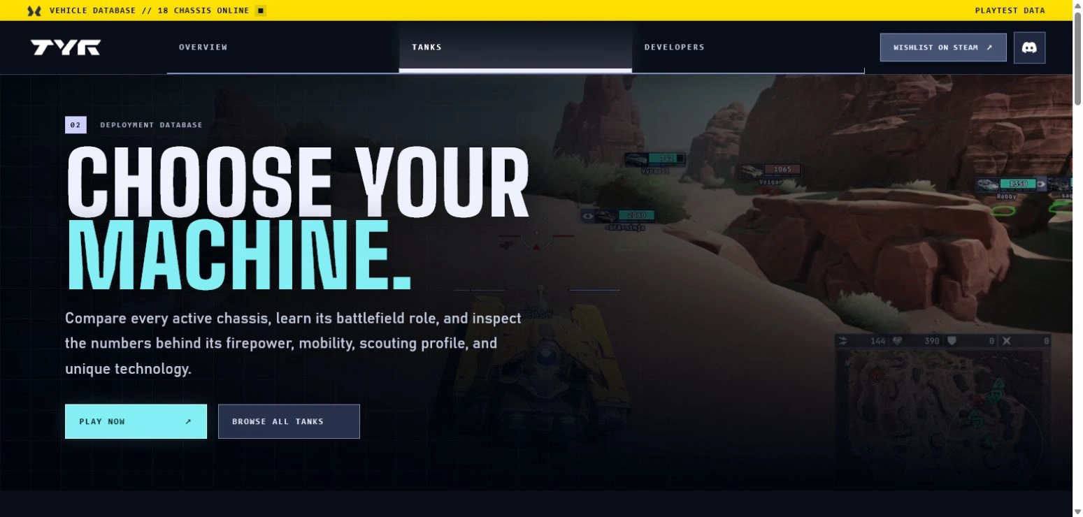
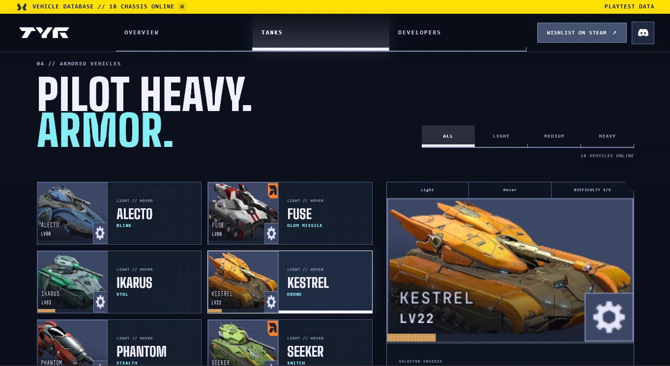
The Tanks page is organized as a vehicle database rather than a simple gallery. It gives each chassis a clear role, a readable visual identity, and a path into deeper information.
The opening roster establishes the scale of the game, then the tank cards create a quick comparison layer: role labels, vehicle names, short descriptions, artwork, and a direct “Tank Database” link. This lets a visitor scan the lineup quickly while still offering a route to more detailed information.
The page uses the same interface language as the homepage. Numbered entries, clipped card corners, grid textures, technical labels, and restrained hover states make browsing feel like navigating an in-world system rather than leaving the TYR experience.
(Placeholder images shown)
THE TEAMS PAGE: MAKING THE STUDIO PART OF THE WORLD
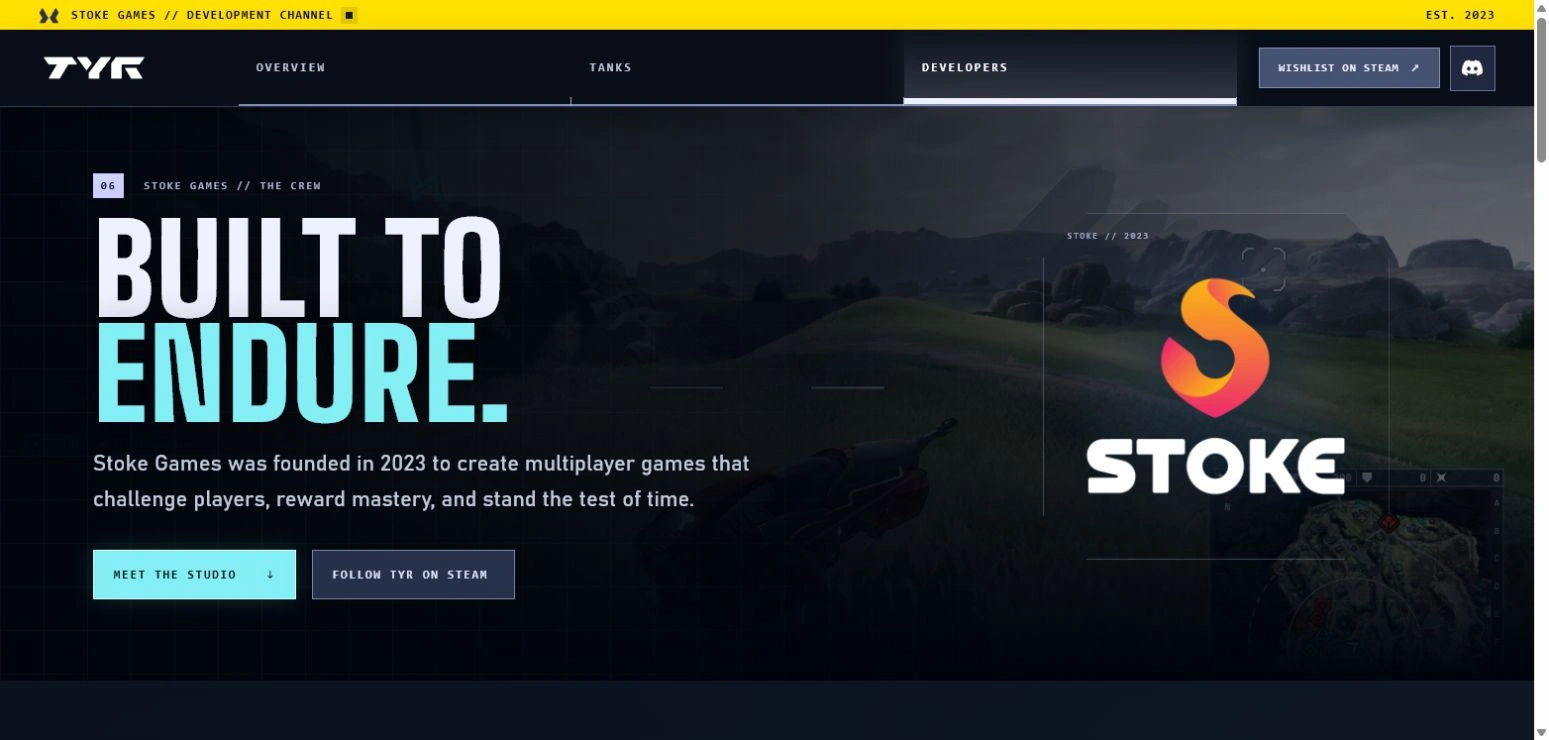
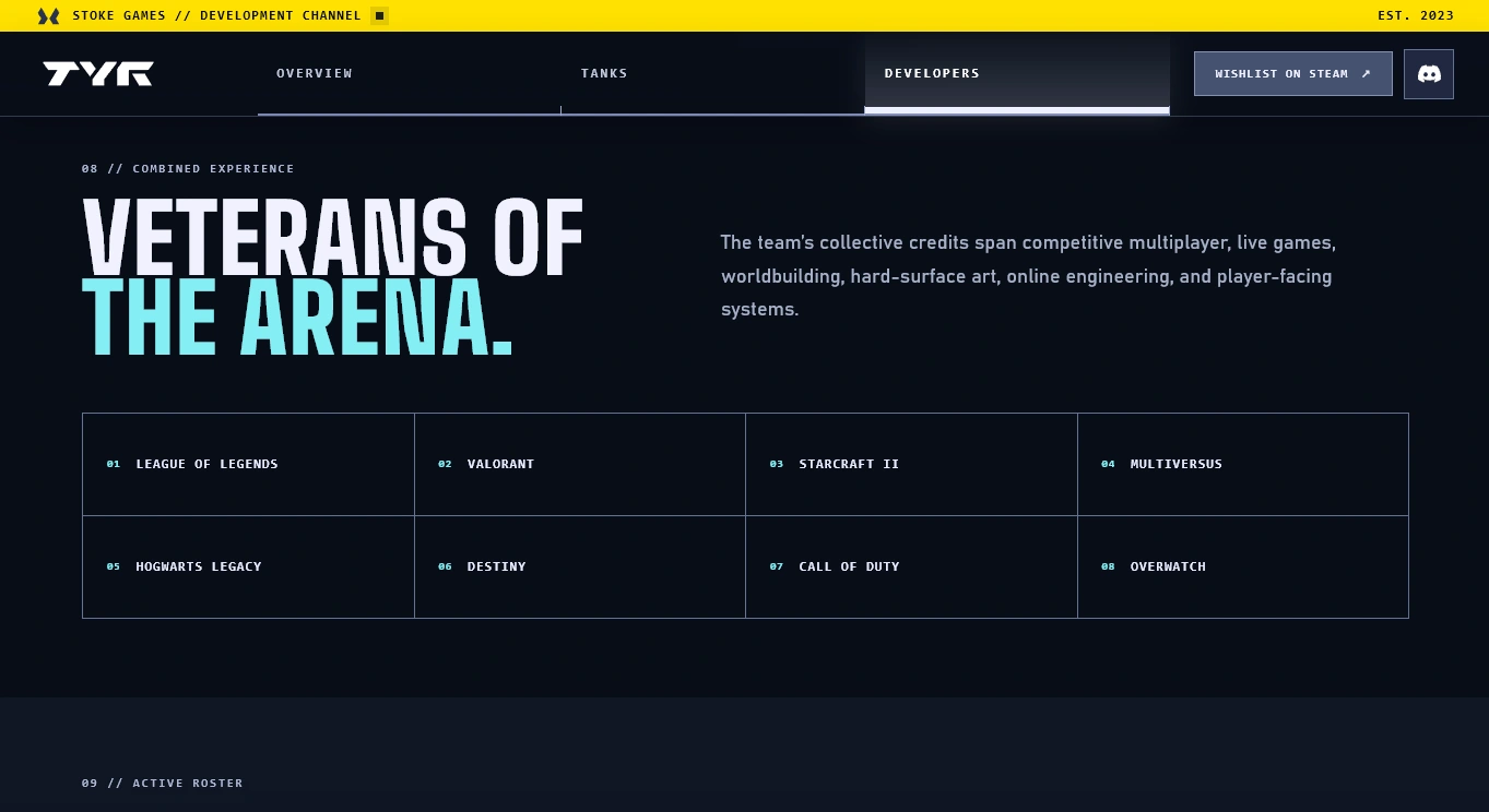
The Teams page gives the project a human and production-focused layer. A game site can explain its mechanics and show its vehicles, but the studio page answers a different question: who is building this, and what kind of thinking sits behind the experience?
I designed the page as a continuation of the same database language used elsewhere in the site. Instead of presenting a generic corporate biography, the team is organized as a structured roster: role labels, numbered entries, disciplined columns, and generous spacing make the page feel like a studio record inside the TYR interface.
The information hierarchy moves from the studio statement into the people who make it real. The opening message establishes Stoke Games as a team focused on multiplayer games that challenge players, reward mastery, and stand the test of time. The roster then provides a clear scan of disciplines across production, design, art, engineering, and technical leadership.
The page also gives visitors useful next steps. A studio-directed action leads toward the broader Stoke Games presence, while a contact action creates a clear route for professional or community inquiries. These are intentionally separated from gameplay calls to action: the homepage is optimized for player conversion, while the Teams page supports trust, context, and relationship-building.
BUILDING THE EXPERIENCE
The site was built in React with a responsive static export and a component-based structure. The interface is designed to work across desktop and mobile layouts, with the same visual language adapting to smaller screens rather than simply shrinking.
The current presentation uses placeholder materials where appropriate. With approved Stoke assets, the next pass would replace those placeholders, refine the content, and prepare the site for production use.
OUTCOME
The result is a promotional site that treats TYR’s identity as a system rather than a surface. It gives the game a place to explain its combat philosophy, showcase its vehicles, introduce the studio, and invite players into the world before they ever launch a match.
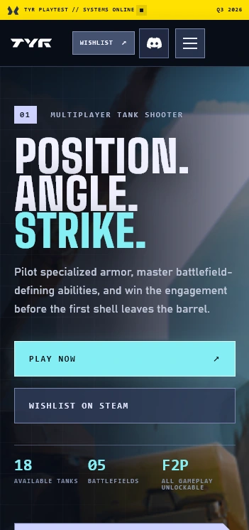
Mobile View
Like this project
Posted Aug 7, 2026
Designed a promotional website for TYR, emphasizing tactical information readability.
Likes
2
Views
15
Timeline
Jul 31, 2026 - Aug 2, 2026
Clients
TYR