La Savonnerie | Brand Identity, Packaging Design
Giulia Virtus Azzoni
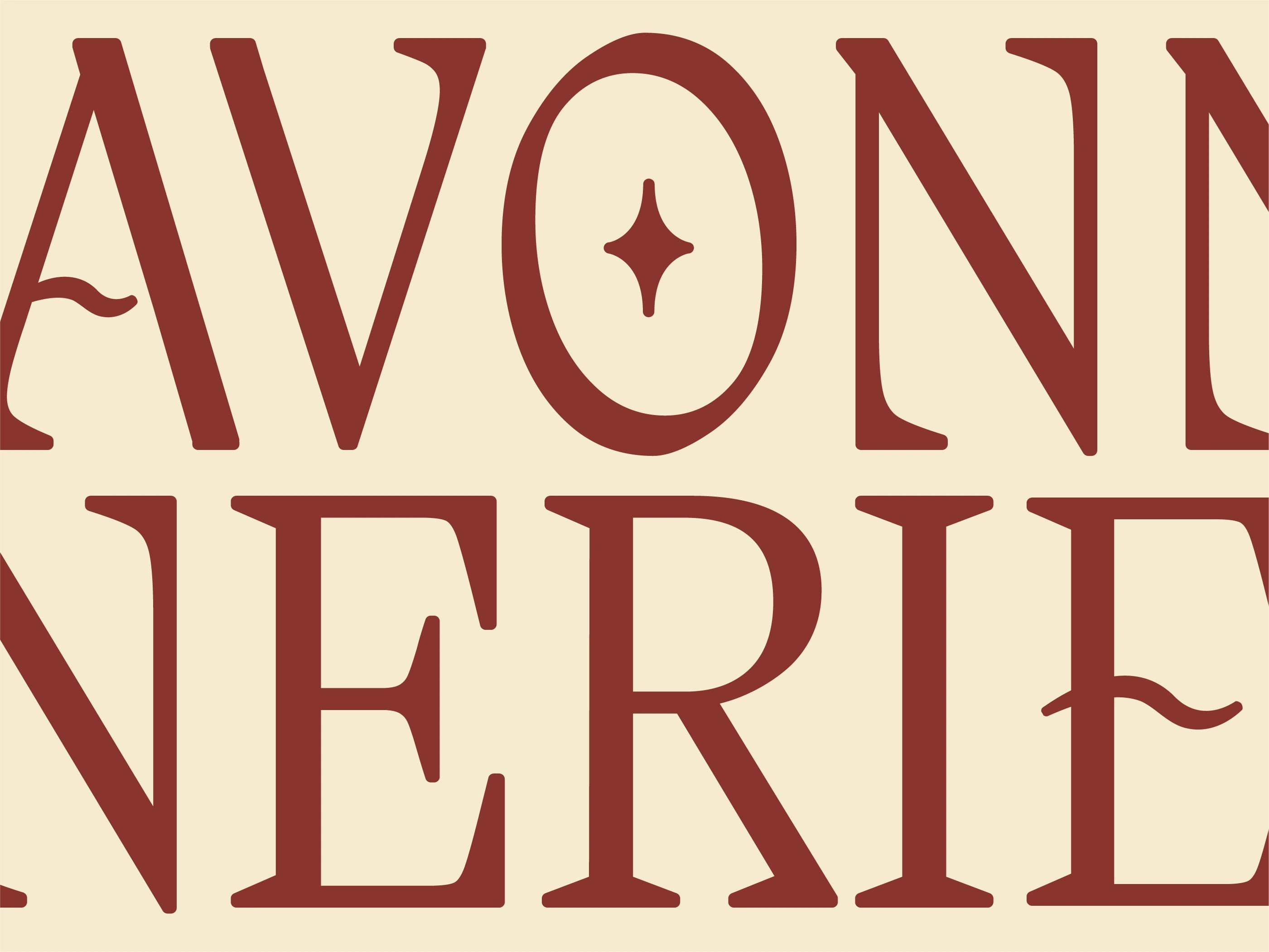
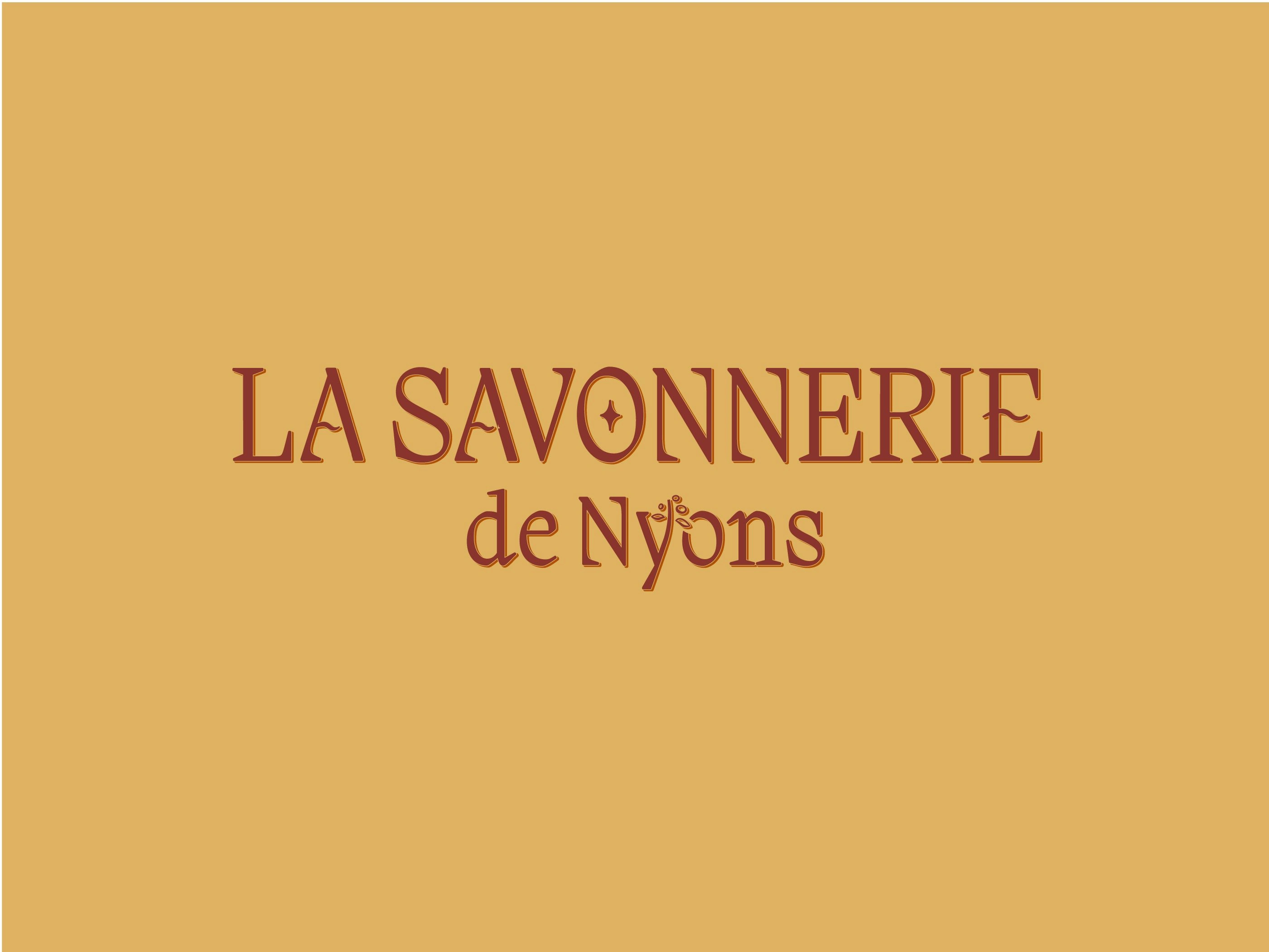
Logo Redesign Detail
• Scope
The goal of this rebranding and packaging project was to modernize La Savonnerie de Nyon while preserving its vintage charm. The focus was on refining the brand’s identity, improving logo legibility, and creating a cohesive yet distinctive packaging system for its soap collection.
• Process
I started by redesigning the logo, removing excessive illustrative details to achieve a cleaner and more sophisticated look. For the packaging, I created custom illustrations for each soap variant, using unique colors and visuals to differentiate them while maintaining a unified brand aesthetic.
• Solution
The final identity strikes a balance between tradition and modernity, offering a refined yet timeless look. The updated logo enhances readability, while the packaging design makes each product easy to distinguish, elevating the brand’s elegance while staying true to its heritage.
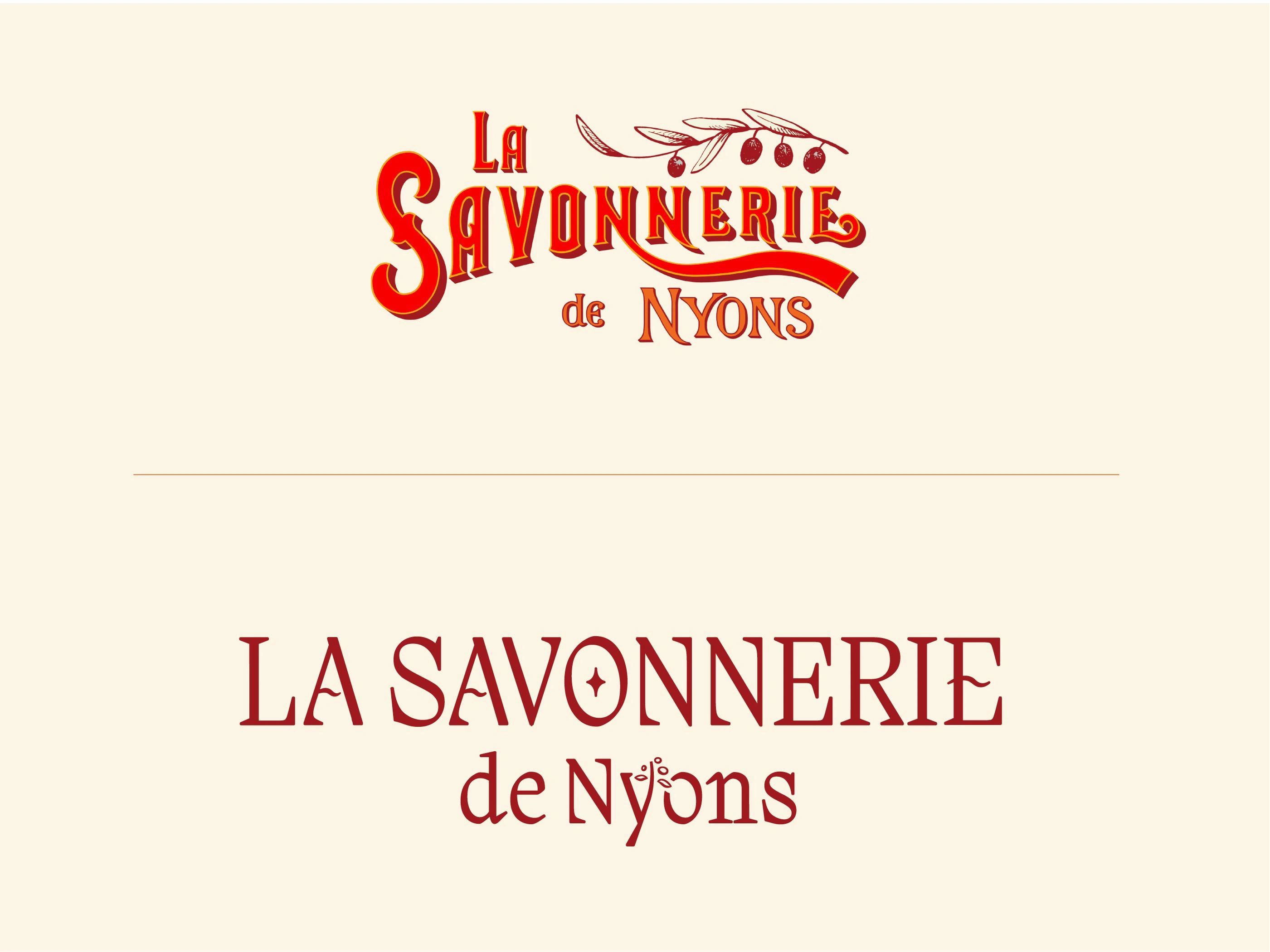
Before and After
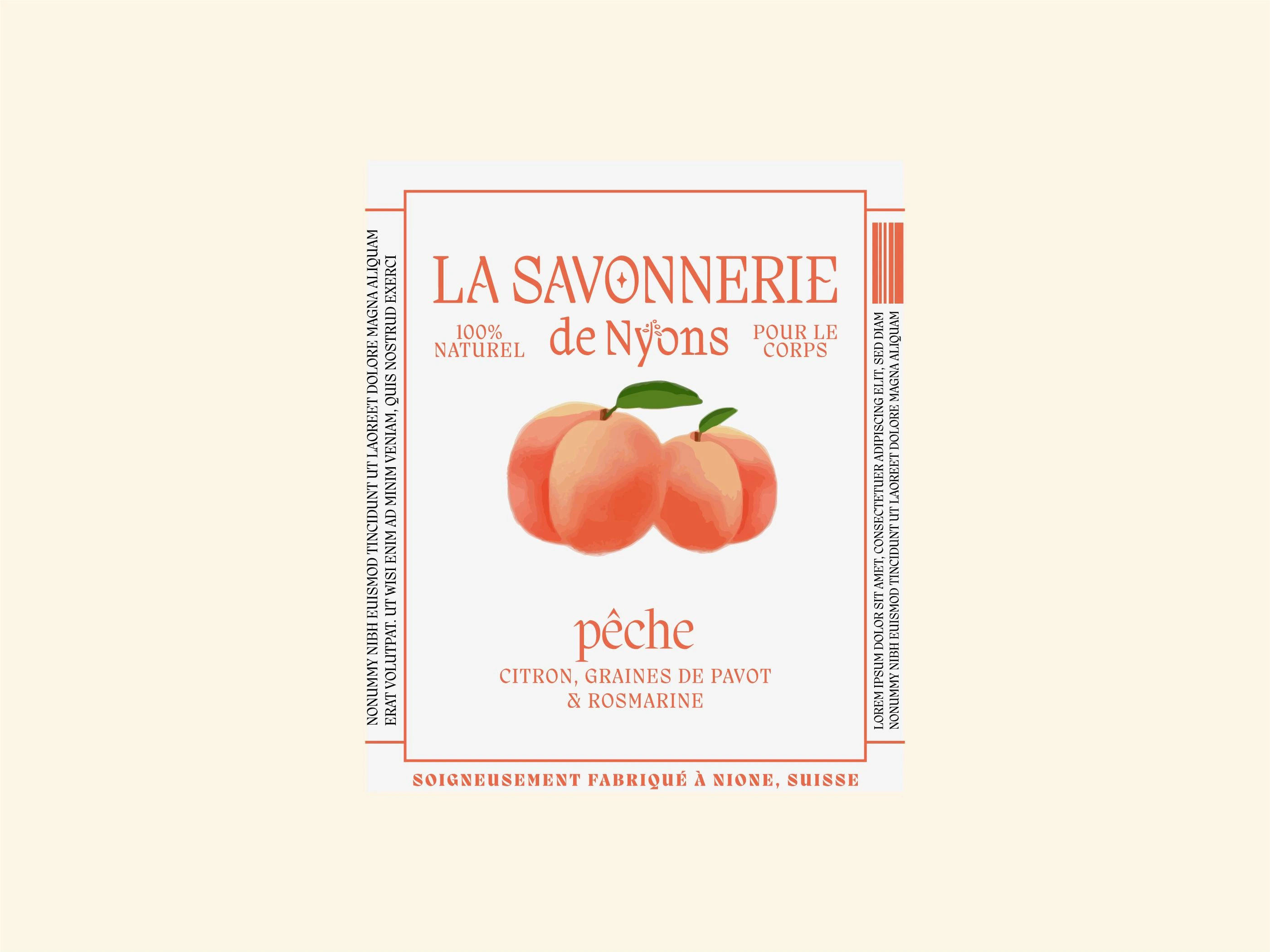
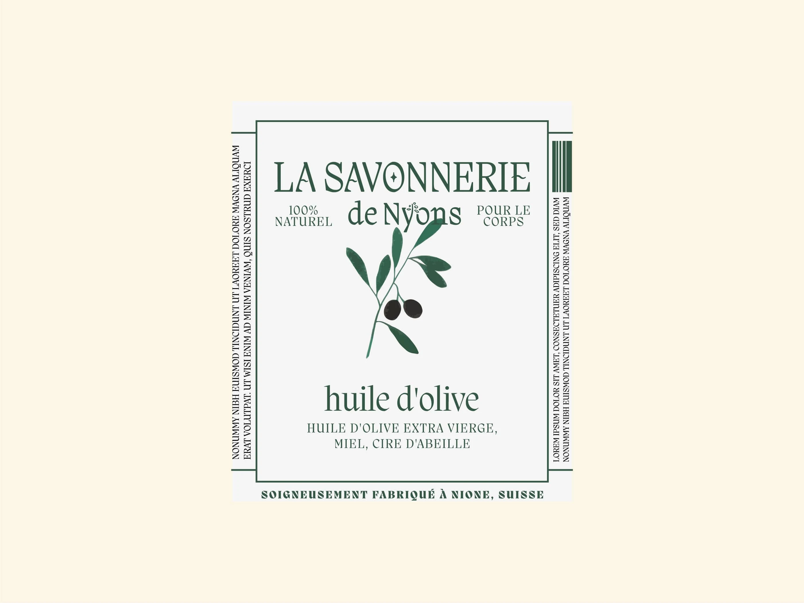
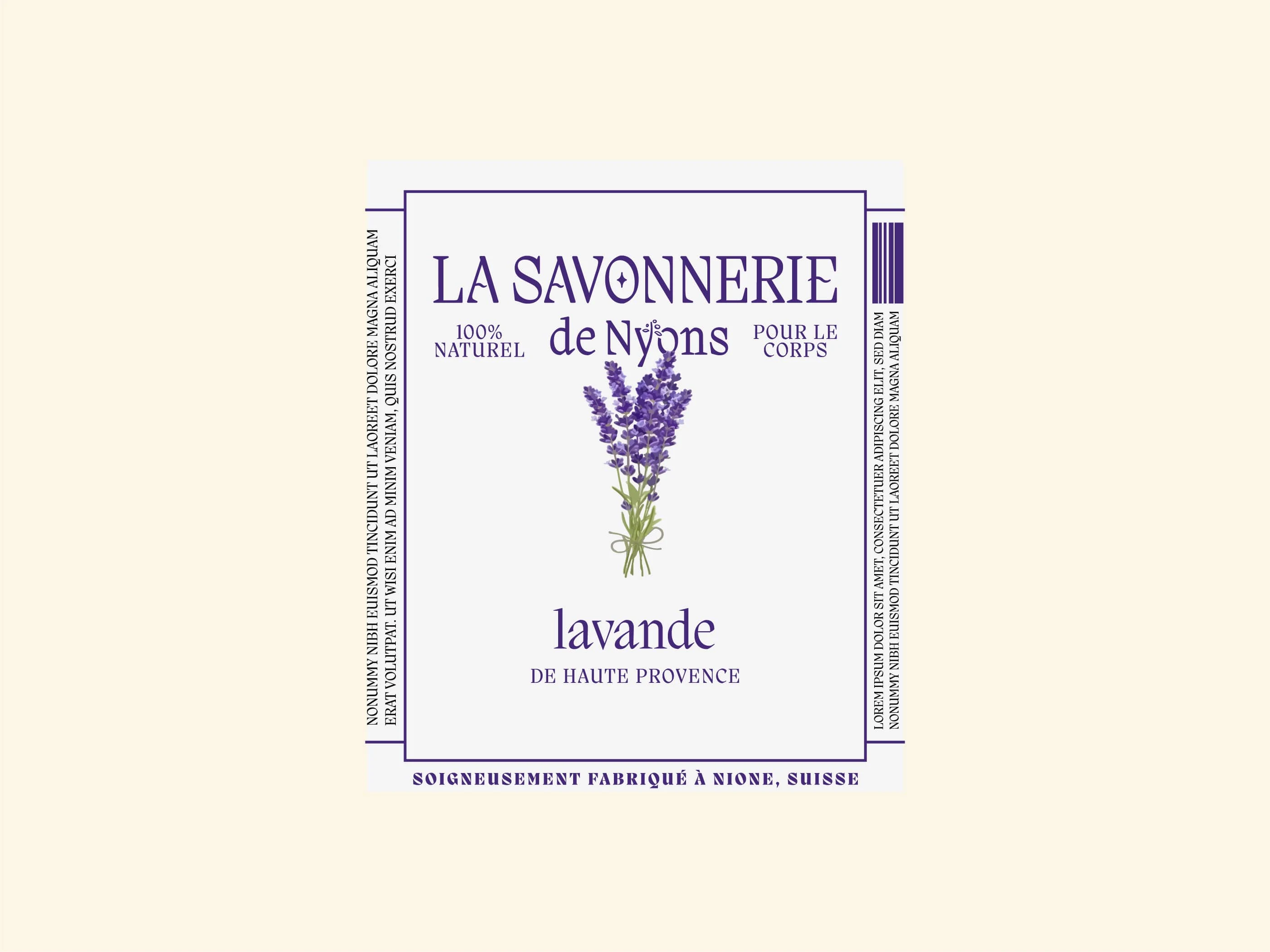
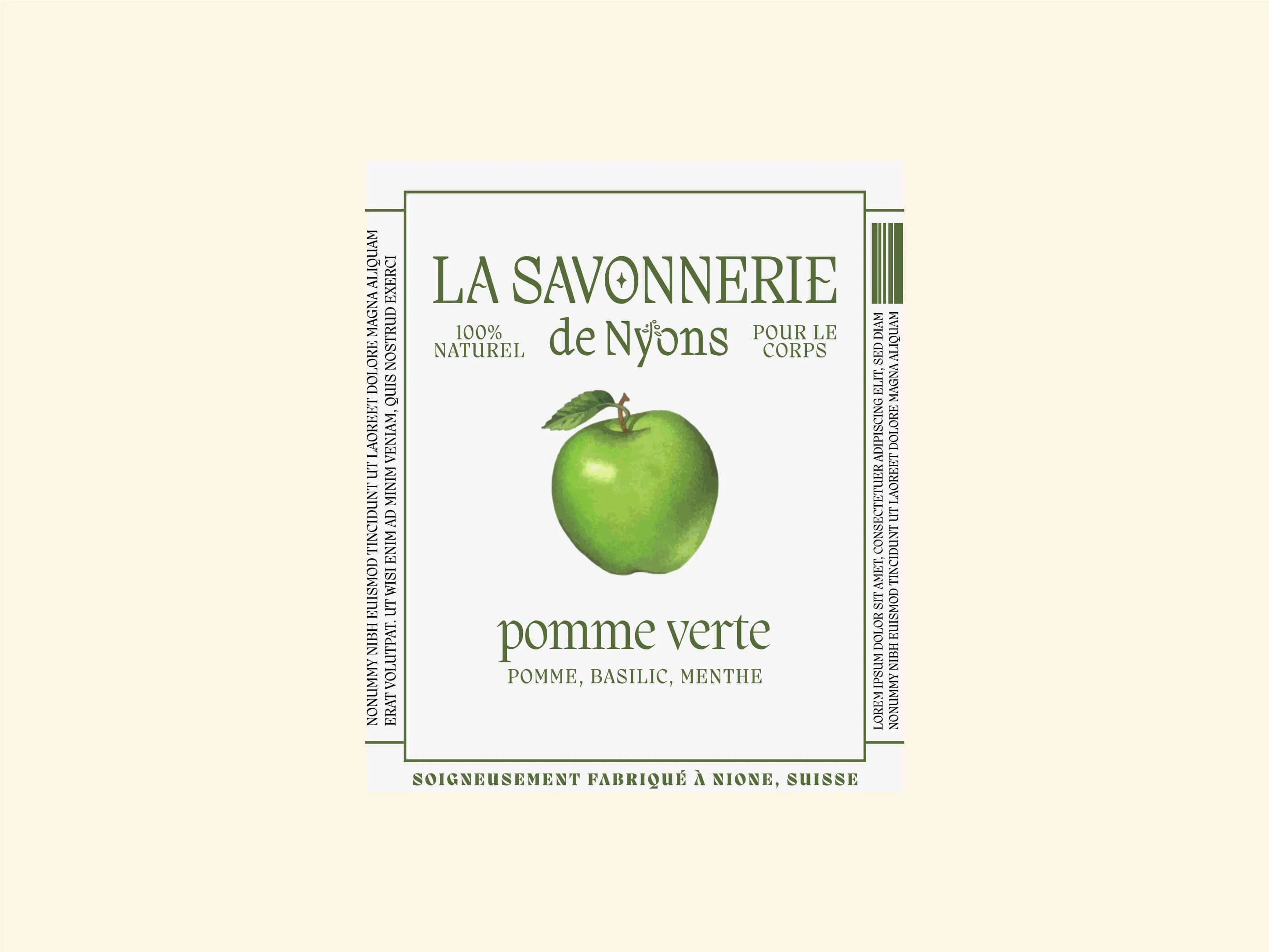
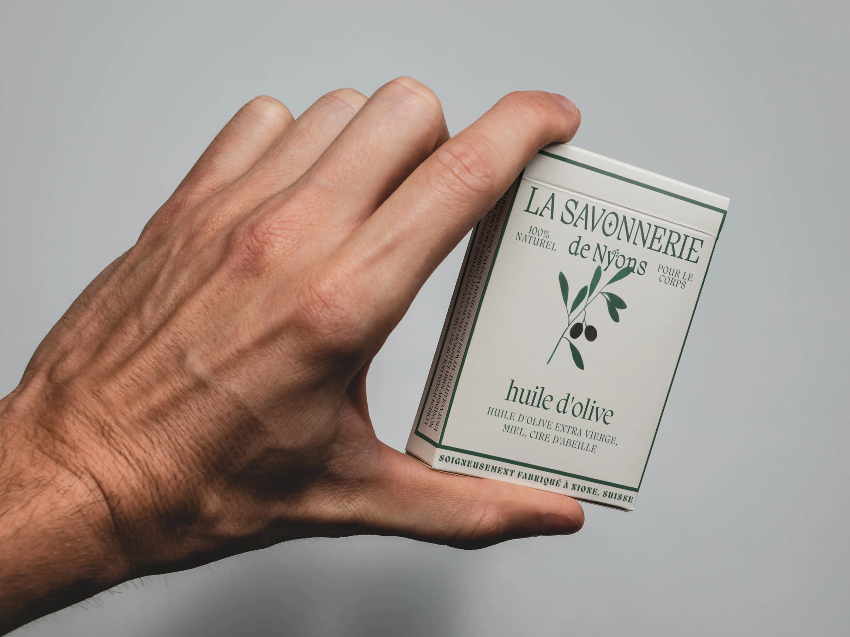
Soap Packaging
Refreshed Logo
Like this project
Posted Aug 23, 2024
The redesigned La Savonnerie blends tradition with modern French elegance.