Casa Verde Brand Identity Design
Kingsley M.⚫️

Contents.
Introduction
Logo
Clearspace
Color Palette
Typography
Imagery
Application
Introduction
Casa Verde” is a Spanish/Portuguese word that translates to “Green House”. As the name implies, Casa Verde is
set up to be a “sustainable haven”. The goal of Casa Verde is to create a community centered on sustainability, where individuals can live, invest in, and thrive.
Nature is the star here, and Casa Verde is designed to honor nature in the best ways possible by implementing
eco-friendly features to complement, rather than destroy, nature.
Casa Verde offers living spaces, both for short and long-term purposes. The community also has other nature preservation features, like mini-parks, gardens, orchards, etc. Overall, Casa Verde offers a safe haven for individuals seeking respite from the hustle and bustle of the city while also being environmentally conscious and practicing healthy living.
Logo animation
Logo
Primary Logo
At its core, the logo is an abstract and geometric combination of two key elements:
• A leaf: Representing nature, sustainability, and eco-conscious living
• A hut/house structure: Symbolizing shelter, tradition, and culturally-rooted architecture
The house-like silhouette is inspired by traditional African huts, known for being naturally cool, breathable, and built from eco-sourced materials such as raffia, earth, and timber. This not only nods to sustainable construction but celebrates a heritage of resourceful, earth-conscious living.
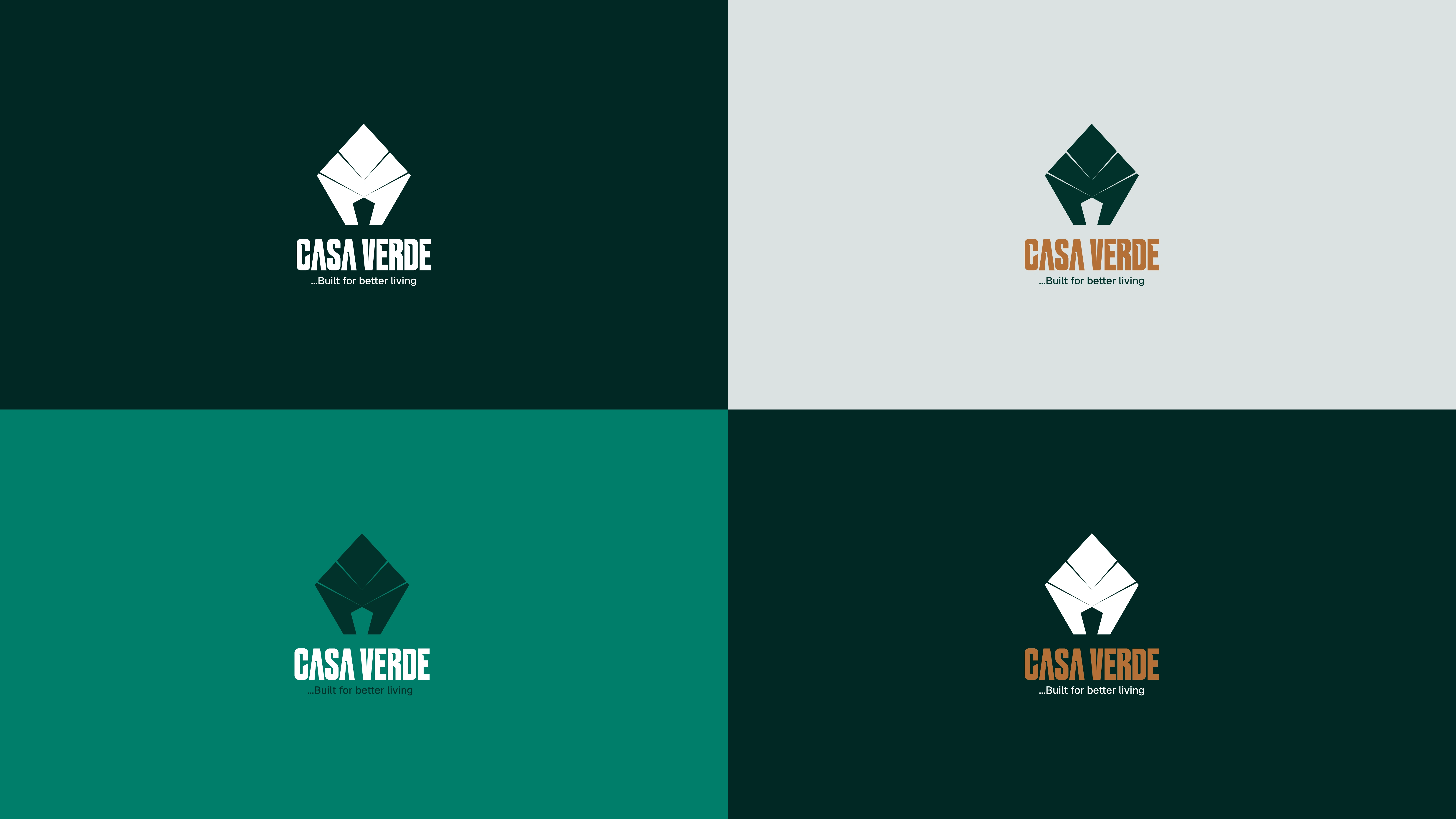
Primary logo design
Secondary Logo
The wordmark represents the brand name in its typographic form and is designed to complement the icon logotype. It reinforces brand recognition and provides flexibility across different applications where the icon alone may not offer sufficient clarity.
Secondary logo
Clearspace
To maintain the logo’s visual integrity and ensure maximum impact, always surround it with sufficient clear space. This clear space protects the logo from visual clutter and ensures it remains distinct and recognizable across all applications.
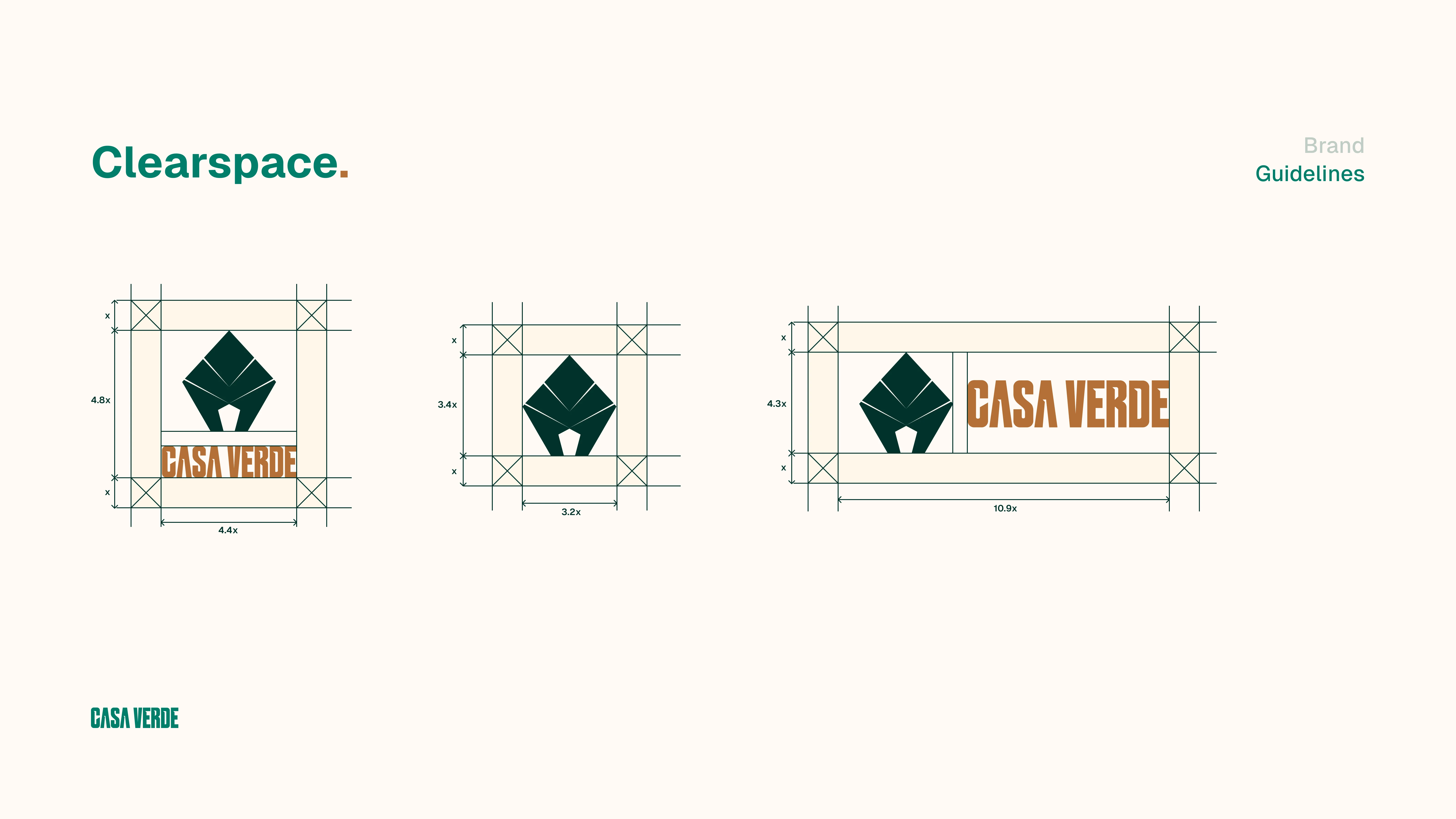
Logo clearspace
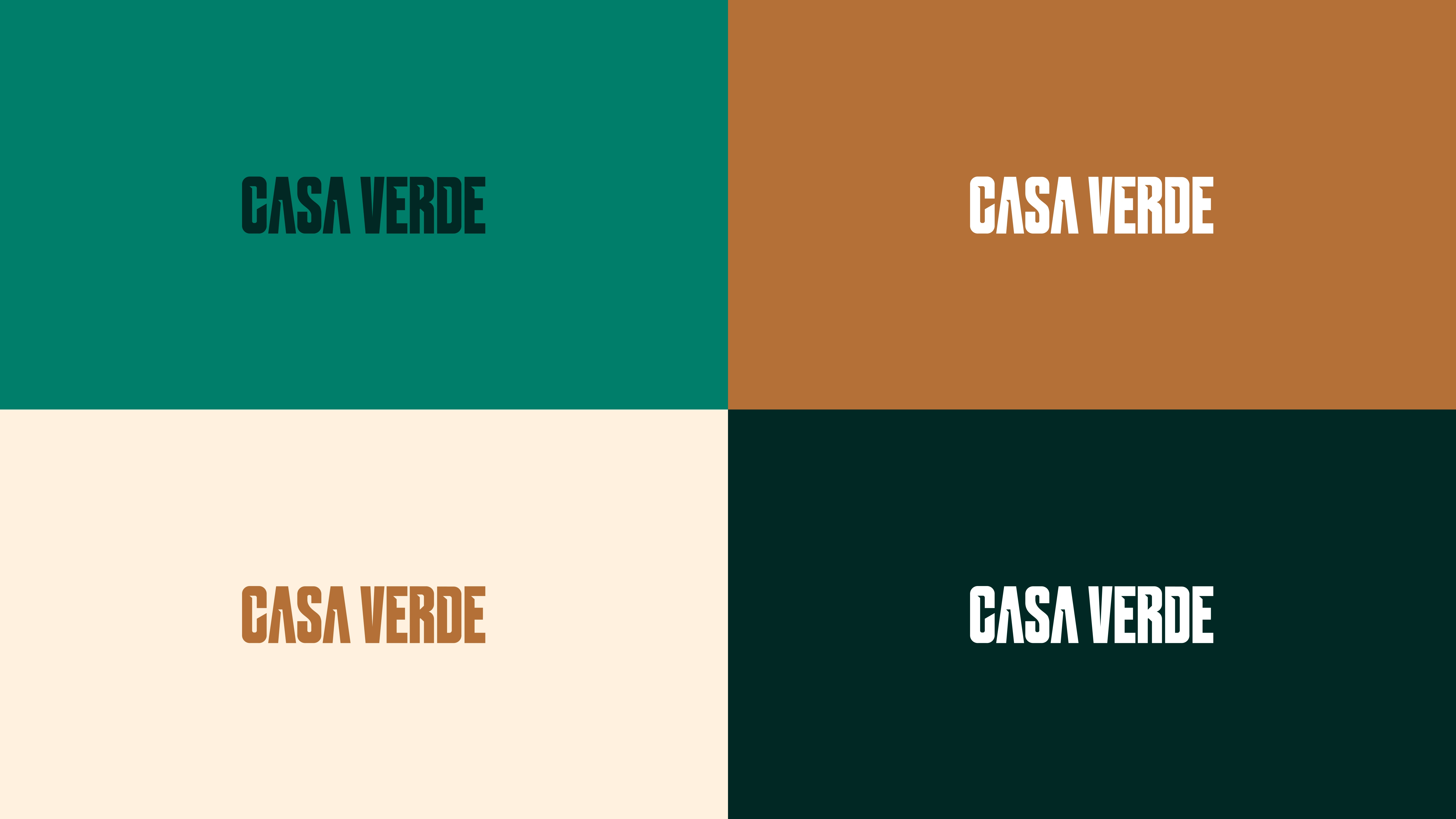
Color Palette
The brand’s color palette defines its visual tone and helps communicate its personality across all touchpoints. Each color has been carefully selected to reflect the brand’s identity and create a consistent experience across digital and print media.
To ensure readability and balance, maintain a strong contrast between background and text elements. Use darker tones against light backgrounds and vice versa to preserve visual clarity and accessibility.
The primary colors represent the brand at its core and should be used consistently, while strong or accent colors should be applied sparingly to highlight key details or actions. Secondary colors offer flexibility for social media, web, and editorial applications, helping expand the visual system without overwhelming the core identity.
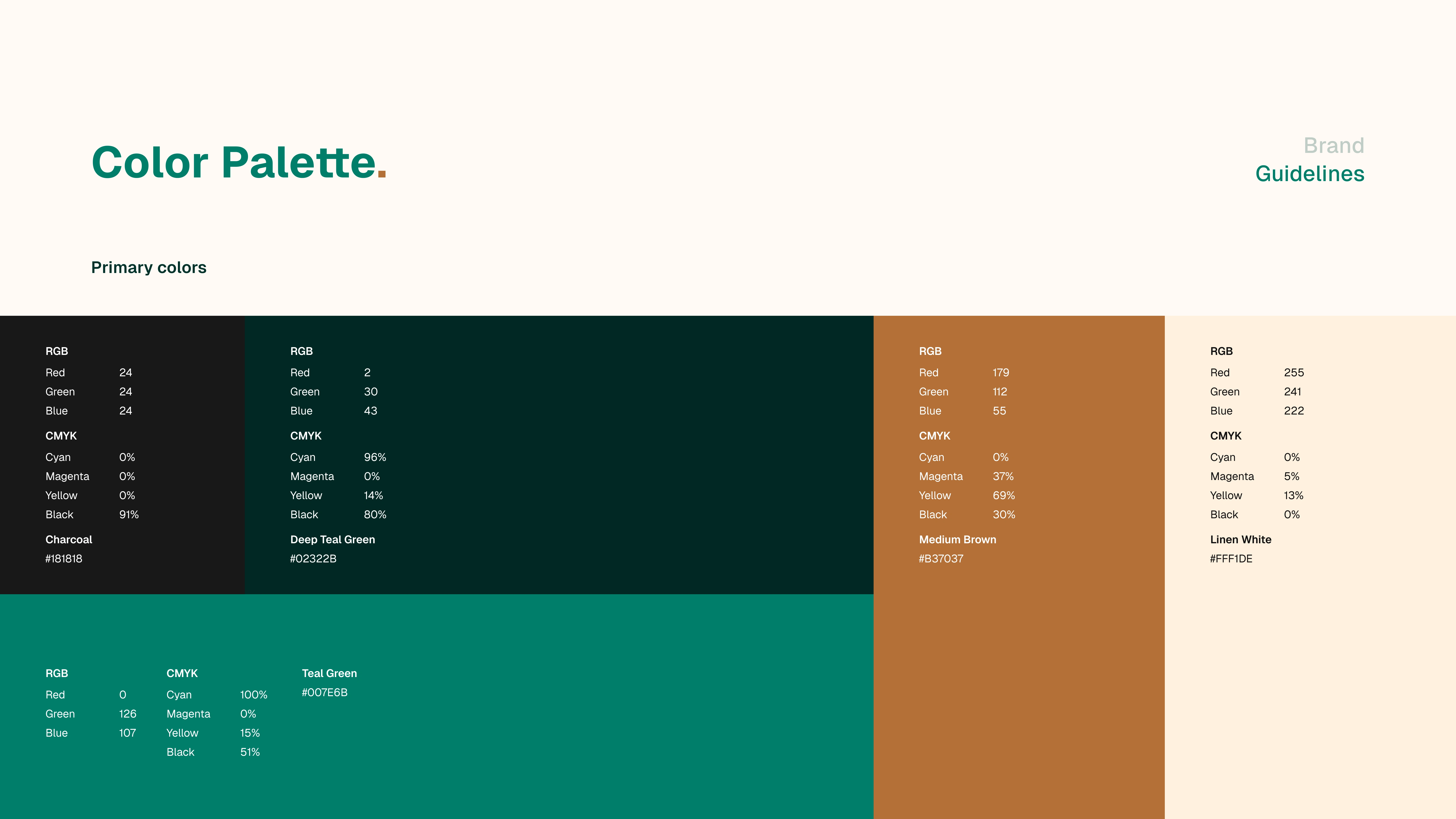
Primary colors
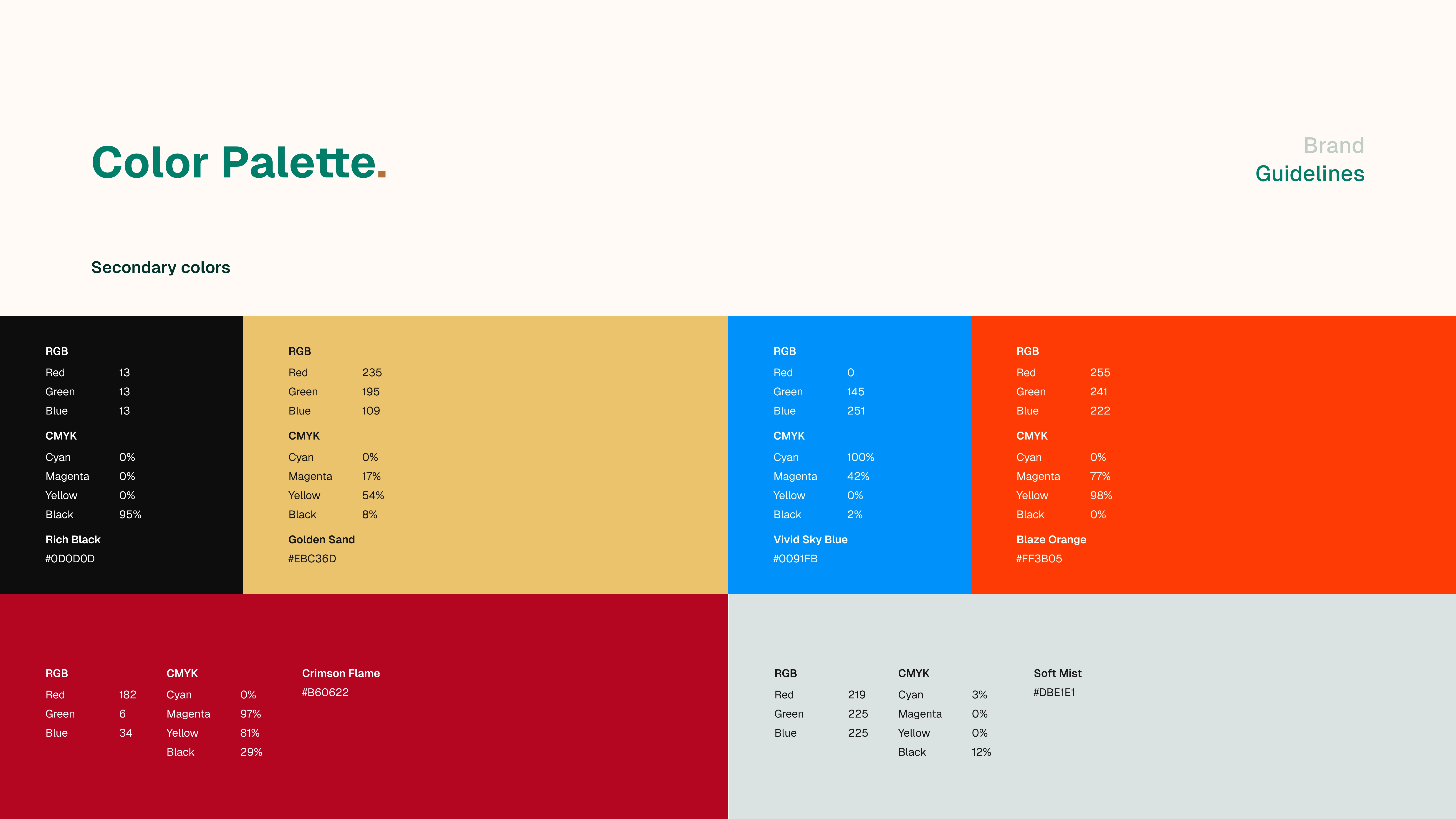
Secondary colors
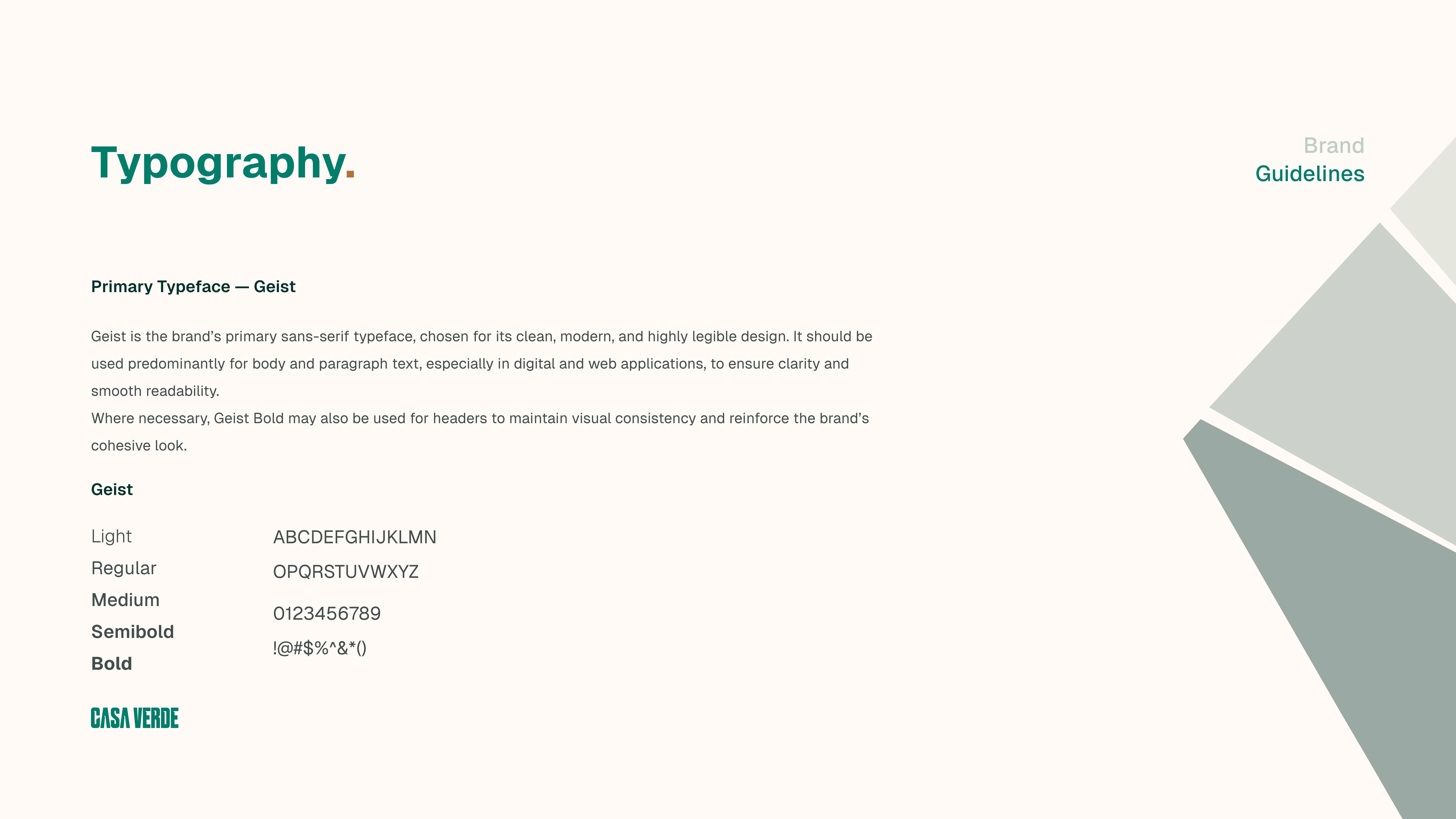
Primary Typography
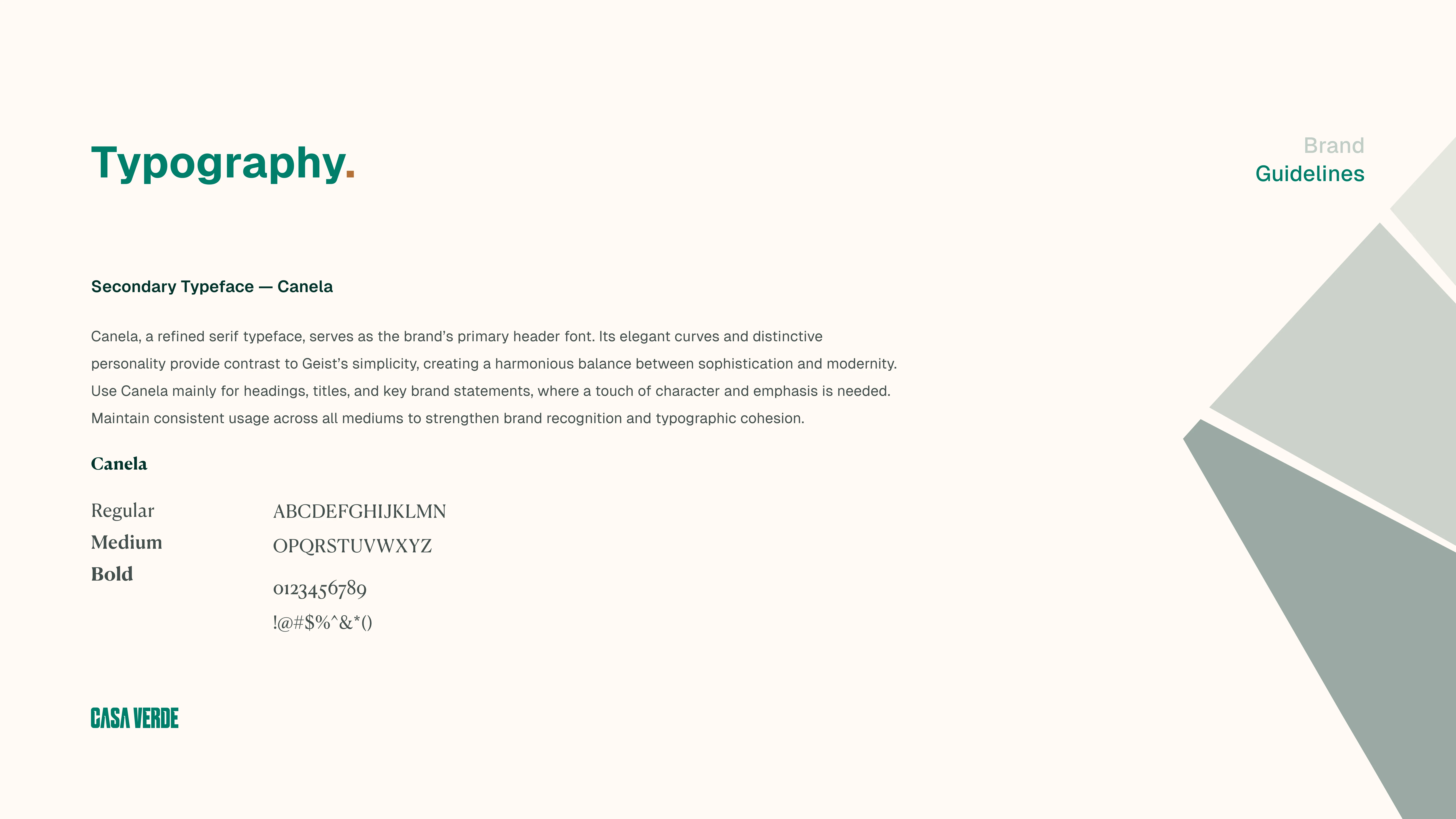
Seconday Typography
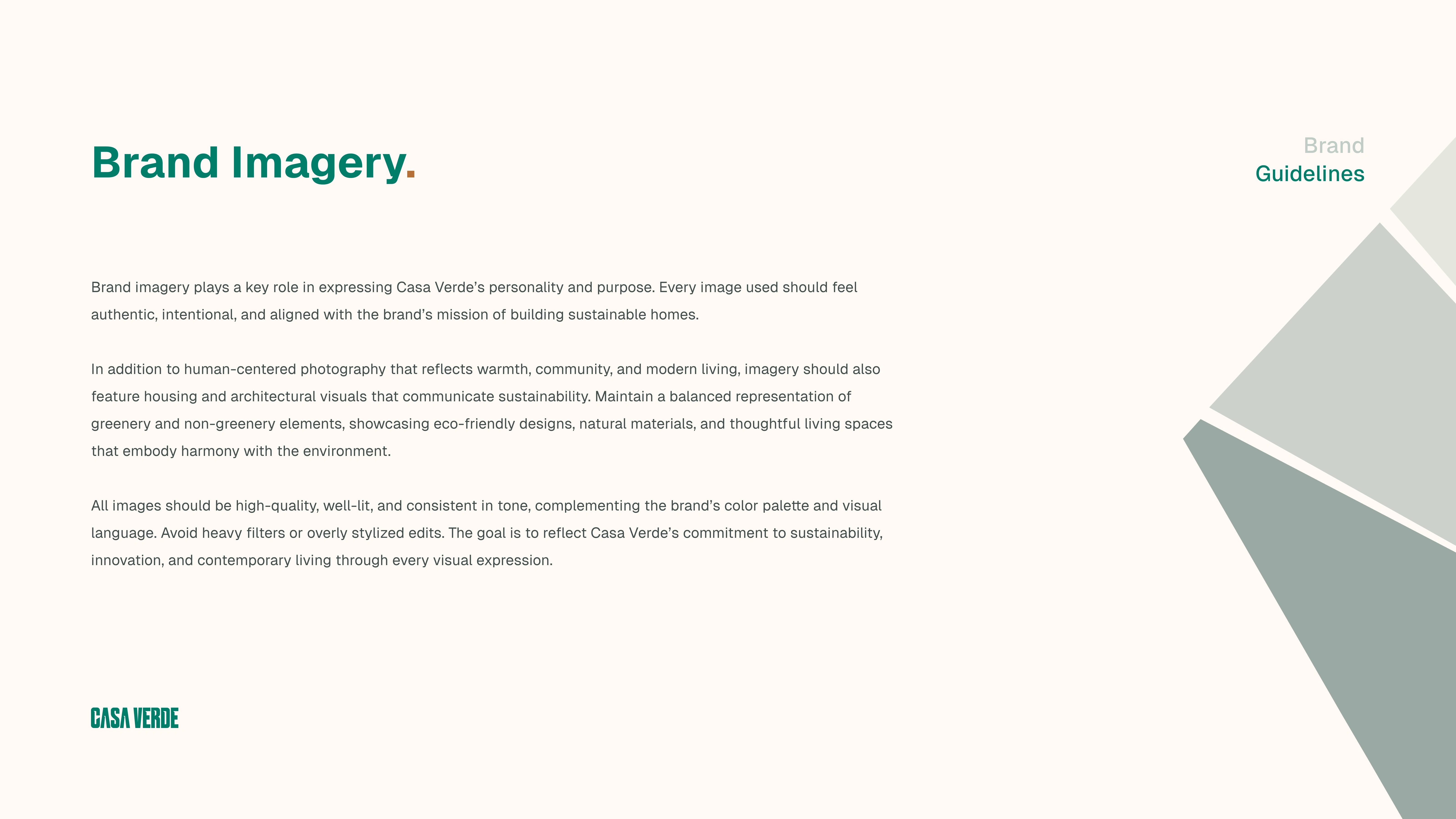
Brand Imagery

Brand personality
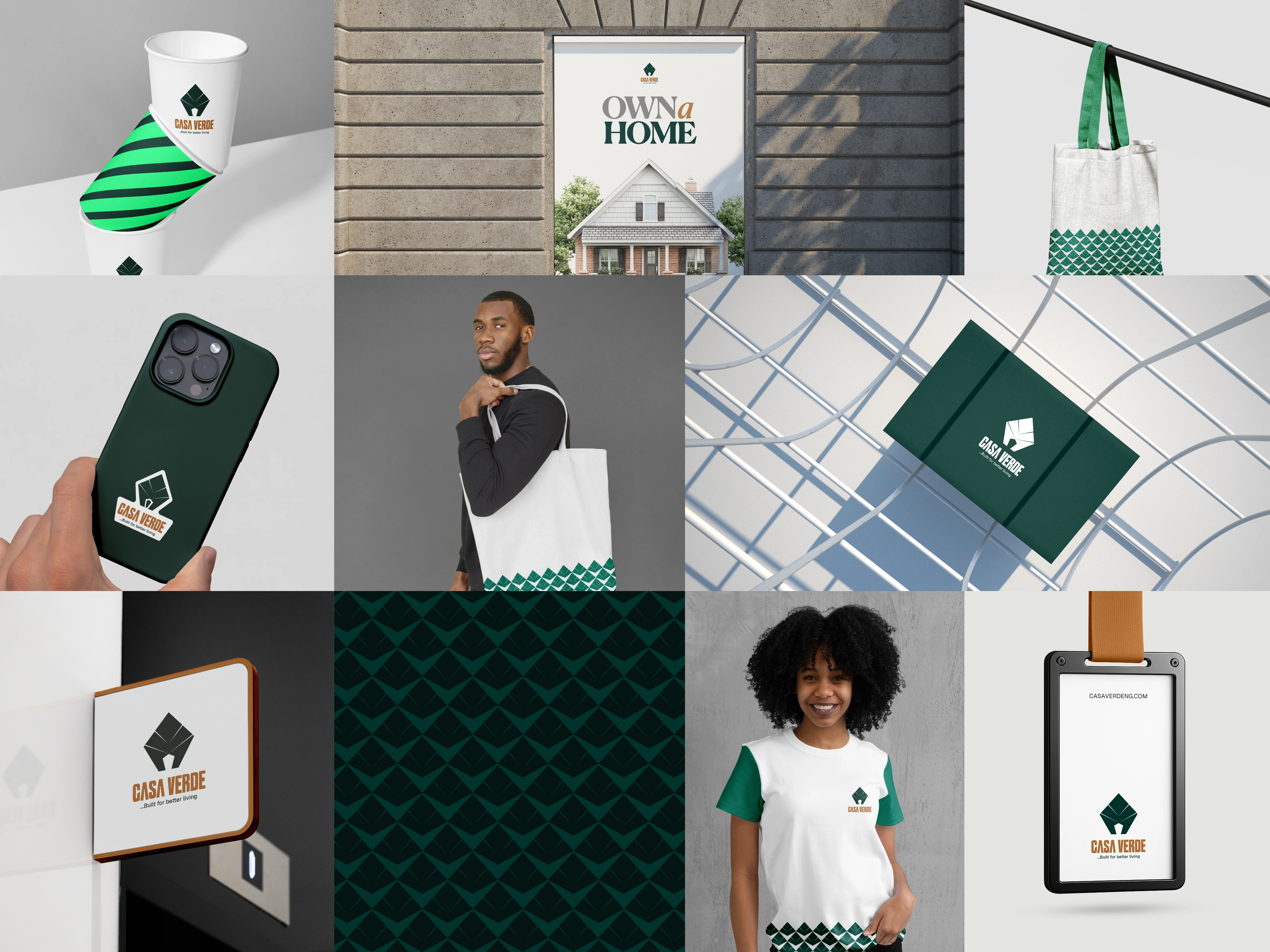
Brand mockups
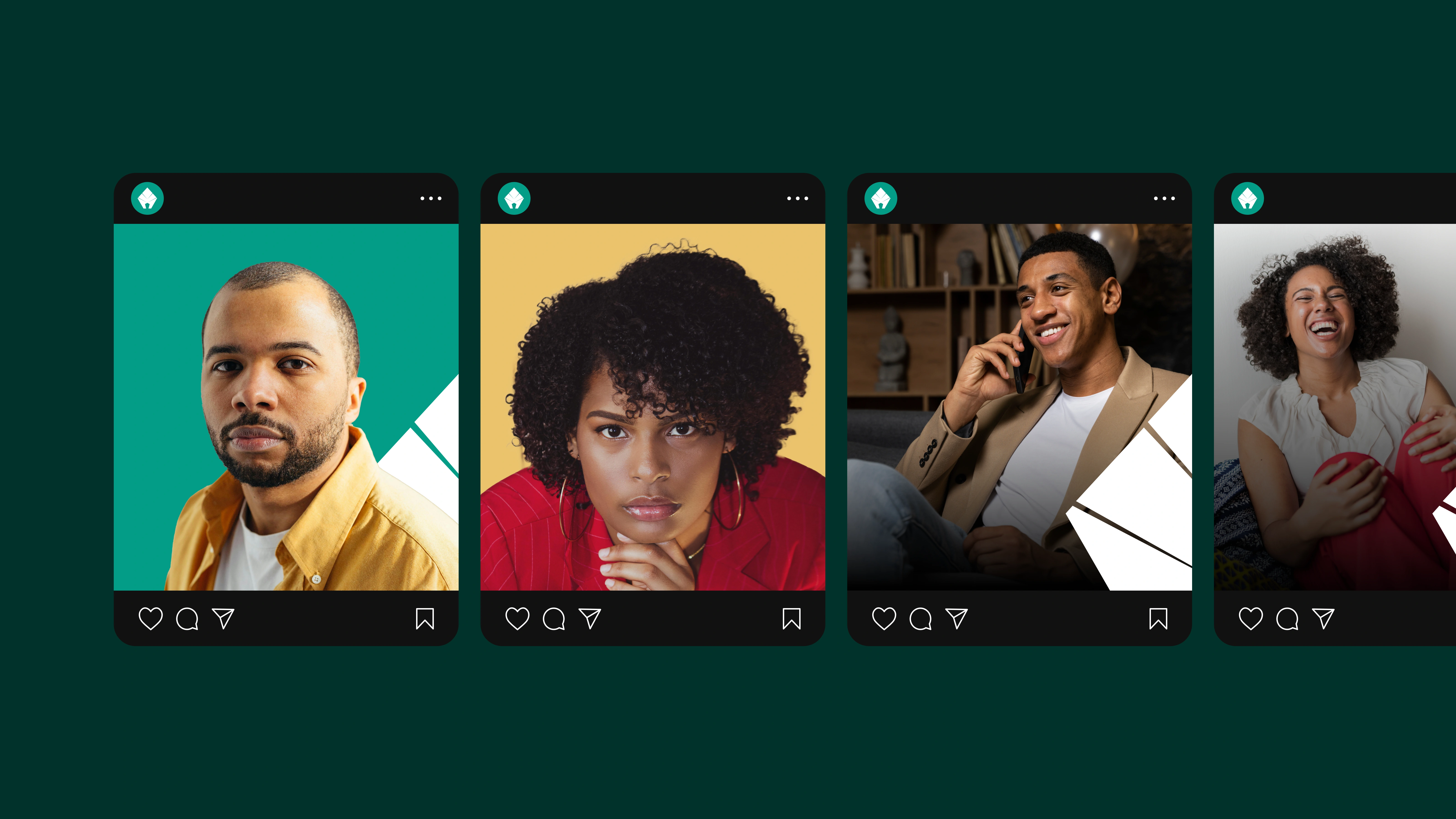
Instagram shots

The end
Like this project
Posted Oct 6, 2025
Created a cohesive brand identity for Casa Verde, highlighting sustainability, modern living, and eco-conscious real estate design.
Likes
0
Views
2