Bounties4 · Branding
Matheus Monteiro
The rebranding of Bounties4 was a very significant project for me.
Founded by two of the most talented developers I've ever had the privilege of working with, the goal is to change the future of remote work for both developers and companies.
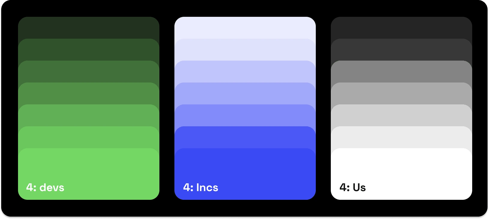
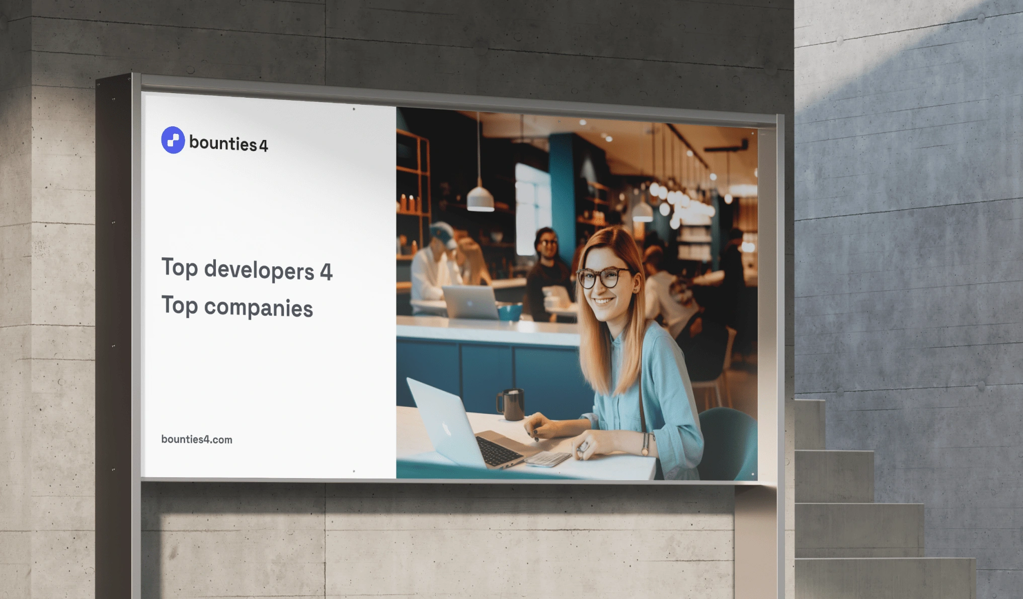
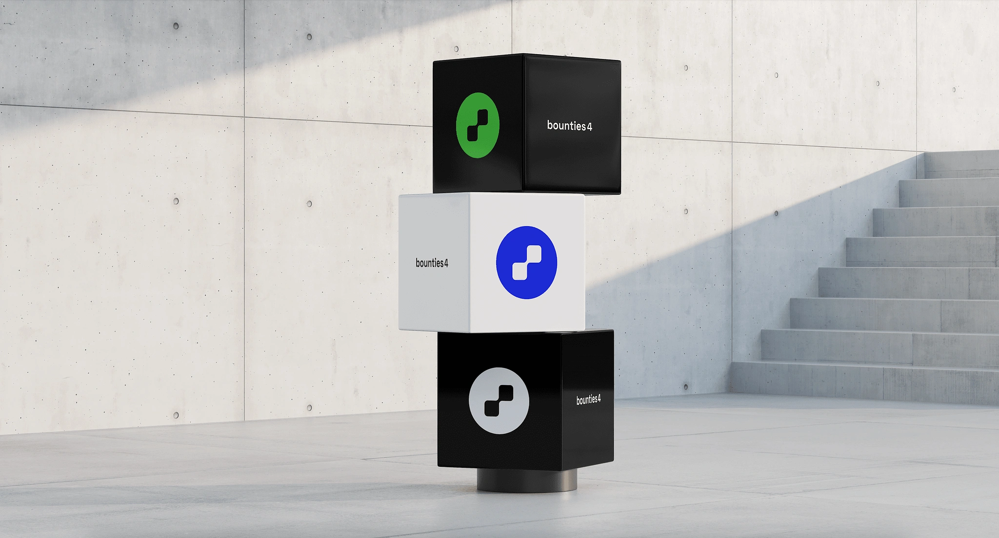
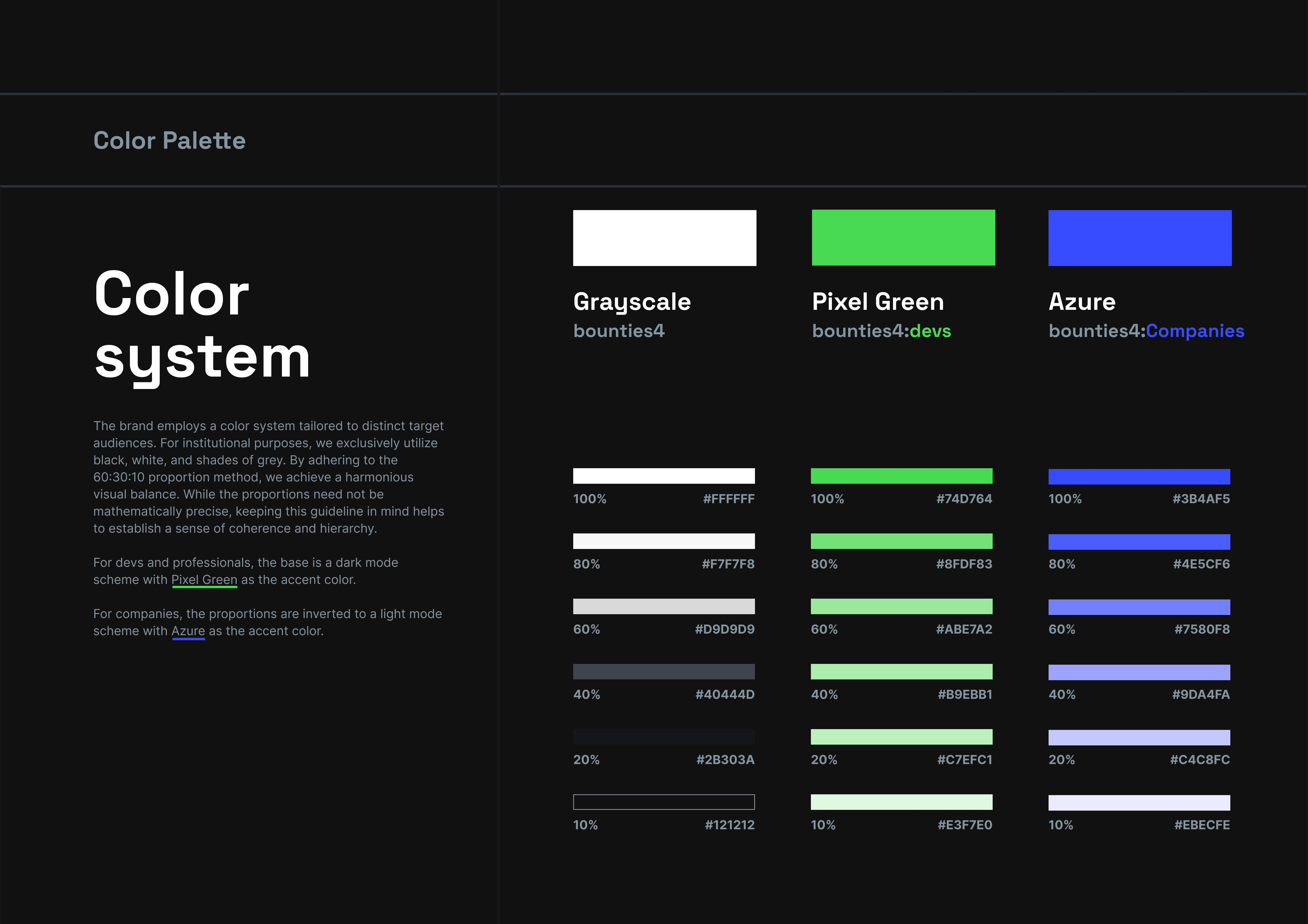
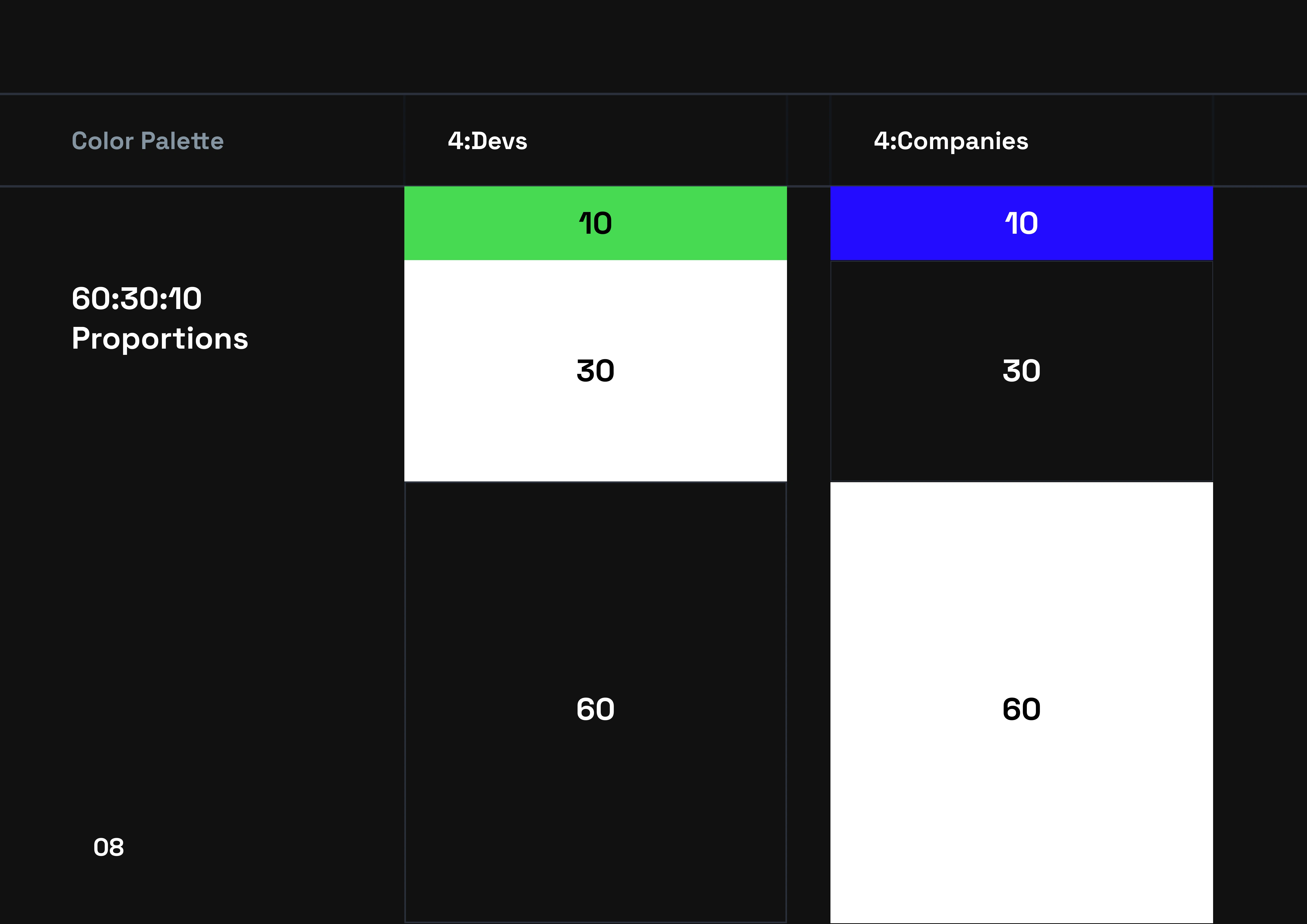
One of the primary challenges we encountered was the need to effectively communicate with two distinct audiences: companies and developers. It was crucial to maintain a sense of unity and consistency while addressing these diverse groups. To overcome this challenge, I chose to explore concepts that functioned seamlessly in black and white.
What is bounties4?
At its core, Bounties4 revolves around the concept of connecting the right developer with the right tasks, all while ensuring quality and timely delivery for the hiring parties. Simultaneously, it aims to provide developers with the freedom and flexibility that remote work offers. After multiple iterations, we settled on a visual concept that represents the seamless connection between these two vital components, all within a secure environment.
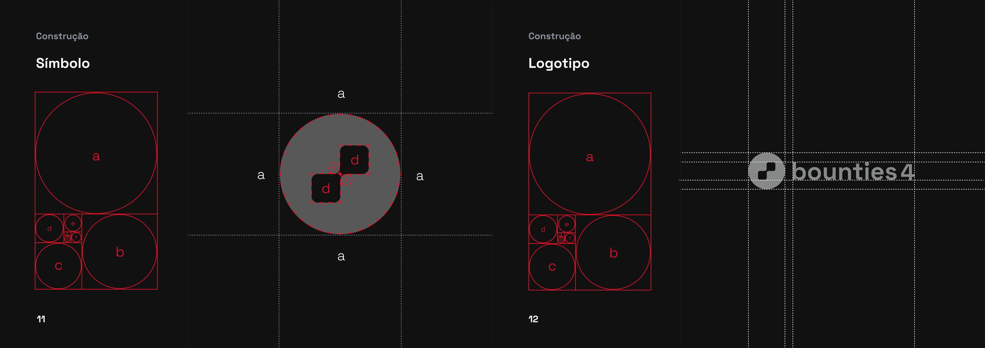
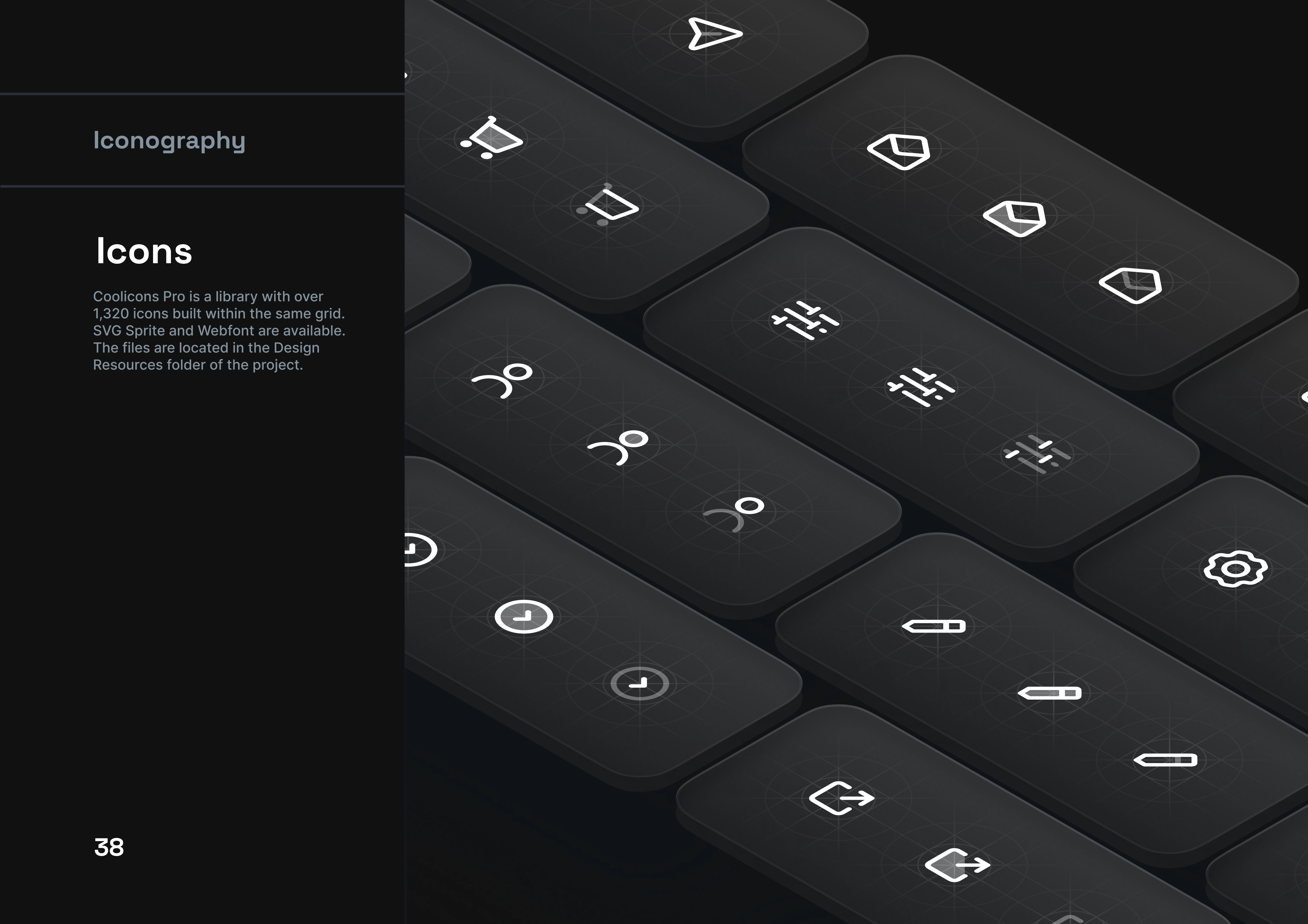
Symbol structure
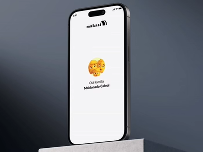
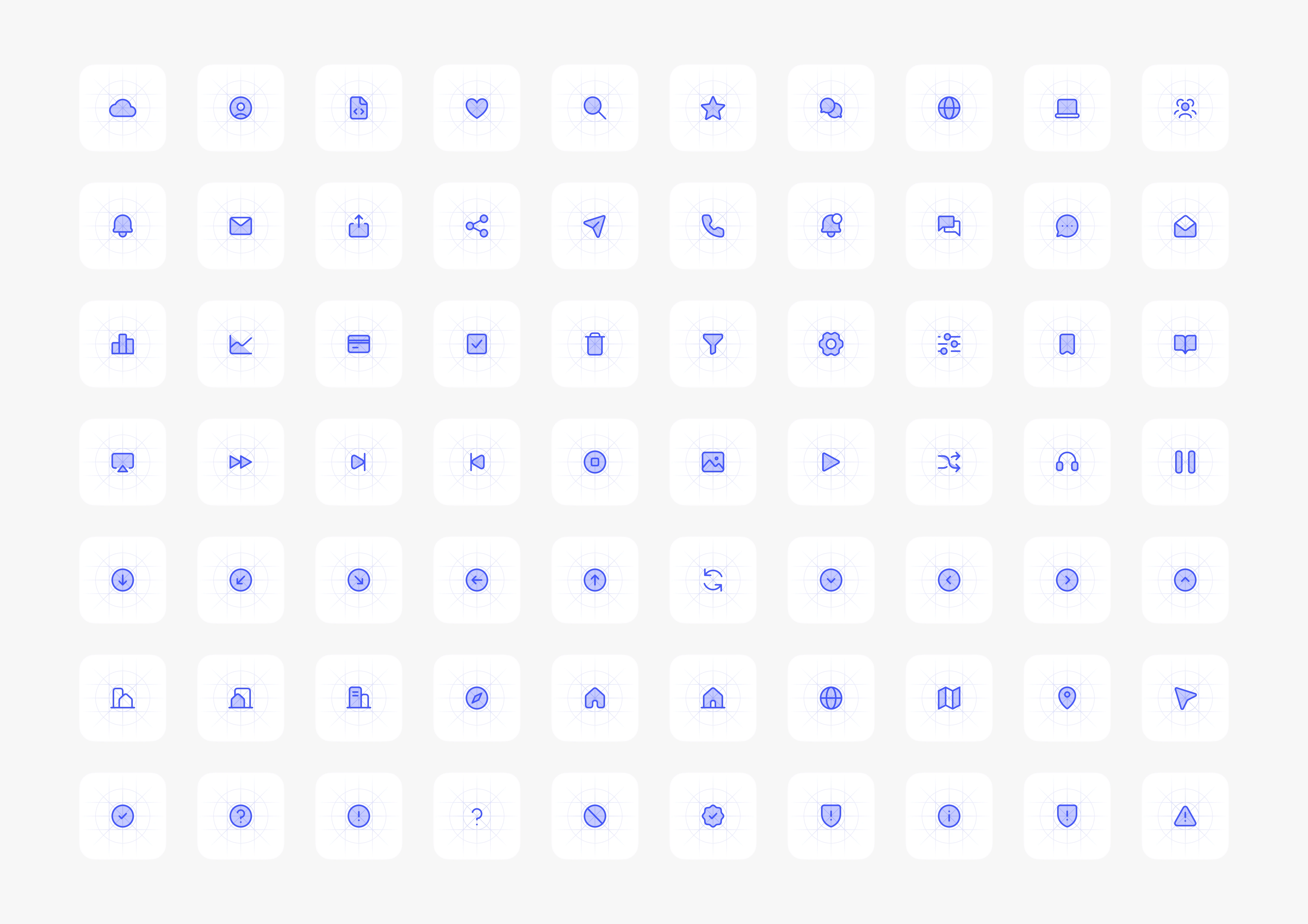
With the symbol in place, I conducted research to ensure our choices remained visually coherent for our target audiences. For companies, we opted for a combination of white and blue. Not only is blue the most favored color, but it also conveys a sense of security.
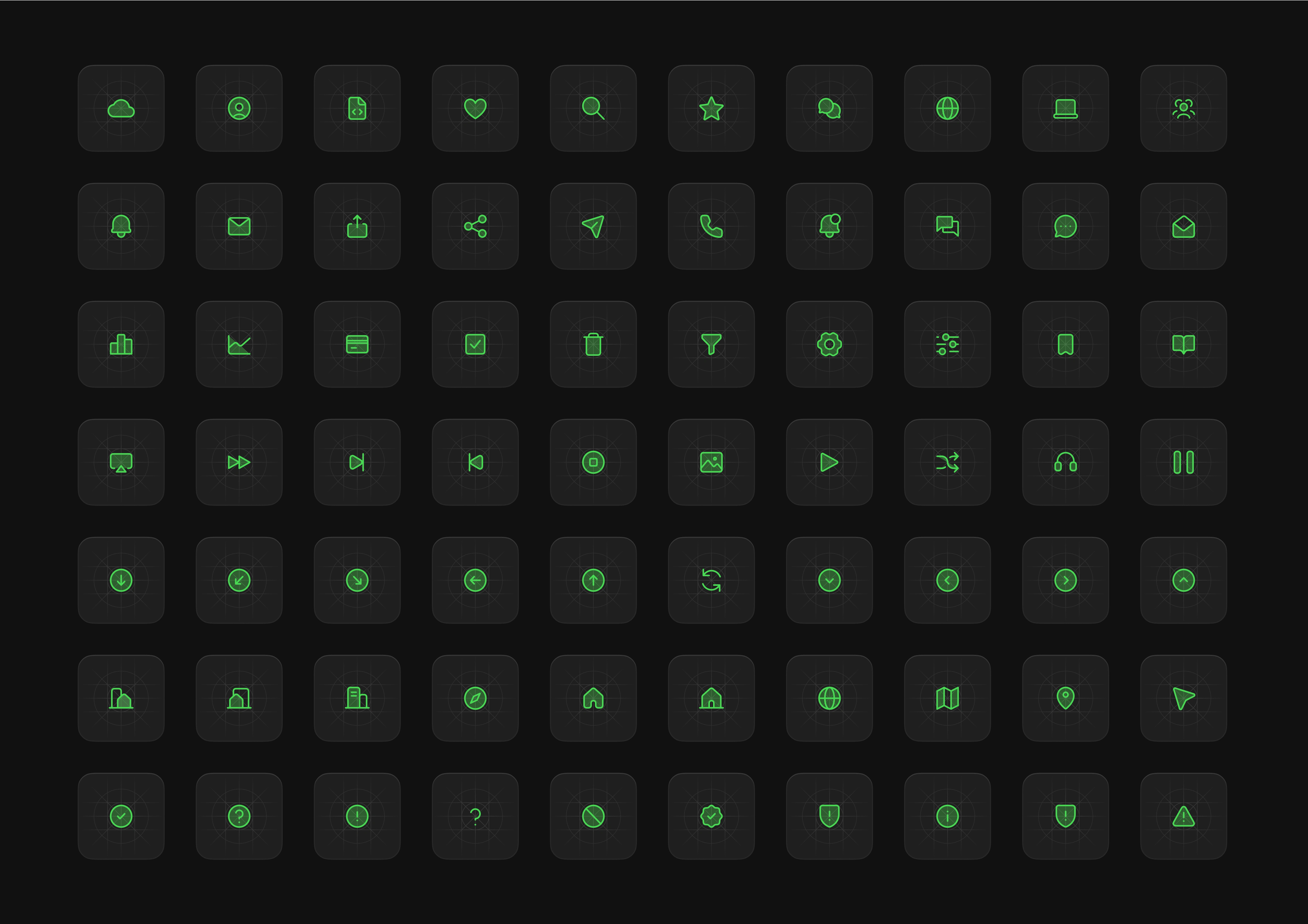
For developers, we embraced a dark mode, featuring an old-school green reminiscent of the earliest computer screens and integrated development environments (IDEs).
The black-and-white version worked so effectively that we decided to use it for internal communication within the company
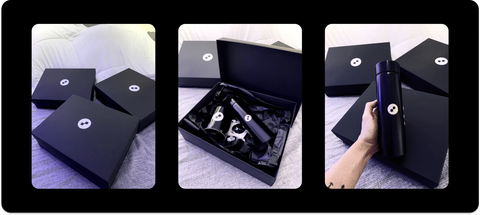
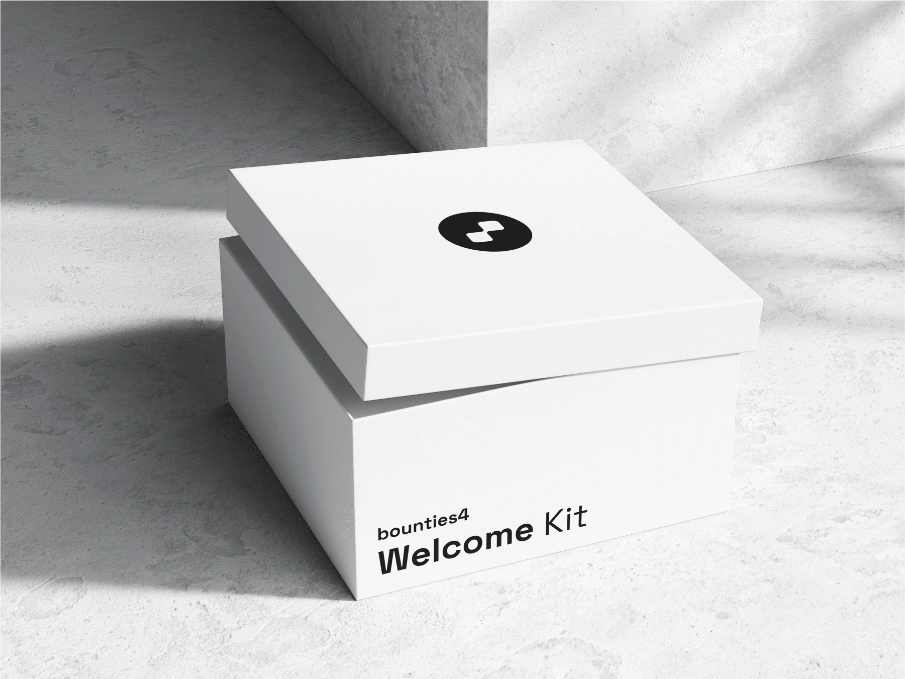
This project provided me with the opportunity to extend my work beyond digital screens. During the creation of mockups, my excitement led me to venture into producing merchandise. This was an excellent opportunity to explore how different shapes and materials affected the visual elements originally designed on a screen. I created stickers, mugs, buttons, and even a thermos with a digital thermometer on the lid, all laser-printed.
Each of the founders received a custom box to package these items. It was my first time investing time and resources into such a venture, and it was a fantastic opportunity to try something new. The clients were thrilled with the merch box 🤞
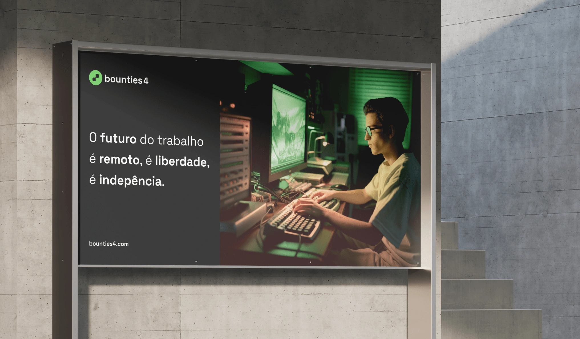
Great design deserves great mockups
My excitement for AI-generated images is still growing. For that project, an image stock was created, consisting of over 30 images, which will be used for communication with developers and companies and gave me a lot of material to explore a few concepts.
Documentation: useful and scalable
Every exemplary design begins with a robust foundation. For me, the main outcome of any project is its documentation. I am deeply committed to investing time in crafting a document that can be comprehended and leveraged by designers from various backgrounds, ensuring they possess a strong and well-supported foundation rooted in our materials. Beyond the visual aspect, a brand manual serves as a guiding light for the brand's self-expression.
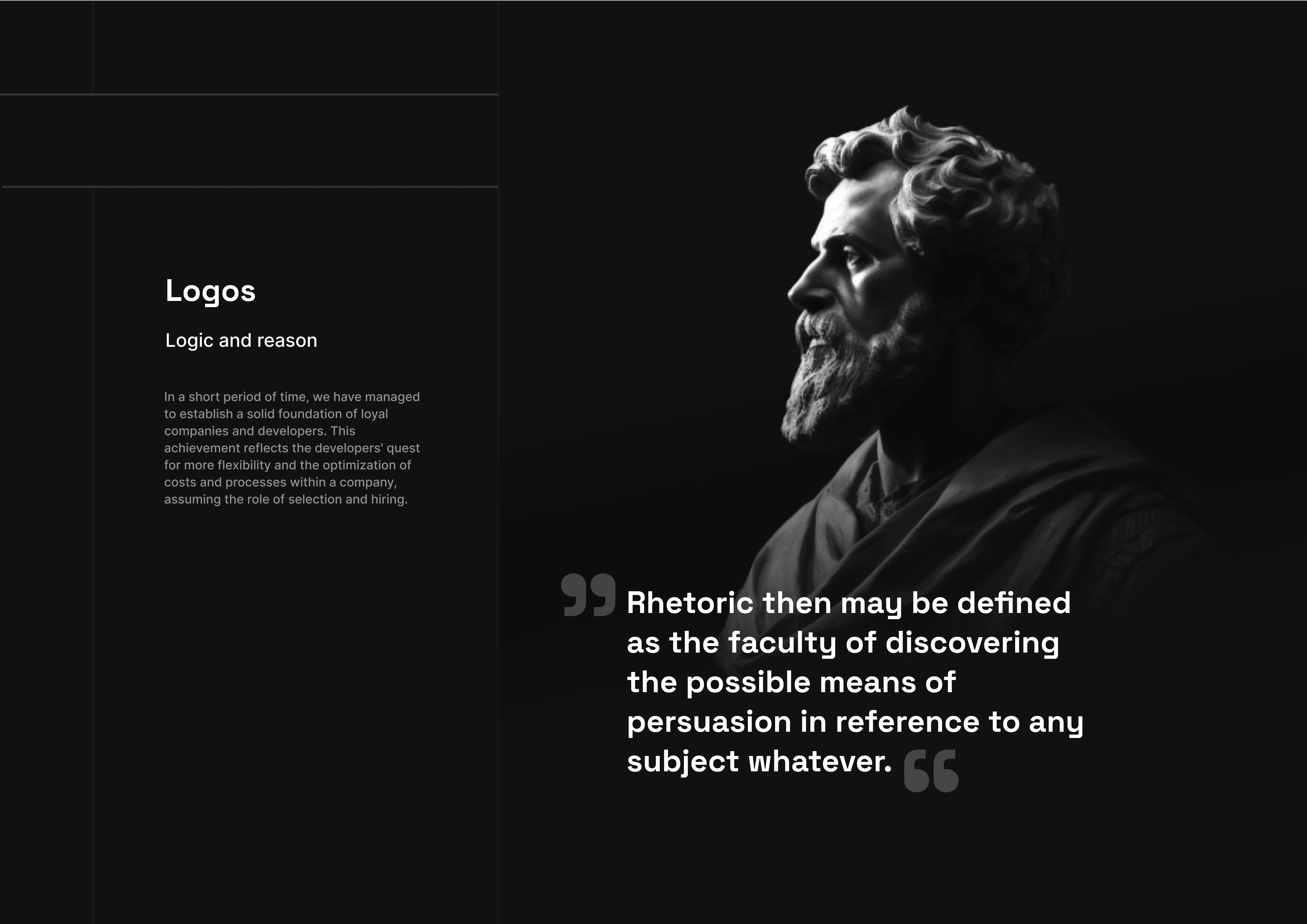
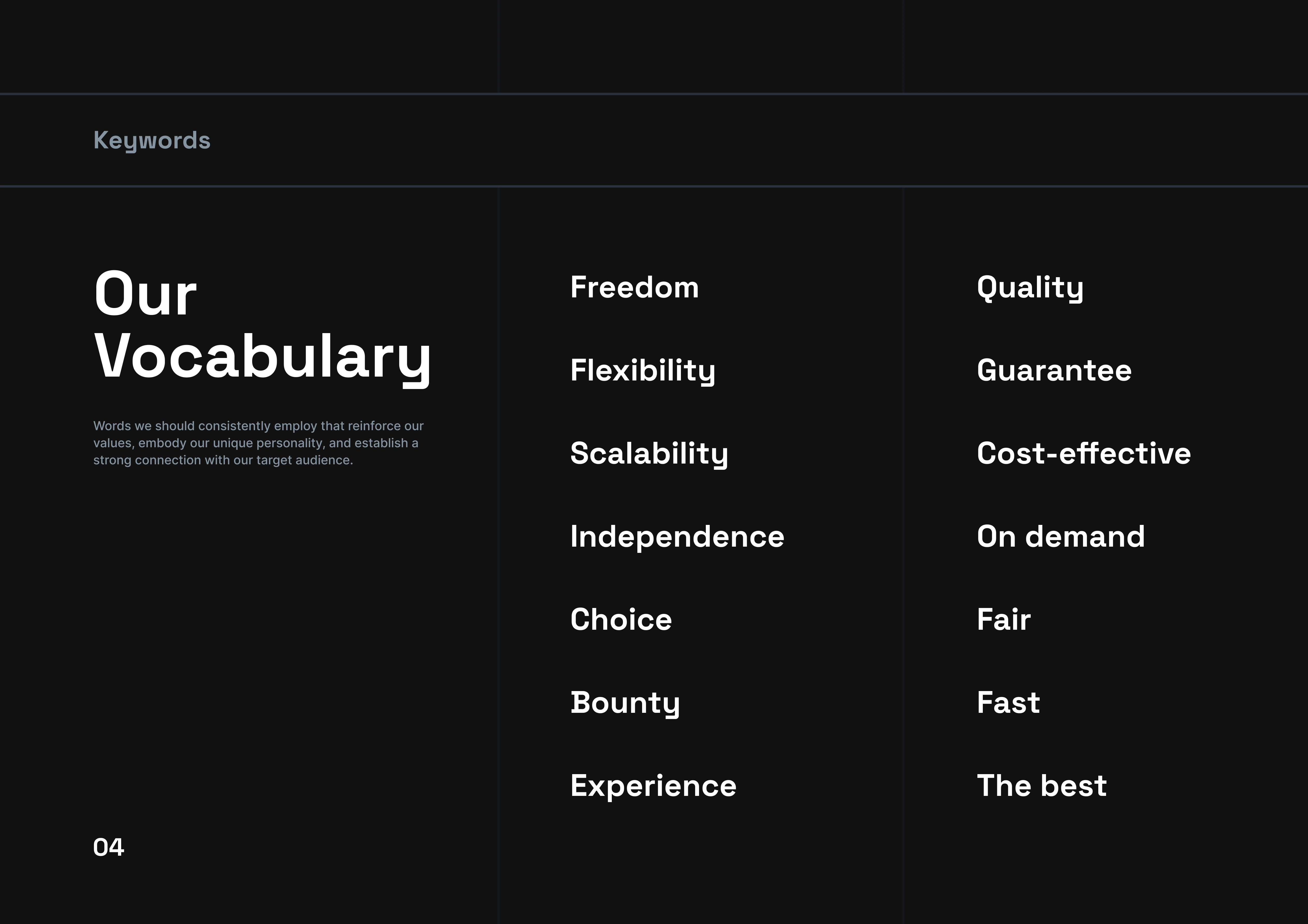
Verbal universe
Branding beyond visuals, for expressing the brand goals and missions.
Visual Universe
The visual expression of personality.
Thanks for reading 🫰
Like this project
Posted Nov 3, 2023
A challenging project. One brand, multiple purposes.
Likes
0
Views
43