Most testimonial sections are decoration.

Most testimonial sections are decoration. This one was costing conversions.
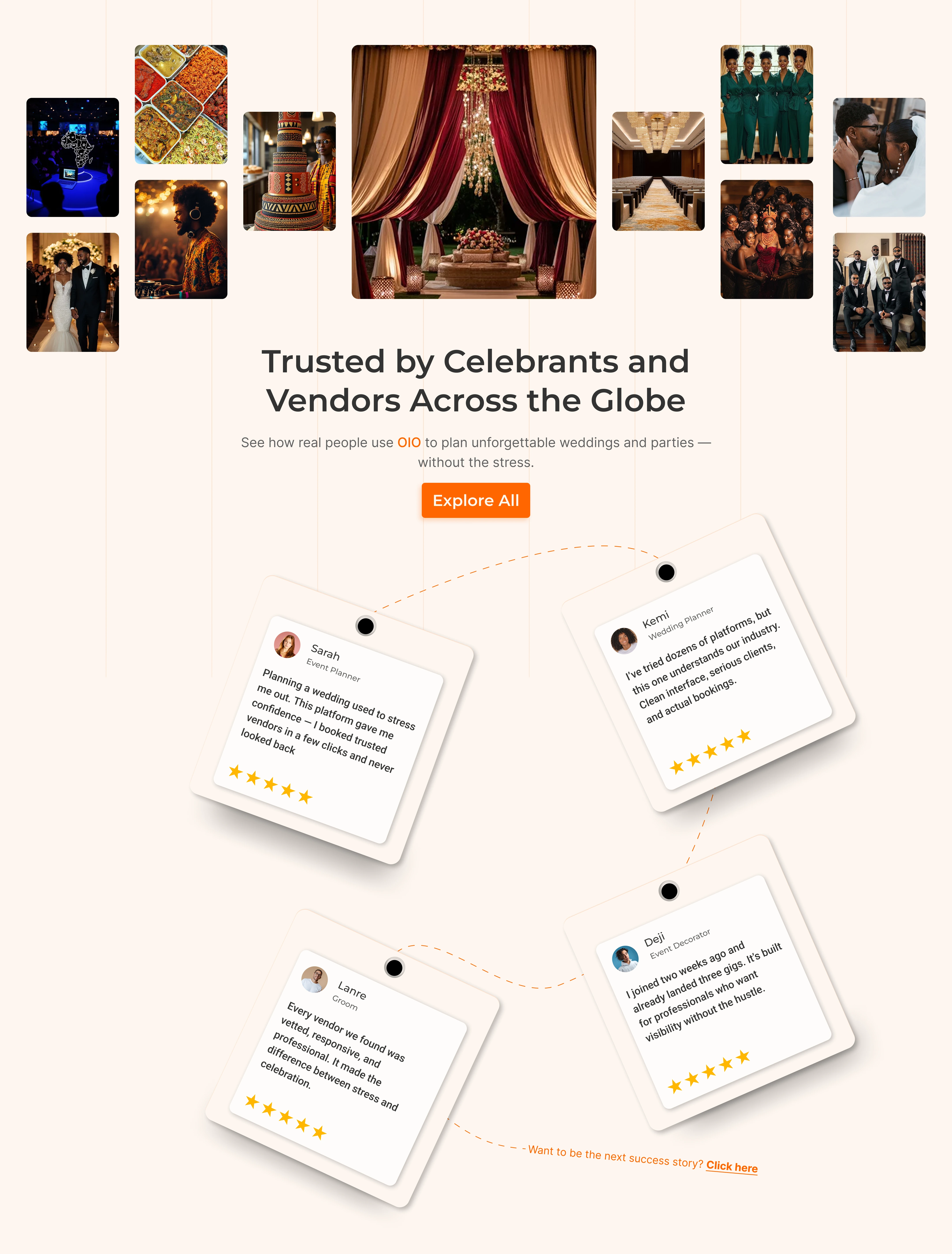
A client's social proof section looked beautiful. It also took four
full screens of scrolling to read four sentences, the text was tilted
12° so it was genuinely uncomfortable to read, and one of the
"customers" on a wedding platform was a web developer talking about
his portfolio.
Nobody was reading it. Which means nobody was being convinced by it.
What I changed:
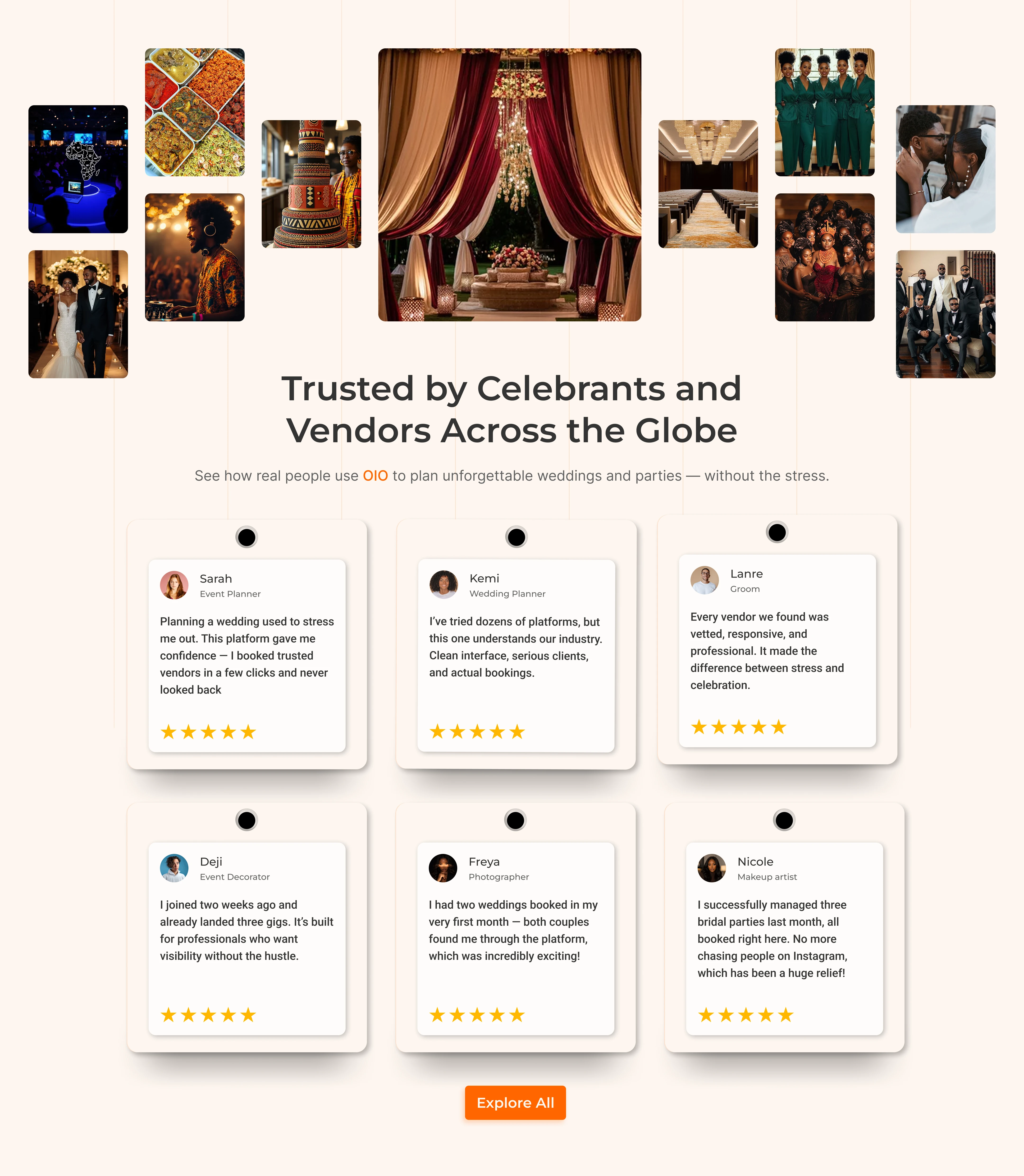
→ Straightened the cards. Pretty is worthless if the words are hard
to read.
→ Deleted the decorative connector line. It implied the reviews were
in some order. They weren't.
→ Cut the section height by more than half. Same content, one screen.
→ Rewrote the reviews to name actual outcomes: "two weddings booked in
my first month" instead of "great platform."
The "before" is the more designed one. The "after" is the one that
does its job. Knowing the difference — and being willing to delete
your own good idea — is most of the job.
I'm a product designer working across marketing surfaces and complex
product systems (this section, and a multi-chain wallet dashboard in
the same month). Open to product design roles — permanent or contract,
US or remote.
Founders: when did you last read your own testimonials section all
the way through?
0 likes · 2 views · Sep 6, 2026
Most testimonial sections are decoration. This one was costing conversions. A client's social proof section looked beautiful. It also took four full screens ...
Tags