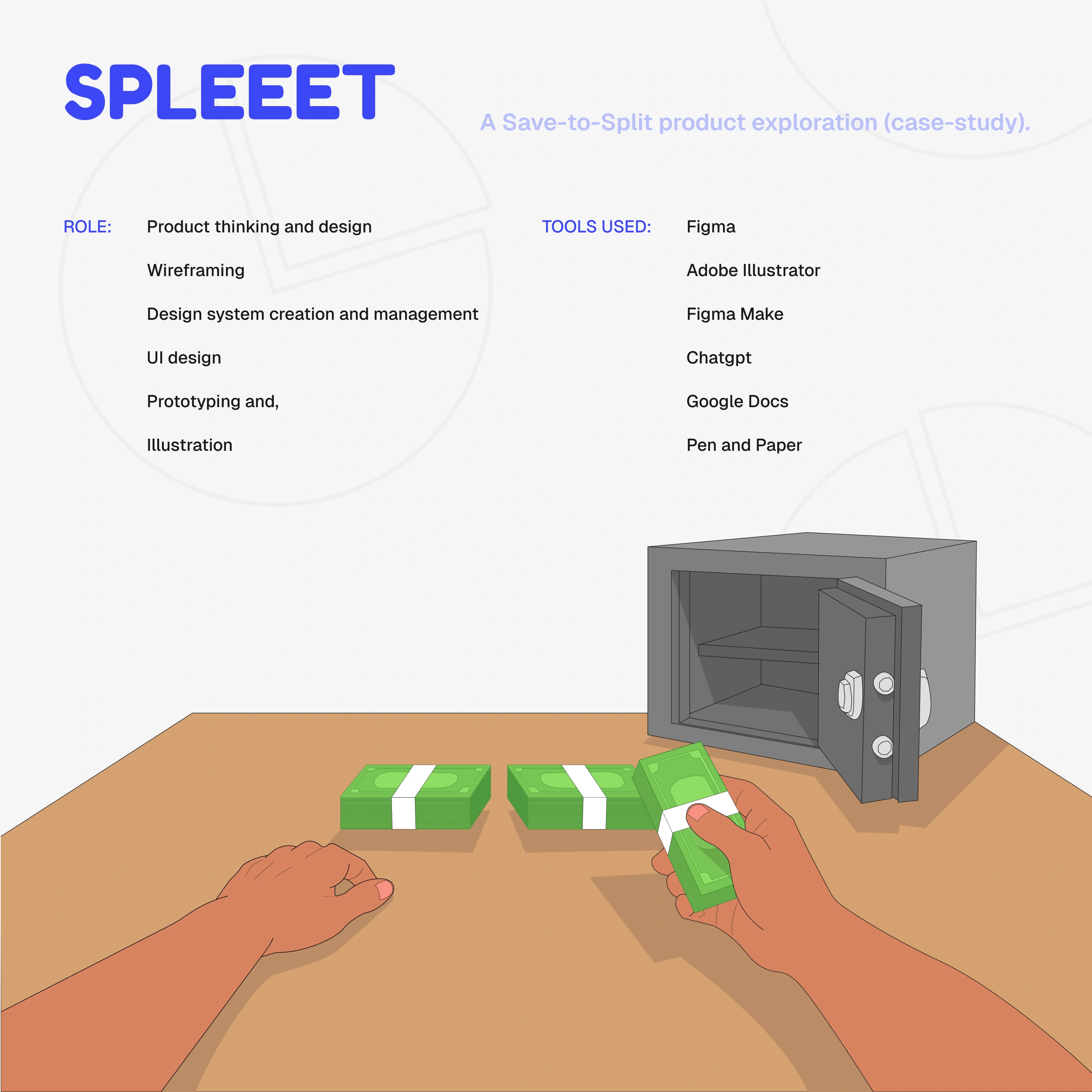
Redefining Saving and Budgeting with Spleeet app
Jeremiah George
Project Overview
The Spleeet app is a fintech solution that seeks to redefine saving and budgeting by splitting bulk sums (money) into manageable portions to ensure you stick to your saving, spending and budgeting plans.
I owned the end-to-end flow of this product from product thinking and strategy, UI/UX design, design systems and illustrations.
(Make sure to check full prototype at the end of the project)
I made this beautiful illustration.
About the app
The SPLEEET app is a mobile app that helps you stick to your financial plans by helping you split your stated savings or “bulk money” into smaller, manageable portions that are automatically released to you based on your preferred intervals—whether that’s daily, weekly, monthly, or any custom schedule that fits your plan—ensuring you spend only what you plan to.
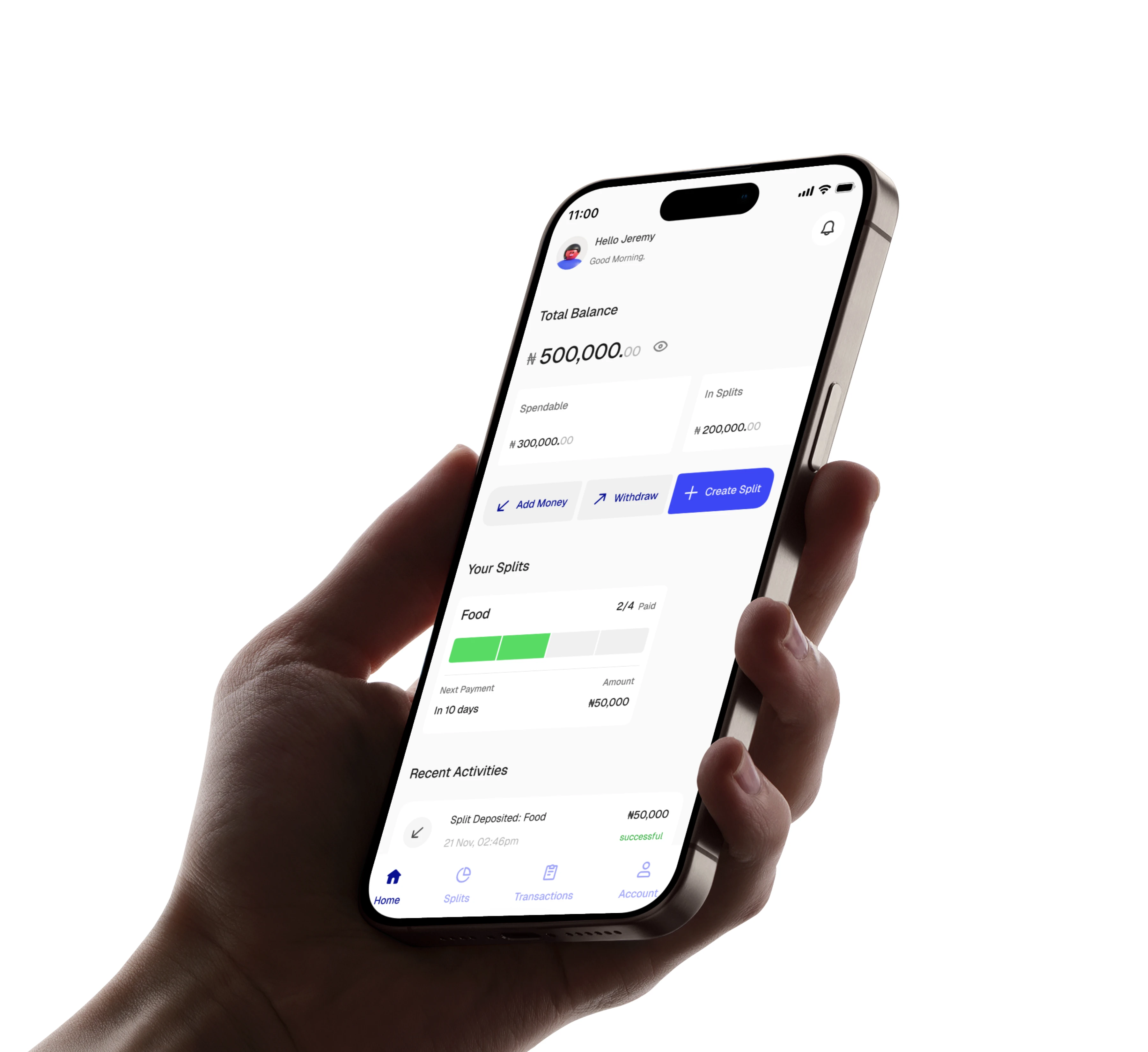
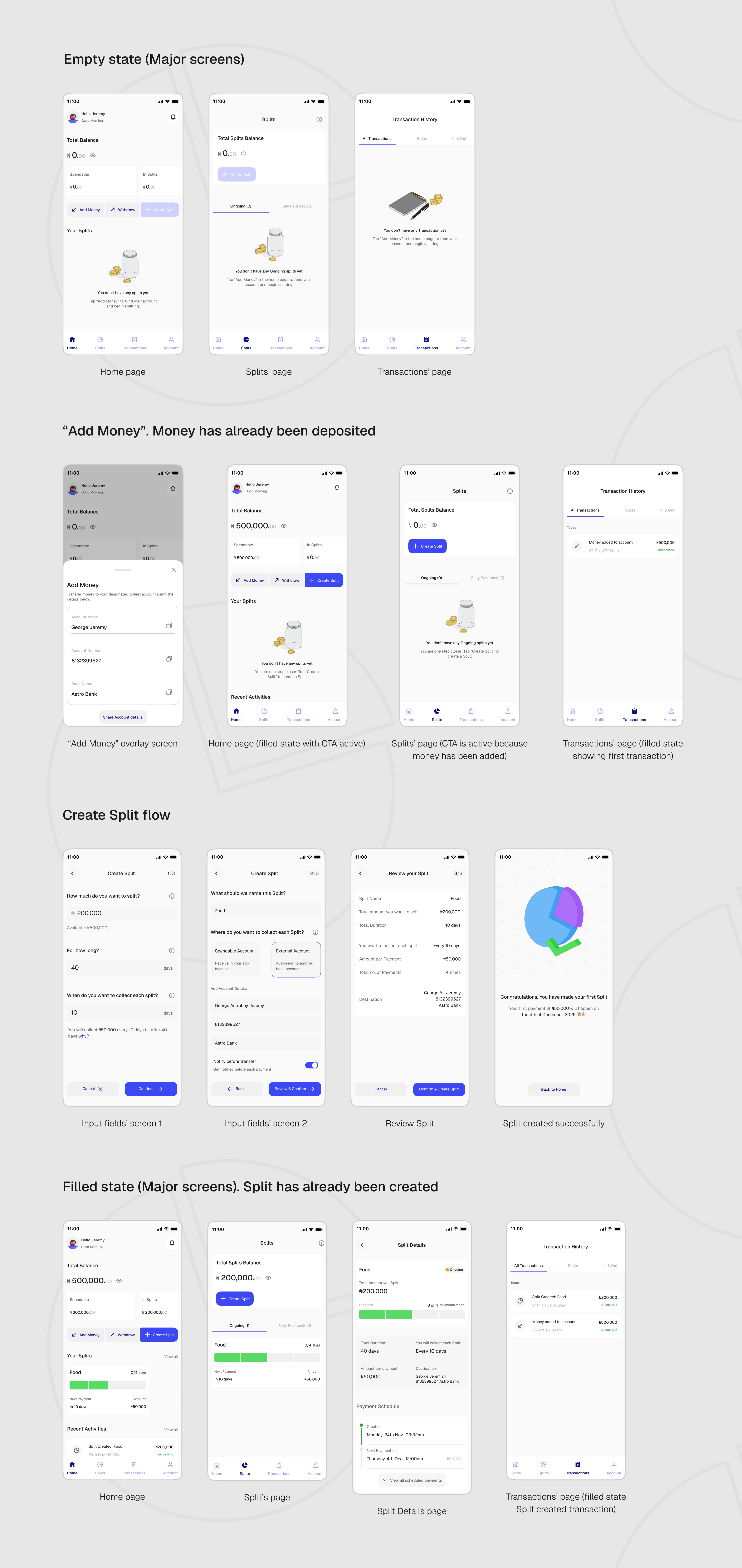
Home screen in mockup
Problem it solves
To understand more on the usecase and the problem the app solves, let’s look at this scenario:
Tunde works on-site and earns ₦500,000 every month. He always sets ₦60,000 in total out of his salary for daily transportation for the month.
But the thing is, he can't lock that money, as he'll need to have access to it every day. Mind you, exposed money like that is at risk of being hijacked by unforeseen circumstances.
So what can Tunde do to make sure he spends the stated budget ONLY on transportation?
Answer: He locks the ₦60,000 and shares the money across 30 days (the working days of the month), collecting each split sum (i.e., ₦2,000) every day for transportation.
That's exactly what Spleeet does.
How it works
Here's how it works:
📌 You save or deposit a bulk amount into the app.
Add Money
📌 SPLEEET splits and locks it into smaller, manageable bits according to your preference.
Split creation
📌 The app then releases the money to you depending on your chosen interval for collection.
Successful Split screen showing details.
Product Thinking
“How do I ensure the funds are evenly split according to the chosen interval without any complexity?”
Ironically, the main goal of the app turned out to be a challenging concept to visualize.
You see, the first idea was to directly split the figures evenly across and for the users to be able to choose ANY interval to collect their splits. But watch this:
Challenges I faced
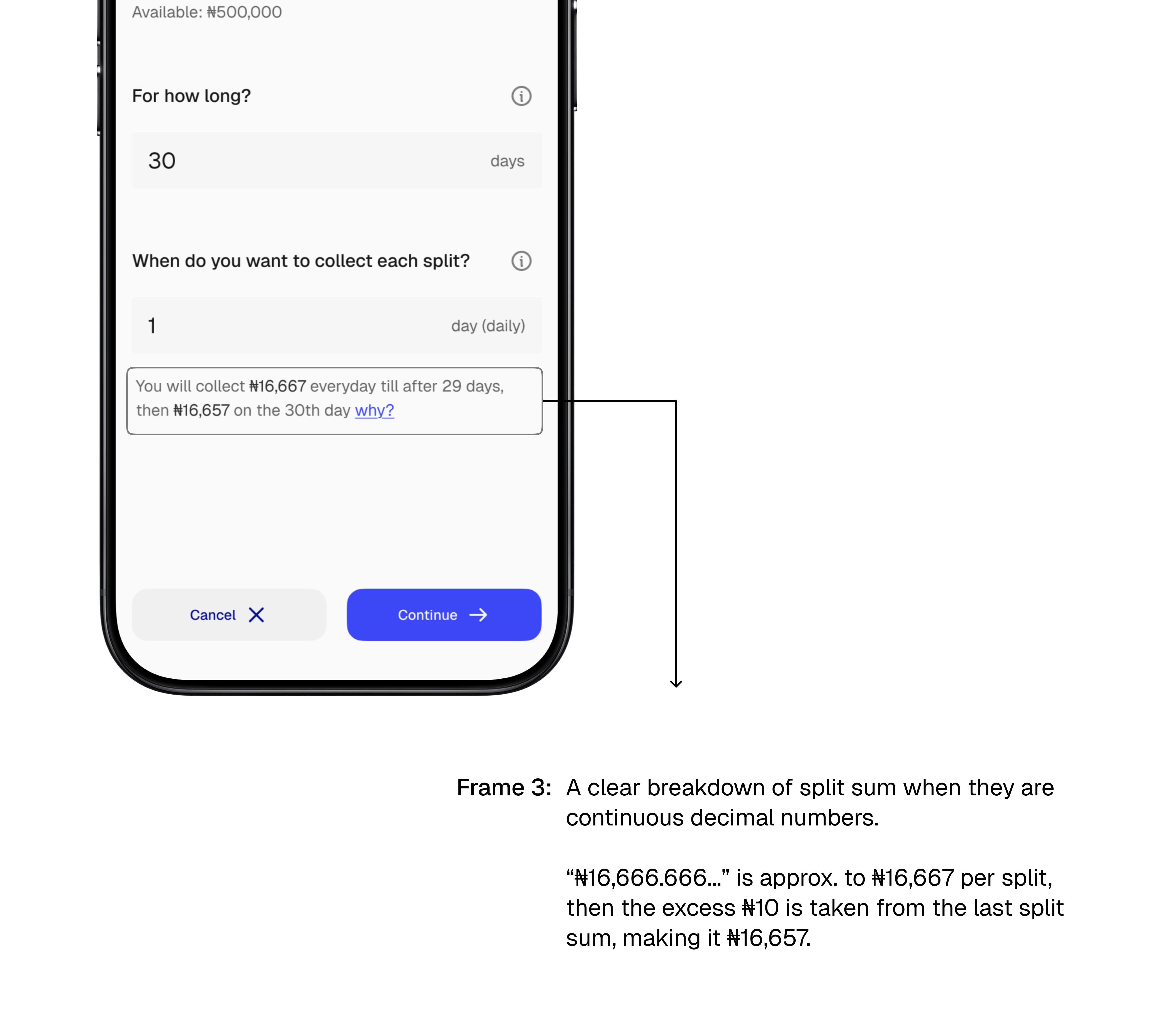
Challenge 1: If a user wants to split #500,000 through 30 days and chooses to collect each split everyday (every 1 day), that will be #16,666.6666…. (This is a continuous decimal and it will be impossible to conceptualize an amount like that for the split)
Challenge 2: Now also imagine if the same user chooses to split that same #500,000 across 30 days but this time chooses to collect each split every 7 days. That will mean the splits will be shared every 7 days, a number of 4 times, but with a remainder of 2 days for another split (to occur?)
Solutions I came up with
After much brainstorming and recalculating, I concluded that;
Solution 1: All duration and time intervals should be calculated in days by default
You see, 1 month is 28 days, technically, but is also 30 and 31 days respectively. If “1 month” is selected as a total duration/interval, this can be really confusing to servers and most especially the users.
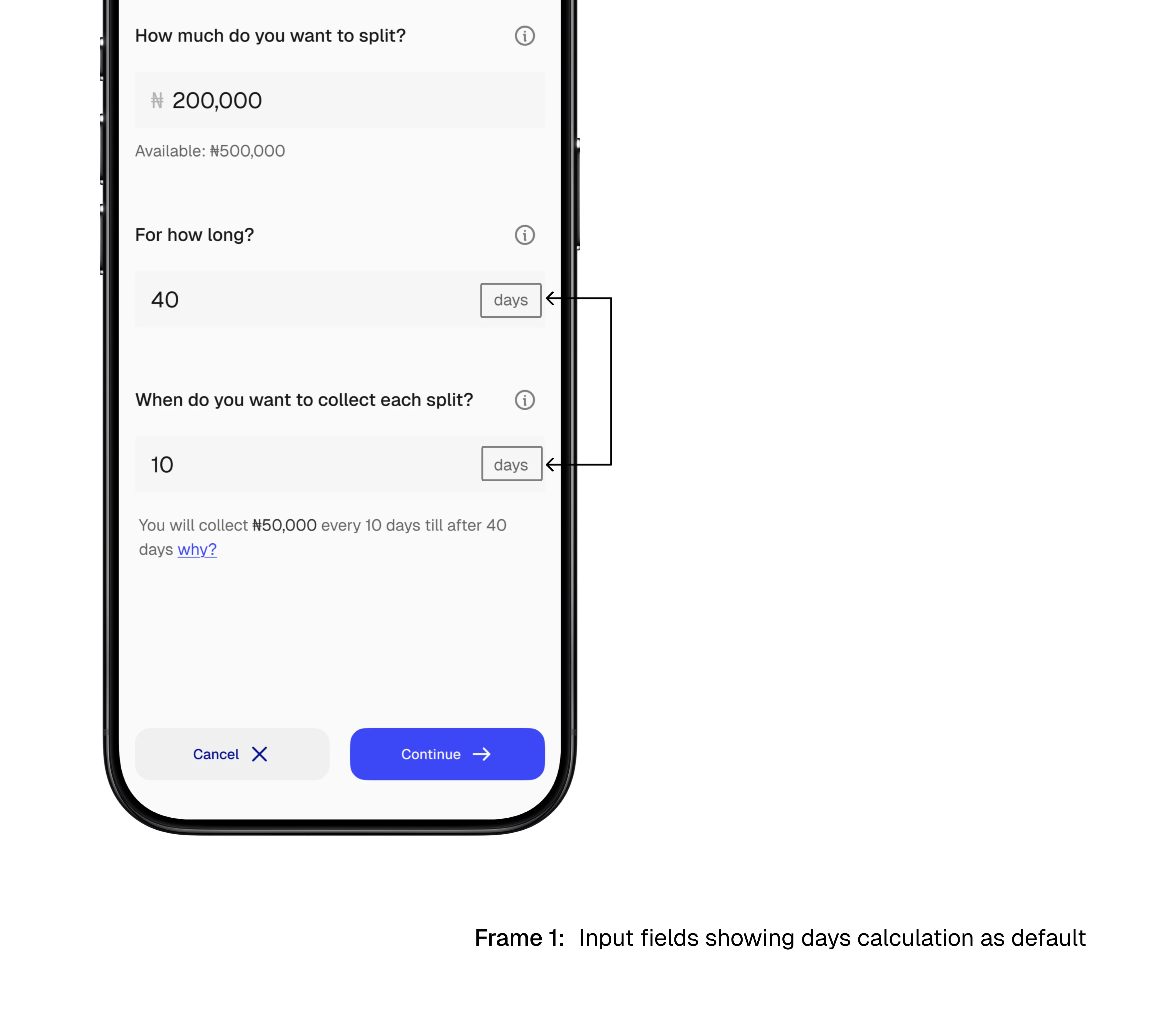
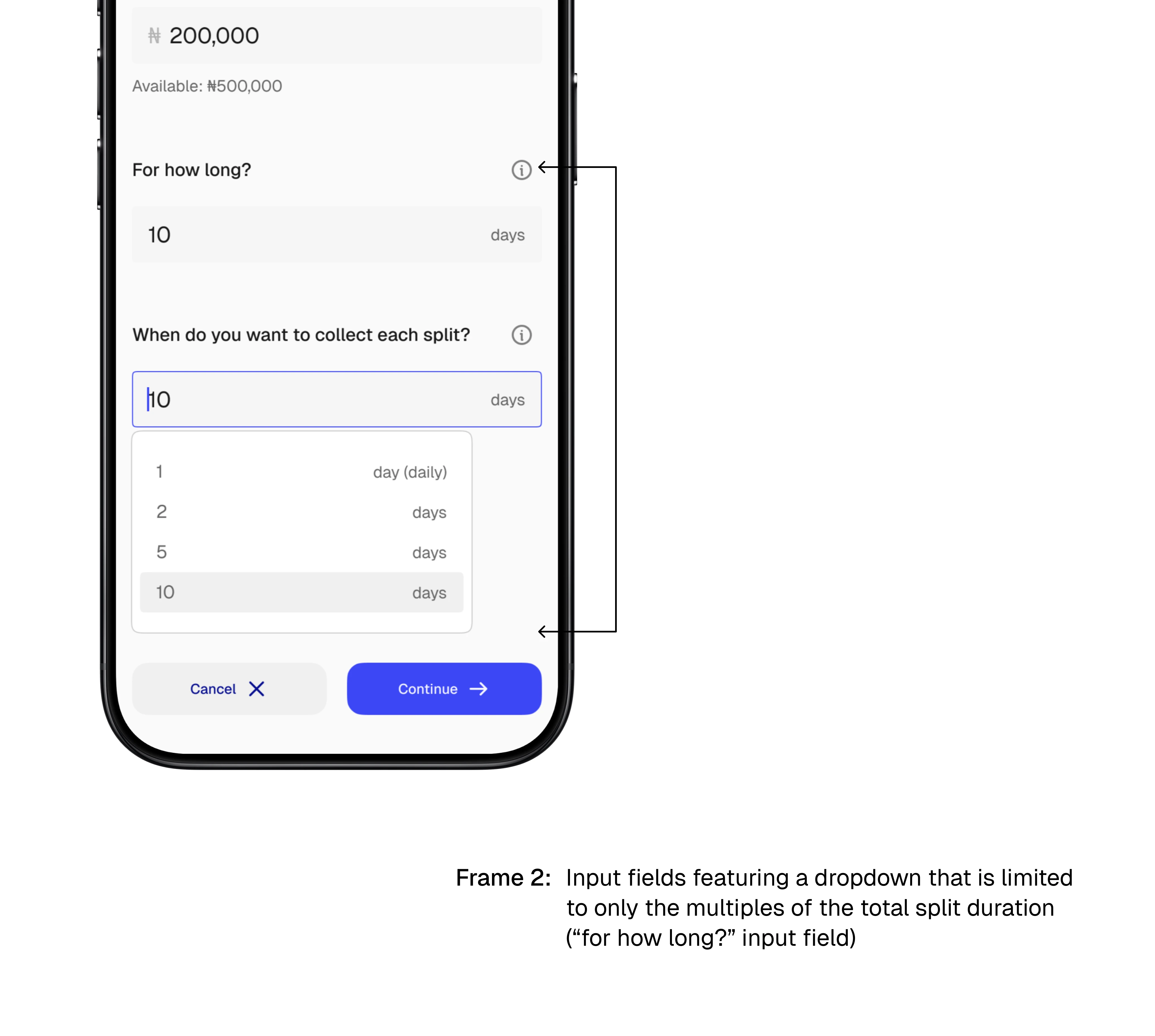
Solution 2: Intervals aside the multiples of the total duration will be deselected.
For example, if the total duration for the split is 30 days, only 1 day (daily), 2, 3, 5, 6, 10 and 30 days can be selected as intervals respectively.
Solution 3: All splits are to be rounded to the nearest sum, then the remainder be taken from/added to the last payment depending on the amount.
For example, if #500,000 is split through 30 days to be collected everyday, instead of the sum to be a continuous amount like #16,666.6666….., an amount that can't be conceptualized, it is rounded to the nearest sum of #16,666.67 with the #10 less removed from the final allocation.
Wireframing
I used Figma Make (an AI wireframing and prototyping tool in Figma) to generate a working prototype first in order to visualize the product, its features and its functions to serve as base inspiration for the flows.
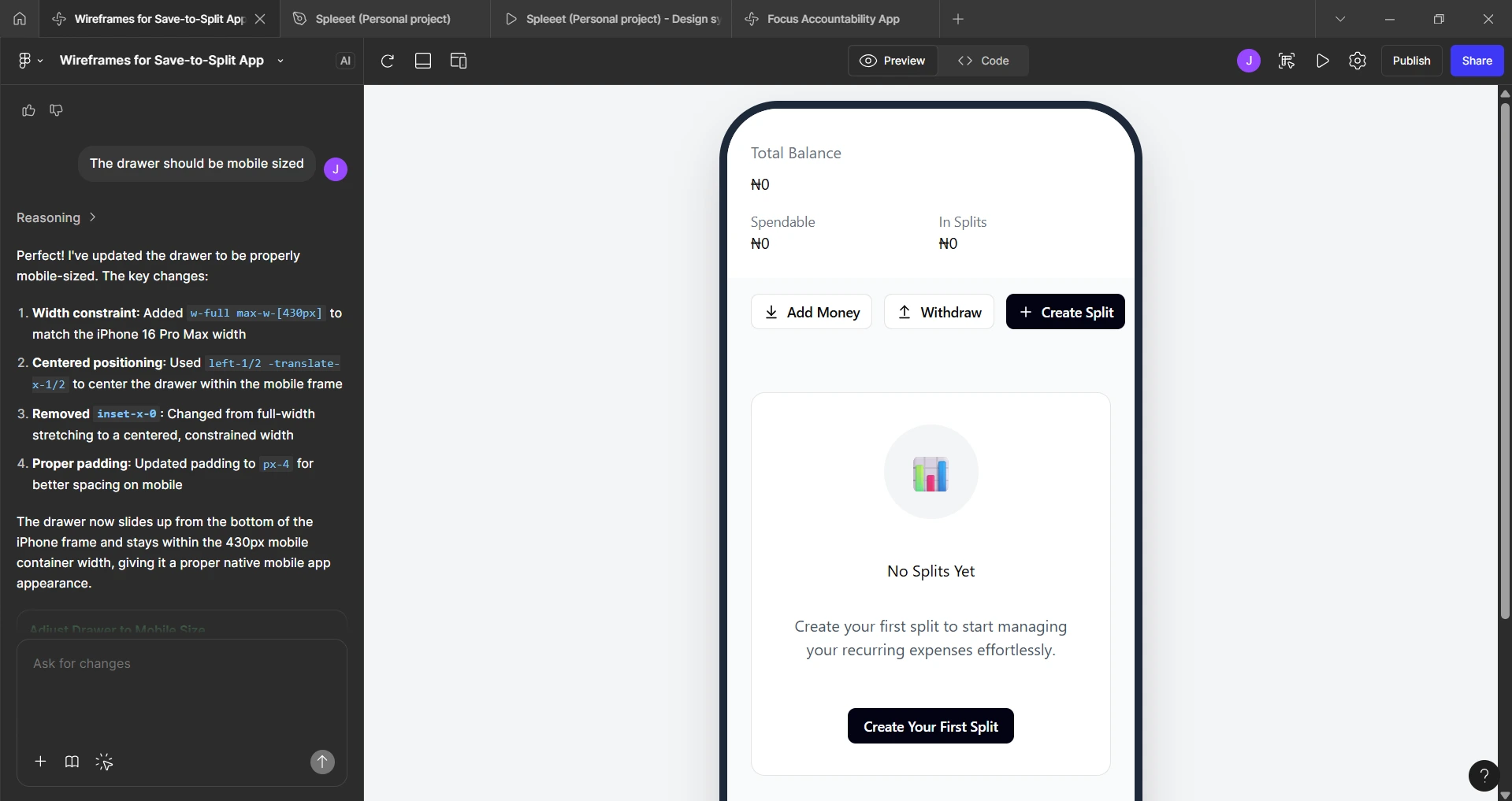
A screenshot of my Figma Make dashboard also showing a wireframe (it was also a working prototype) of the home screen empty state that I prompted using the software
Moodboarding
I selected two major apps as an inspiration for this product;
Piggyvest, for their smooth interface that encourages saving, and
Grey Finance for their smooth, minimalistic design that just works.
These apps helped visualize some color and layout choices to be able to make the flow smoother
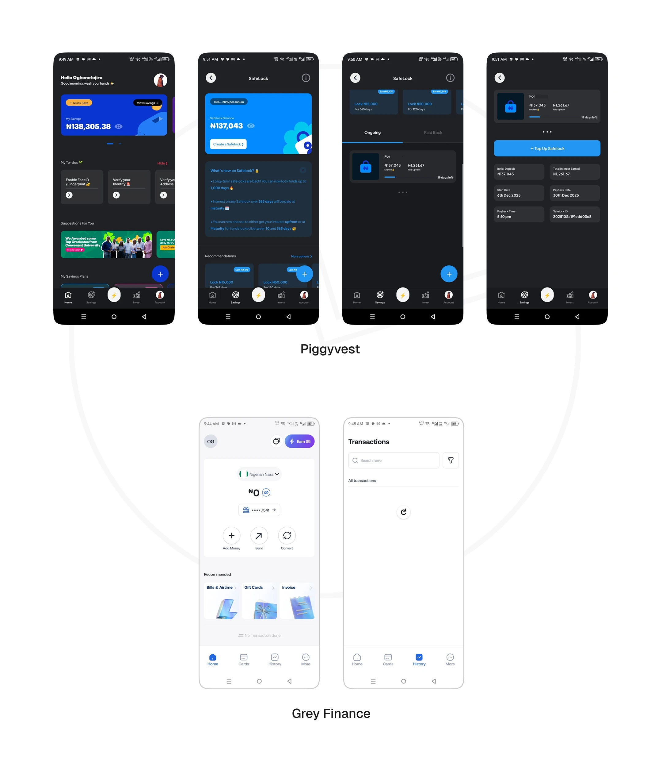
Screens from the app that was involved in the moodboard
Hi-Fi Screens
Prototype walkthrough
Watch in full screen mode.
Outcome
📍Designed the end-to-end flow of the product
📍Quick and correct understanding of the flow by the users during usability testing.
📍Massive validation of the app idea by the users.
Thanks for staying till the end.
Do get in touch with me here on Contra and let's work on your amazing idea.
Like this project
Posted Feb 2, 2026
I owned the end-to-end process for the design of the Spleeet app. The app seeks to redefine saving with effective budgeting in the fintech industry.