Havana — Brand Identity
Judit Hecri
A visual identity for the city of Havana.
In this project I try to convey the Havana that I know: colorful and vital like Africa; elegant and refined like Europe; vibrant and melancholic like no other.
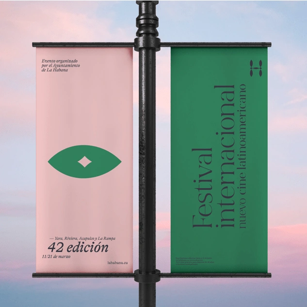
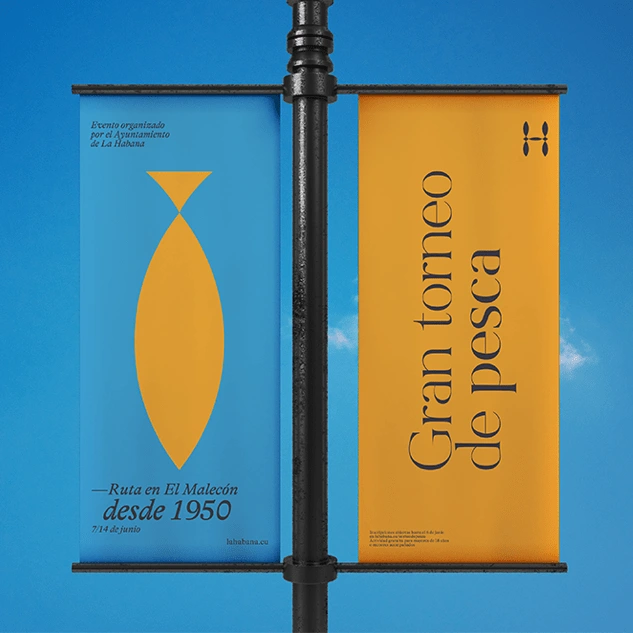
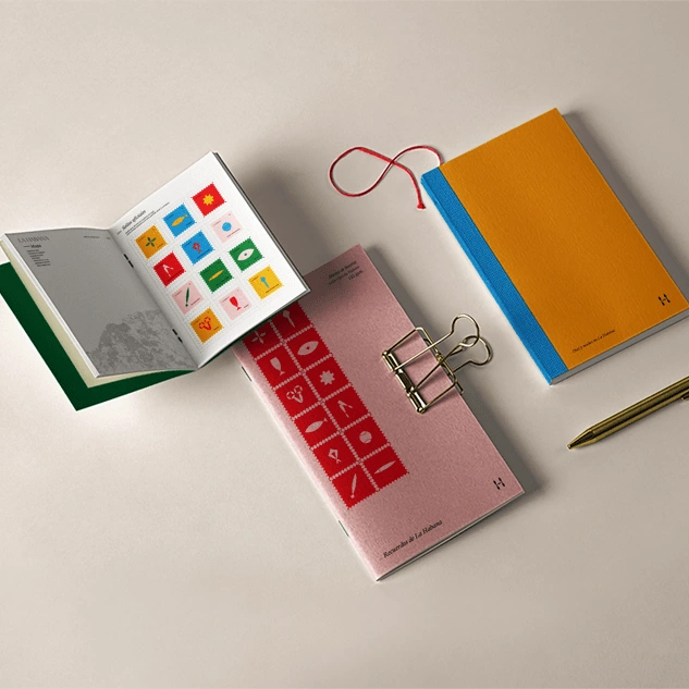
After investigating the architecture of the city and its colonial influences, I began to discover elements that were repeated in the buildings, floors, lampposts and monuments of the city: these were arches, Greek columns, mosaic tiles, geometric motifs, stained glass ... From this set of ideas, the symbol of the brand emerges: an h formed by tears and triangles created from geometric shapes; like a mosaic of colonial tiles. The logo that complements the symbol is the name of the city with the Bon Vivant Regular typography - by Nicky Laatz-, in capital letters. The visual system consists solely of illustrations or icons that start from the elements that make up the symbol. Combining them with each other, cutting, lengthening or widening them, icons have been born that represent the main attractions of the city. In order not to forget the African touch, I wanted to combine the elegant iconography with very striking and vibrant colors, typical of the island.
Like this project
Posted Jan 3, 2023
A visual identity for the city of Havana.