Minarat Studio · Brand Identity
Aymen Rouabehi
Minarat Studio is a design studio I co-founded with a developer. The positioning: we design for businesses that serve Muslim audiences, because we understand the persona better than anyone. What resonates, what creates friction, what builds trust.
I owned the entire brand identity process from scratch.
Naming & Concept
The name comes from "minaret," the tower that overlooks the city. The idea: a studio that sees the full picture, that has a vantage point others don't. I explored the concept through visual metaphors of elevation, guidance, and cultural precision.
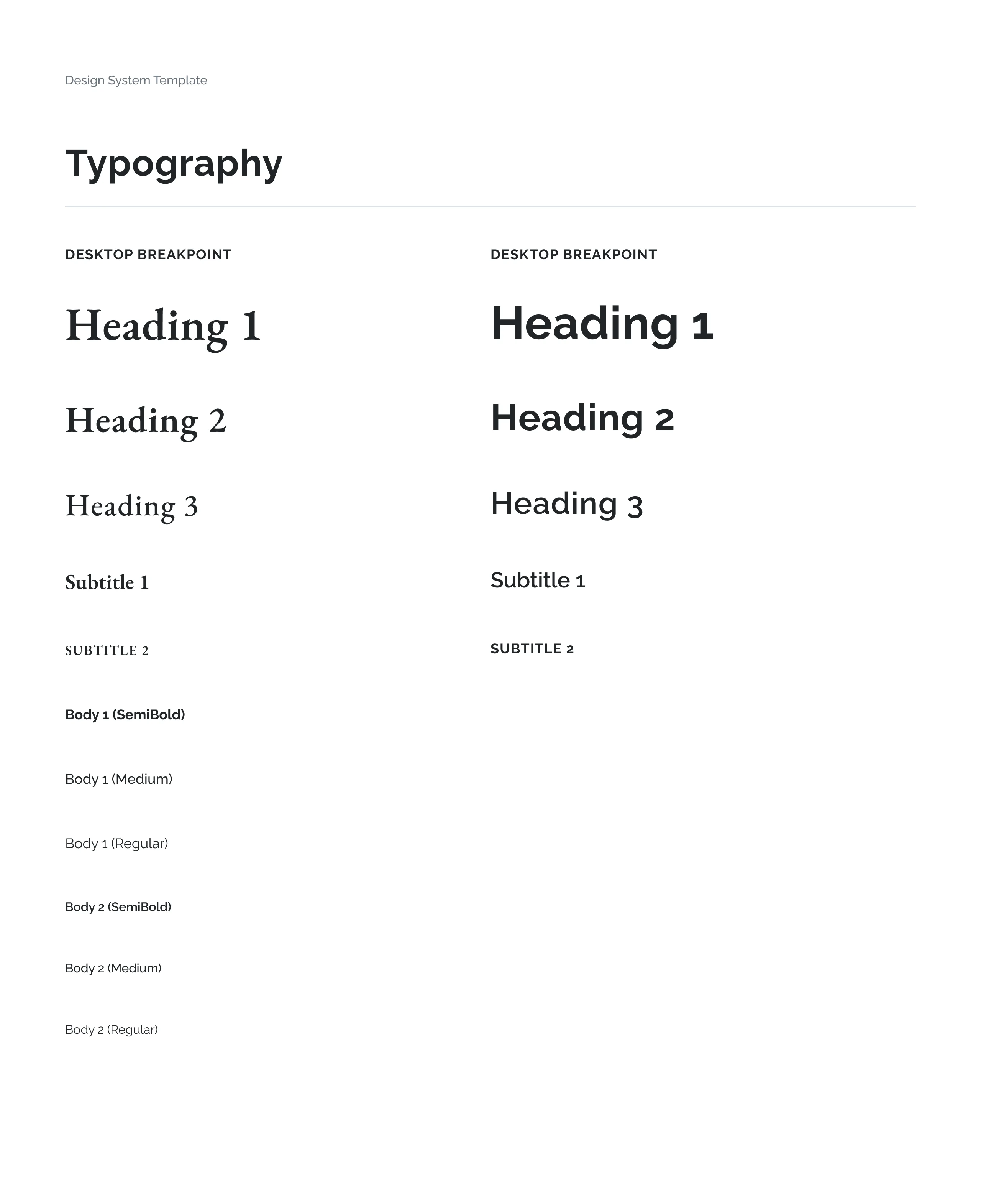
Logo & Visual Identity
I went through multiple rounds of exploration and iteration before landing on the final mark. Every decision was intentional: the logo needed to feel modern and professional while carrying a subtle cultural signal, not decorative, not cliché.
Brand System
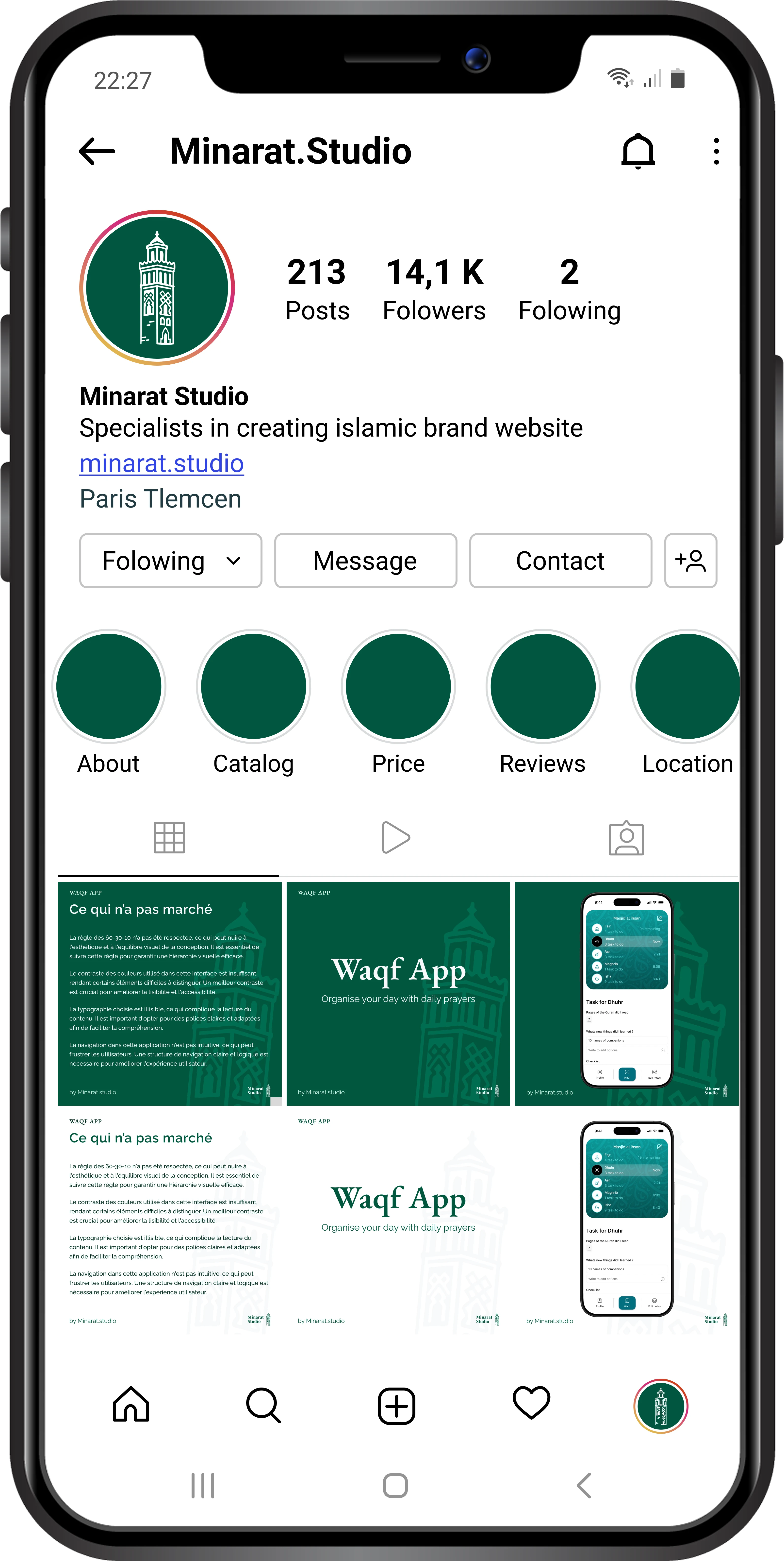
I delivered a complete identity system: logo and its variations, color palette, typography, brand guidelines, and a set of social media templates (Instagram carousels, posts) ready for content production.
Status
The project is currently on standby. The brand is built, the system is ready, but we haven't launched commercially yet.
Like this project
Posted Feb 16, 2026
Designed a full brand identity for a studio serving Muslim-focused businesses, blending modern visuals and spiritual values across logo, color, and everything