Purple Seoul Brand Transformation
Mirindra Rakotovao
About
Client: Purple Seoul (A BTS & K-Pop Malagasy Merch Specialist)
Scope: Brand Strategy, Visual Identity Redesign, Social Media Systems.
Work: Transitioning a rapid-launch Facebook shop identity into a structured, trustworthy, and premium online brand.
Challenge
Purple Seoul was launched with speed in mind years ago. Using generic logos (Light stick seen in BTS concert ), and BTS dynamite font. They successfully proved the concept and built trust through excellent customer service. However, they hit a plateau.
The Problem
On Facebook and Instagram, they looked identical to every other local reseller. Their visual identity didn't reflect their logistical powerhouse (the China-Madagascar bridge) or their deep "ARMY" expertise. They were seen as a commodity rather than a destination.
Old Purple Seoul Logo with Lightstick and BTS Dynamite font
The approach
The strategy was not to lean into a "local" look, but to mirror the high-end, sleek aesthetic of the K-Pop industry itself (Weverse, Line Friends).
Establishing the Anchor: We moved away from stock imagery to a custom, universal logo that feels at home in Seoul, Shanghai, or Antananarivo.
Consistency as Strategy: Instead of "post-as-you-go" graphics, we developed a rigid visual system. This consistency acts as a psychological signal of reliability and professionalism.
The "International" Standard: We designed the brand to feel like a global franchise. This gives the customer the feeling that they aren't just buying from a person on Facebook, but participating in a global culture.
Who they are?
Purple Seoul is positioning them selfs ad the "Official-Feeling" local partner for the Malagasy ARMY. They are:
The Connector: Bridging the gap between international K-pop hubs and Madagascar.
The Curator: Not just selling "items," but sharing the culture of BTS.
The Professional: An online shop that matches the quality of the high-end merch they deliver.
Slogan of Purple Seoul
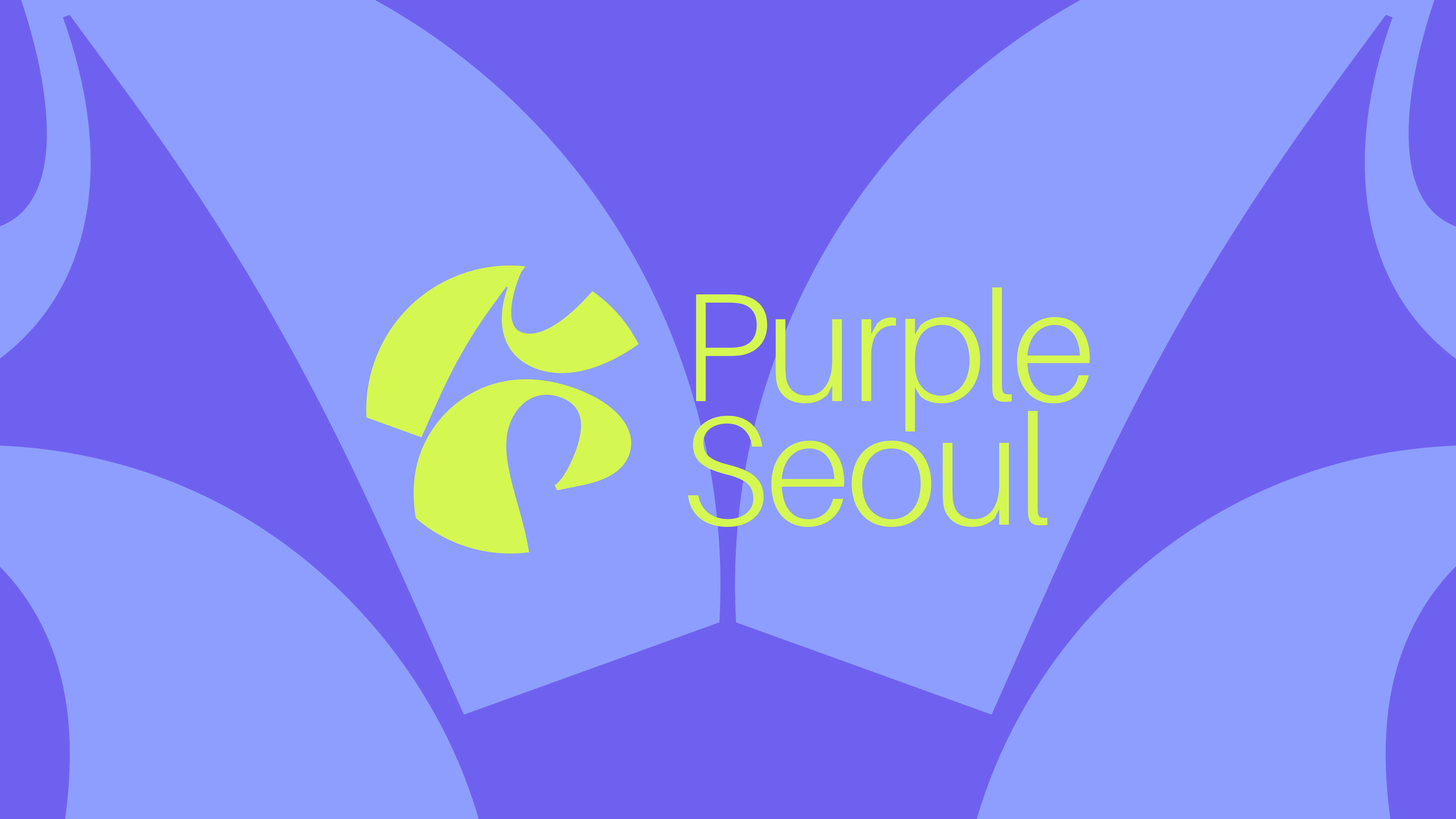
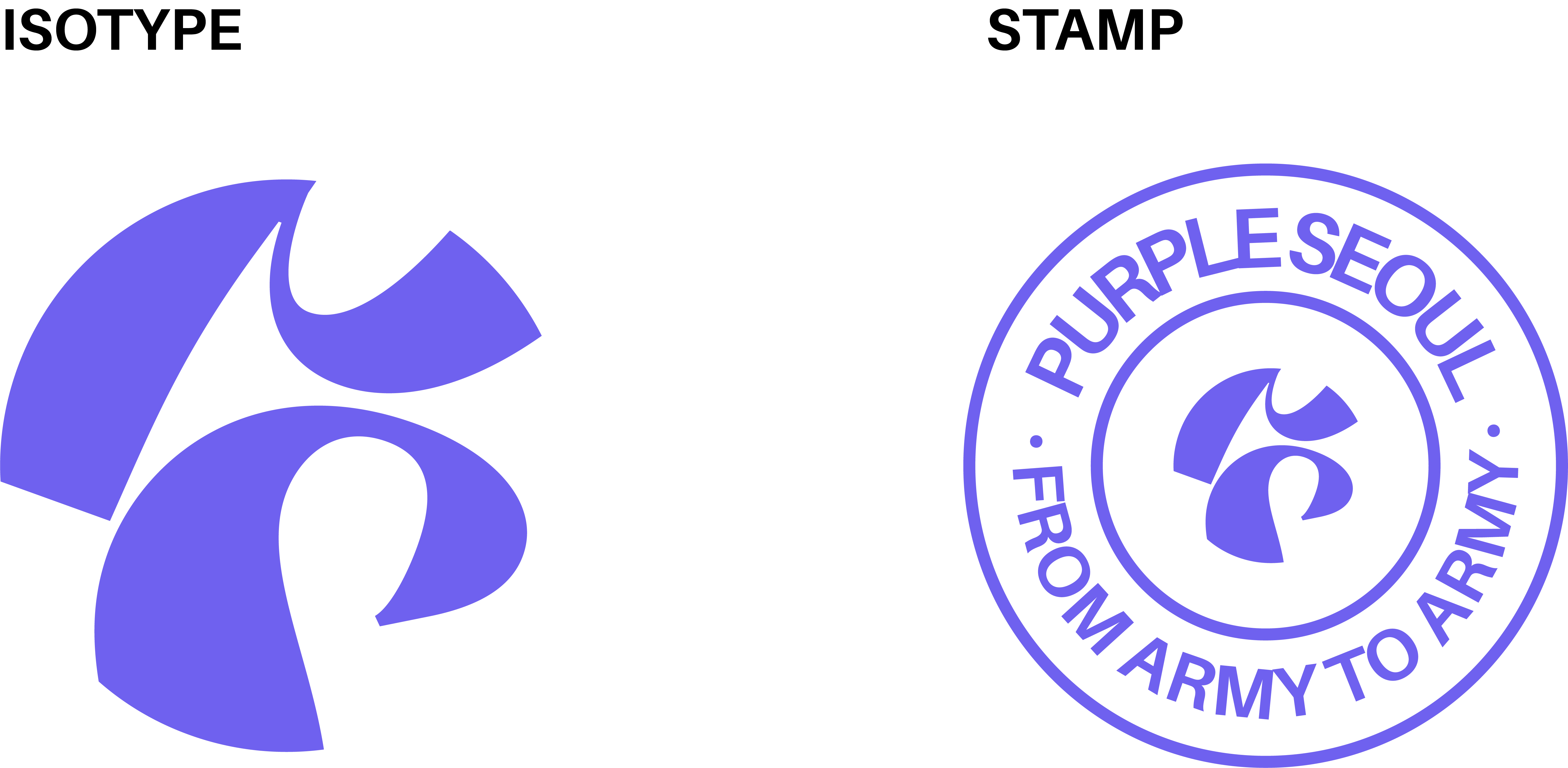
Logo
The primary logo for Purple Seoul is a masterclass in modern, minimalist branding that successfully bridges the gap between a local shop and a global K-pop aesthetic. It moves the brand away from its original "Canva-style" roots and "weird type stock image logo" toward a sophisticated, international standard.
New Purple Seoul Logo Design
Movement & Cultural Connection
The core of the identity is an abstract, geometric isotope that functions as the brand's signature mark.
The "Secret" Choreography: Beyond its abstract form, the isotope is a literal representation of a dance pose frequently seen in BTS and K-pop choreography. This creates an immediate "insider" connection, proving the brand's message of "ARMY serving ARMY."
Dynamic Geometry: The fluid, overlapping curves suggest a "P" and "S" monogram while maintaining a sense of constant motion, echoing the high energy of the K-pop stage.
Universal Reach: Designed to be universally connected, the mark avoids being "too local," allowing the brand to feel at home in any international K-pop context.
Logo Variations
Variations
The "Stamp" variation is where the brand’s core values of honesty, trust, and community are physically manifested.
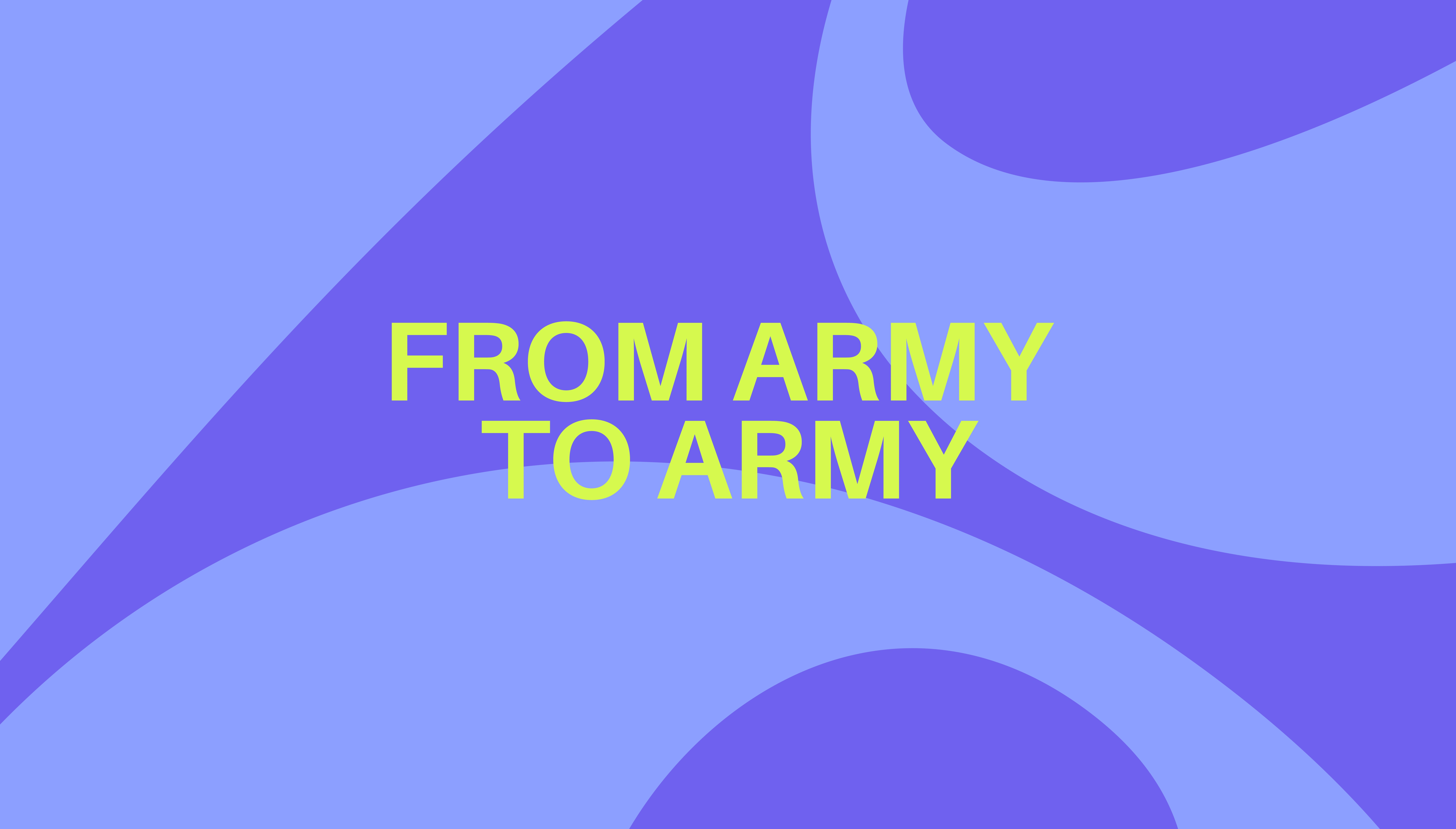
"From ARMY to ARMY": By incorporating this slogan into a circular seal, we transform the simple transaction into a community exchange. It reinforces the message that this isn't just a business; it's a service by fans, for fans.
Tactile Authenticity: The stamp format mimics official "Checked" or "Certified" seals. For a brand sourcing items from China to Madagascar, this visual cue provides a psychological layer of security and authenticity for the customer.
Operational Versatility: This asset is designed for the "unboxing" experience. It’s perfect for physical use think custom stickers, packaging tape, or actual ink stamps on thank-you notes adding a "boutique" feel that separates Purple Seoul from generic online resellers.
Colors
The color selection for Purple Seoul is the most critical emotional bridge in the entire rebranding. It moves the identity from a generic online shop to a culturally significant space for the Malagasy ARMY.
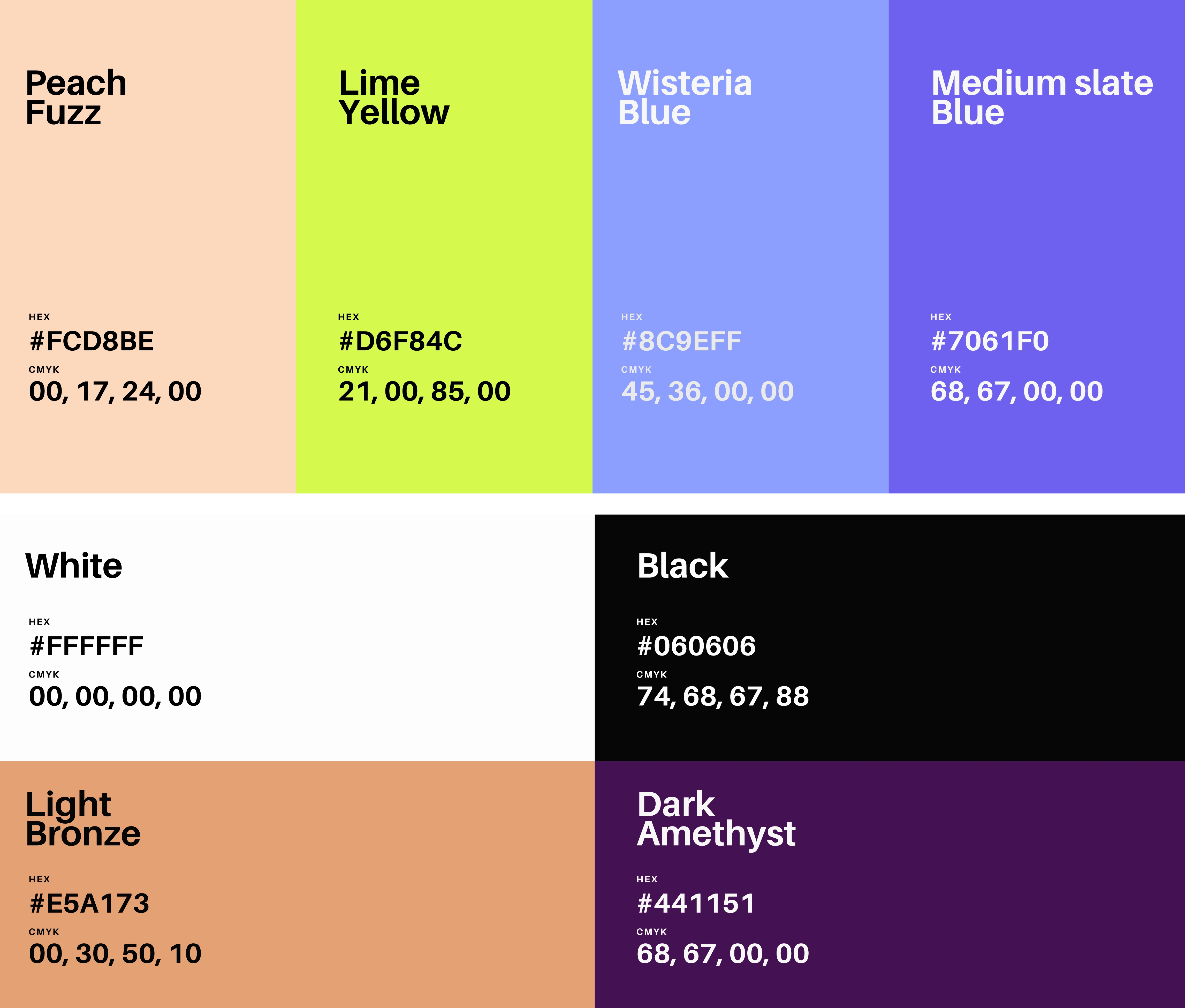
Purple Seoul Color palette
The "Borahae" (I Purple You) Strategy
The rebranding centers entirely around the "Borahae" philosophy a term coined by BTS’s V that has become the universal symbol of the bond between the band and their fans.
A Symbol of Longevity: Just as purple is the last color of the rainbow, representing trust and long-lasting love, the color strategy signals that Purple Seoul is here to stay and truly understands the depth of its customers' passion.
Instant Recognition: By using this specific frequency of violet, the brand achieves "instant trust." A fan scrolling through Facebook or Instagram doesn't need to read the name; they "feel" the BTS connection immediately through the color alone.
From "Shop" to "Community": The color transforms the brand from a commercial entity into a fan-led movement. It validates the primary message: We are ARMY serving other ARMYs.
Brand in action
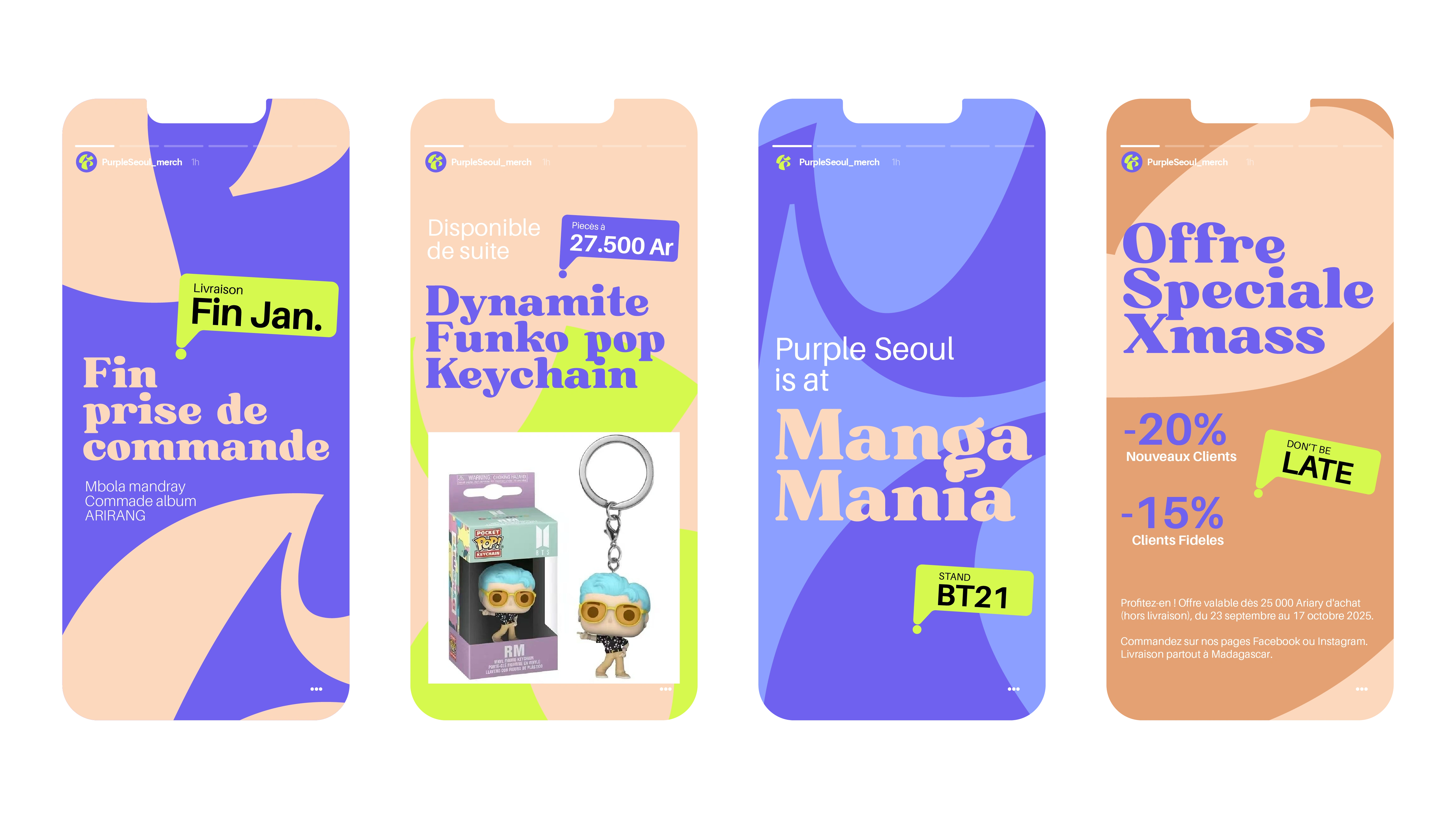
Social Media Story Templates
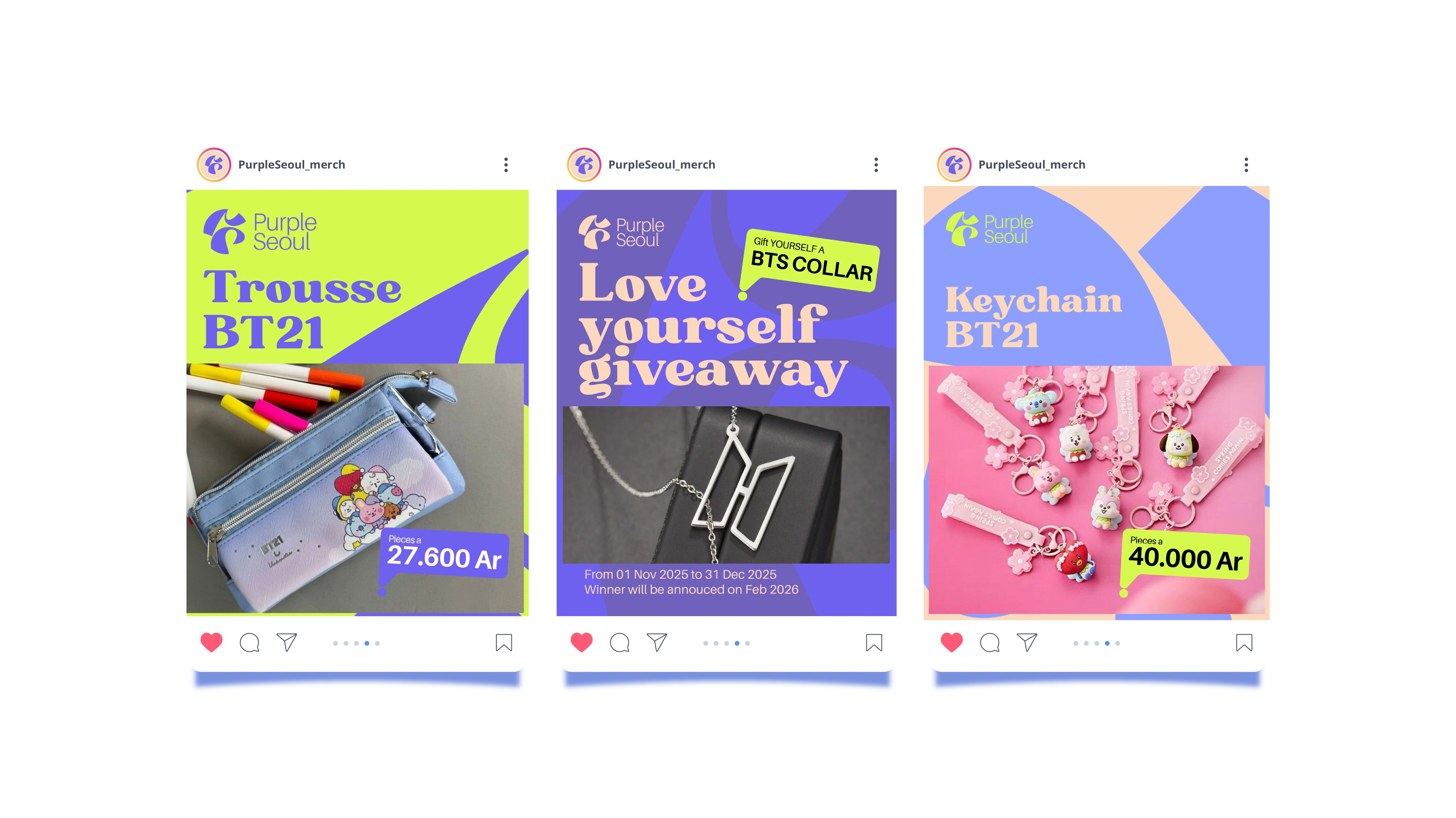
Social Media Post Templates
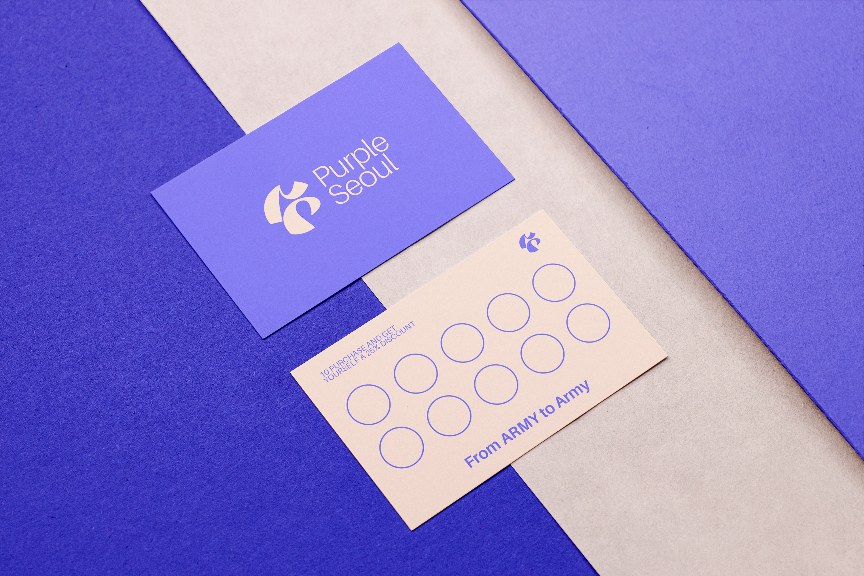
Loyalty Card
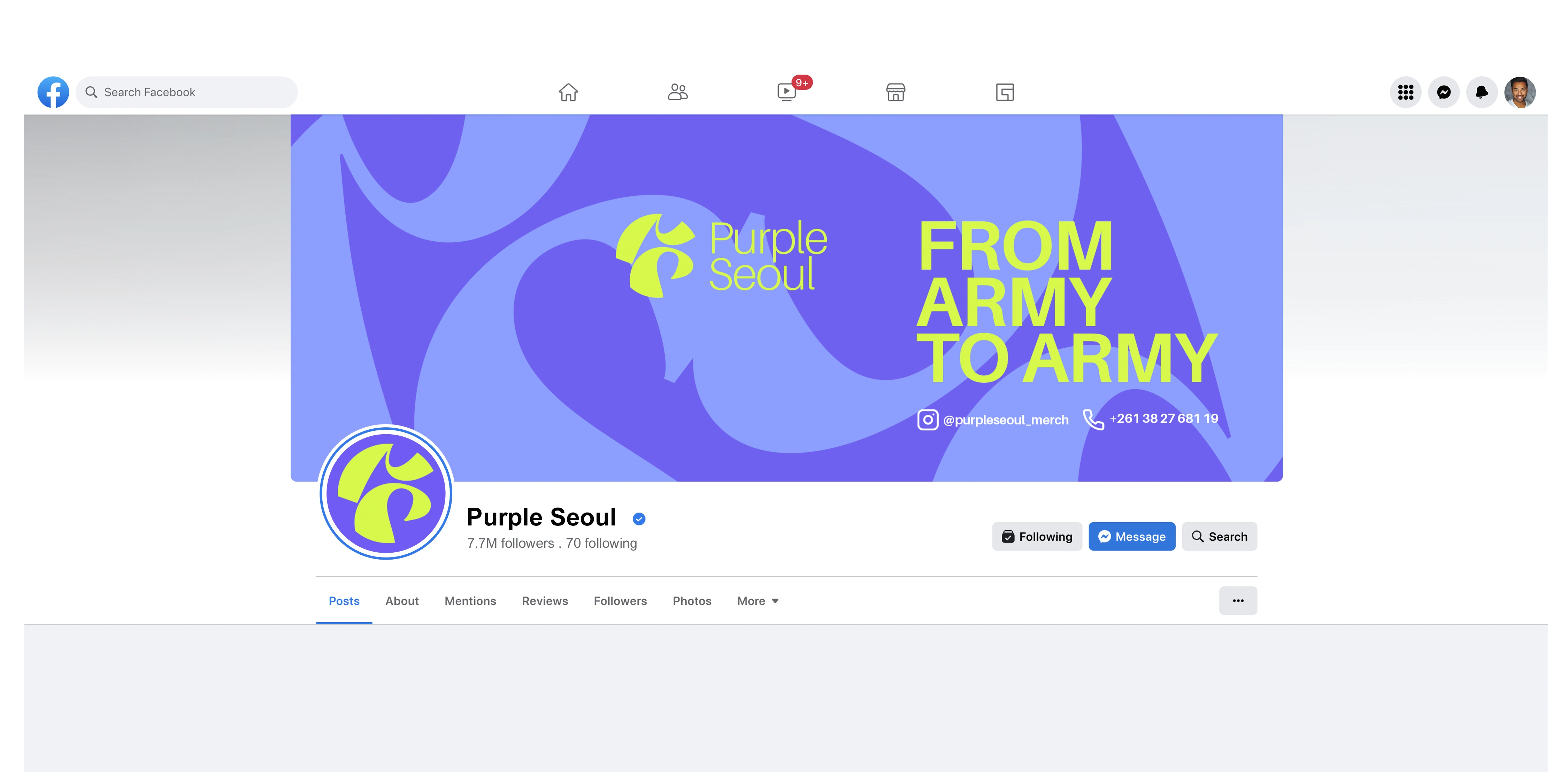
Facebook Profile & Cover - Main page
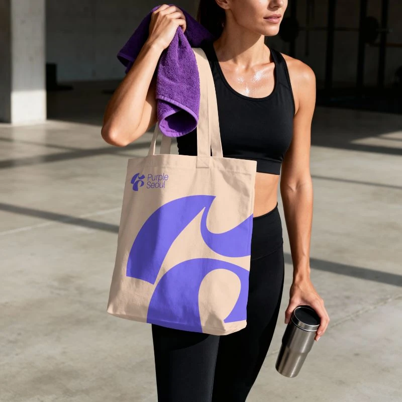
Merchandise - Tote bag for product delivery
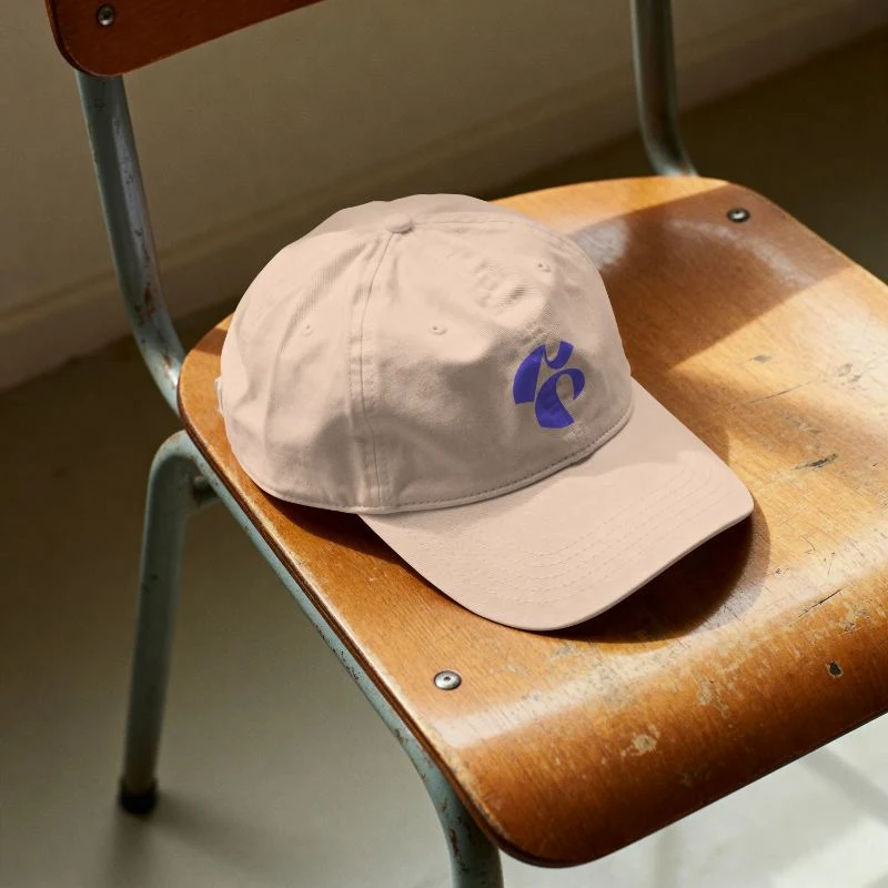
Cap
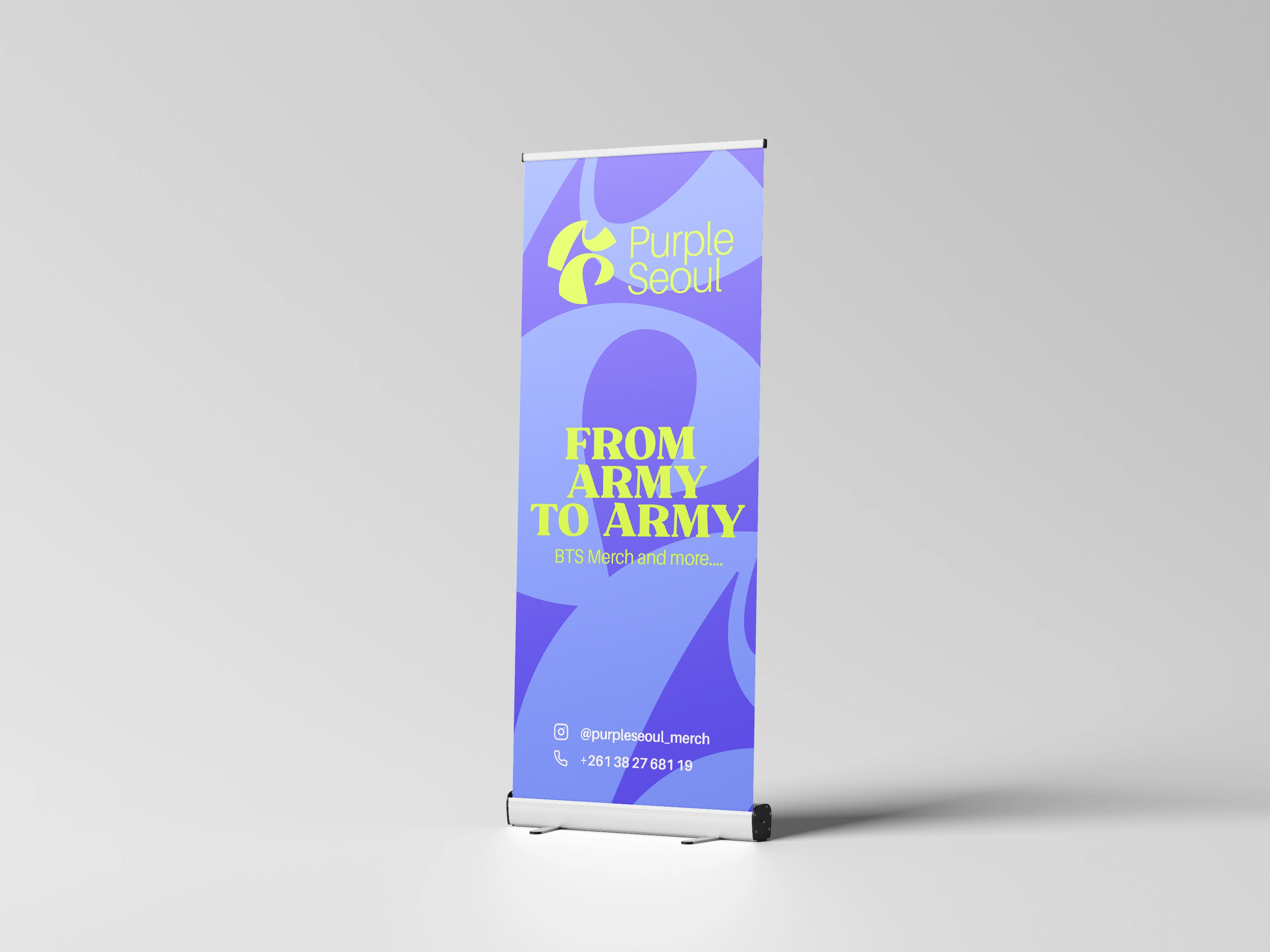
Rollup
Owner signature stamp
Like this project
Posted Jan 24, 2026
Purple Seoul: A strategic rebrand evolving a local shop into a sleek, global K-pop authority in Madagascar through the "Borahae" philosophy and iconic design.
Likes
0
Views
22
Timeline
Dec 17, 2025 - Jan 17, 2026