Moblerin — Brand Identity
Mariano Diez
CONTEXT
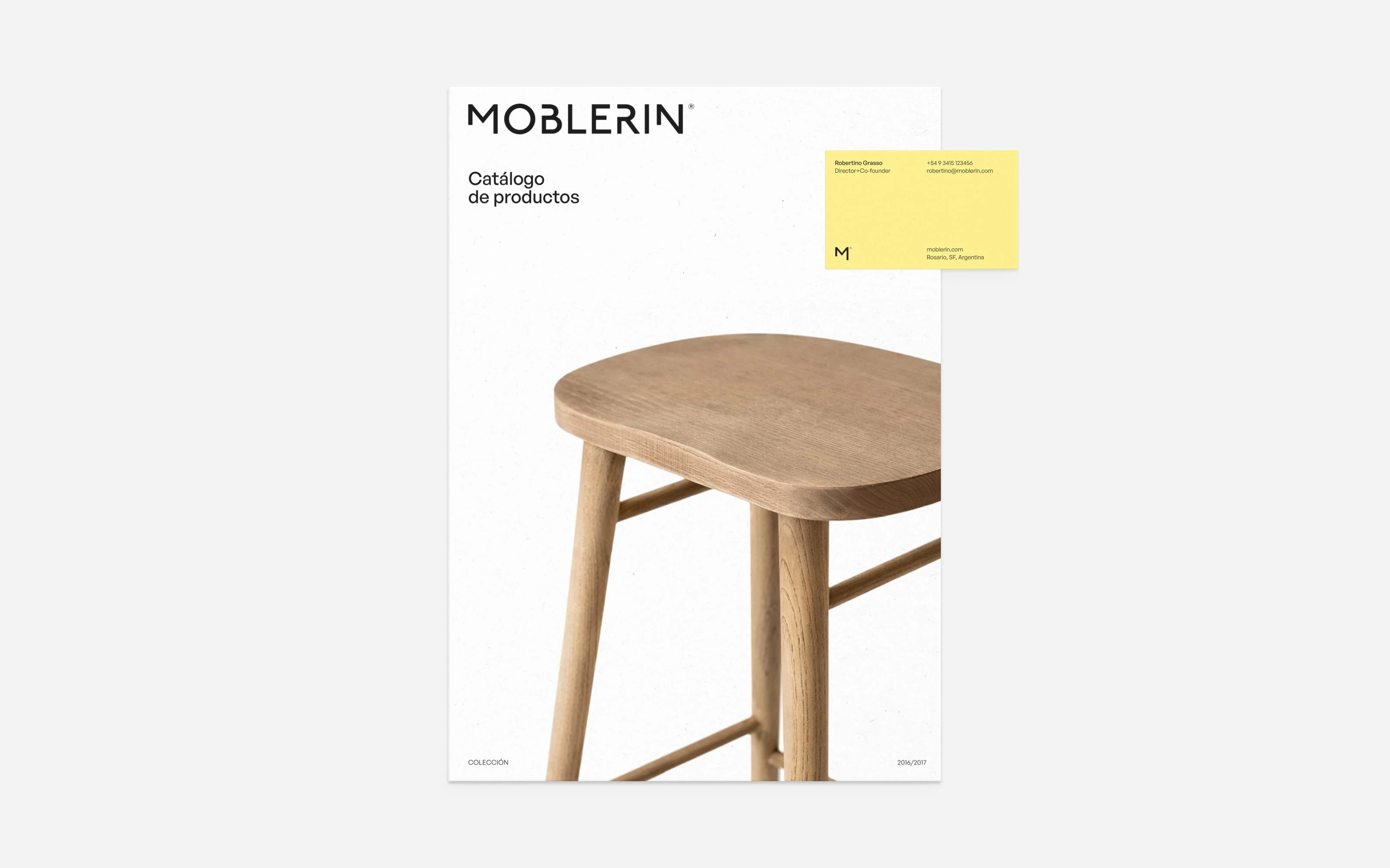
Moblerin is a wholesale furniture importer — its role is not to produce but to select. The brand needed a visual identity that could support that positioning: one that communicates editorial judgment and design criteria without competing with the product itself.
APPROACH
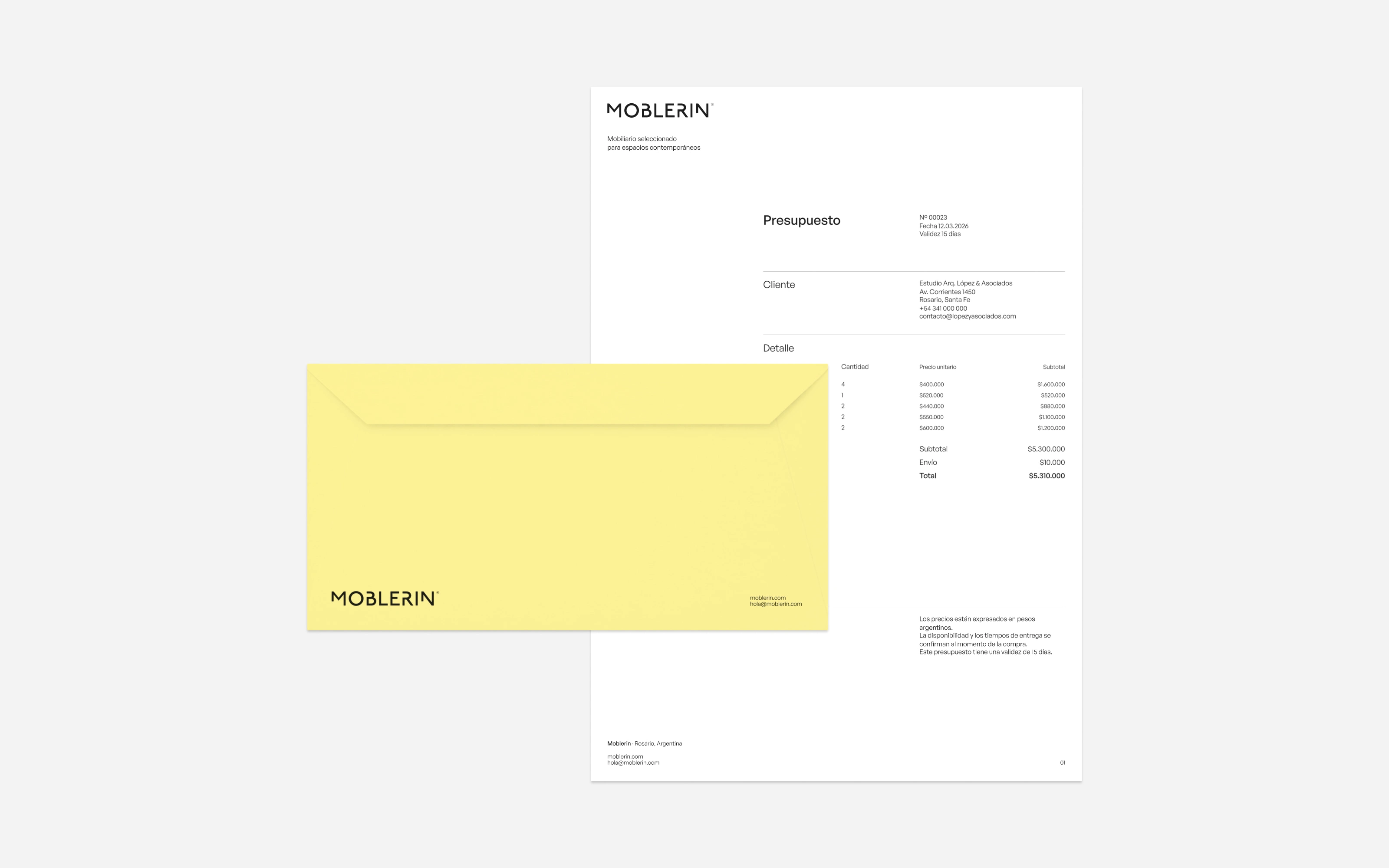
The identity was built as a structural framework rather than an expressive system. Typography, grid and spacing function as organizational tools — creating hierarchy and rhythm across catalog, commercial and digital applications.
Yellow operates as a single accent: selective, consistent. It marks the brand without asserting itself over the product.
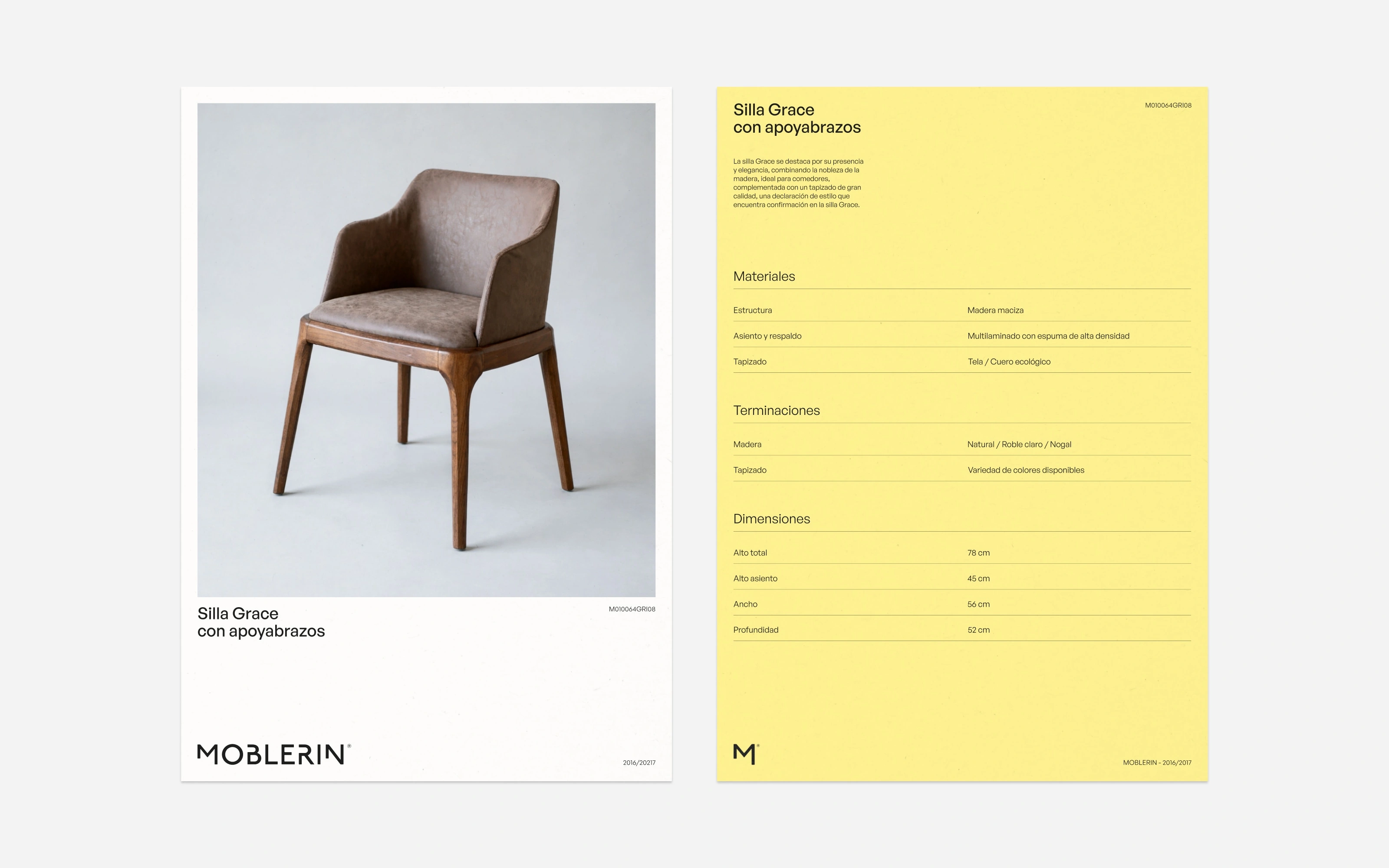
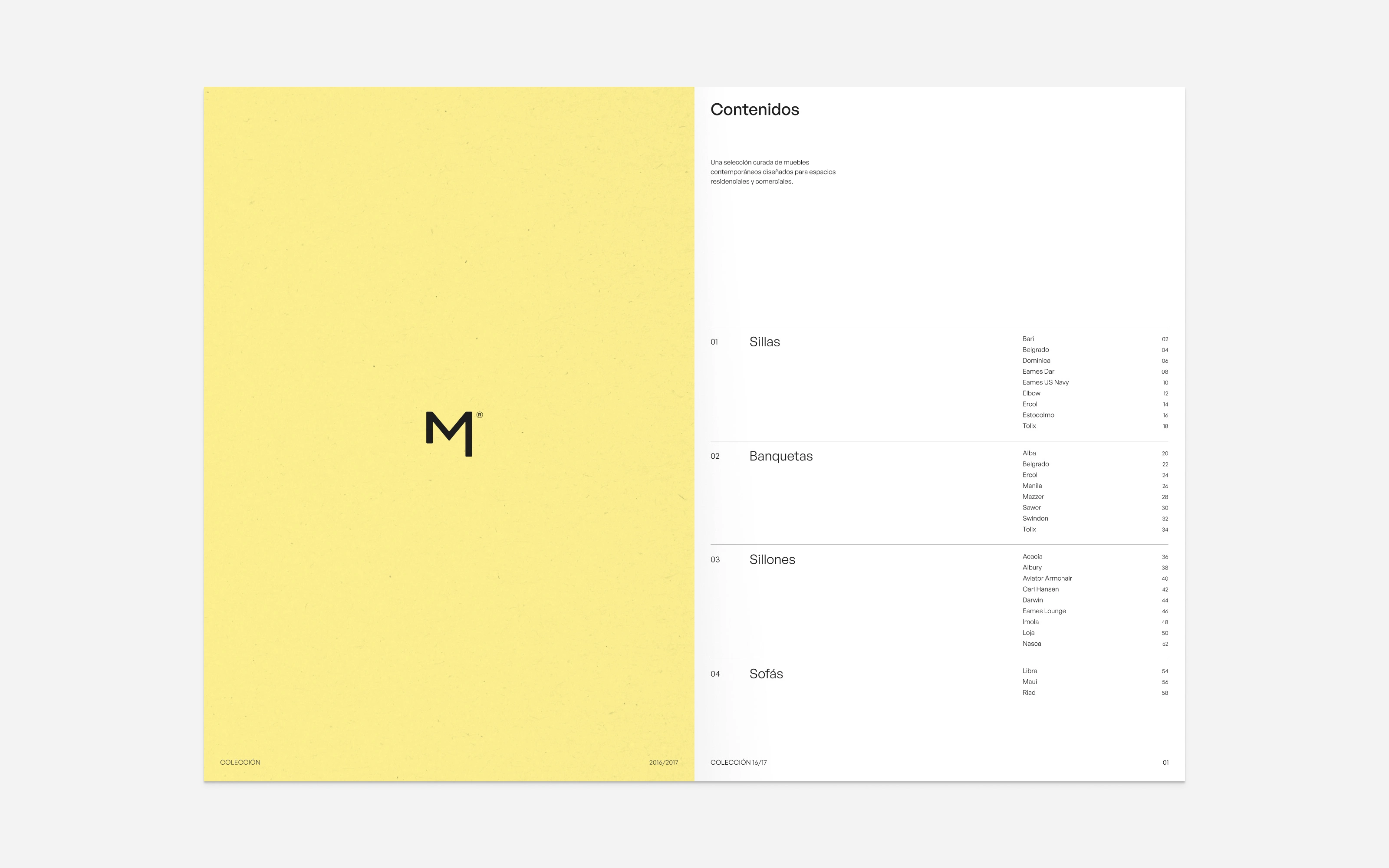
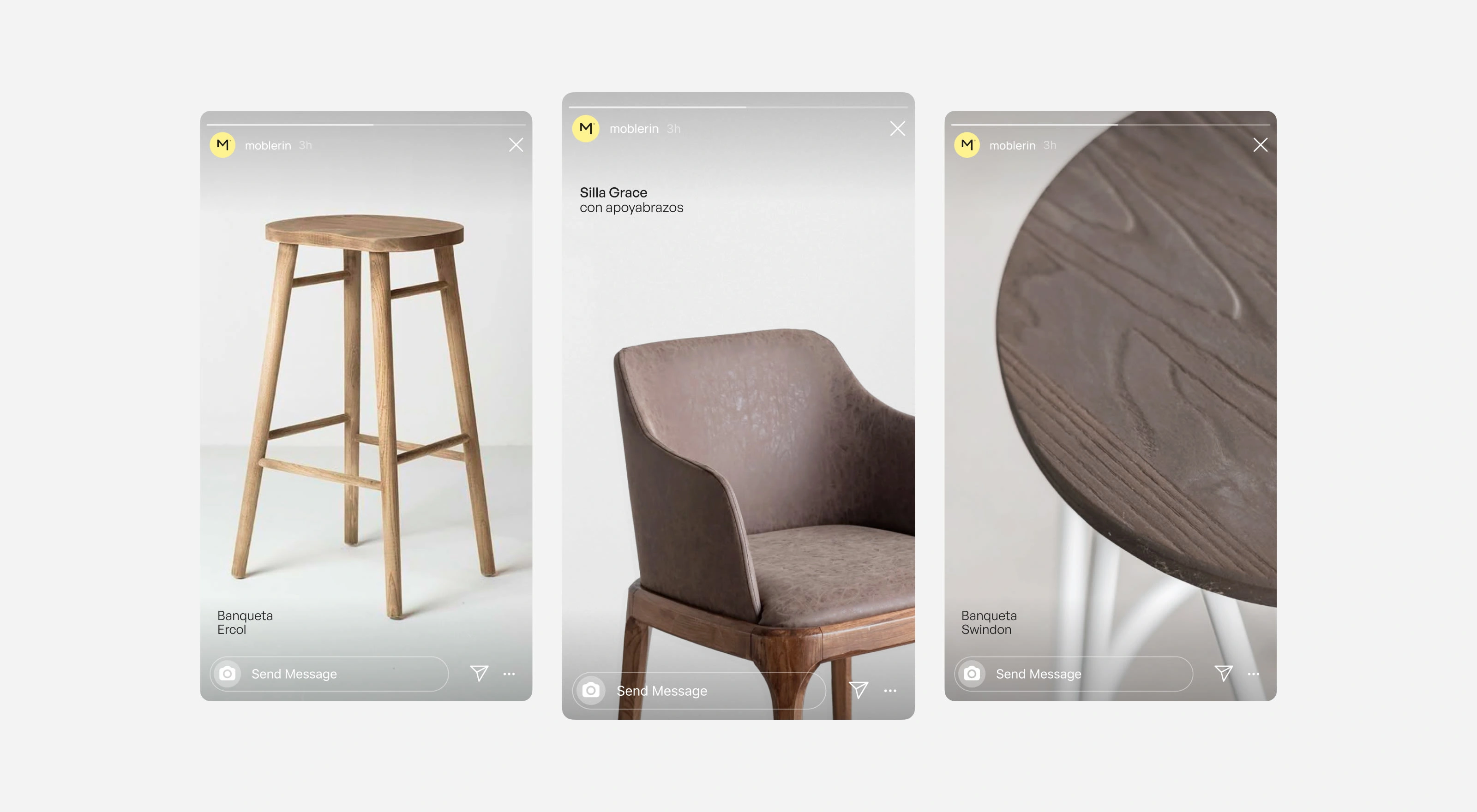
Every product in the Moblerin catalog is selected based on three principles: Balance, Usability, Material quality.
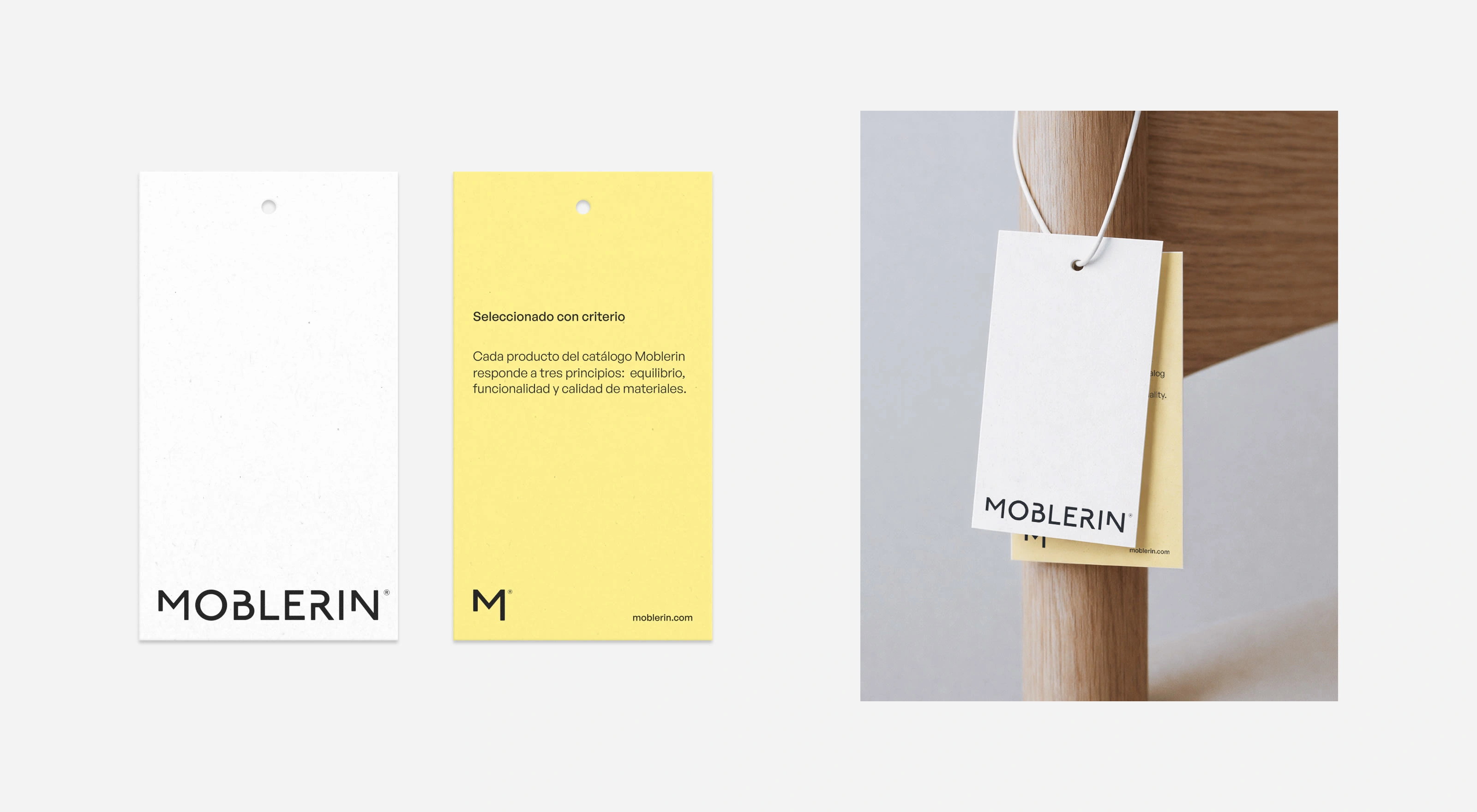
The symbol appears occasionally as a discreet marker of authorship across the identity.
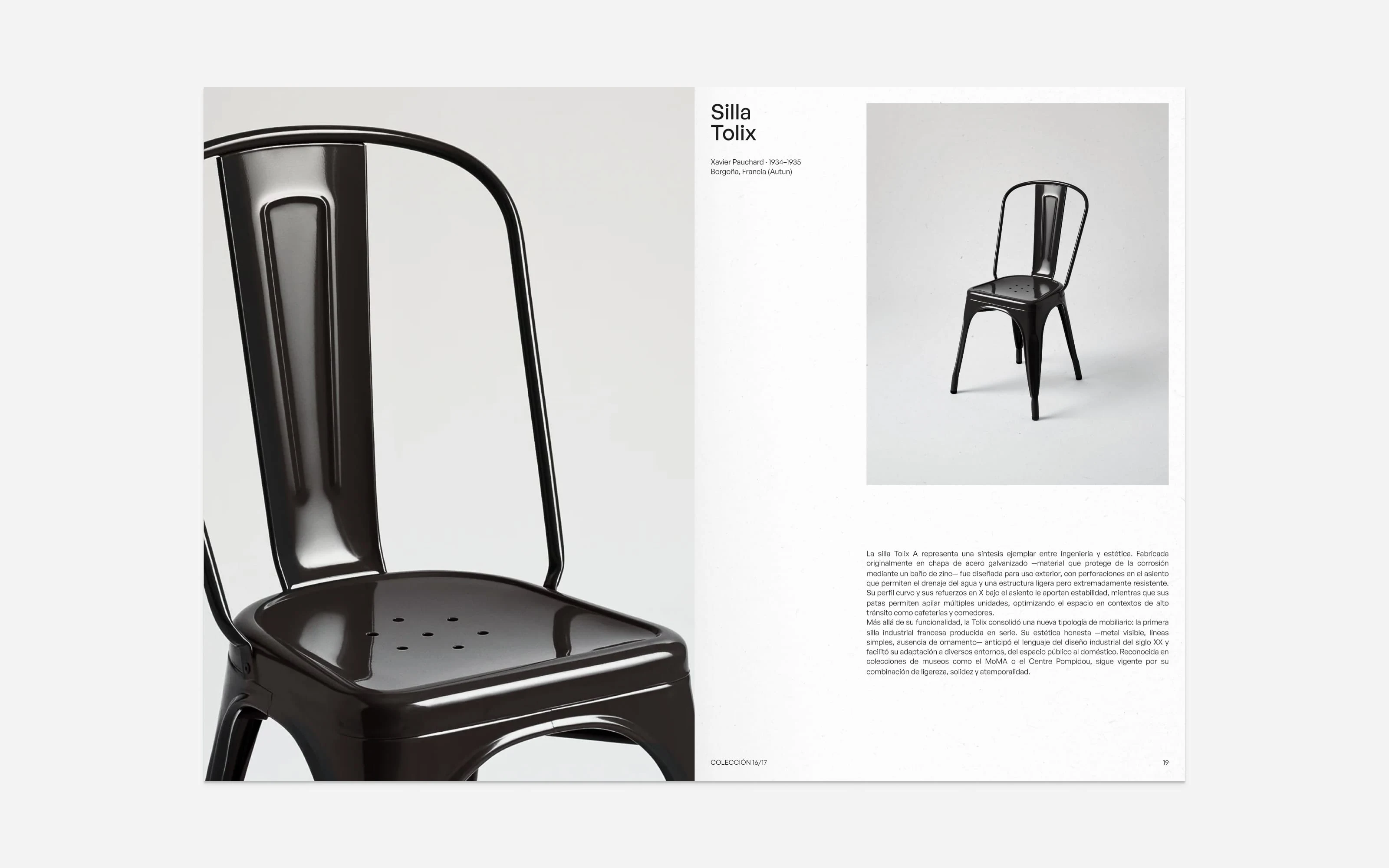
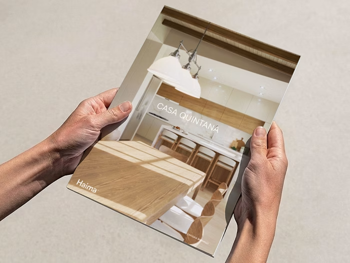
The catalog treats each product as a design object with its own history. Editorial space is given accordingly — not to sell, but to contextualize.
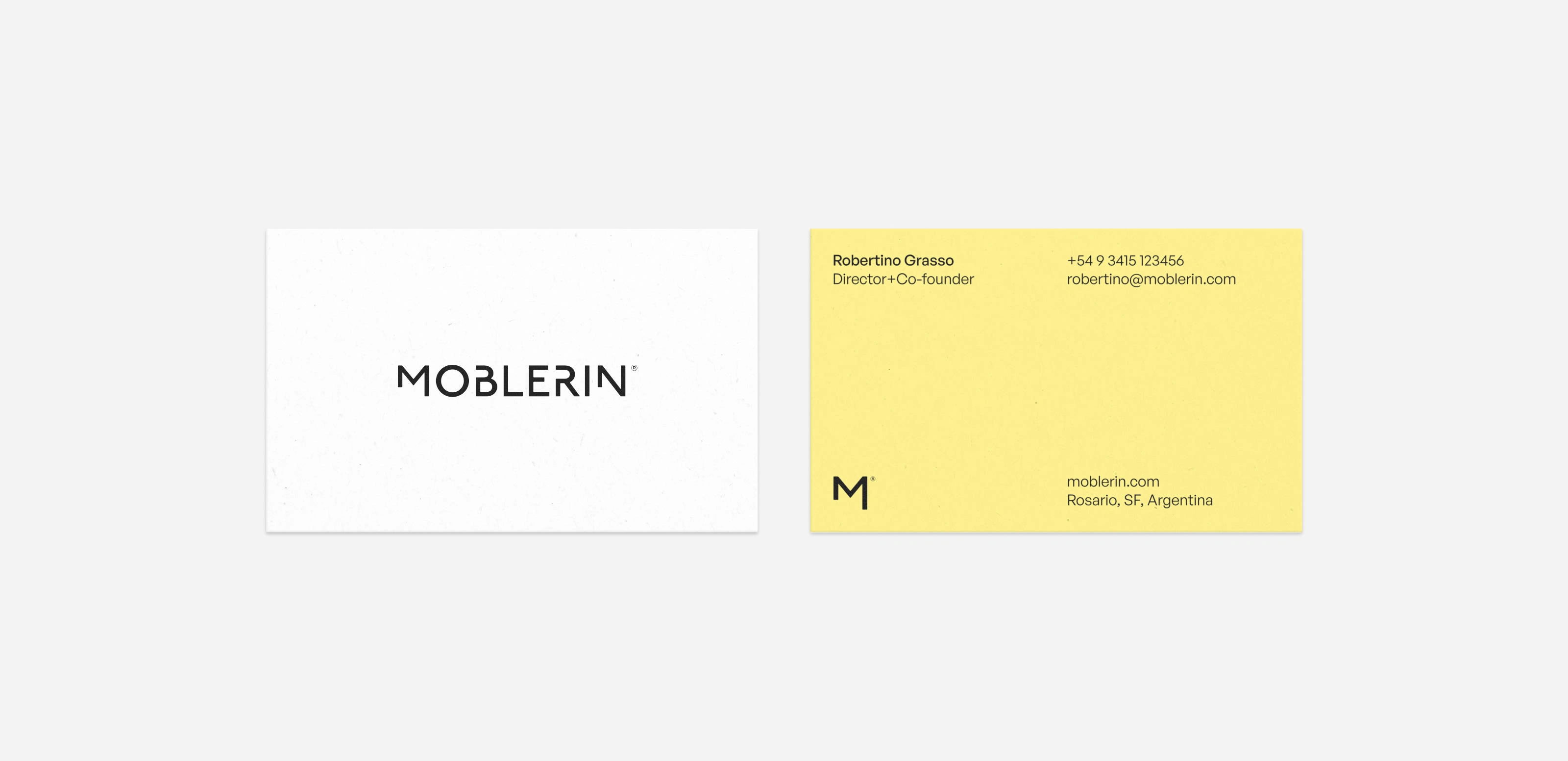
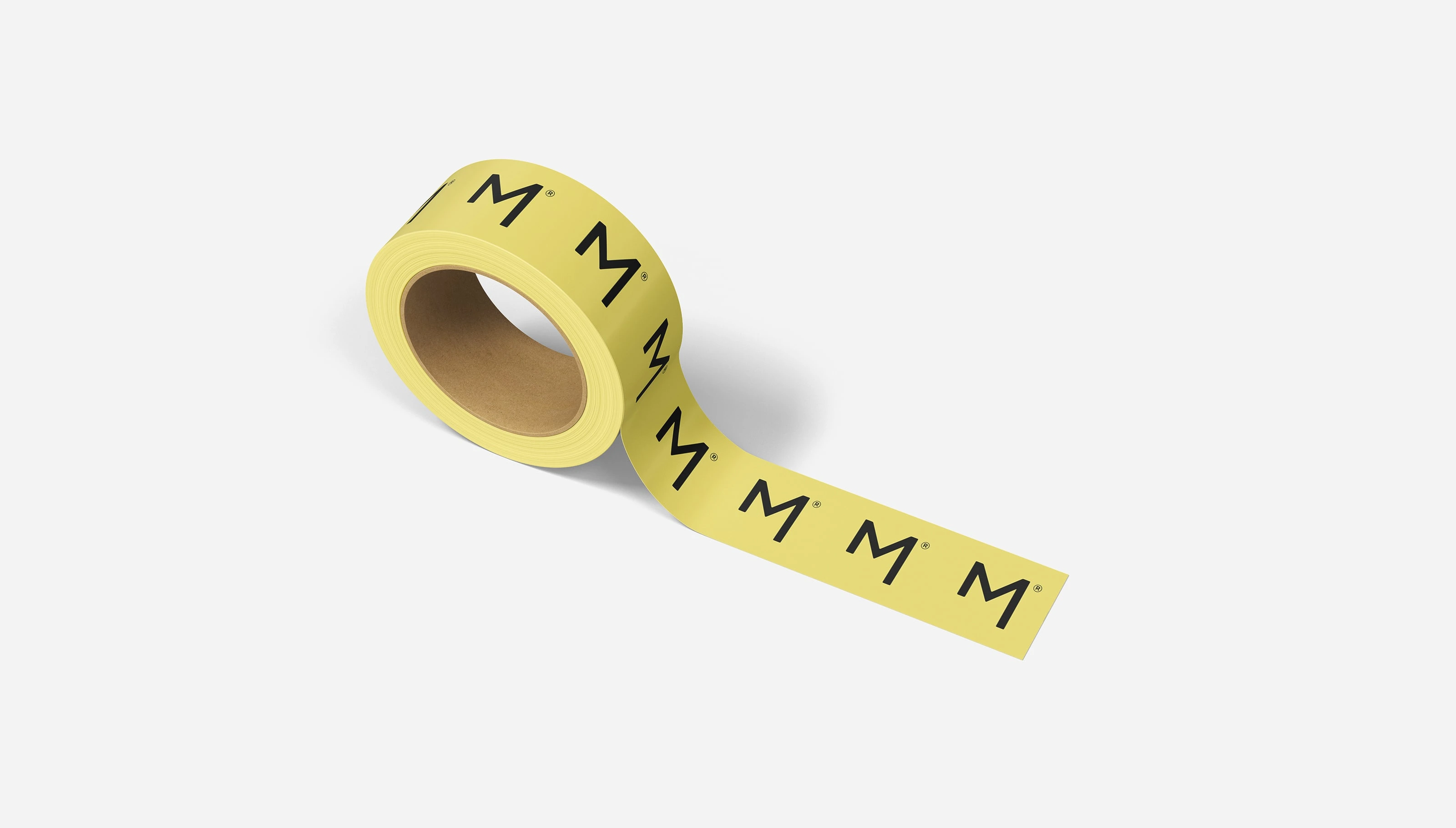
The M symbol was designed to function at small scale — as an avatar, a stamp, a quiet identifier across digital surfaces.
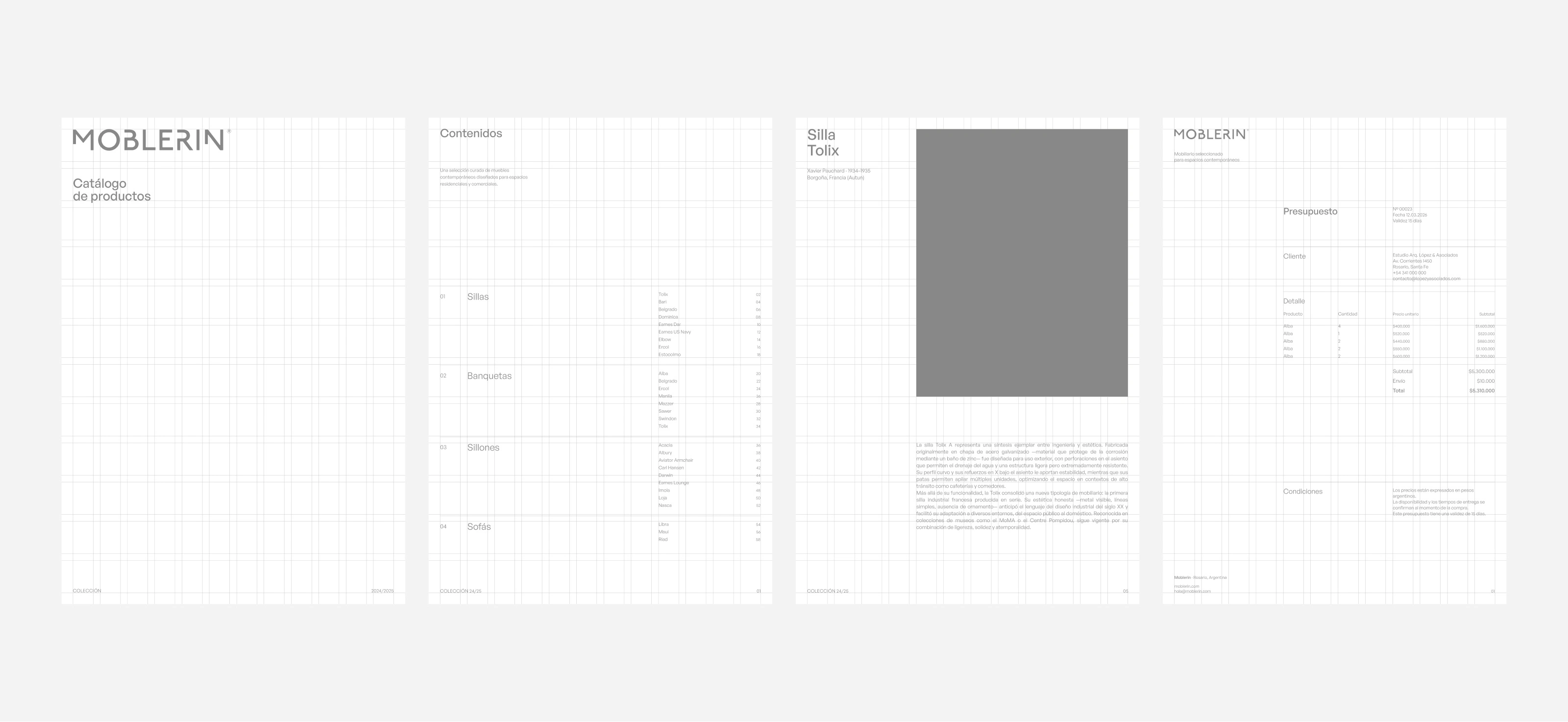
The system is built on a consistent grid. Structure is not invisible here — it is the identity.
Moblerin
Curation as positioning.
Structure as identity.
Restraint as a design decision.
Like this project
Posted Apr 10, 2026
Moblerin is a wholesale furniture importer — its role is not to produce but to select. The brand needed a visual identity that could support that positioning.