Logo Design for Ankomst
Cihan Tamti
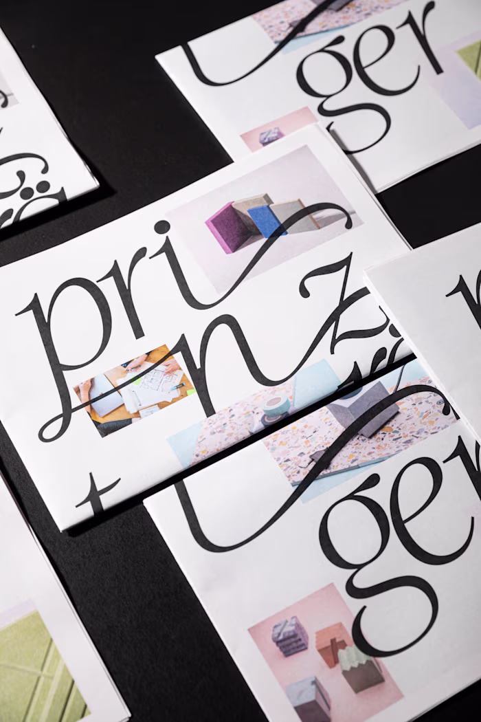
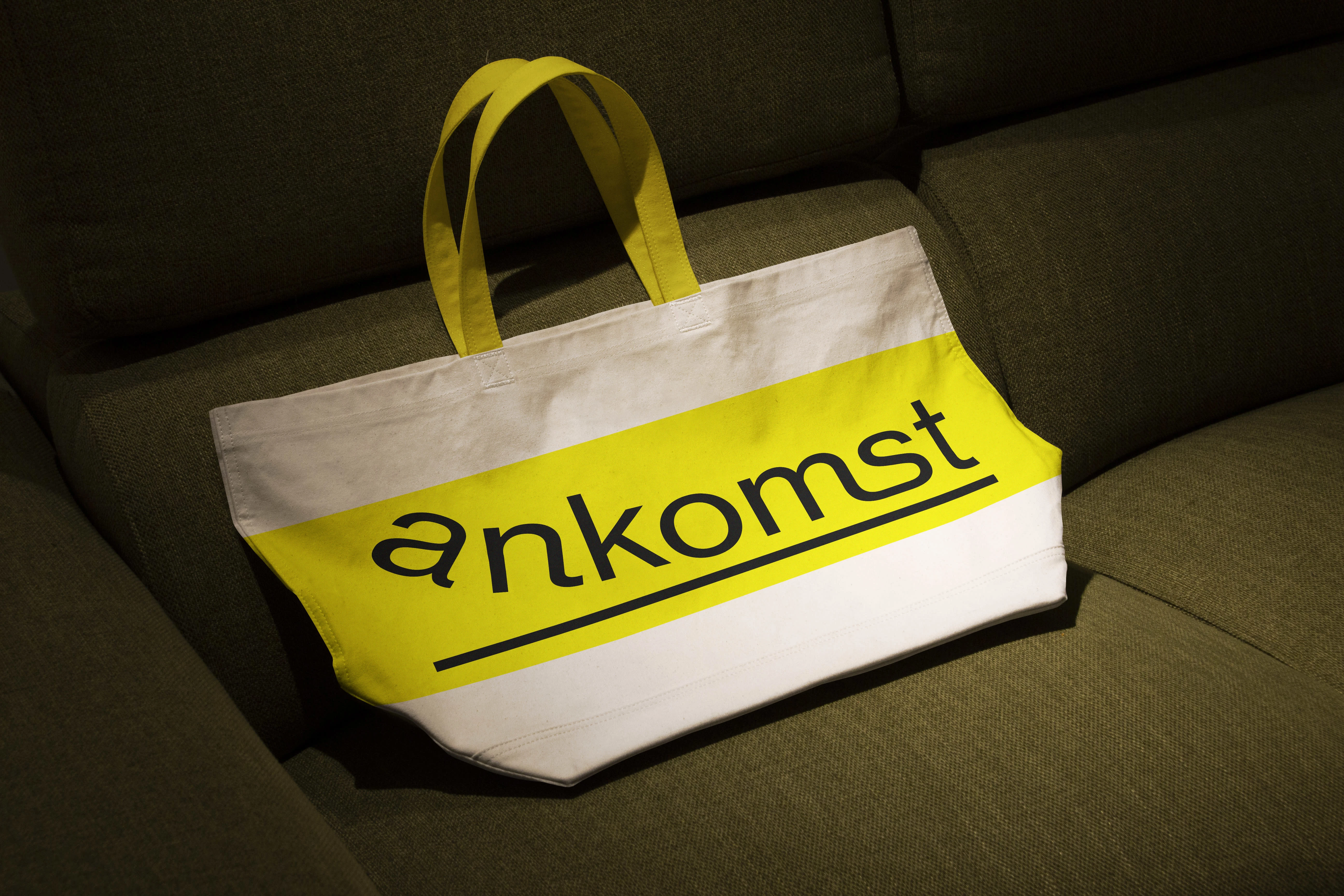
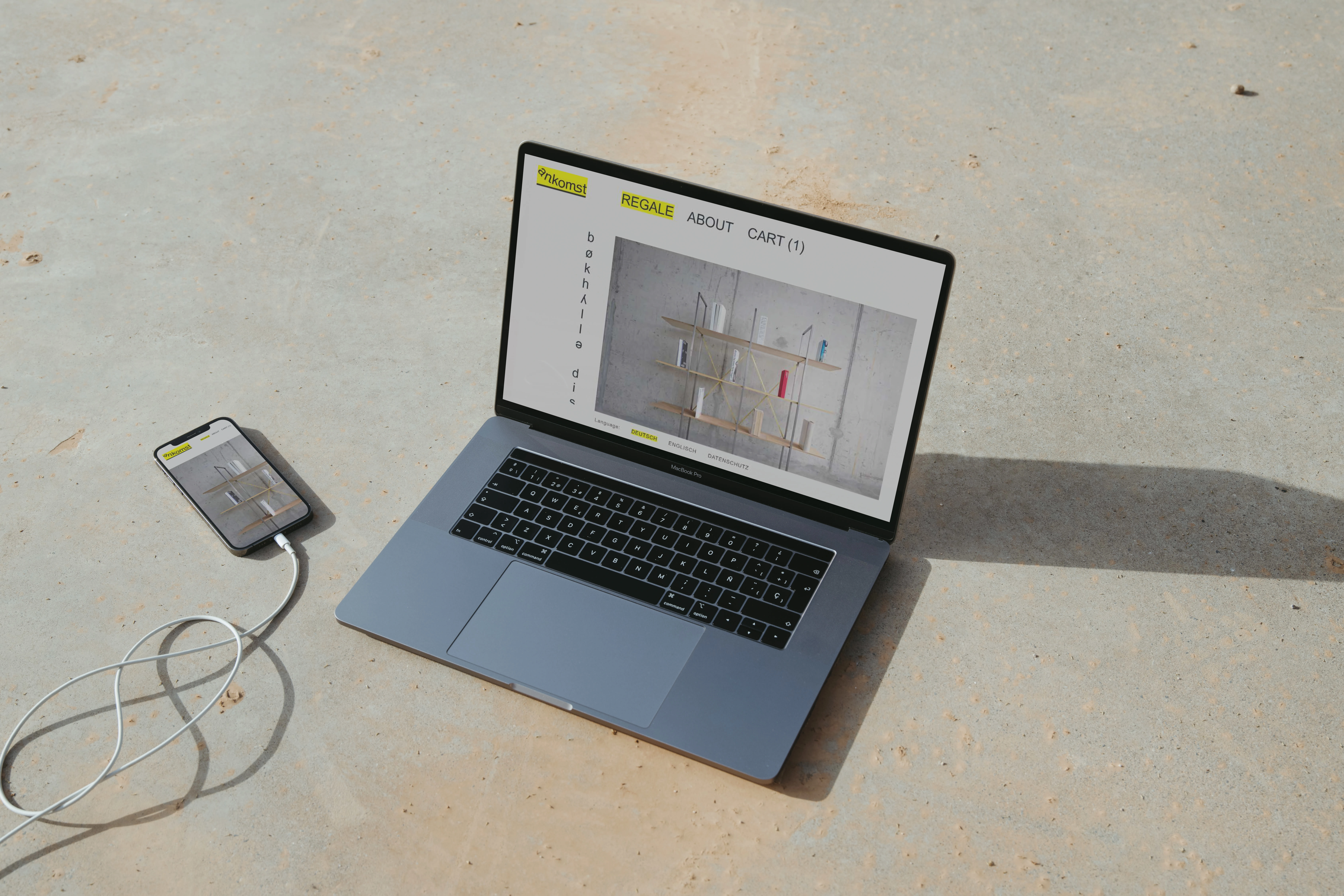
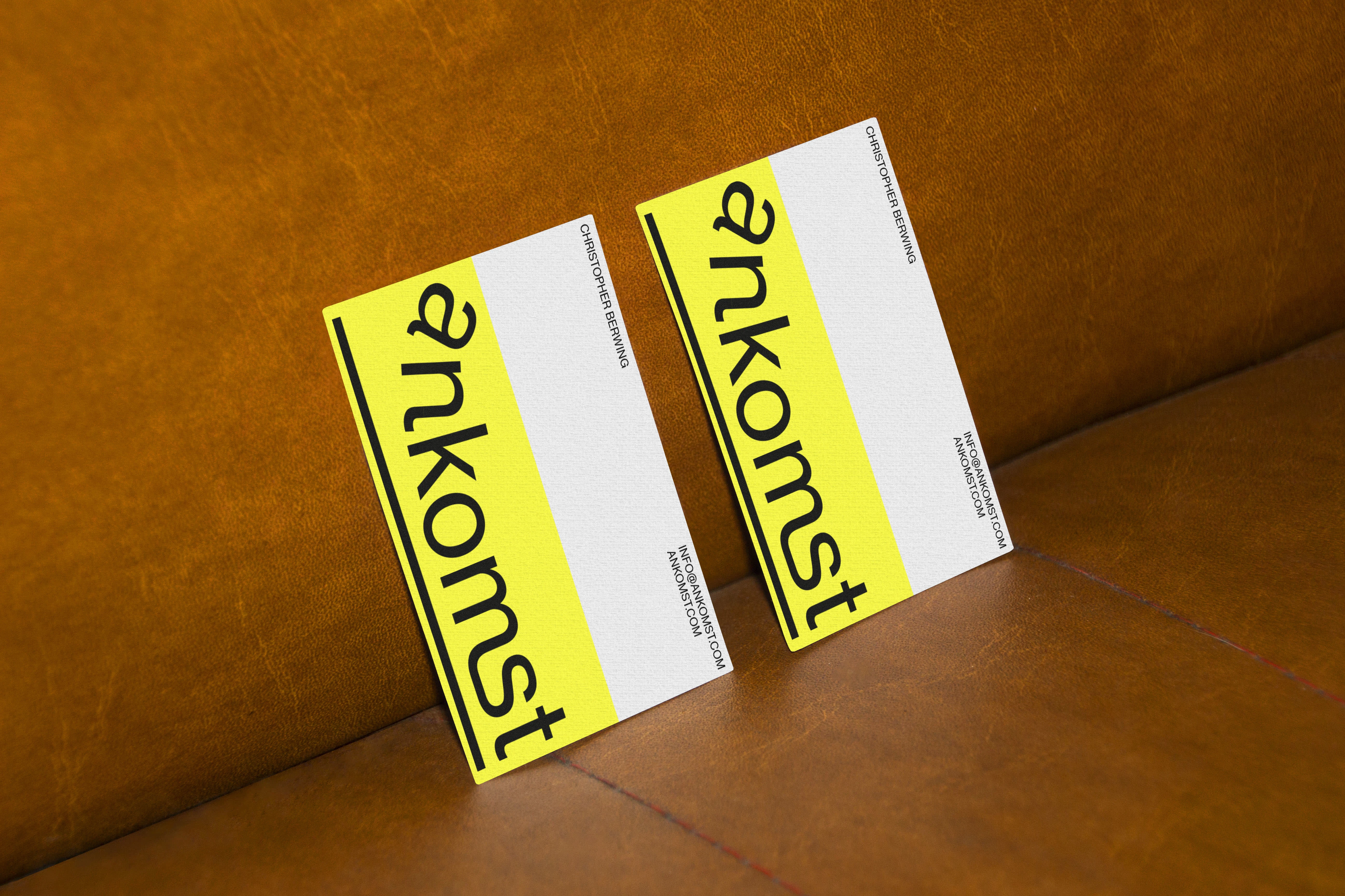
The Swiss brand Ankomst develops linear shelving systems for a design appreciative interior.
The comission was to modify the logo of the start-up. Here it was about giving the typographic logo more personality. Therefore, another detail in the logotype was requested. Ankomst means arrival in Norwegian and the brand wanted to visualize that. In this way, the logo was bent with a ligature and illustrates the arrival icon of airports.
Like this project
Posted Feb 18, 2023
The comission was to modify the logo of the start-up. It was about giving the typographic logo more personality.
Likes
1
Views
38