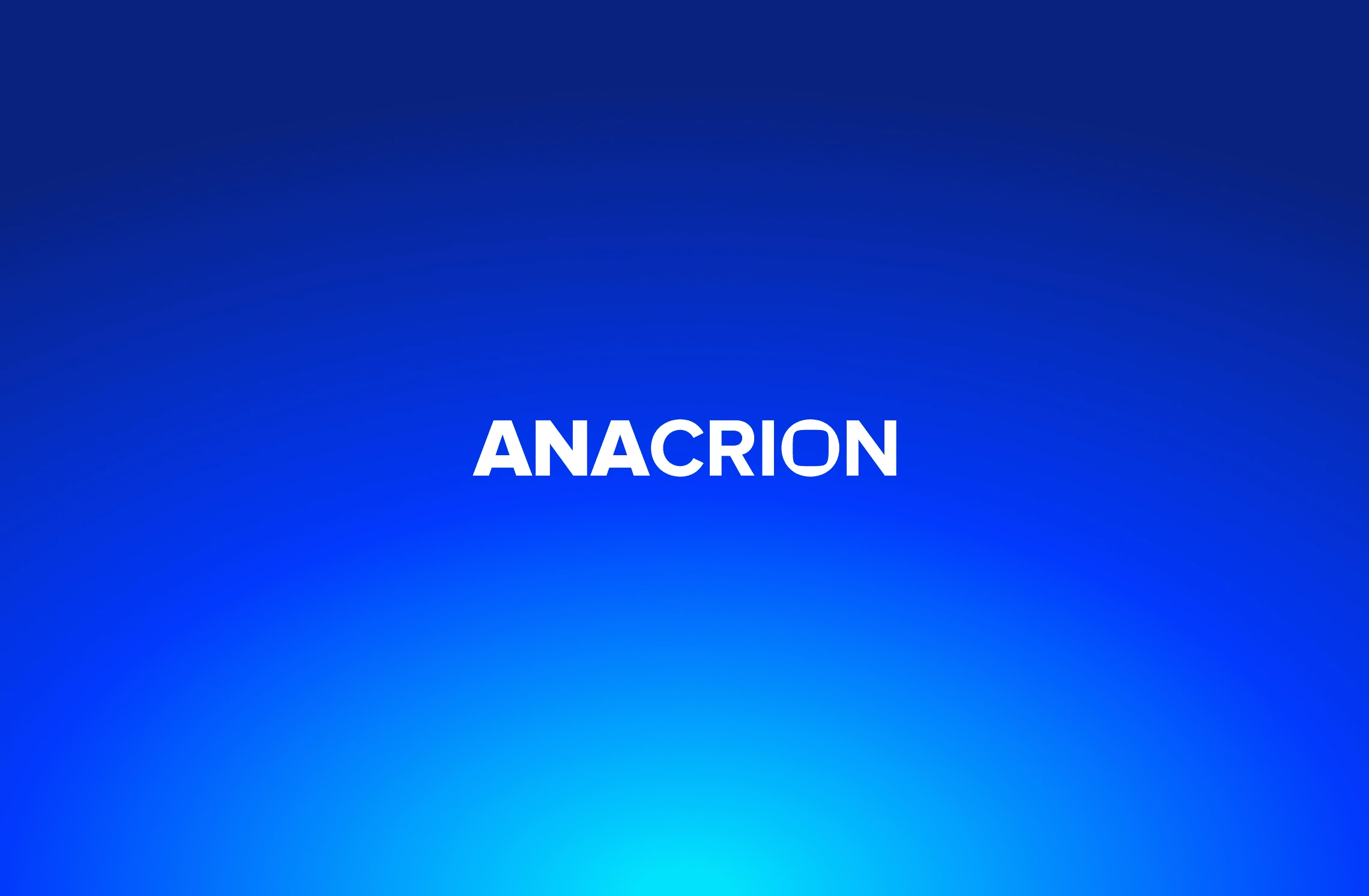
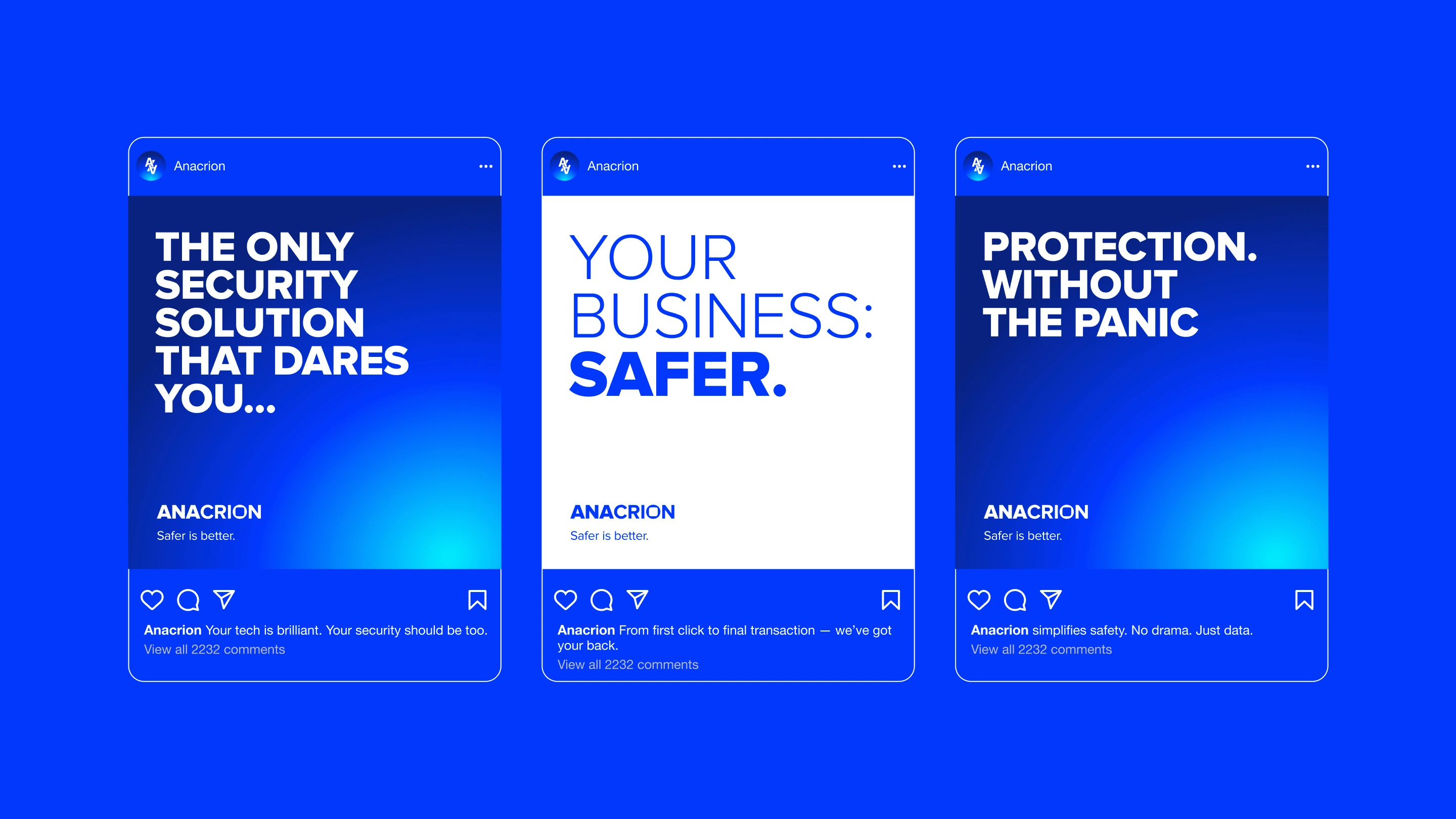
ANACRION simplifies safety. No drama. Just data.
Ovalay Studios
Anacrion – Branding a New Standard in Offensive Cybersecurity 🛡️
Anacrion is a new player in the offensive cybersecurity space, offering advanced services in network audits, penetration testing, and business data security. As a new company entering a saturated but critical market, they needed a visual and strategic identity that would immediately communicate trust, technical excellence, and a cutting-edge mindset.
Our Role
We led the end-to-end development of Anacrion’s brand identity and strategy — from naming consultation and visual direction to color systems, typography, and application across brand assets — and working directly with the founders to define how the brand should be perceived by enterprise clients and industry stakeholders.
🔍 The Challenge
As a fresh cybersecurity startup, Anacrion had to establish immediate credibility while standing out in a domain often saturated with sterile, overly complex visuals. They needed:
A strong brand presence that could compete with more established firms
A color system and tone that conveyed confidence and precision
A brand voice and visual system that appealed to both technical buyers and C-suite decision-makers
💡 The Strategy
We positioned Anacrion as bold, precise, and vigilant — a brand that doesn't just protect but proactively tests the limits of security to ensure resilience.
Key strategic themes:
Offense as Assurance: Framing penetration testing as a proactive form of protection, not just a checkbox activity.
Clarity over Complexity: Simplified brand language and clean visuals to cut through industry jargon.
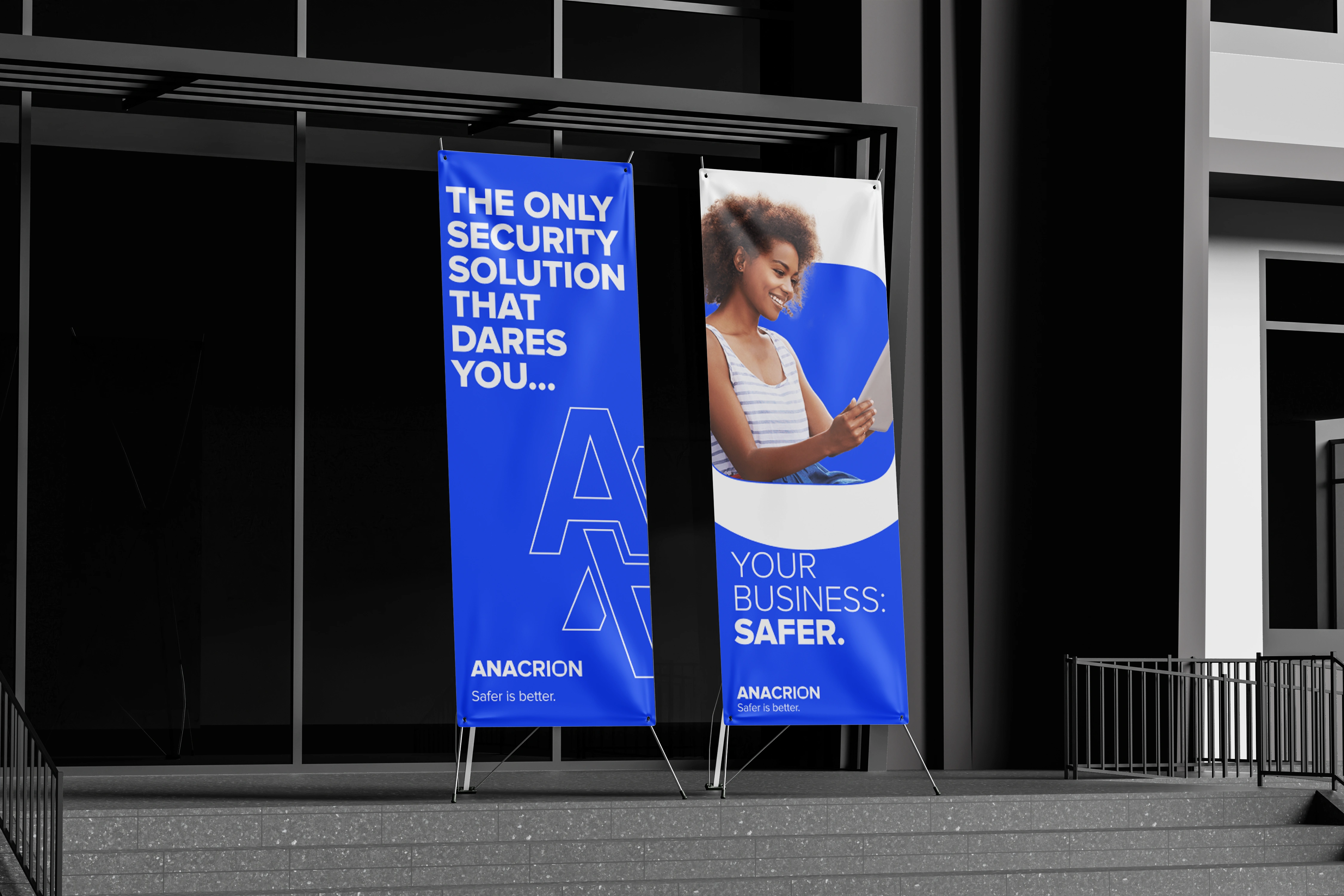
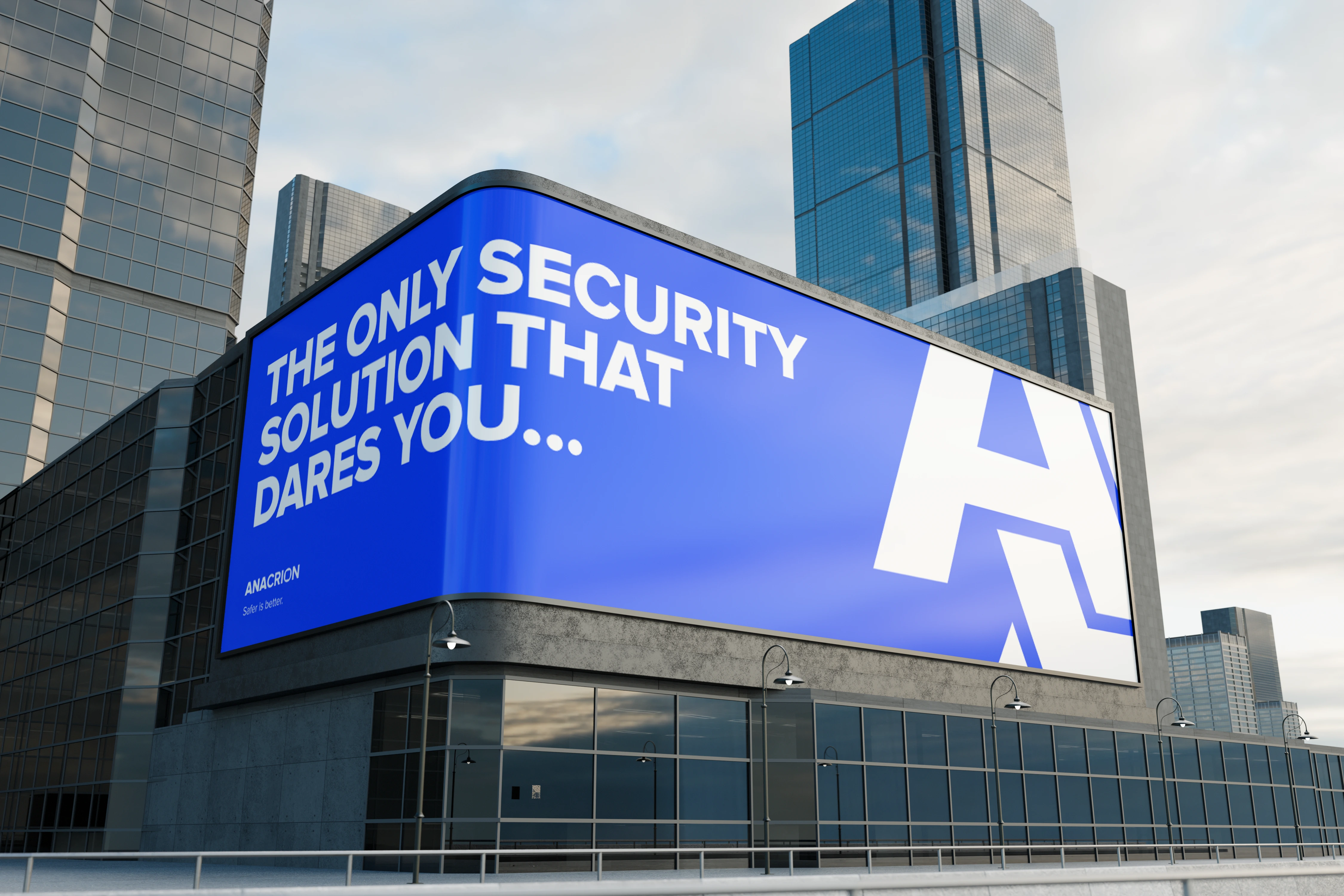
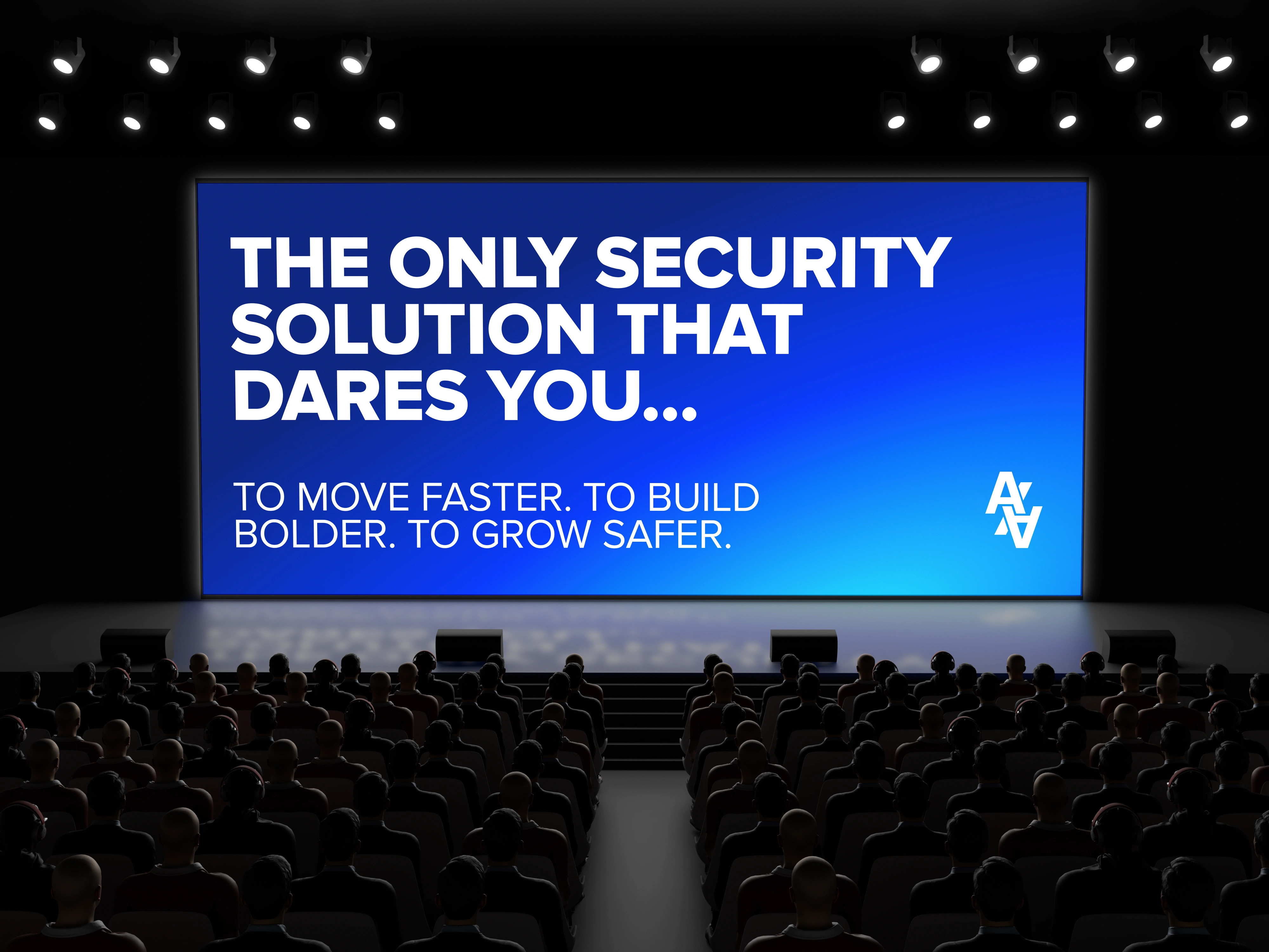
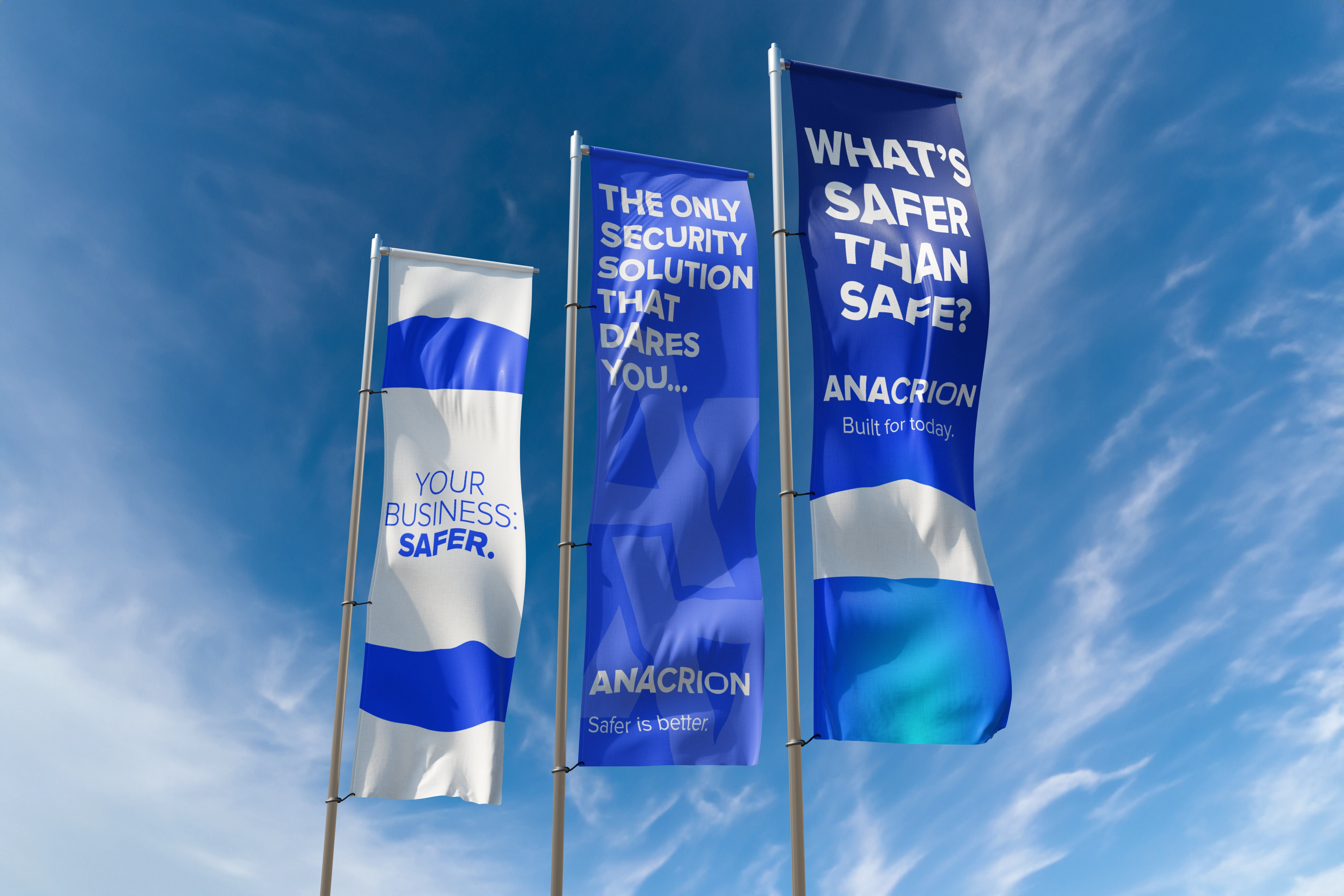
Elite Precision: Drawing aesthetic cues from special ops and high-stakes environments — sharp lines, deep blues, and commanding typography.
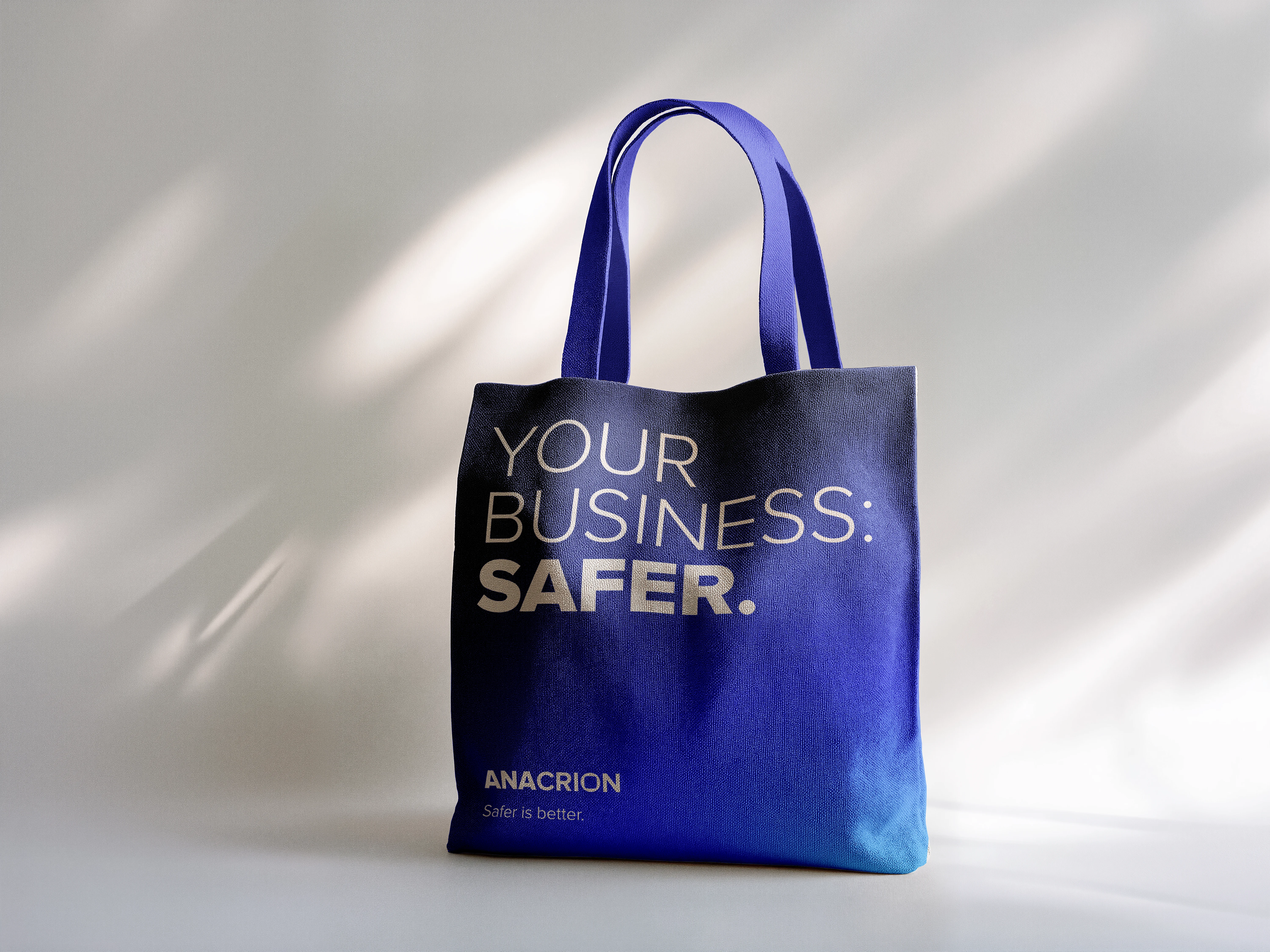
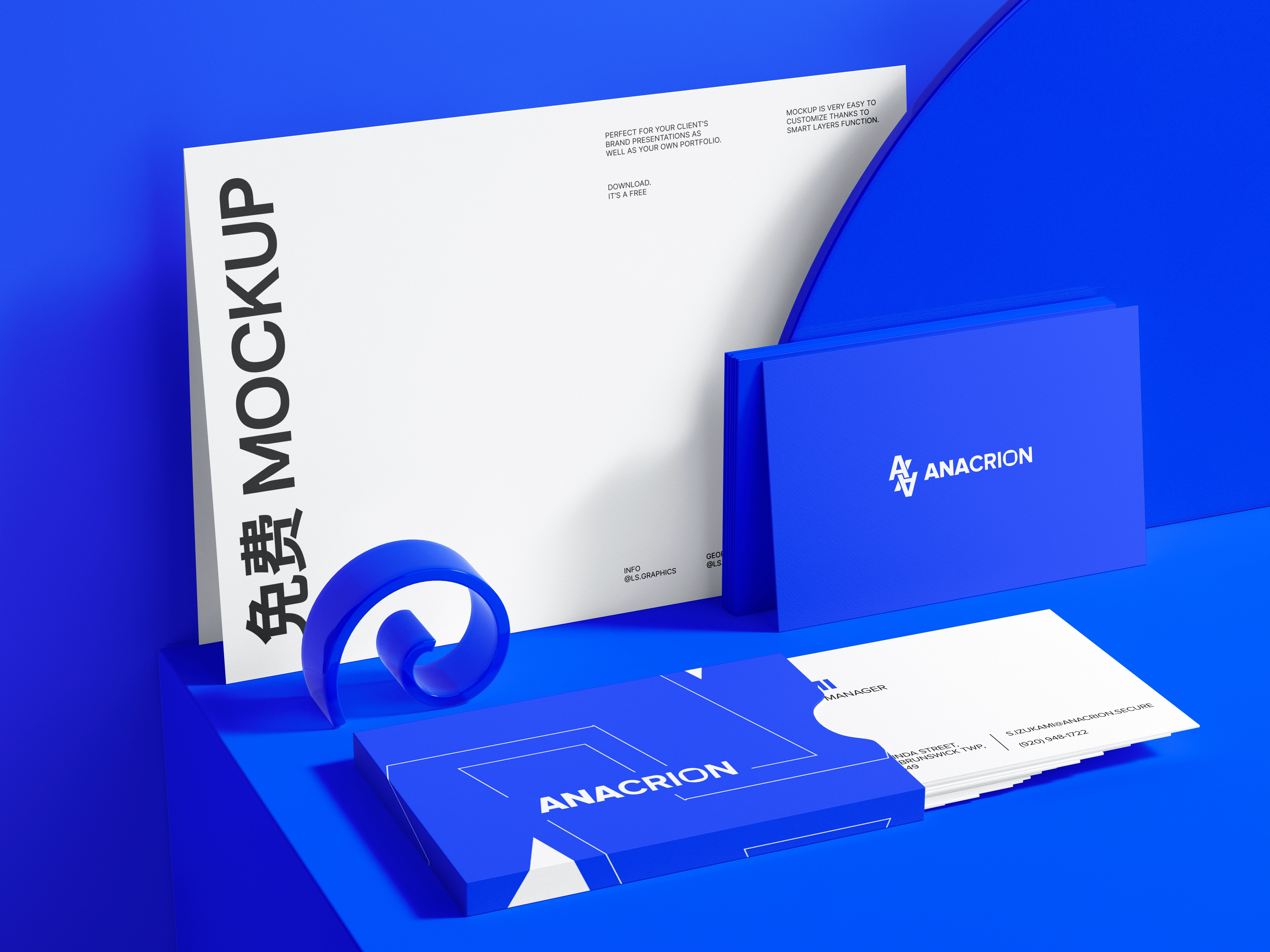
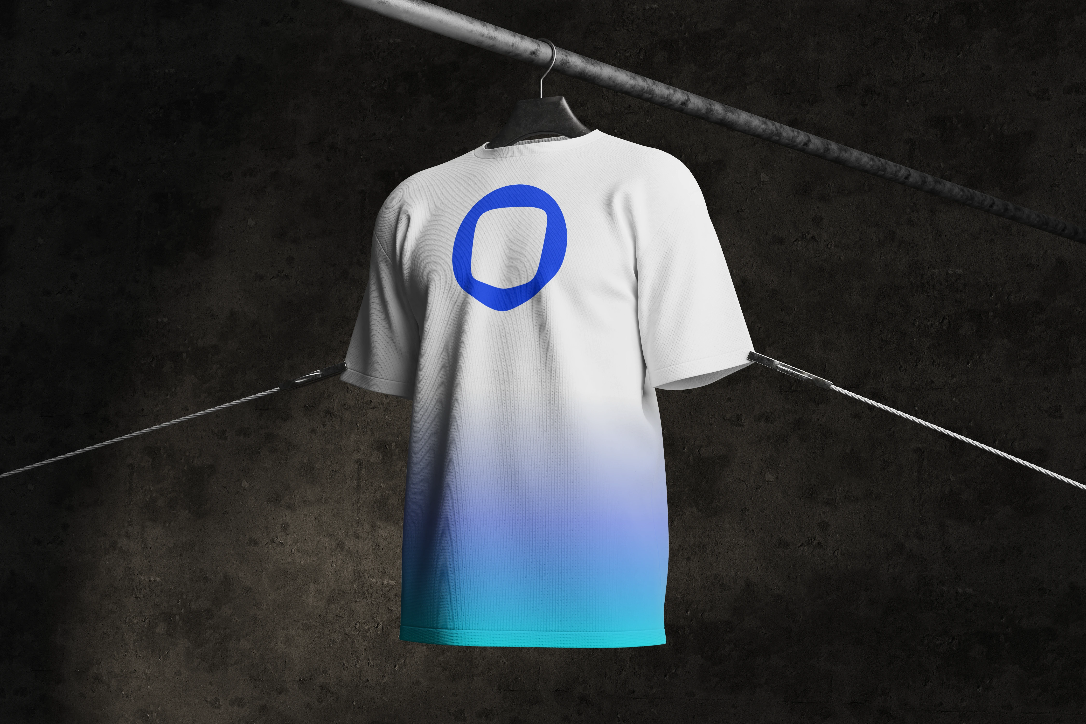
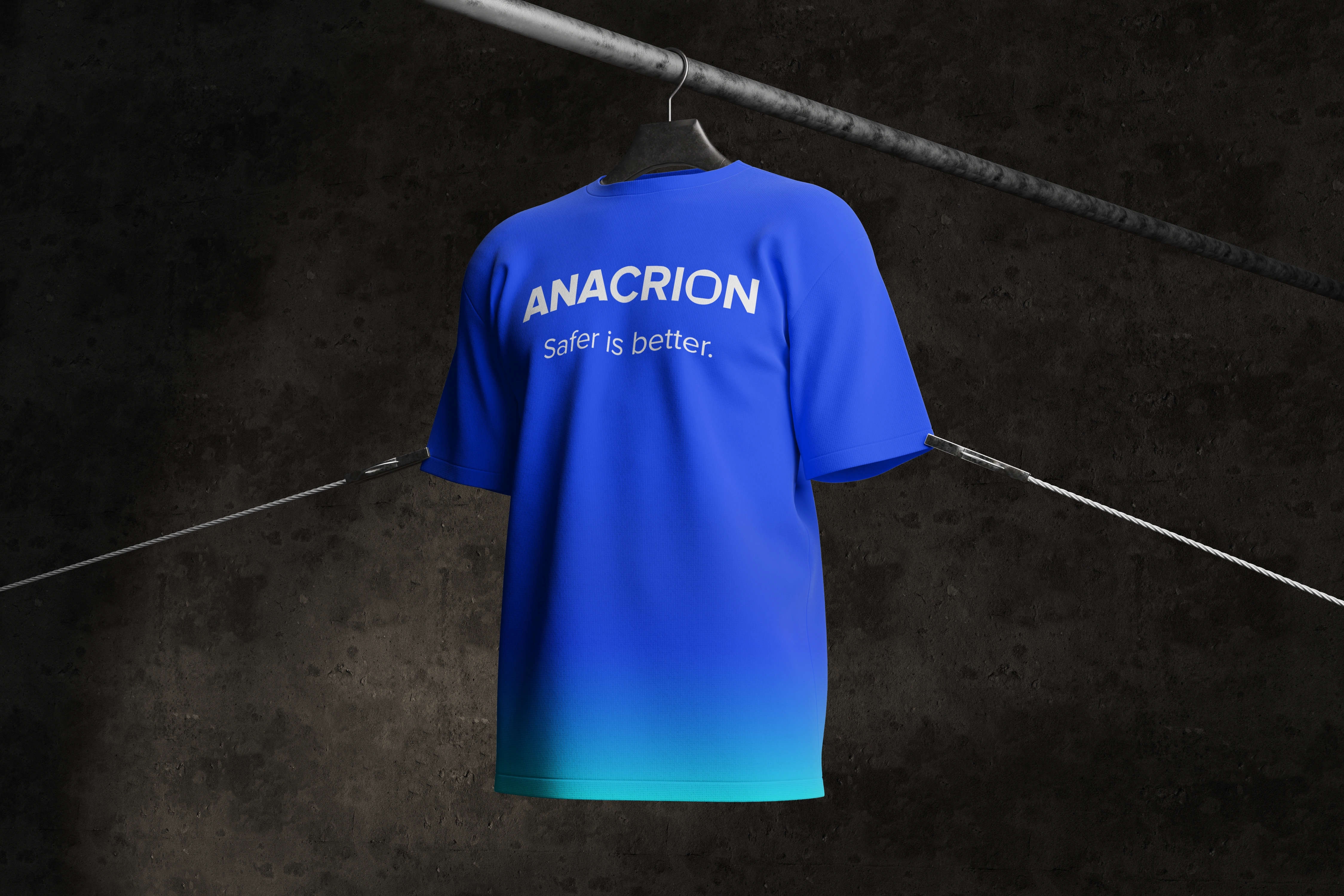
Logo: A modern, monospaced logotype combined with a secondary stacked symbol mark for flexibility. The “O” is stylized to reflect security layers and controlled breach points.
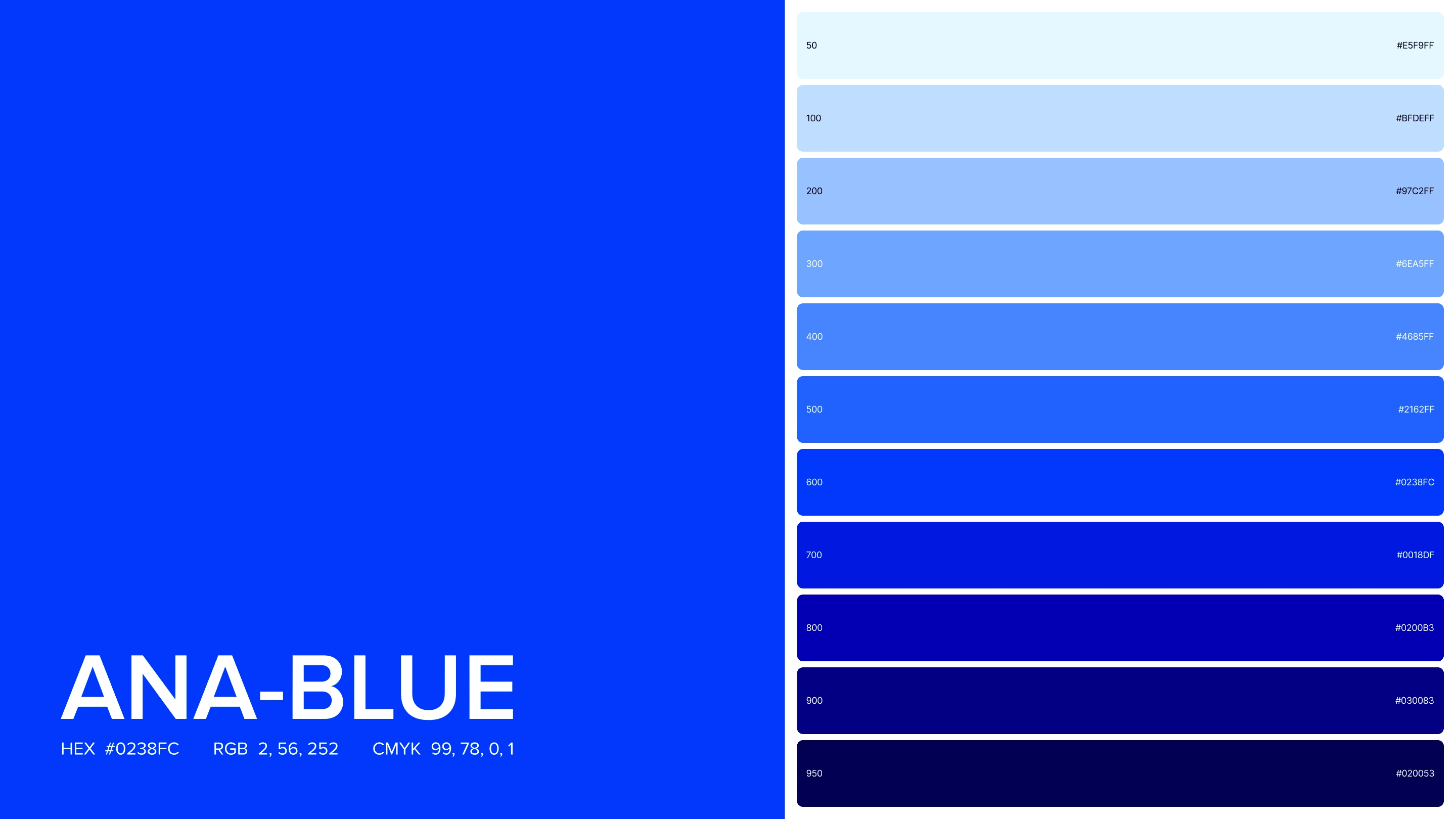
Color System:
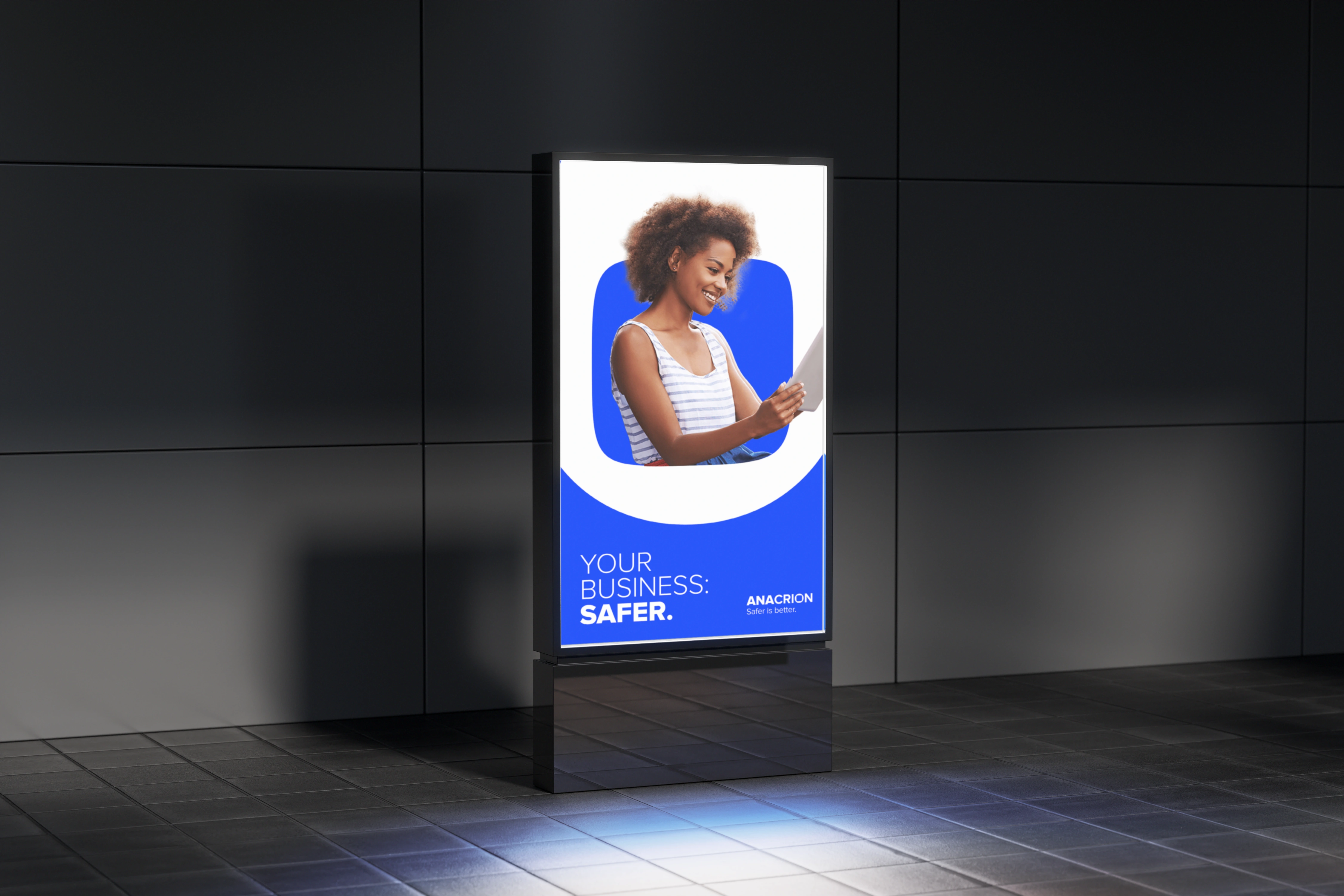
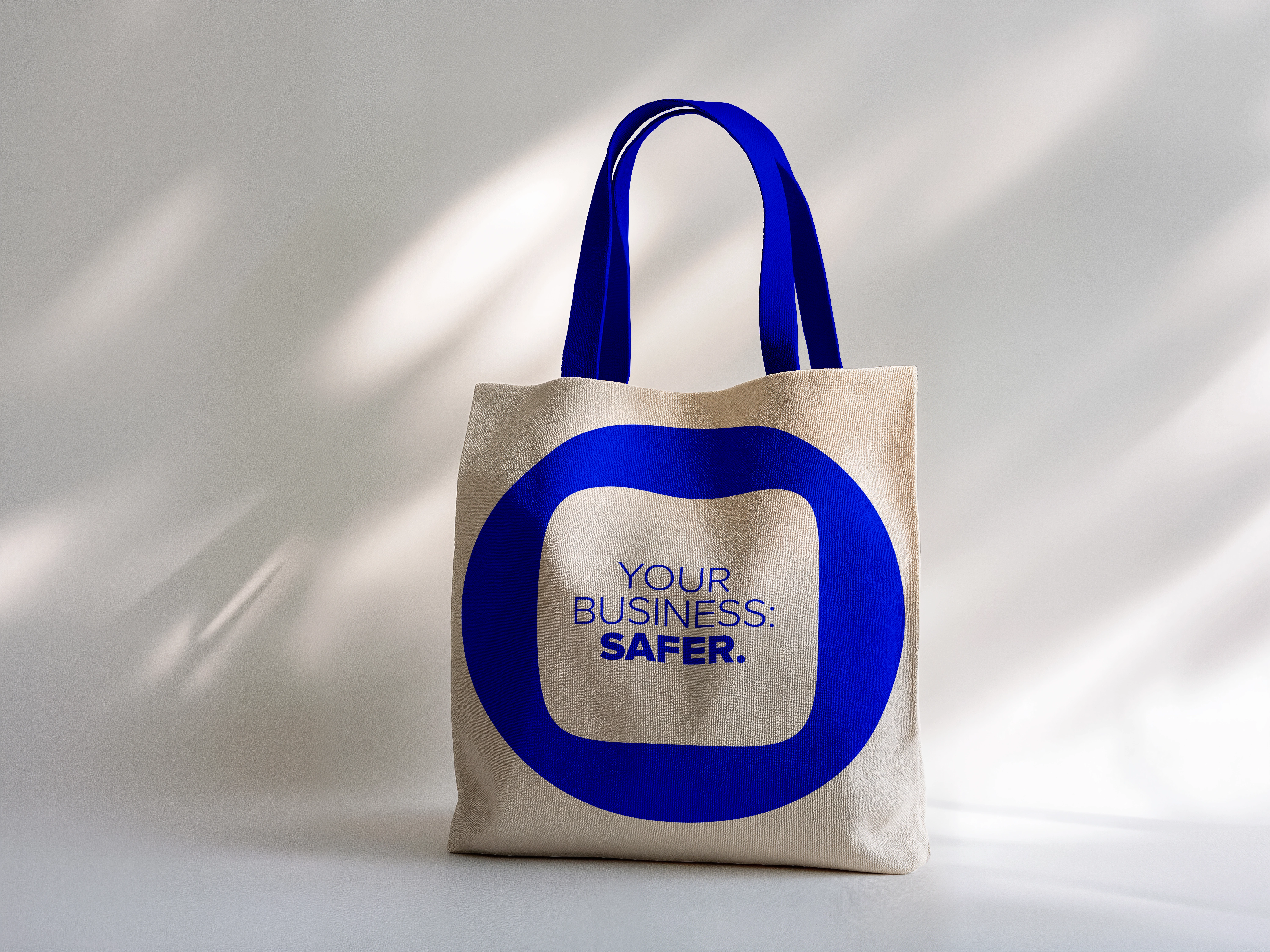
We introduced ANA-BLUE — a proprietary electric blue hue paired with a structured gradient system (from ANA 50 to 950), optimized for both light and dark applications. It evokes trust, clarity, and digital sophistication.
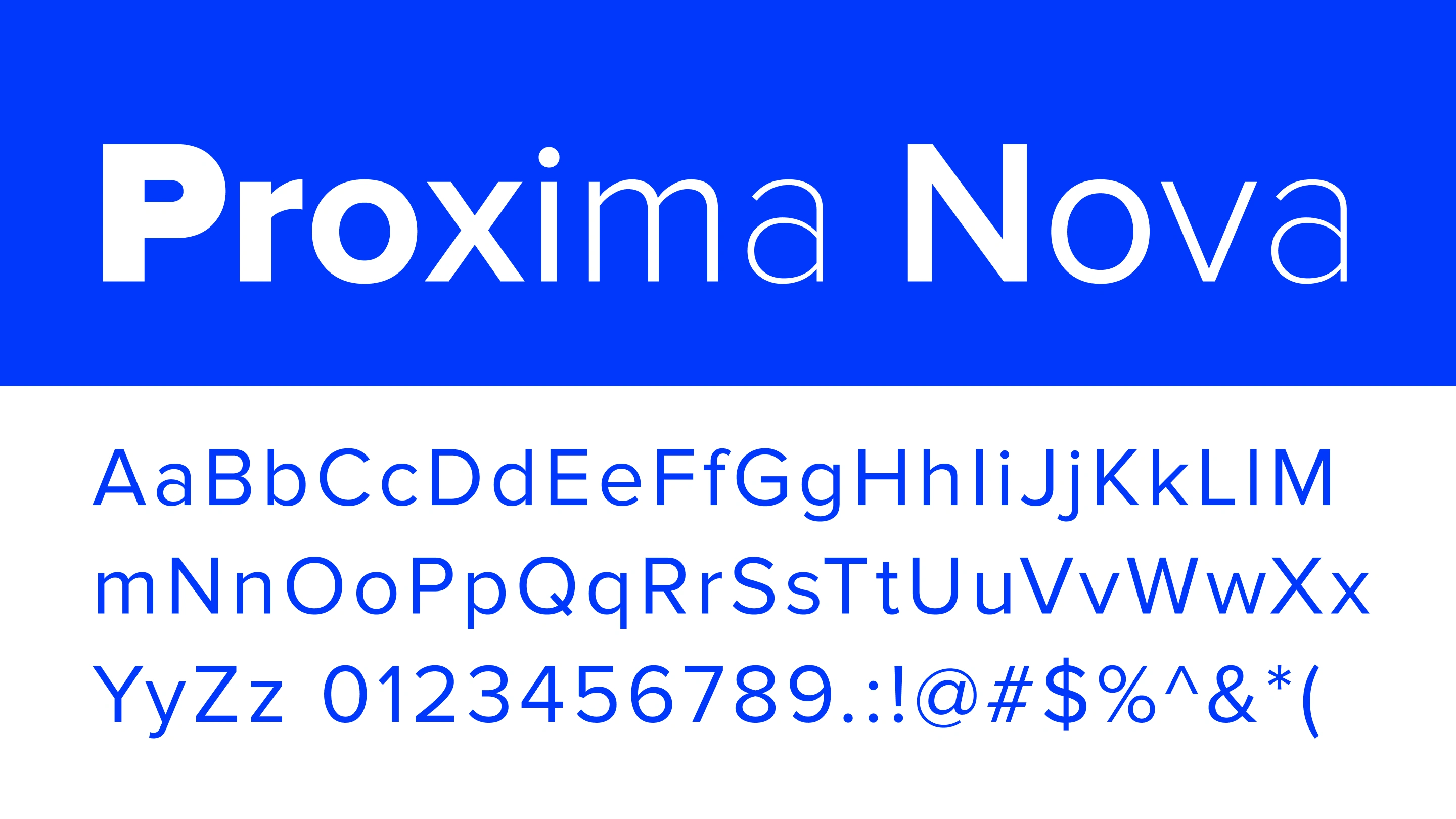
Typography:
A bold, modern sans-serif typeface gives the brand confidence and legibility, ideal for both technical documentation and executive reports.
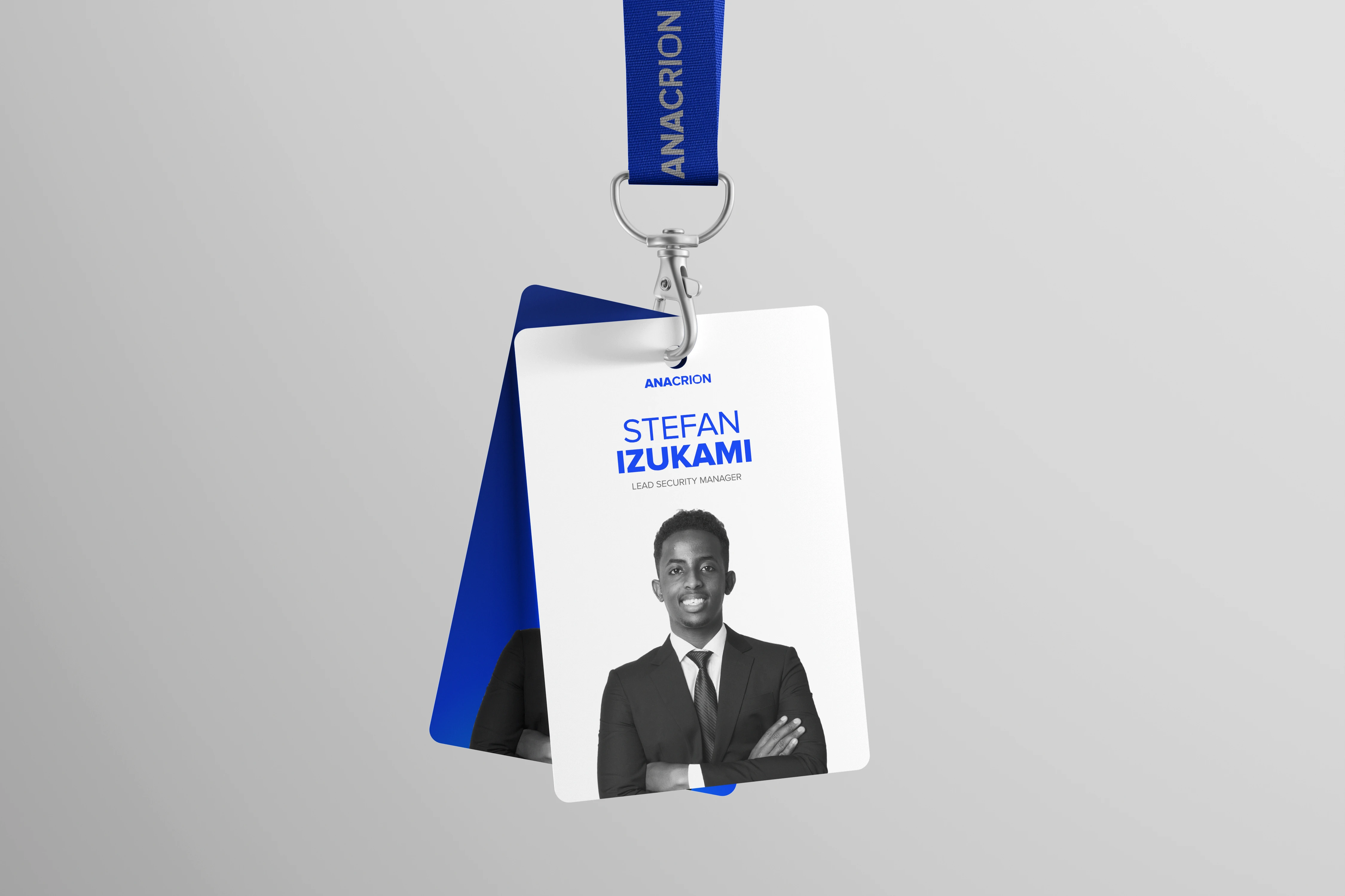
Brand Assets:
Business cards, pitch decks, report templates
Security ID cards and branded merch
Figma-ready design tokens for future product UI
📈 Outcome
Anacrion launched with a brand that instantly set them apart from typical cybersecurity aesthetics. The visual system was designed to scale — from conference booths to browser toolbars. Internally, the strategy gave the team clarity on how to talk about what they do and who they do it for.
Tools Used
Figma, Illustrator, Photoshop (Moodboarding, Typography Kits, Color Token System)
🔦 Reflections
Designing for a cybersecurity brand meant balancing authority with approachability. The most powerful brands don’t just look secure — they feel secure. With Anacrion, we built a system that does both.
Like this project
Posted May 6, 2025
Designed for modern businesses that prioritize safety without compromising on aesthetics or innovation.