Iroha Crest Works (Concept): 1881 Crests, Modern Tools

Jorge Zamora

A concept project for the Recraft x Contra Archive Style Challenge. Iroha Crest Works is a fictional studio. Every historical claim links to its source.
In 1881 a former samurai named Tanaka Kikuo published a pattern book of Japanese family crests in Tokyo, the Iroha-biki Monchō. I trained a Recraft Style on eight of its crests and asked what its makers would have done with the tools we have now.
This case study is less about the answer than the route. The project changed shape eight times. Each change came from one plain question, and each question is below with the image that answered it.
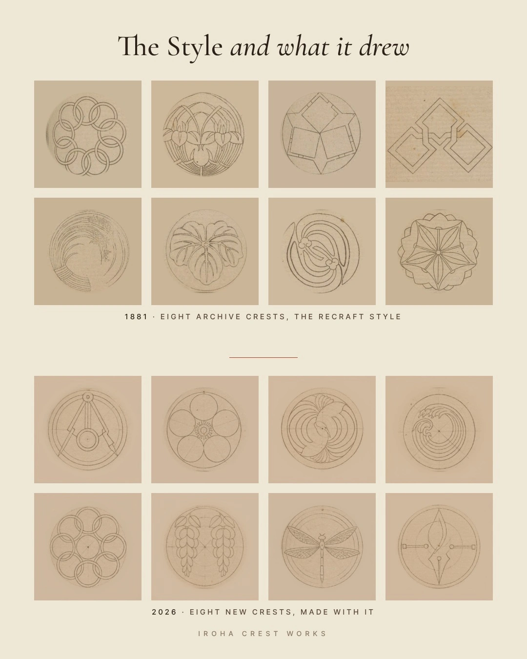
The Style and what it drew: the eight 1881 crests above the eight new ones.
The archive
The book is a reference crest painters, dyers and customers could open to find a crest and draw it correctly. Its opening illustration shows the trade: cloth left with blank white circles outside, an artisan drawing at a Western-style table inside. In 1881 these makers were already adopting new tools. University of Sydney Library
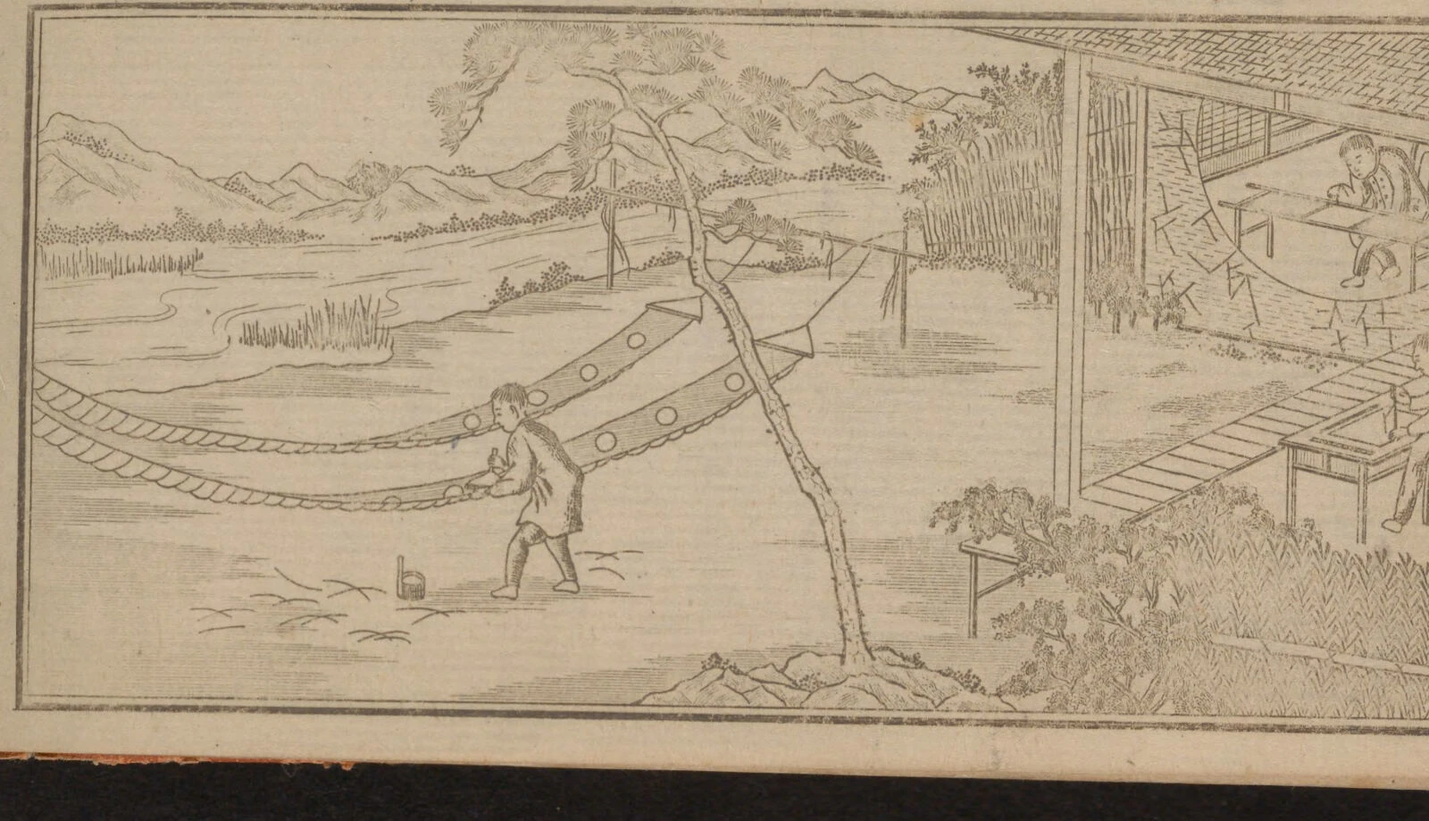
The workshop illustration from the opening of the Iroha-biki Monchō, 1881.
I used the Smithsonian Libraries scan on the Internet Archive, labeled public domain, and logged every page I cropped. archive.org/details/irohabikimoncho00tana
What the makers believed
Crests are called mon or kamon. Nobles, samurai, merchants, actors and ordinary families all carried one, on cloth, lacquer, wood and paper, in a single color, at any size. Wikipedia, Mon (emblem) Working crest painters still describe their craft as the art of subtraction. Kyogen Kamon
Six rules run through the book and the painters who still practice:
Subtract until only meaning remains.
Construct, never freehand. Every crest is built from compass arcs and straight lines.
One color, reversible. White on indigo or black on paper. A crest that fails in reverse is not finished.
Contain it. Most crests sit inside a ring.
Draw from nature and mean something.
Build a family, then vary it.
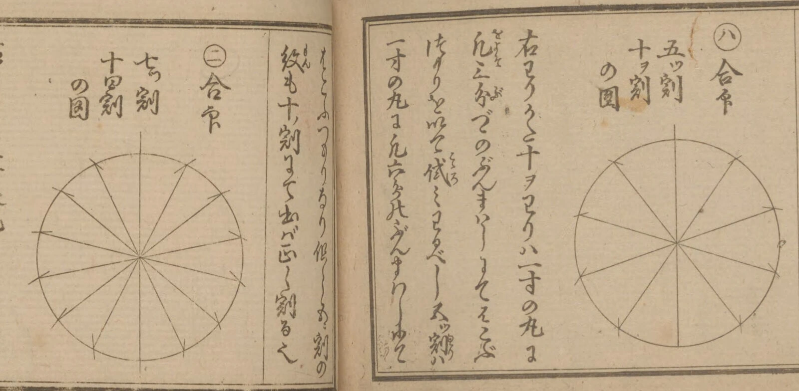
Circle division diagrams from the back of the 1881 book.
The back of the book teaches rule two directly: how to split a circle into five or seven equal parts with a compass. A designer today would call it a construction grid.
How the project moved, question by question
1. What can we make with crests?
The first ideas were safe: a crest icon set, a crest pattern library. They felt simple. The goal became something outlandish that still honored the people who drew the originals.
2. Crests are logos. What if a crest standard had run modern life?
I built a world where the 1881 book became the visual standard for everything, from rockets to coffee cups, all drawn in the book's line. It looked good, and it looked like most entries: modern life repainted in an old style.
3. What if we brought it into the real world?
Photographic versions of the same objects. The hand disappeared. Without the line, it was just a photo with a logo on it.
4. What if the artists of 1881 had our tools?
This was the turn. Keep the makers and their method, and change only the tools. A compass arc is already a vector curve. A circle division is already a grid. A family of variants is already a component set. The first version of the film came from here.
5. Ours looks simple next to the other entries. Is that the point?
Yes. The makers' first rule is subtraction. The restraint stayed.
6. Does it have a before and after?
It needed one. Each new crest now sits beside the 1881 crest it answers, then follows it into a blueprint and into use.
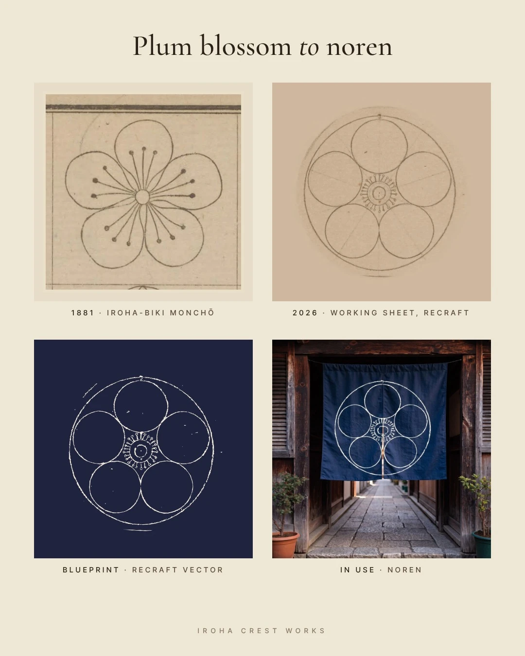
Plum blossom to noren: 1881 page, working sheet, blueprint, in use.
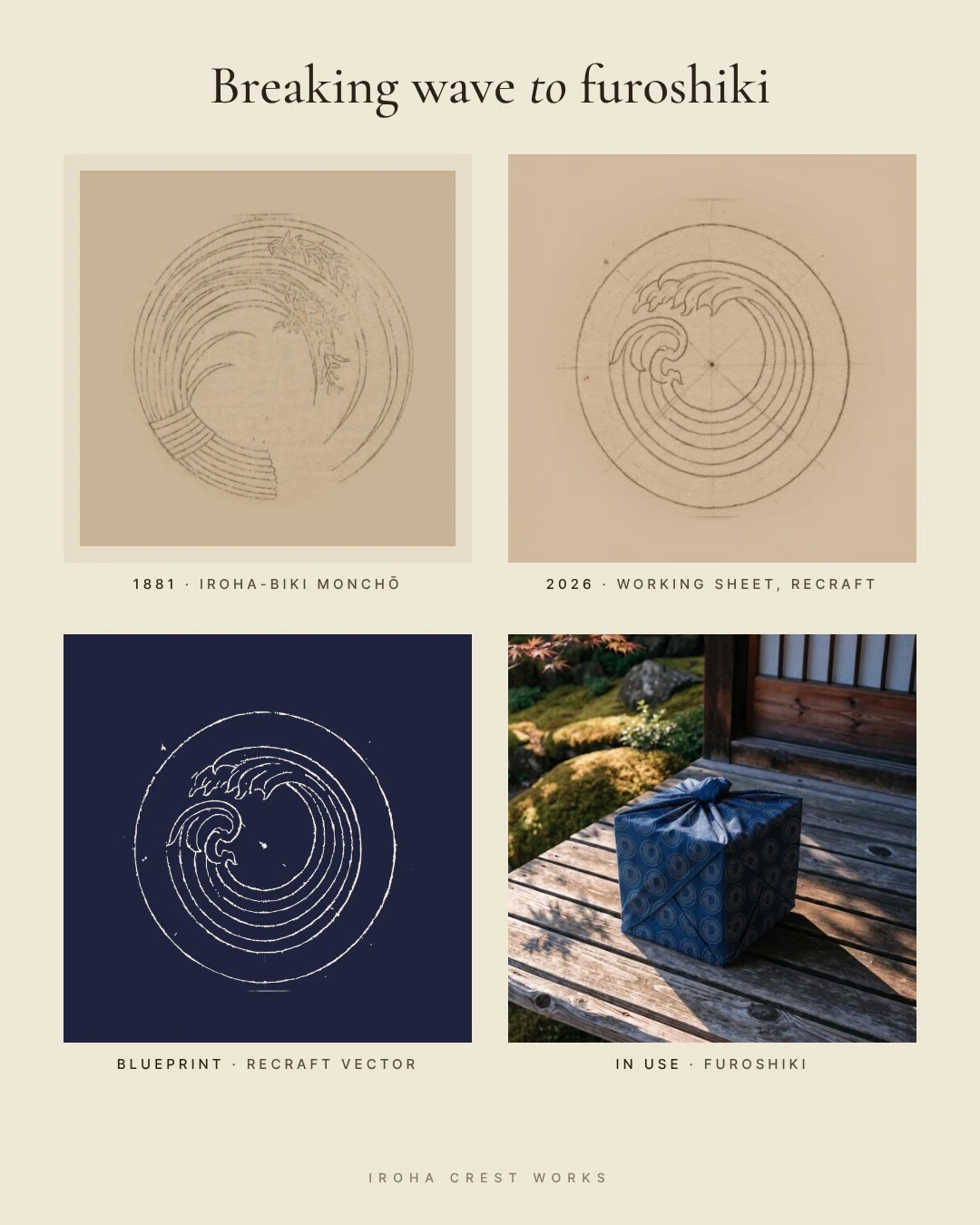
Breaking wave to furoshiki.
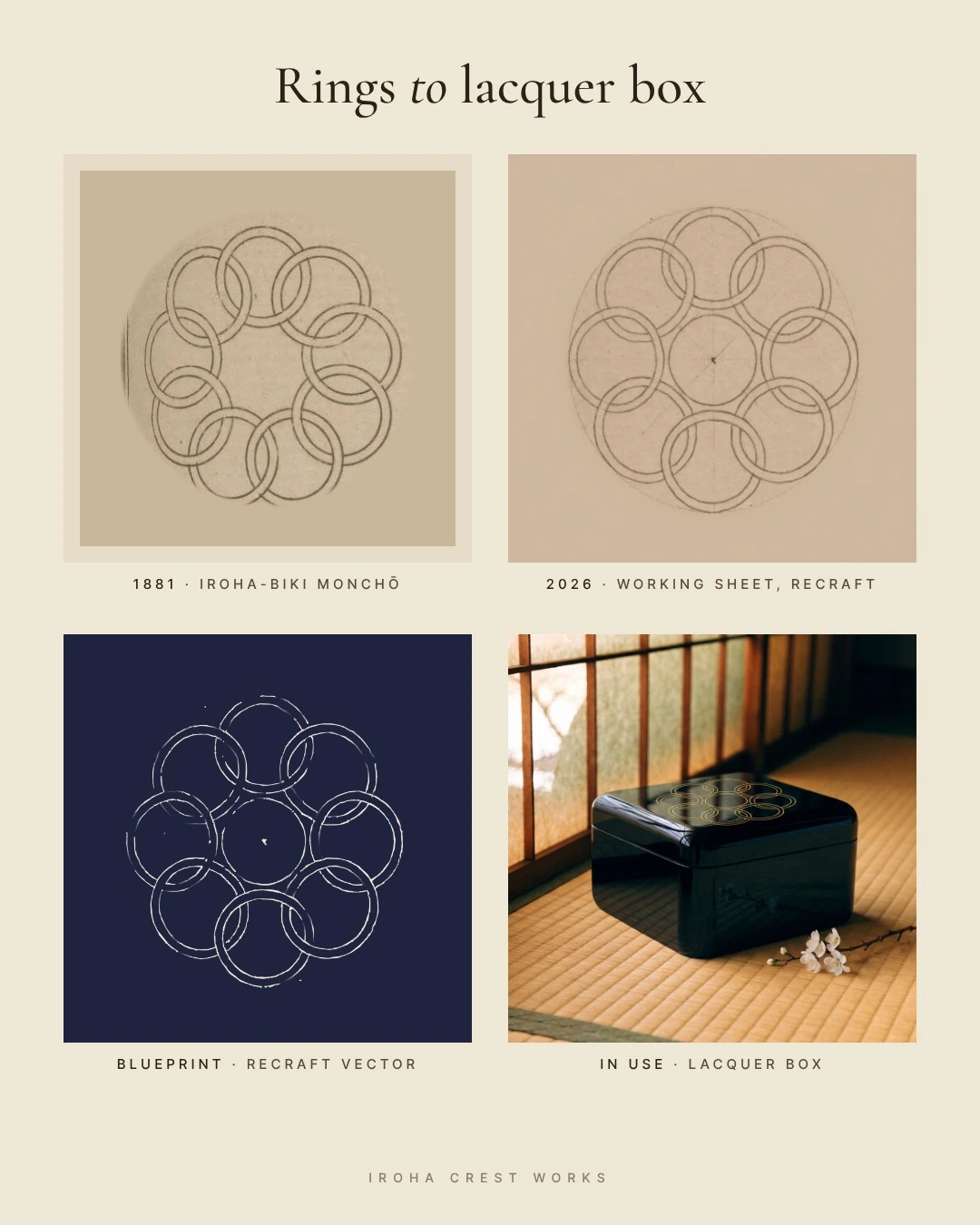
Rings to lacquer box.
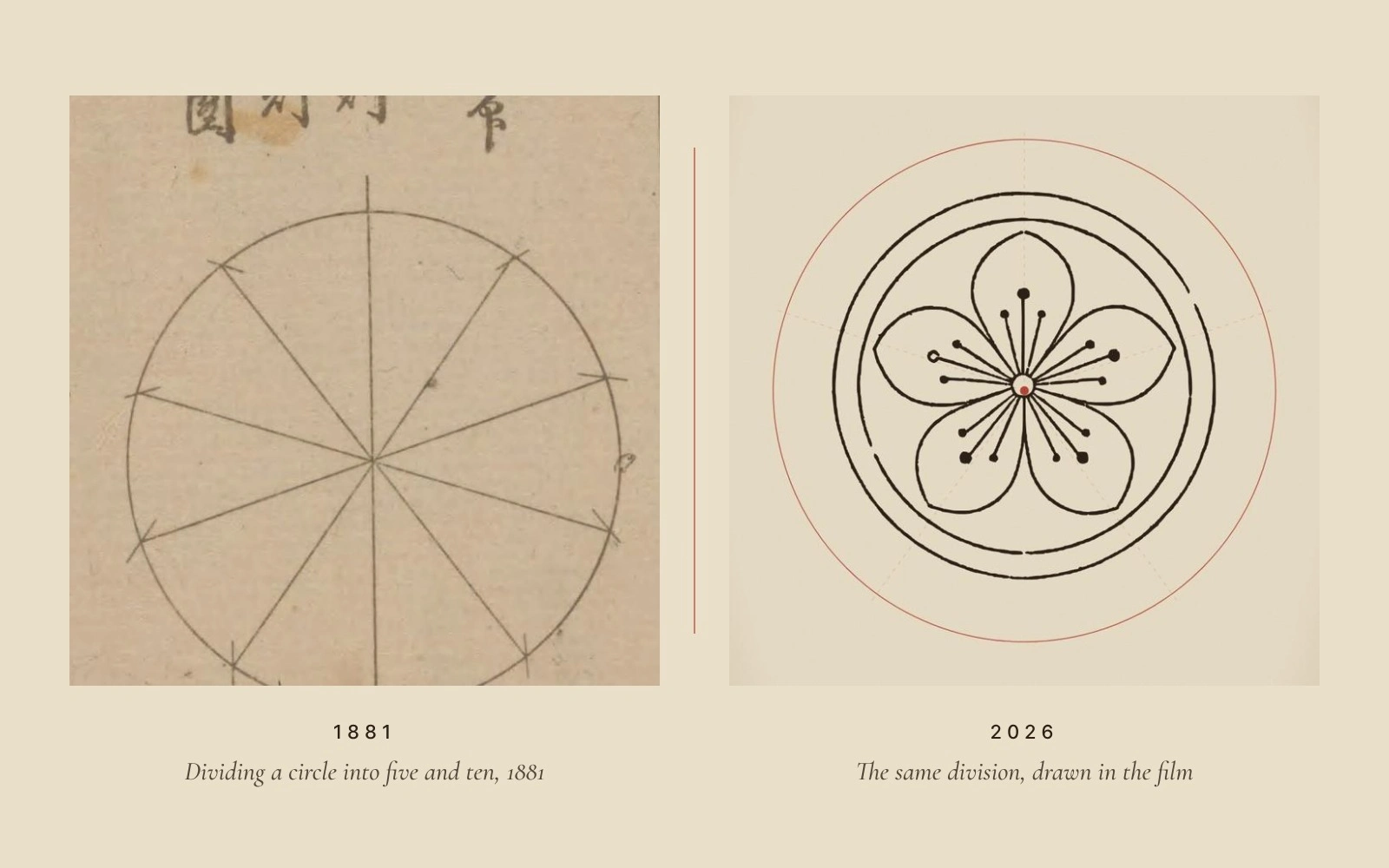
Circle division: the 1881 diagram beside a frame from our film.
7. Would it pass a strict judge?
Not yet. The first film and vectors were made outside Recraft, and the project held every earlier direction. So everything moved into one clean Recraft project, and the crests were redrawn as working sheets: the finished crest in ink over the faint compass construction the old makers drew by hand. Recraft's vectorizer rebuilt them, Adjust colors turned them into cyanotype blueprints, and Recraft's video tool made three short clips where indigo floods the paper and the ink turns to light.
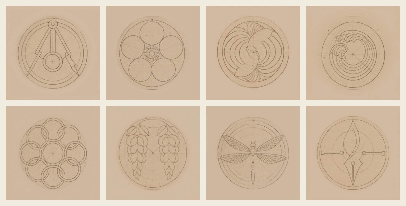
The eight working sheets, made in Recraft with our Style: compasses, plum, crane, wave, eight rings, wisteria, dragonfly, pen tool.
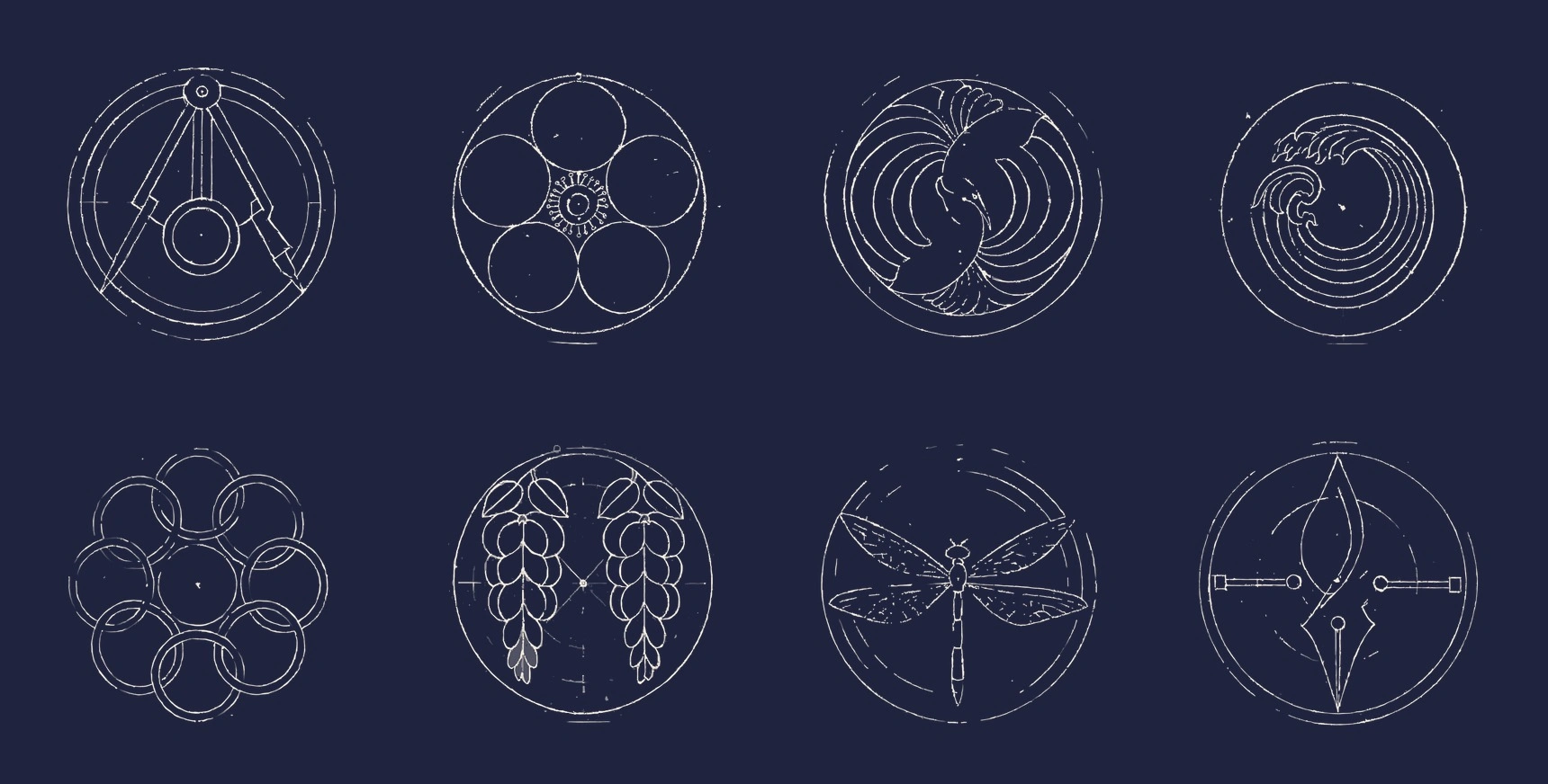
The same eight, vectorized and recolored in Recraft as cyanotype blueprints.
8. What would they make with those tools?
Marketing. A crest exists to mark something. If the makers had our tools, they would sell the things crests already lived on in 1881: a noren shop curtain, a furoshiki wrap, a paper lantern, a lacquer box and a sake bottle.
The first product pass looked like catalog shots on blank backgrounds, and the crests felt pasted on. Three questions fixed it. Would a dyer leave a noren lopsided? No, so the plum now splits exactly down the opening, one complete half on each panel. Does a furoshiki carry one crest or a pattern? A pattern, so the wave became an all-over stencil repeat. Does a crane belong on a lacquer lid? The eight rings read better in gold maki-e. Then every object went back into the world it came from: a stone lane in the morning, a veranda in late sun, a teahouse eave at dusk, tatami under shoji light, an izakaya counter.
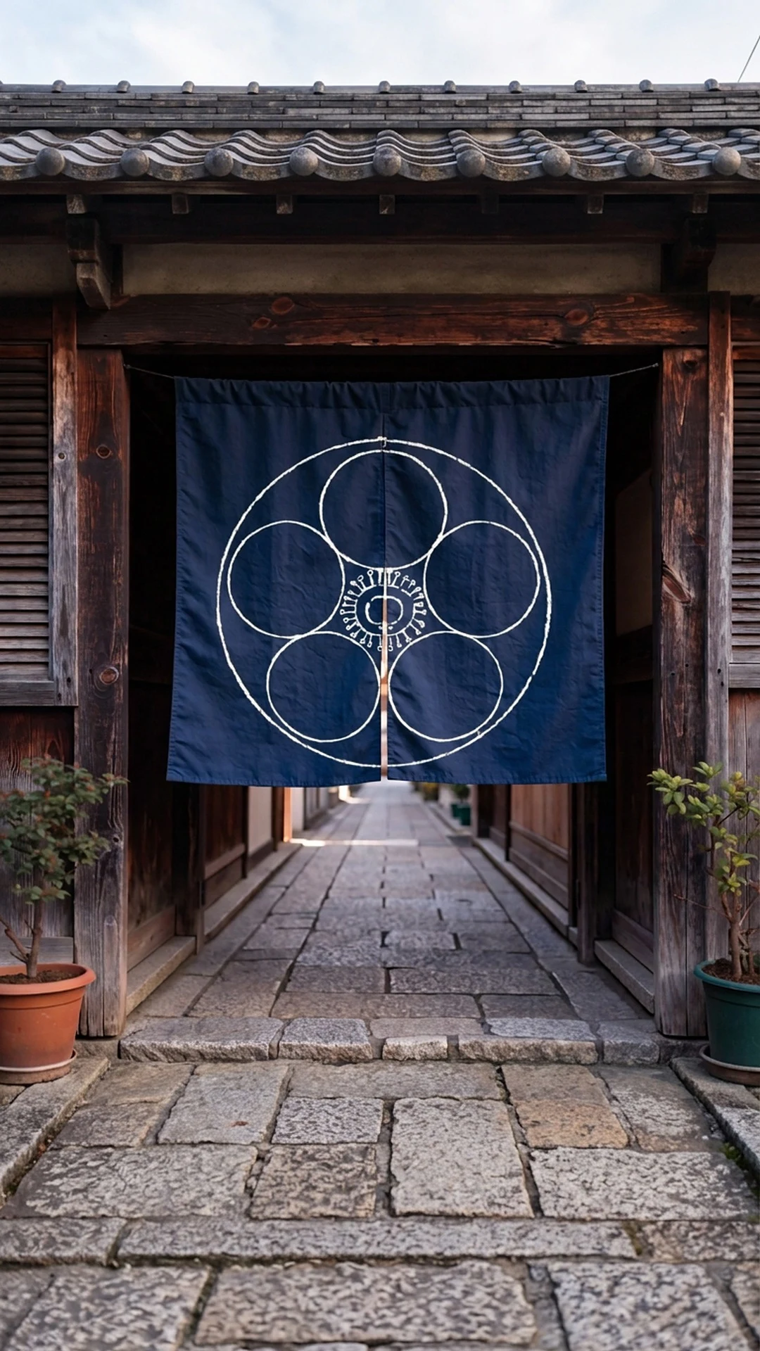
Noren, plum blossom: one half of the crest on each panel.
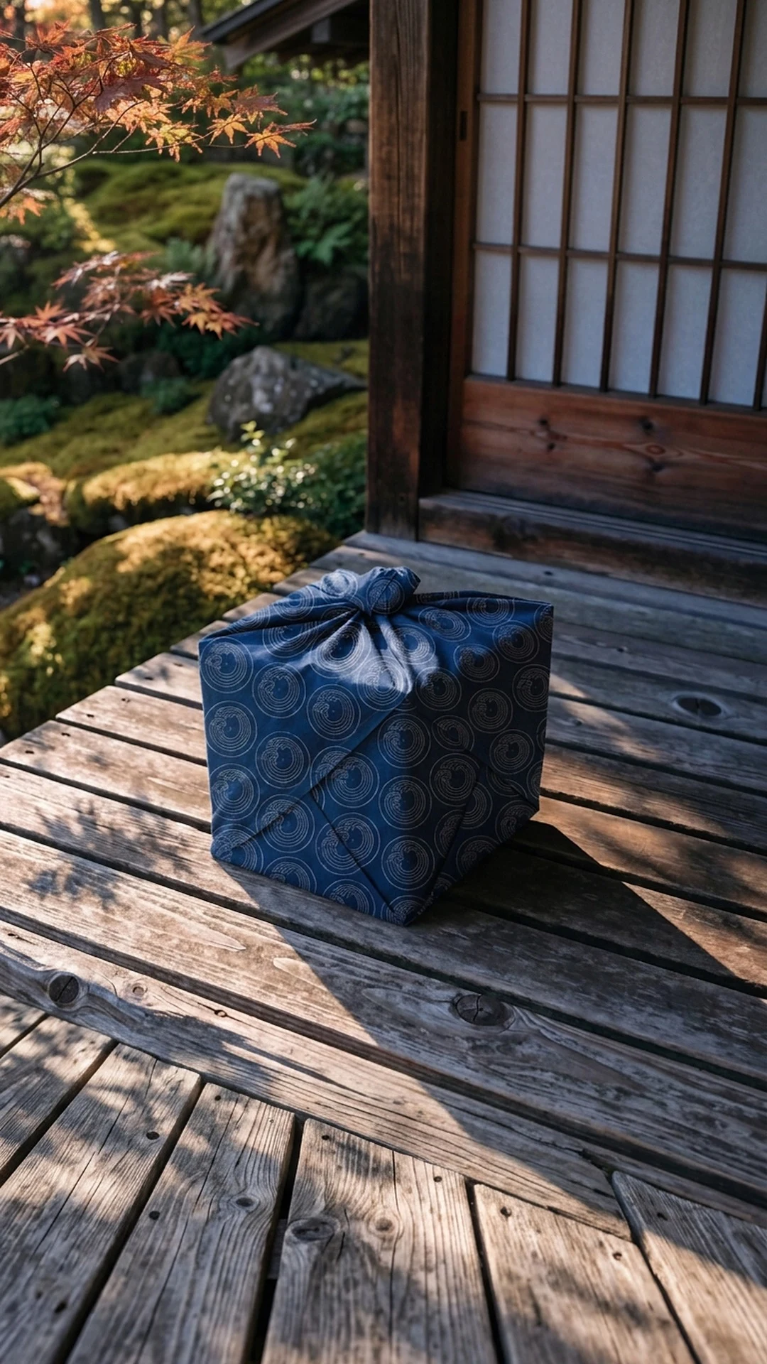
Furoshiki, wave: an all-over stencil repeat.
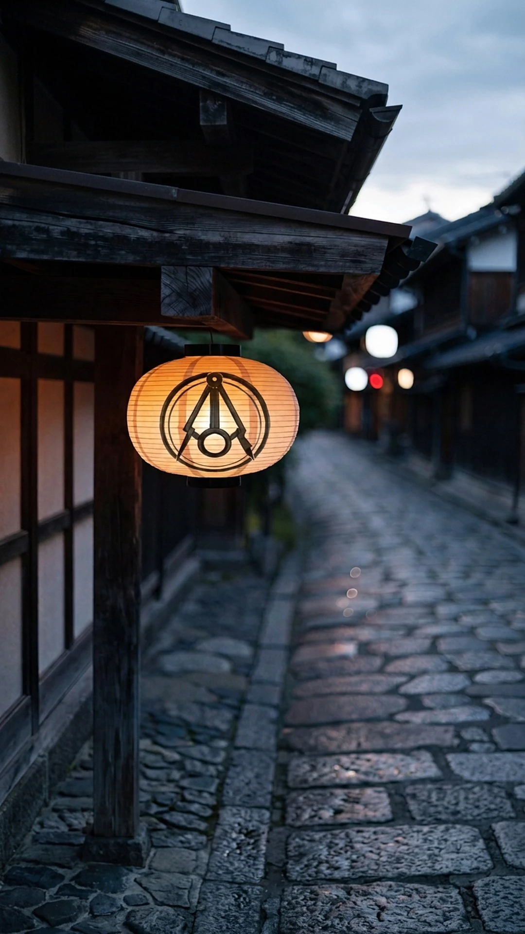
Paper lantern, compasses: sumi ink at dusk.
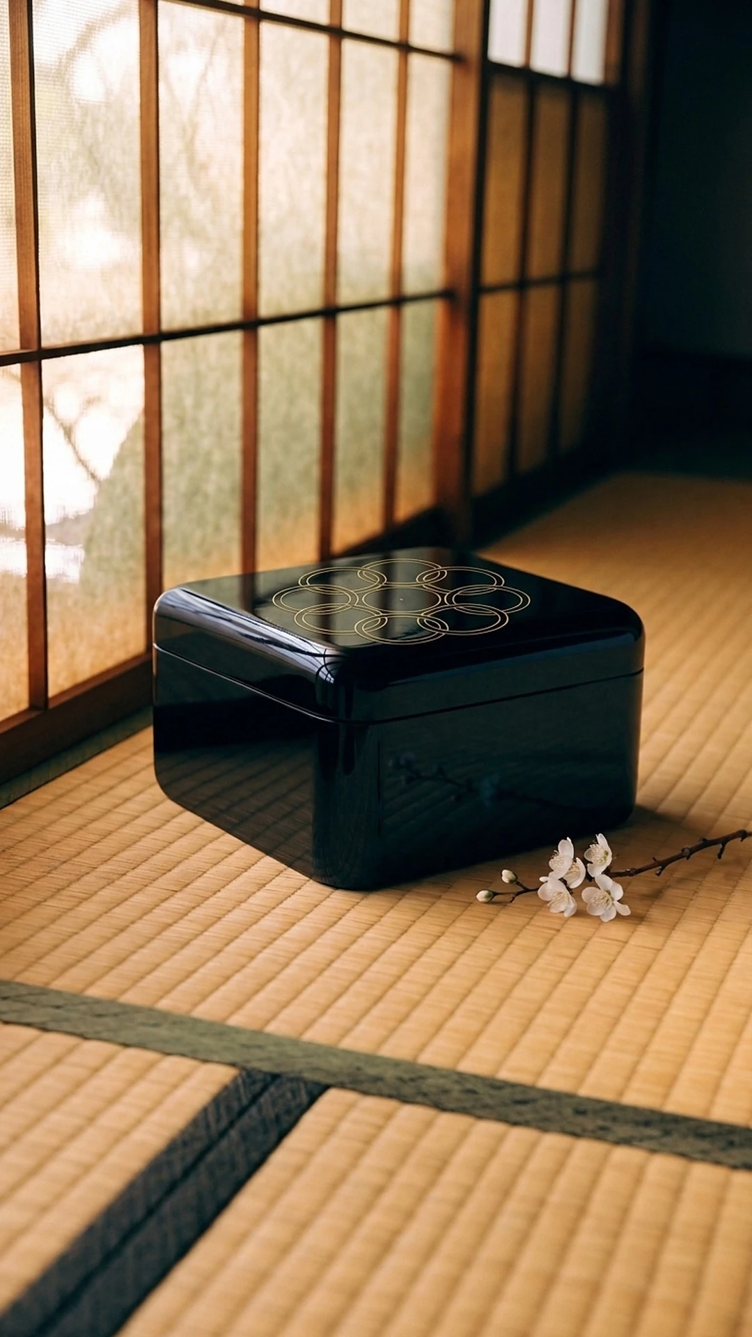
Lacquer box, eight rings: gold maki-e on the lid.
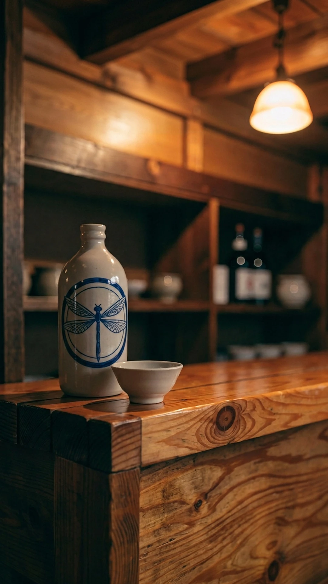
Sake bottle, dragonfly: cobalt underglaze.
How it was built in Recraft
Style. Eight single crests cropped from the scans, cleaned of text, page numbers and pencil notes. Recraft V4 Style "Iroha-biki Moncho 1881", Style match Precise.
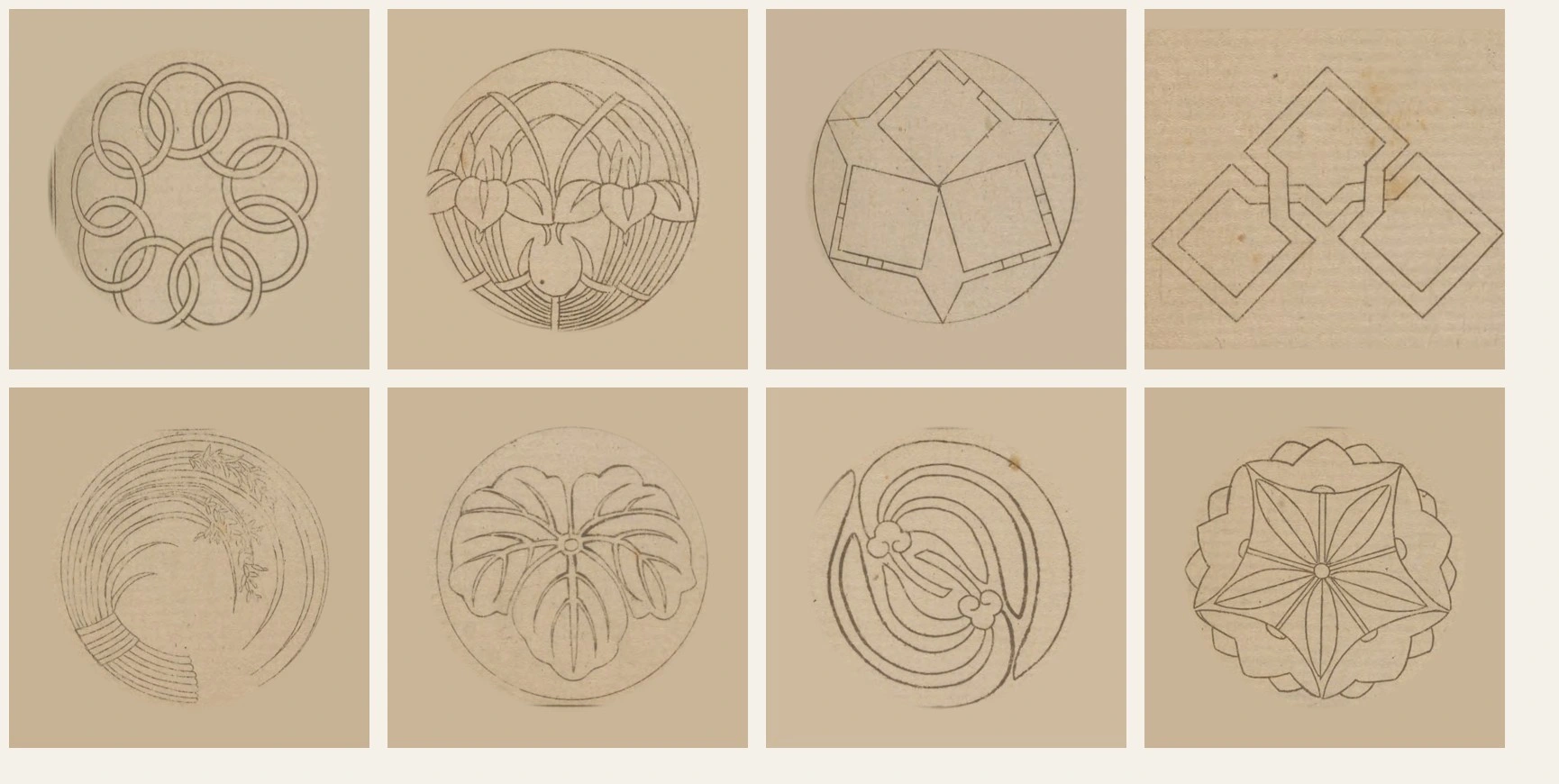
The eight archive crests used as Style references.
Crests. Recraft V4.1 with the Style. Every prompt used one template:
A single round family crest centered on plain aged paper: [subject], the crest in crisp dark ink drawn over very faint pencil compass construction: concentric guide circles, a pricked center point and thin radial lines, like a crest maker's working sheet, fine even engraved lines, generous margin, no text.
Eight subjects: compasses, plum blossom, crane, breaking wave, eight rings, wisteria, dragonfly, pen tool. The series opens with the makers' tool and closes with ours.
Blueprints. Turn into vector, then Adjust colors down to four or five colors mapped to indigo and warm whites.
Motion. Reuse for video with Kling 3 Pro on three working sheets.
Products. Each scene generated plain in Recraft V4.1 Pro, then Recraft's Edit image with Nano Banana 2 applied the crest, using the Recraft blueprint or working sheet as the reference: white resist dye on the noren, a stencil repeat on the furoshiki, sumi ink on the lantern, gold maki-e on the lacquer box, cobalt underglaze on the sake bottle. Recraft's Outpaint then extended each scene to a full vertical frame.
Film. A 24 second vertical ad assembled from those Recraft outputs: the compass draws the plum, the eight sheets appear, ink drops over them and turns them to blueprints, then the five products full frame, each with its source crest beneath it, then the seal.
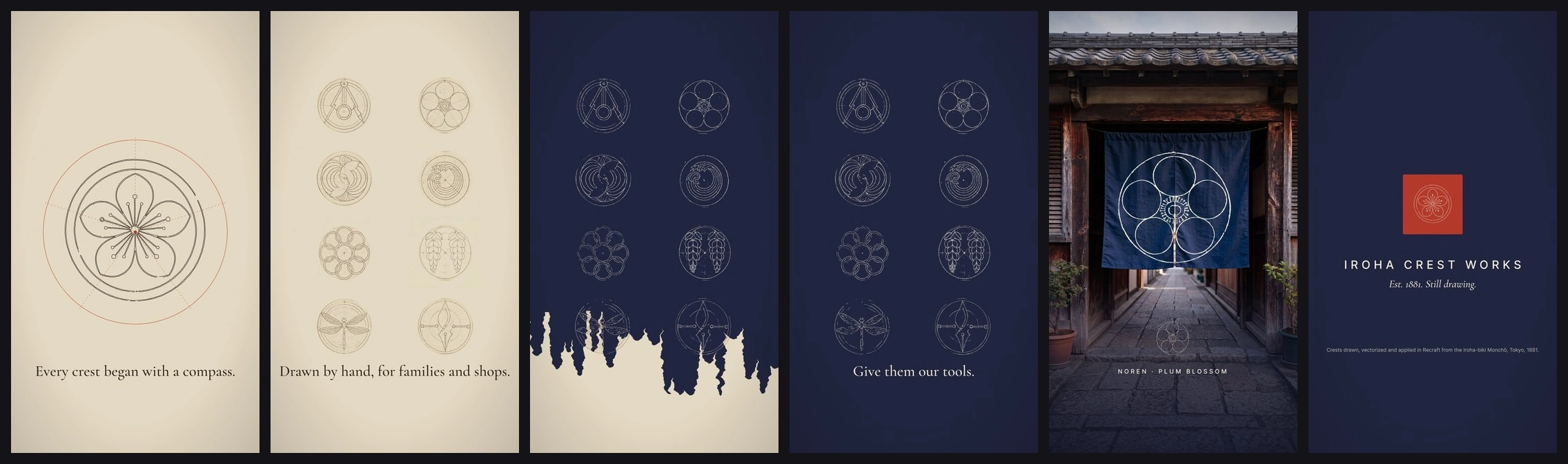
Stills from the film.
What I respected
The archive figures come straight from the 1881 scans, credited and linked. I left out imperial, government and religious crests, including chrysanthemum and paulownia, and avoided samurai and geisha clichés. No generated Japanese characters; any text is English I set myself. Tanaka Kikuo and his publisher Matsuzaki Hanzō are credited by name.
Bottom line
The makers of 1881 solved simplicity, construction, reversal and systems with a bamboo compass. Give them our tools and they would not have to learn modern design. They would do what they always did: mark what families and shops made, and help them sell it.
Credits and sources
Archive: Iroha-biki Monchō, compiled by Tanaka Kikuo, Tokyo: Matsuzaki Hanzō, 1881. Smithsonian Libraries and Archives, public domain. archive.org/details/irohabikimoncho00tana
Further reading:
Tools: Recraft V4 Styles, Recraft V4.1 and V4.1 Pro, Turn into vector, Adjust colors, Outpaint, Edit image with Nano Banana 2, and Kling 3 Pro, all inside Recraft.
Like this project
Posted Oct 25, 2026
Recraft x Contra Archive Style Challenge concept: the 1881 Tokyo crest makers given modern tools. Every crest, blueprint, product scene and clip made in Recraft
Likes
1
Views
2
Timeline
Oct 23, 2026 - Oct 25, 2026