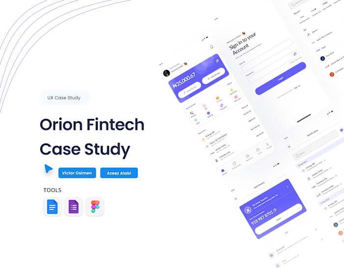
Case Study on an existing fin app (Redesign)

Case Study on Wema Bank Mobile App (Redesign)
Out of curiosity, I decided to explore the interfaces of every one of my bank apps to critique, learn, and relearn some UI and UX principles, of course, as a designer.
While exploring @alat_ng , I realized the interface looks cluttered, the aesthetic requires enhancement, and lacks some principles that could encourage users to keep revisiting.
What did I redesign?
I added a warm greeting to make the user feel welcomed.
I reduced and replaced the overwhelming information on the DASHBOARD CARD to give users a quick view, seamless access to what is necessary, and a visual hierarchy.
Placed the most essential links below the dashboard card for quick access.
UX Laws Applied
Hick's Law (Decision-Making Time)
Fitts' Law (The fund account & Send money buttons)
Aesthetic-Usability Effect
Tesler's Law (The 'more' button)
Jacob's Law (Familiarity with bank apps interface)
Like this project
Posted Aug 29, 2025
I realized the interface looks cluttered, the aesthetic requires enhancement, and lacks some principles that could encourage users to keep revisiting.
Likes
1
Views
0
Timeline
Aug 25, 2025 - Aug 28, 2025
Clients
Wema Bank


