Branding for PUNI Mochi Bar

Mara Miranovna


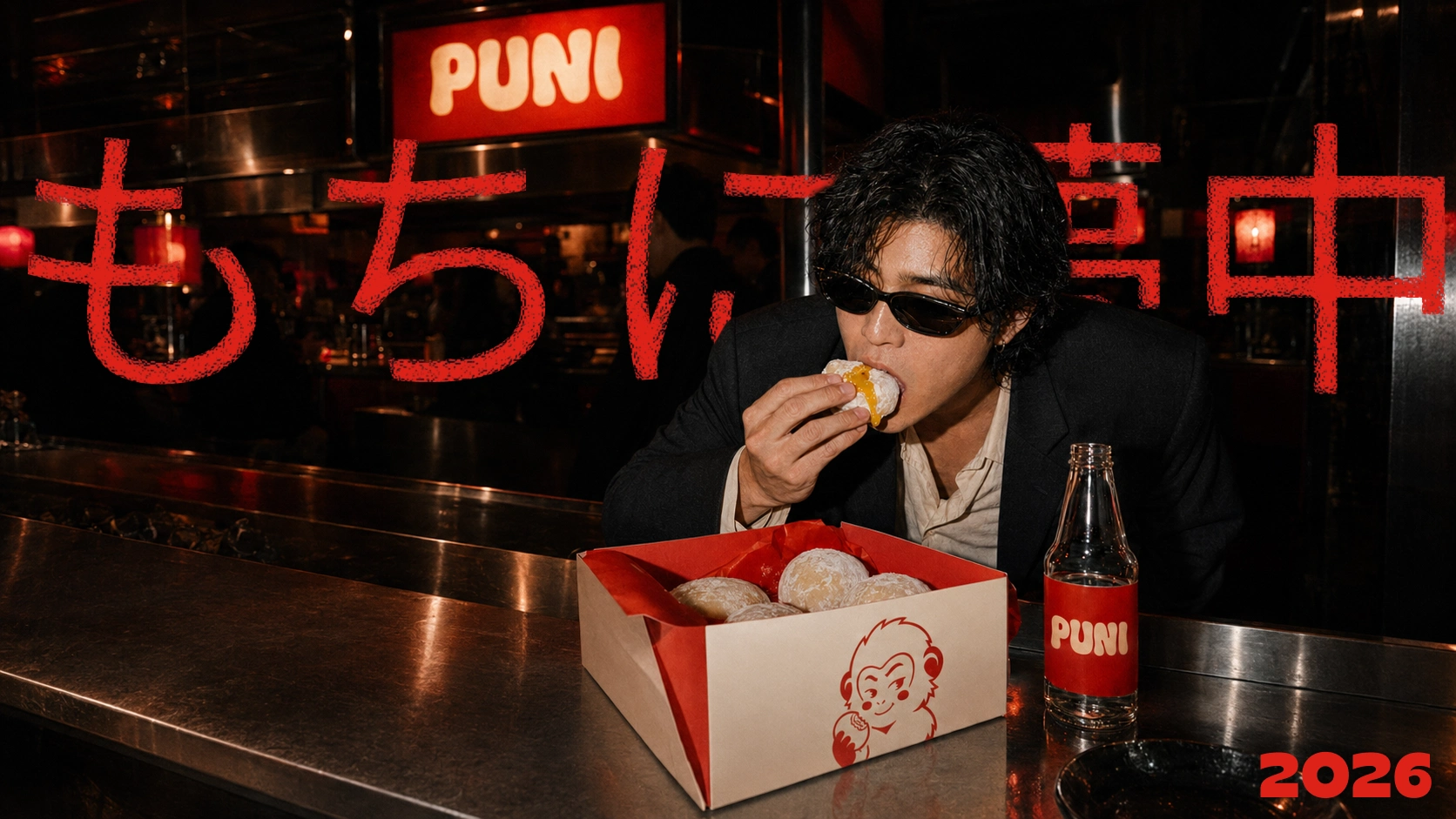
PUNI
A bold identity for a contemporary Japanese mochi bar.
Soft outside. Loud inside.
Self-initiated branding concept · 2026
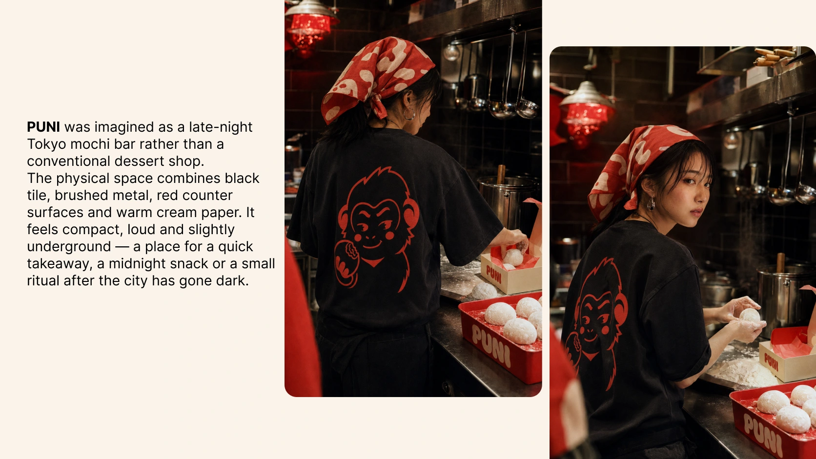
PUNI is a contemporary Japanese mochi bar built for people who want more personality from their sweets.
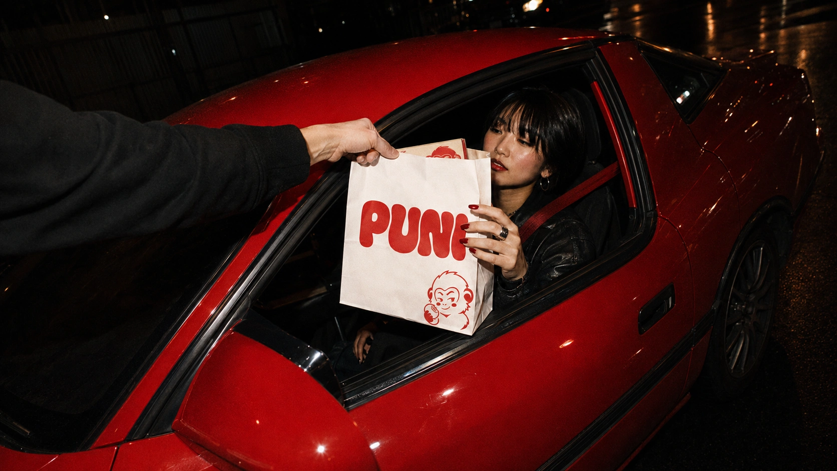
The brand reimagines mochi as a bold, urban food experience: fresh, soft, colourful and made to be eaten on the move. Instead of leaning into the expected delicate or overly kawaii aesthetic, PUNI brings together street-food energy, Japanese craft and expressive visual culture.
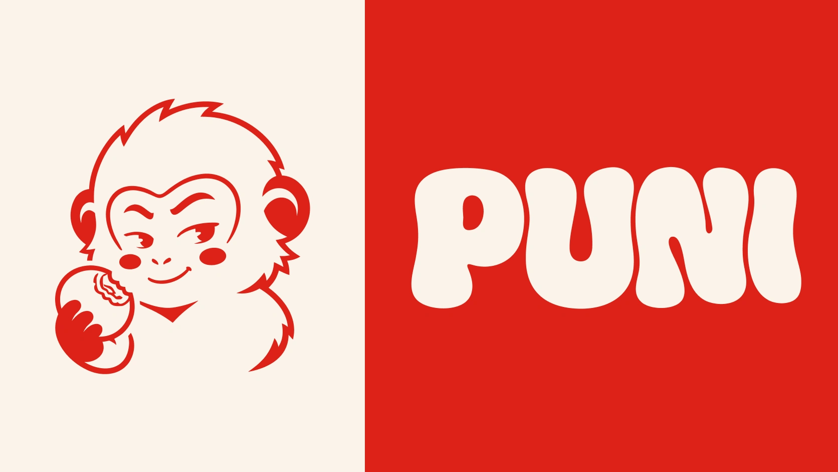
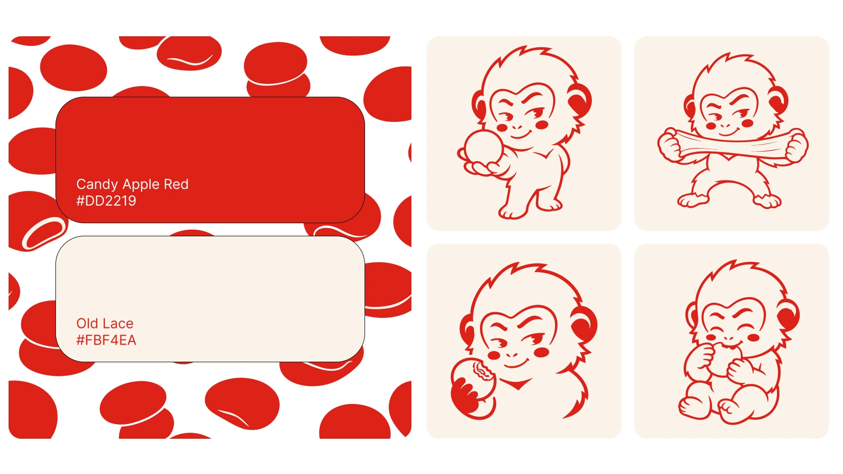
/Logo / Mascot
The challenge
Mochi brands often sit at one of two extremes: traditional and restrained, or overly cute and childish.
PUNI was created to occupy a different space — a brand that feels playful without being childish, Japanese without relying on clichés, and energetic enough to live beyond the packaging.
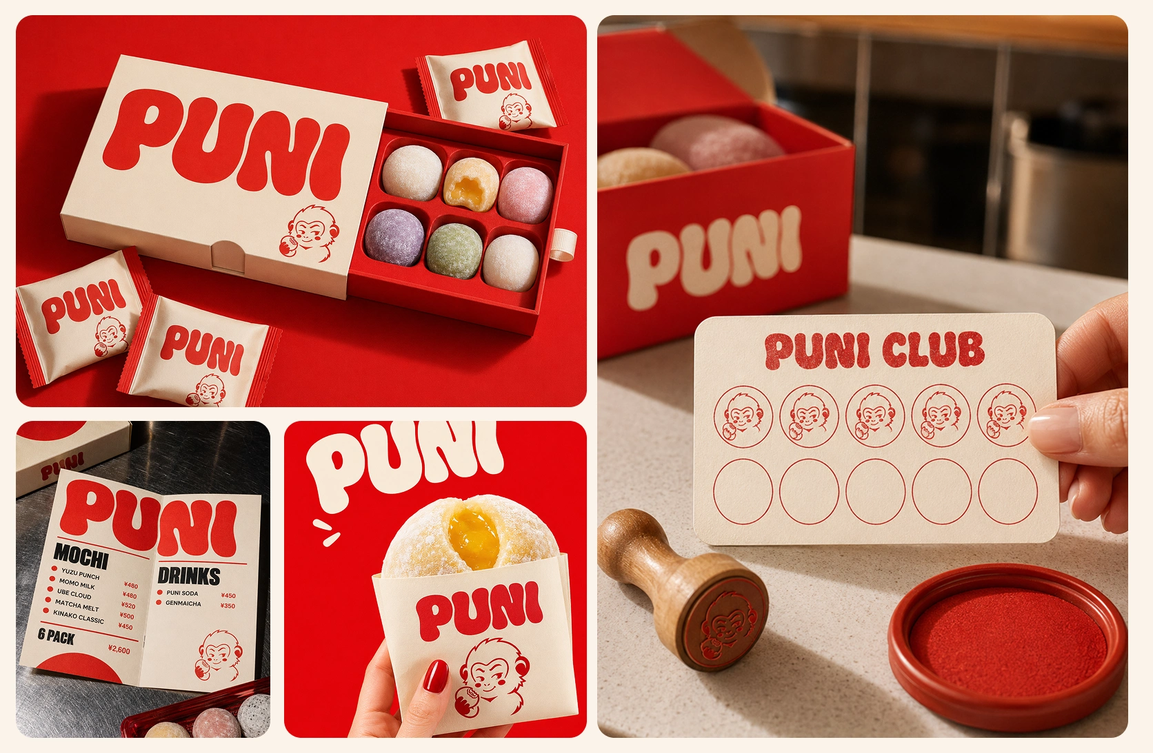
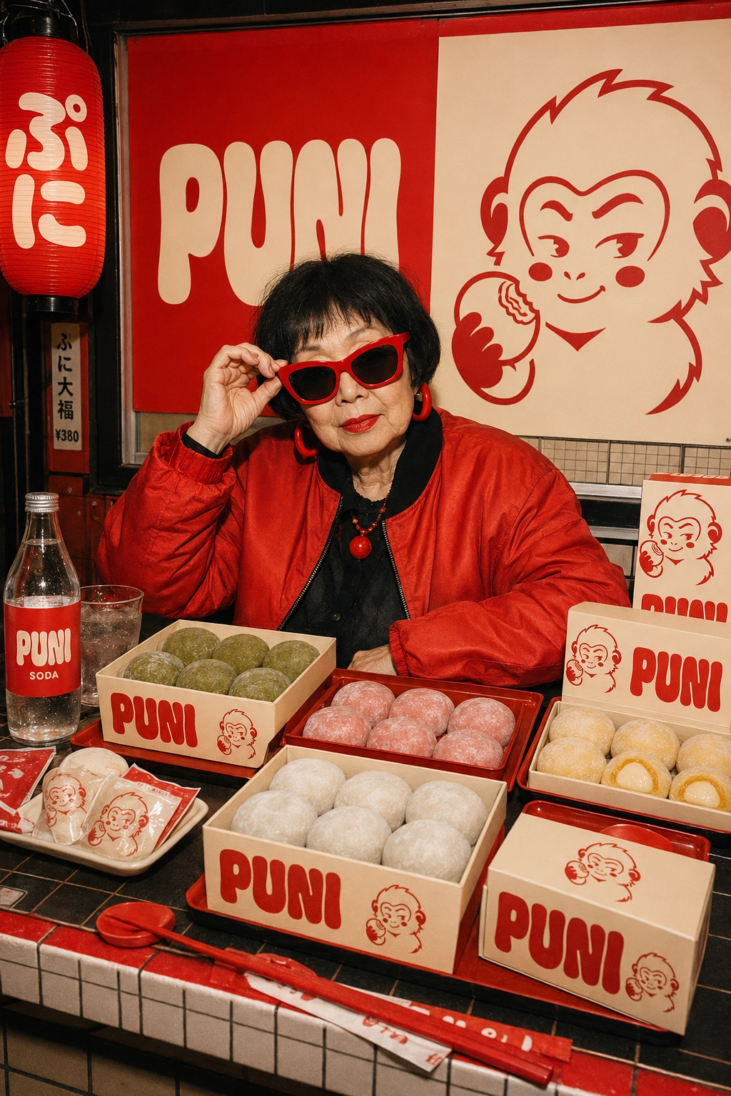
The goal was to build an identity that could move naturally between a mochi bar, takeaway packaging, merchandise, loyalty cards and social campaigns.
Brand identity
The PUNI wordmark was custom designed with tall, soft and slightly irregular letterforms inspired by the elasticity of mochi.
Its exaggerated shape feels friendly and expressive, while staying bold enough to work on a takeaway bag, a cap or a large storefront sign.
The identity uses a deliberately limited palette:
PUNI Red(Candy Apple Red) — energy, appetite and street presence
Rice Cream(Old Lace) — softness, craft and warmth
/ Physical Product Mockups /
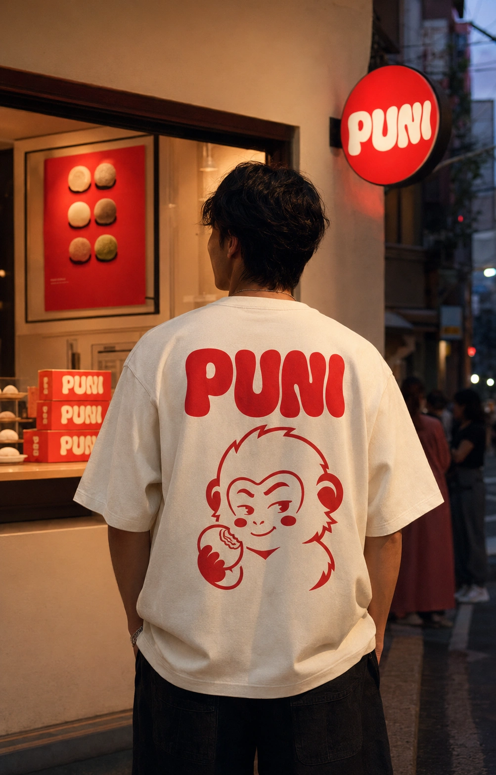
PUNI turns a soft traditional treat into a bold contemporary ritual.
A mochi bar with a strong visual voice, a memorable character and enough flexibility to grow from one box of sweets into a complete lifestyle brand.
Like this project
Posted Jul 17, 2026
Created a bold brand identity for PUNI, a contemporary Japanese mochi bar.