Charts That Charm: Data-Storytelling Formulas for Instant Backlinks
Gordon Ibarra
Charts That Charm: Data-Storytelling Formulas for Instant BacklinksWhy Data is a Goldmine for BacklinksThe Power of Original ResearchContent Curation: Finding Stories in Public DataThe Data Storytelling Formula: From Numbers to NarrativeStep 1: Find the 'Aha!' MomentStep 2: Build the Narrative ArcStep 3: Humanize the DataCharts That Charm: Simple Visualization for Maximum ImpactChoosing the Right Chart for Your DataDesign Principles for Shareable GraphicsTools for Easy Chart CreationPromoting Your Data-Driven Content for LinksIdentifying Potential LinkersCrafting the Perfect Outreach EmailConclusion: Become a Data-Driven Content AuthorityReferences
Charts That Charm: Data-Storytelling Formulas for Instant Backlinks
Ever wonder why some content gets shared like wildfire while yours sits quietly in the corner? The secret weapon might be simpler than you think: data storytelling. When you transform boring numbers into compelling visual stories, something magical happens. Journalists start citing you. Industry leaders share your work. And those precious backlinks? They start rolling in naturally.
Here's the thing - you don't need to be a data scientist or graphic designer to master this skill. As content writers, we already know how to tell stories. Now we just need to add numbers and charts to our toolkit. This guide will show you exactly how to find data, craft narratives around it, and create simple visuals that act as backlink magnets. It's a skill that pairs perfectly with other advanced techniques like optimizing for voice search (which often pulls from data-rich content) and creating gamified whitepapers that generate original research. If you're looking to hire content writers who can elevate your brand with data-driven stories, this approach is what separates the pros from the crowd.
Why Data is a Goldmine for Backlinks
Think about the last time you read an article that made you go "wow, I didn't know that!" Chances are, it included a surprising statistic or eye-opening chart. That's the power of data-driven content. It doesn't just inform - it provides proof that other writers desperately need.
Every day, thousands of journalists, bloggers, and content creators search for statistics to support their arguments. When you provide well-researched, clearly presented data, you're not just creating content. You're creating a resource that others will reference again and again. It's like building a bridge that connects your content to countless other pieces across the web.
The beauty of this approach? It works across every industry. Whether you're writing about marketing trends, health statistics, or environmental data, there's always someone looking for the exact information you can provide. And when they find it, they'll link back to you as their source.
The Power of Original Research
Nothing beats original research when it comes to attracting backlinks. When you create proprietary data through surveys, studies, or unique analysis, you become the primary source - the origin point that everyone else must reference.
Let me paint you a picture. Say you survey 500 remote workers about their productivity habits. You discover that 73% are more productive between 10 PM and 2 AM than during traditional work hours. That's not just a statistic - it's a headline waiting to happen. Every article about remote work productivity will want to cite your finding.
Creating original research doesn't have to break the bank either. Simple Google Forms surveys shared in relevant communities can yield fascinating insights. Customer feedback analysis can reveal industry trends. Even analyzing publicly available data in a new way counts as original research if you're the first to spot the pattern.
The key is asking questions nobody else has asked. What assumptions does your industry make that might be wrong? What trends are people feeling but nobody has quantified? These gaps are where original research gold lies.
Content Curation: Finding Stories in Public Data
Not ready to conduct your own research? No problem. The internet is overflowing with public data just waiting for someone to find the story within it. Government databases, academic studies, and industry reports contain thousands of potential articles - you just need to know where to look.
Start with these goldmines of public data:
Census.gov for demographic trends
Bureau of Labor Statistics for employment data
Google Trends for search behavior patterns
Industry association reports
University research repositories
Open data portals from major cities
The trick isn't just finding data - it's finding the unexpected angle. Maybe everyone knows unemployment is down, but what if you discovered that freelance graphic designers in rural areas saw the biggest gains? That's a story worth telling.
I once found a government report showing that coffee shop density correlated with startup success rates in different cities. The data was public, but nobody had connected those dots before. The resulting article got picked up by three major business publications and generated dozens of backlinks.
The Data Storytelling Formula: From Numbers to Narrative
Raw data is like a rough diamond - valuable, but it needs cutting and polishing to truly shine. The difference between a boring statistical report and a viral data story comes down to one thing: narrative structure.
Every compelling data story follows a predictable pattern. First, you hook readers with a surprising finding. Then you provide context that helps them understand why it matters. Finally, you explore the implications that affect their lives or businesses. It's storytelling 101, just with numbers as your main characters.
The best data stories make readers feel something. Maybe it's surprise at an unexpected trend. Perhaps it's validation that their hunches were right. Or it could be concern about a growing problem. When you combine emotional resonance with hard facts, you create content that people can't help but share.
Step 1: Find the 'Aha!' Moment
Every spreadsheet hides at least one "aha!" moment - that surprising insight that makes people stop scrolling and pay attention. Finding it requires looking at data like a detective, not an accountant.
Start by asking yourself: What would surprise my audience? Look for outliers, reversals of common wisdom, or dramatic changes over time. Maybe organic food sales dropped in wealthy neighborhoods but surged in middle-income areas. Perhaps Gen Z spends less on streaming services than millennials. These counterintuitive findings are content gold.
Sometimes the "aha!" hides in the relationships between data points. I once analyzed startup funding data and discovered that companies with female CTOs got funded 40% faster than those without. The insight wasn't in any single number - it emerged from connecting different datasets.
Don't overthink it. If a data point makes you raise an eyebrow or mutter "really?" under your breath, you've found your hook. Trust your instincts. If it surprises you, it'll surprise your readers too.
Step 2: Build the Narrative Arc
Once you've found your "aha!" moment, it's time to build a story around it. Think of your data point as the climax of a movie - you need to set it up properly for maximum impact.
Start with the problem or question your audience faces. Maybe small businesses struggle with customer retention. Perhaps marketers wonder if TikTok really drives sales. This opening creates tension that your data will resolve.
Next, reveal your key finding at just the right moment. Don't bury it too deep, but don't give it away in the first sentence either. Build anticipation. Use phrases like "what we discovered surprised us" or "the data revealed something unexpected."
Then provide supporting details that reinforce your main point. If your headline finding is that email marketing ROI increased 45% in 2024, show which industries saw the biggest gains. Explain what tactics drove the improvement. Give readers the full picture.
Finally, explore what this means for your audience. How should they change their strategy based on this data? What opportunities does it create? This "so what?" section transforms interesting information into actionable insight.
Step 3: Humanize the Data
Numbers tell, but stories sell. The most shareable data content connects statistics to real human experiences. This doesn't mean making things up - it means finding the people behind the percentages.
Use analogies to make abstract numbers concrete. Instead of saying "Americans waste 40% of food," try "the average family throws away $1,500 worth of food yearly - enough for a nice vacation." Suddenly the statistic hits differently.
Include mini case studies that illustrate your data points. If your research shows that companies with flexible work policies have 25% less turnover, tell the story of one company that made the switch. Quote their HR director. Share specific results. Make it real.
Direct quotes from survey respondents add authenticity that pure numbers can't match. When presenting data about workplace stress, including a quote like "I check email at 11 PM because I'm terrified of missing something important" makes the 78% statistic about after-hours work feel more urgent.
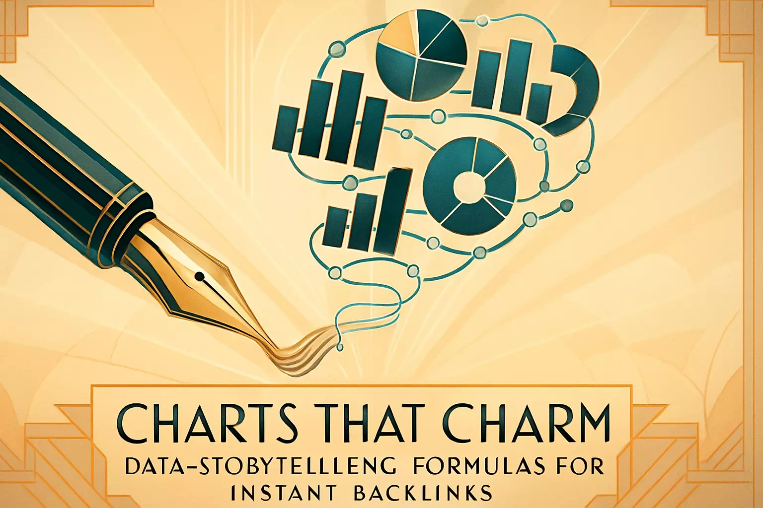
Charts That Charm: Simple Visualization for Maximum Impact
Here's a truth bomb: ugly charts kill great stories. But here's another one: you don't need to be a designer to create compelling visualizations. The best charts are often the simplest ones.
Think of charts as visual punctuation marks in your story. They emphasize key points, break up text, and give readers a mental break. Most importantly, they make your content more shareable. People love posting charts on social media because they communicate complex ideas instantly.
The goal isn't to impress people with your design skills. It's to make data so clear that a busy journalist can understand your main point in three seconds. When you achieve that clarity, backlinks follow naturally.
Choosing the Right Chart for Your Data
Picking the right chart type is like choosing the right words - the wrong choice confuses your message. Luckily, you only need to master three basic types to cover 90% of data stories.
Bar charts are your workhorses for comparisons. Use them when showing differences between categories - like conversion rates across different marketing channels or salary ranges across job titles. Keep bars horizontal when labels are long, vertical when they're short.
Line charts excel at showing trends over time. They're perfect for illustrating growth, decline, or seasonal patterns. If you're showing how remote work adoption changed from 2019 to 2024, a line chart tells that story instantly.
Pie charts get a bad rap, but they work well for showing parts of a whole - just use them sparingly. They're great for budget breakdowns or market share, but terrible for comparing similar values. If your slices are all between 20-30%, use a bar chart instead.
Avoid the temptation to get fancy. No 3D effects. No rainbow colors. No chart types that require a manual to understand. If you're debating between simple and complex, simple wins every time.
Design Principles for Shareable Graphics
Creating share-worthy charts isn't about artistic talent - it's about following proven principles. Think of these as recipes that work every time.
First, your chart needs a headline, not just a title. Instead of "Q3 Sales by Region," try "West Coast Sales Surge 47% in Q3." The headline should state your main finding, not just describe the data.
Color matters more than you think. Use your brand colors to maintain consistency, but ensure enough contrast for readability. Highlight the most important data point in a bold color while keeping everything else muted. This guides the eye exactly where you want it.
Always include your source and logo. This isn't just about credit - it's about building brand recognition. When your chart gets shared across LinkedIn or embedded in articles, your brand travels with it.
Font size is crucial. Test your charts on mobile devices. If you have to pinch and zoom to read labels, make them bigger. Remember, many people will see your chart as a small image in their social feed.
Tools for Easy Chart Creation
You don't need expensive software to create professional charts. Some of the best tools are free or cheap, and most have gentle learning curves.
Canva is the Swiss Army knife of chart creation. With templates for every chart type and drag-and-drop simplicity, you can create publication-ready graphics in minutes. The free version covers most needs, though the paid version offers more customization.
Datawrapper is purpose-built for data visualization. Paste in your data, pick a chart type, customize colors and fonts, and export. It's what many newsrooms use because it's fast and foolproof. The free tier allows plenty of charts per month.
Don't overlook Google Sheets either. Its chart builder has improved dramatically, offering clean designs that export beautifully. For simple visualizations, it might be all you need. Plus, keeping your data and charts in one place streamlines updates.
For the more ambitious, tools like Flourish and Tableau Public offer advanced features like animated charts and interactive dashboards. But remember - simple static charts often perform better than complex interactive ones because they're easier to screenshot and share.
Promoting Your Data-Driven Content for Links
Creating brilliant data content is like cooking a gourmet meal in an empty restaurant. Without promotion, even the best research goes unnoticed. The good news? Data-driven content is easier to promote because people actually want it.
The key is thinking like your potential linkers. Journalists face daily deadlines and need reliable sources. Bloggers want fresh angles on trending topics. Industry publications seek exclusive insights. When you understand their needs, promotion becomes about helping, not pestering.
Timing matters too. Release your data when it's most relevant. Education statistics work best in August when back-to-school content peaks. Retail data gets attention before Black Friday. Fitness trends gain traction in January. Align your promotion with when people are already looking for your type of content.
Identifying Potential Linkers
Finding the right people to pitch is like fishing - you need to know where the fish are and what bait they like. Start by identifying who has linked to similar content in the past.
Use Google to search for articles on your topic from the past year. Look for phrases like "according to a study" or "research shows" combined with your keywords. These articles rely on data and their authors will likely appreciate new statistics.
Check who shared similar data stories on social media. Twitter/X is particularly useful because journalists often share studies they find interesting. Tools like BuzzSumo can show you who shared competitor content, giving you a ready-made outreach list.
Don't forget about roundup posts and resource pages. Many sites maintain lists of statistics or industry resources. If your data fits their theme, you've found an easy linking opportunity. Search for "marketing statistics 2024" or "[your industry] data resources" to find these pages.
Build relationships before you need them. Follow relevant journalists and bloggers. Comment thoughtfully on their articles. Share their work. When you eventually reach out with your data, you won't be a stranger asking for favors.
Crafting the Perfect Outreach Email
Your outreach email is a 30-second audition. Nail it, and you get featured. Mess it up, and you're just more inbox clutter. The secret is making the recipient's job easier, not harder.
Start with a subject line that promises value, not asks for it. "New data: Remote workers 73% more productive at night" beats "Link request" every time. Be specific about what you're offering.
Keep the email body short and scannable. Open with why you're reaching out to them specifically - mention their recent article or beat. Then hit them with your most compelling data point. Make it something they can immediately visualize using in their own content.
Here's a template that works:
"Hi [Name],
Just read your piece on remote work productivity trends - fascinating stuff about morning routines.
Thought you'd be interested in our new study of 500 remote workers. We found something surprising: 73% report peak productivity between 10 PM and 2 AM, completely flipping traditional work schedule assumptions.
The full report includes charts and additional findings about productivity by industry and experience level: [link]
Happy to provide any additional data or answer questions if this fits something you're working on.
Best, [Your name]"
Include everything they need in one email. Direct link to the content. Key findings summarized. Charts attached or embedded. Make saying yes effortless.
Conclusion: Become a Data-Driven Content Authority
You now have the complete playbook for transforming numbers into backlink magnets. Find the story hiding in data. Build a narrative that resonates. Create clear, shareable visualizations. Then get your content in front of the right people.
This isn't just about SEO or traffic - though those benefits are real. When you master data storytelling, you become a trusted resource in your industry. Publications cite you. Peers respect you. Clients seek you out because you don't just write content - you create authoritative resources that stand the test of time.
Start small. Find one interesting dataset this week. Pull out one surprising insight. Create one simple chart. Write one story around it. Then reach out to five relevant people who might find it useful. That's all it takes to begin.
The writers who thrive in the next decade won't just craft words - they'll weave data into narratives that inform, persuade, and inspire. They'll be the ones journalists quote, the ones whose content gets shared in boardrooms, the ones building lasting authority through the perfect marriage of numbers and narrative.
Your data storytelling journey starts with your next article. What story will you tell?
References
Like this project
Posted Jun 23, 2025
Stop writing content that gets ignored. Learn how to turn boring data into compelling stories and visualizations that attract high-authority backlinks, boosting your SEO.