Building Services Systems — Visual Comparison

Sandra Sonei

Context
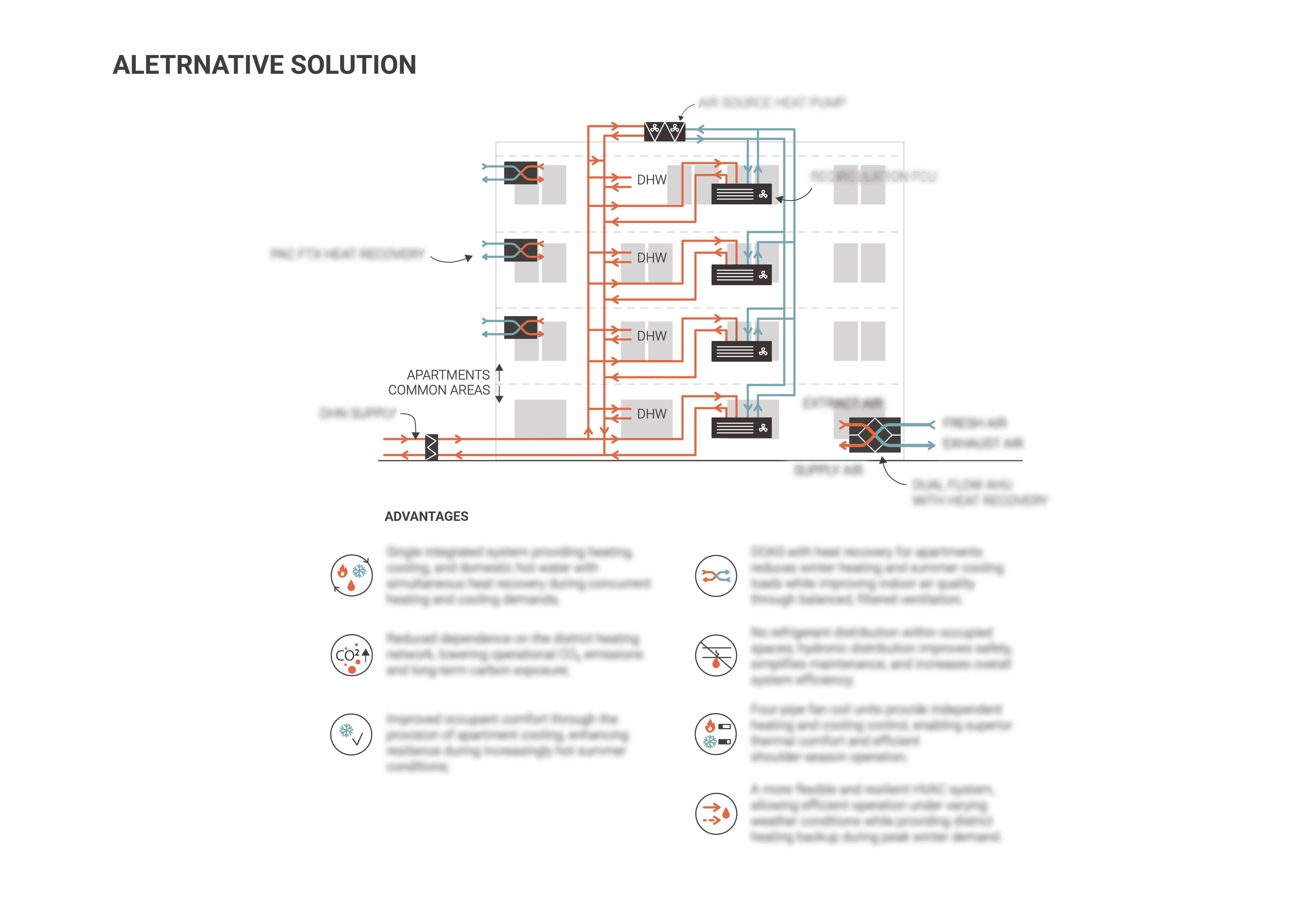
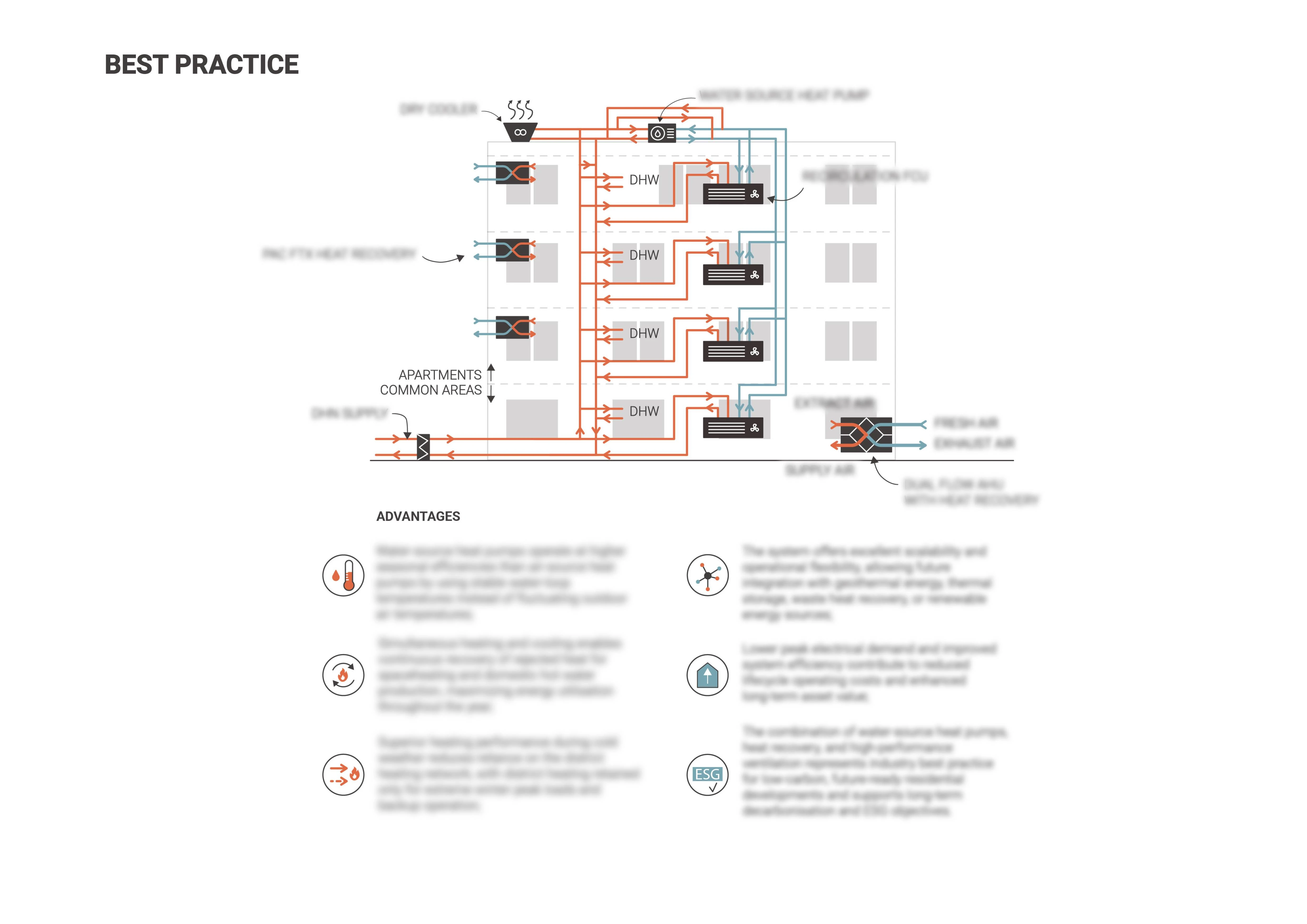
An existing building-services system needed to be assessed and compared with improved alternatives in a way that could be understood quickly.
My role
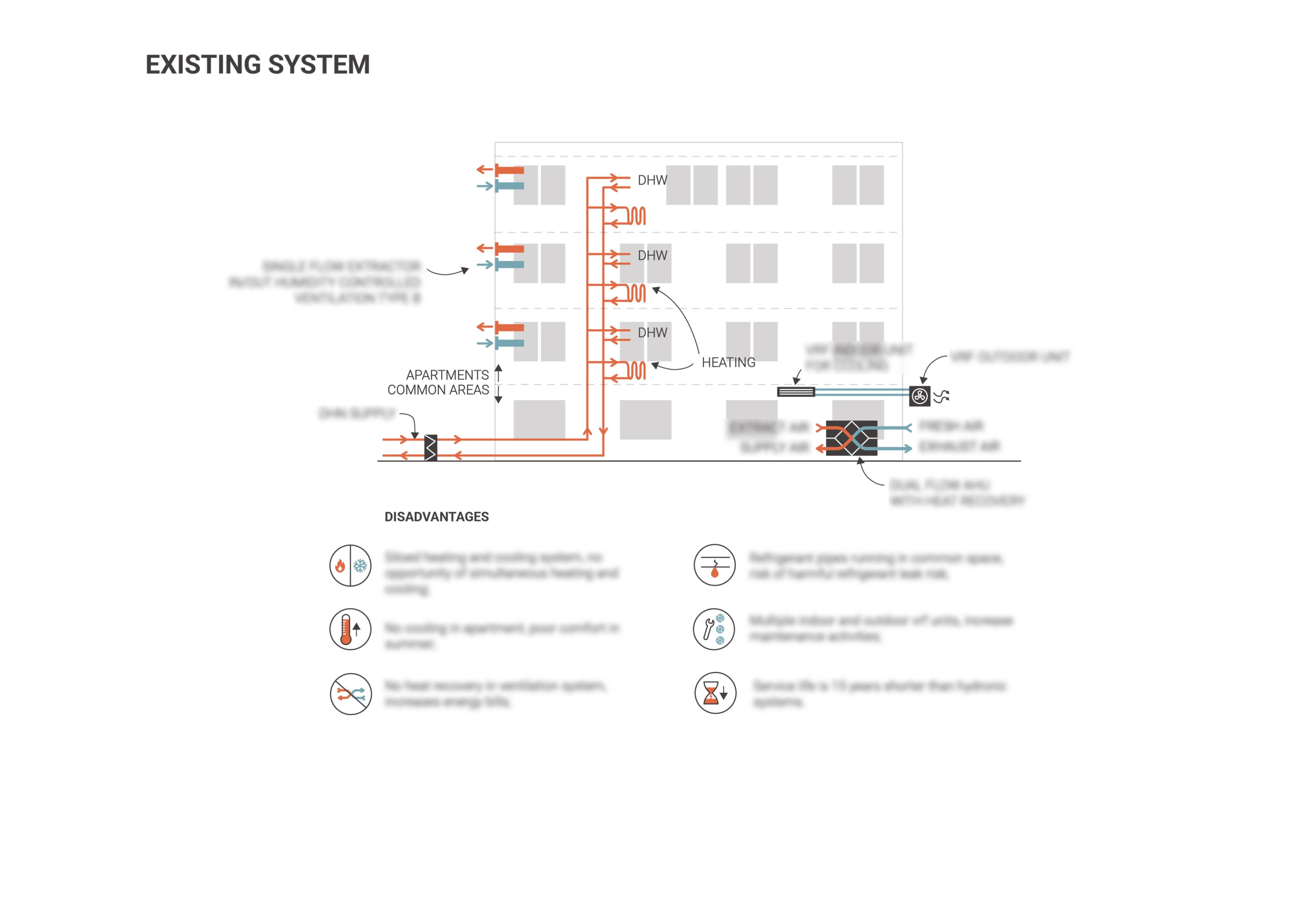
I developed a series of technical diagrams showing the existing configuration, an alternative solution and a best-practice approach, using a consistent visual language across all three options.
Outcome
The final visuals made the differences between the systems easier to compare and supported clearer communication around performance, comfort and system design.
Like this project
Posted Aug 19, 2026
Technical illustrations comparing an existing building-services system with alternative and best-practice solutions for clearer decision-making.
Likes
0
Views
0
Timeline
Jul 13, 2026 - Jul 17, 2026