Framer Website Development | KOTO | SaaS Template
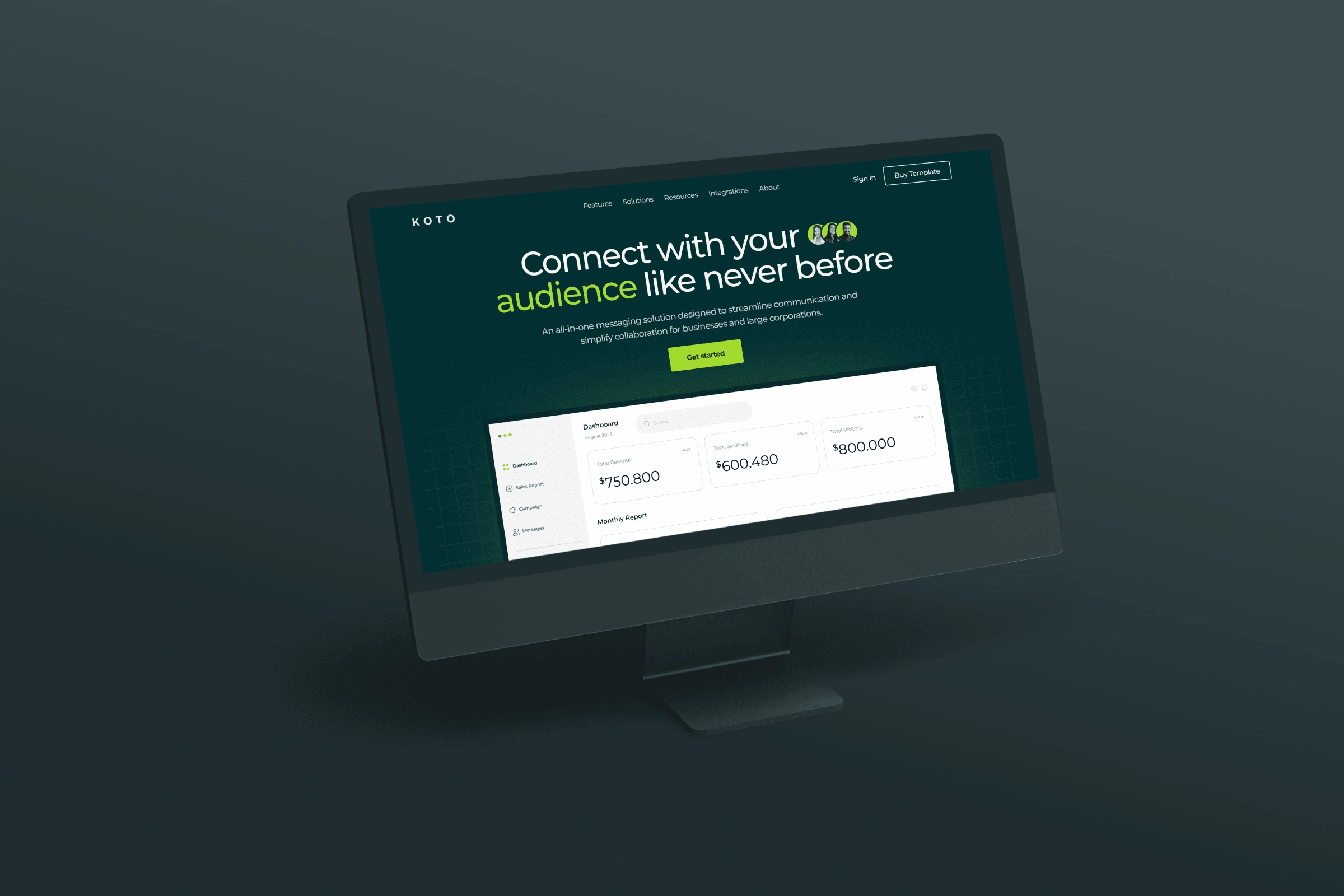
Koto SAAS template mockup
KOTO
Website Template Development
My friend Adnan, who is the founder of Supa Stellar, reached out in the community looking for Framer developers who could develop the KOTO Template for this company, after talking about the project and showcasing my work we decided to collaborate on this project. I have created a detailed case study of this project below for reference. It's currently live and you can purchase this template directly from Supa Stellar by clicking here.
KOTO is a sleek, fully-responsive Framer website template designed exclusively for SaaS companies. With its elegant design and user-friendly interface, KOTO offers a ready-to-use platform to elevate your online presence effortlessly.
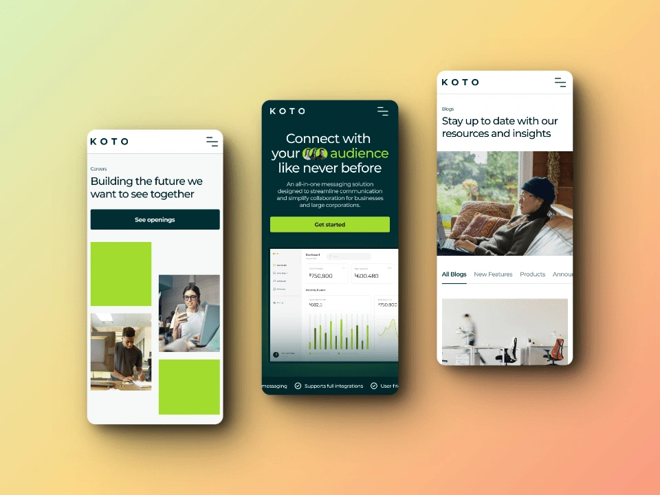
KOTO website hero sections on mobile
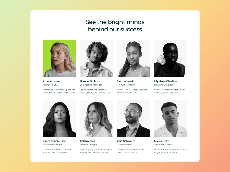
Team
🎯The Goal
The objective was to develop a high-quality website using Framer, with a strong emphasis on seamless functionality, visual appeal, and adaptability across various devices. The website should not only be aesthetically pleasing but also fully responsive, ensuring an optimal user experience on different screen sizes and devices.
⏳Timeline
The timeline of this project was 2 weeks.
🤝🏼The Client
Adnan Jaweed, Founder of the Supa Stellar product design agency.
📝The Process
Initial Discussion with the Client:
The project commenced with a thorough discussion with the client to understand their specific requirements, including desired functionalities, animations, interactions, as well as the various pages and sections essential for the website.
Creating Components:
Following the initial discussion, my focus shifted to creating the fundamental components of the website, such as the testimonial carousel, feature card animation, navigation bar, footer, buttons, etc. This step laid the groundwork for the subsequent development phases.
Pages and Sections Development:
Once all the components were in place, the development process transitioned to building the individual pages and their respective sections. My key emphasis during this phase was on simultaneous development across different breakpoints to ensure seamless responsiveness and optimal user experience across various devices.
Adding Magic to the Website:
After the static pages and sections were constructed and the components integrated, the next step involved adding the agreed-upon interactions and animations to enhance the website's visual appeal and user engagement.
Client Feedback and Final Review:
Upon completion of the development phase, I presented the website to the client for review. Feedback was incorporated, and once all pages, interactions and animations were approved, the website was published for a final review before going live.
Project Hand-Off:
Following the client's approval, I prepared a comprehensive hand-off guide. This guide included all the necessary deliverables (mentioned at the end of this case study), such as the Framer Project (source) File, the published link, and a detailed video guide explaining the website's maintenance and other essential information for the client.
🧗♂️Challenges and Solutions
Challenge 1: Building the Testimonial Carousel
One of the challenges faced was creating an animated testimonial card carousel, requiring the implementation of advanced prototyping techniques to achieve the desired result.
Solution: Advanced Prototyping Techniques
To address this challenge, advanced prototyping techniques were employed to develop the animated testimonial card carousel, ensuring a seamless and engaging user experience.
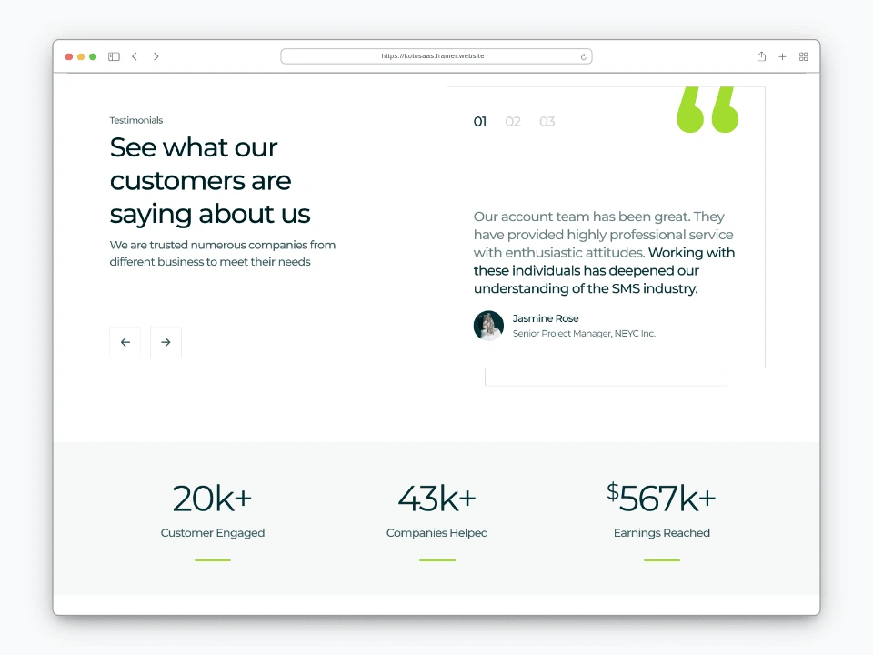
Testimonials section
Challenge 2: Features Section Build and Animation Component
Another challenge involved creating the animated feature card section on the features page, requiring the use of a code component to achieve a smooth animated slider effect.
Solution: Code Component for Animated Slider Effect
To overcome this challenge, a code component was utilised to create the animated feature card section, enabling the seamless integration of the smooth animated slider effect.
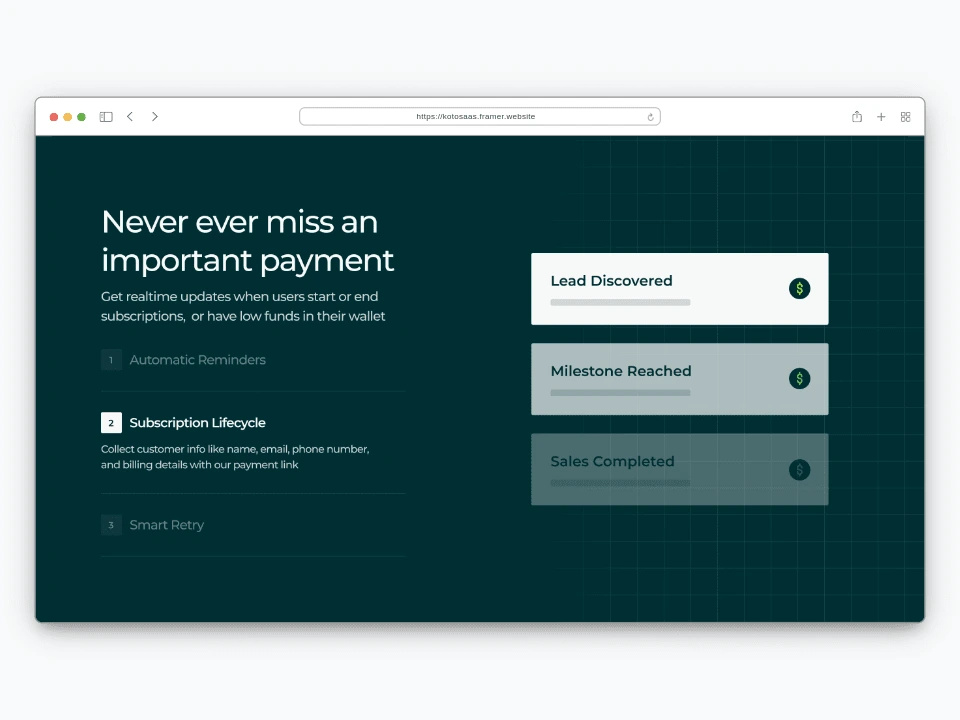
Features section
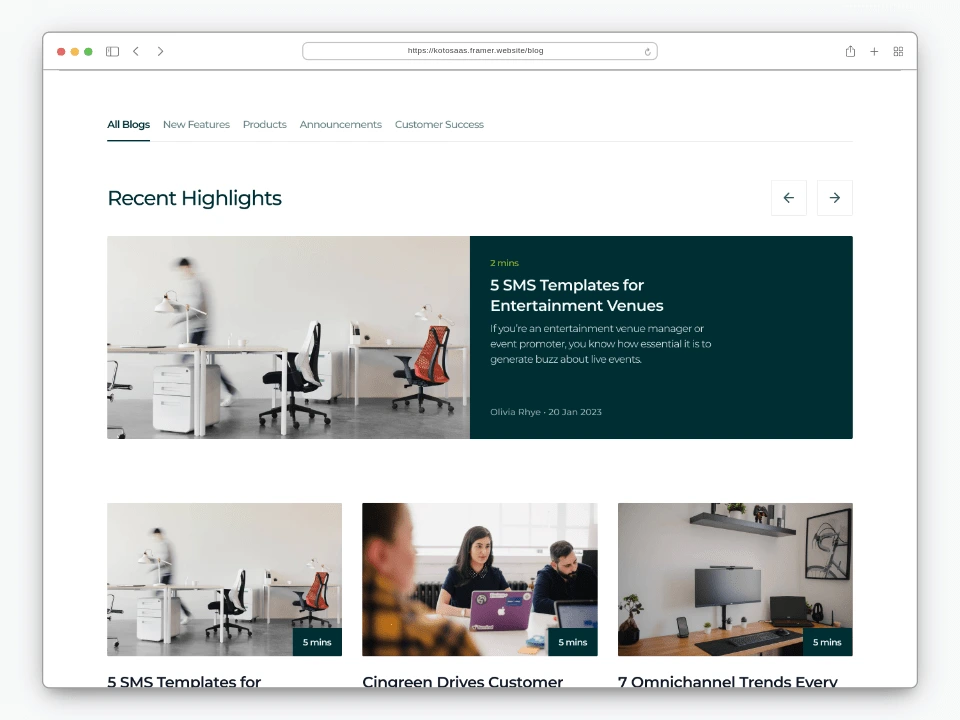
Challenge 3: Tabs Sections in the Blog and Career Pages
The implementation of tabs sections in the blog and career pages presented a unique challenge during the website development process.
Solution: Custom Tab Implementation
To address this challenge, custom tab implementation techniques were employed to ensure a user-friendly and intuitive navigation experience within the blog and career pages.
✅Deliverables
Framer Project Source File: The Framer project source file is available for further exploration and customisation. It provides a comprehensive overview of the website development process and can be used as a reference for future projects.
Individual Links of All Pages Developed: The individual links of all pages developed are available for review and can be accessed for a more in-depth understanding of the website's design and functionality.
Loom Video Demonstrating How to Maintain the Site: The Loom video provides a detailed demonstration of how to maintain the website, including the use of variables, CMS features, and other essential aspects. It serves as a valuable resource for clients and team members alike.
🏆Check out final published link here!
Thank you for reading the case study. If you liked my work check out my Framer Development service here and let me help you on your next project.
Like this project
Posted Jan 31, 2024
KOTO is a sleek, fully-responsive Framer website template designed exclusively for SaaS companies.
Likes
0
Views
30

