BBQDad Brand and Website Design
Henry Ugo
Verified
BBQDad
A story-led backyard brand and content site built around warmth, utility, and real-life BBQ
BBQDad started as a content site, but the brief called for something more specific than a standard blog. The brand needed to feel like a backyard people could step into: approachable, practical, and full of personality. The challenge was to design a site that could carry storytelling, recipes, backyard life, DIY, and hosting content without losing clarity or becoming overdesigned.
I shaped the experience around a simple idea: build the website like a backyard world. That meant a strong illustrated hero, light-touch motion, short and human copy, and a content structure that made people feel welcome from the first scroll.
My role
I led the visual direction, homepage structure, illustration system, content layout, responsive design, and implementation guidance for the WordPress build.
What I worked on
Homepage concept and hero direction
Illustration style development across the site
Story-led About page structure
Blog and category page design
Mobile refinement and navigation behavior
Motion concepts for cards and logo entry
WordPress/Elementor implementation support
The brief
The brand needed to feel:
welcoming, not performative
useful, not crowded
authentic, not overproduced
confident, but still approachable
BBQDad also had to support a growing content library, so the site needed structure. The visual system had to be strong enough to make the brand memorable, but flexible enough to scale across blog categories, utility pages, and future content.
The approach
The site was designed to feel less like a homepage and more like an arrival.
Instead of treating the experience as a list of links and articles, I framed it as a backyard someone is stepping into. That guided the copy, the layout, the illustration style, and the motion. Everything had to feel like it belonged to the same world.
The language stayed short and grounded. The illustrations were warm and hand-drawn in feel, but not overly decorative. The layout gave users clear ways in, while still leaving room for story and atmosphere.
Hero direction
The hero centered on a single illustrated backyard scene, designed to feel lived-in and inviting rather than polished or staged. The approved copy was:
Every backyard needs a hero.
Real BBQ for real people. Straightforward tips, reliable gear, and simple ideas to bring your backyard to life.
The illustration became the anchor for the whole brand. It set the mood, established the backyard as the brand world, and created a visual identity that could extend into the rest of the site without flattening the personality.
Homepage structure
The homepage was intentionally lean. It needed to communicate value quickly while still feeling warm and human.
Pick your path
A simple, visual entry point into the site:
Recipes
Grill & Smoke
Drinks
Backyard Life
DIY
Waiting for the Coals
This section helped the homepage feel organized and gave users a clear way to move into the content that matched their intent.
Blog Category Cards
Join the backyard
A low-friction newsletter and contact area gave the brand a natural close without forcing it. The tone stayed soft and invitational.
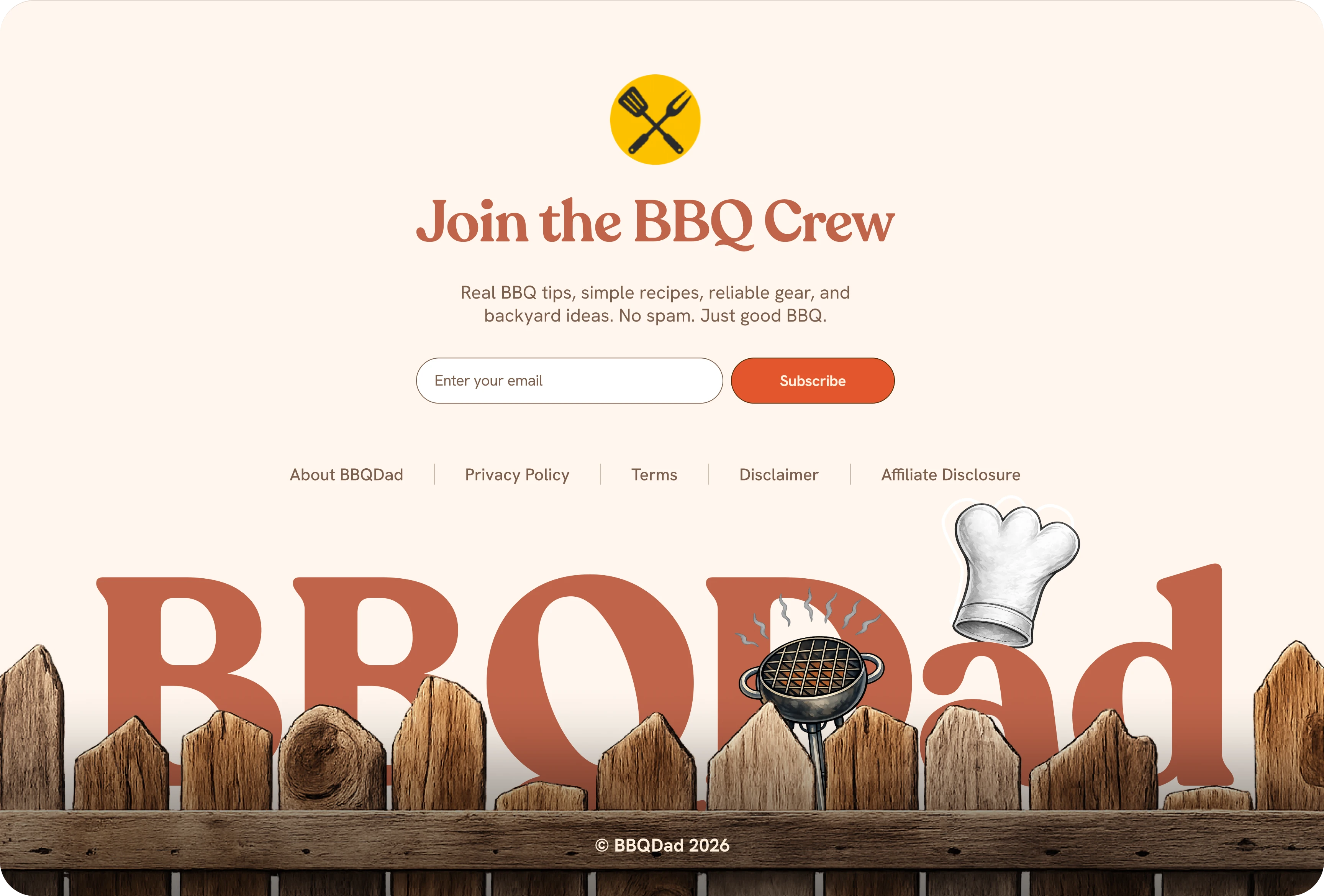
Footer
About page storytelling
The About page was one of the most important parts of the project because it needed to do more than explain the brand. It needed to tell a story.
I broke the narrative into five sections:
childhood spark
early cooking years and the corporate detour
Beth and the home-life dynamic
barbecue, fatherhood, DIY, and hosting
the brand’s purpose and invitation
This structure made the page feel like a storybook rather than a long biography. It also gave each chapter room to breathe visually with supporting illustrations.
Illustration system
A major part of the project was keeping the illustration style consistent while adapting it to different page types.
The visual system developed into:
a main hero illustration style
lighter supporting illustrations for cards
zoomed-in blog page art
subtle decorative details that supported the story without competing with the content
The aim was to create a site that felt handmade and human, not generic or overdesigned.
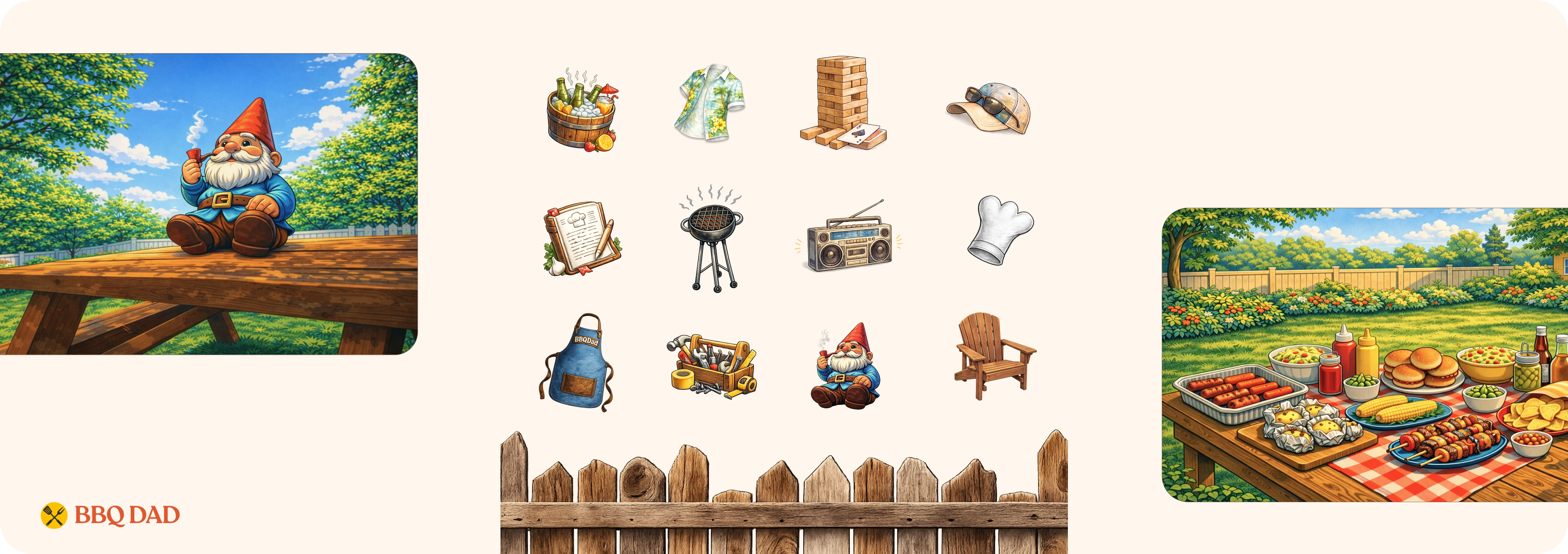
Illustrations
Responsive design
The mobile experience was simplified to keep it fast and readable. That meant reducing unnecessary clutter, tightening spacing, and making sure the cards, illustrations, and headings stayed usable on smaller screens.
Key mobile priorities:
clear tap targets
readable hierarchy
controlled image cropping
simple navigation behavior
no overlays blocking content
The result was a mobile experience that stayed consistent with the brand while remaining practical.
Outcome
BBQDad now feels like a brand people can step into. The site is warm, practical, and full of personality, but still structured enough to grow. The homepage introduces the world. The About page gives it heart. The blog and category pages make it functional. And the illustration system ties everything together into a coherent backyard experience.
Like this project
Posted May 13, 2026
Designed BBQDad's site with a backyard feel, focusing on storytelling and branding.
Likes
1
Views
12
Timeline
Jan 14, 2026 - May 13, 2026
Clients
BBQDAD