UX Redesign of Condri Health Anxiety App
Henry Ugo
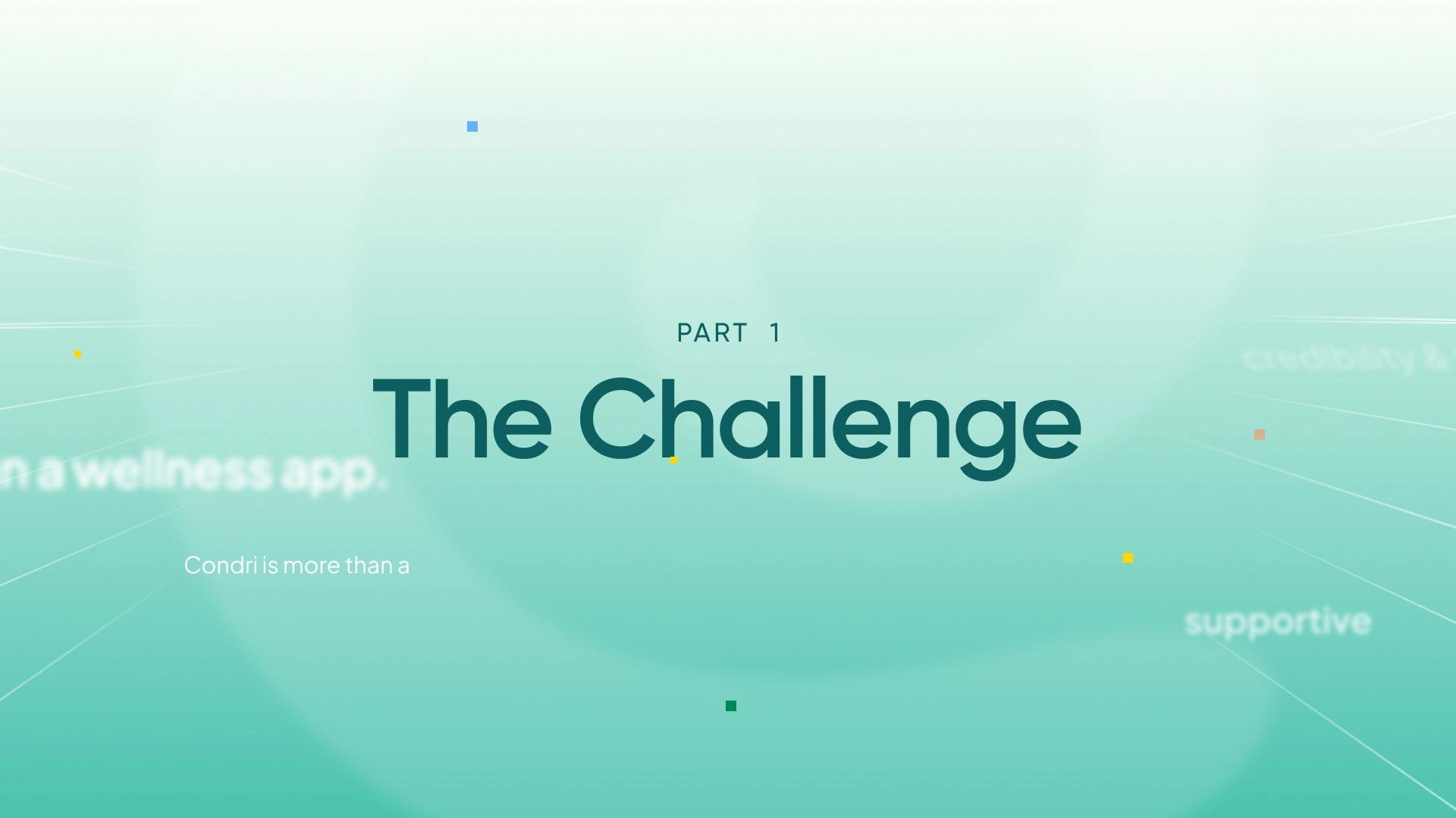
Condri — Designing for Clarity in Health Anxiety
Overview
Condri is not just another mental health app—it sits in a highly sensitive space: health anxiety, where design decisions directly influence user perception, emotional safety, and behavioral outcomes.
This project wasn’t about “making things look better.”
It was about designing trust, reducing compulsive behaviors, and guiding users toward recovery—without reinforcing the very cycles the product is trying to break.
Health anxiety products face a unique paradox:
Users want certainty, but recovery requires tolerating uncertainty
Users seek reassurance, but reassurance reinforces the cycle
Users need guidance, but not dependence
The existing experience had strong foundations, but:
Flows lacked emotional clarity and narrative continuity
Visuals felt functional, but not human
Interactions risked being too clinical or too overwhelming
The product didn’t fully communicate its core value: breaking the cycle
Strategic Approach
Rather than approaching this as a redesign, I treated it as:
A behavioral design problem, not a UI problem
Key principles:
Clarity over stimulation
Guidance without dependency
Emotionally intelligent interfaces
Consistency across product, motion, and language
Designing against compulsive patterns—not enabling them
Defining the North Star
Splash Screen Animation
The visual and interaction direction was grounded in one core idea:
“Condri is the place you go when you’re ready to move forward—not stay stuck.”
This influenced:
Tone of voice (human, grounded, non-corporate)
Visual hierarchy (calm, intentional, not busy)
Motion (supportive, not distracting)
Content structure (progressive, not overwhelming)
Onboarding — From Questions to Insight
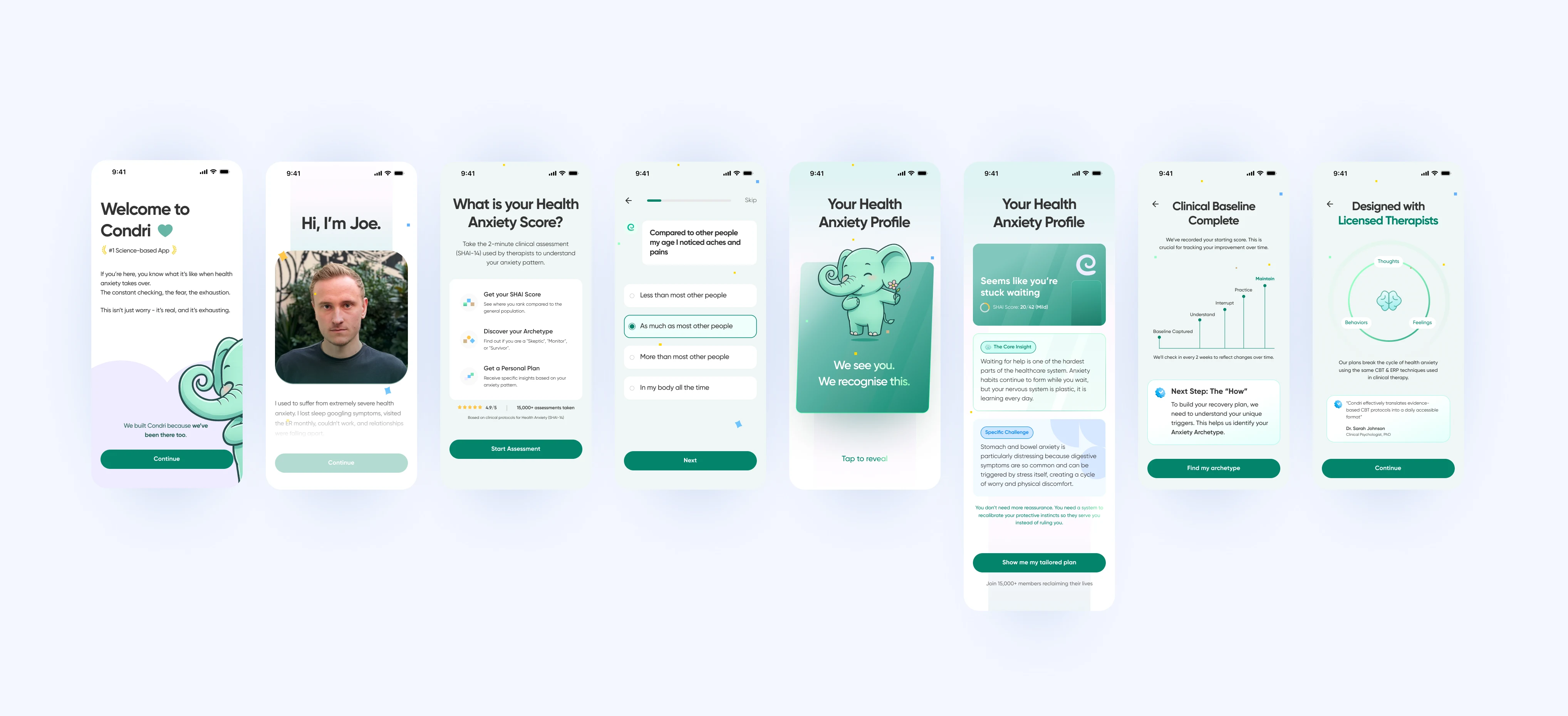
Onboarding Screens
Problem
Typical onboarding flows feel:
Transactional
Clinical
Overwhelming
Solution
I redesigned onboarding as a conversation, not a questionnaire:
Introduced human-centered copy
Structured inputs into digestible segments
Delivered insight moments after key inputs
Result
Users don’t feel “assessed”
They feel understood
Early trust is established through tone, not claims
Design System — Built for Scale, Not Screens
Instead of designing screens first, I went deeper:
Focus on primitives
Spacing logic
Typography hierarchy
Interaction states
Component behavior across contexts
Why this mattered
The product is expected to evolve, and:
New exercises
New content types
New behavioral flows
…shouldn’t break consistency.
This wasn’t a UI kit — it was a system designed for unknown future states
Color System — Meaning, Not Decoration
Color wasn’t aesthetic—it was semantic.
Core logic:
Blue → Learning / Understanding
Green → Experiential / Doing
Yellow → Behavioral Awareness
Applied across:
Knowledge Jar
Exercises
Insights
Navigation cues
Outcome
Users subconsciously understand:
What they’re learning
What they’re practicing
What they’re observing
Without needing explanation.
Progress & Data — Avoiding Obsession Loops
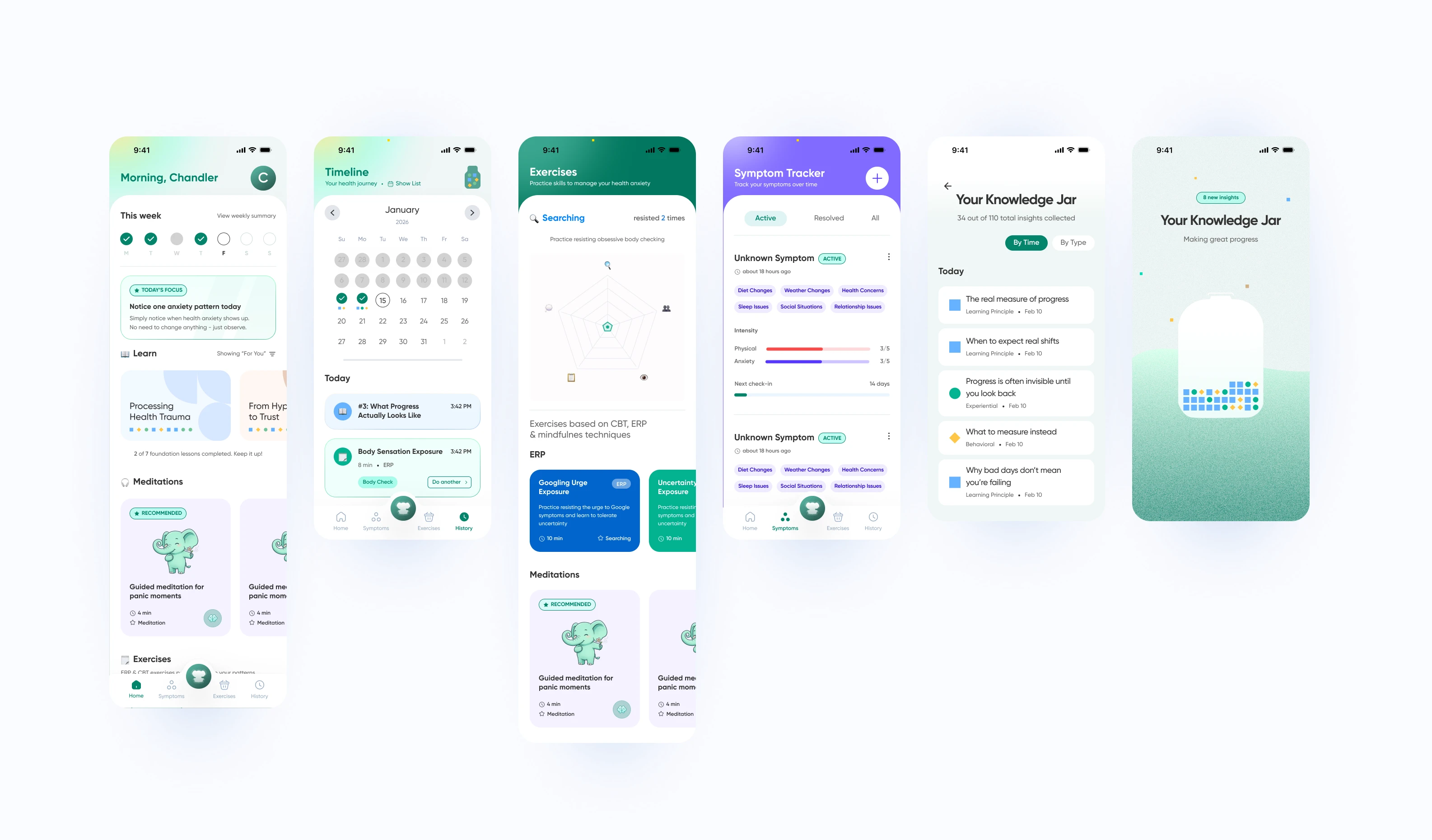
Problem
In health anxiety, too much data = more checking behavior
Solution
Keep Home screen lightweight
Move detailed metrics to History
Focus on:
Progress direction (not perfection)
Patterns (not precision)
Design choice
Reduced emphasis on raw “scores”
Increased emphasis on:
Behavioral shifts
Recovery signals
Animations — Designing Emotional Transitions
Motion was treated as a core part of the experience, not decoration.
Principles:
Short (3–4 seconds)
Purposeful
Emotionally grounded
Use cases:
1. Grounding Exercises
Soft, breathing-like motion
Simple forms (circle / organic shapes)
Subtle symbolism (e.g. elephant ears forming a heart)
2. Micro Explainers
Replaced text-heavy lists
Showed:
Behaviors (checking, scanning, reassurance)
Patterns users recognize themselves in
3. Transitions
Reduced abruptness
Created psychological continuity
Illustration System — Simple, Recognizable, Non-Triggering
Health anxiety visuals must avoid:
Medical imagery
Anything that triggers symptom focus
Approach:
Minimal, abstracted representations
“Big limbs” style for approachability
Focus on behavior, not anatomy
Examples:
Pressing for pain → hand + simple gesture
Pulse checking → wrist + repetition cue
Mirror checking → silhouette, not detail
Content & Tone — Human, Not Clinical
Everything was rewritten or guided toward:
Conversational tone
Emotional awareness
Non-authoritative language
Example shift:
From:
“This does not cure…”
To:
A human explanation that informs without sounding like legal copy
Outcome
The final product direction:
Feels calm but not empty
Feels supportive but not dependent
Feels intelligent without being clinical
Most importantly:
It aligns design decisions with how recovery actually works, not just how apps usually function.
What This Project Demonstrates
This wasn’t just a redesign.
It demonstrates:
Behavioral design thinking
Designing within clinical & legal constraints
System thinking over screen thinking
Balancing emotion, clarity, and function
Creating meaning through visuals, motion, and structure
Closing
Condri is more than an app.
It’s a system designed to help people:
Recognize patterns
Interrupt cycles
Move toward recovery
And every design decision was made to support that—quietly, intentionally, and at scale.
Like this project
Posted May 7, 2026
Redesigned Condri app to enhance user trust, clarity, and recovery effectiveness through behavioral design.
Likes
0
Views
9