Data Analysis & Custom Interactive Dashboard

Muhammad Rehmat


From Pile of Data to Actionable Insights
The Problem
The client needed a way to turn large volumes of raw energy data into a clear, actionable insights through interactive dashboard that could guide decision-making. With more than 4 million data points from 100+ households, the existing data was too complex to extract insights such as consumption patterns, solar production, battery needs, or grid connection options.
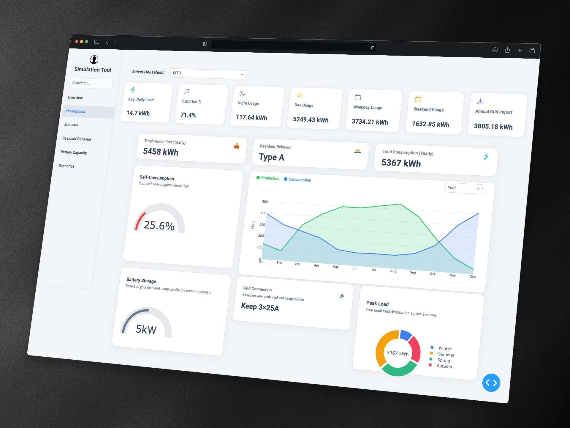
Interactive dashboard with KPIs for individual household
The Solution
I designed and built REPA (Residential Energy Planning Assistant), a data analysis, simulation and visualization project powered by Python, analytics workflows, and interactive dashboards.
Data Cleaning & Processing: Handled millions of records, normalizing consumption, production, and resident behavioral data.
Interactive Dashboards: Created multiple pages for insights:
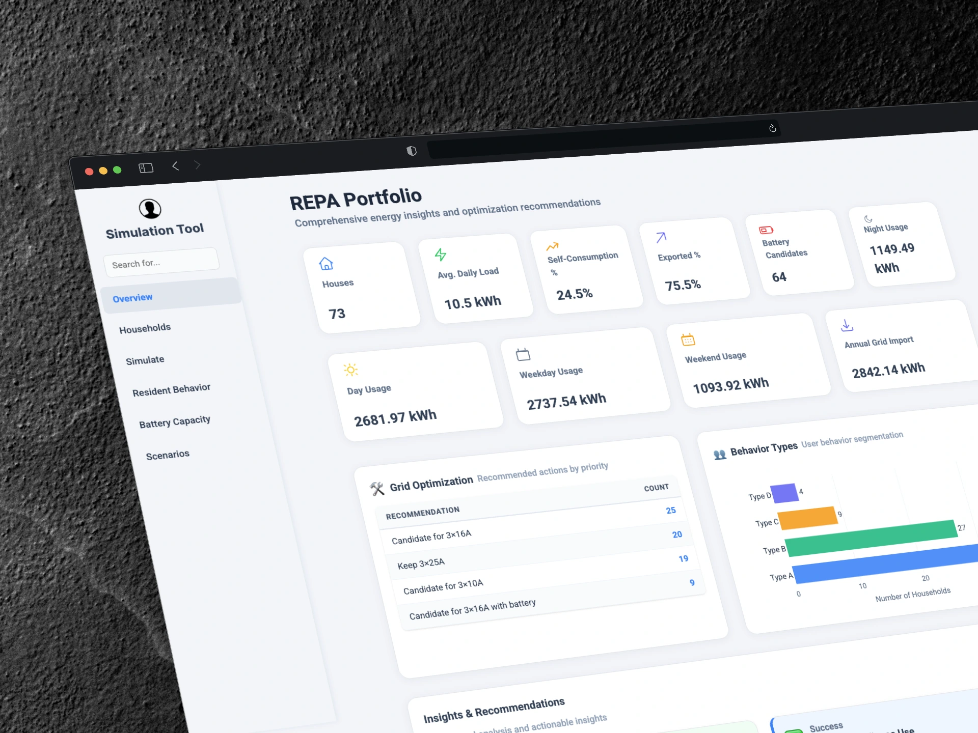
Overview: Summarized key household energy metrics
Household: Yearly, monthly, weekly, daily breakdowns with interactive charts
Resident Behavior: Behavioral segmentation of households
Battery Capacity: Recommended storage with ROI & payback calculations
Simulation Tool: “What-if” scenarios for solar + storage setups
Scenarios: Compare grid connections (3x25A, 3x16A, 3x10A)
Analytics Features: Self-consumption ratio, performance benchmarking, scenario modeling.
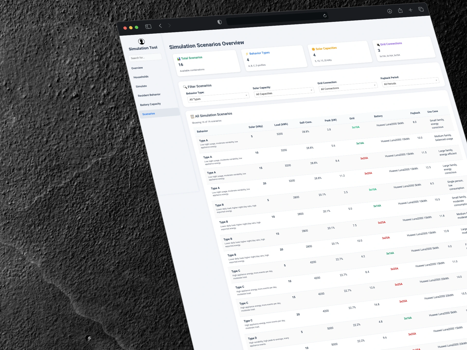
Simulation result of different scenarios
The Impact
The final solution transformed raw data into an interactive tool that helps homeowners and energy planners:
Quickly visualize energy data with clear charts and KPIs
Use simulation and A/B testing style comparisons to test scenarios
Identify the optimal battery size for maximum returns
Select the best grid connection for cost savings and stability
Why it Matters
This project demonstrates my ability to combine data analytics, dashboard design, and Python workflows to deliver insights that are both visually clear and business-ready. Beyond energy planning, the same process applies to any business that wants to turn raw data into dashboards, simulations, and measurable growth insights.
Like this project
Posted Jul 20, 2025
Built ETL pipeline for 4M+ records using Python & DuckDB; clustered 100+ households & created an interactive Plotly Dash dashboard.
Likes
0
Views
25
Timeline
Feb 21, 2025 - Mar 31, 2025