Redesigning & Improving The User Experience of Zupago Mobile App
Zupago is a hybrid HD wallet that provides the best and the most affordable way to transfer E-currencies across the globe.
Responsibility: Research, Logo Design, UX/UI Design
Device: Mobile
Industry: Finance
Tools: Figma, Miro, Notion
Project goals
Revamp the Zupago mobile app's user experience and interface design to create a more user-friendly and accessible platform for both new and existing users, reducing complexity and promoting ease of use.
Redesign the current logo to modernize its appearance, as the current design appears outdated and in need of a refresh.
Include a virtual card feature to allow users to bypass the minimum spending limit for online transactions, providing more flexibility and convenience.
Research
While starting out, I attempted to conduct interviews with actual users of the app in order to understand their pain points but encountered difficulties getting them to respond and have an interview session. I utilized Twitter to
promote a survey but was unable to generate the desired level of participation (maybe I could have done it a bit different and come out successful😁).
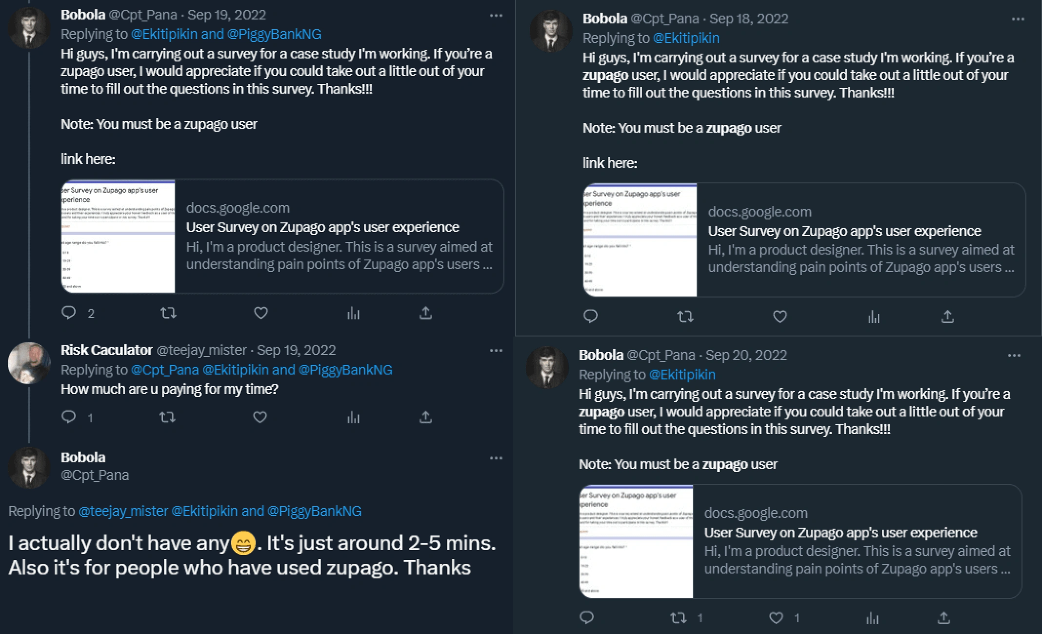
Despite this setback, I continued my research by exploring app reviews on Playstore and Twitter.

Logo design
The current app logo appears outdated, so I set out to modernize its appearance by sketching different concept designs on paper prior to digitizing.

Current app logo
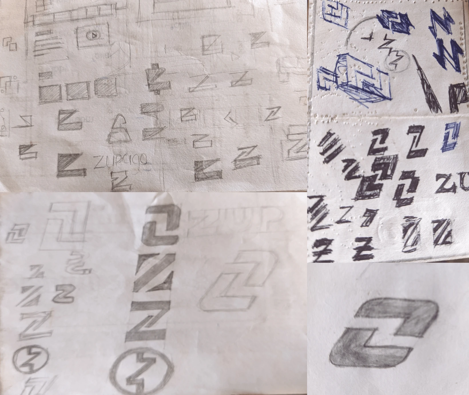
Behind the scene
After many paper sketches, I arrived at the final logo concept. It features Zupago's initials in negative space, surrounded by two opposing arrows symbolizing incoming and outgoing transactions. Rounded corners to introduce a little bit of friendliness. The slanted design also emphasizes speed and efficiency, reflecting the app's focus on fast and secure payment system.
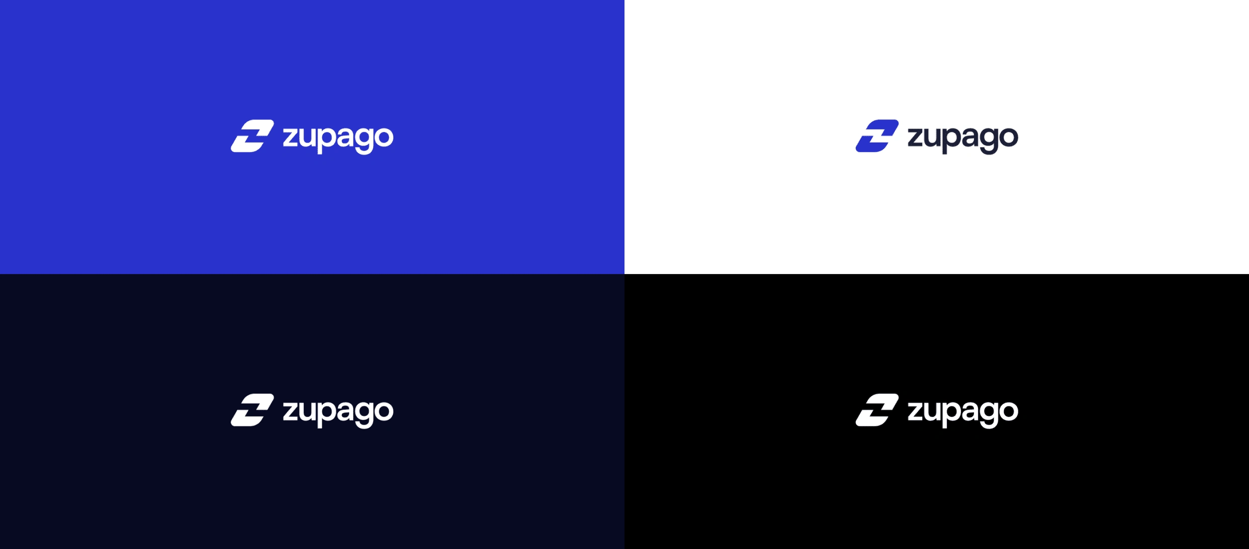
Redesigned app logo
Information Architecture
After extensive analysis of top competitor apps, I developed a clear understanding of the desired app flow. This was visualized and documented in Figjam, demonstrating the journey of a user through the app.

UI sketches
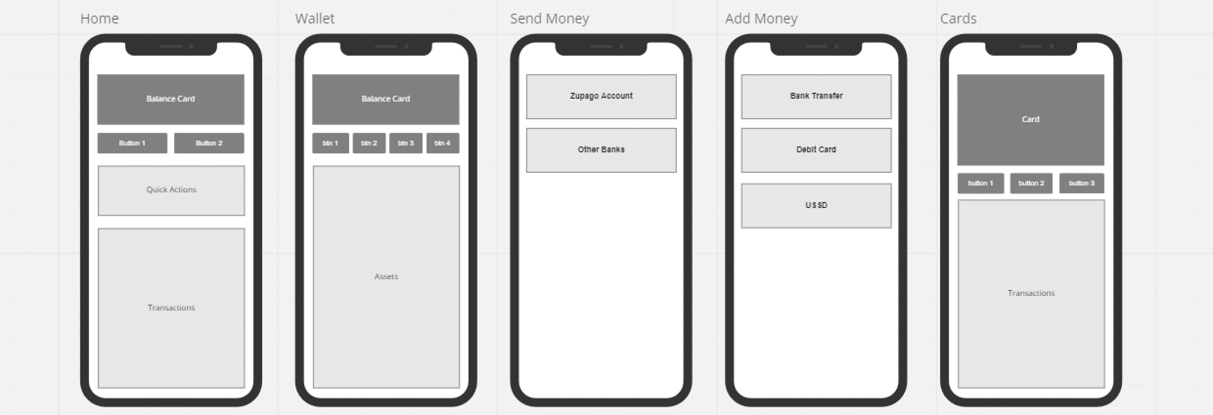
I began sketching low-fidelity wireframes on paper, allowing me to quickly capture and explore ideas. This early stage of the design process focused on functionality over aesthetics, serving as a foundation for the later high-fidelity screen designs.

Low fidelity wireframes
High fidelity designs
Typography & Colors

Onboarding
The current app lacks onboarding screens, leading to potential confusion and disorientation for users. To address this, I included simple and straightforward onboarding screens in the redesign to provide users with a base idea of the app and how it works
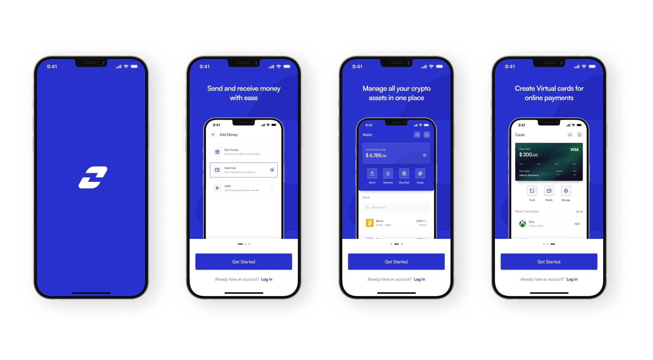
Homepage
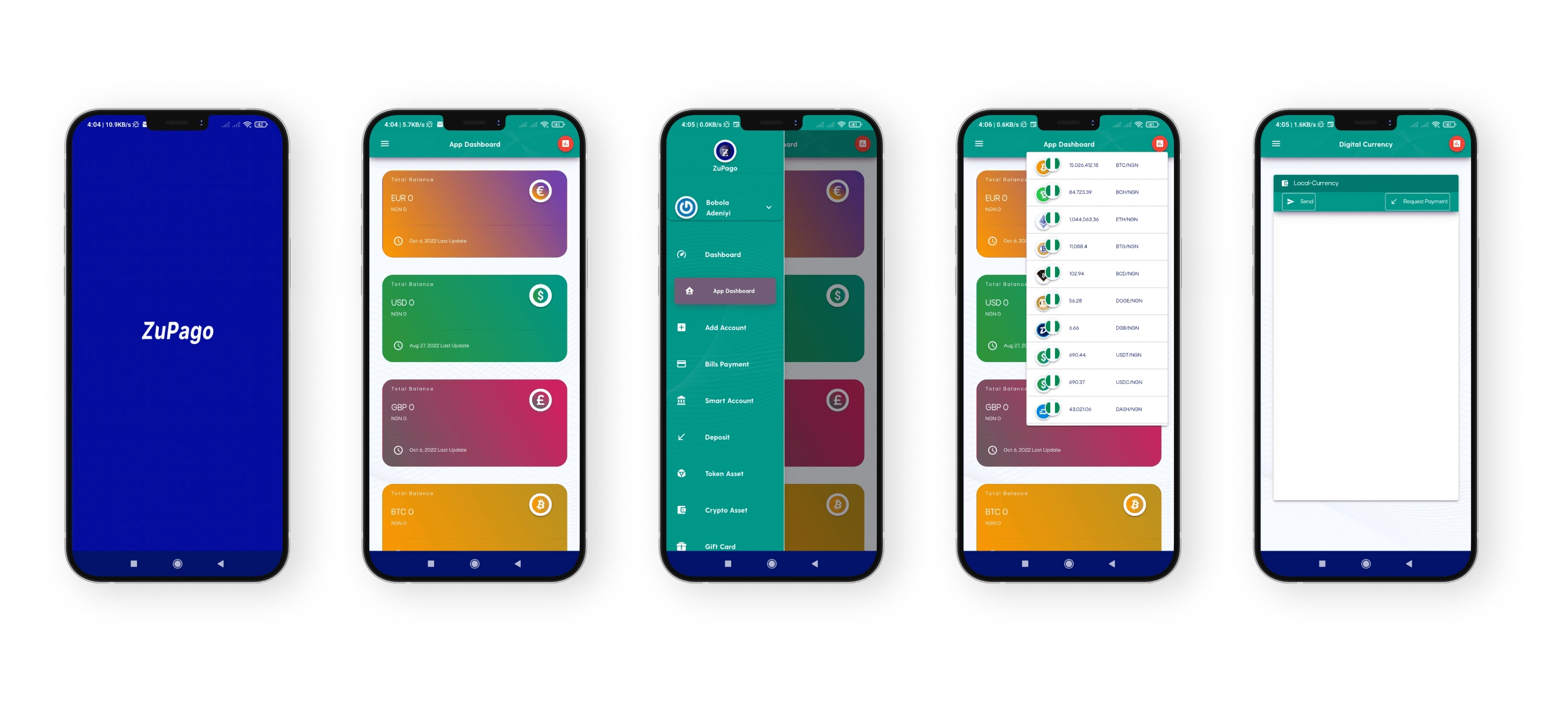
The current app's homepage displays all balance cards together, making it confusing for users as no actions can be performed from this view until you click on the hamburger menu to select an action. To improve the user experience, the redesign separates normal currency (Home) and crypto balances (Wallet) with a clear distinction, utilizing a bottom navigation bar for easy access. A quick actions section has also been added to the homepage, providing users with easy and quick access to some of the app’s features. Additionally, the new design integrates an exchange rate modal that is readily available from most top-level navigation pages for convenience.
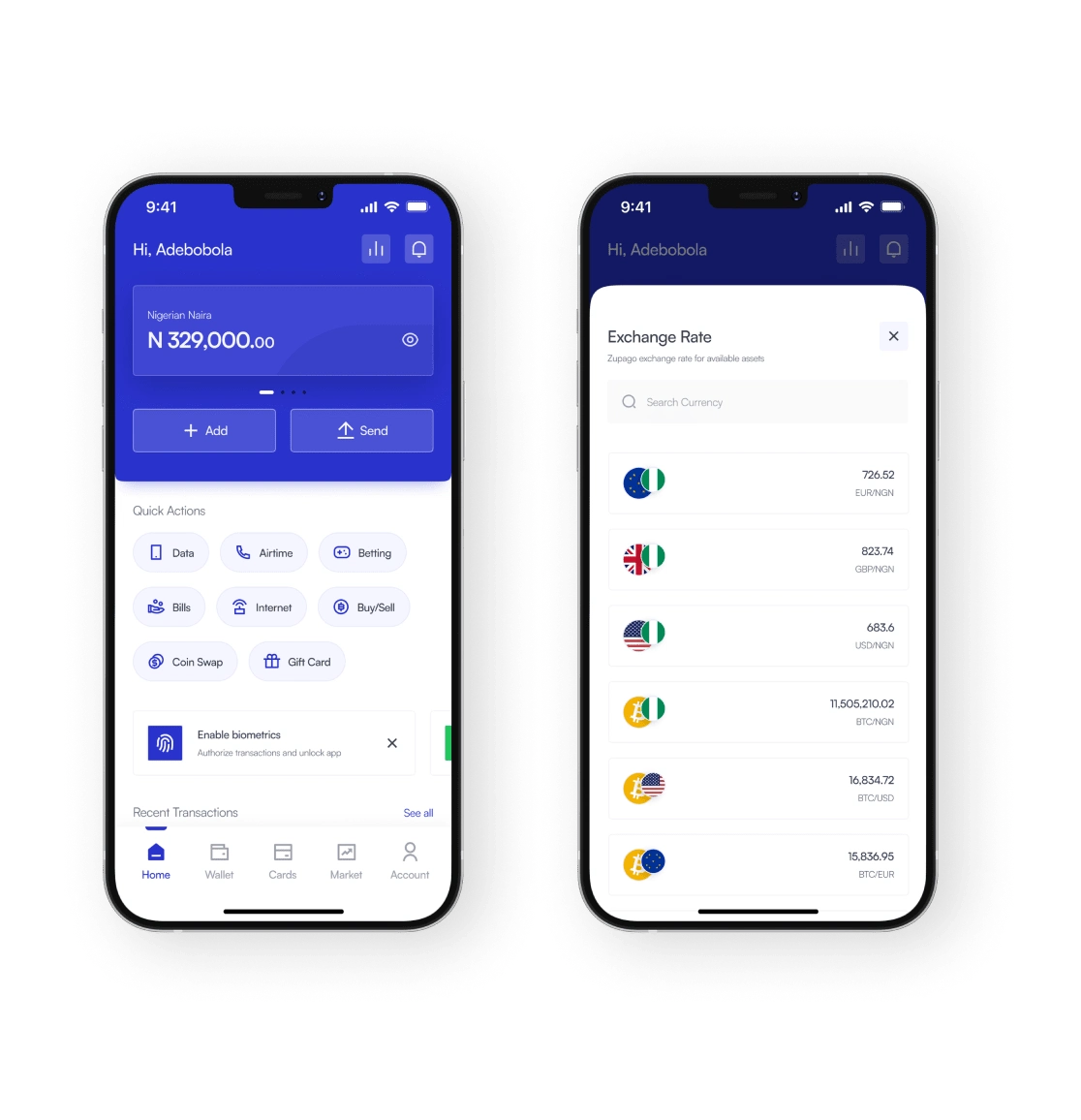
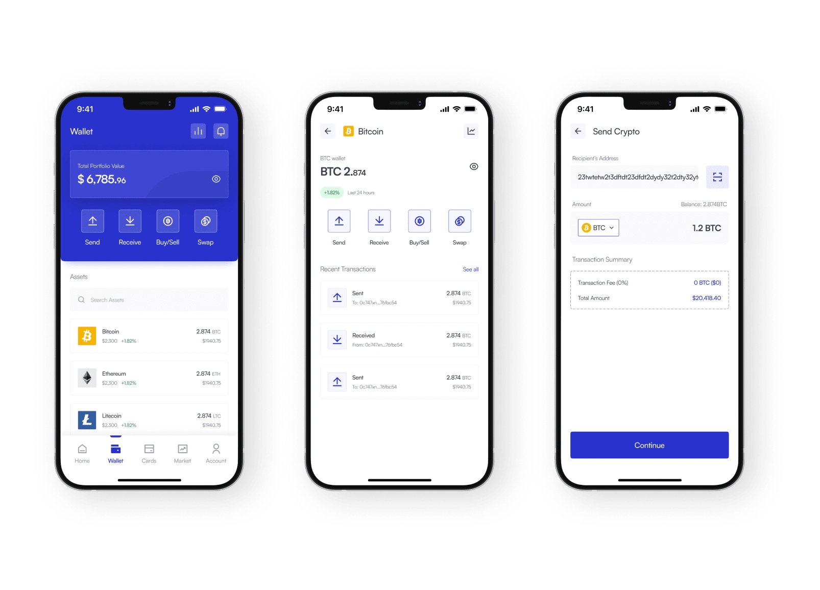
Wallet
A separate page specifically dedicated to crypto-related functions is now available in the redesign. It provides a comprehensive overview of all crypto assets and allows users to perform actions such as sending, receiving, buying/selling, and swapping between different crypto currencies.
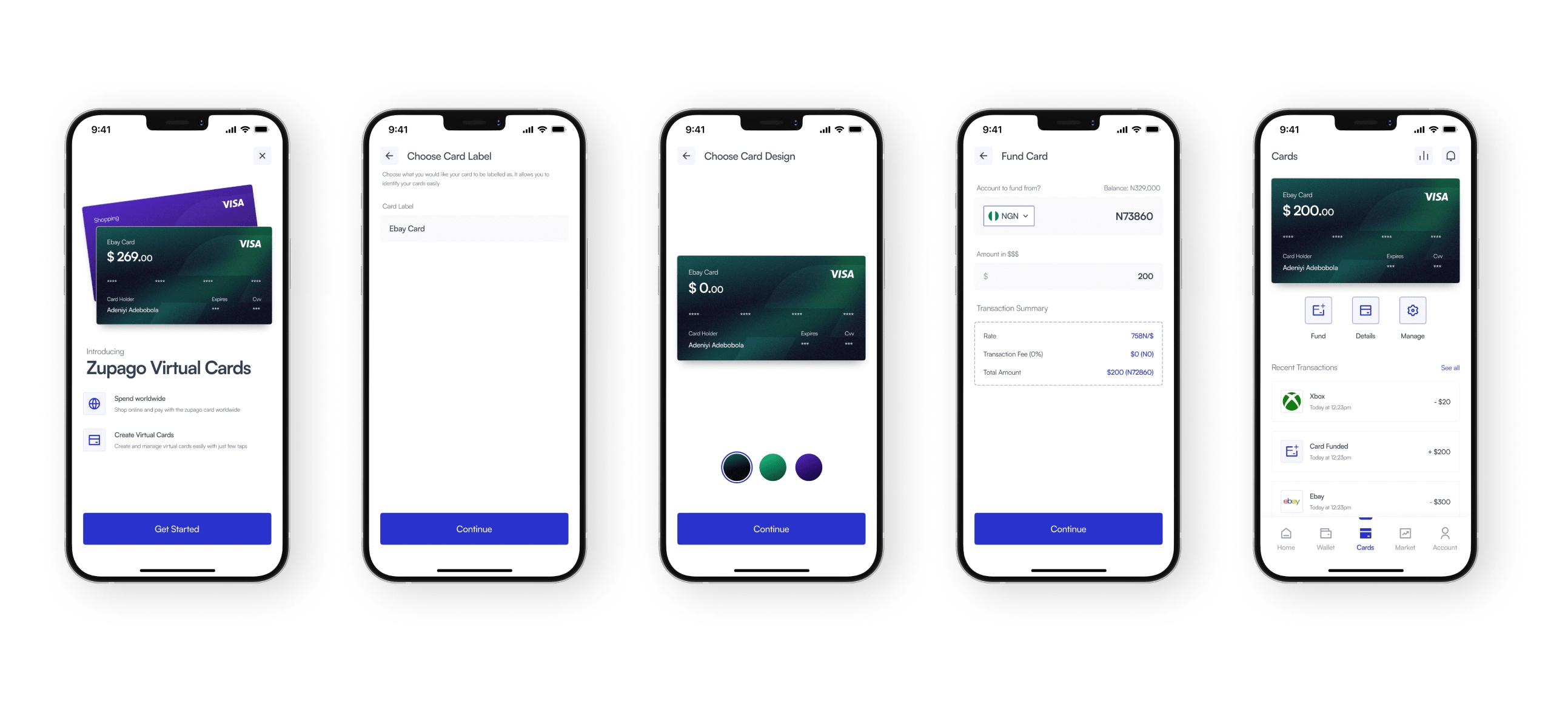
Cards
The redesign introduces the new "Zupago Virtual Cards" feature, which enables users to create and fund virtual cards that can be used for online purchases and shopping.
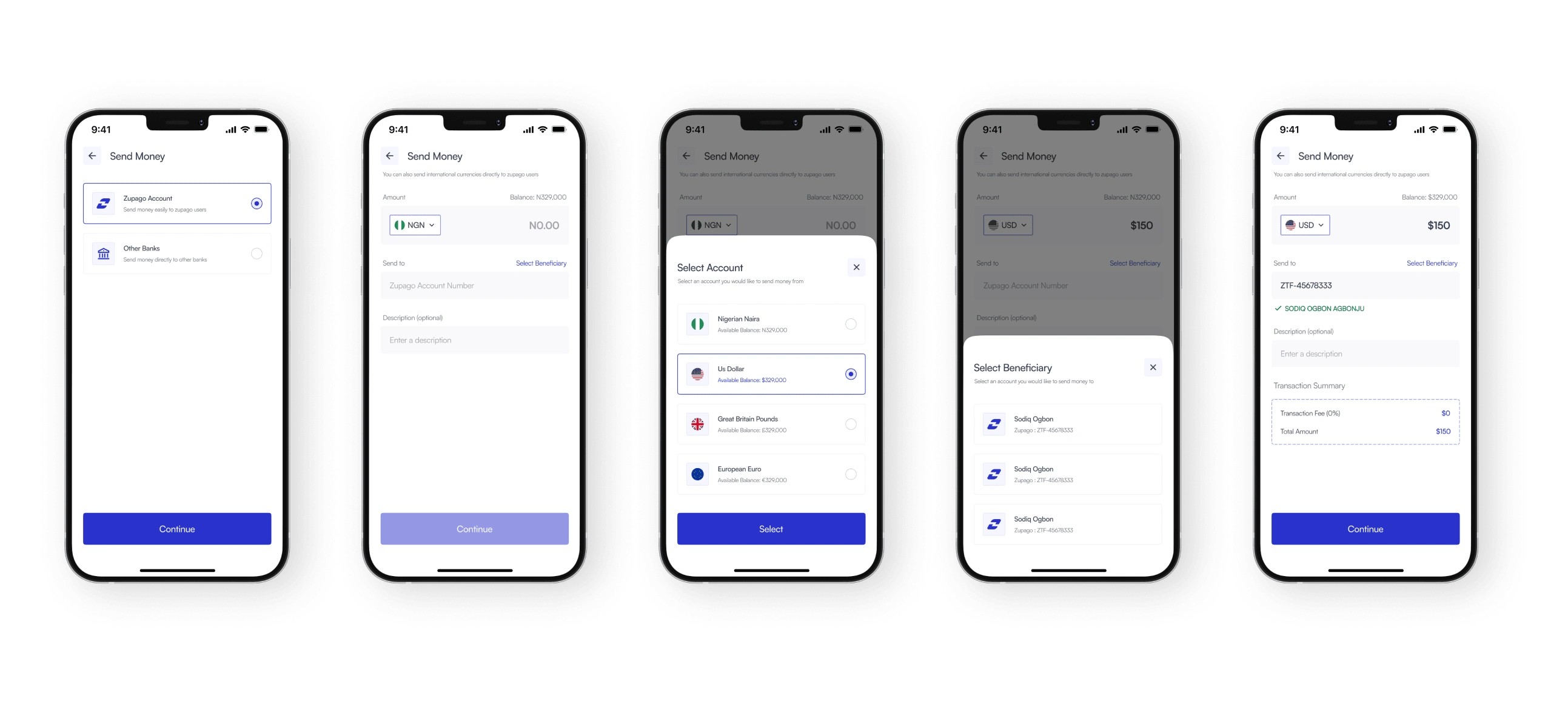
Send money
The current app required users to go through an additional step before accessing the transfer page. In the redesign, the process has been streamlined, allowing users to initiate transfers directly from the homepage for a more
efficient experience.
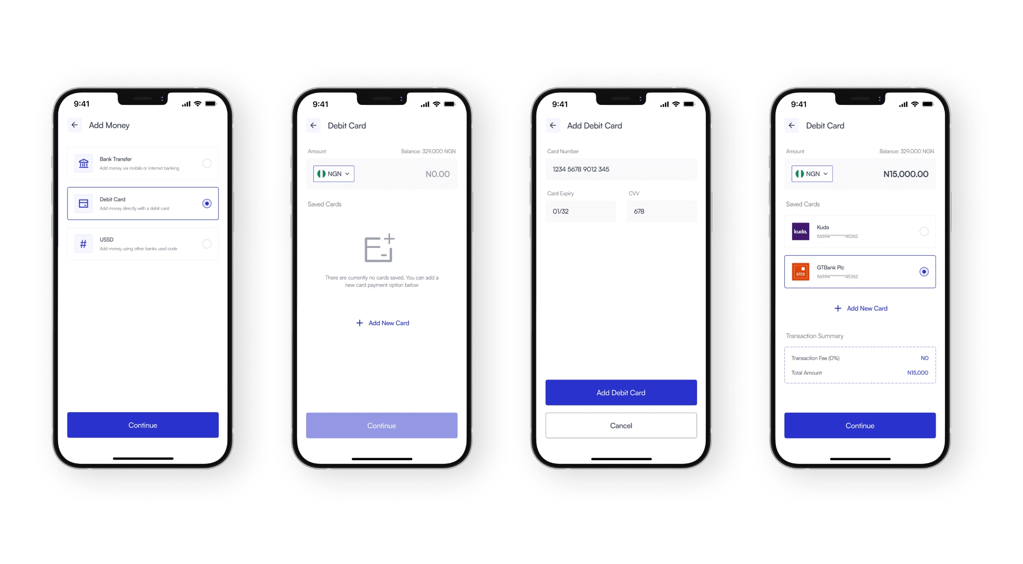
Add money (Debit card)
Same way with sending money, adding money has been simplified and can be completed in few steps
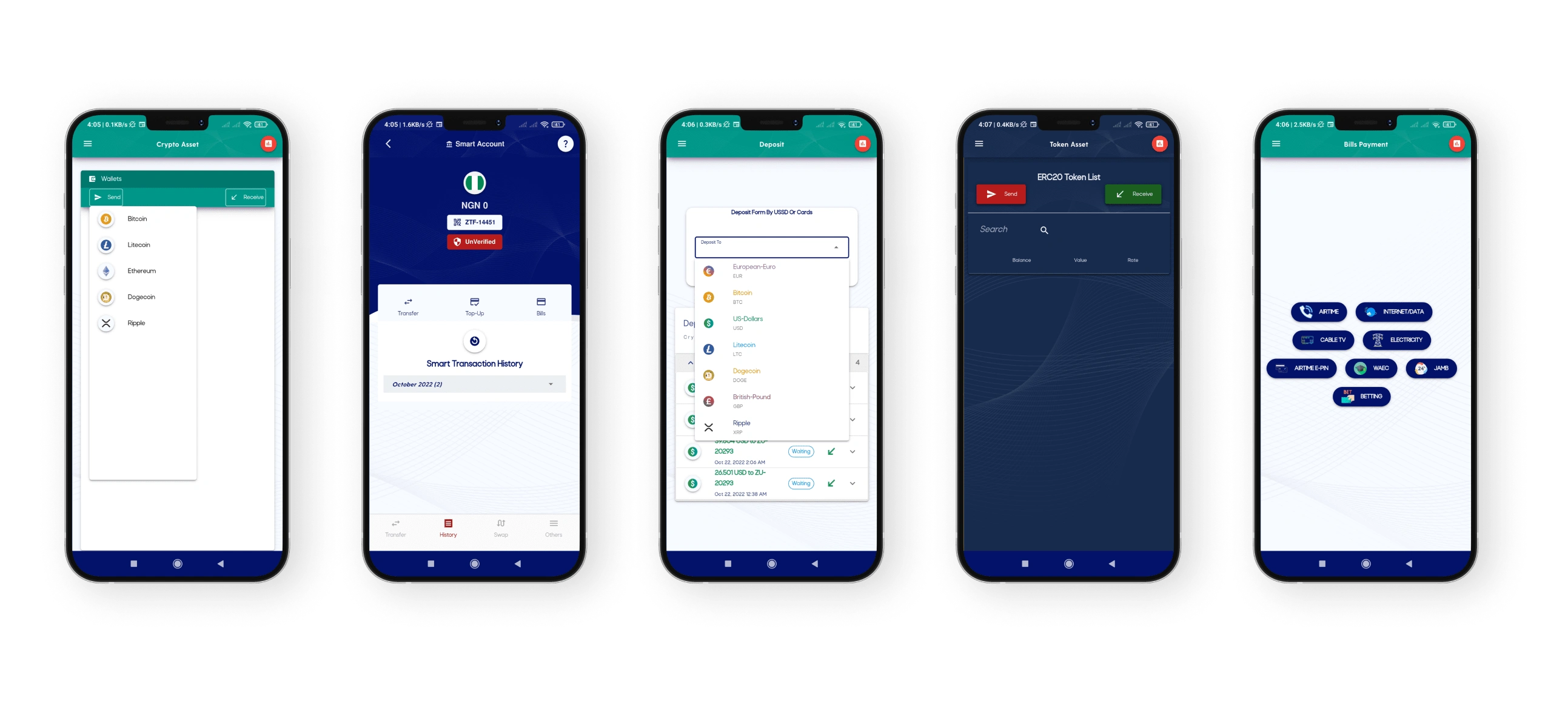
Current app design
Conclusion
Working on this project was an exciting opportunity for me to learn about the fintech industry in general. This also being my first major case study, I had to put my research skills to test as a product designer.
Moving forward, I plan to continue refining the design based on feedback to ensure that the app delivers a streamlined and user-friendly experience.
Like this project
Posted Jan 4, 2025
Zupago is a hybrid HD wallet that provides the best and the most affordable way to transfer E-currencies across the globe.
Likes
0
Views
15


