Opsis Partners Brand Revamp

Marcel Kargul


Overview
Opsis Partners is an operations partner for founders and growing businesses.
They take care of the operational work behind a growing company, invoices, suppliers, deadlines, recurring processes, so founders get their time and attention back to actually build.
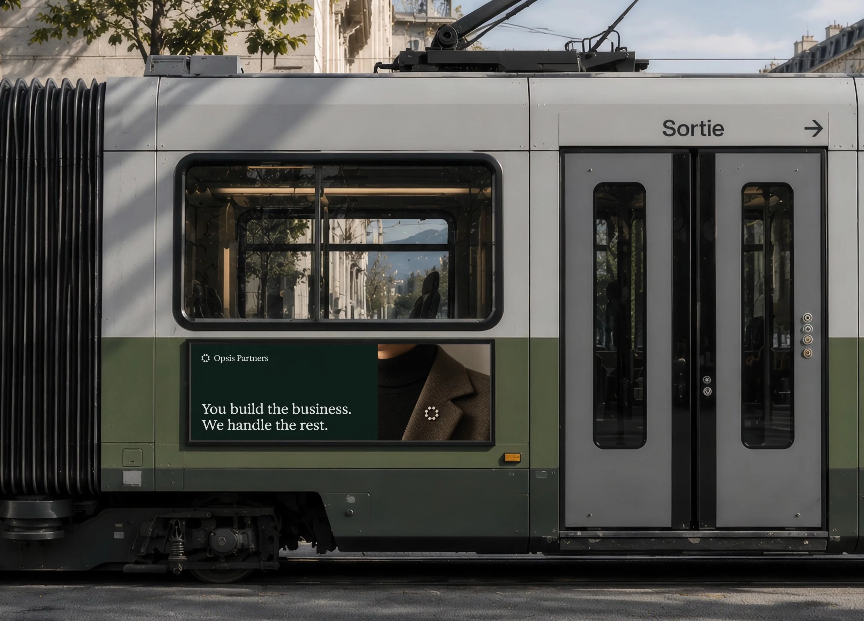
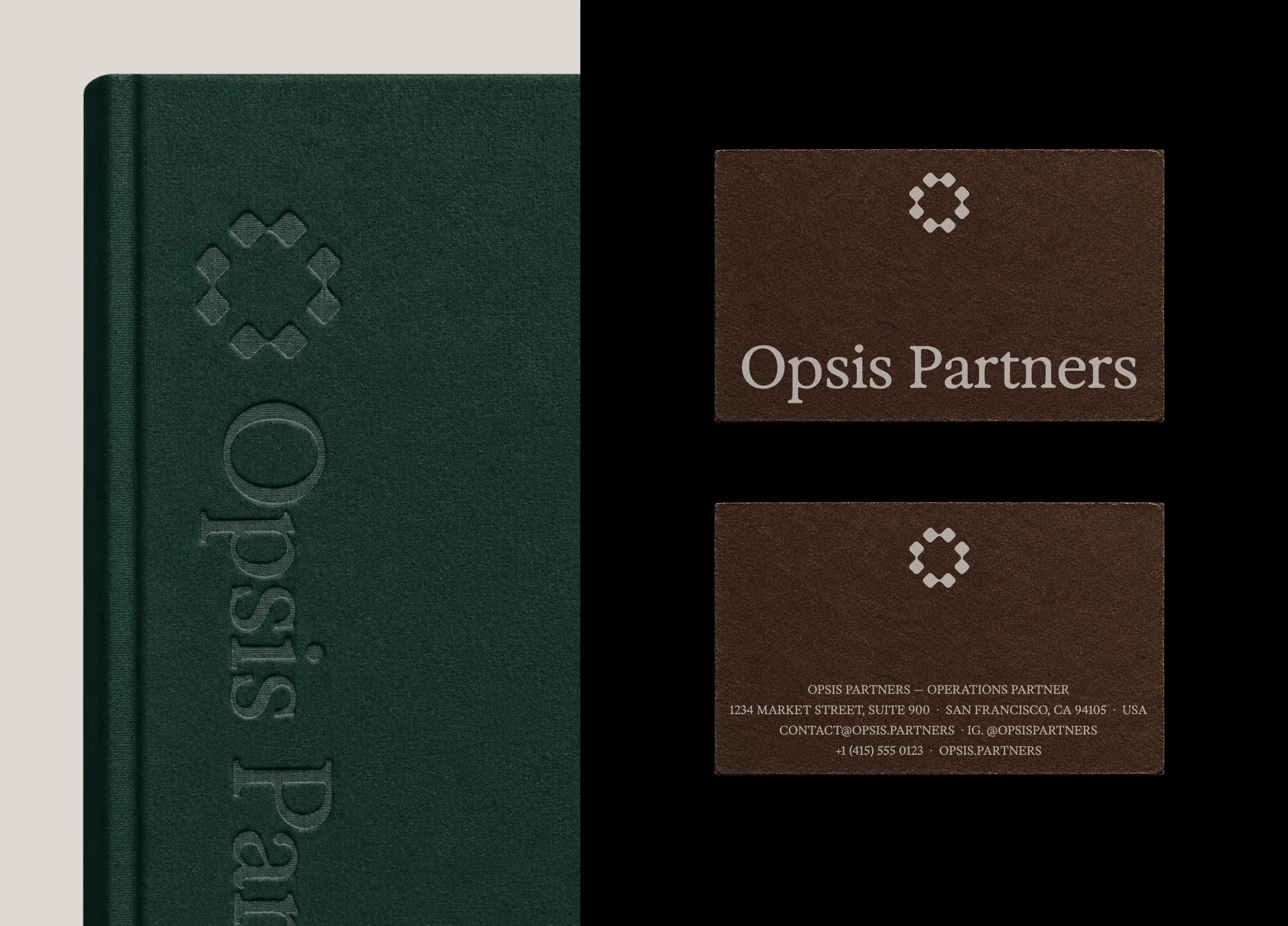
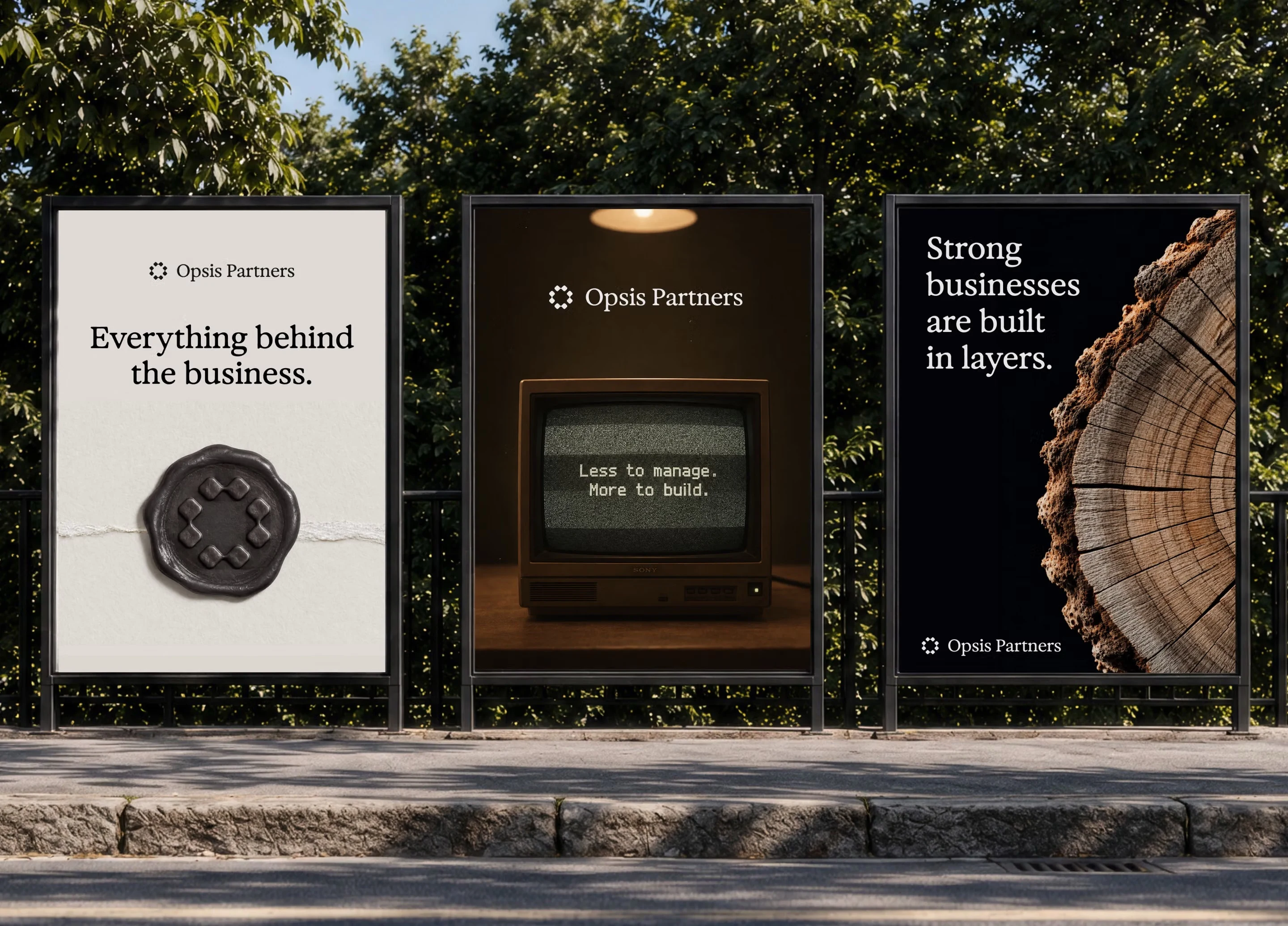
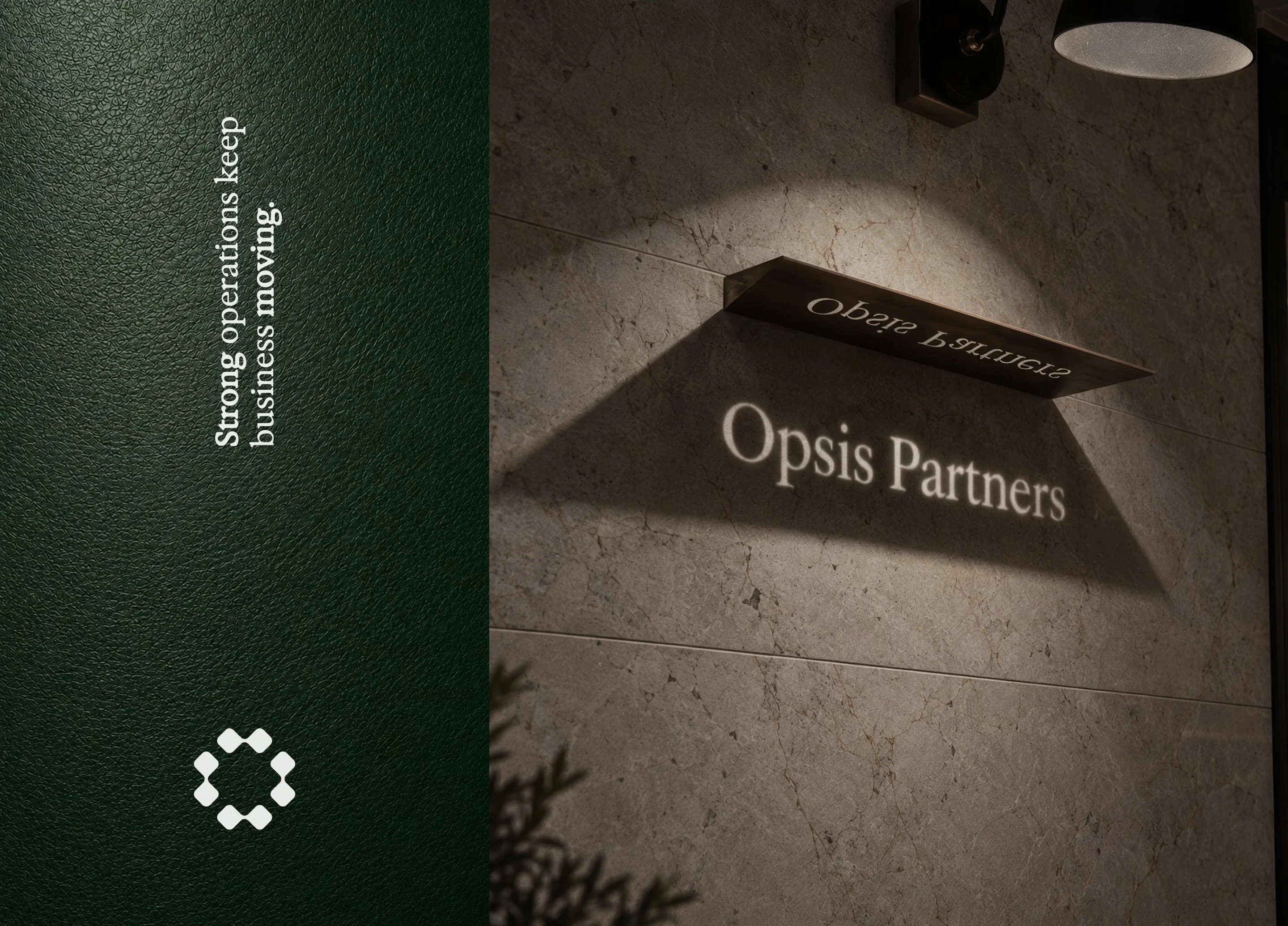
They came to us for a complete brand identity that matched the calm, dependable, hands-on nature of what they actually do.
Challenge
Most operations and back-office brands read as generic, "solutions," "streamlined," "end-to-end," language that says nothing and looks like everyone else in the category.
Opsis needed the opposite. A brand that felt composed, tactile, and quietly capable, the visual equivalent of someone who follows through without needing to be asked twice.
Outcome
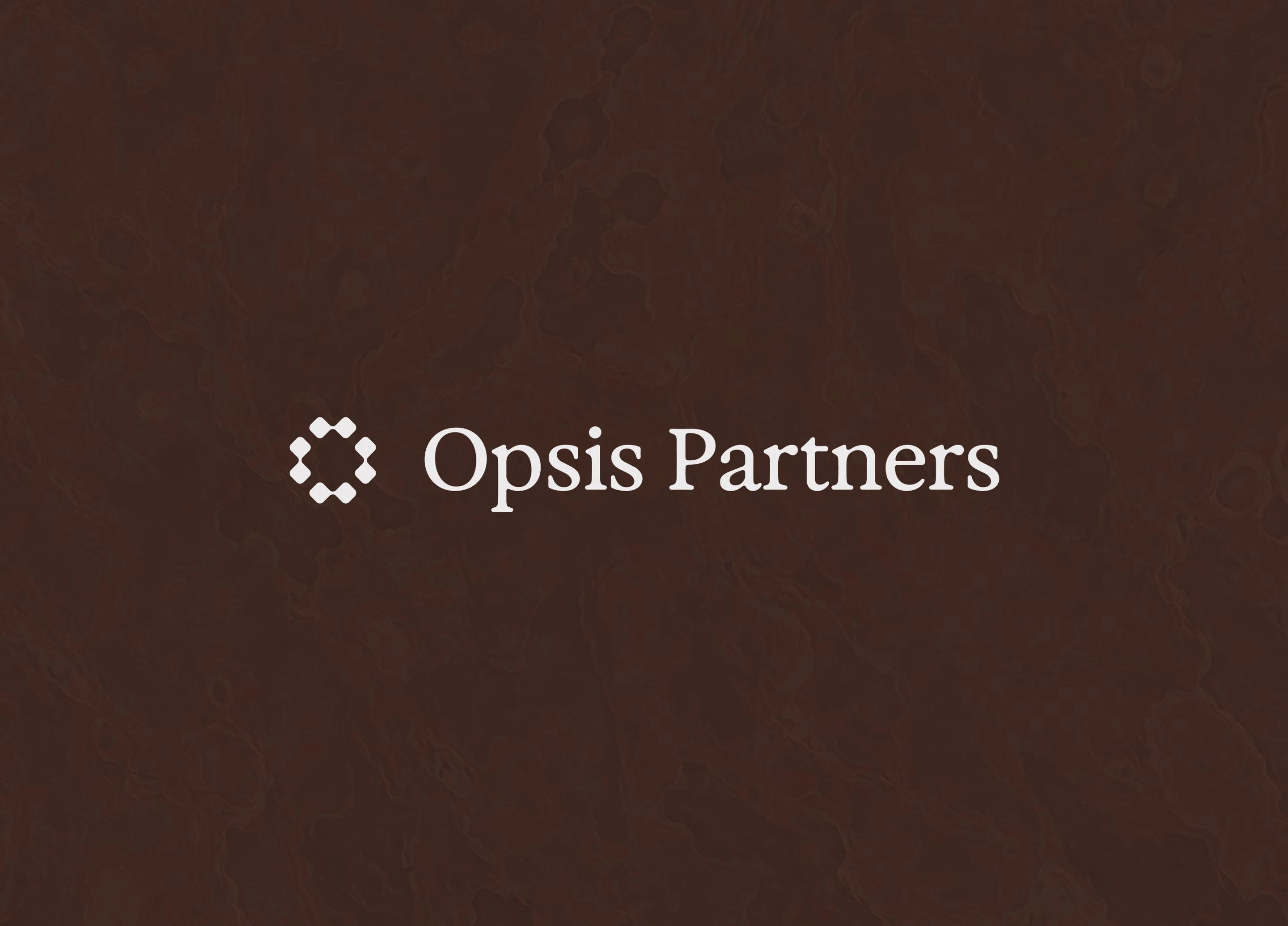
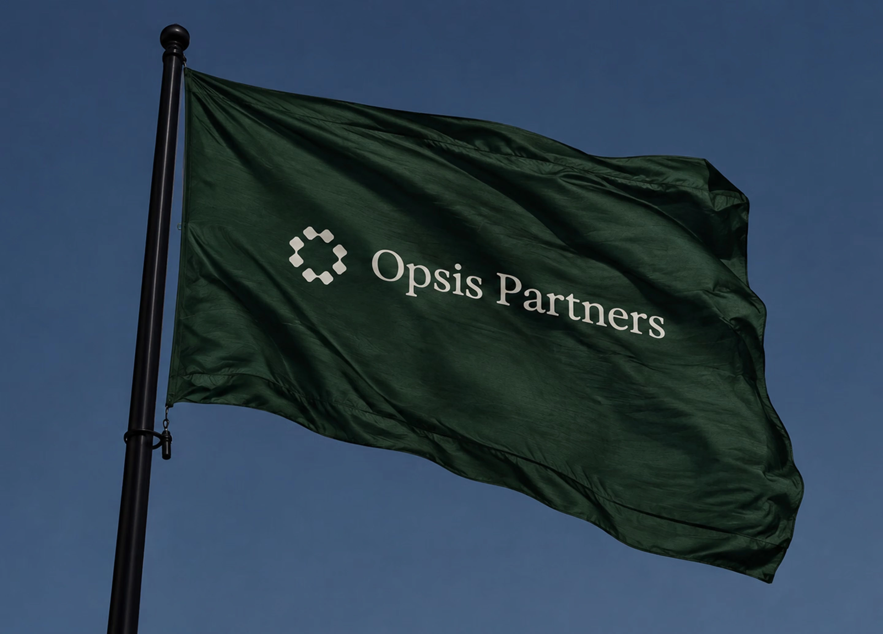
We delivered the full brand identity from the ground up: a connected-node symbol built around the letter O, a grounded palette of Forest, Earth, and Paper tones, a considered type system pairing an editorial display face with a clean working typeface for everyday correspondence, and a tone of voice built entirely around plain, specific, founder-respecting language.
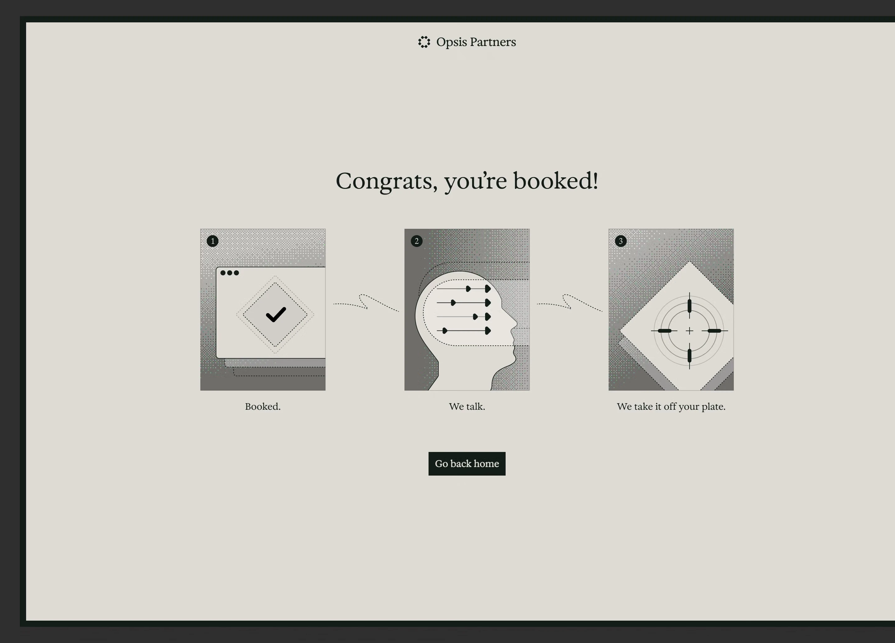
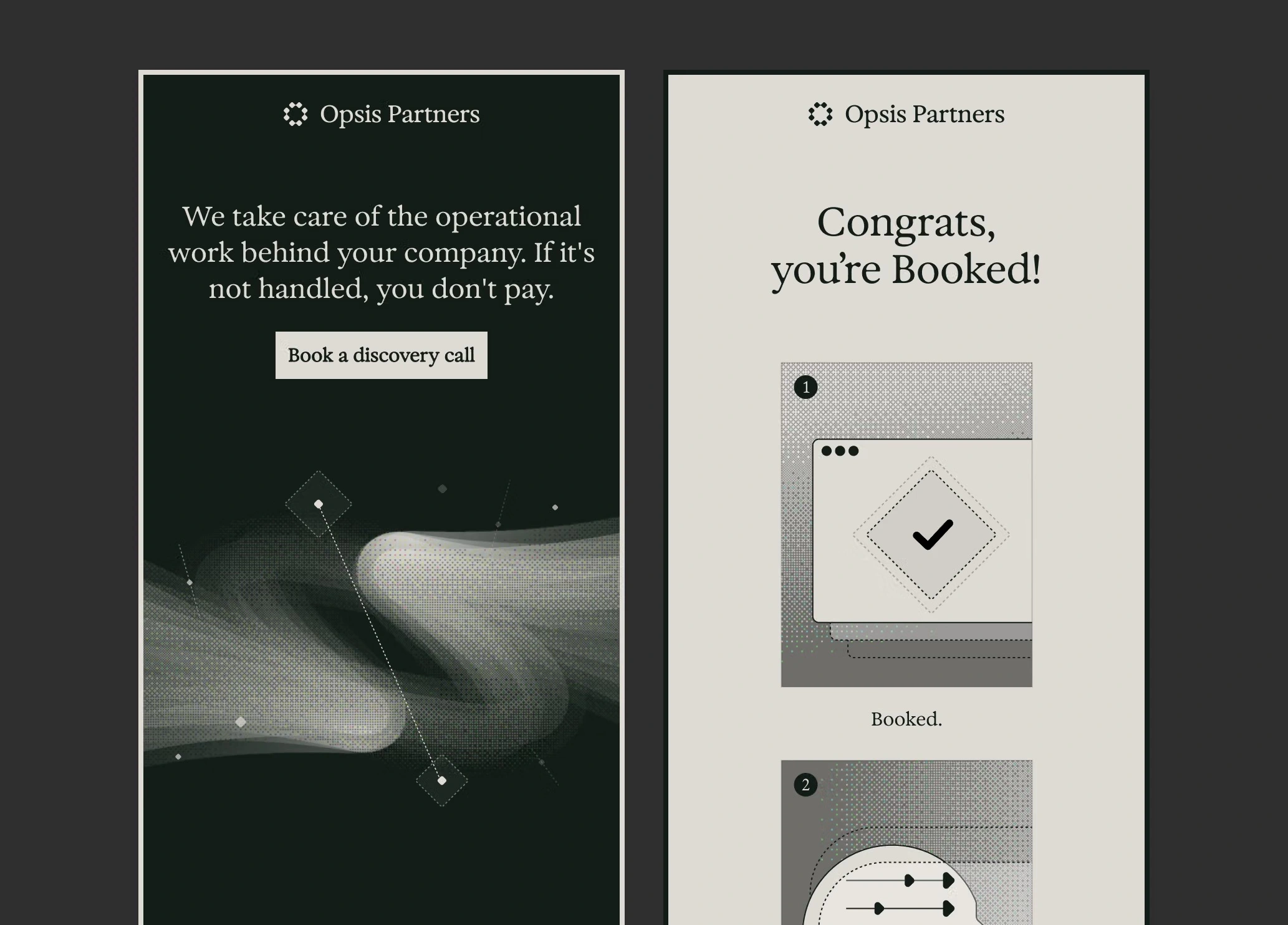
We also designed and developed a single-section landing page/booking flow in Next.js, built around one goal: getting people to book a meeting, with an awesome animation/illustration in the hero section.
Gallery
Tools used
Figma, Next.js
Like this project
Posted Oct 8, 2026
Developed a unique brand identity and landing page for Opsis Partners.
Likes
0
Views
1