IRIS
As the digital paradigm shifts into unprecedented territory due to advancements in artificial intelligence systems and technology, ethical concerns regarding its usage and global perennial impact remain ubiquitous.
Every industry and facet of human involvement will inevitably be affected by this technology, and prudently approaching it is imperative for utilizing it in ways that vastly increase the ratio of its benefits to caveats.
This vision shapes IRIS’ tenets and firm resolve for an ethical and bio-harmonic digital future—one that liberates humanity from the obtrusive system that underlines our current digital landscape and redefines how we interact with it.
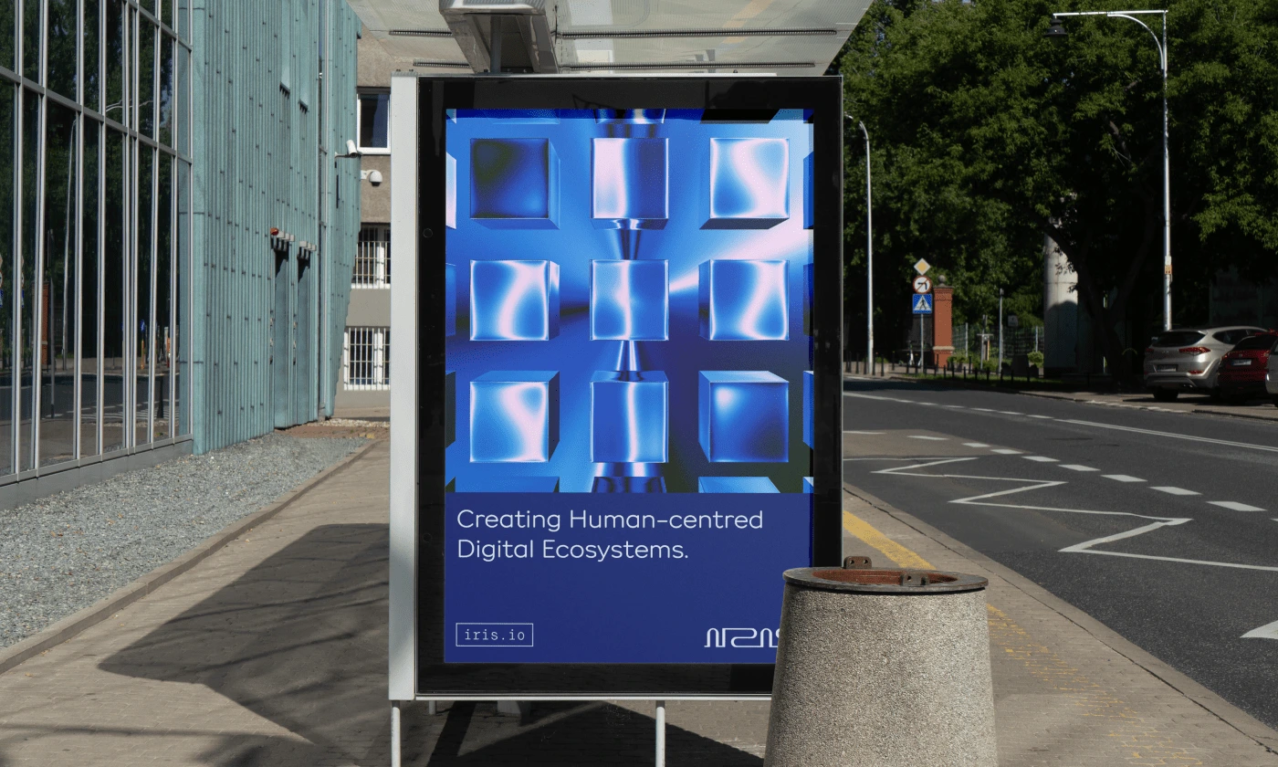
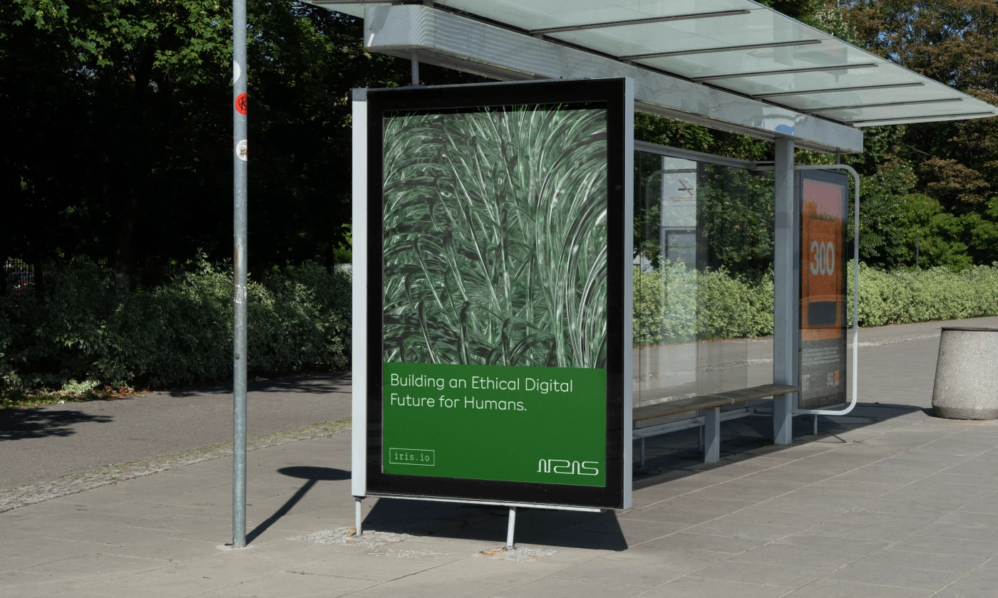
Succinctly defining IRIS’ vision made it possible to communicate their mission with brevity and adequate gravity.
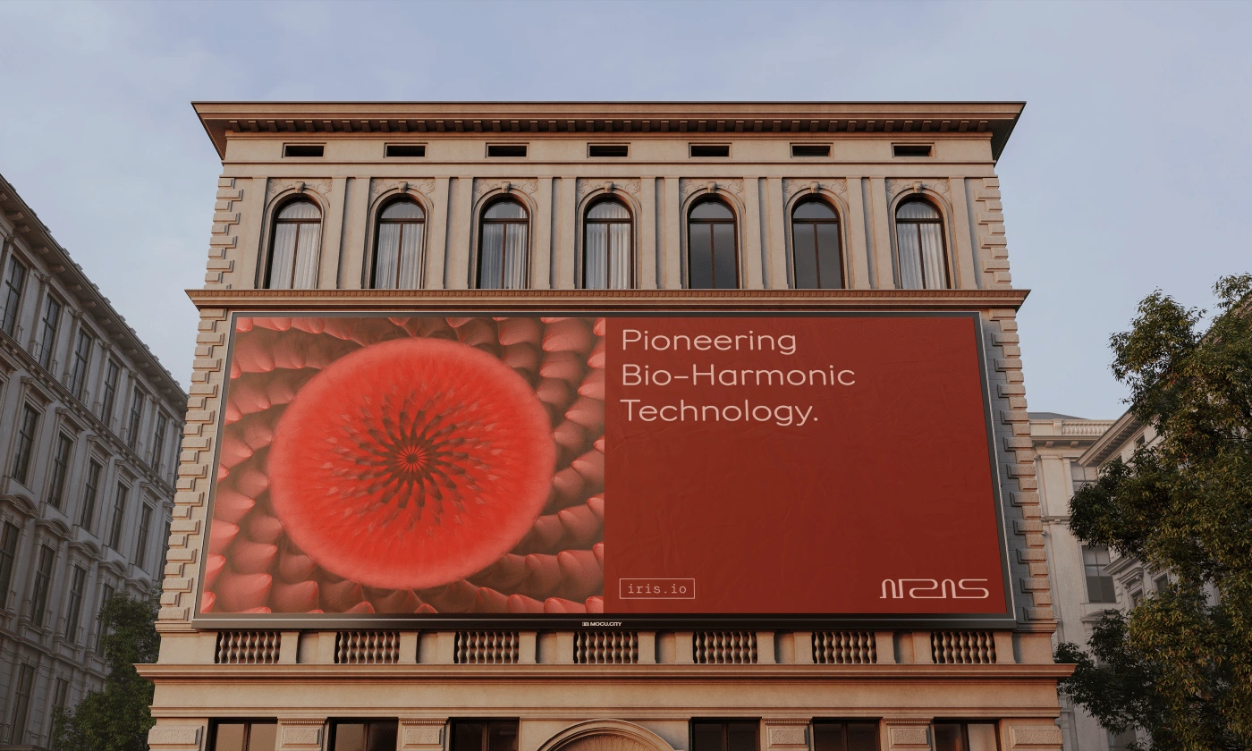
“Pioneering Bio-Harmonic Technology,” “Building an Ethical Digital Future for Humans,” and “Creating Human-centered Digital Ecosystems” are the brand’s core missions distilled from their resolute vision.
Further pairing these salient messages with abstract imagery allows IRIS to be equally verbal and visually evocative.
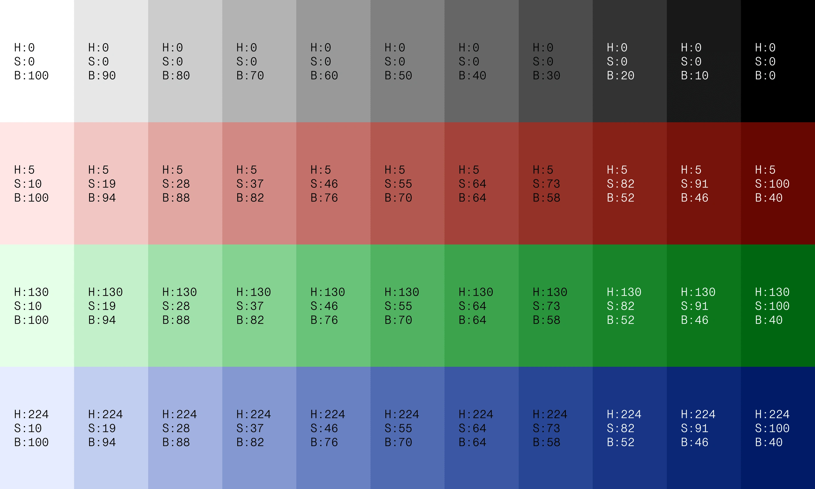
IRIS' chromatic color palette, adapted from the RGB color model used in digital interfaces, is applied exclusively in monochromatic pairings following a custom color system to ensure a cohesive visual hierarchy across all hues.
An achromatic color palette, suitable and preferred for a more muted and subdued appearance, complements the vivid chromatic palette.
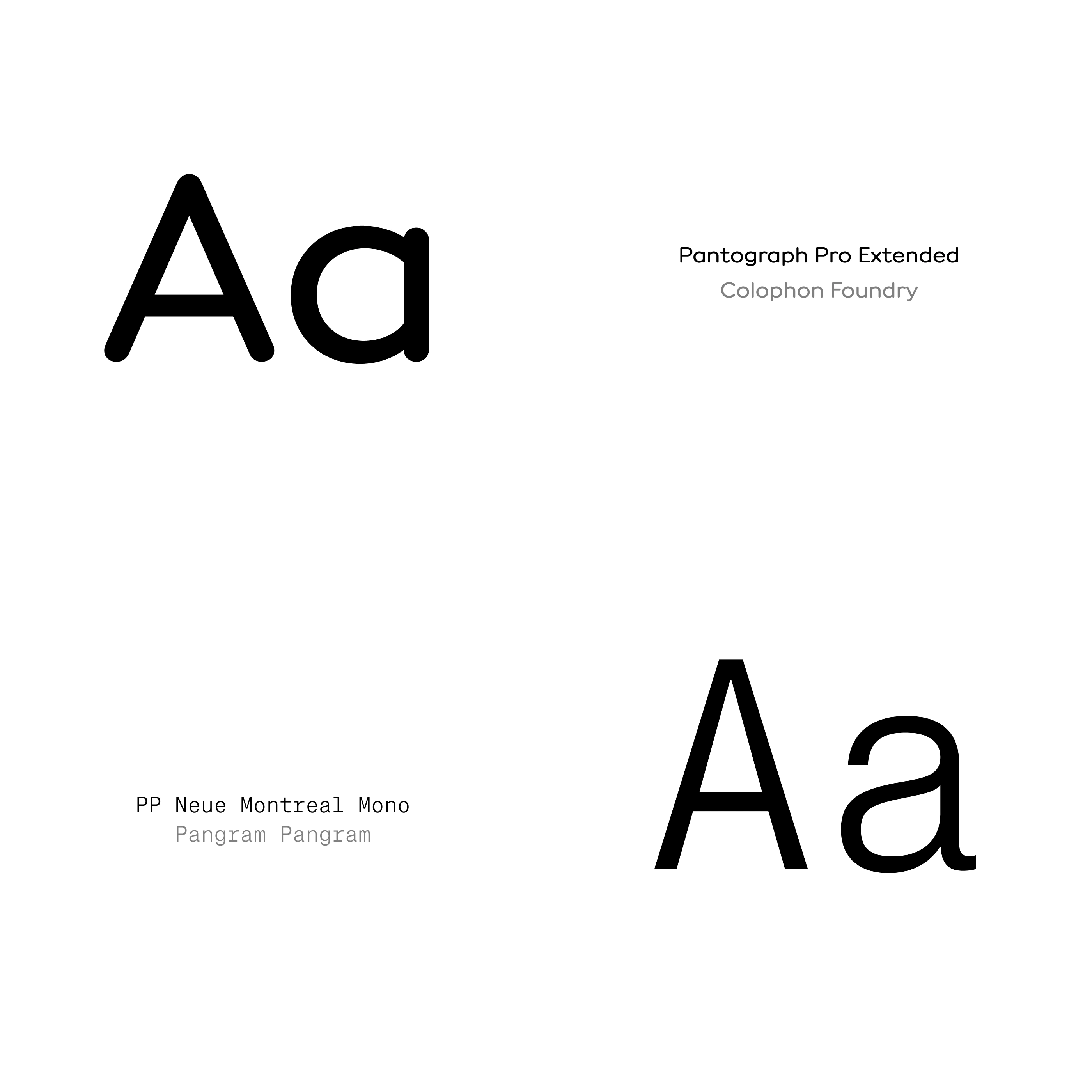
IRIS’ primary typeface used across all mediums is Pantograph Pro, a rounded san-serif typeface designed by Colophon Foundry. The extended variant is preferred—for most contexts—because it mirrors the elongated form of the logo.
PP Neue Montreal mono, a mono-spaced sans-serif typeface designed by Pangram Pangram, is IRIS’ auxiliary typeface. It is used exclusively for accents and to contrast the primary typeface.
“IRIS” was chosen specifically for its human subtext and because it forms part of our core optical anatomy, allowing us to interact visually with the world around us.
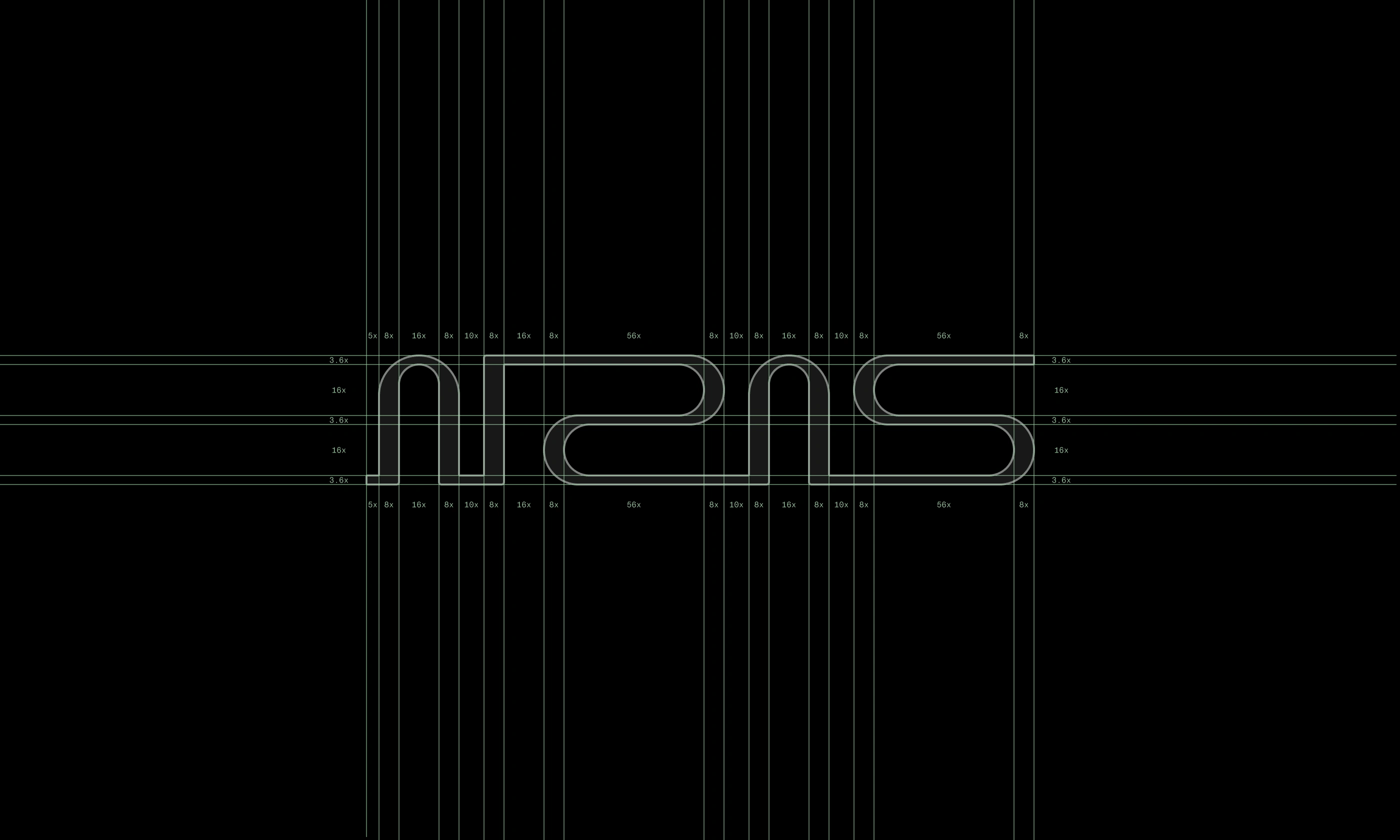
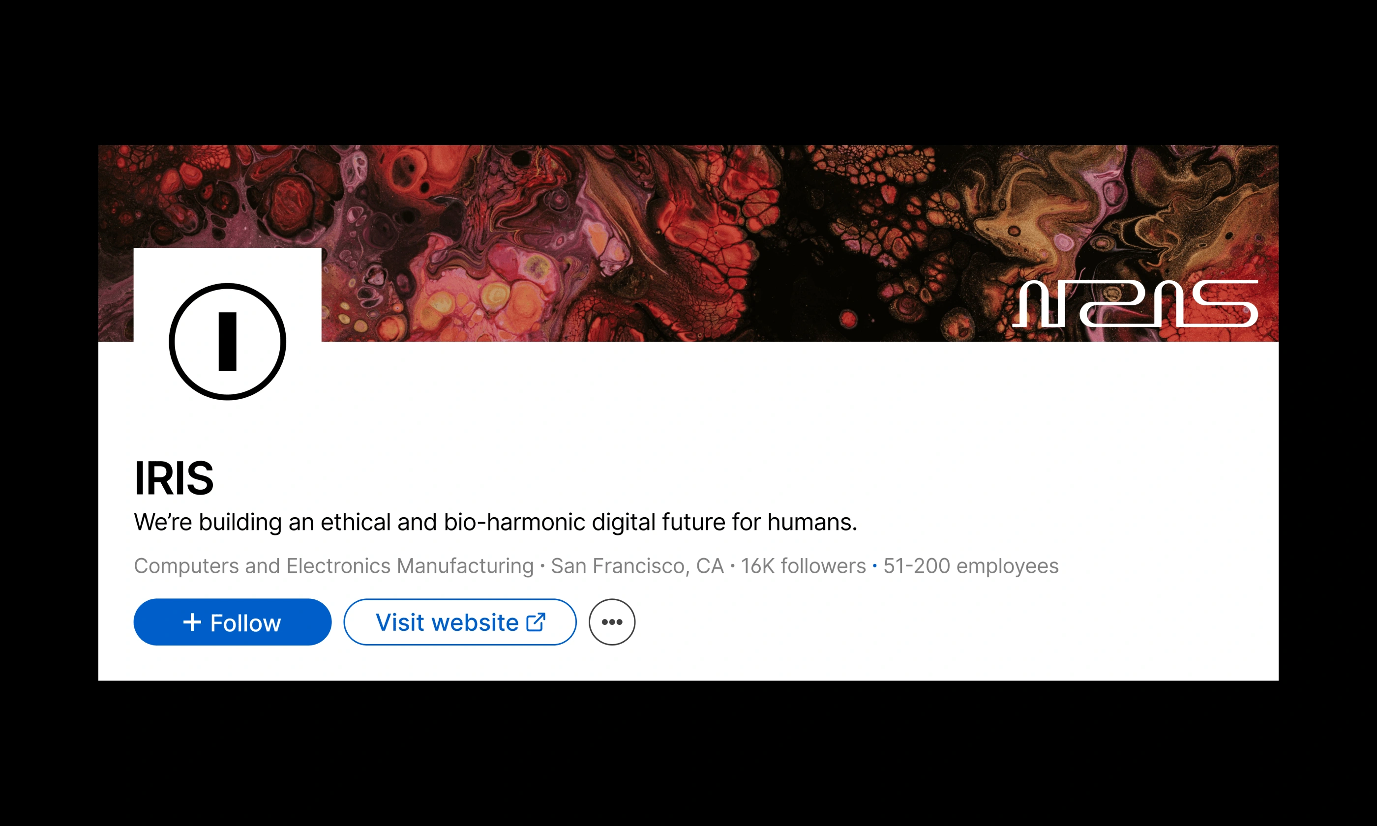
The logo is a bespoke word-mark of the brand’s name, featuring interwoven ligatures—a nod to the brand’s philosophy and vision for a bio-harmonic future.
The brand icon—used exclusively for small or subtle contexts—features a visual ‘triple entendre’ and can be interpreted as the brand’s initial enclosed in a circle, as 0 and 1(which form the core of the digital world), and an abstract eye.
Like this project
Posted Sep 11, 2024
A company with a vision to redefine how we interact with our digital ecosystem by ethically leveraging advancements with artificial intelligence systems and aug
Likes
0
Views
0


