Molecuve Rebranding Project
Tanzeel Haider
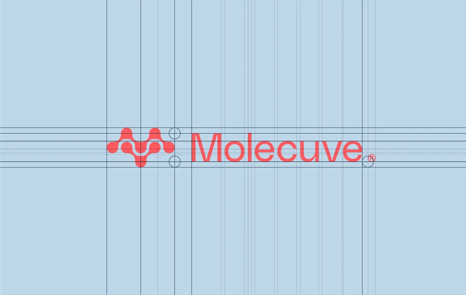
Molecuve
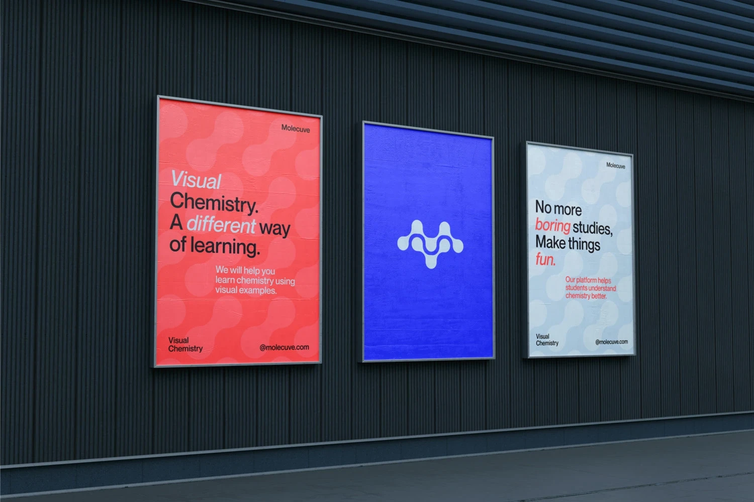
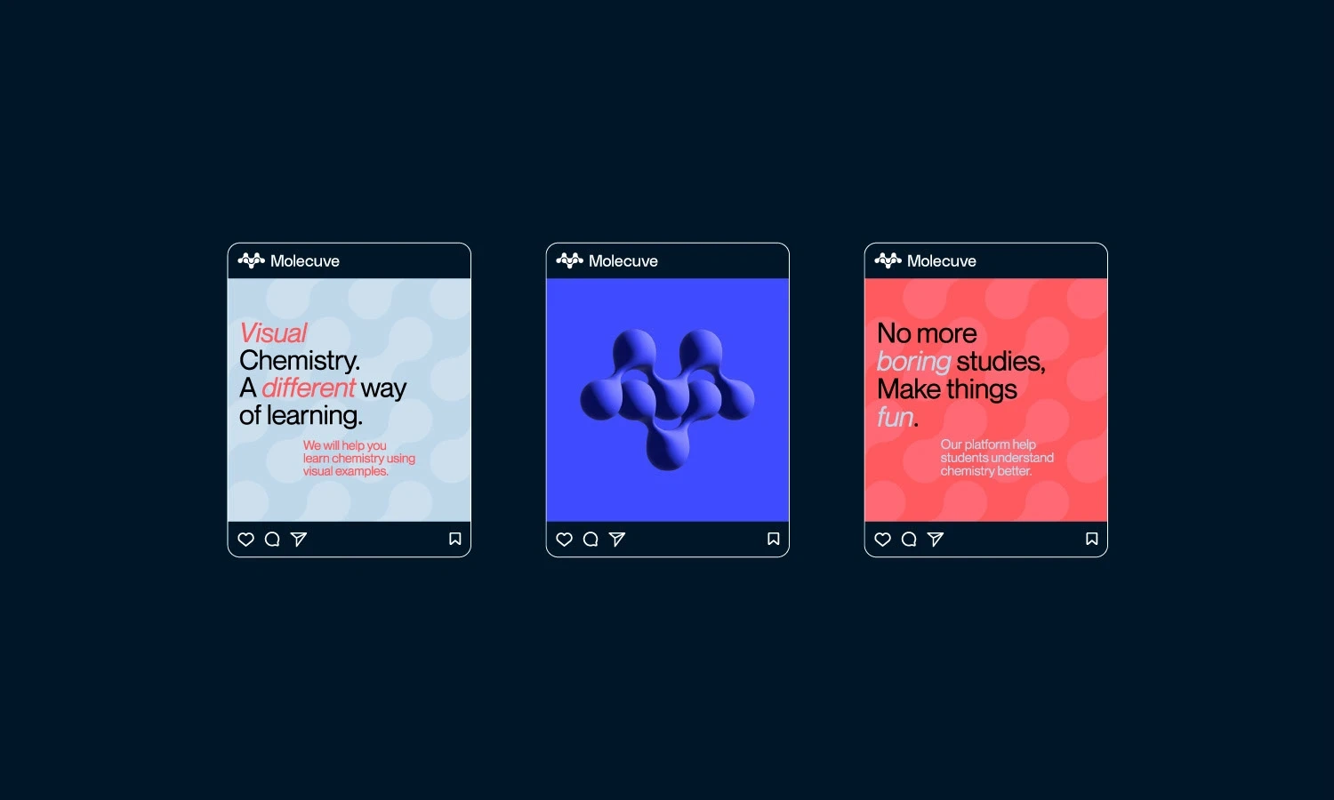
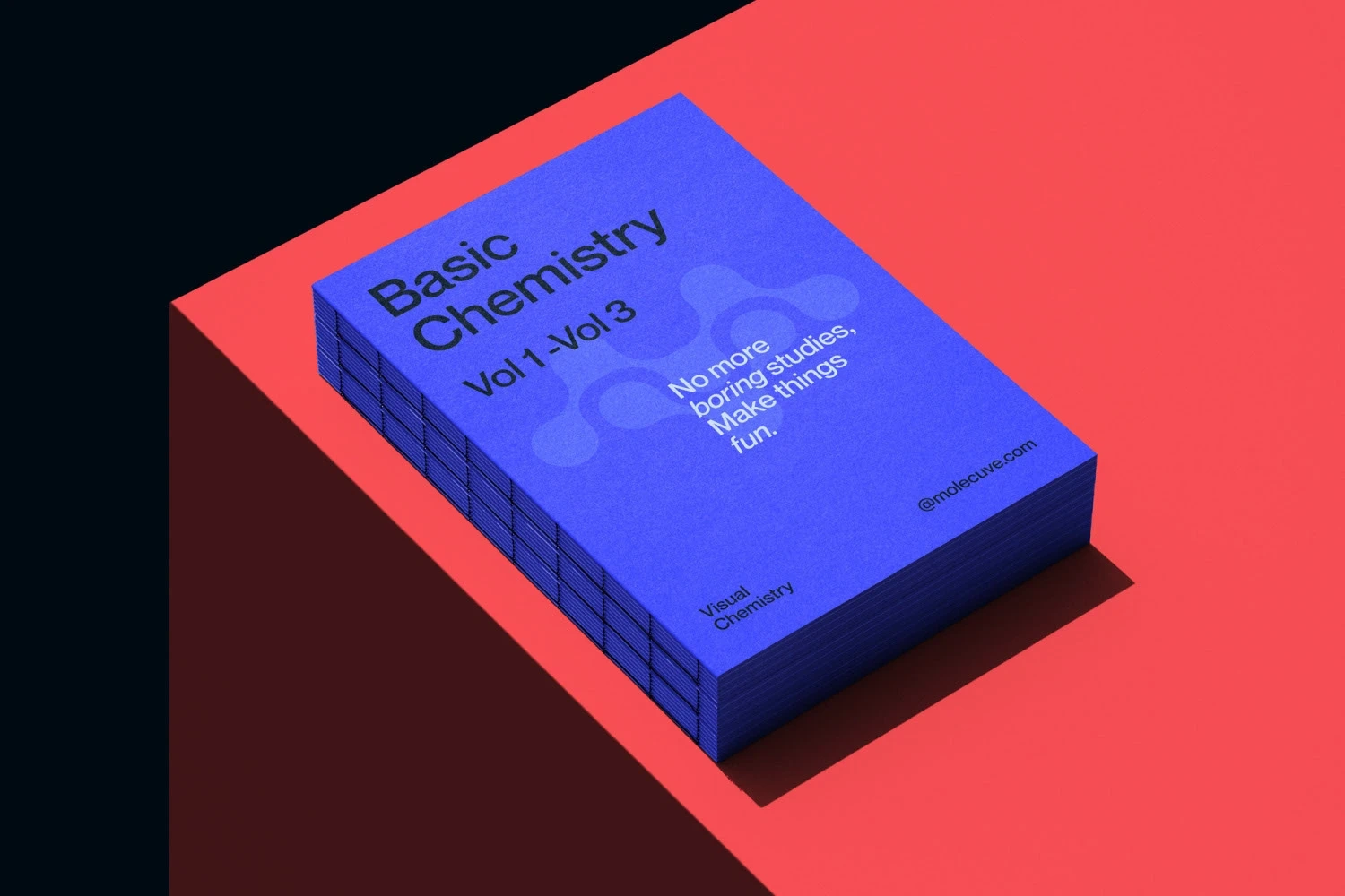
Molecuve is a modern online learning platform designed to simplify and enhance the learning experience. Unlike traditional methods that rely on lengthy theoretical texts, Molecuve offers concise, focused content supported by engaging visual representations and animations. Research underscores that visual learning is significantly more effective than purely text-based approaches, making Molecuve a forward-thinking choice for education.
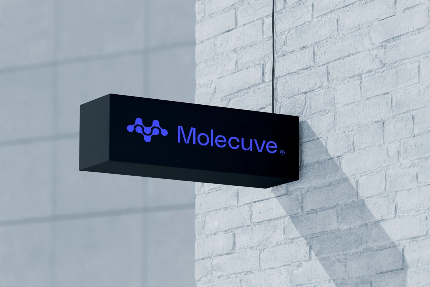
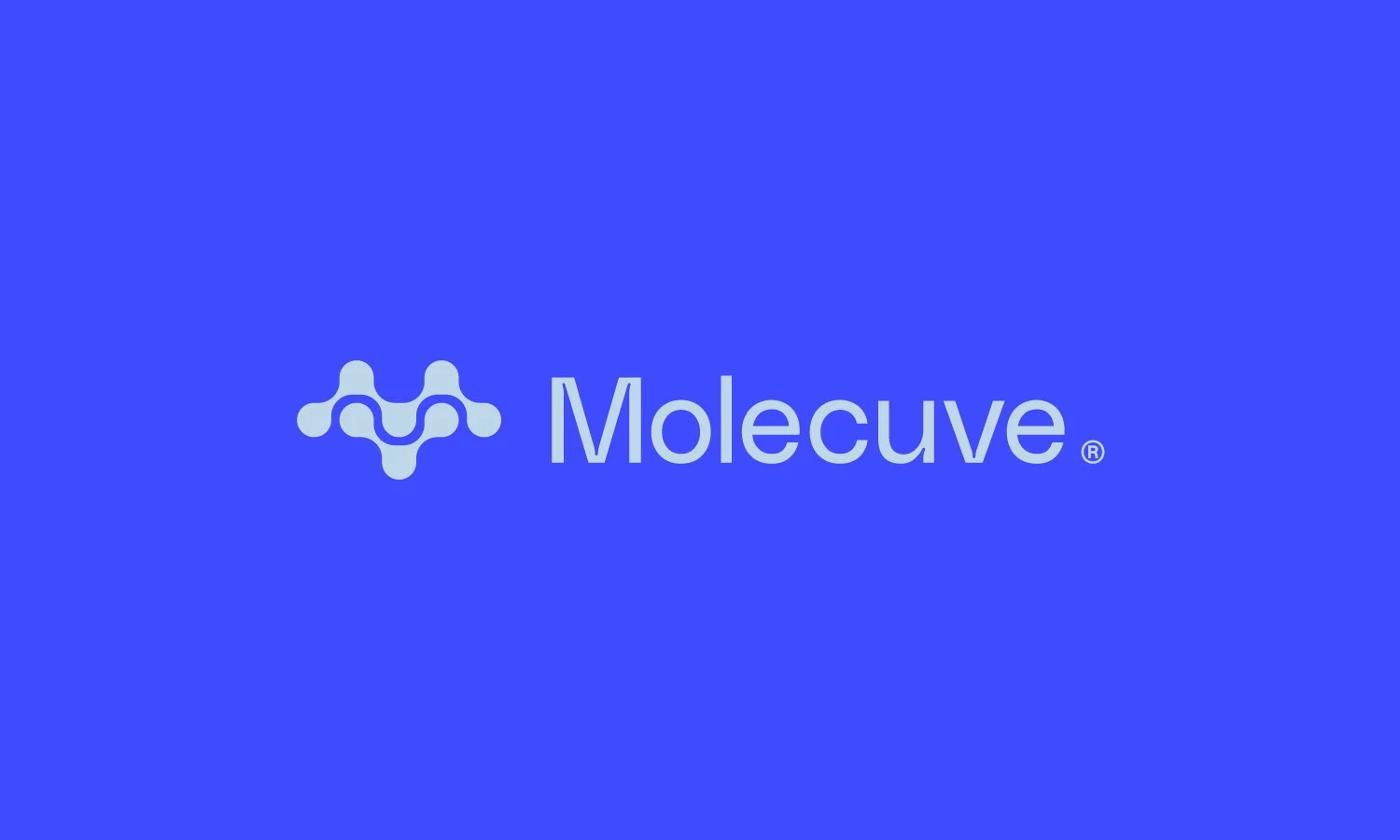
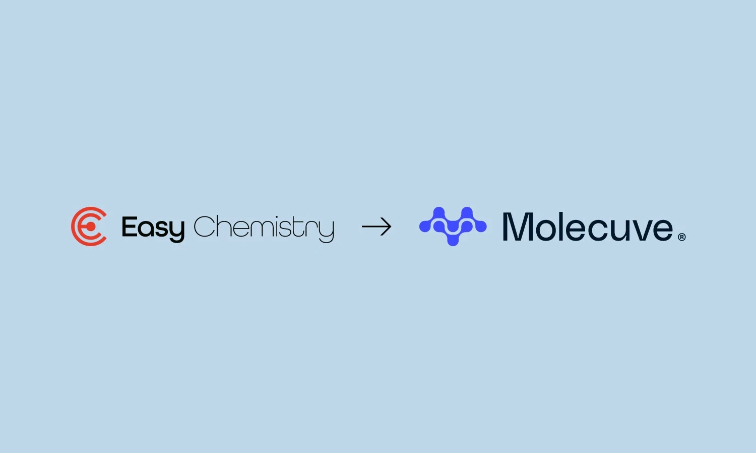
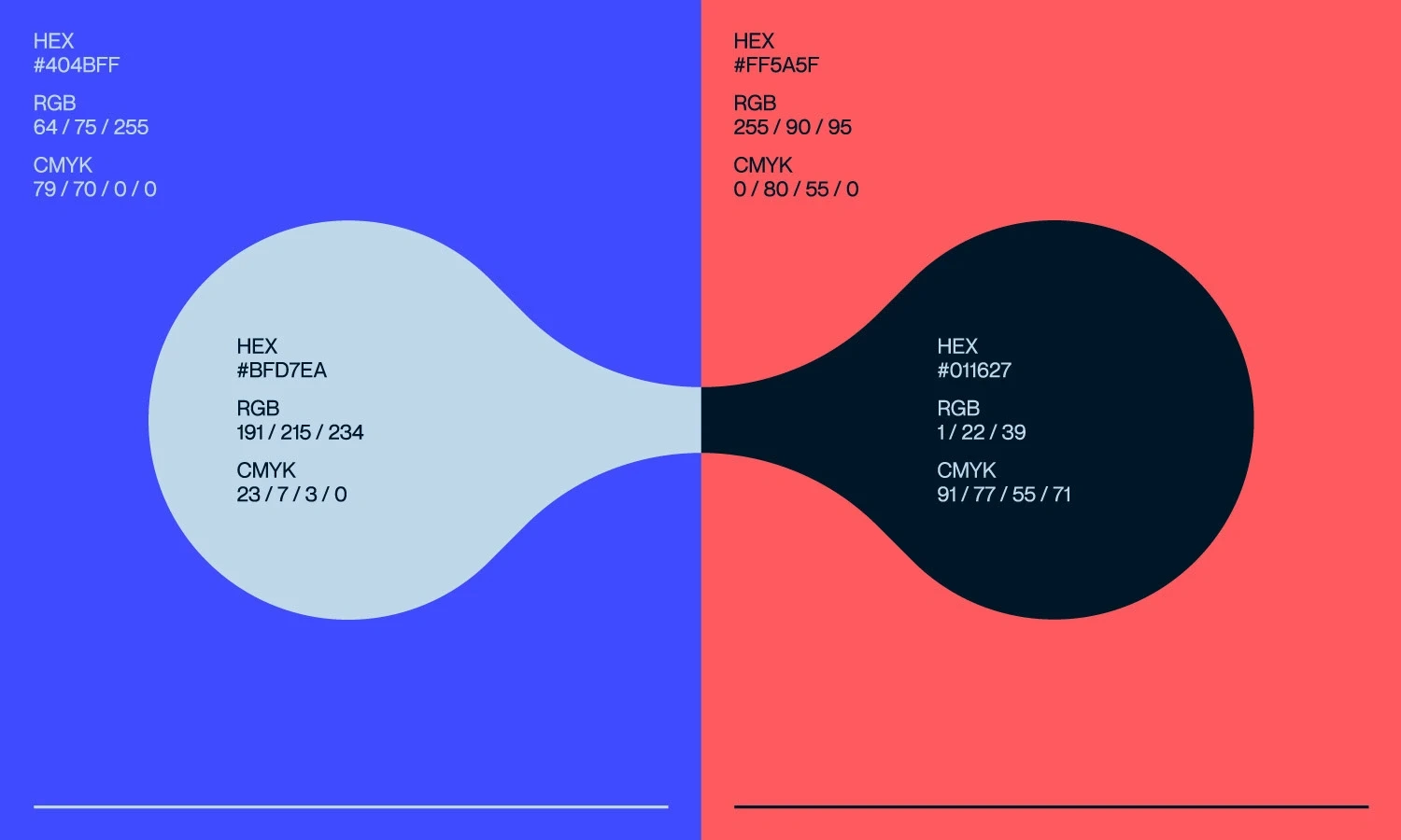
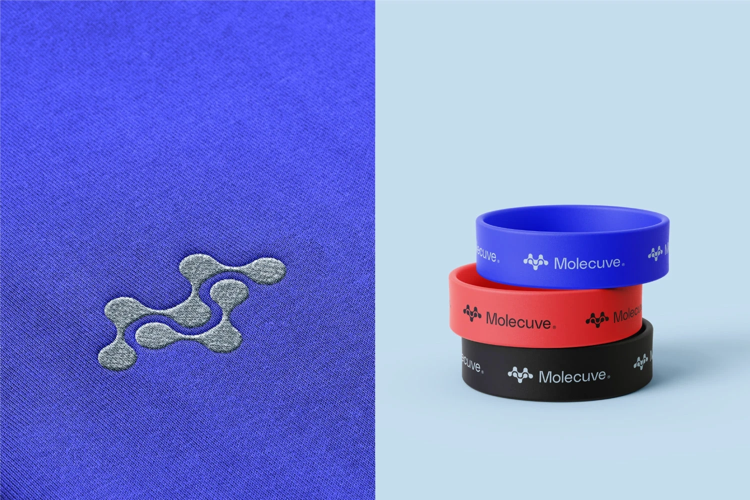
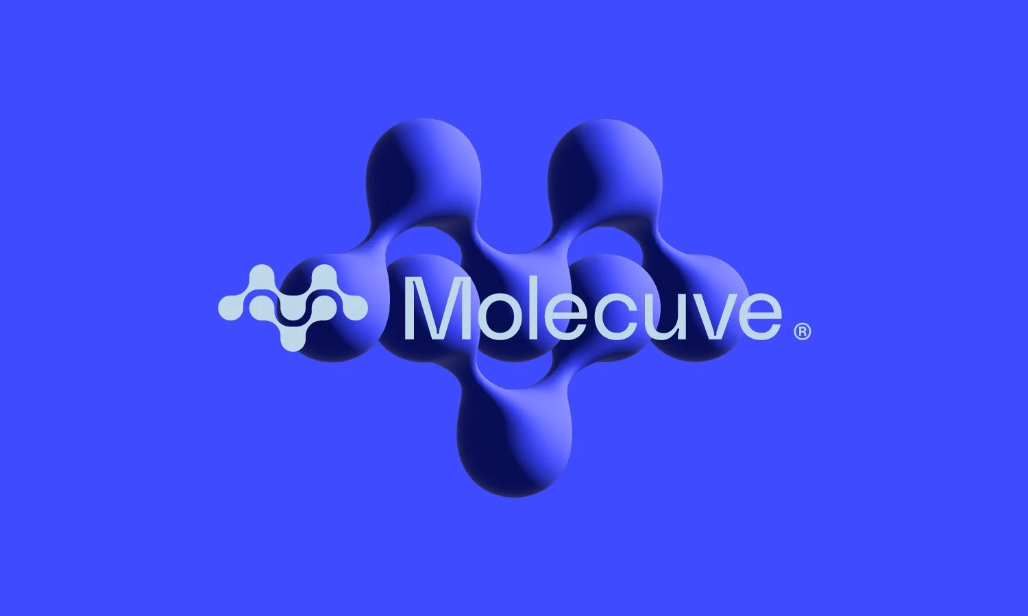
The company’s branding has undergone a thoughtful transformation. The previous logo lacked distinction in a crowded market, prompting the need for a complete rebrand. After extensive discussions, the name "Molecuve" was proposed, a creative twist on the word "molecule," with the letter "i" replaced by "v," reflecting the client’s last name. The name, paired with rounded geometric curves in the design, conveys approachability and fosters a stronger connection with the audience.
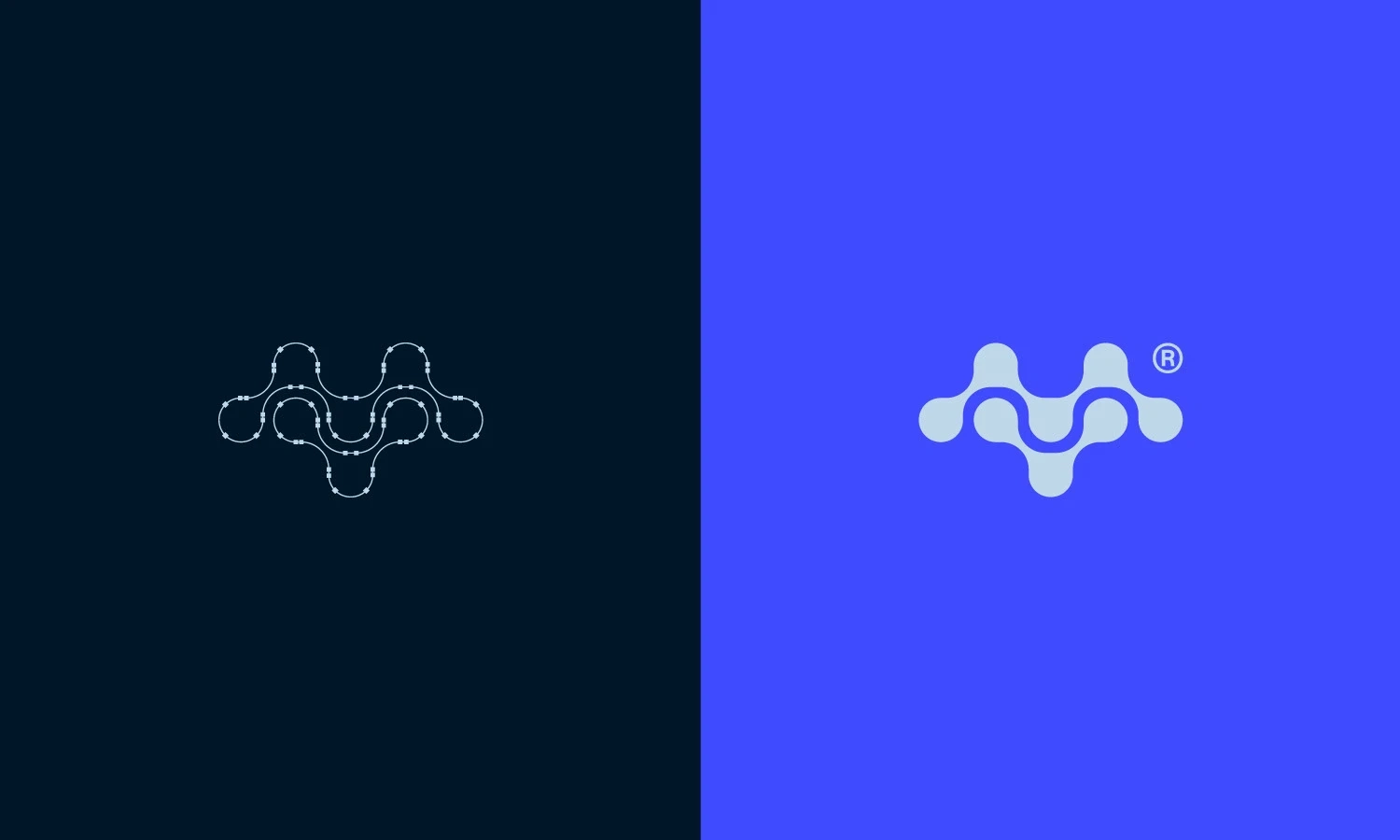
Rounded, approachable forms meet scientific credibility. The molecular nodes symbolize interconnected learning, perfectly reflecting how Molecuve breaks down complex concepts into digestible, visual experiences.
—


Like this project
Posted Nov 2, 2025
Rebranded Molecuve with a new name and logo for better market distinction.