
Brand Strategy | Branding and Visual Identity | Packaging Design
The brief for Fold Pastries was simple: build an identity for an African pastry shop that brings the rich history of African sweets to the forefront. What began as a design project evolved into a profound lesson in African food culture and the incredible diversity of a single pastry. Our role at Debugged was to introduce the brand for what it does best—crafting artisanal pastries—in a uniquely African way. We built a visual language that communicates the values and recipes Fold Pastries holds dear, creating an identity that is both authentically African and a testament to the mastery of the craft.
Brand Strategy
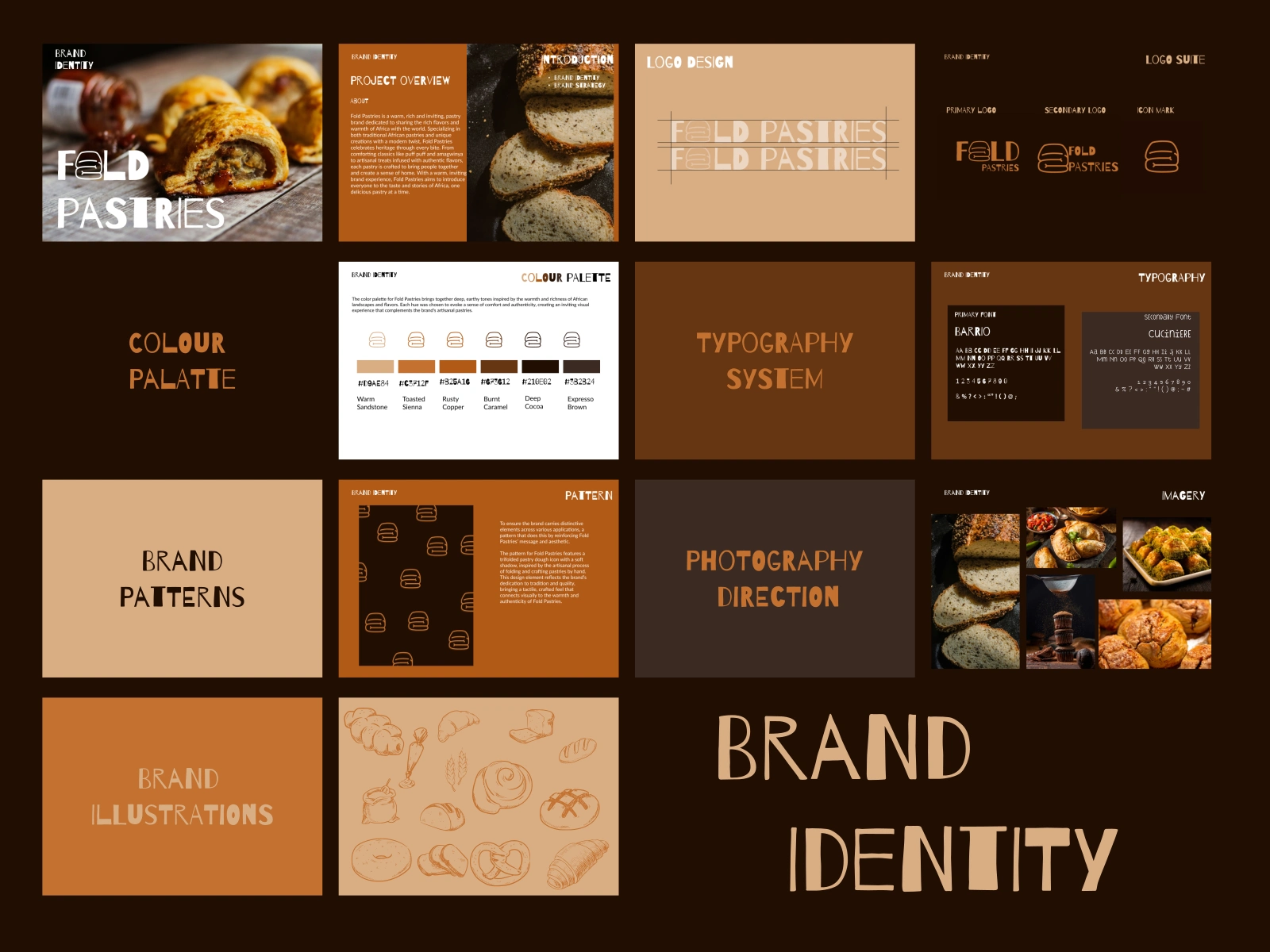
When approaching the strategy for Fold Pastries, we wanted to anchor the brand in the concept of heritage and home. While pastries are a global staple, the narrative of African-specific pastries is one that is often unheard of. We positioned the brand as a bridge between traditional African comfort and modern artisanal quality. The strategy was less about selling a snack and more about inviting people to experience a story—one of warmth, community, and the rich, diverse landscapes of Africa. By focusing on the emotional connection of "bringing people together," we created a foundation that feels grounded, authentic, and deeply inviting.
Branding and Visual Identity
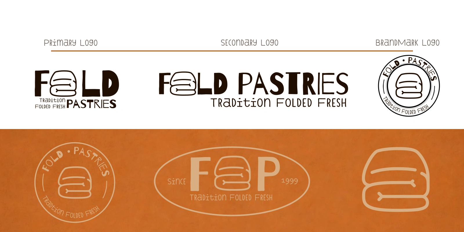
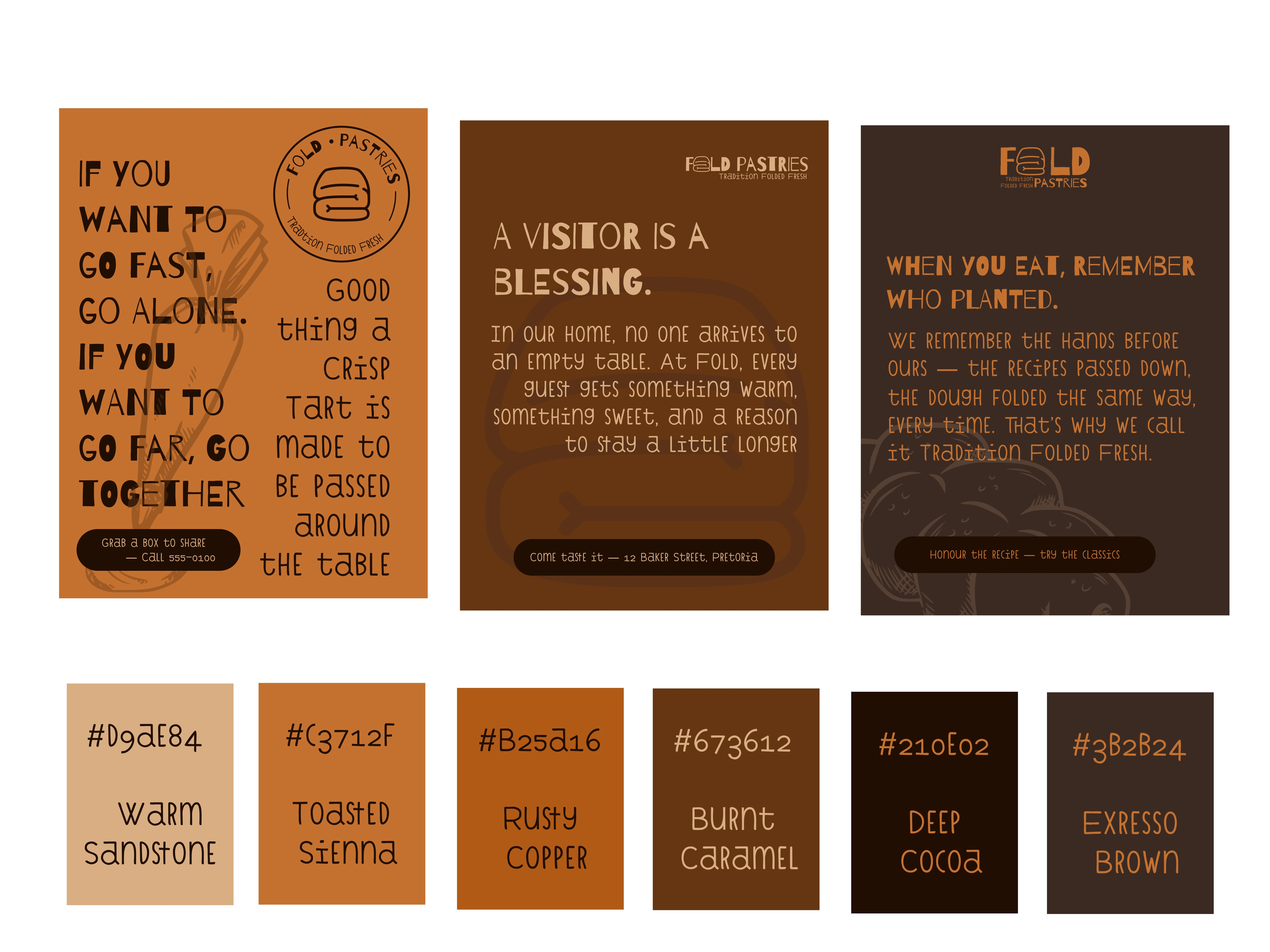
For the visual identity, we wanted to eschew the bright, primary colors often associated with modern bakeries in favor of a palette that feels like the earth itself. We utilized deep, earthy tones—burnt caramels, rustic coppers, and espresso browns—to evoke a sense of comfort and authenticity. The typography pairing of a bold, structural font like Barrio with the handwritten and warm Cuciniere was chosen to balance tradition with approachability. Every element was designed to feel less like a corporate logo and more like a stamp of quality, ensuring that the Fold Pastries identity immediately communicates the warmth and richness of the African continent.
Packaging Design
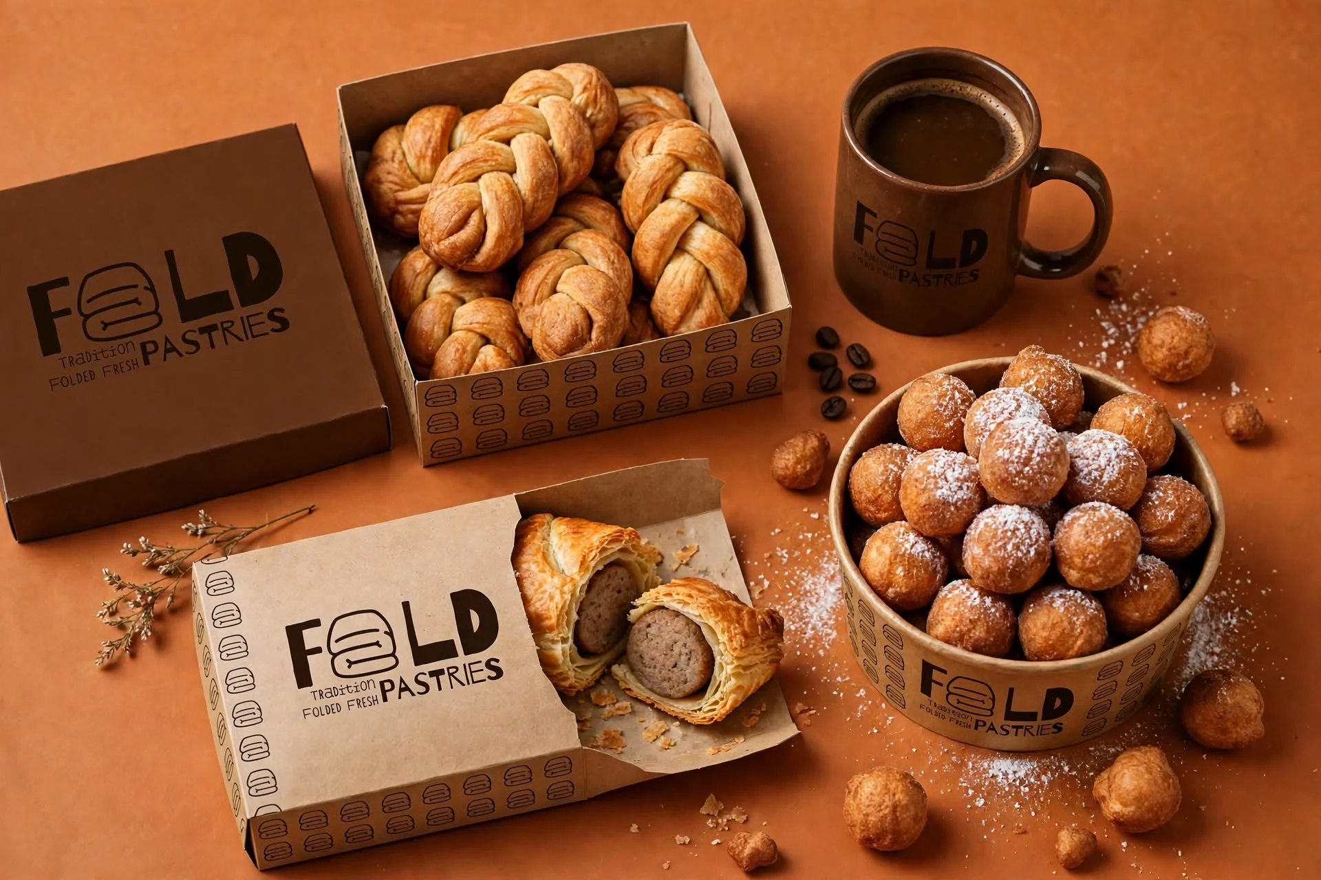
The packaging design was a direct extension of the brand's core desire to make every customer feel at home. We aimed to create a tactile experience that mirrors the artisanal nature of the pastries themselves. By utilizing natural textures and a minimal, elegant application of the brand’s earthy color palette, the packaging serves as a physical invitation to slow down and savor the moment. It was important to us that the packaging didn't just protect the food, but honored the heritage of the recipes inside, ensuring that the moment of unboxing felt as thoughtful and rich as the food itself.
Collateral
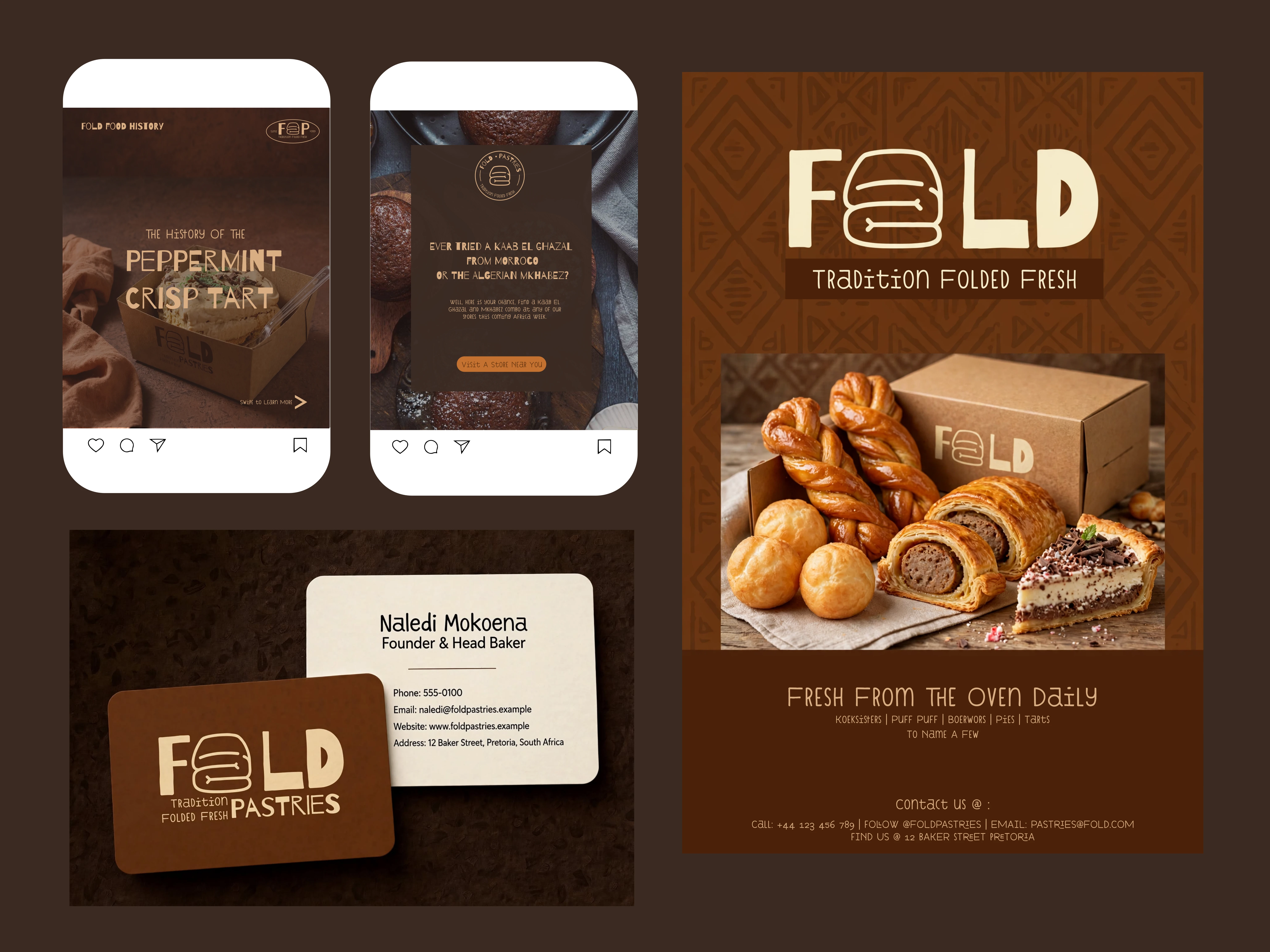
When designing the brand collateral—from business cards to social media
presence—we focused on creating a seamless, calm experience across all touchpoints. We wanted the brand to feel cohesive and grounded, whether you were holding a physical flyer or scrolling through a feed. The layout choices were intentionally restrained, giving breathing room to the imagery and the logo. This approach reinforces the brand's thoughtful tone; the collateral is designed to be informative yet unobtrusive, acting as a quiet guide that leads the viewer to the sensory experience of the food rather than overwhelming them with visual noise.
Custom Illustrations
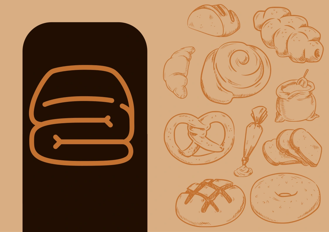
The custom illustrations were born from a desire to capture the "artisanal products" in a unique way. We created a specific tri-folded pastry icon that serves as the brand's visual signature. Then added illustrations of some of the pastries sold to give it a warmer feel. The goal was to visually represent the act of folding and crafting—the human touch behind every pastry. These illustrations act as a bridge between the abstract and the tangible, offering a distinct, recognizable symbol and illustrations that feels both traditional and modern. They are a celebration of the craft and the heritage that goes into every single fold of the dough.
Pattern Design
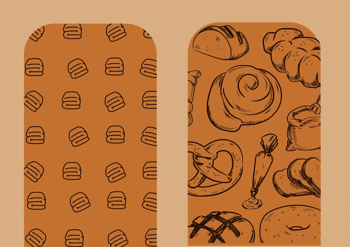
The pattern for Fold Pastries was conceived as a way to carry the brand’s distinctive elements across various applications while reinforcing its message. We wanted the pattern to feel rhythmic and consistent, much like the process of baking itself. By repeating the tri-fold pastry icon against the deep espresso background, we created a visual texture that is both subtle and sophisticated. This pattern brings a tactile, crafted feel to the brand, ensuring that even in printed materials, the warmth and authenticity of the Fold Pastries experience are physically palpable. Yet for a more chaotic and authentic feel, a secondary pattern made up of baking elements was created to hold true to the free flowing nature of African food itself.
Photography Direction
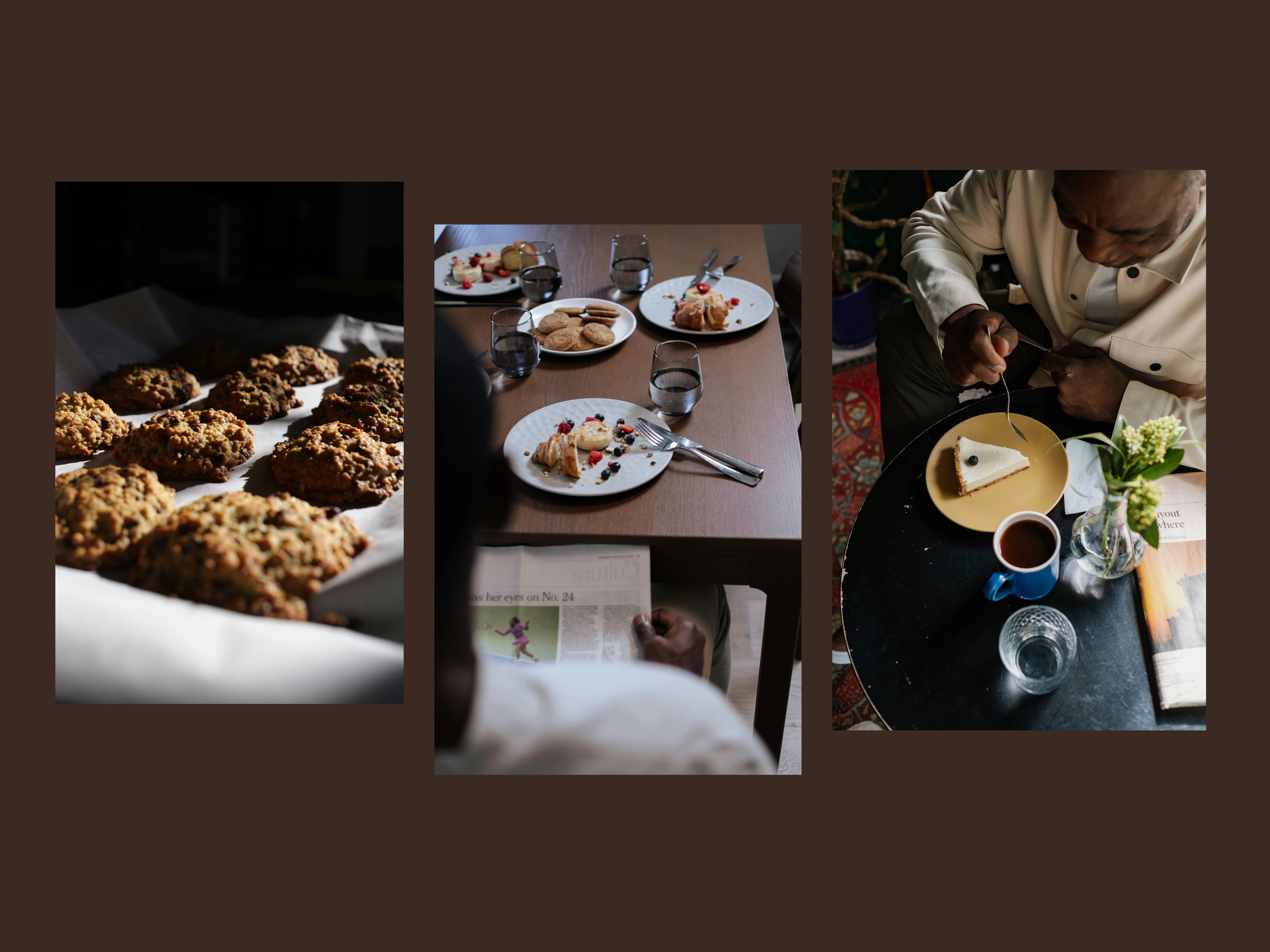
For the photography direction, we aimed for a style that feels moody, warm, and deeply sensory. We veered away from sterile, high-key food photography in favor of compositions that emphasize texture, moisture, and shadow. The goal was to make the viewer feel the crunch of the crust and the warmth of the spice. By using dark, moody backgrounds and focusing on the rich, golden hues of the pastries, we positioned the food as the hero. We also chose imagery that shows sides and angles of people creating a sense of framing the food itself. The photography direction is designed to evoke an immediate, physical response—a craving not just for the food, but for the comfort and history it represents.
0 likes · 3 views · Nov 17, 2026
Crafted a comprehensive brand identity and strategy translating African food heritage into a warm, artisanal visual experience.

