
An idea shaped for every brand
A brand's personality should come through in every piece of content. This selection brings together projects with different audiences, ambitions and visual worlds, each approached with its own creative direction.
My contribution connects concept development, art direction and design: finding a compelling way into the subject, building a recognisable visual language and carrying it across the content.
Coren-SP — A campaign with presence and purpose
For a campaign recognising nursing professionals, I developed a visual language that gave the people behind the profession a commanding presence. Black-and-white portraits, white cutout outlines and bold yellow typography created a cohesive campaign around recognition and respect.
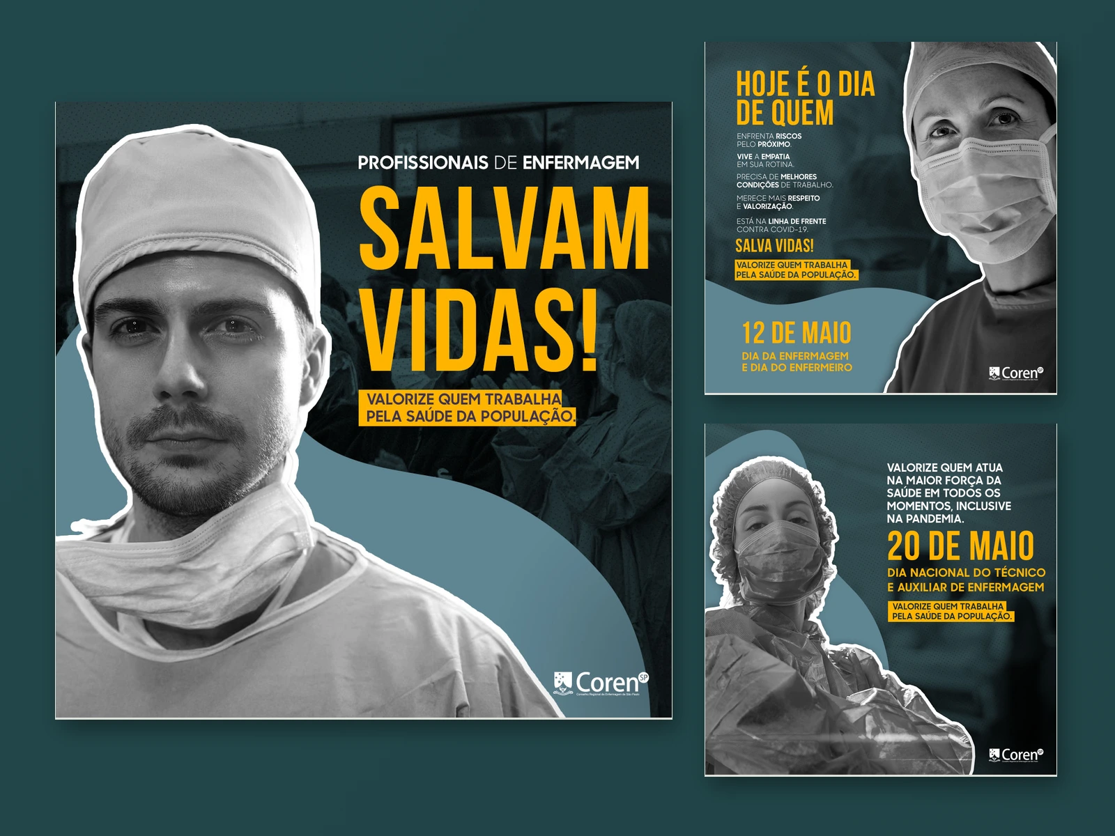
The campaign achieved 1 million organic impressions. Its organic performance meant no subsequent paid media support was needed.
Governo RJ — Turning the subject into the concept
Working across public health, environmental awareness and seasonal communication called for a broad creative range. A blood donation message became part of a tattoo; the state's silhouette became a Christmas ornament. In each piece, the visual idea connected the message to something familiar and specific.
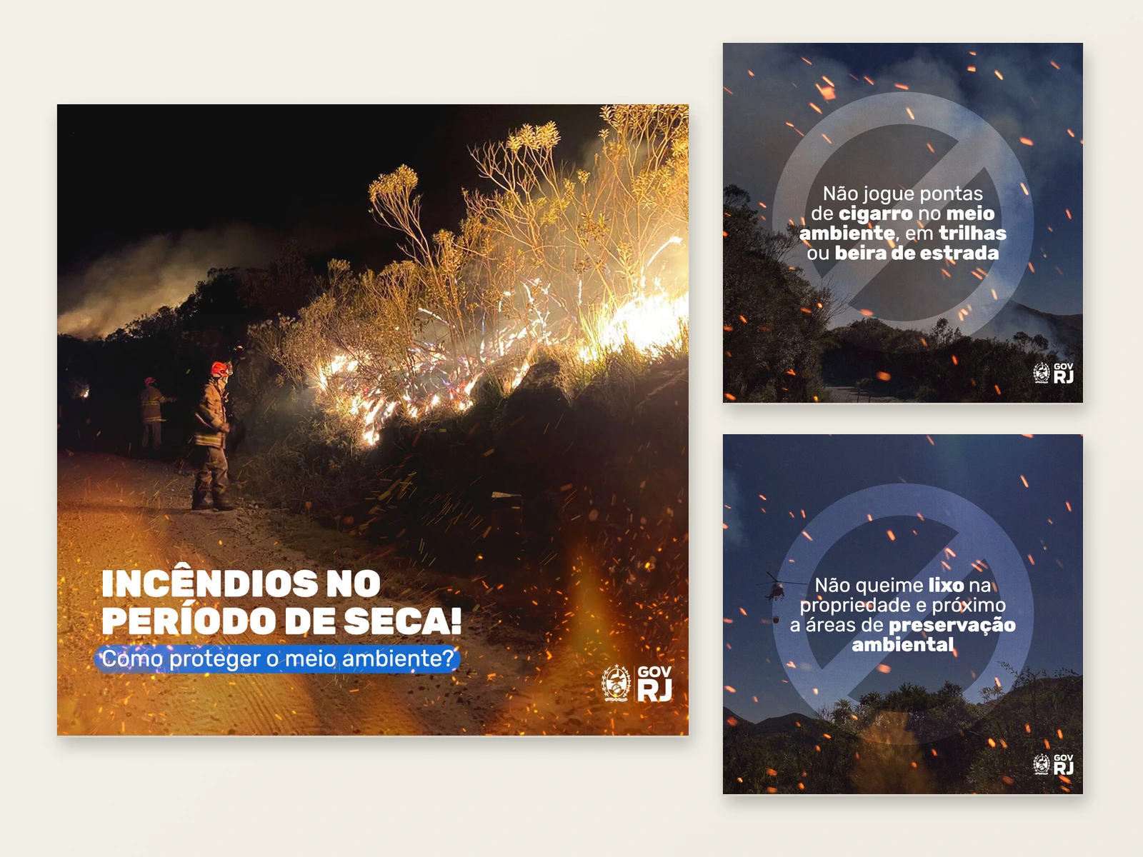
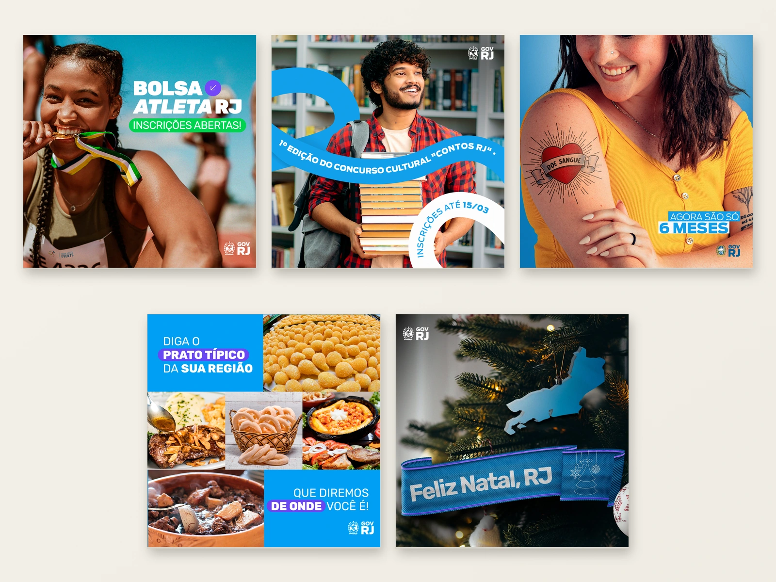
For educational carousels, I built sequences using photographic composition, collage and typographic hierarchy. The challenge was to give each subject a distinct treatment while maintaining the government's brand presence across the work.
Beauty & aesthetics — A voice of their own
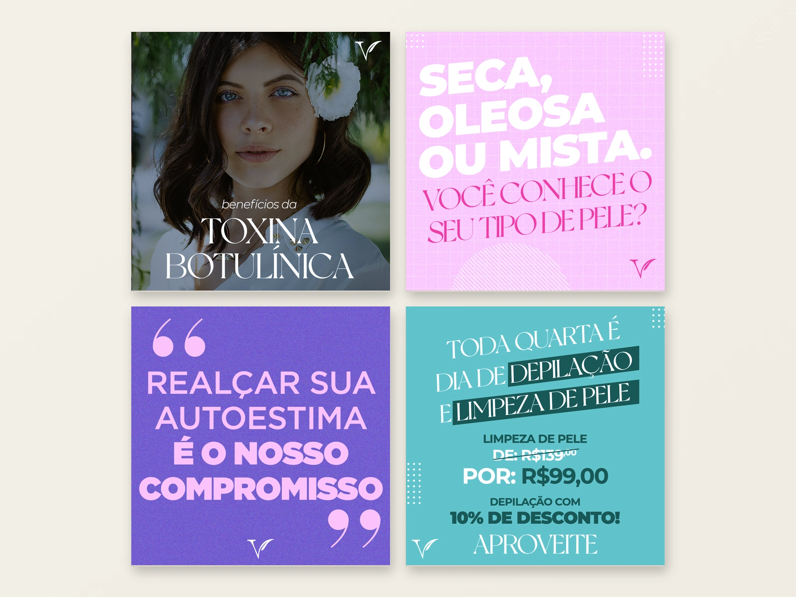
These projects explore different ways of giving beauty and aesthetics content a recognisable personality. Reminder notifications and search bars brought familiar digital behaviours into the creative concept, framing the subjects as questions and concerns from everyday life.
For VOG, expressive typography, portrait photography and contrasting colours established another visual register. Across both approaches, the design choices were shaped around the brand's tone and the message each piece needed to carry.
Riocard Mais — From campaign system to everyday relevance
For Clube Riocard Mais, I developed a vibrant campaign language around the brand's benefits. Dimensional elements, illuminated frames and a strong colour palette connected the pieces, with a clear hierarchy between the offer, supporting information and call to action.
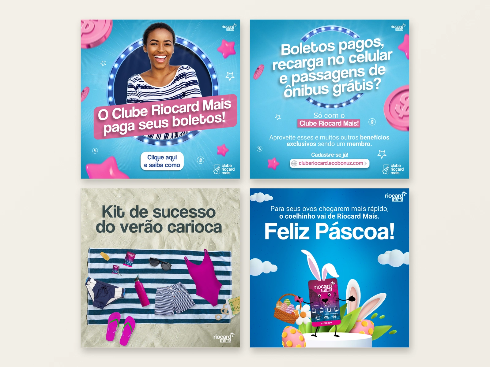
Seasonal content extended the creative range: a card placed among the essentials for a Rio beach day, or transformed into an Easter character. These pieces found a role for the product within the occasion, carrying the brand beyond a conventional seasonal greeting.
Petra Belas Artes — A new release, a new visual world
For Petra Belas Artes, a street cinema, I created weekly Facebook covers inspired by the latest film release. Each title became a new art direction exercise, translating its atmosphere into colour, imagery, typography and composition.
The series moves between cinematic genres and visual styles while keeping the cinema present throughout. It shows my ability to reinterpret references and build a new composition around the character of each release.
Clube Melissa — A visual world with attitude
Classical sculpture, neon colours and product imagery came together in a playful collage language for Clube Melissa. The compositions use contrast, unexpected combinations and a strong sense of colour to give the products an expressive setting.
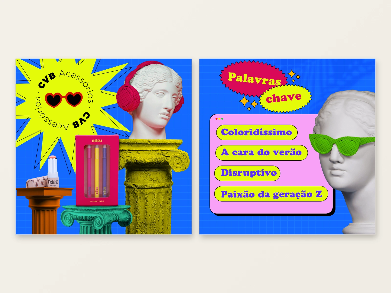
It is another expression of the same creative skill: finding the right visual world for a brand, then making its elements work together with intention.
0 likes · 0 views · Nov 19, 2026
Creative concepts and distinctive visual systems for brands across culture, beauty, public services and consumer products. A selection of work connecting origin


