Redesign of Llama Pay's Website and Docs
David Akanbi
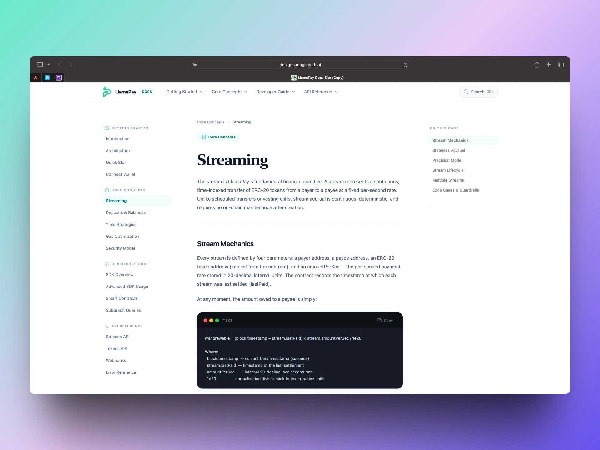
Docs site for LlamaPay
I worked on the redesign of the Llama Pay website and its developer documentation, contributing across both interface design and content to improve the overall user experience.
Llama Pay enables on-chain payment streaming, but like many Web3 products, the complexity of the system can make it difficult for new users and developers to quickly understand and get started. The existing experience didn’t clearly communicate the product’s value or provide a smooth onboarding path.
As part of this process, I also experimented with Magic Path to explore more guided, step-by-step flows within the documentation aiming to move away from static content toward a more interactive onboarding experience.
Tools used: Magic Path
My Process
I approached the project by first understanding how users interacted with both the website and documentation, identifying areas where clarity and structure were breaking down especially for first-time users. From there, I focused on simplifying the experience by restructuring content, refining messaging, and improving visual hierarchy across key pages. Instead of treating the docs as static reference material, I explored ways to make them more guided and actionable.
As part of this, I experimented with Magic Path to design step-by-step flows that help users navigate concepts more intuitively and reduce onboarding friction. Throughout the process, I iterated on both content and layout together, ensuring that what users see and what they read work cohesively to support understanding.
Preview Link
For Partnership And Collaboration
Whether you’re building a new product or refining an existing product, Let's lcollaborate and ship your idea to life
📧Email: davecsko@gmail.com
Like this project
Posted Mar 21, 2026
Worked on improving Llama Pay’s website and docs experience by simplifying messaging, restructuring content, and introducing guided onboarding flows.
Likes
1
Views
13