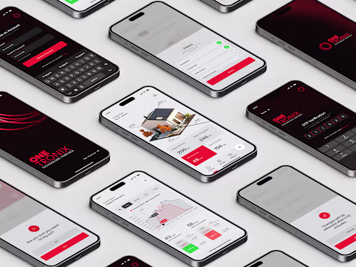
OneTronix - Solar Monitoring App Design
Ather Waseem
OneTronix | Solar Monitoring Mobile App
It is a solar energy monitoring app designed entirely from scratch, built for homeowners, offices, and businesses running solar panel installations.
OneTronix Solar Monitoring App Design
The Details
Solar monitoring isn't a simple category. The people using this app range from a homeowner checking their savings after a power cut to an installer managing dozens of client systems simultaneously. Designing for both without making either experience feel compromised was the core design challenge.
The app serves two distinct roles.
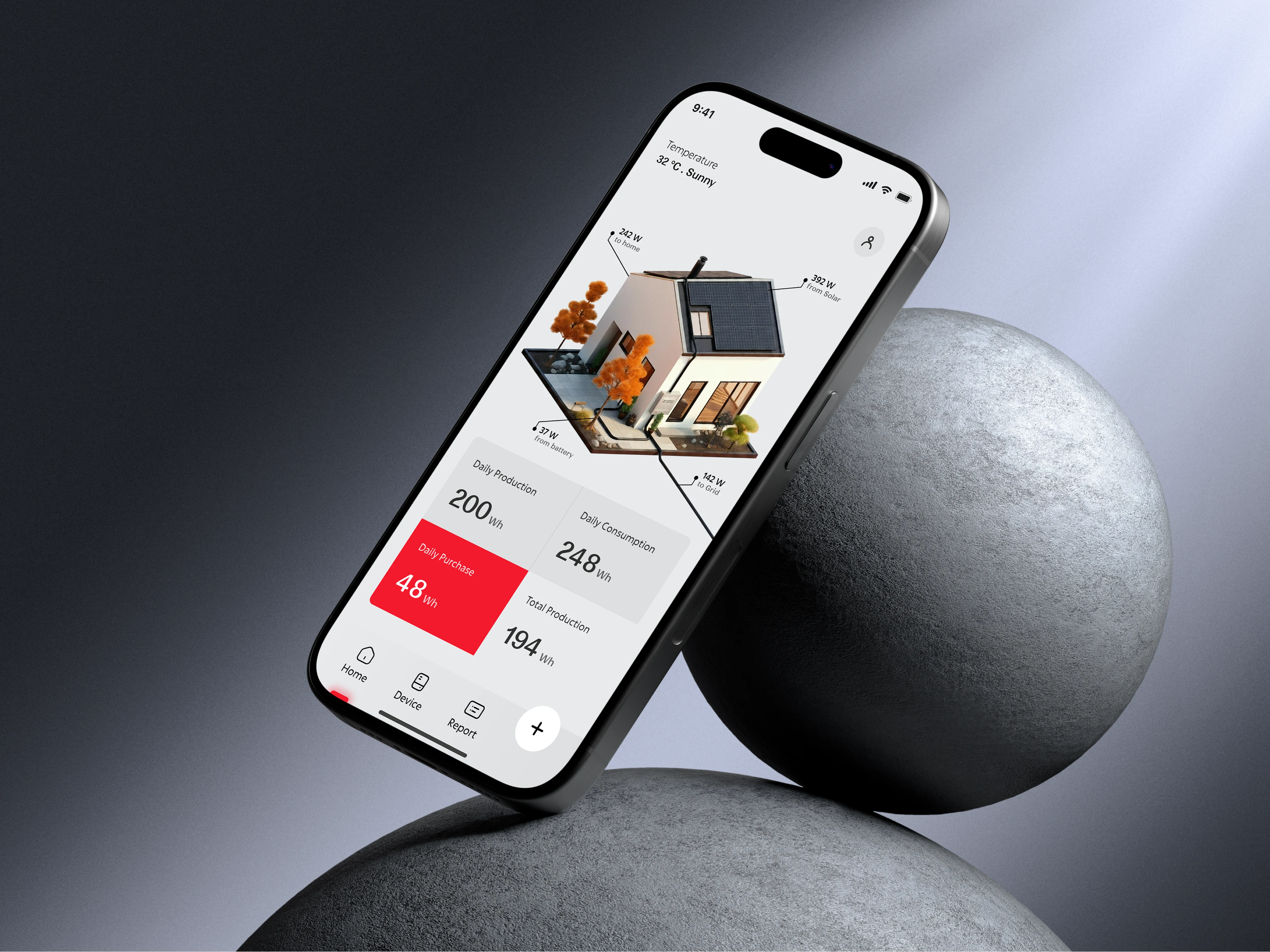
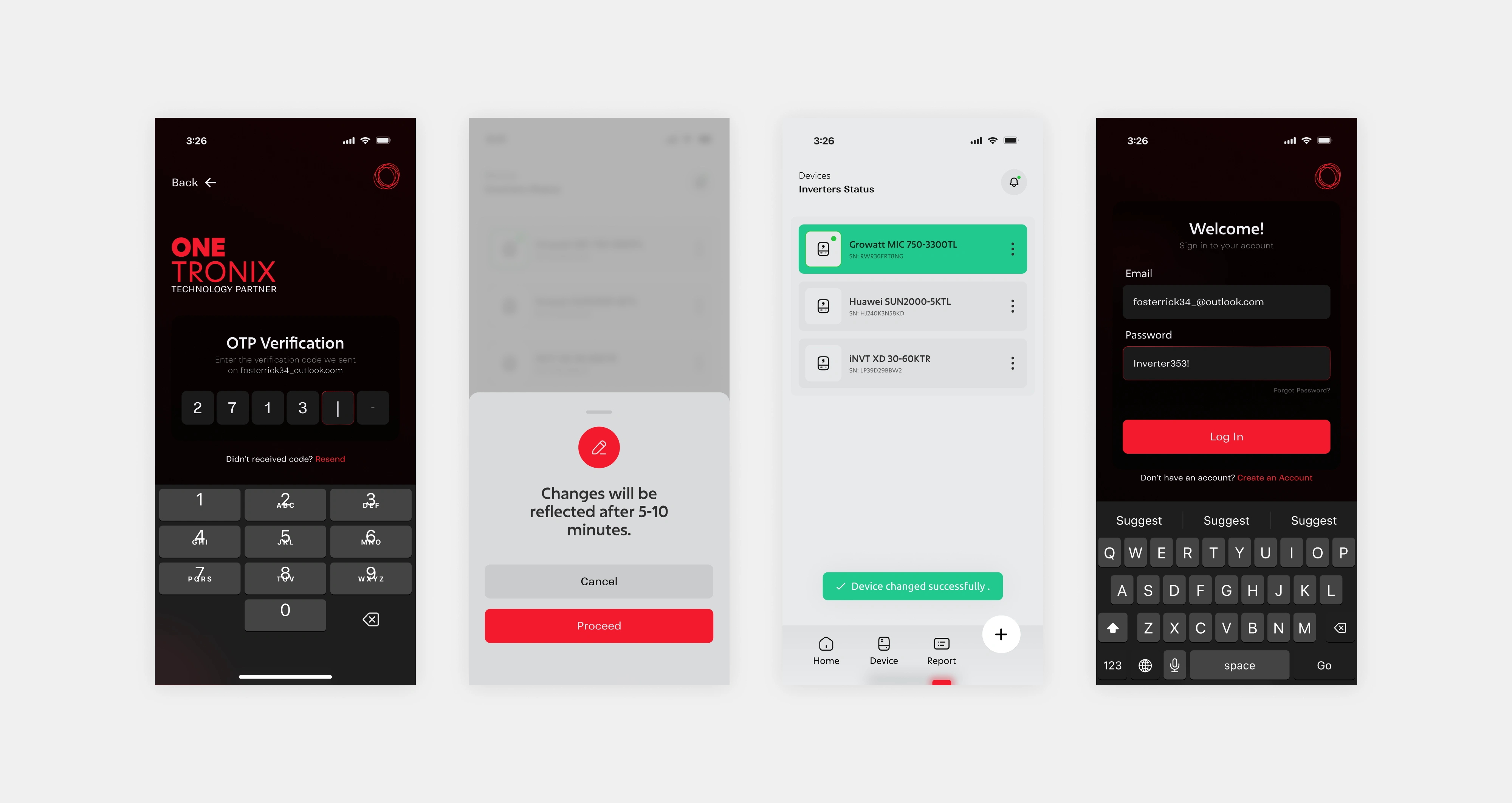
✦ Customers link their solar inverter by scanning a QR code, which pulls their system data directly onto a personal dashboard.
✦ Installers, on the other hand, don't scan anything. Every client they've set up appears on their profile automatically.
The decision to split the experience into two distinct roles, Customer and Installer, came from understanding that their goals are fundamentally different.

OneTronix Logo
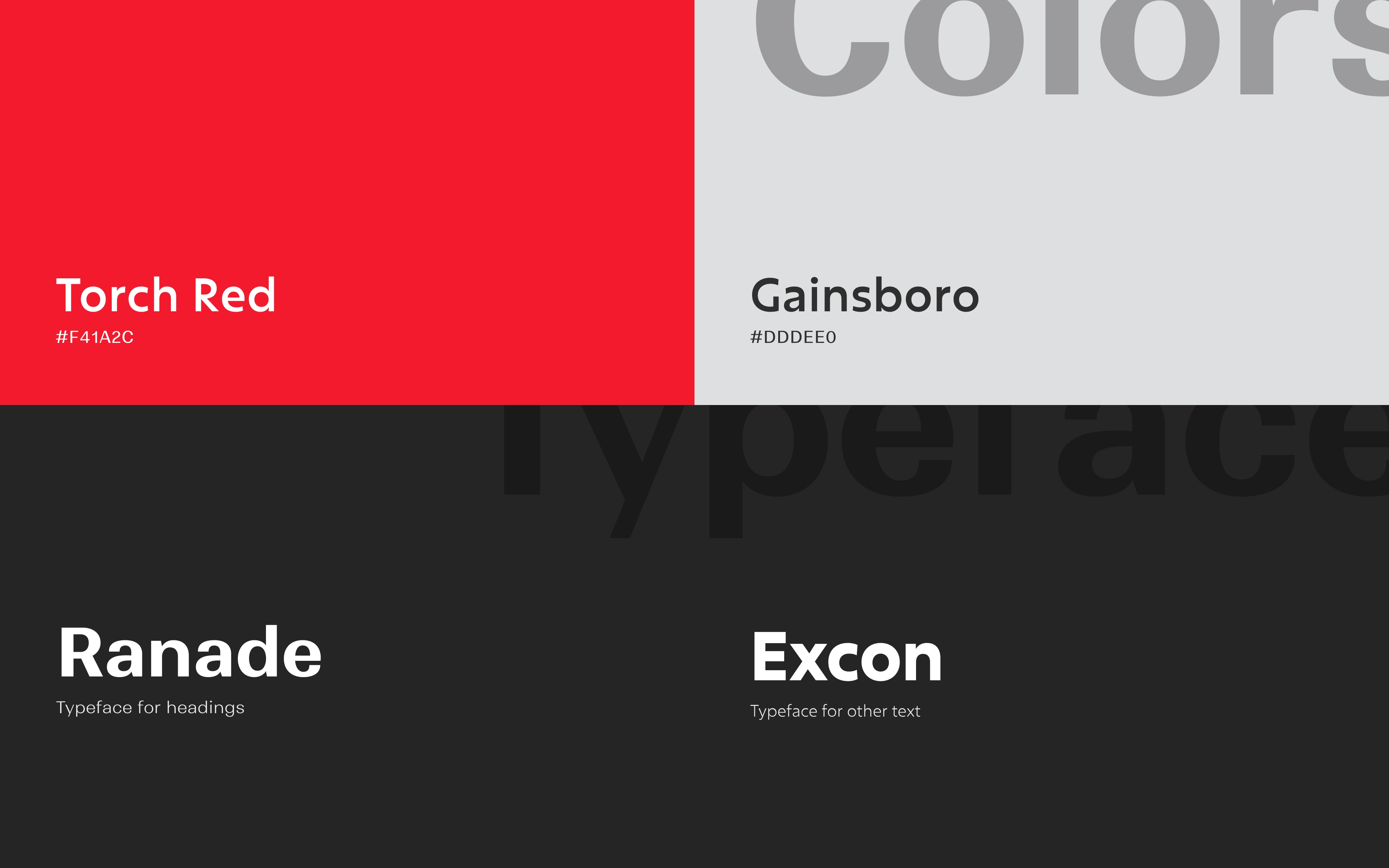
Brand Identity - Colors & Typography
Typography
Ranade brings a clean, slightly geometric character that works well for headings and key data points, giving the app a technical feel without being cold.
Excon handles the supporting text, offering readability at smaller sizes while staying consistent with the overall tone.
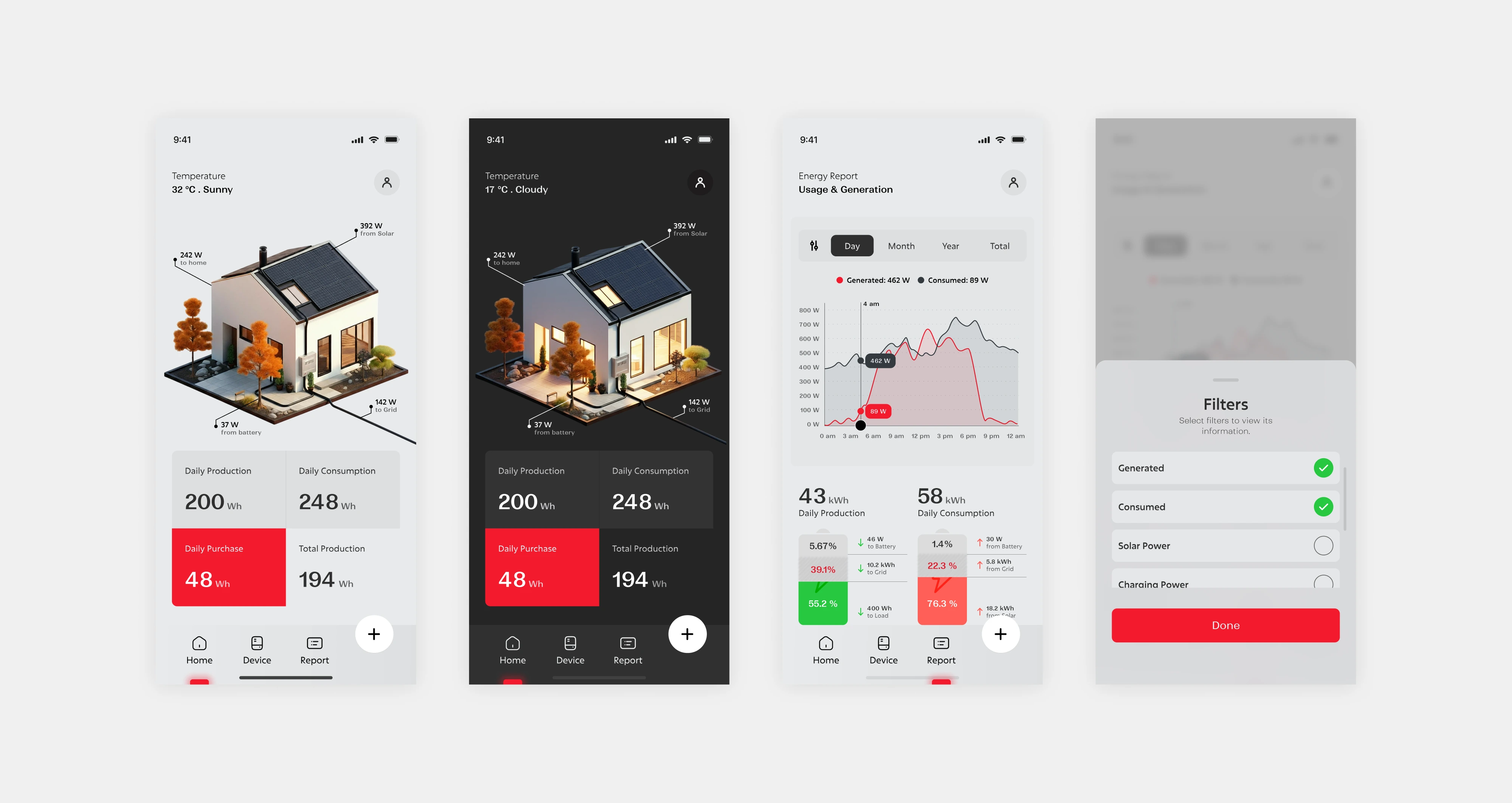
Mobile Screens
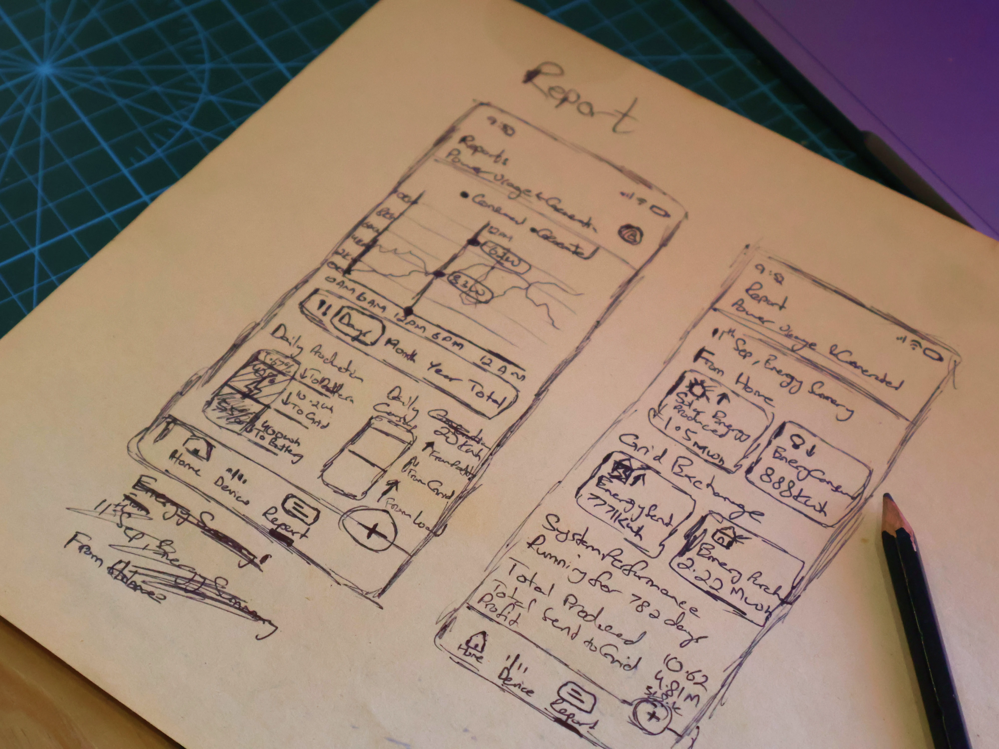
Rough Sketch before Design
Sketch Before High-Fidelity Design
Before opening Figma, the report screen was sketched on paper first.
This screen carried the most data complexity in the entire app. It includes Energy Production, Consumption, Savings, and Usage Summaries, all needed to coexist without overwhelming the user.
Sketching it by hand allowed the information architecture to be mapped out freely. No constraints, no components, just structure and logic. It cleared the ambiguity early so the Figma work had a clear direction to follow.
The report screen is where most data-heavy apps lose users. Too much information at once, or information ordered by what's easiest to display rather than what's most useful to read, results in a screen that technically shows everything but communicates nothing clearly.
Sketching by hand forced a prioritisation decision: what does the user need to see first, second, and third? That hierarchy — production at the top, consumption below it, savings following — was established on paper before any component was placed in Figma. The high-fidelity work then had a clear structural logic to execute rather than one to figure out mid-design.
Mobile Screens
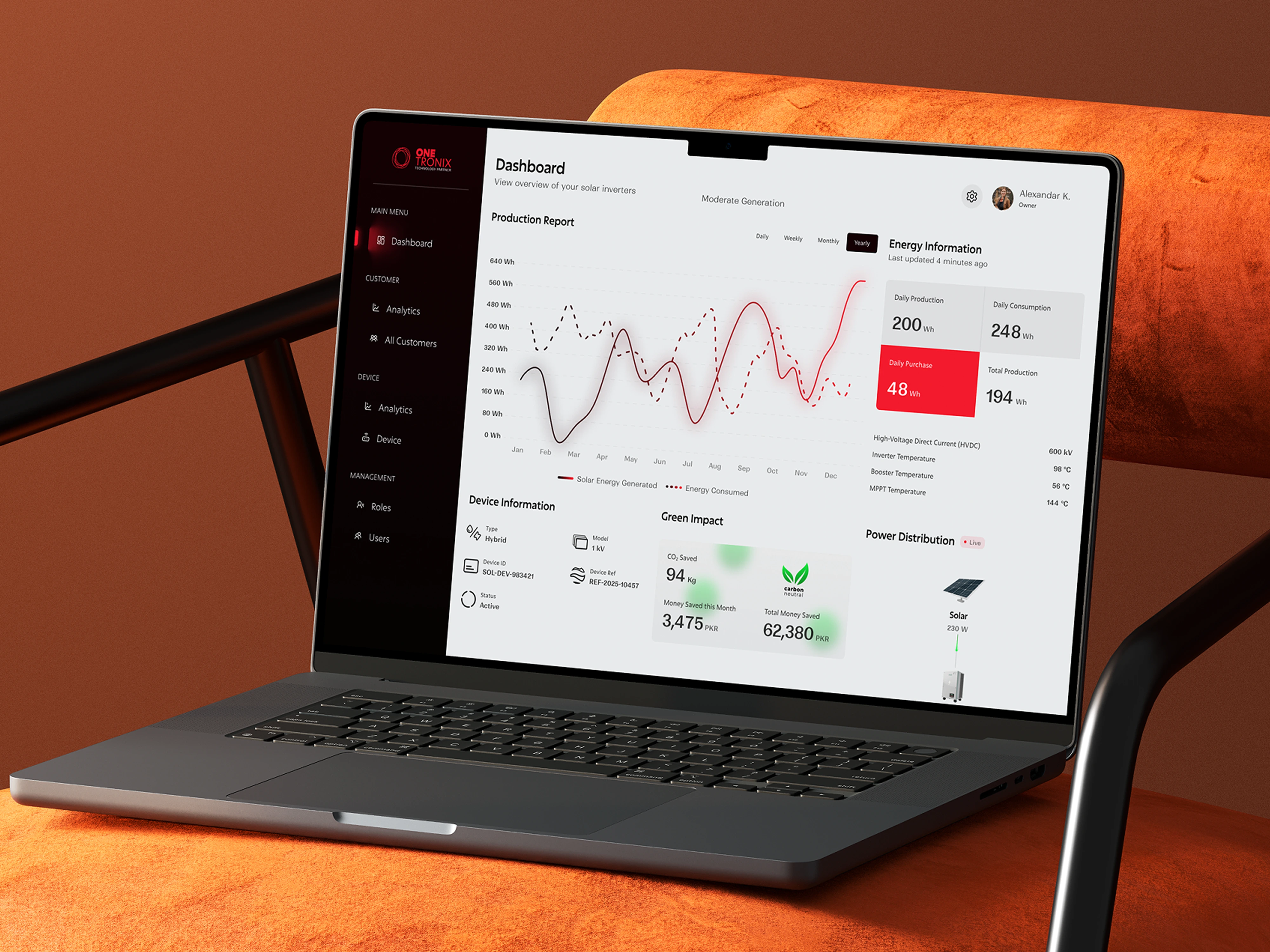
Web Dashboard
Web Dashboard
The web dashboard extends the product for installers who need a larger view of their client base, the kind of detailed monitoring that works better on a wider screen than a phone.
The same design language carries over from the mobile app: the color system, typography, and component style are consistent across both surfaces. This wasn't done just for visual consistency, it reduces cognitive load for installers who switch between their phone in the field and a desktop back at the office. The interface feels familiar regardless of where it's being used.
The dashboard gives installers a deeper view of individual client systems: historical performance data, usage trends, and system health details that go beyond what the mobile overview surfaces.
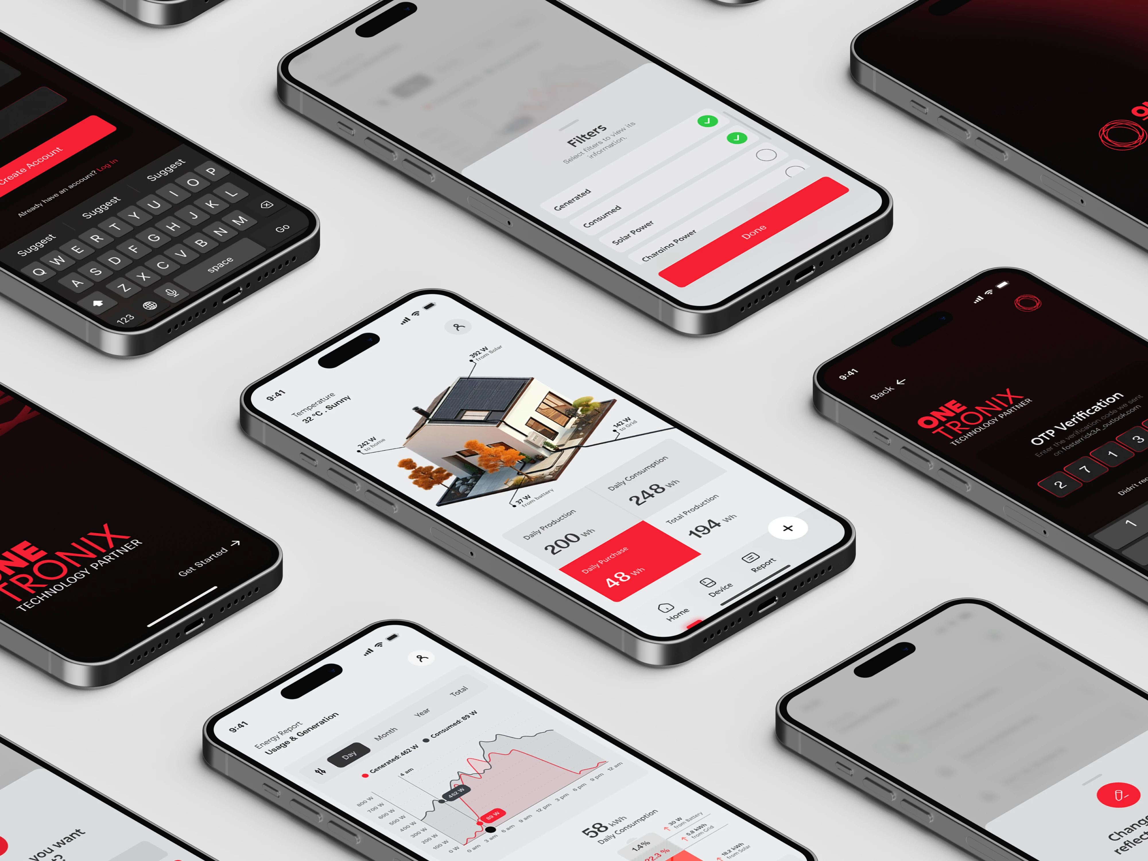
Mobile Screens
Figma Prototype
Prototype
The Figma prototype covered the Report screen end-to-end — the most complex screen in the app and the one most likely to expose UX problems before development began.
Walking through the prototype revealed how transitions between time ranges (daily, weekly, monthly) felt in practice, whether the data hierarchy was immediately readable, and where the eye naturally landed on first load. Issues that would have been expensive to fix in development were caught and resolved at the prototype stage.
A working prototype also serves as a communication tool, it gives stakeholders something concrete to react to rather than asking them to imagine how a static design will behave.
App Icon
Like this project
Posted Dec 15, 2025
Solar data is complex. This app makes it readable — live production, consumption, and savings for users, with a full installer dashboard for pros.