Sydney Easter Show Mobile App
Project Summary
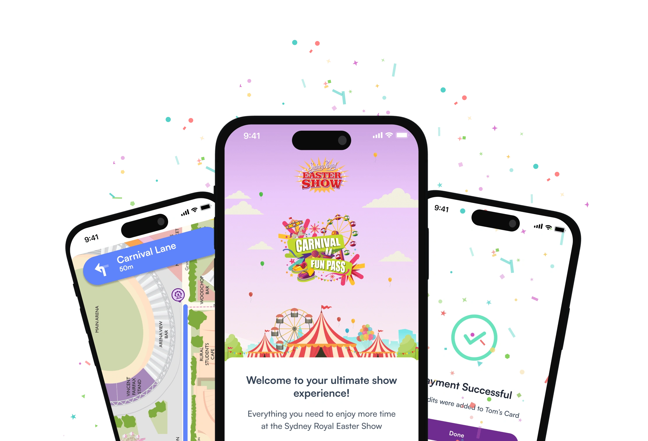
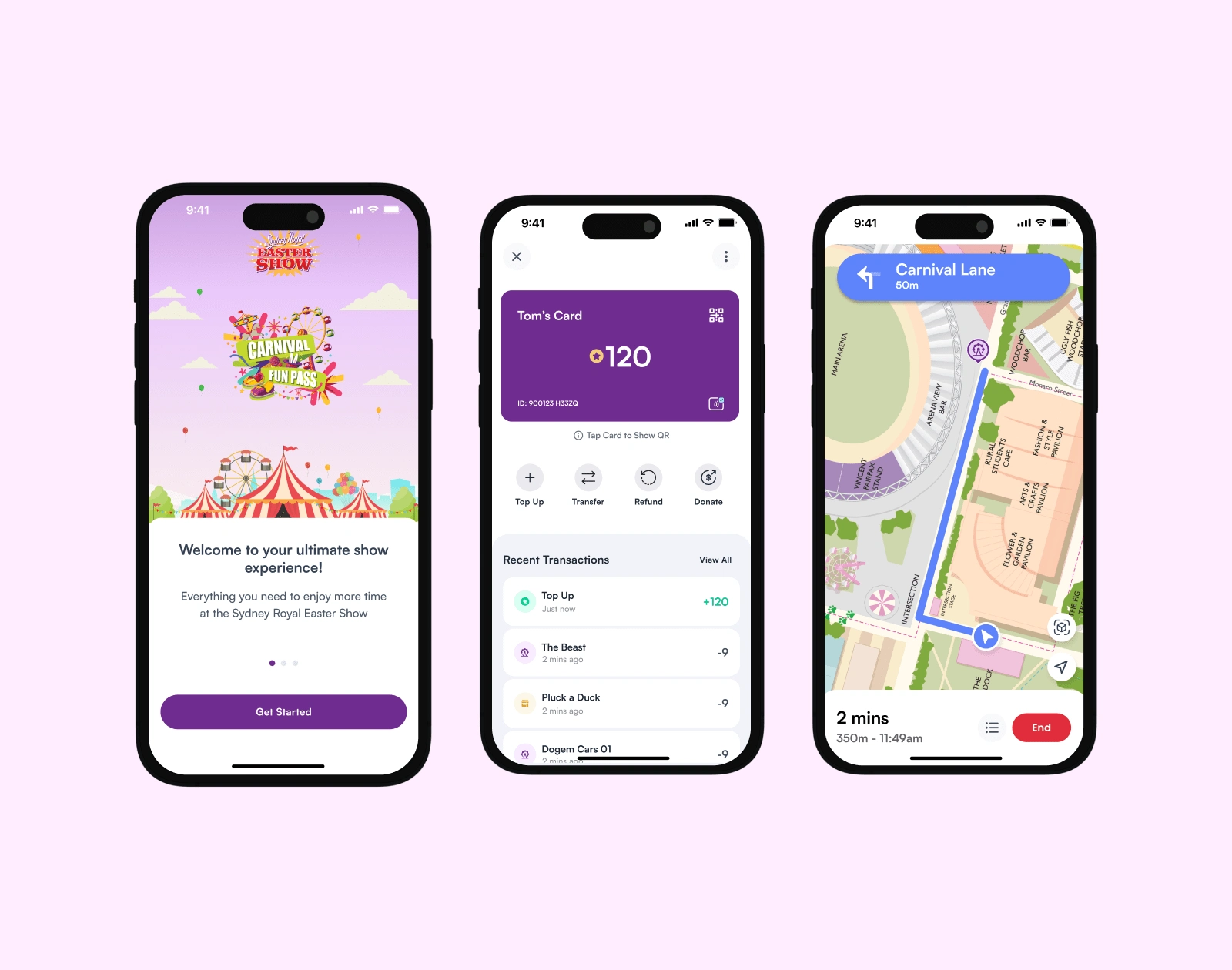
Redesigning the Sydney Royal Easter Show visitor app to streamline the process of buying, using, and managing carnival credits. Additionally adding value for users by incorporating an interactive map, favourites and a scannable QR method for redeeming carnival credits directly from their phone.
My Role
As the sole designer on this project, it was my job to design an app that balanced a fun, vibrant theme with clean and intuitive features. I did this through research, creative strategy, open feedback loops and producing clear design solutions. This helped the team deliver an engaging product for users and addressed business objectives.
69% increase in app generate revenue
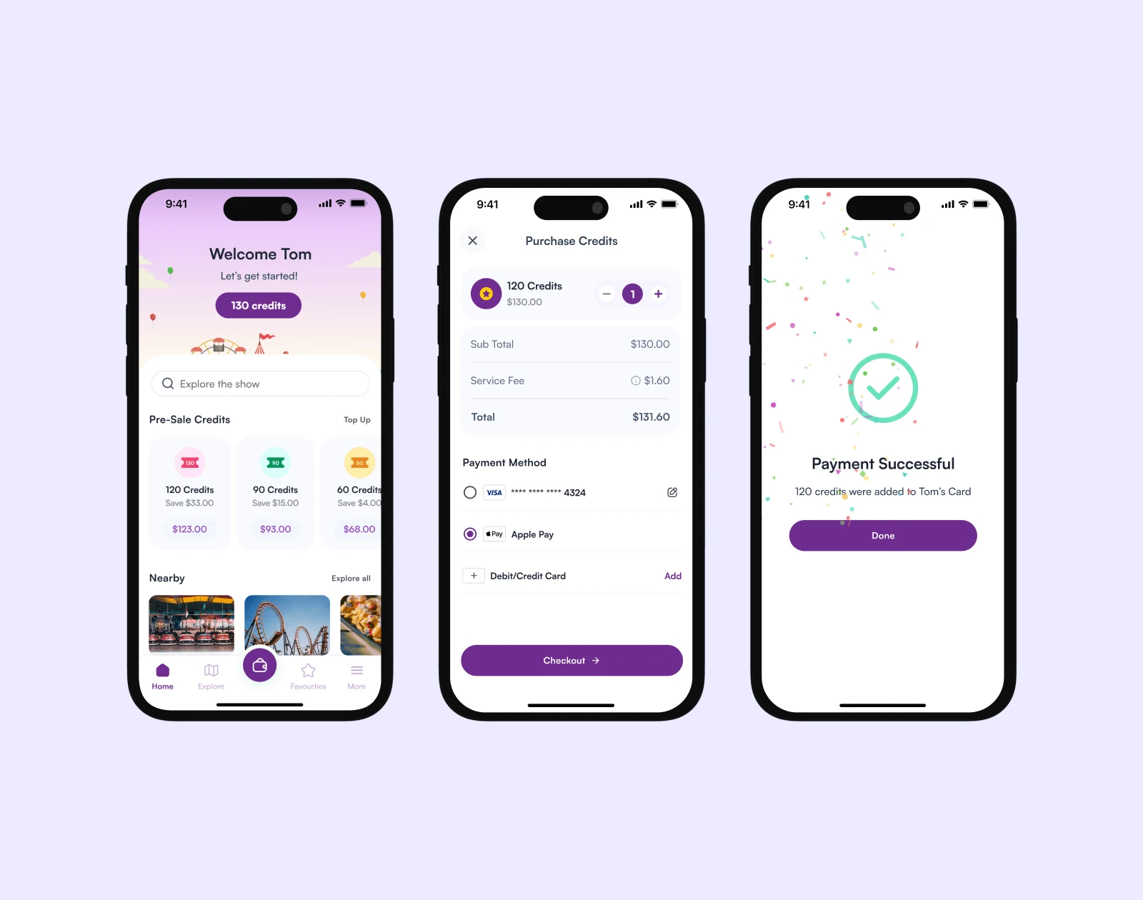
Simplified credit purchasing flow by adding credit product packages to the home screen, allowing users to quickly select their desired amount of credits and move through checkout process with less friction.
25% of all event credits redeemed via mobile app QR option
Implementing a QR code for visitors to redeem credits via their phones resulted in 25% of all credits being redeemed this way.
This addition allowed visitors to skip lines for physical Carnival Fun Pass cards, enhancing their experience and reducing plastic waste, making it a planet-friendly solution. 🌏 😇
15% increase in map users
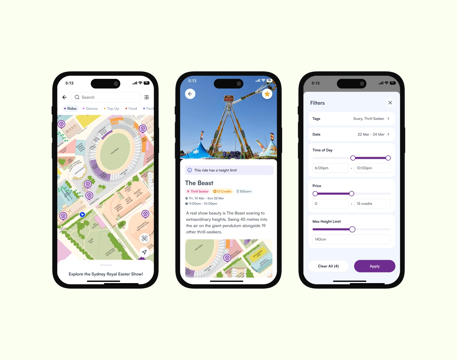
The user experience of the Explore feature was improved by introducing categories and advanced filters with visual representations - enabling users to easily find specific attractions and events.
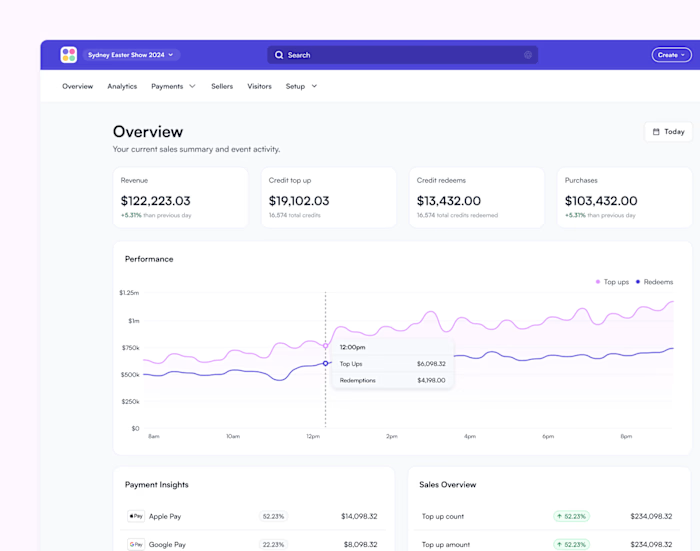
Additionally, implementing custom map creation via the Ludo Control web app allowed for event-specific streets, enabling way-finding and step-by-step navigation for visitors. These improvements streamlined navigation, significantly boosted user engagement and satisfaction, and made exploring the Showgrounds intuitive and efficient.
What I Did
With a fast approaching event deadline and an already functional barebones app, designs need to be clear, considered and minimally intrusive.
I conducted pattern research and small-scale usability tests to validate user flows and design ideas as well as maintained open feedback loops. I worked closely with the developers and managers to learn the infrastructure and financial boundaries of a cashless system. This helped ensure that I could be self-directed in quickly delivering finished designs to maintain project momentum.
Here's a summary of how I approached this project:
Identified areas for improvement
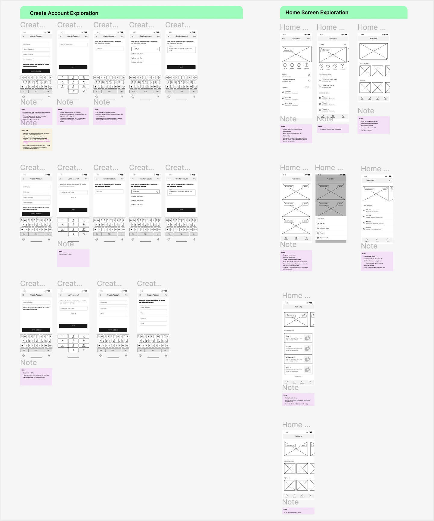
Explored alternative options based on patterns & research
Discussed impacts with devs
Prepared designs for improved flows
Iterated, tested and repeated
Wireframe Exploration
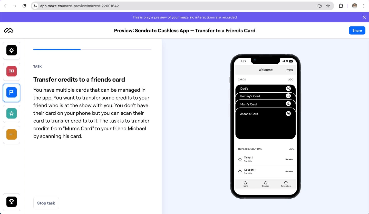
User testing using Maze
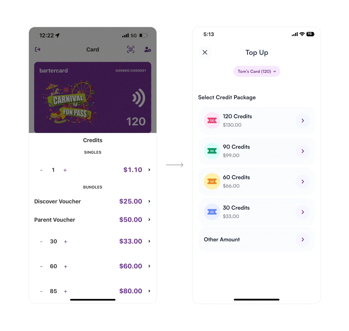
Old vs. New Credit Packages
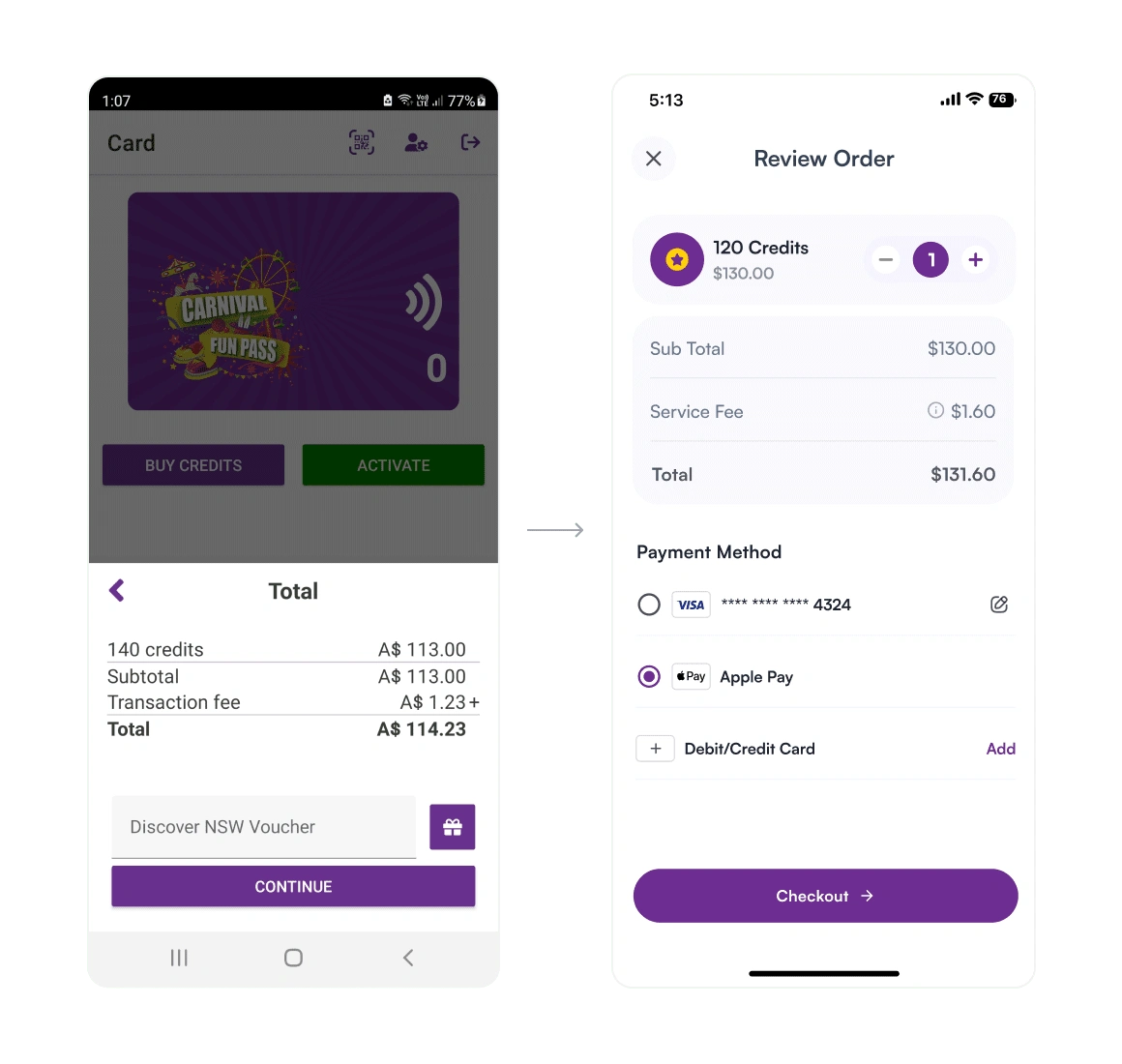
Old vs. New Order Summary
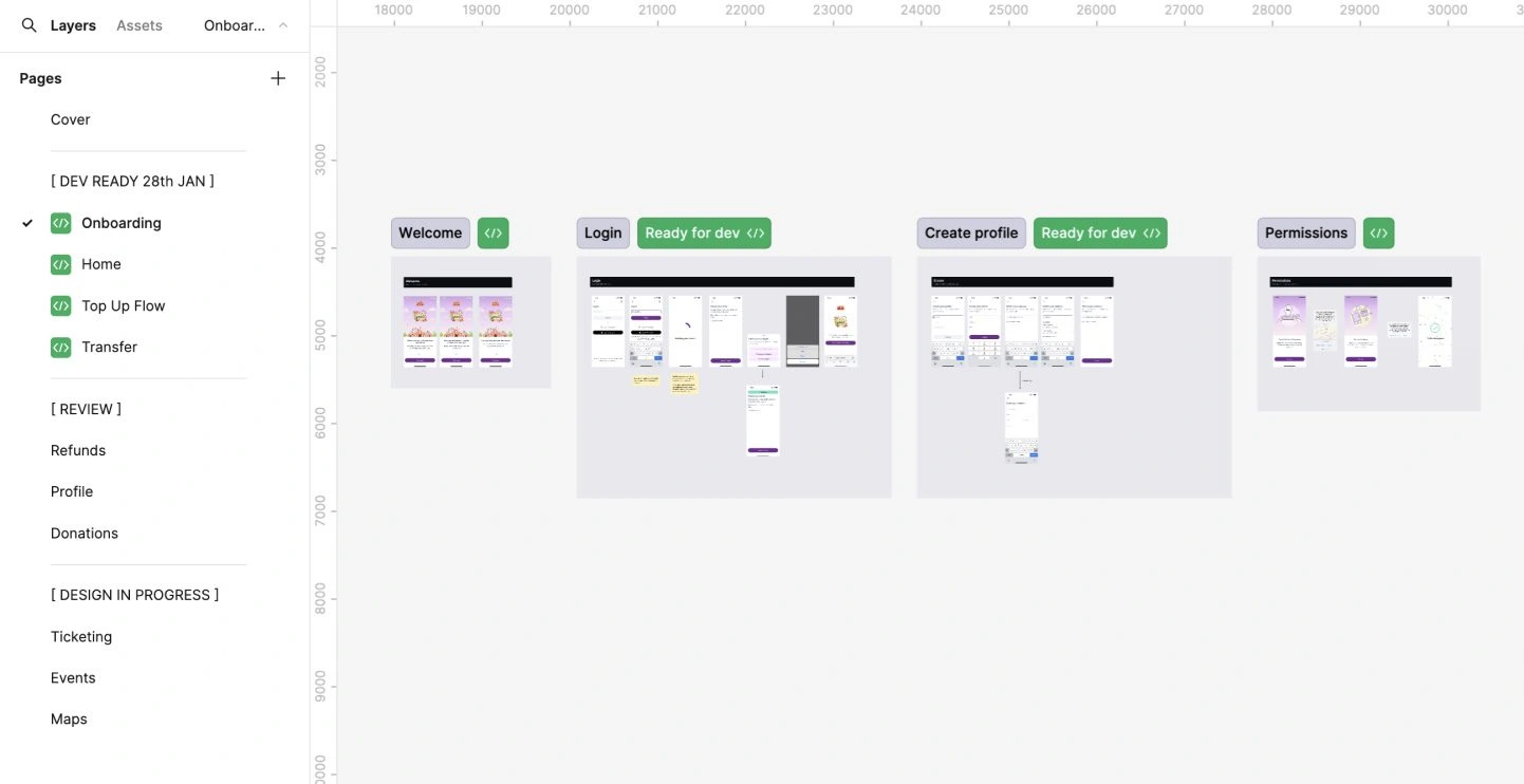
Figma File Organisation Example
Reflection
This was the first project where I witnessed over 200,000 people using the app I designed. Seeing it work effectively at the show was an amazing feeling and is definitely a motivator for wanting to work on projects with larger user bases.
One major limitation was Apple's restrictions on utilising their wallet technology. Ideally, we wanted to enable credit top-ups within the app and use NFC payments for redeeming credits, rather than scannable QR codes. This would allow users to simply tap their phones to redeem carnival credits. As the rules around this technology evolve in Australia, we hope to make these improvements for 2025 and beyond.
Like this project
Posted Jun 21, 2024
Redesigning the Sydney Royal Easter Show visitor app to streamline the process of buying, using, and managing carnival credits.
