Built with Framer
MindfulSpace, Landing Page for a Mindfulness App
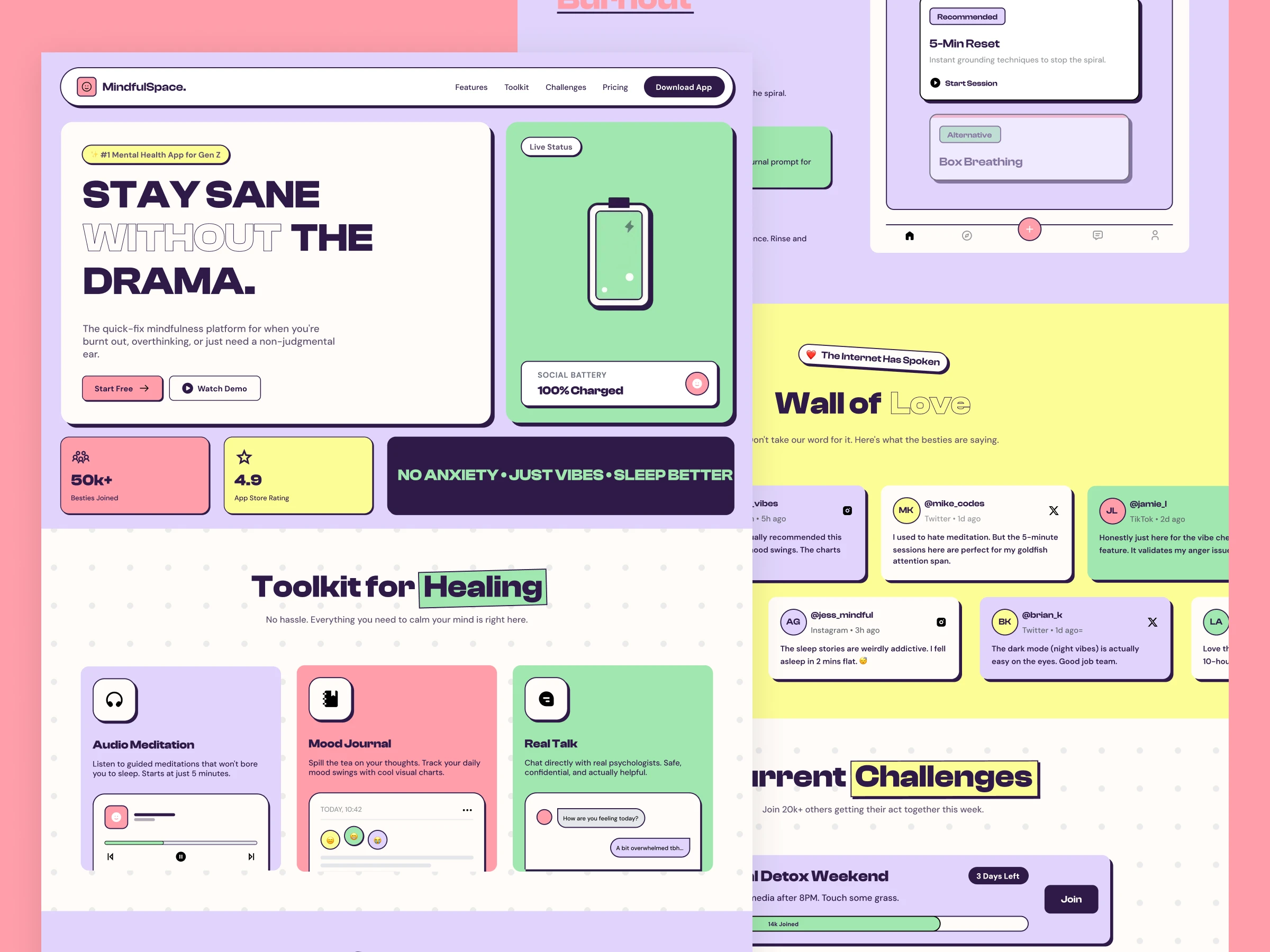
MindfulSpace, Landing Page for a Mindfulness App
A landing page for a mindfulness app, designed to explain the toolkit fast, build trust, and drive sign ups with clear CTAs.
Problem & goal
Mindfulness tools can feel vague, especially for first time users. The goal was to make the product feel simple and usable, with clear sections that answer, what it is, how it helps, and what to do next.
What I did
I planned the full landing page flow and designed each section as a scannable card based layout. I focused on clarity, quick actions, and trust layers, including social style testimonials, a simple pricing comparison, and an FAQ that tackles common doubts.
The site and flow
Hero introduces the core promise and gives two clear actions (Start Free, Watch Demo).
Toolkit for Healing explains the main features with UI previews (Audio Meditation, Mood Journal, Real Talk).
Mood Journal shows a low effort daily check in experience.
Emergency Mode presents instant actions (breathing, focus, sleep) for high stress moments.
Steps explains the burnout flow in 3 simple steps with a UI preview.
Wall of Love adds social proof using feed style cards.
Challenges makes the product feel active with joinable challenges and progress bars.
Pricing keeps the decision simple with Free vs Pro Vibe.
Team, FAQ, CTA add credibility, remove last minute objections, and capture email sign ups.
Results & my role
This page turns a broad wellness idea into a clear, structured story that is easy to scan and easy to act on. My role covered UX structure, visual design, and landing page layout decisions.
Role and tools
Role: Web & Product Designer
Tools: Figma, Framer
Deliverables
Full landing page design with section by section layout
Responsive layout planning for desktop and mobile
UI components and card system for consistent sections
CTA and conversion focused section ordering
Pricing layout and FAQ structure for objection handling
Export ready visuals and organized design file
Build ready layout for Framer implementation
Full Page:

Like this project
Posted Feb 10, 2026
A landing page for a mindfulness app, designed to explain the toolkit fast, build trust, and drive sign ups with clear CTAs.
Likes
2
Views
5
Timeline
Jan 21, 2026 - Feb 7, 2026

