THE BLUE SHIFT — An Editorial Campaign
Isabella Guran
THE BLUE SHIFT — An Editorial Campaign
THE BLUE SHIFT — An Editorial Campaign
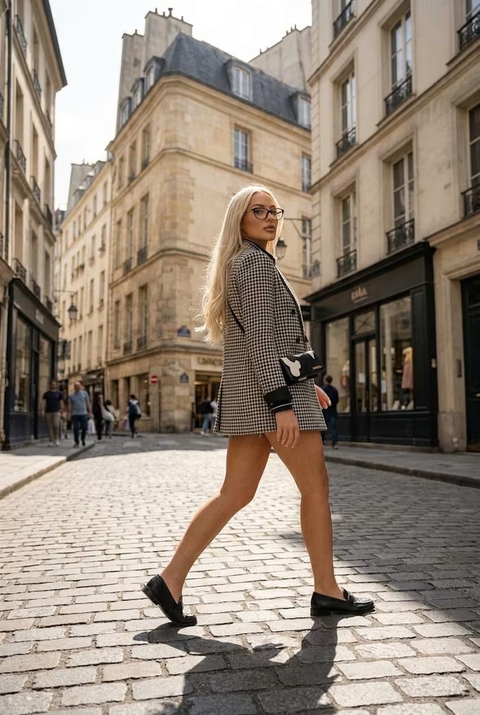
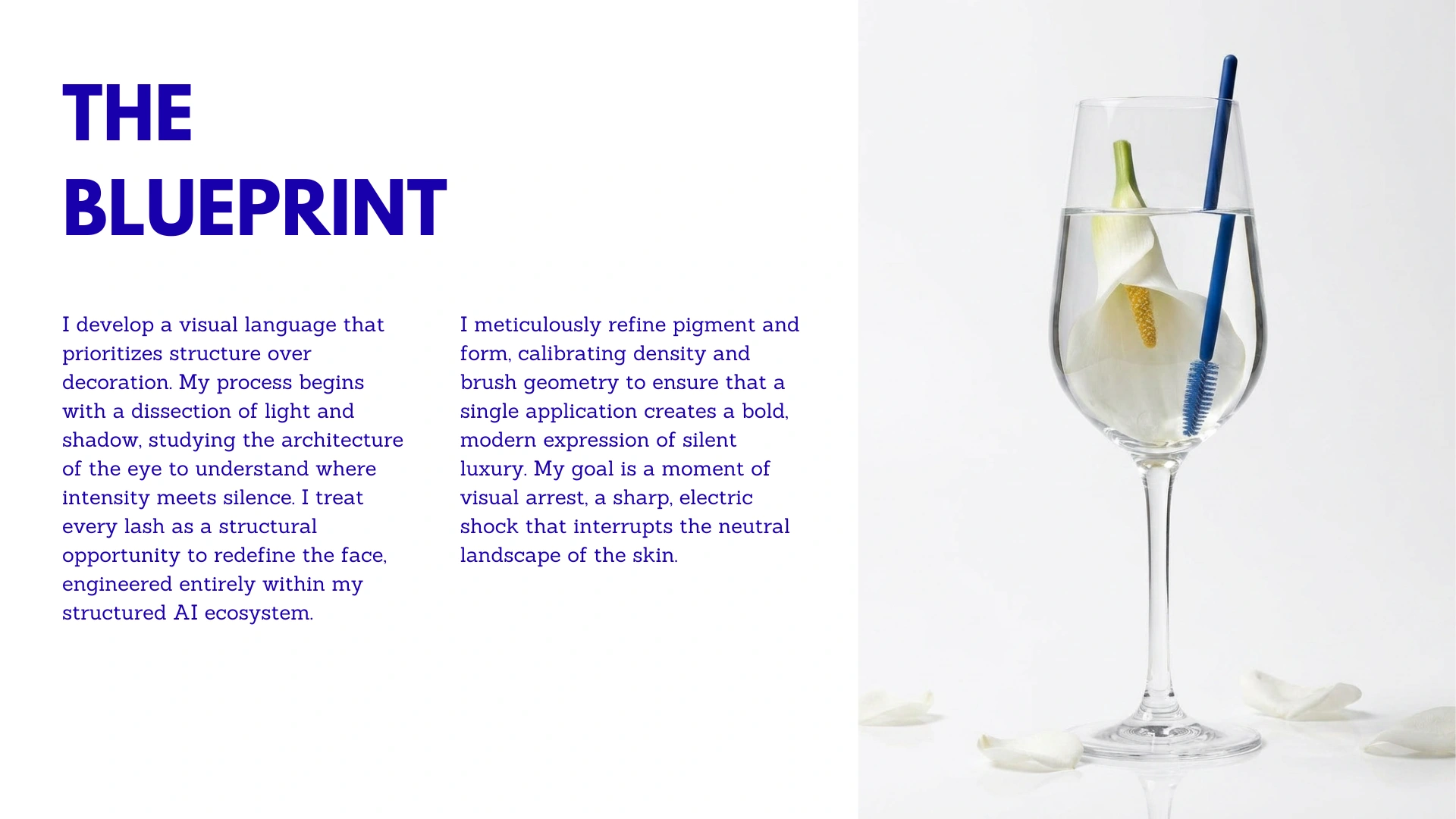
This campaign started with a single question: what happens when you treat the face not as a canvas for beauty, but as a structural object?
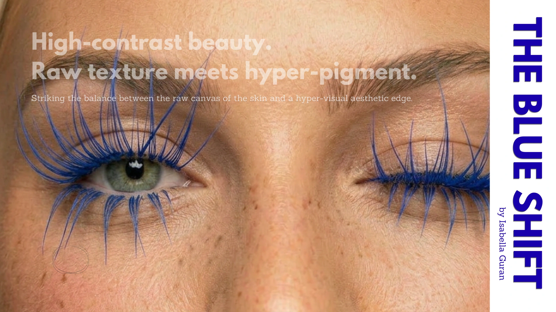
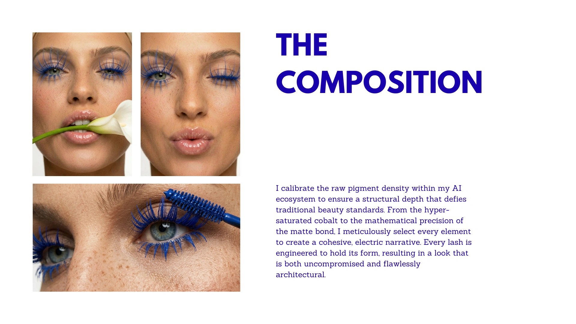
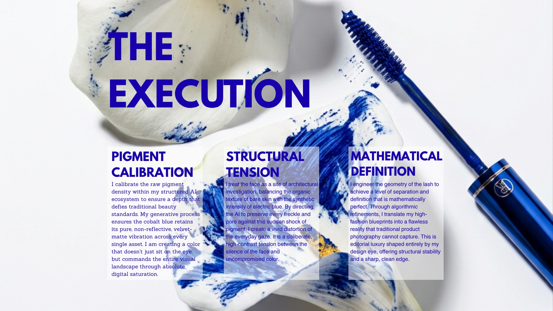
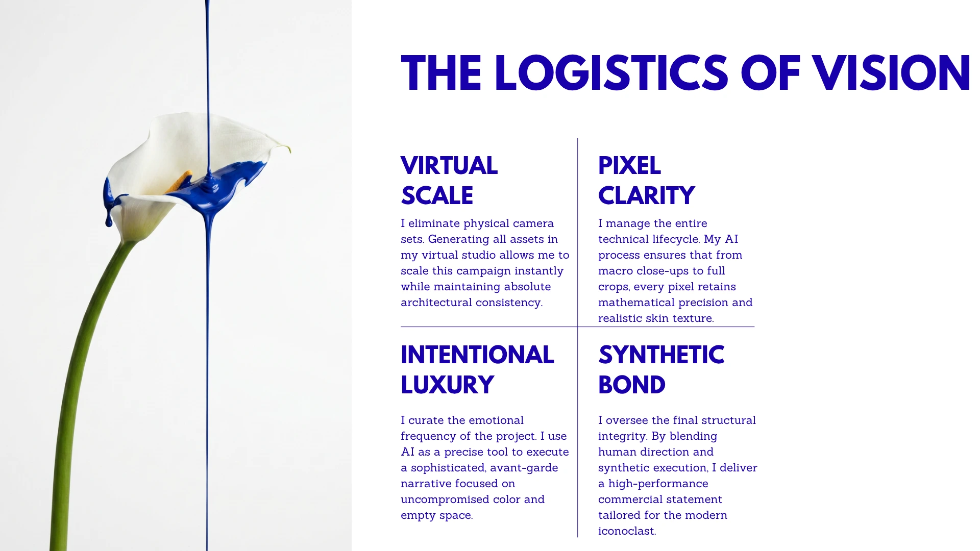
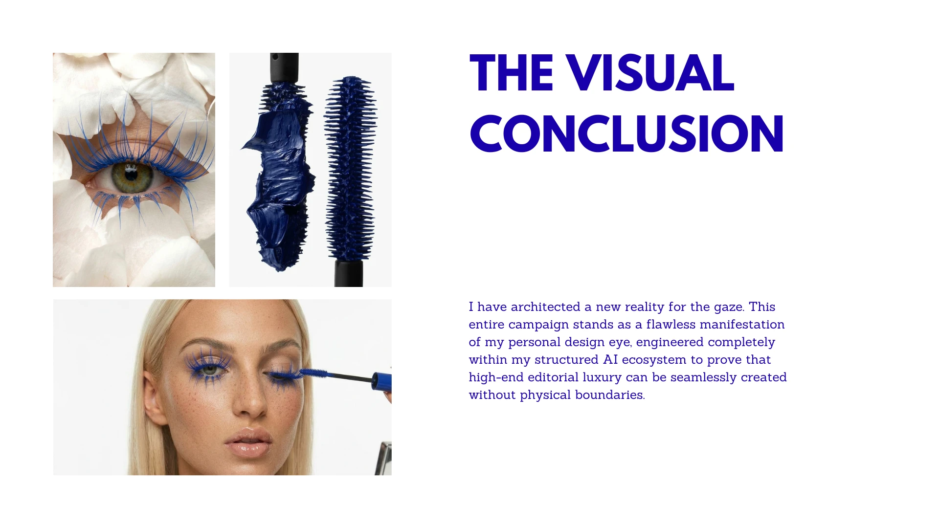
The Blue Shift is a high-contrast beauty editorial built around the tension between raw skin and hyper-pigmented colour. No heavy base. No softening. The texture of the skin stays visible, organic, and real. The colour does all the work.
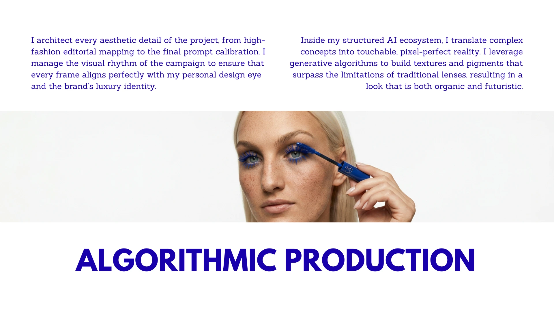
The hero element is blue. Not as a trend reference but as a deliberate creative choice. Blue as architecture. Blue as weight. Applied in exaggerated lash forms and graphic pigment placements that push the look past editorial and into art direction territory.
Every visual decision in this campaign was intentional. The tight crop that removes context and forces the viewer into the detail. The freckled skin left bare against the intensity of the colour. The typography treatment that mirrors the boldness of the look itself.
This is what beauty creative direction looks like when the brief is to go further.
Scope of work: Creative concept, art direction, AI-assisted visual production, typography and layout, campaign framing.
Creative direction by Isabella Digital Hub
Like this project
Posted Jun 8, 2026
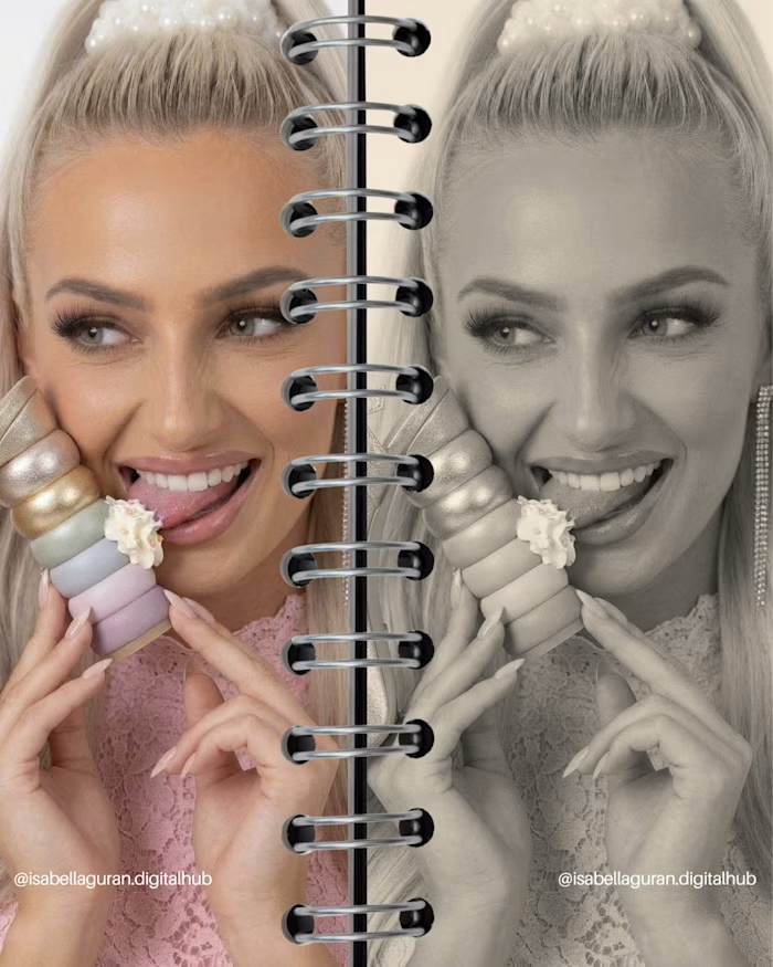
The face as a structural foundation. Pigment, light, and precision as creative tools. A beauty editorial where texture becomes the entire concept.
Likes
0
Views
2